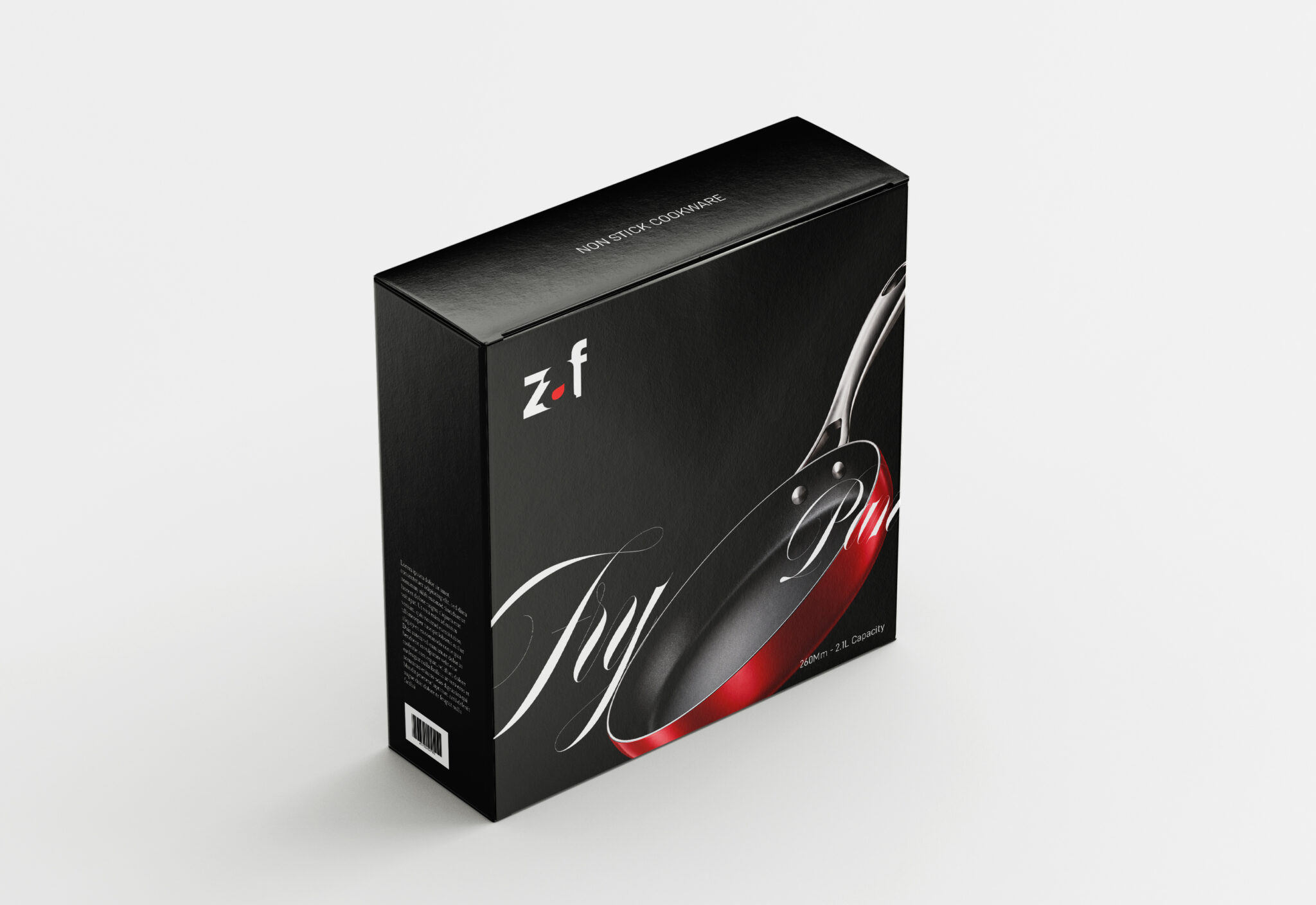

When “enough” is never really enough.
Every kitchen has its essentials.
But there is always another pan.
Another pot.
Another piece of cookware that suddenly feels necessary.
That human truth became the foundation of the Zaf brand identity.
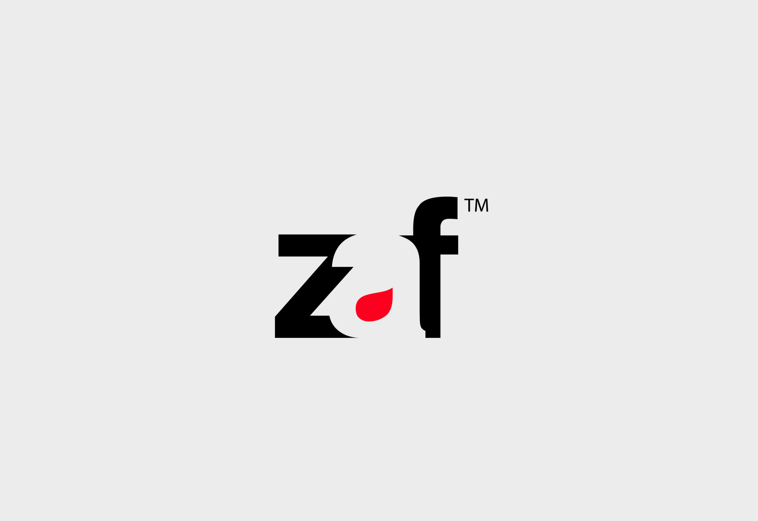
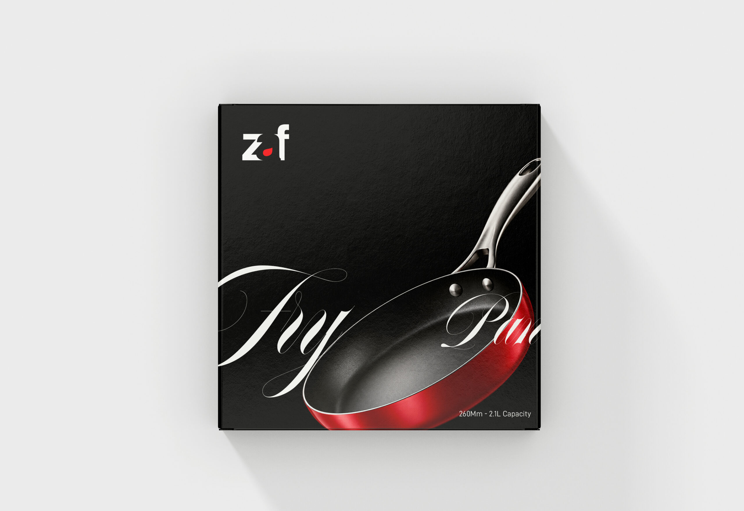
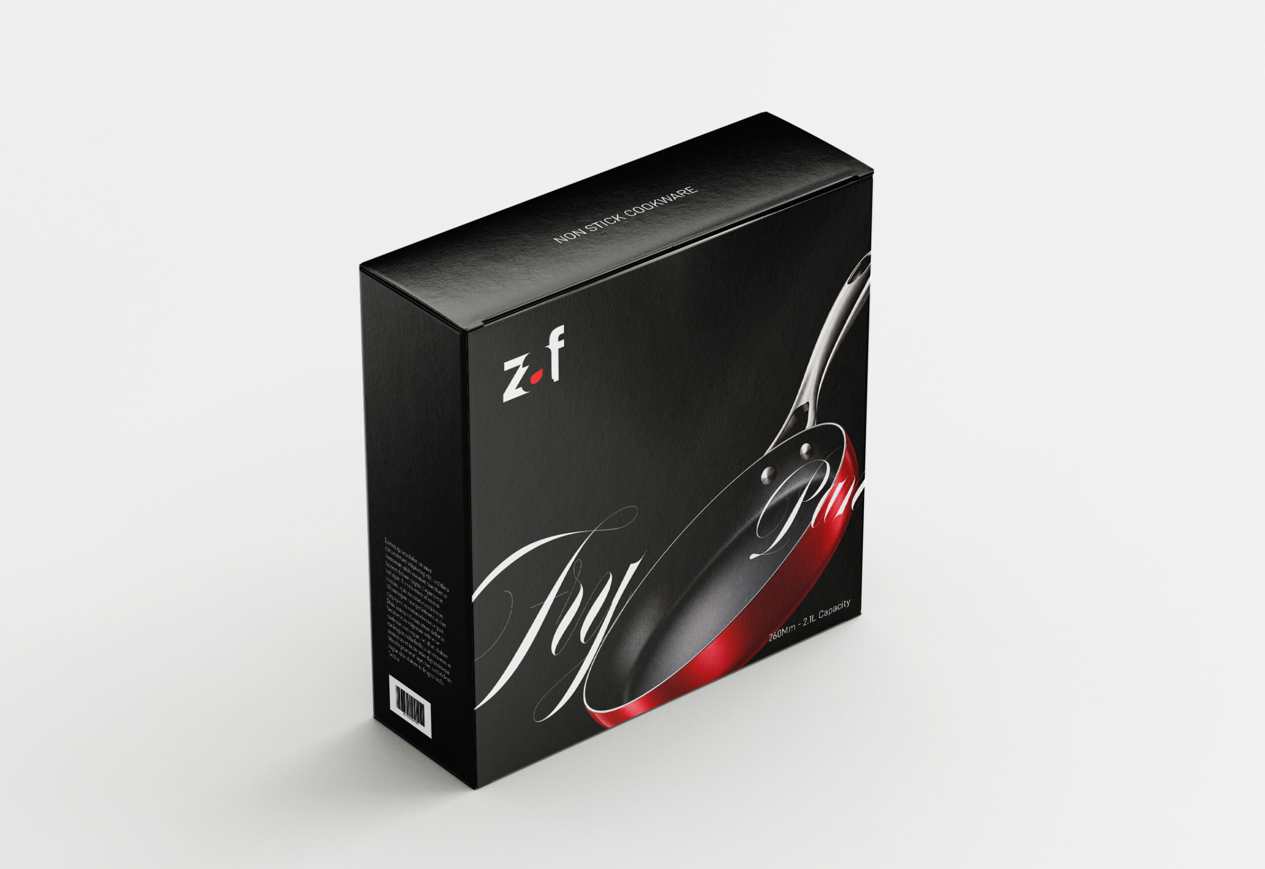
We designed the Zaf logo around a hidden “A”, created through negative space between the Z and f.
The hidden A represents the unspoken desire behind every purchase—the feeling that your kitchen could always use one more beautiful, functional piece.
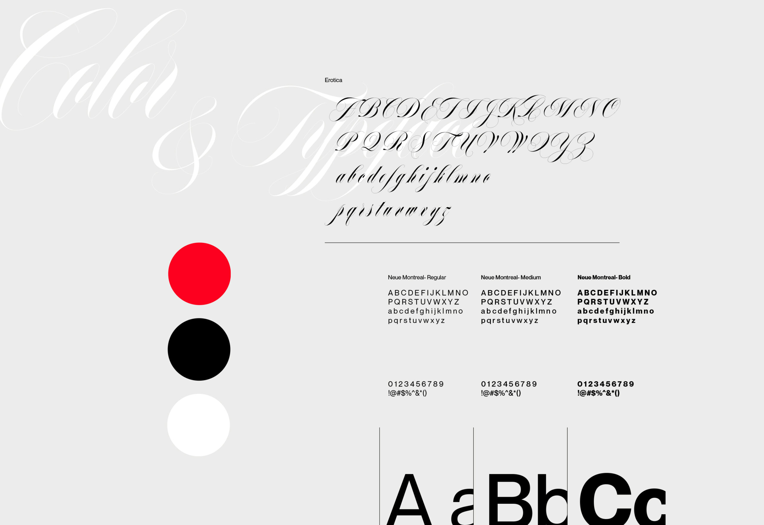
We used red to express desire, energy and sensuality, balanced with black to establish a premium character.
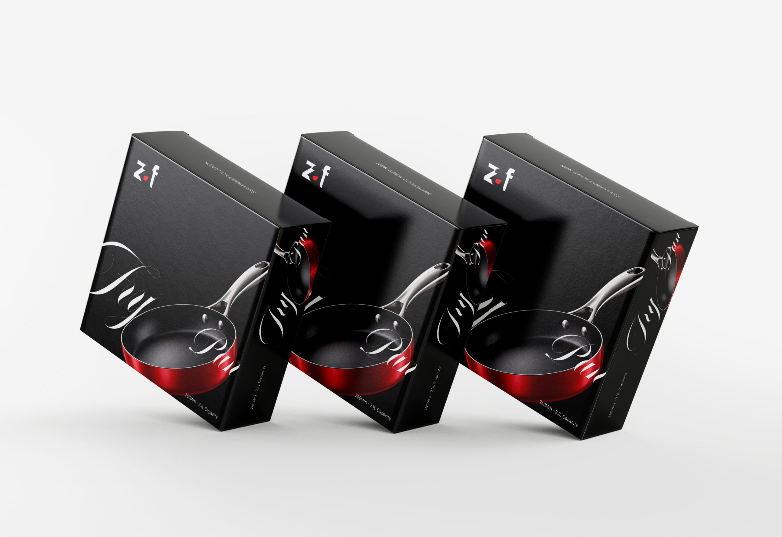
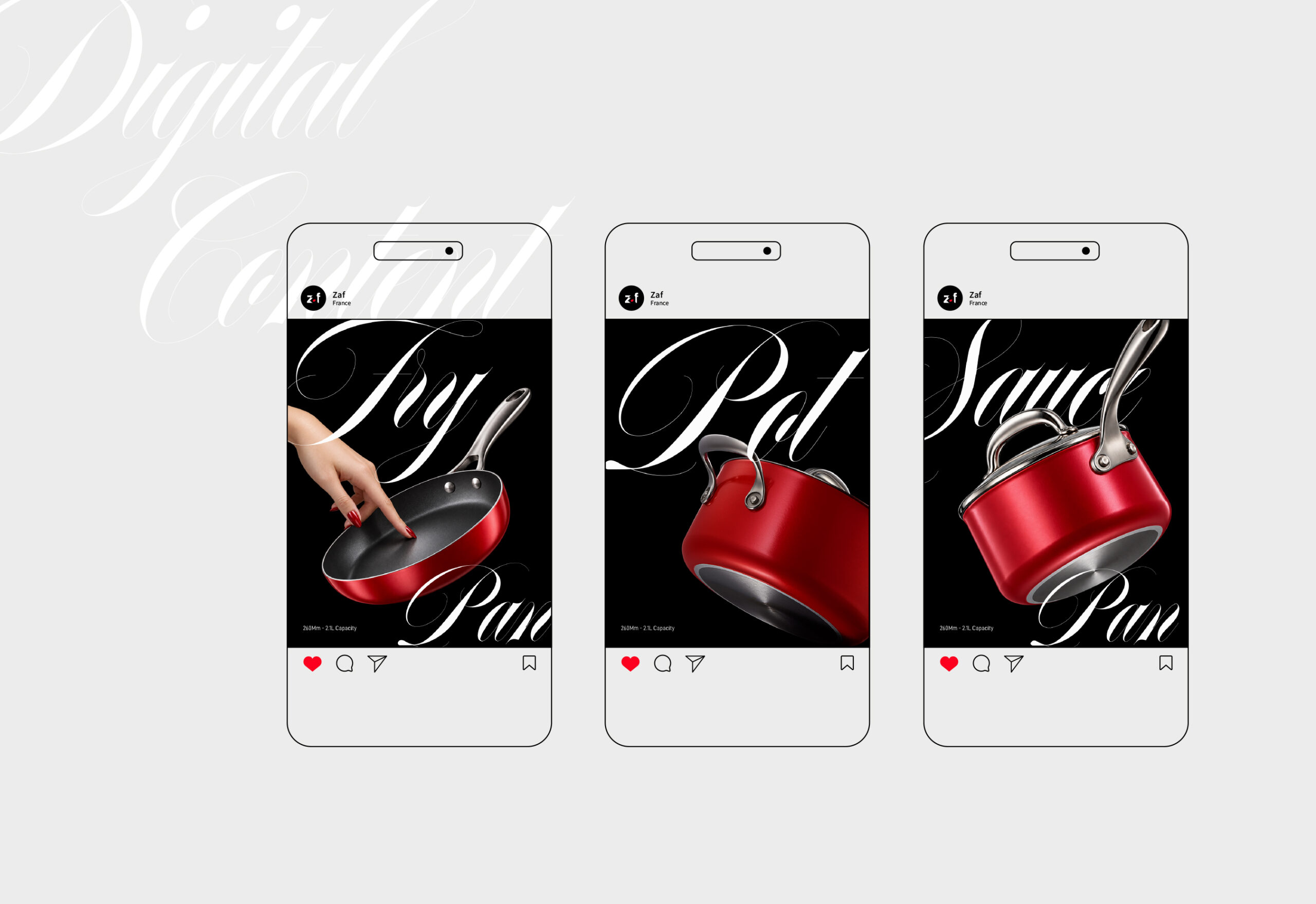
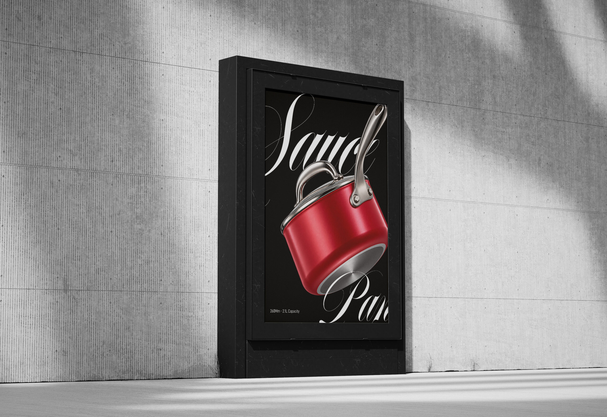
The visual identity then expands into packaging and communication through an expressive script typeface, creating a more emotional and seductive personality around an everyday category.
The result is a kitchenware identity that doesn’t simply communicate function.
It communicates desire.
Zaf — because sometimes, enough is never enough.
📩 DM for collaborations, hello@plusdesignbd.com
 hello ocean
 monther al omari
 the Labelmaker
 alamgirbrands
 kat bres
 Vantablack Studio
 GruppoSaida
 studiorevv
 grafisercreative
 Kate Reichel
 UPRISE
 Modern Theory
 By siddika
 MAISON D'IDÉE Prague
 Kinshuk Bainss
 Palashcc
 www.branding.uz
 Hutton Creative
 DESIGN CONCEPTS
 Tancybox
 habiba hatem
 Up-Brands
 sayadworks
 Kingdom & Sparrow
 furtgoods
 Si me preguntas