

How do you bring the story of Sri Lankan Ceylon cinnamon to the French market?
For Liréa, the answer was not to make the packaging look traditionally Sri Lankan.
Instead, we wanted to translate its origin into a contemporary visual language.
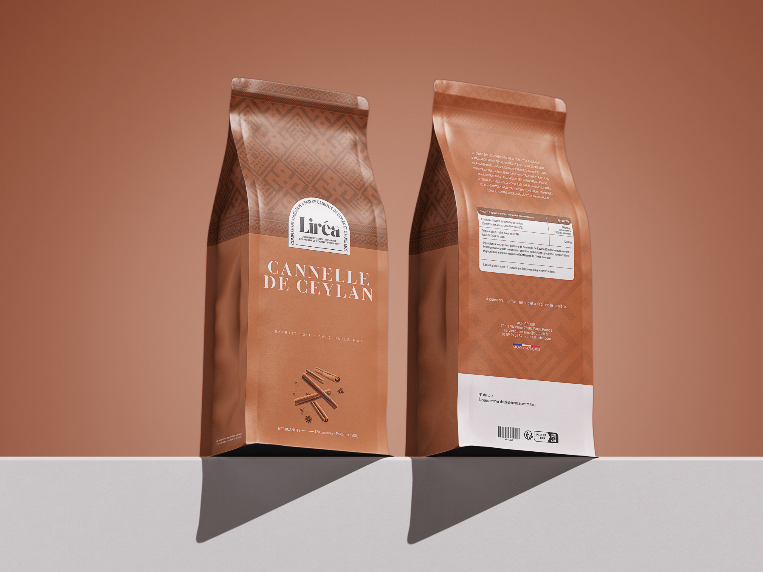
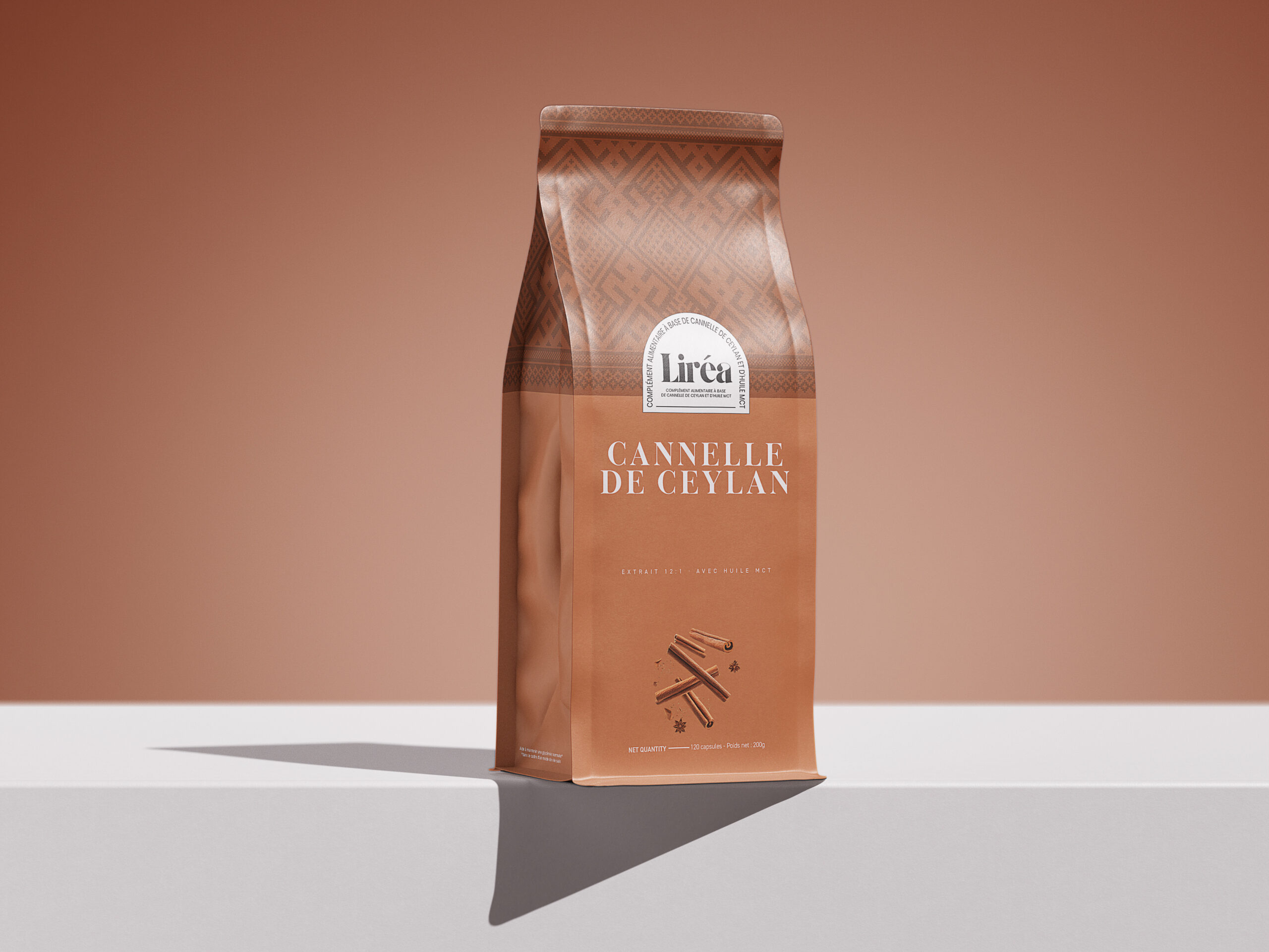
The warm terracotta palette takes inspiration from cinnamon itself-its bark, warmth and natural character.
The geometric pattern is inspired by Sri Lankan decorative heritage, giving the packaging a subtle cultural signature and creating a visual connection to the ingredient’s origin.
Then we introduced a more restrained typographic system and spacious composition to create the clean, sophisticated feel expected in the French wellness market.
The design therefore sits between two worlds:
Sri Lankan heritage × French refinement
The pattern tells the story of where the ingredient comes from.
The colour creates emotional connection with the ingredient.
The typography brings clarity and sophistication.
And the overall system gives Liréa room to grow beyond a single product.
For us, packaging design is not simply about making a product look premium.
It is about finding the right visual translation of a brand’s story for the audience it wants to reach.
From Ceylon, refined for France.
📩 DM for collaborations: hello@plusdesignbd.com

 United Creatives Studio
 Kingdom & Sparrow
 Anastasia Bakhmatskaya
 CreativeWise
 Great and Golden
 Ximena Ureta Design Studio.
 Sorted Branding
 Lisa Sirbaugh Creative
 vitoramockup
 YQIAN
YQIAN Navegante
 Anastasia Cherepanova | xtramez
 Polaris Designs
 pavlyai
 Milena Kocharyan
 monther al omari
 Mohamed sherif midoo
 DESIGN CONCEPTS
 mmdesign
 markcreativestudio
 Rosario Lo Iacono