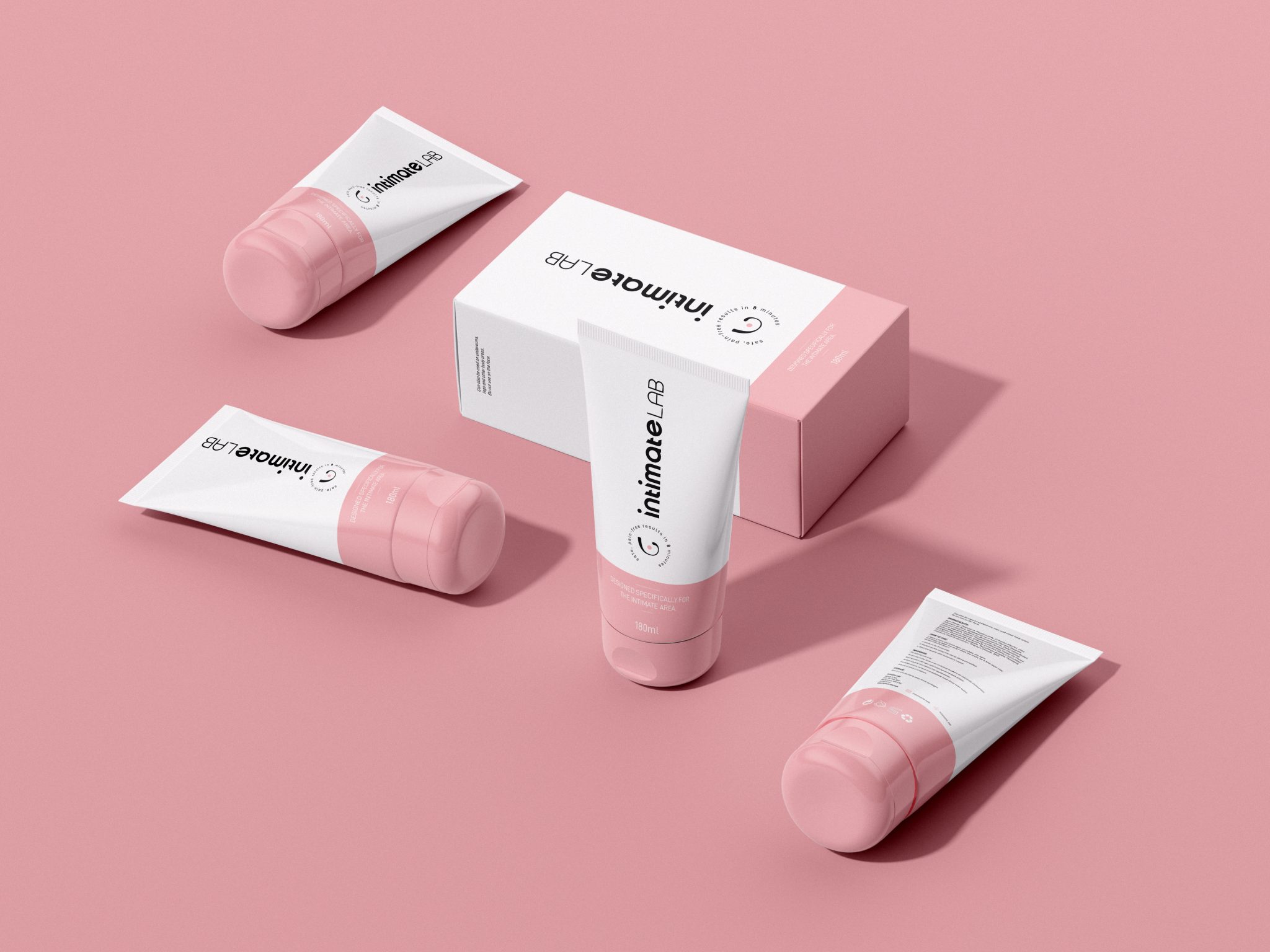

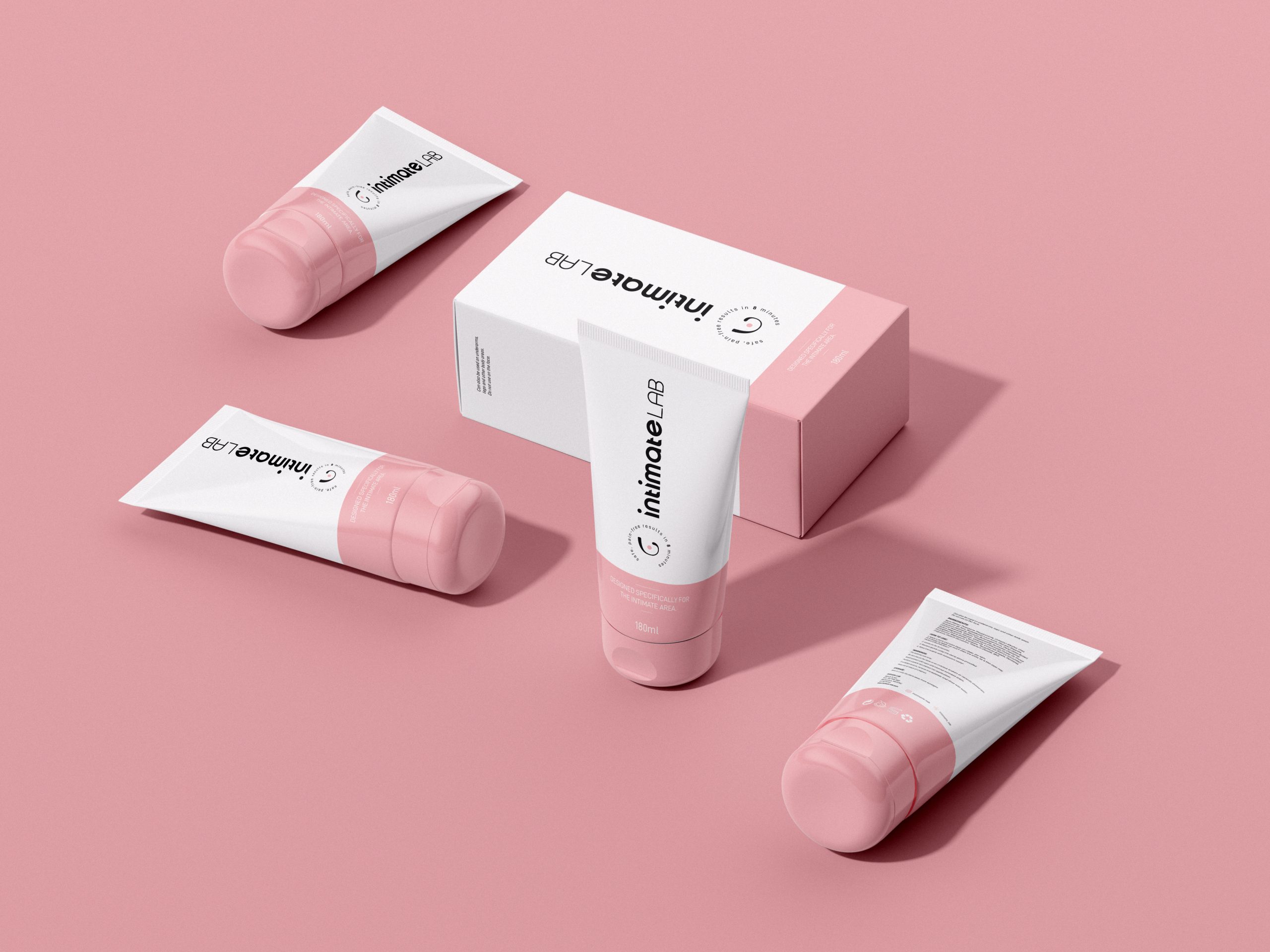
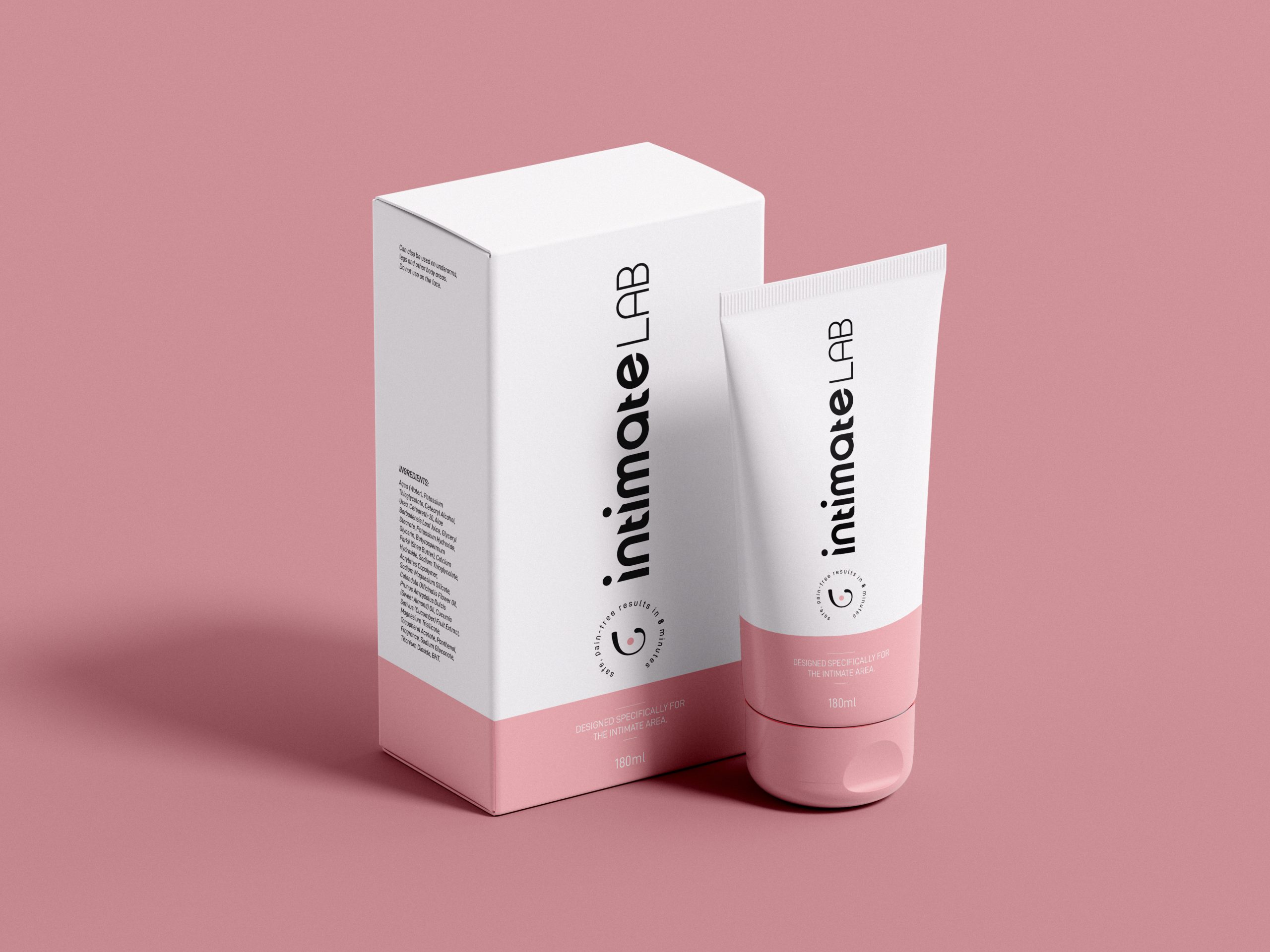
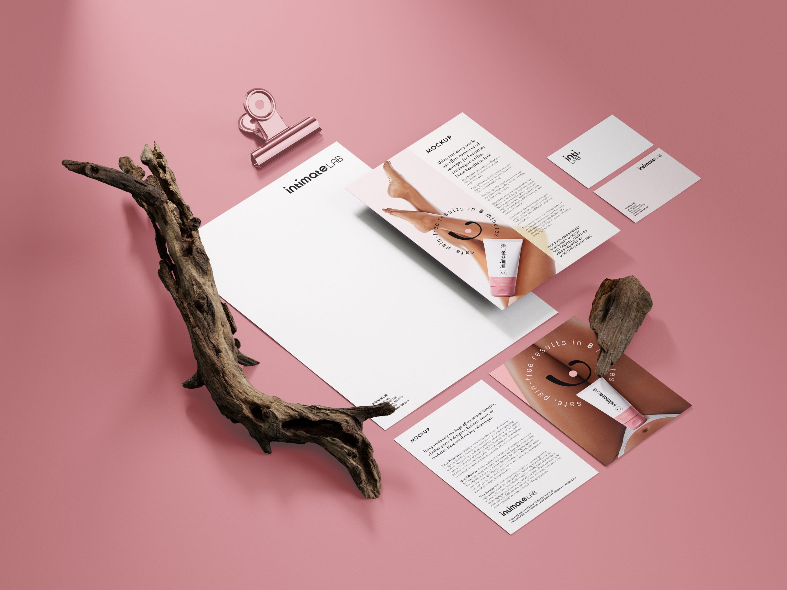
Visual Identity and Packaging Design for Intimate Lab.
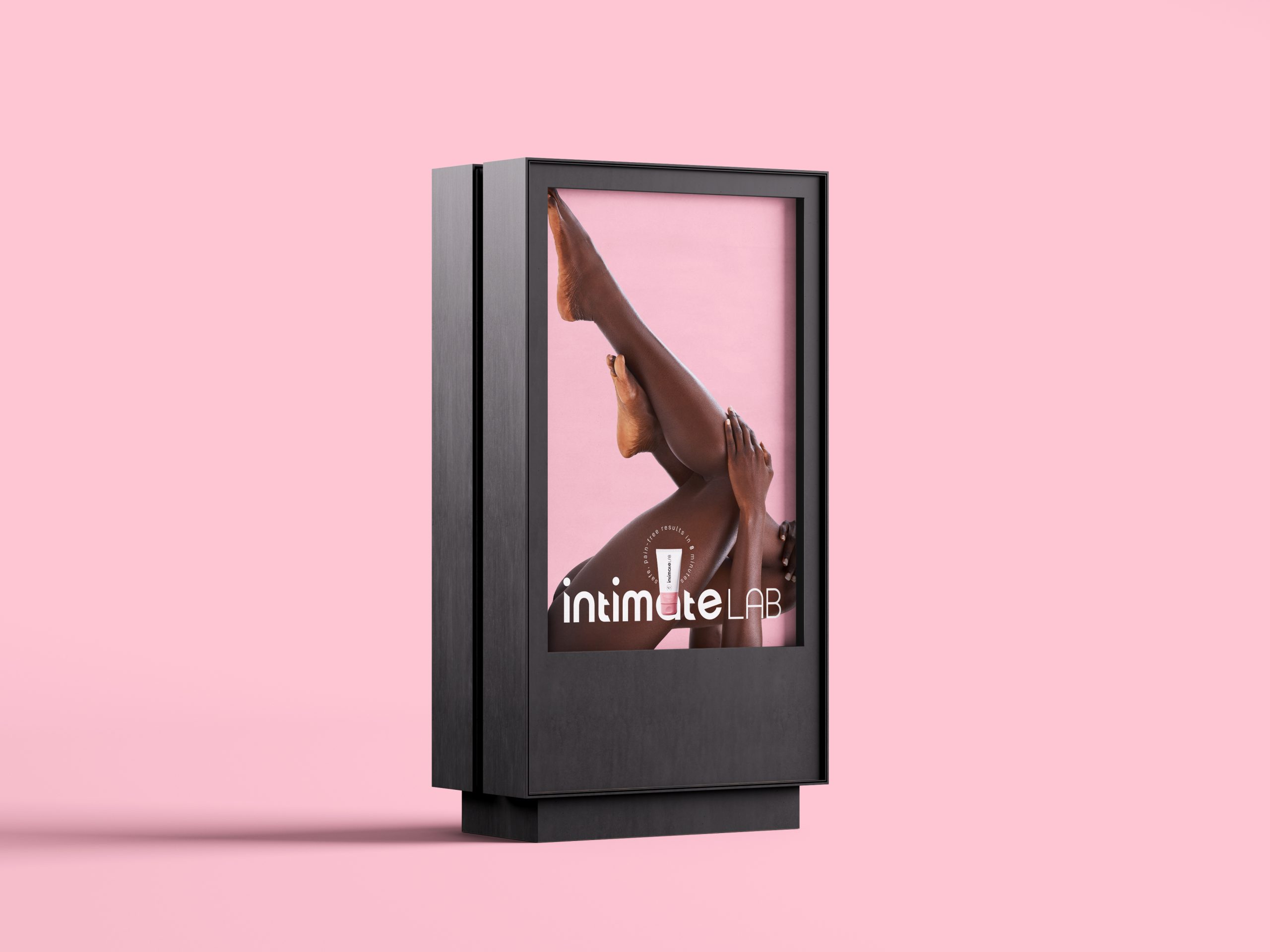
Our logo for Intimate Lab is crafted with a minimalist philosophy—clean, effortless, and intuitively easy, just like the experience we promise our users. As a brand, we believe hair removal should feel smooth and uncomplicated, and our visual identity reflects that confidence.
The typeface is premium, modern, and trend-forward, chosen to echo the refined quality of our formula—designed to perform better and gentler than the rest. We selected a female-centric colour palette that resonates with our audience, capturing softness without losing strength. The bold typography makes a confident statement, yet carries a sense of sophistication and care.
This is not a generic style; every detail is thoughtfully selected to mirror the brand’s essence. The subtle curves in the letterforms stem from our core inspiration: CARE. The smooth, flowing silhouette hints at skin that is nurtured, healthy, and free from unwanted hair. It symbolizes the care we put into our product— and the care women give to their own hygiene and comfort.
In every touchpoint of the brand, the identity stands out—bold, modern, and deeply considerate, just like Intimate Lab itself.
📩 DM for collaborations.
📧 raja@plusdesign.plus
 hello ocean
 monther al omari
 the Labelmaker
 alamgirbrands
 kat bres
 Vantablack Studio
 GruppoSaida
 studiorevv
 grafisercreative
 Kate Reichel
 UPRISE
 Modern Theory
 By siddika
 MAISON D'IDÉE Prague
 Kinshuk Bainss
 Palashcc
 www.branding.uz
 Hutton Creative
 DESIGN CONCEPTS
 Tancybox
 habiba hatem
 Up-Brands
 sayadworks
 Kingdom & Sparrow
 furtgoods
 Si me preguntas