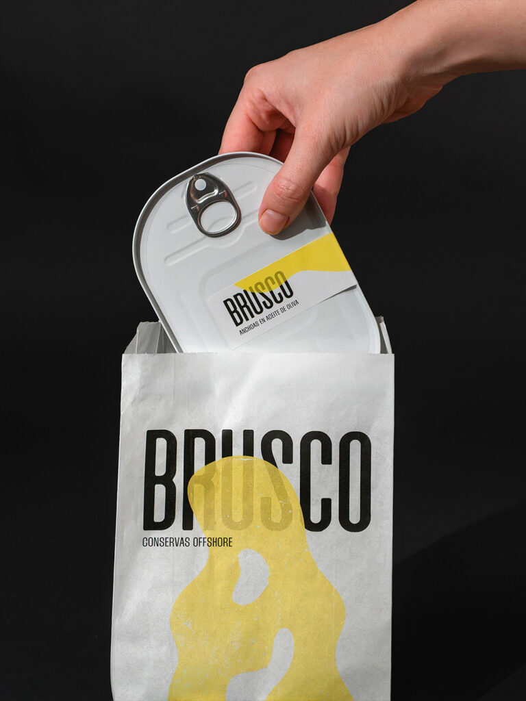

El Brusco: The Power of the Sea Transformed into Brand Identity
El Brusco is the mountain that separates the beaches of Santoña and Noja, in Cantabria, northern Spain. It is also the name given to the powerful wave that breaks at its foot. An iconic spot for the local surfing community, it lends its name to a new canned seafood brand created by Alikate, a surf bar located on Berria Beach.
The project began with a very specific challenge: to create packaging for canned seafood sold at a casual beachside bar, with a very limited production budget. The solution needed to be affordable, functional and capable of conveying a distinctive brand identity without relying on expensive materials or complex production processes.
The creative concept draws inspiration from the relationship between the sea and its surroundings: the force of the tides, the movement of the waves and the erosion of the rocks. Two opposing yet complementary forces, the solidity of the land and the fluidity of the water, translated into the brand’s visual language.
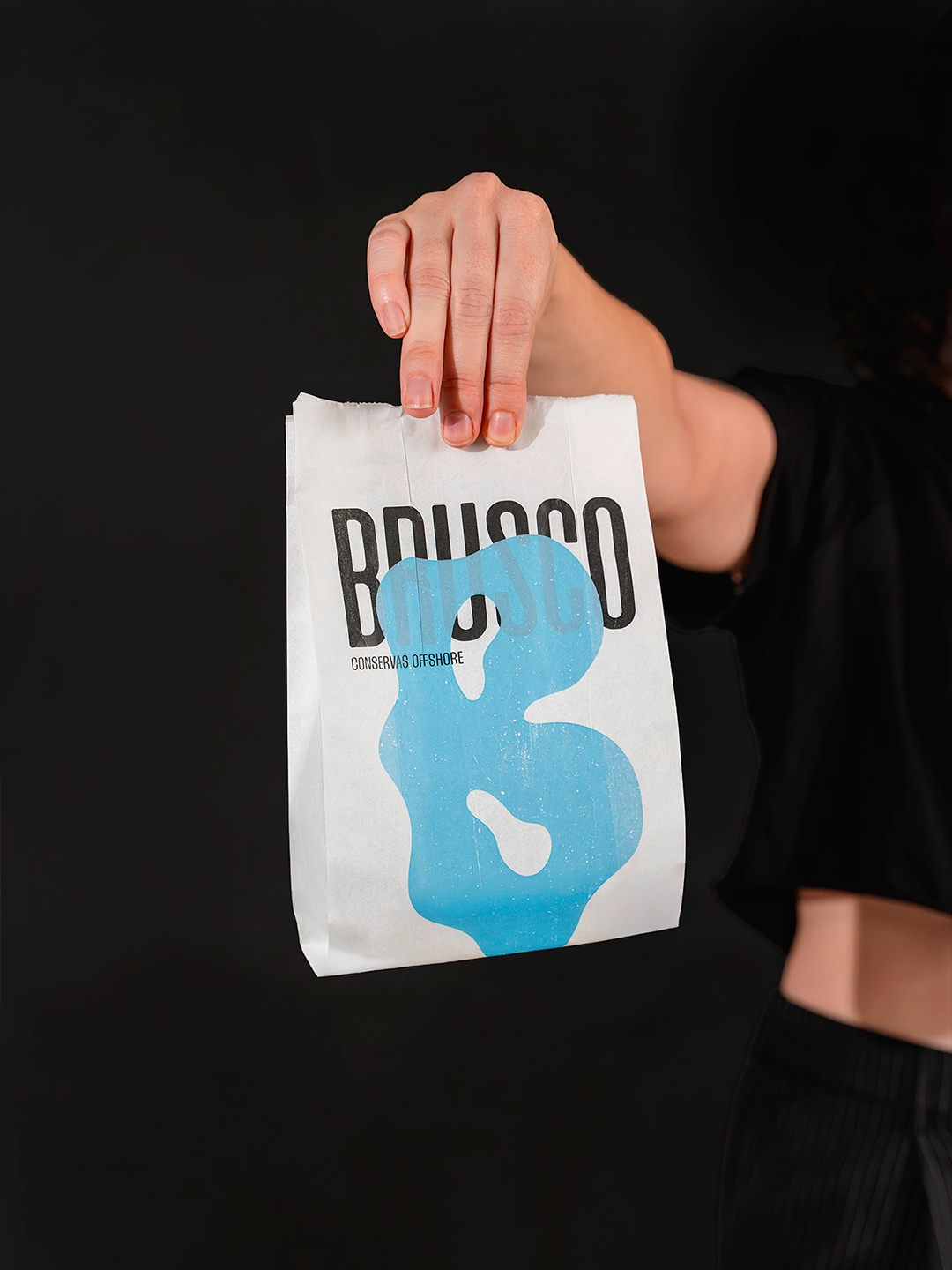
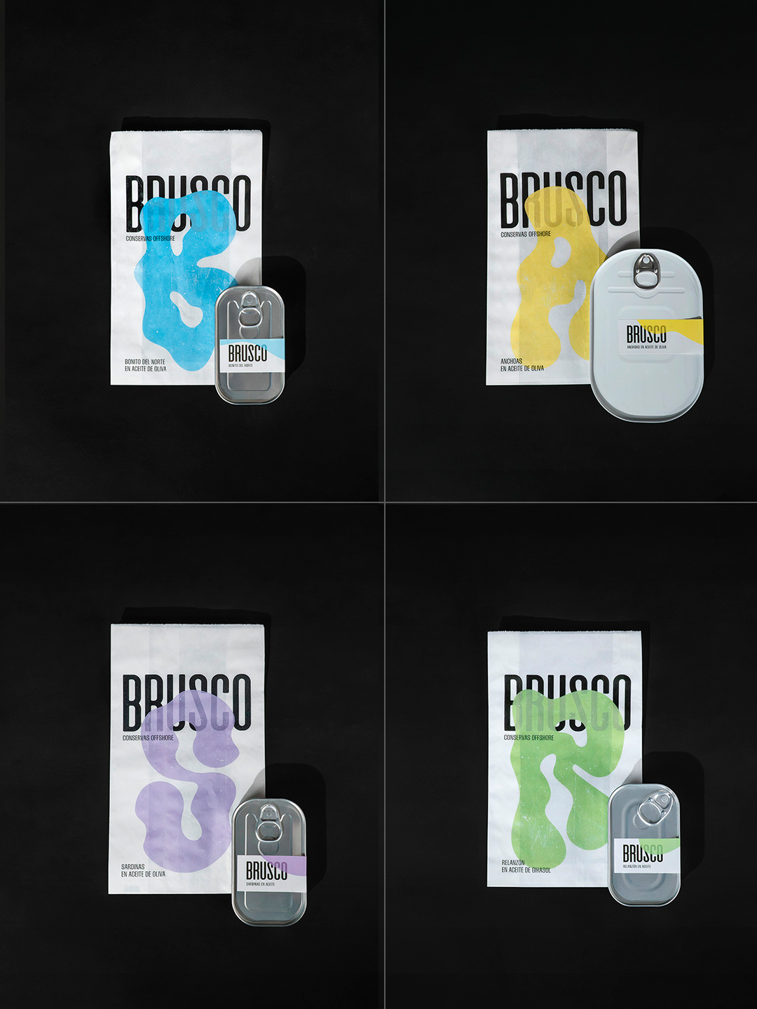
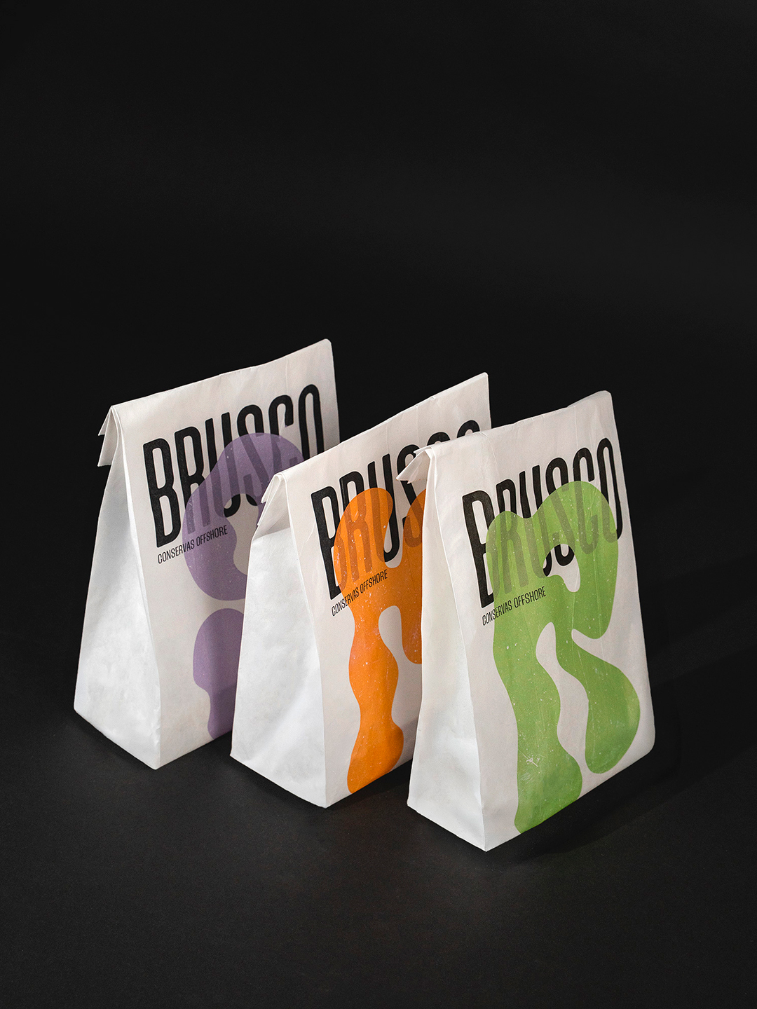
The identity is built around the contrast between two typographic styles. On one hand, a logotype with bold, abrupt and vertical letterforms that evoke the rugged rocky landscape of El Brusco. On the other, organic, flowing initials that identify each product variety: A for anchovies, B for bonito tuna, and so on.
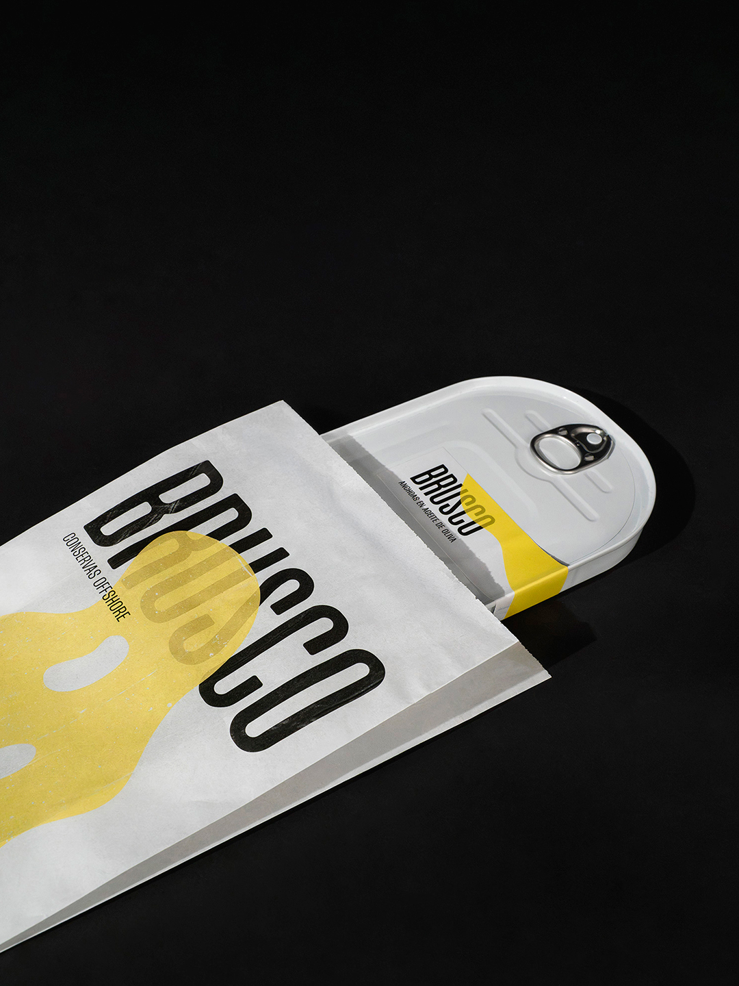
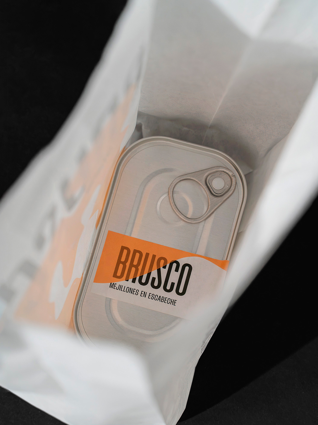
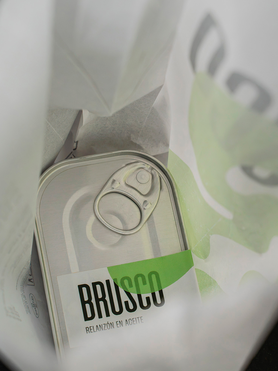
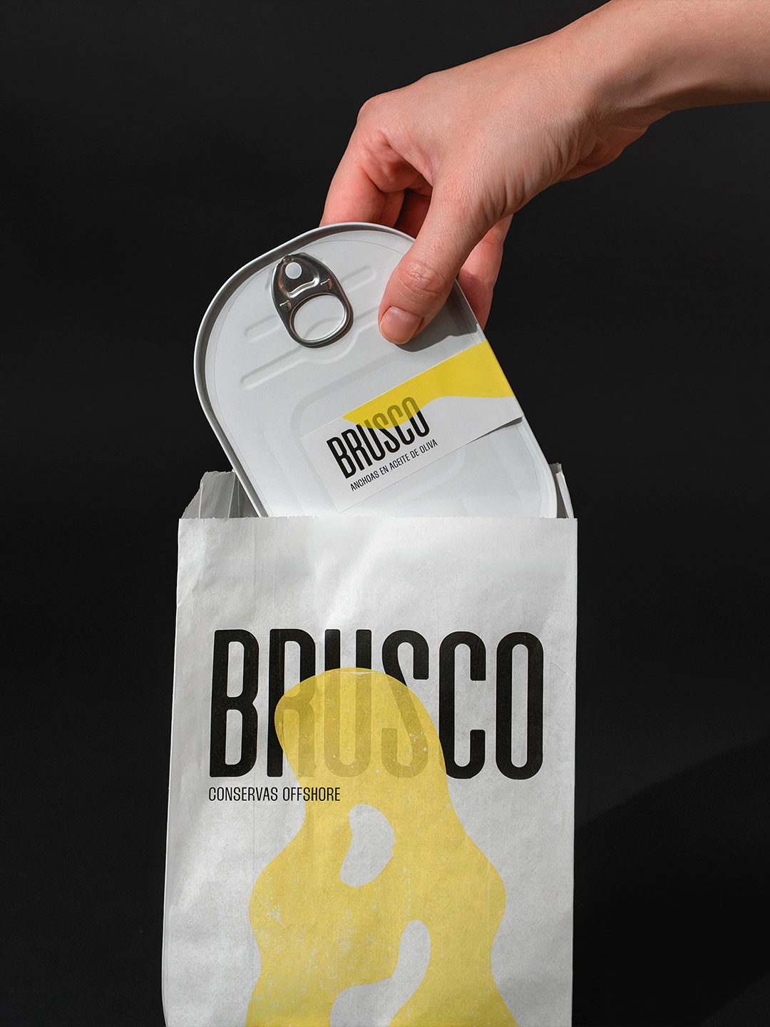
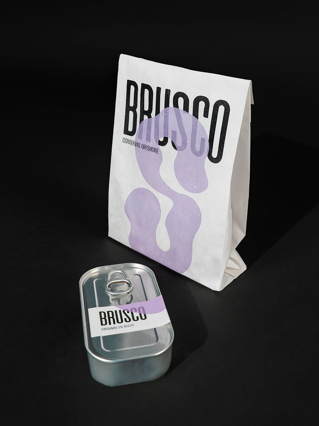
To solve the packaging challenge, we chose a simple yet unexpected solution: a screen-printed sandwich paper bag. Each bag features the initial of its corresponding product, with organic letterforms that extend across and into the bag, echoing the way waves wash onto the shore. This graphic gesture transforms an everyday, low-cost material into a distinctive element of the brand.
The result is an affordable, flexible and instantly recognisable packaging system that turns production constraints into an essential part of its identity. A straightforward, unpretentious solution that stays true to the spontaneous, laid-back spirit of surf culture.
Curator’s Insight
The wordmark and the blob are given opposite jobs. The condensed black letters stay fixed in size, weight and position on every bag, while the colour shape changes from flavour to flavour and is allowed to cover half the name. Because the ink looks translucent, the letters stay legible through the blob, and the overlap becomes the brand’s signature rather than a flaw. The same curve appears again as the diagonal edge of the tin label, so the bag and the tin read as one system even though the metal itself carries no print. Putting the colour on a disposable paper bag and a small label also keeps the product looking honest.
 Eva Chistyakova
 vostorge
 alchimistestudioParis
 lettera7
 killeridea
 leekyeongyeob
 vitoramockup
 Akshay 11
 Deeez Studio
 Oksana
 M&A CREATIVE AGENCY
 宏洛图品牌设计HONGLT
 mattdoyledesign
 Up-Brands
 Semenova Ekaterina
 Valérie Colace
 Rosario Lo Iacono
 maud de pourpre
 Firstrein