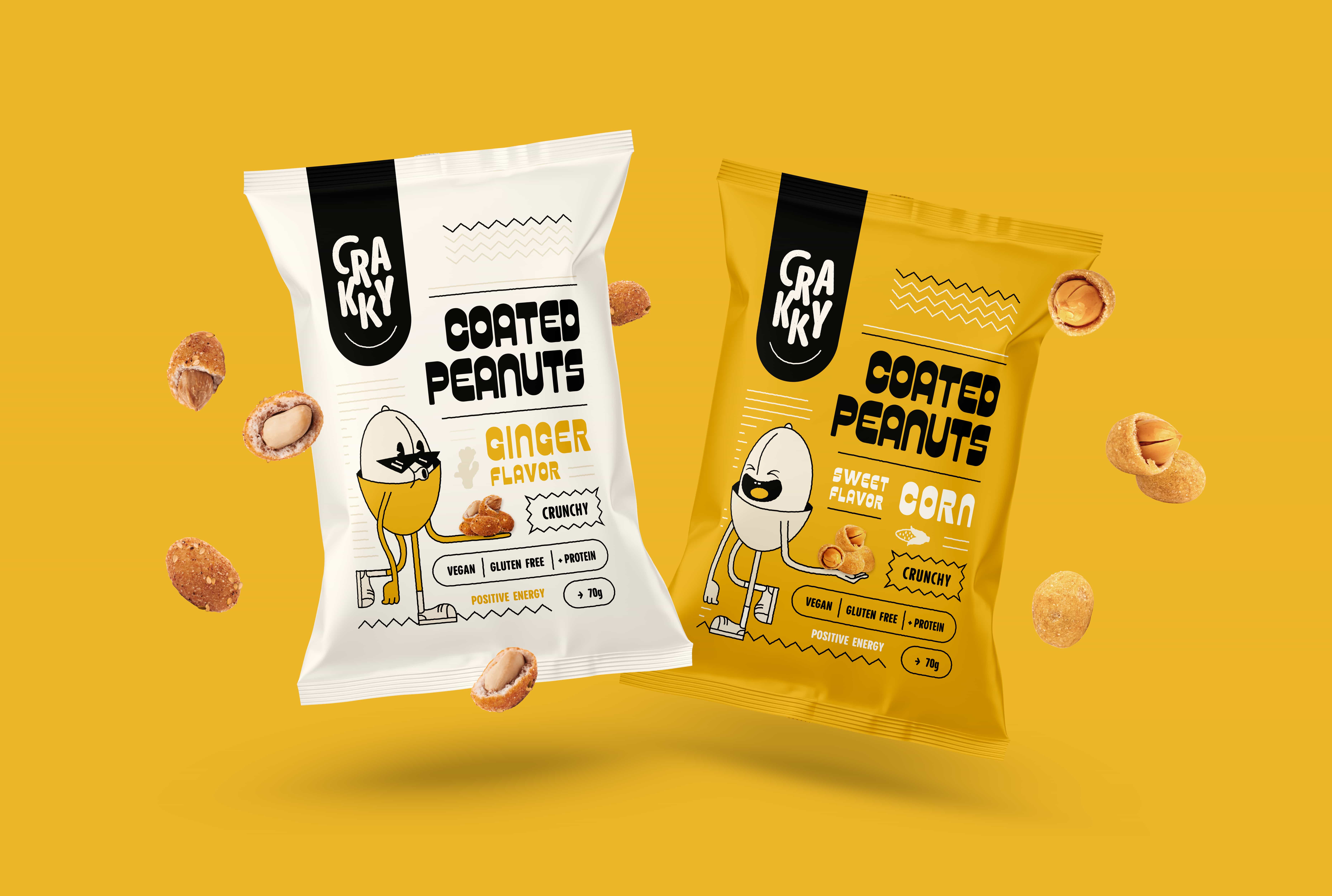

A brand that promotes positive energy: more impact on consumers, less on the environment.
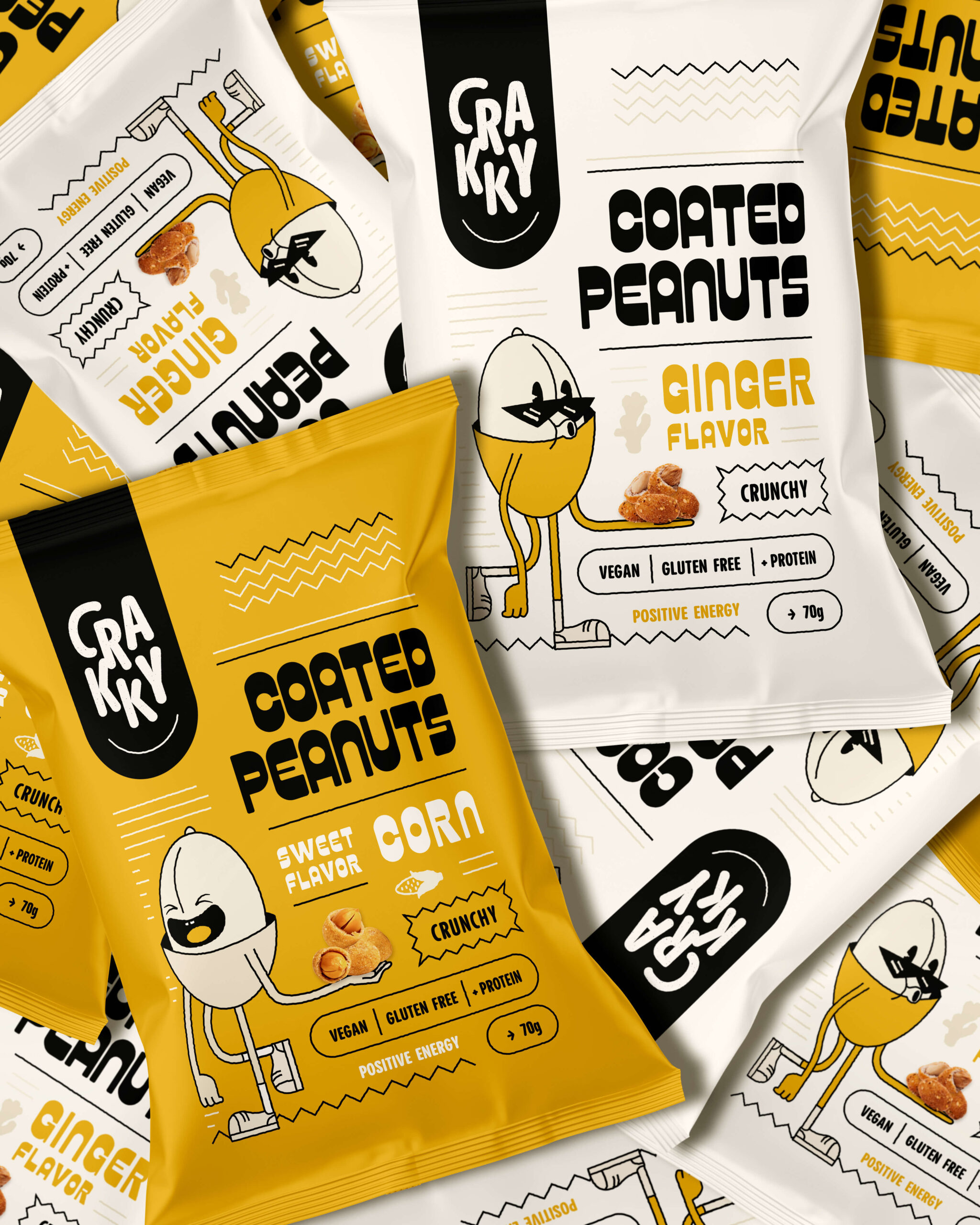
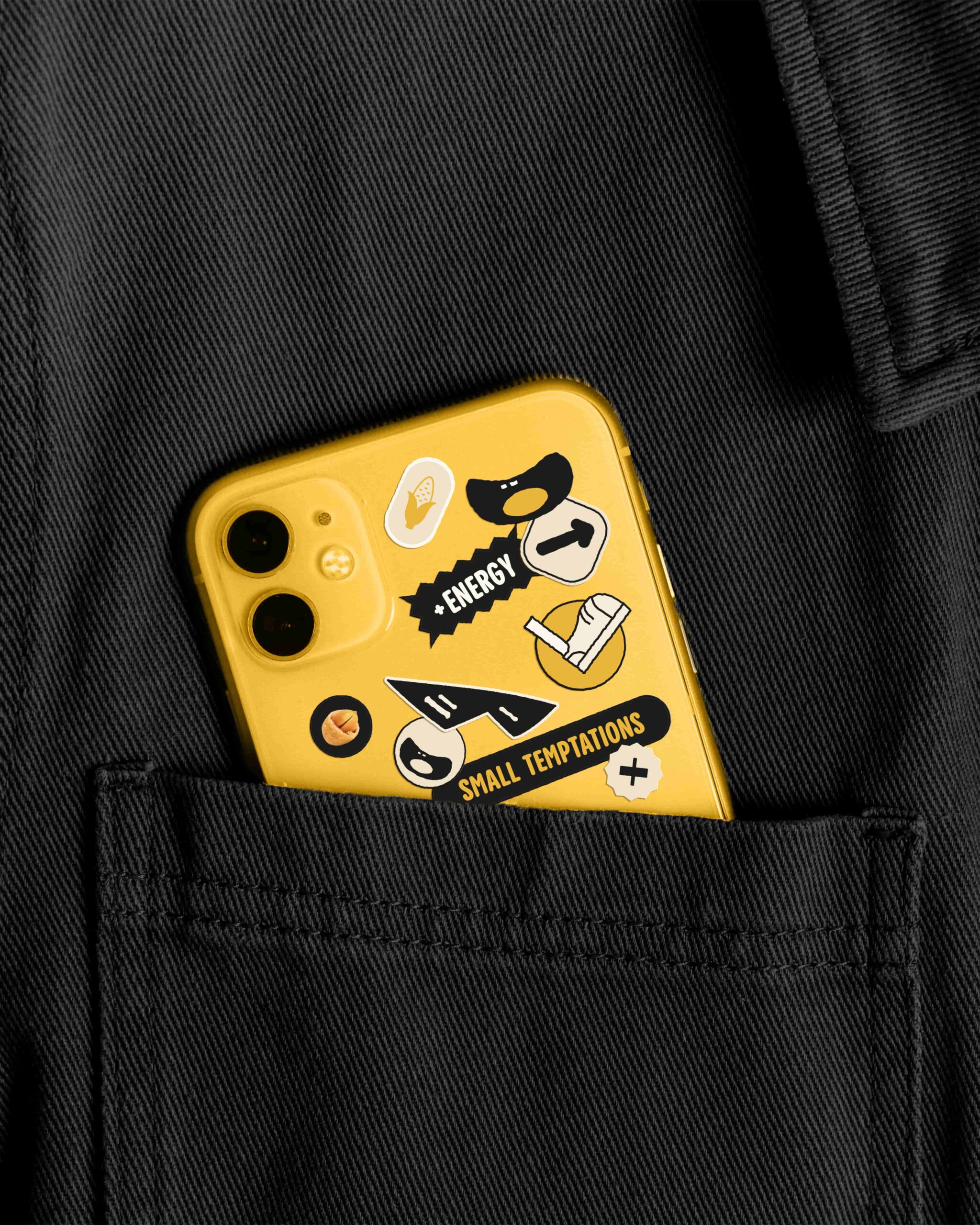
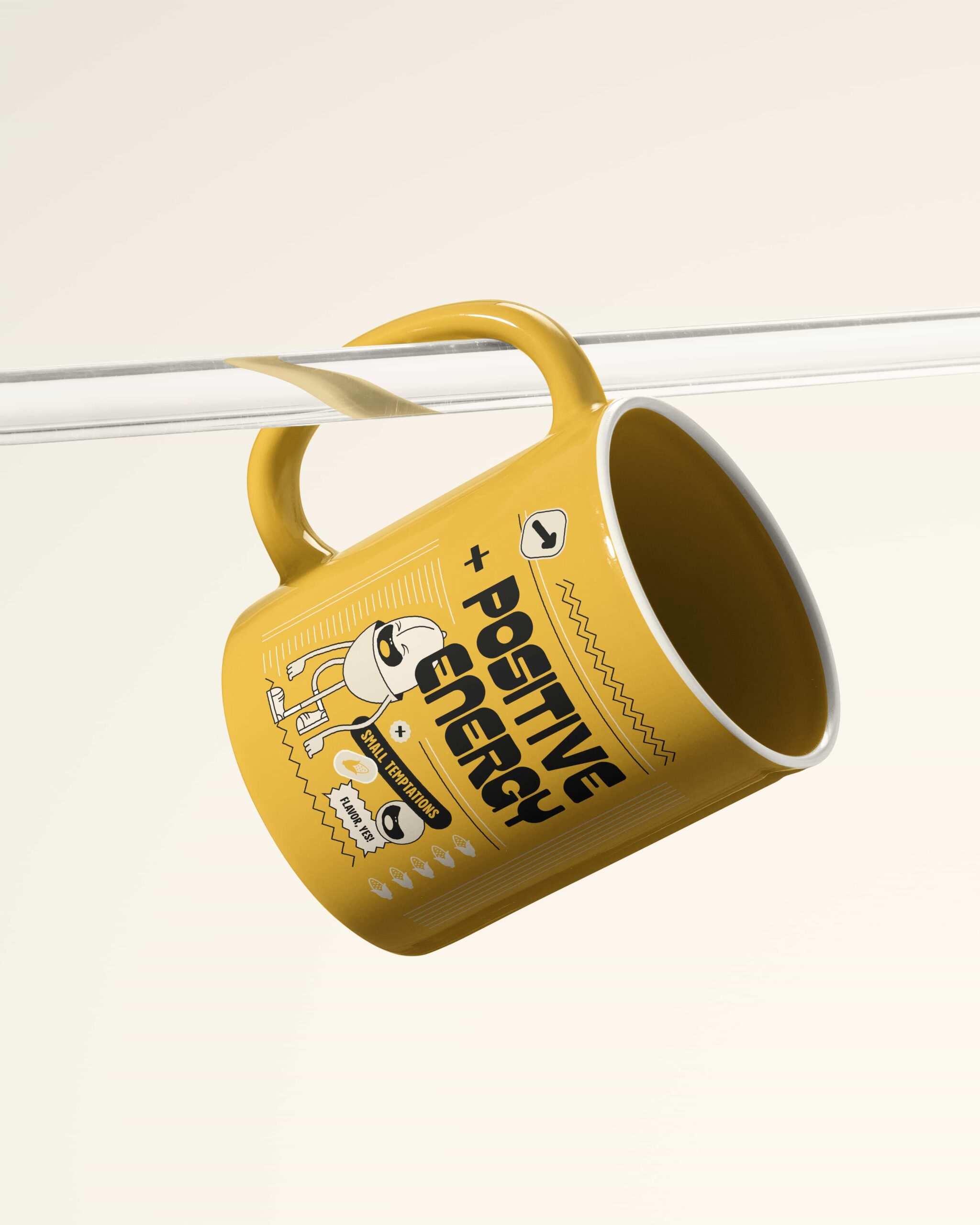
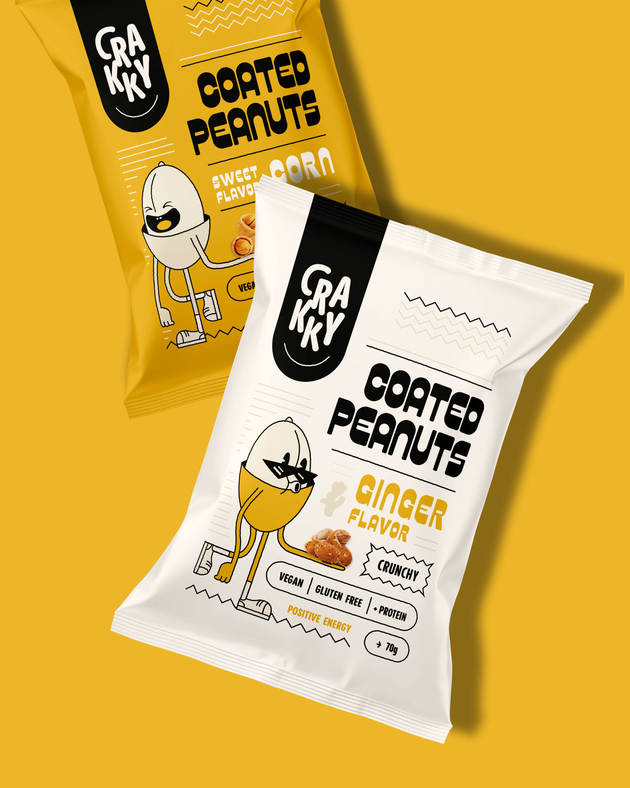
Crakky was created to transform everyday snacking through design that combines a bold aesthetic with sustainability. The project elevates a simple product—coated peanuts—into a desirable product with a conscience, balancing indulgent pleasure with environmental responsibility. Designed for a young, energetic audience, its updated retro pop graphics use expressive typography and illustrated characters to humanise the brand. The identity centres on the brand concept “Positive Energy,” supported by a punchy, distinctive name. The result is fresh, nostalgic and bold.
The innovation lies in the material: conventional multilayer plastic laminate is replaced with high-barrier paper featuring a water-based coating that can be heat-sealed directly. This ensures product preservation and recyclability, while the matte finish gives the colours an organic depth and a sophisticated look. The most intriguing aspect is the synaesthesia: the paper’s crackle as the bag is handled reinforces the “Crakky” concept—a reference to the crunch of a peanut. It anticipates the sound of the snacking experience, strengthening sensory coherence and the emotional connection with consumers.
Crakky addresses a real challenge in the consumer goods industry. It demonstrates that brands can combine purpose with a vibrant visual language, and that design should serve as a strategic tool for protecting our ecosystem.
Strategy, naming, visual and verbal identity, packaging and brand activation.
 Up-Brands
 Almighty
 Desember Design Studio
 Daria Levina
 Yuliya Likhacheva
 carola matalinares
 daniitenaa
 StudioMordius
 Simon Pendry Creative
 Sti&Co Design
 Yasmin Sherif
 Roberto De Simone
 aseelstudio
 Rabia zouina
 UPRISE
 HazelBishop
 Qianyu Liu
 siyajacob
 Rohan Barwal | D2C Brand Identity, Logo & Packaging Designer
 Karen Salem
 omarchafik
 nastyaabeketova
 Roberto Núñez Studio