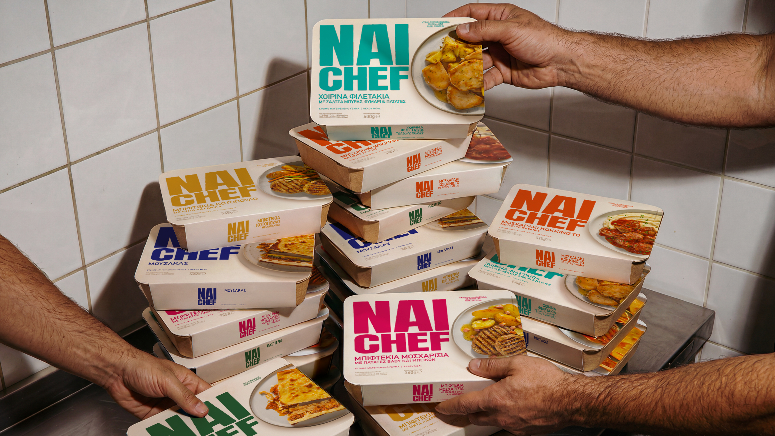

Nai Chef is a brand within a category where trust is not a given. In ready-to-eat meals, taste is often questioned, and most products are perceived as a matter of convenience.
Our strategy was to position taste not as a promise but as a given, and the choice of the brand as a statement.
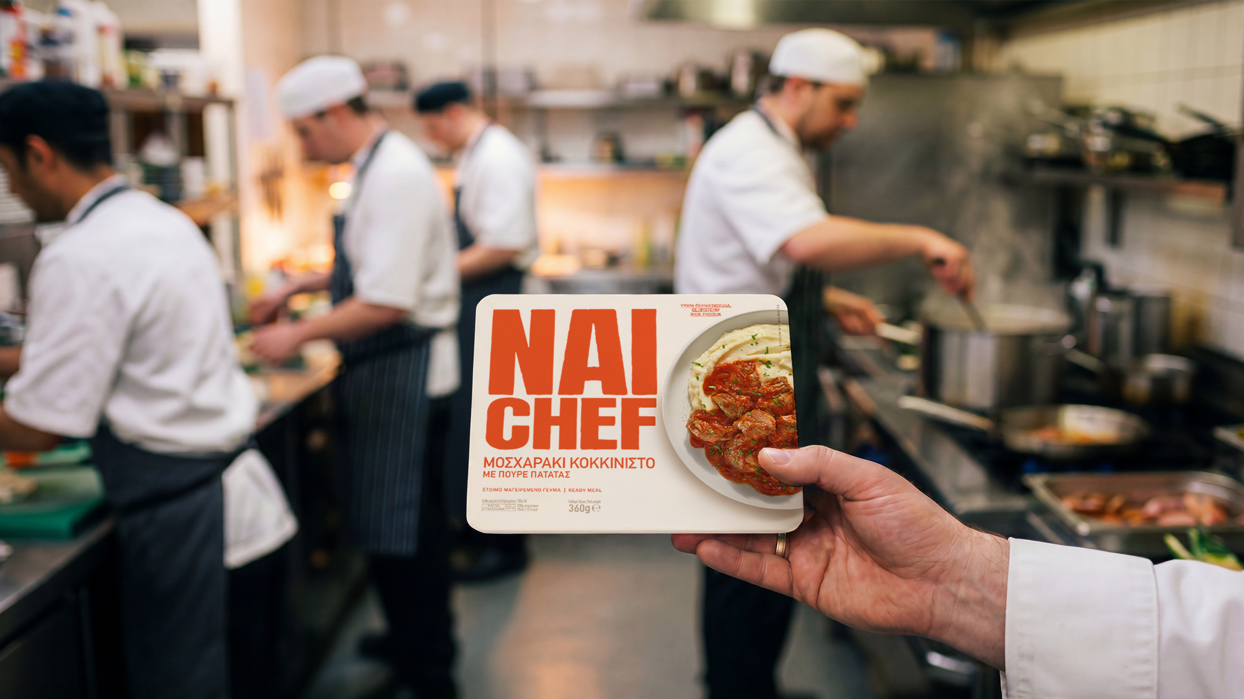
We named the brand “Nai Chef” (Yes Chef). Originating from the language of the professional kitchen and finding its way into pop culture through cooking shows, the phrase conveys knowledge, discipline and precision if not a little sense of humour.
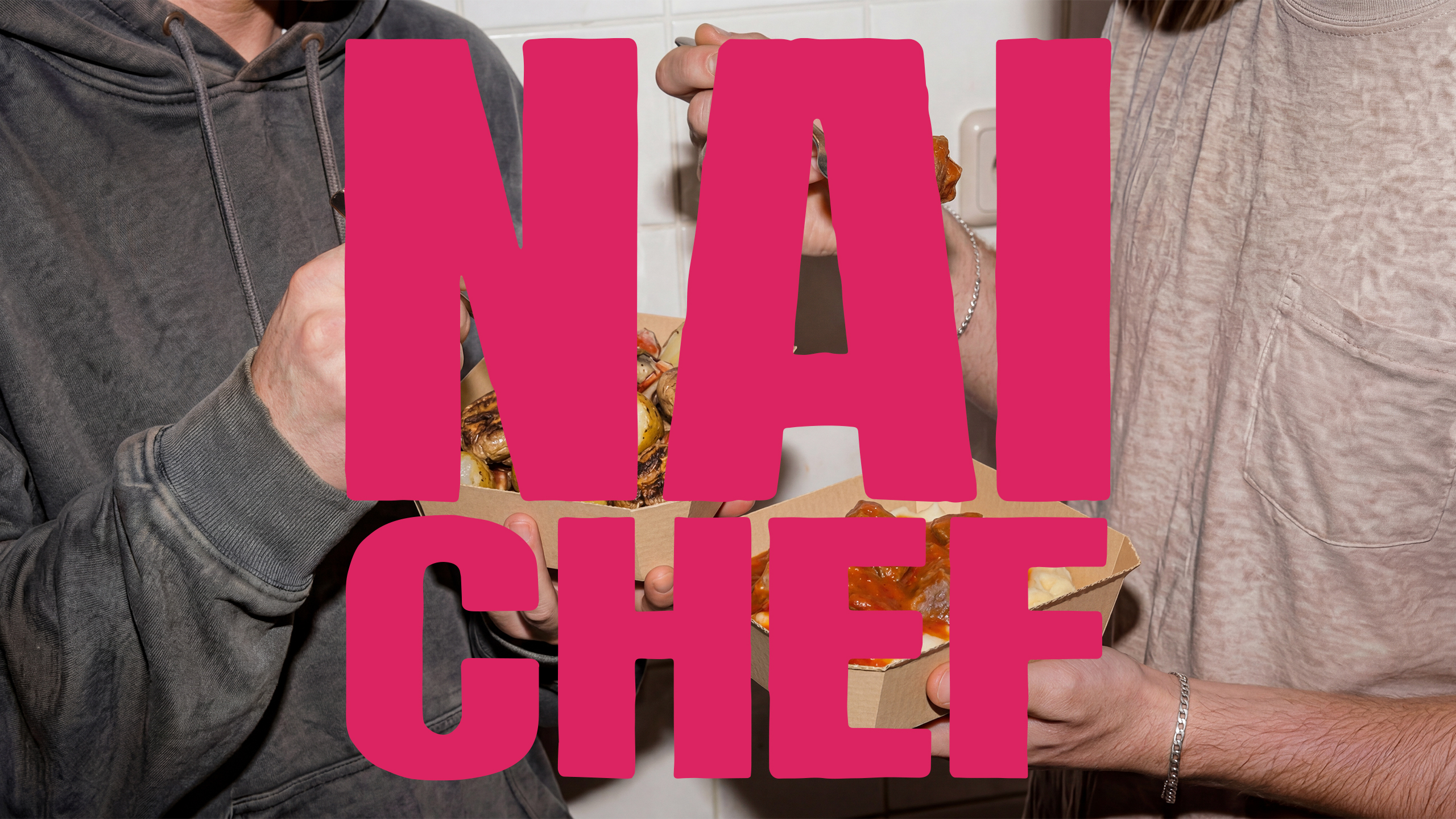
The logotype gives the name weight and confidence, creating an internal tension. “NAI”, rendered more freely, conveys energy and immediacy. “CHEF”, more structured, ensures control and precision. Together, they create a balance that echoes the process of professional cooking. Inspiration and discipline in continuous dialogue.
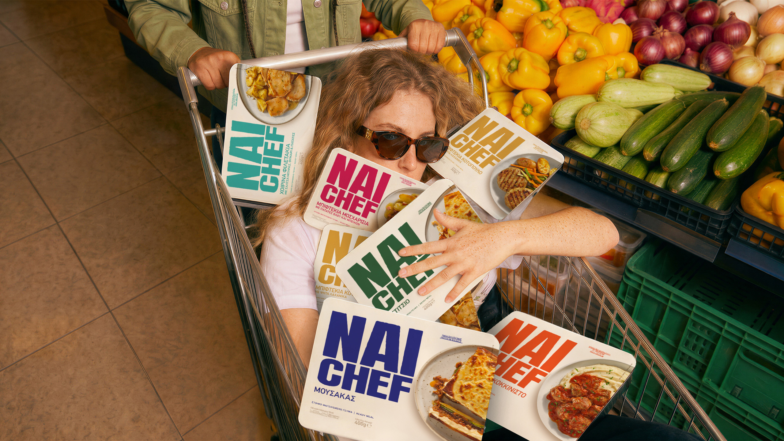
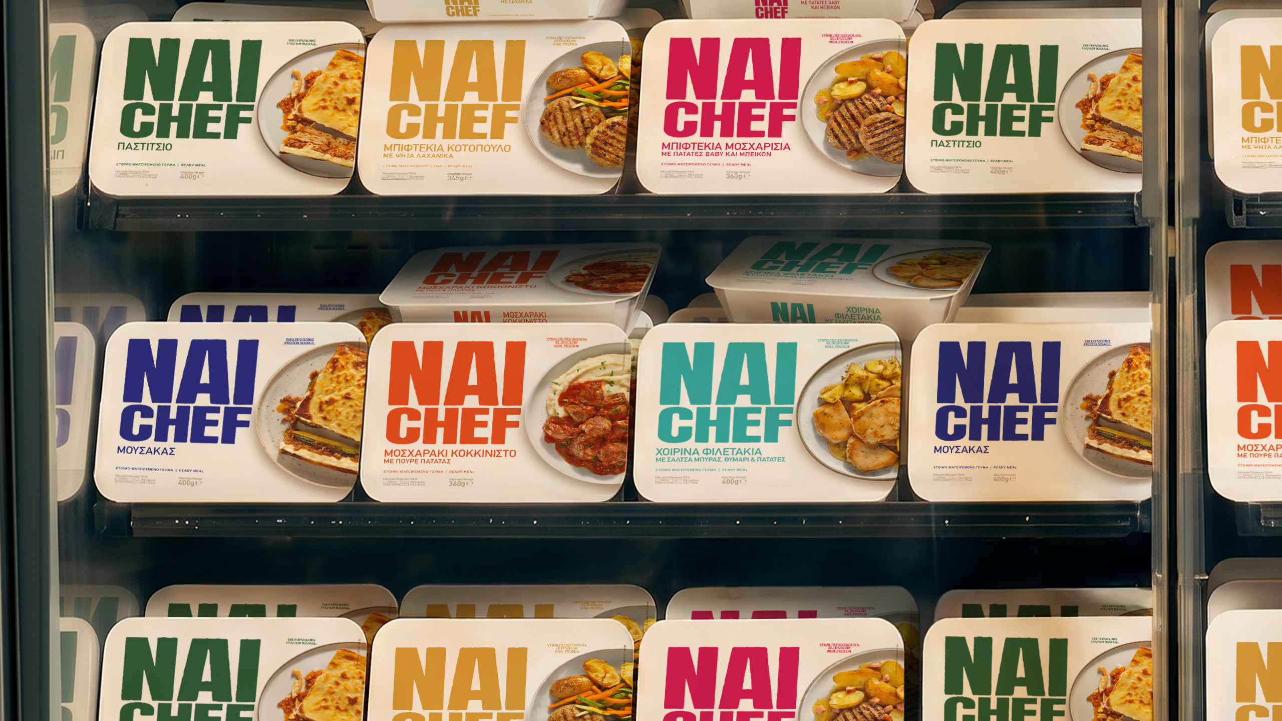
Across the packaging, typography assumes the primary role. The phrase NAI CHEF is expressed with intensity across the surface, functioning as a system of differentiation: each flavour adopts its own colour tone, forming a range that balances cohesion with variety.
The visual approach employs a clean, off-white field as a canvas, allowing the food to appear without mediation. The result is a presence that is contemporary, direct, and entirely confident in itself.
 Jaehee Ha
 Intertype Studio
 Yosuke Inui
 Aadarsh Jain
 Norma
 aseelstudio
 Luna West
 Eva Chistyakova
 vostorge
 alchimistestudioParis
 lettera7
 killeridea
 leekyeongyeob
 vitoramockup
 Akshay 11
 Deeez Studio
 Oksana
 M&A CREATIVE AGENCY
 宏洛图品牌设计HONGLT
 mattdoyledesign