
INTRODUCTION
What if a glass of sharbat could be as exciting as a toy?
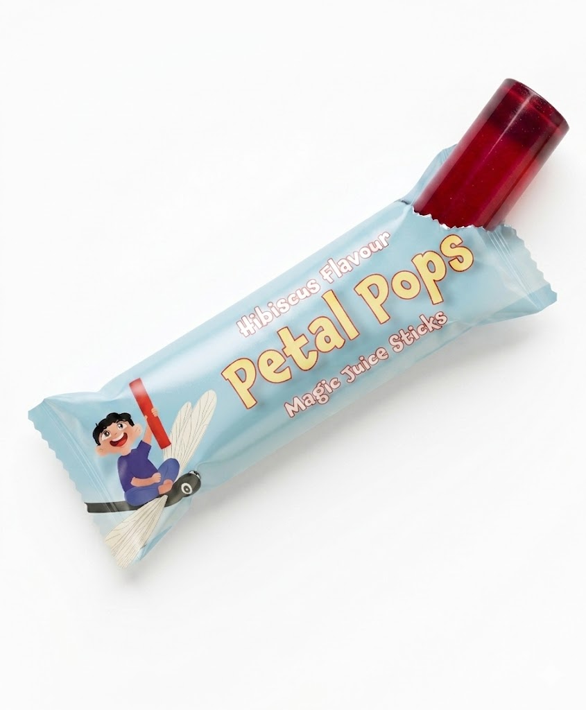
Petal Pops is a conceptual beverage and packaging project created especially for kids aged 7 to 12. It gives the familiar Indian sharbat a playful little twist through a 2 × 5 cm dissolvable cylinder made from Indian flower extracts. Drop one into a glass of water, watch it dissolve, and the drink is ready. No measuring, no mixing, no mess.
CONCEPT
Kids want something fun, colourful and delicious, while parents want something they can feel good about giving them. Petal Pops was created to bring these two worlds together.
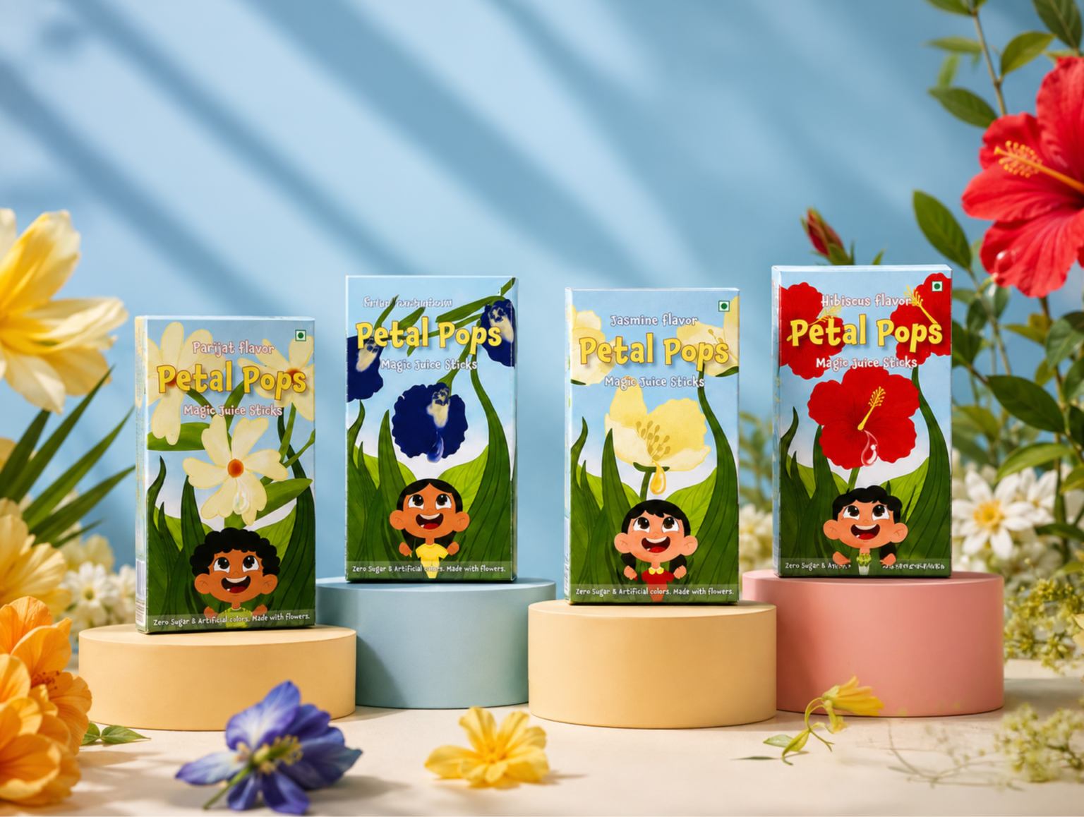
The concept draws inspiration from Indian flowers including Hibiscus, Parijat, Jasmine and Blue pea. Their colours, forms and familiarity in Indian culture became the starting point for developing the flavours and visual world of Petal Pops.
The idea was to move away from the conventional powdered drink format and turn sharbat into something more playful, convenient and interactive for kids. Instead of telling children to drink something because it is healthy, Petal Pops makes the experience itself the fun part.
PACKAGING SOLUTION
The packaging system was developed across individual, secondary and tertiary packaging, creating a complete packaging experience from the individual drink cylinder to transportation and handling.
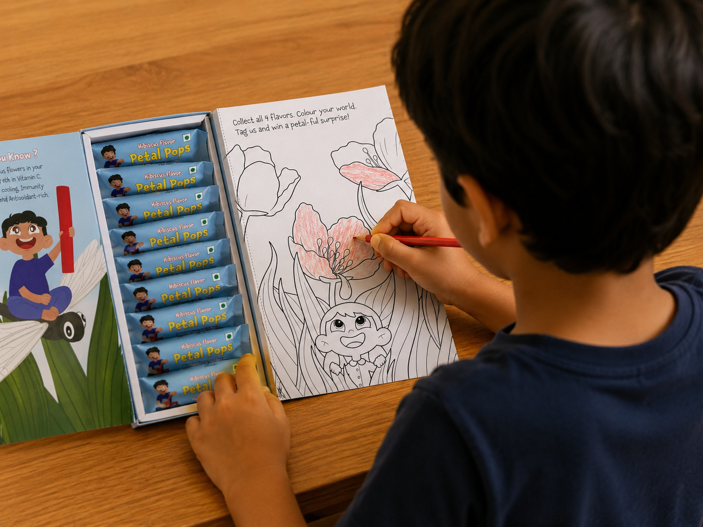
The individual packaging protects and presents each dissolvable Petal Pop, while making the product easy to pick, carry and use. The secondary packaging brings multiple Petal Pops together in a playful outer pack and introduces the interaction through a removable and refillable internal tray. This allows kids to access the product one at a time without exposing the entire pack.
The packaging was also explored as a refillable system, where the internal pack can be replaced once the Petal Pops have been used. This allows the outer packaging to have a longer life rather than becoming disposable after one use.
The tertiary packaging completes the system by providing a practical layer for transporting and handling multiple packs while maintaining the integrity of the individual and secondary packaging.
DESIGN APPROACH
The visual language was built around five words: Experimental, Bright, Carefree, Organic, Reliable.
The illustrations bring these qualities together through the idea of a magical garden explored by kids. Bright flowers, playful characters and an imaginative environment create a visual world that invites children to discover the product rather than simply look at it.
The colours and floral elements are inspired by the flowers used as ingredients, while the illustrations and expressive typography keep the identity energetic, playful and distinctly child-friendly.
The aim was simple: make healthy feel exciting, make preparation feel playful and turn a drink into a little adventure.
SUSTAINABILITY
Sustainability was considered by giving the packaging a second life beyond its primary function. The outer packaging can be retained and used with refill packs, reducing the need to discard the entire pack after the first use.
But the idea of reuse goes a step further. The packaging also includes an alternative activity for kids through a colouring page, turning part of the package into something they can interact with even after the product has been consumed. This adds a small gift-like element to the unboxing experience while encouraging children to keep and reuse the packaging rather than immediately throw it away.
The sustainability approach therefore focuses not only on reducing packaging waste, but on extending the life and value of the package through reuse, refill and play.




 NEV
NEV Stefano Bracci
 Alina
Alina monther al omari
 Lizakjx
 JOAOMARCOSDESIGN
 alchimistestudioParis
 Harriet Neild
 octavio rojo
 宏洛图品牌设计HONGLT
 DESIGN CONCEPTS
 Alexander Skurihin
 Studio K95
 ARMBRAND
 Richa Rai
 houseoferas by Miti
 Agence des Coteaux
 Kushi Eaknath
 Ann Treasa
 Xiao Ning
 krrrrrllii
 babyage
 Deep
Deep