

Creative Direction, Structural Design & Graphic Design by Soft Machine®
ABOUT
Tanica is Australia’s answer to the aperitif. Founder Adriane McDermott had a great liquid, crafted with native plum and strawberry gum leaf, and a great idea: an aperitif that’s distinctly Australian. What it didn’t have was a brand and bottle to match. We were brought in to redesign Tanica and make a category built on European tradition feel local, modern and right at home in the hands of a fashion-forward drinker.
SOLUTION
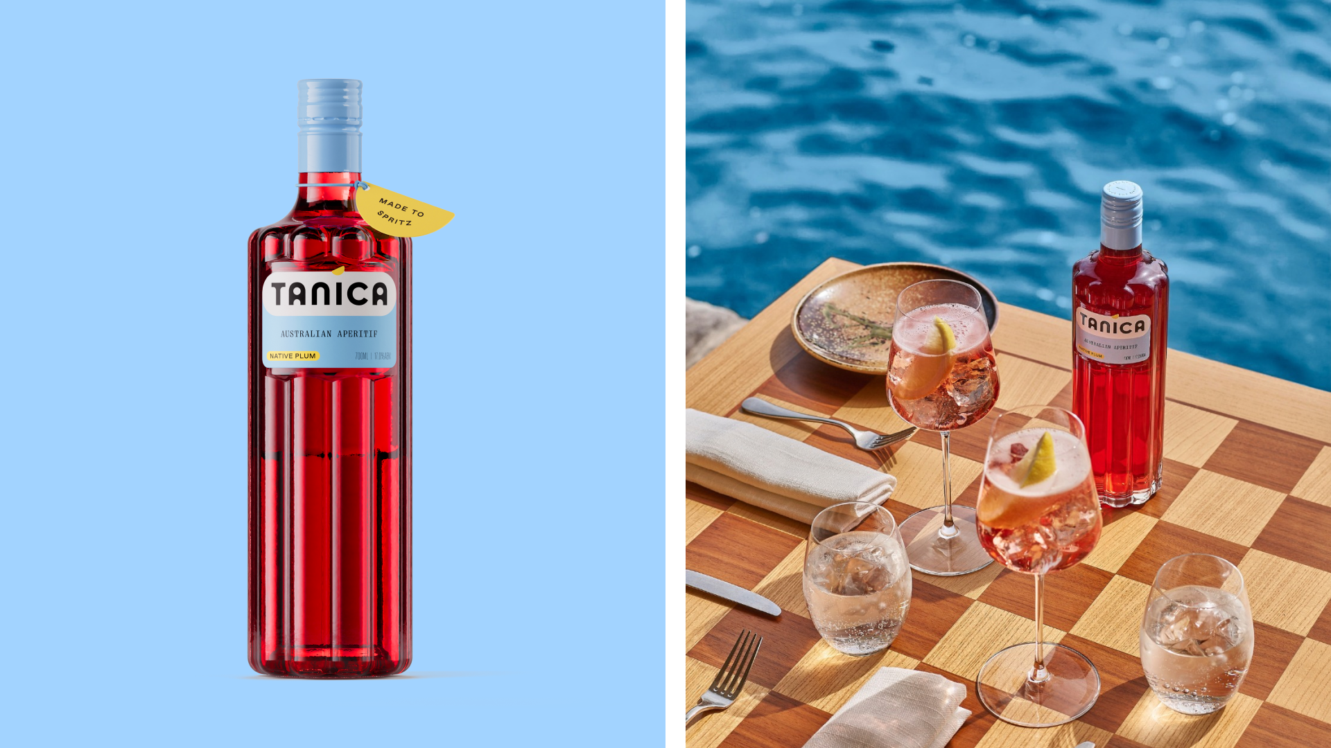
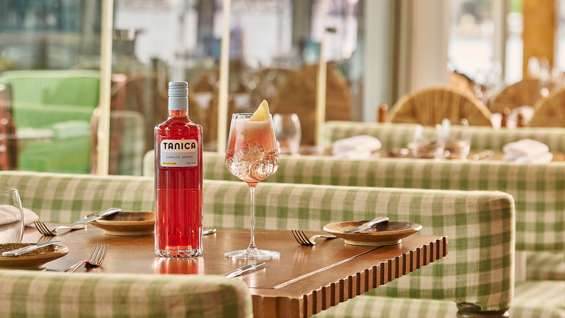
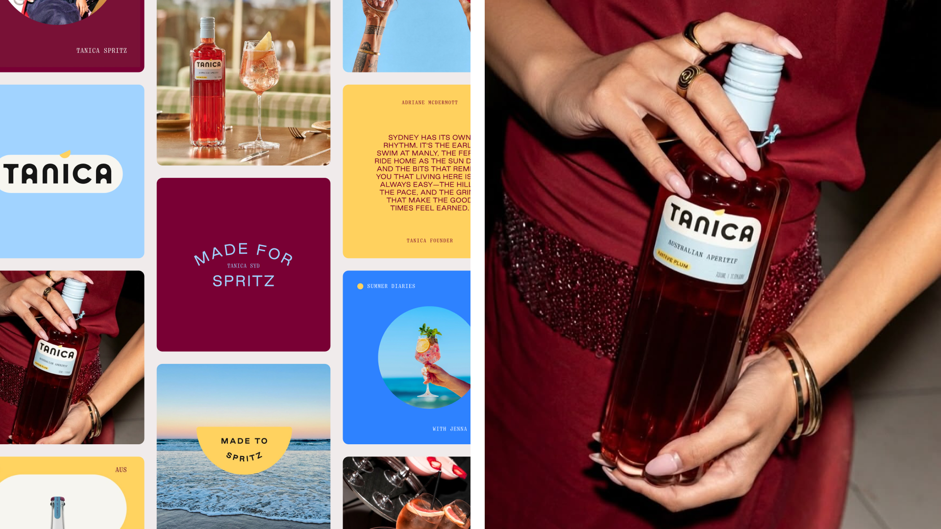
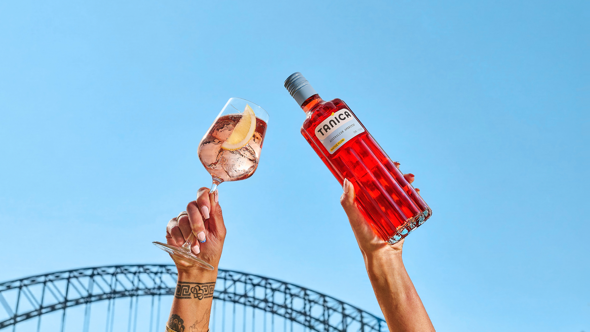
Sydney is not just a place; it’s a feeling, and we set out to capture that in a bottle. A spritz crafted for Sydney’s way of life—balanced, refreshing, and effortless—deserved an equally confident brand. We rebuilt Tanica from the glass up. A bespoke new structure echoes the juiciness of the flavour while significantly reducing production costs. A fresh identity feels confident, joyful and unmistakably Australian, made for sunset spritzes.
RESULT
Tanica is now as confident on the shelf as it is in the glass. Since the relaunch, sales have grown 159% and gross profit has risen 171%. It’s a brand that looks as bright and juicy as it tastes, with a better-performing business behind it.
Curator’s Insight
Tanica’s strongest move is a colour decision. Aperitifs usually dress in the warm reds and oranges of their contents, so shelves in this category tend to blur together. Here the packaging takes the opposite hue. The pale blue cap and label sit against the red liquid as a complementary pair, which means the drink supplies the category colour and the packaging frames it. The fluted glass supports this, since the vertical ribs bend light through the liquid and deepen the red where it matters. The yellow tag then does double duty, borrowing the shape of a lemon wedge while turning a serving suggestion into a small object on the neck. The wordmark’s heavy, open-bottomed letterforms feel friendlier than the engraved serifs of the old-world category. The transferable principle: when a category owns one colour, let the product keep it and push the packaging to its opposite.
 monther al omari
 alchimistestudioParis
 airobtq
 Buzz & Co.
 Ruby
Ruby themythographer
 IDNB Inc.
 viktorflr
 Zenpack
 Wessam Hussien
 samarabdelmonem
 StudioMordius
 Polaris Designs
 Atiq Alam
 duha mohamed
 HassanEtman22
 agarcia studio
 Wynand88
 Eva Chistyakova
 Maria Bukhtilova
 estudiomarciano