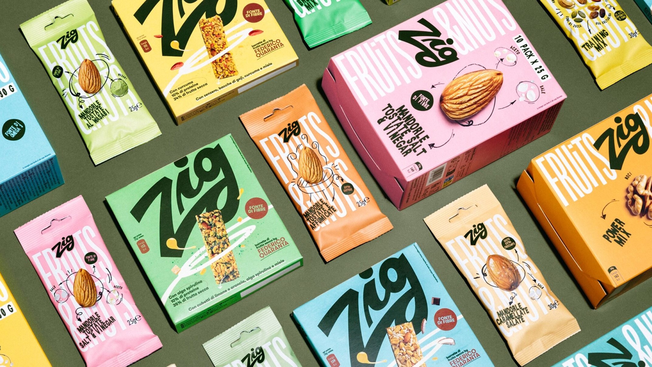

Zig has been selling nuts and dried fruit in Italy for decades, in a category where people choose by price per kilo and brands stay in the background. Our brief to ourselves was simple: turn a commodity into a companion, a small spark for the everyday break.
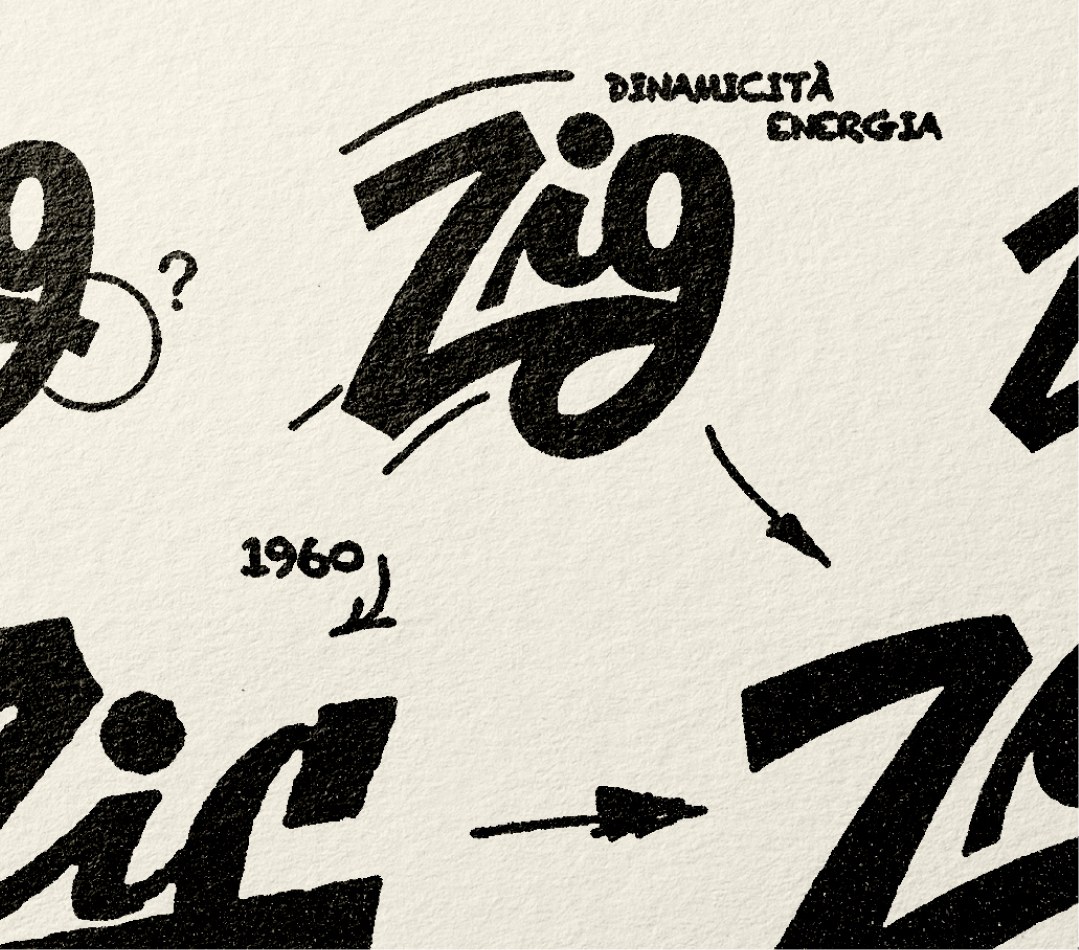
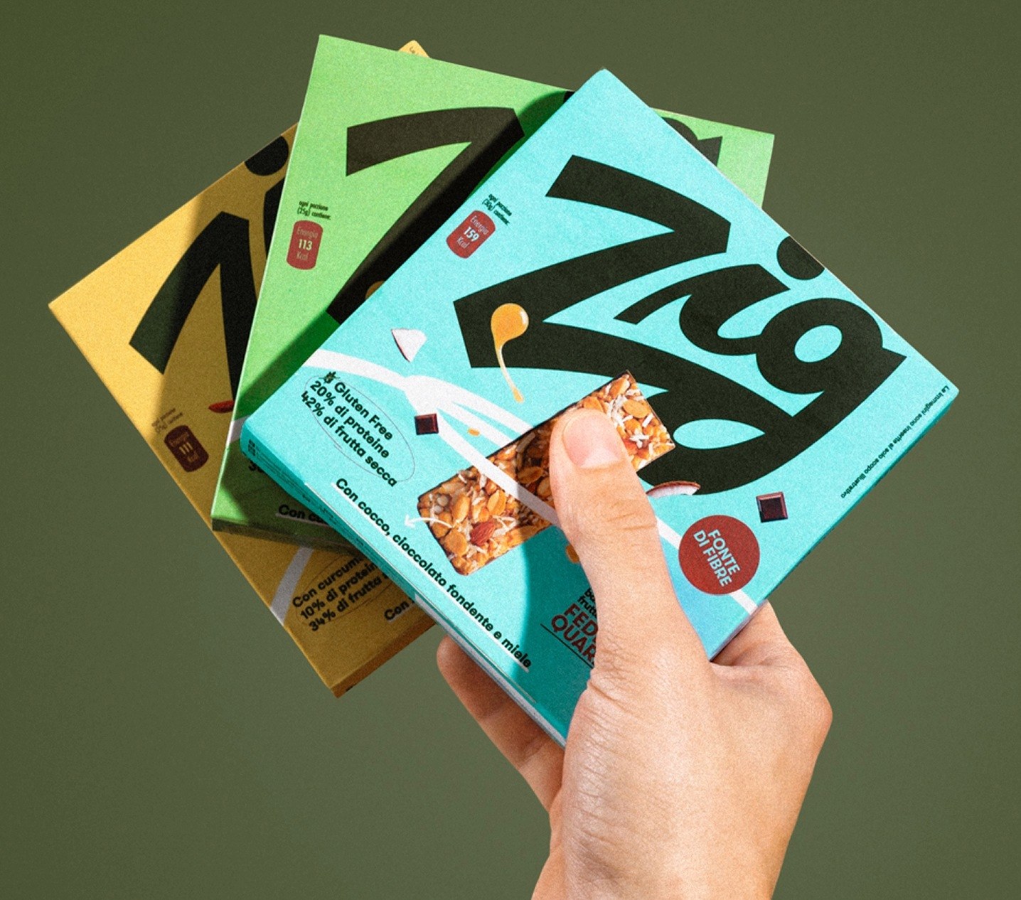
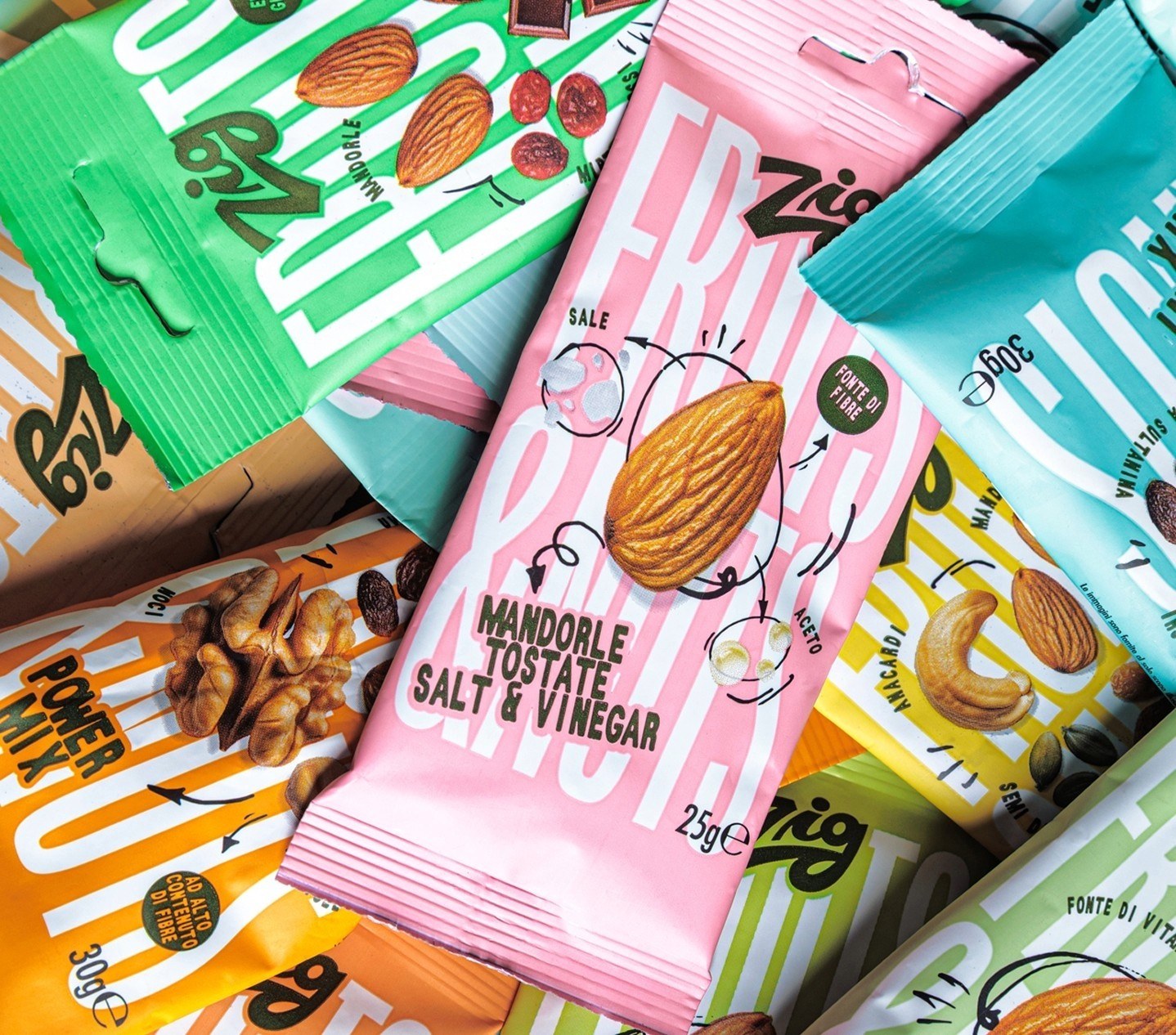
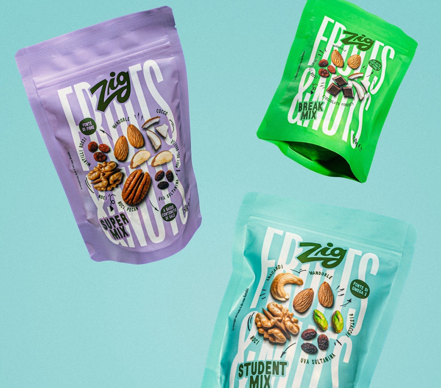
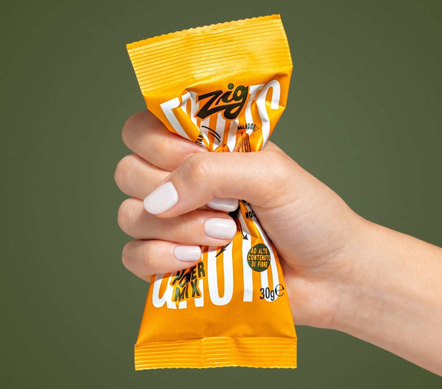
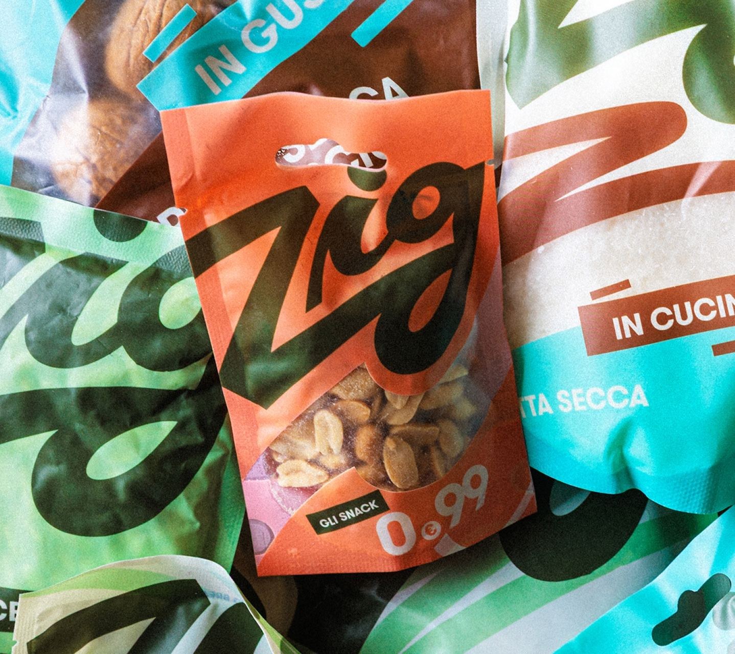
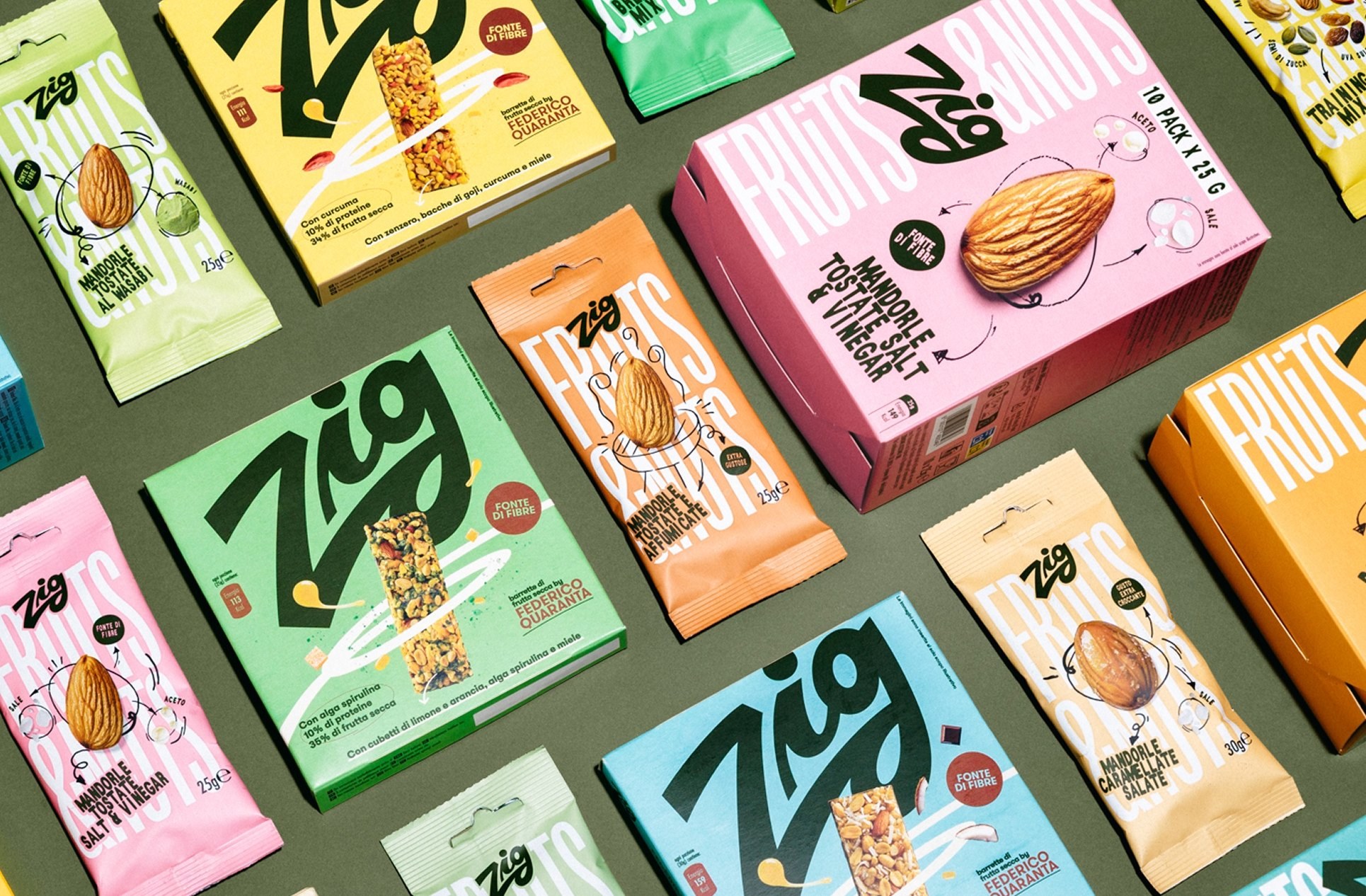
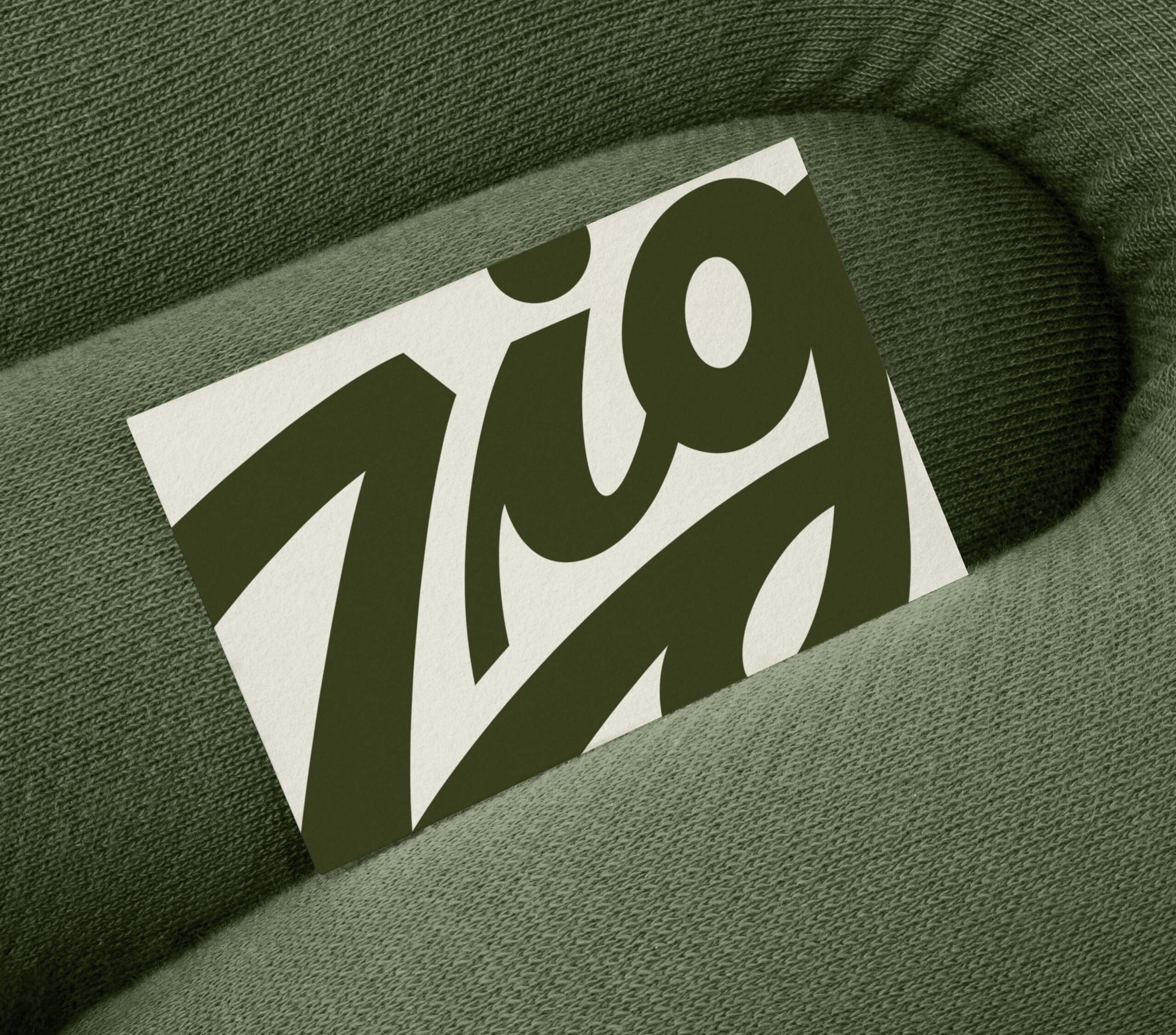
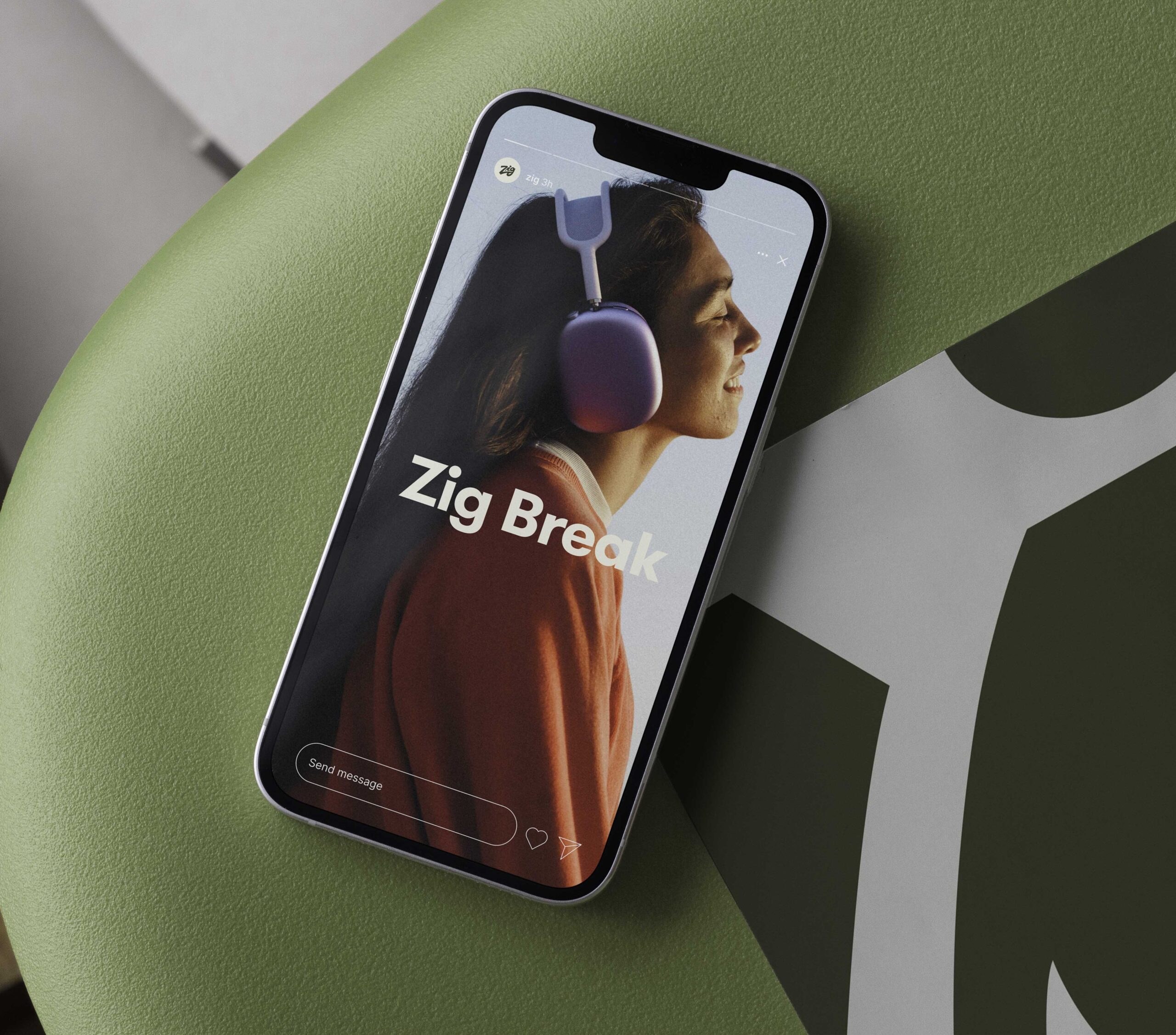
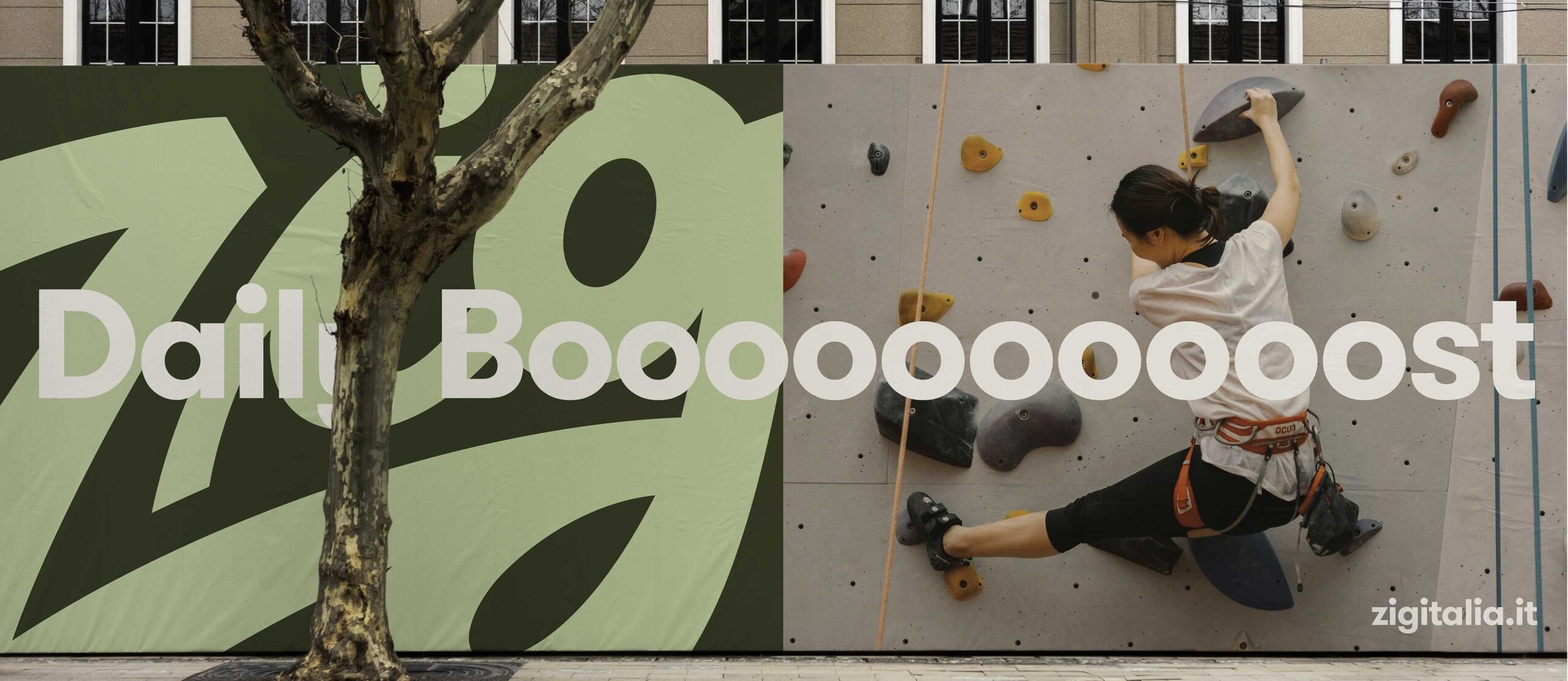
The answer was waiting in the company archives. The original 1967 Zig logotype, fluid and a little imperfect, was redrawn for today without losing the character that made it feel human. Around it we built a visual and verbal system that balances joy and structure: natural tones lifted by lively accents, everyday photography and short animations that give the brand a rhythm.
Four themes, #zigbreak, #momentozig, #socializig and #guizzozig, follow the moments of the day when people reach for a handful of nuts: a pause at work, a moment alone, something to share. They drive copy and imagery across packaging, social and retail.
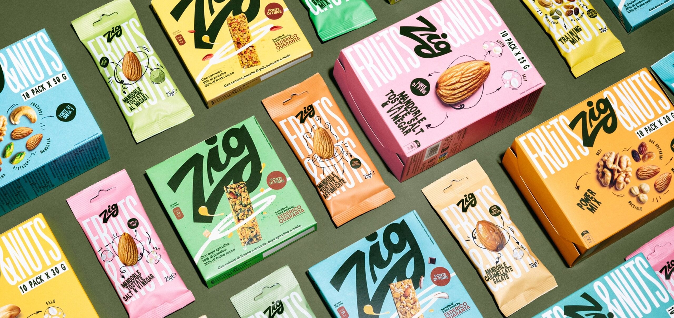
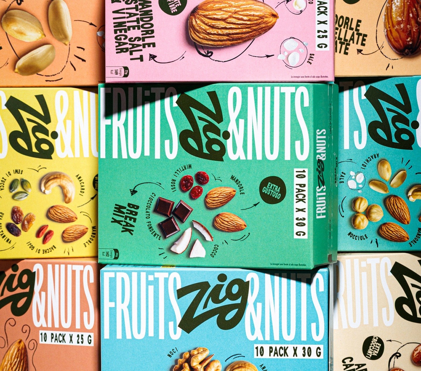
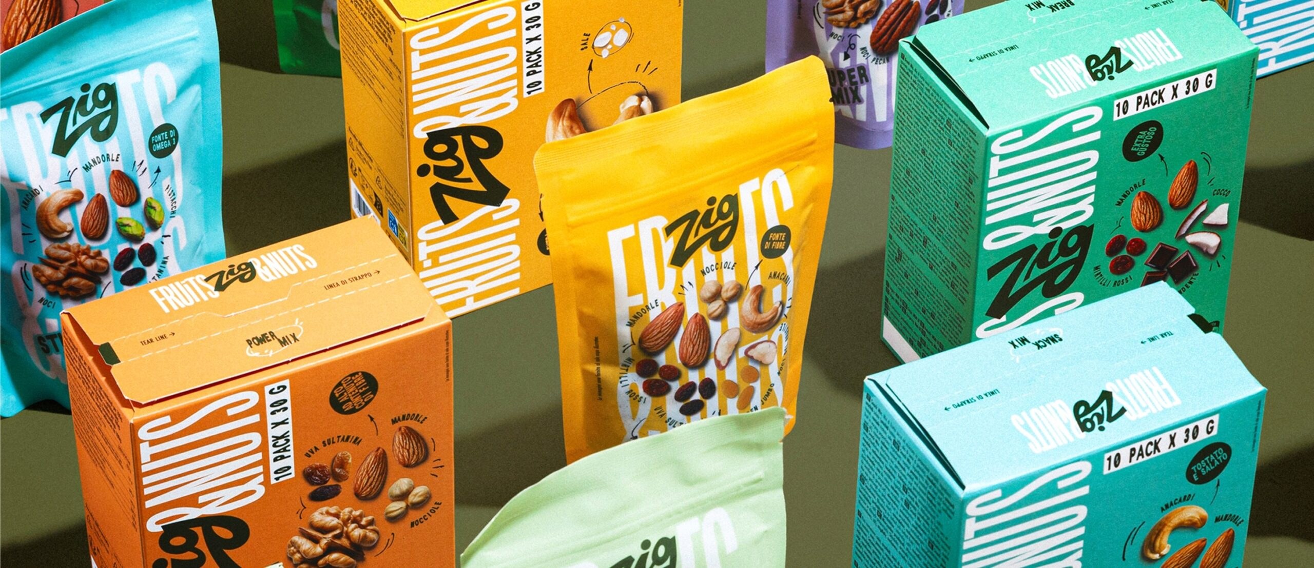
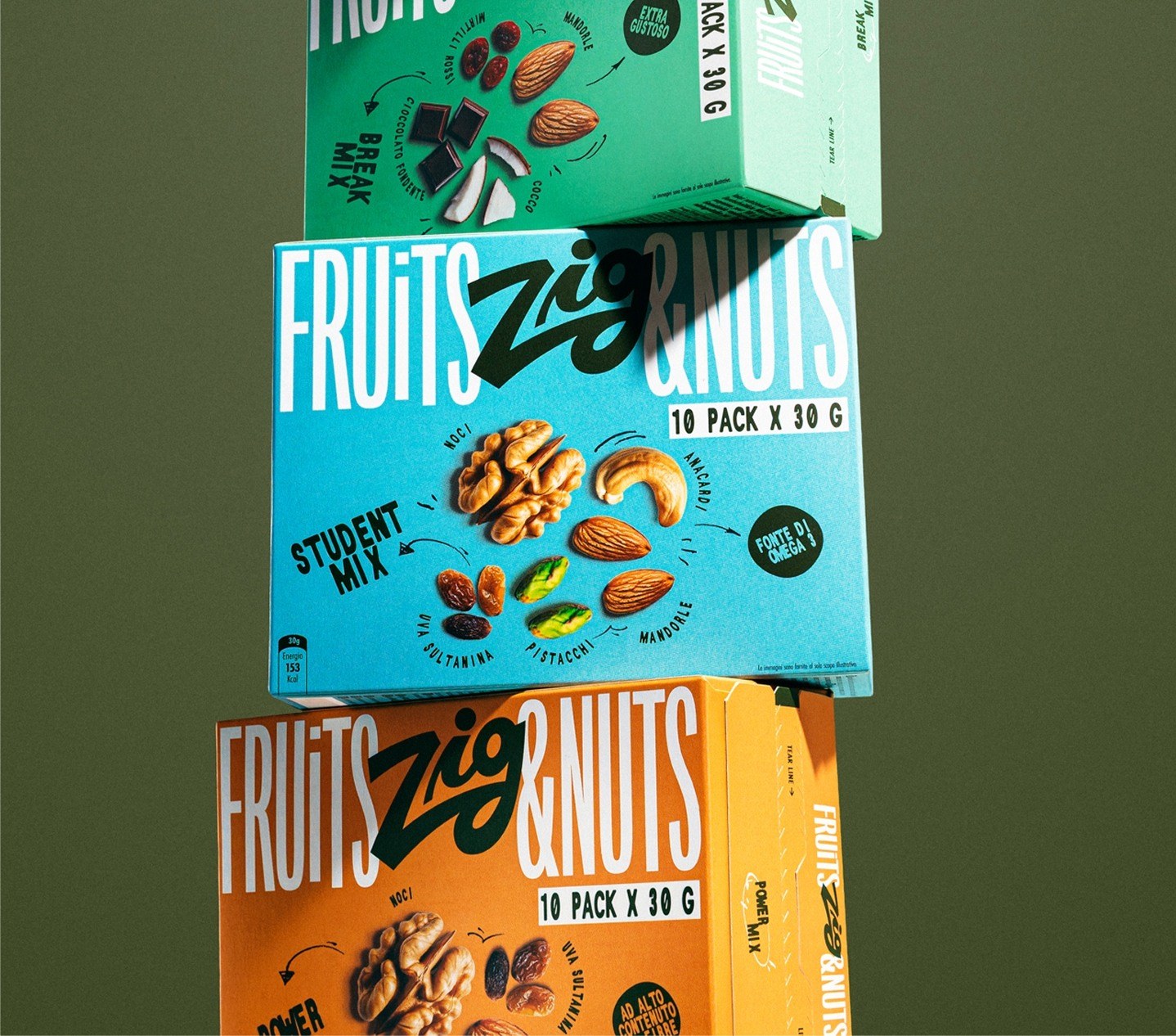
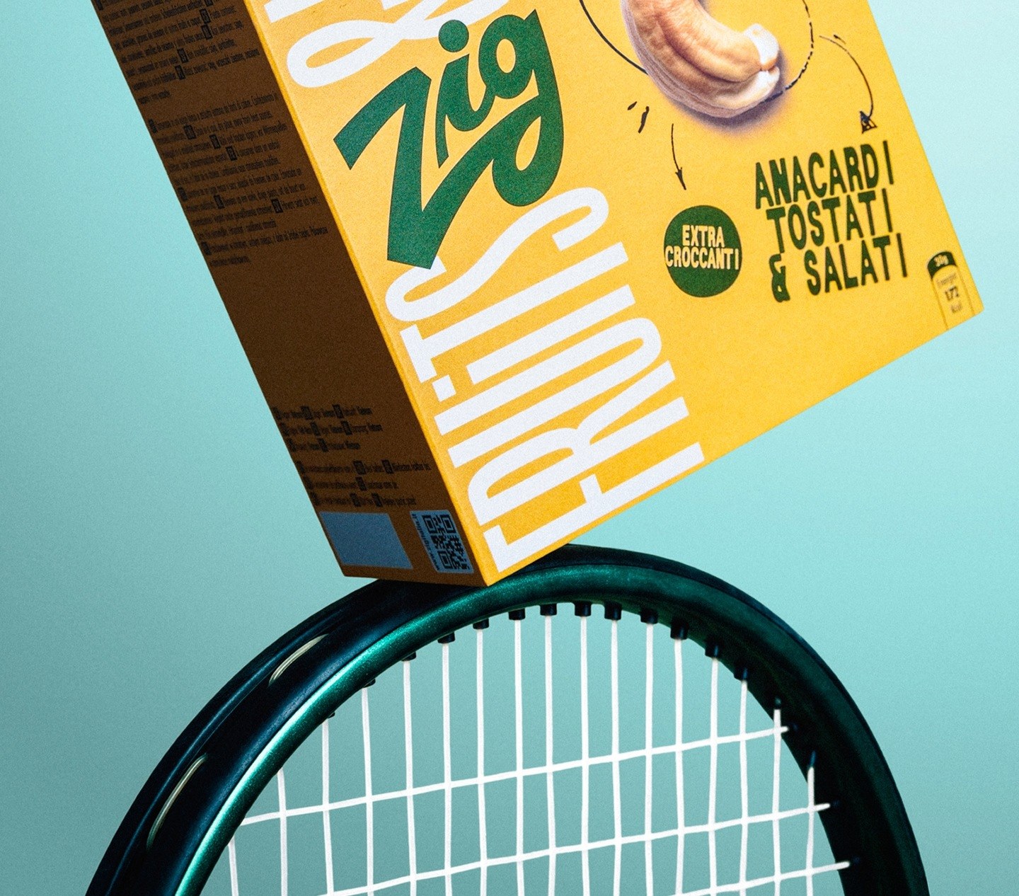
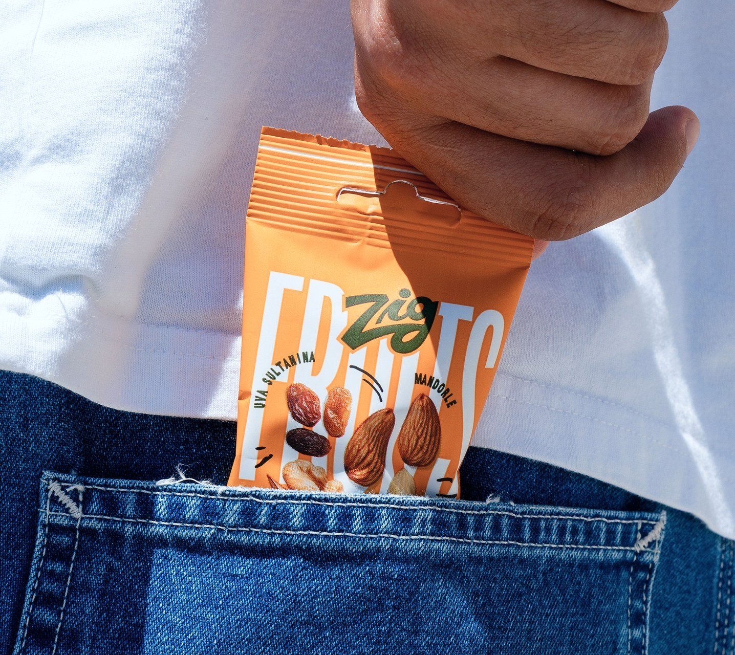
The Fruits & Nuts line is the first to carry the new identity on shelf.
 Otherness
 Alena Chemodurova
 Estudio Argo
 Pomodoro Design Office
 amandacoppeti
 Rabia zouina
 VANESA GARCÍA ESTUDIO
 anima
 Radar Agency
 Aadarsh Jain
 M&A CREATIVE AGENCY
 Valérie Colace
 Antonia Skaraki
 Aurora Baréalisse
 Artrime Graphic Design
 Just Design
 ANONIMA/
 Armoder Arte y Diseño
 eimanbeh
 Biaa
 Hartson Creative
 Karen Danielyan
 AUN BRANDS
 Studio Zak
 Hey Joe Studio