
ABOUT
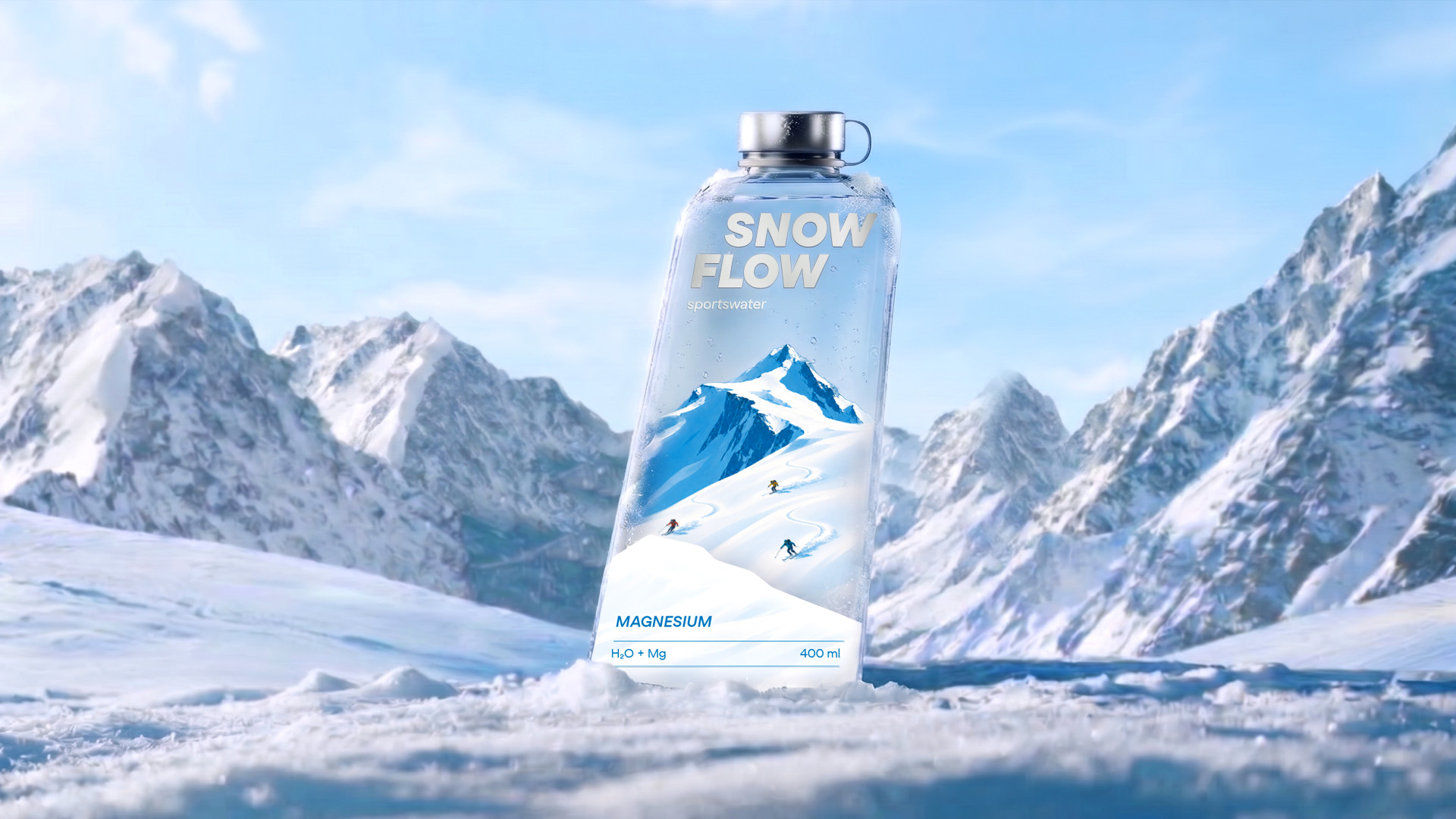
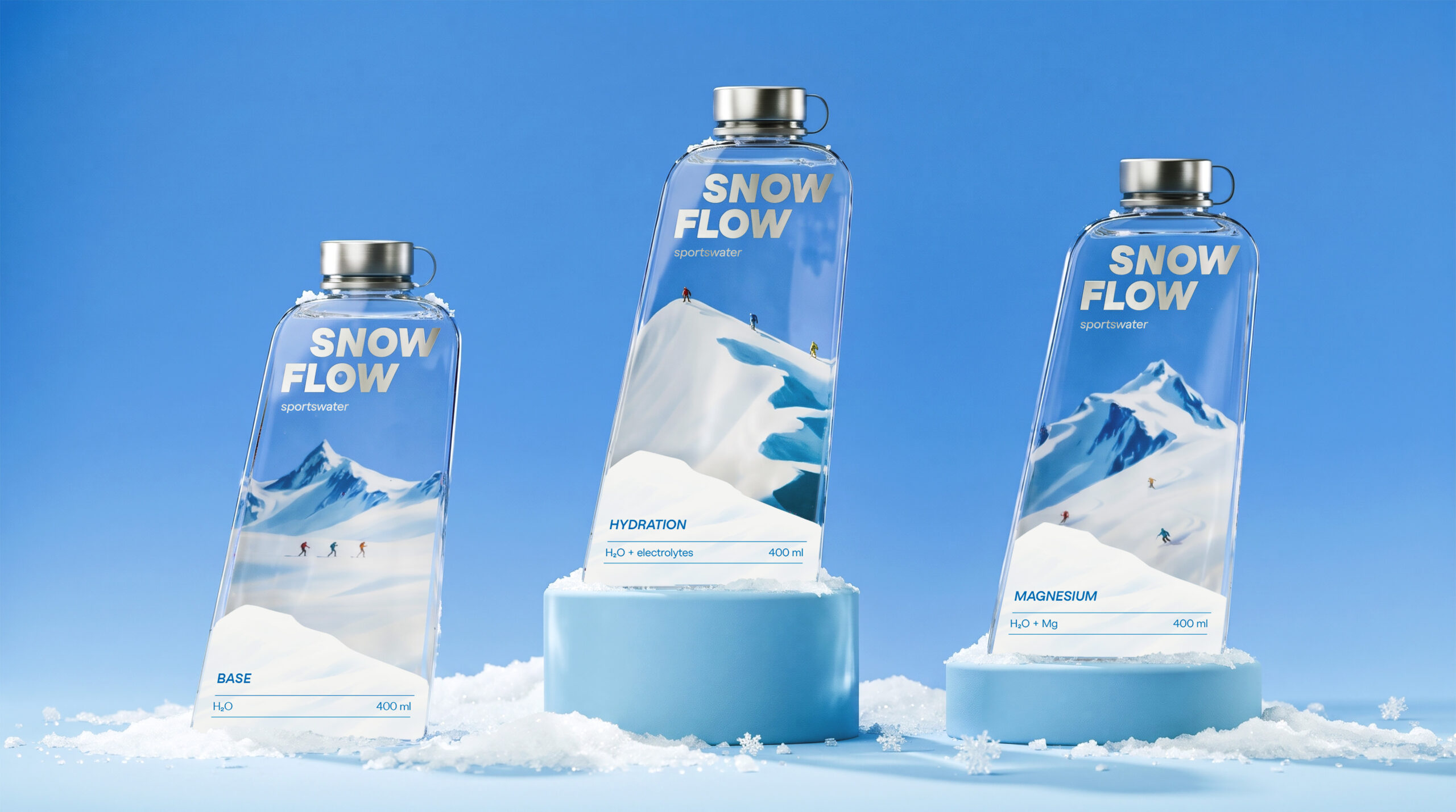
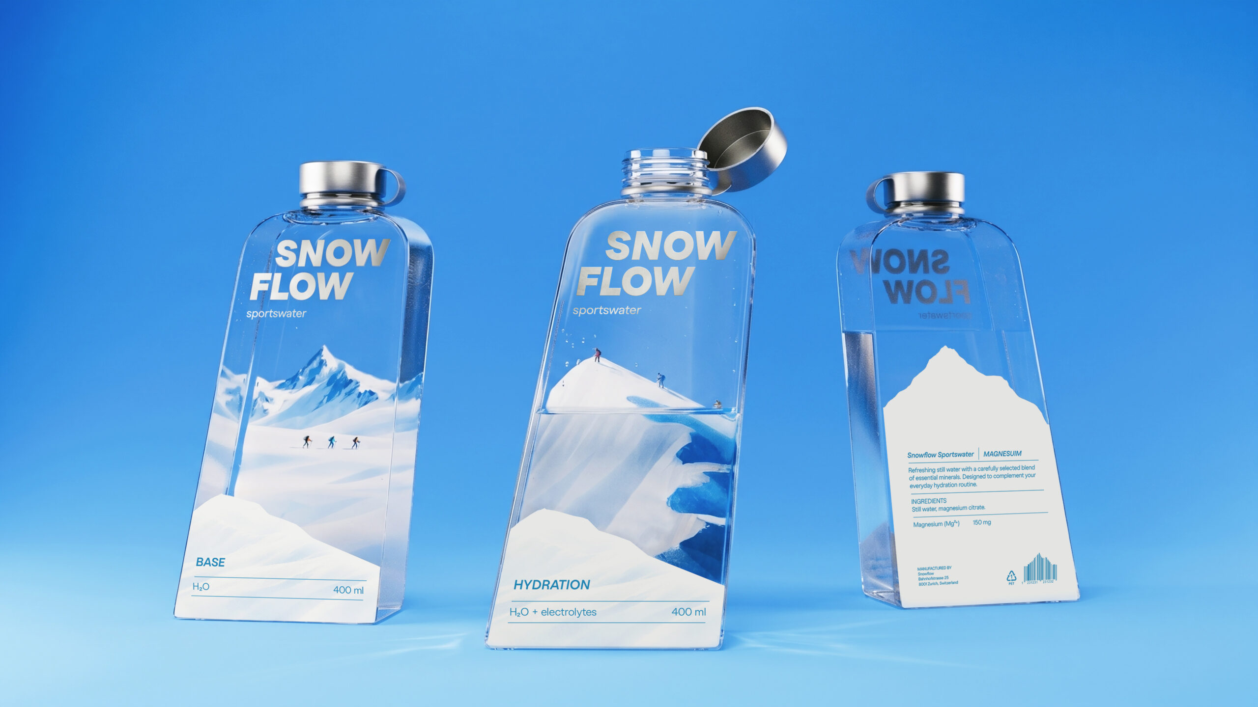
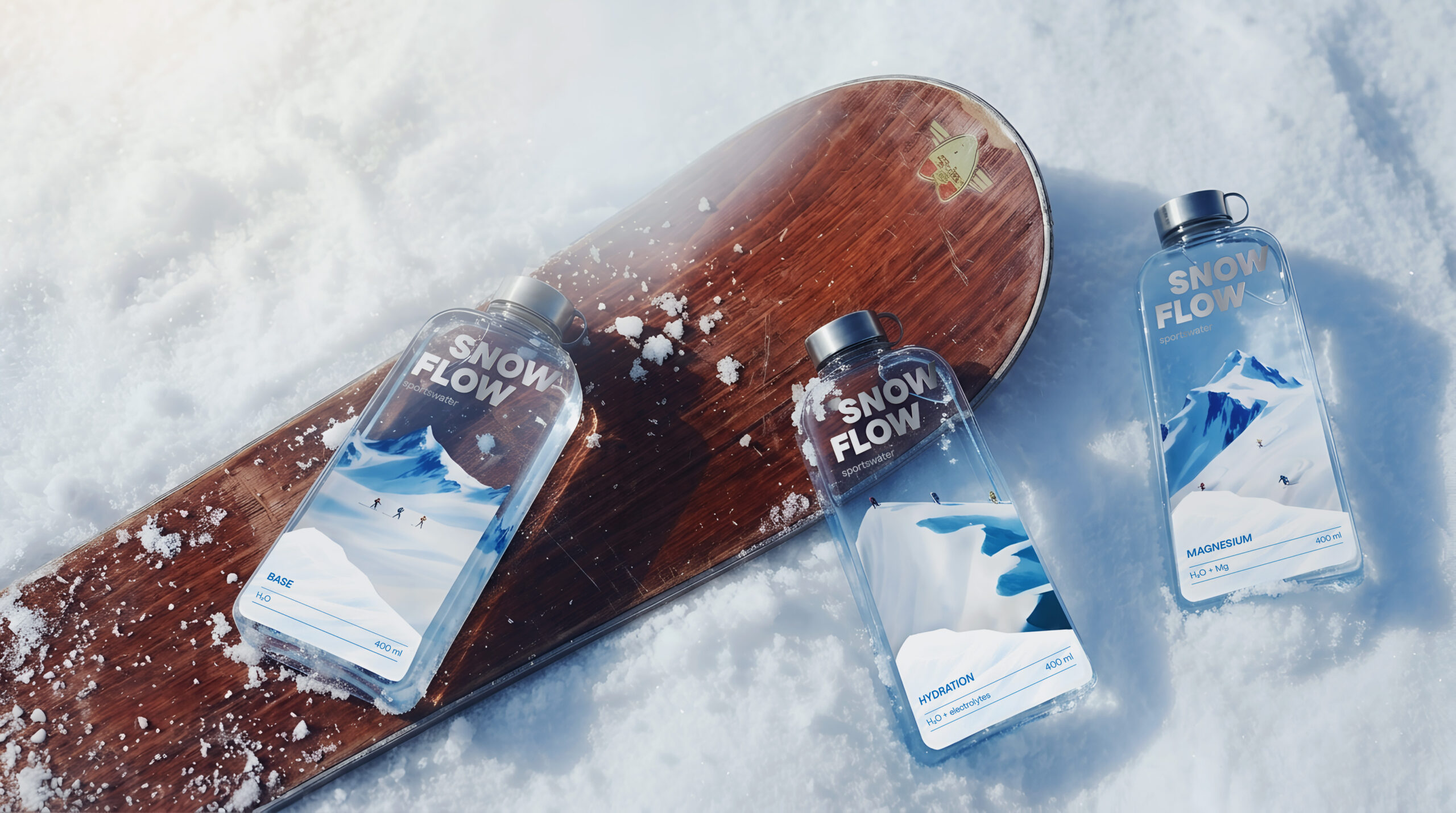
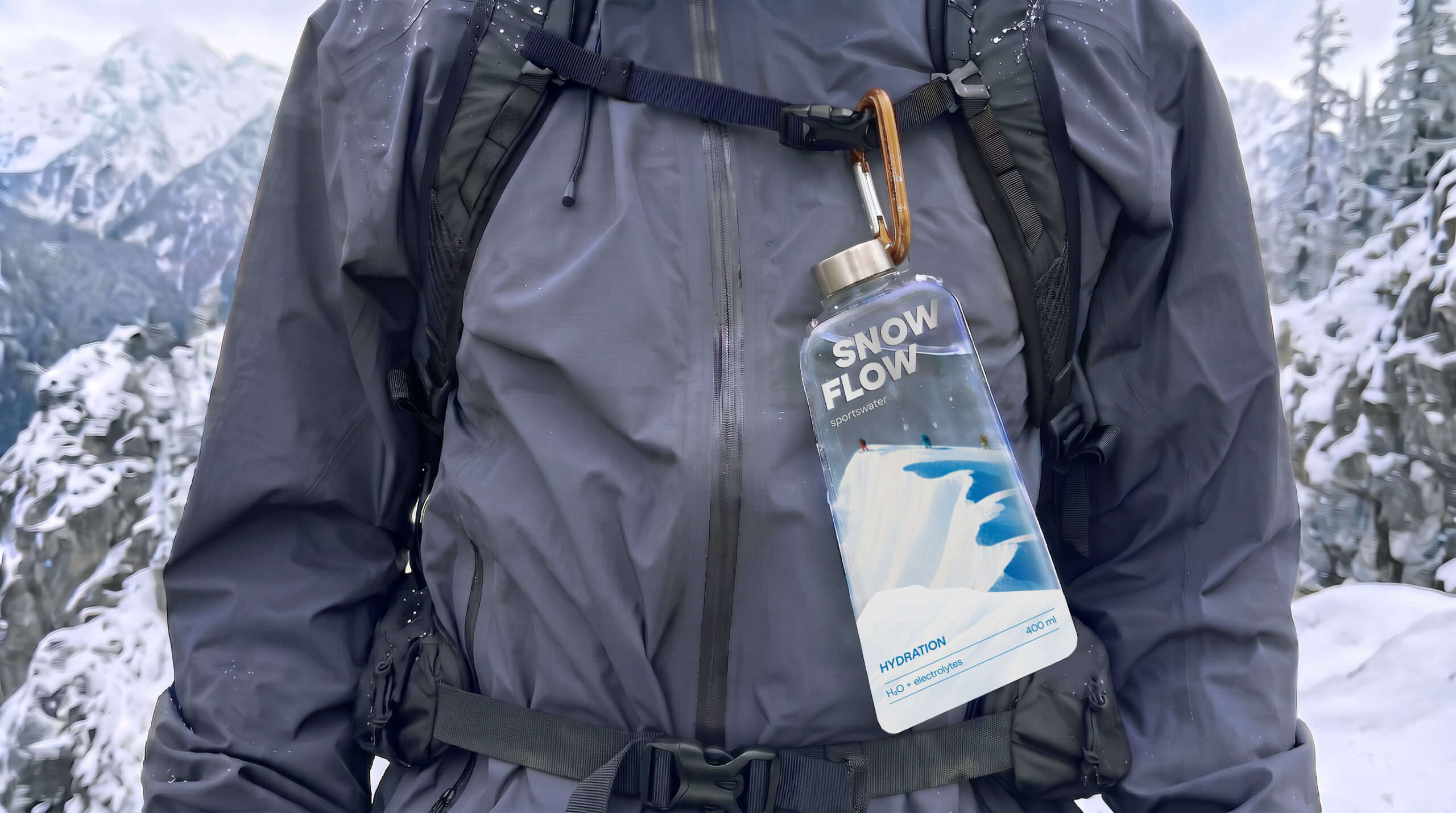
Snowflow is a functional water brand inspired by the atmosphere of mountain resorts, the freedom of movement and the energy of winter sports. The product line consists of three variations: Base, Hydration and Magnesium, each designed to support a different stage of physical activity. The main idea was to create a visual identity that connects the product’s functional purpose with the experience of skiing. Rather than treating the three bottles as separate products, I wanted to tell one continuous story of movement through the mountains, where every stage of the journey has its own purpose.
SOLUTION
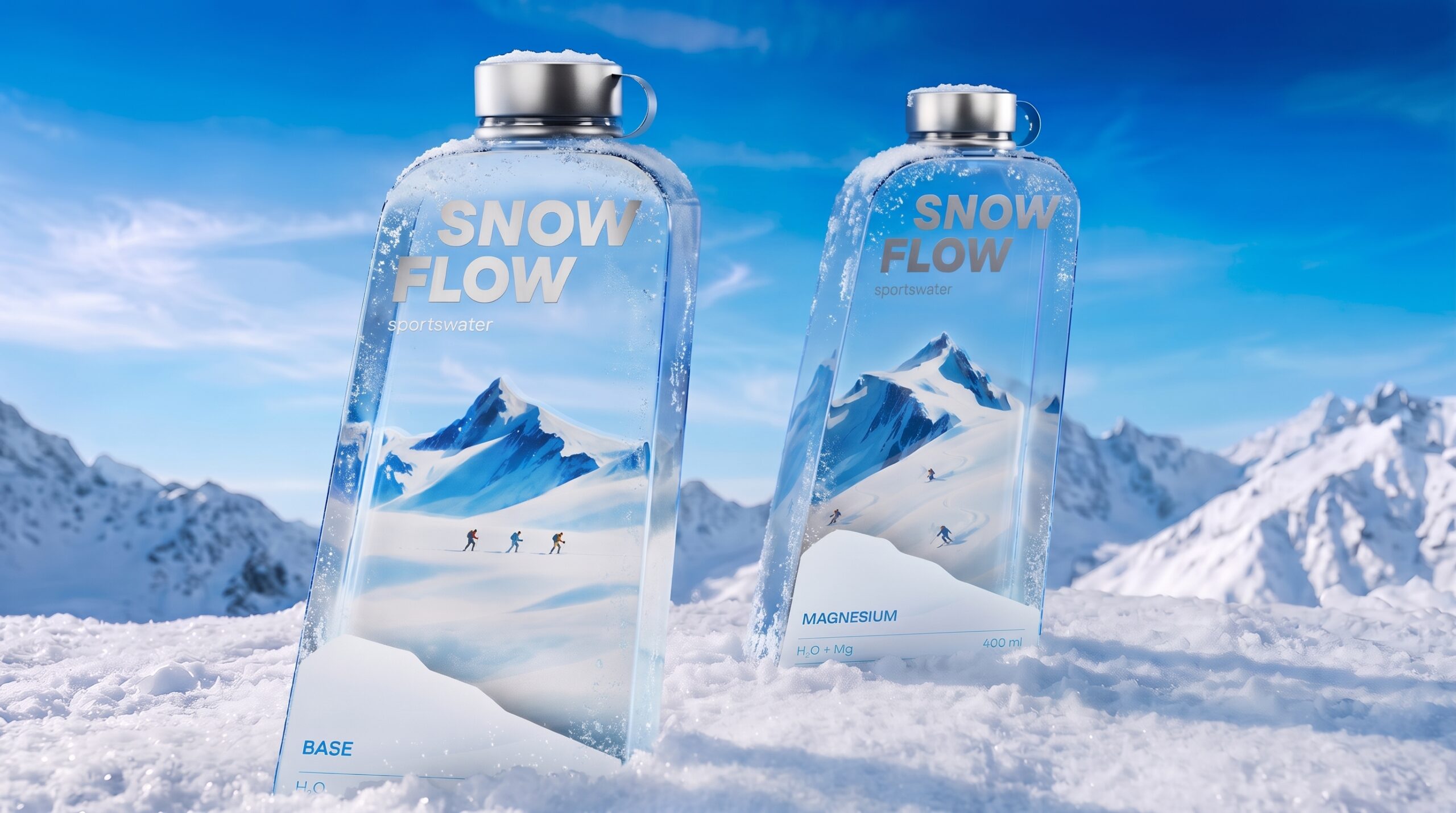
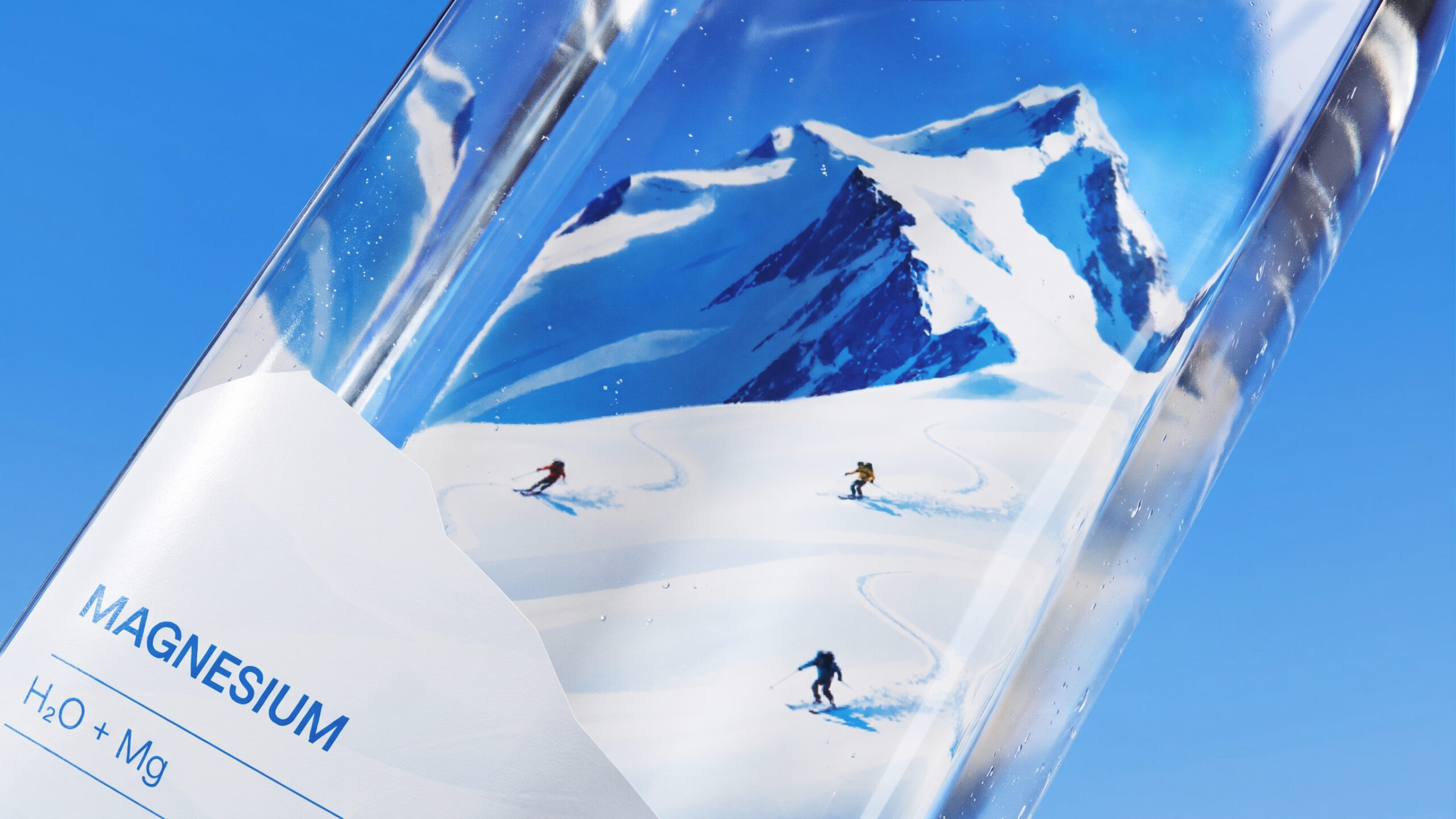
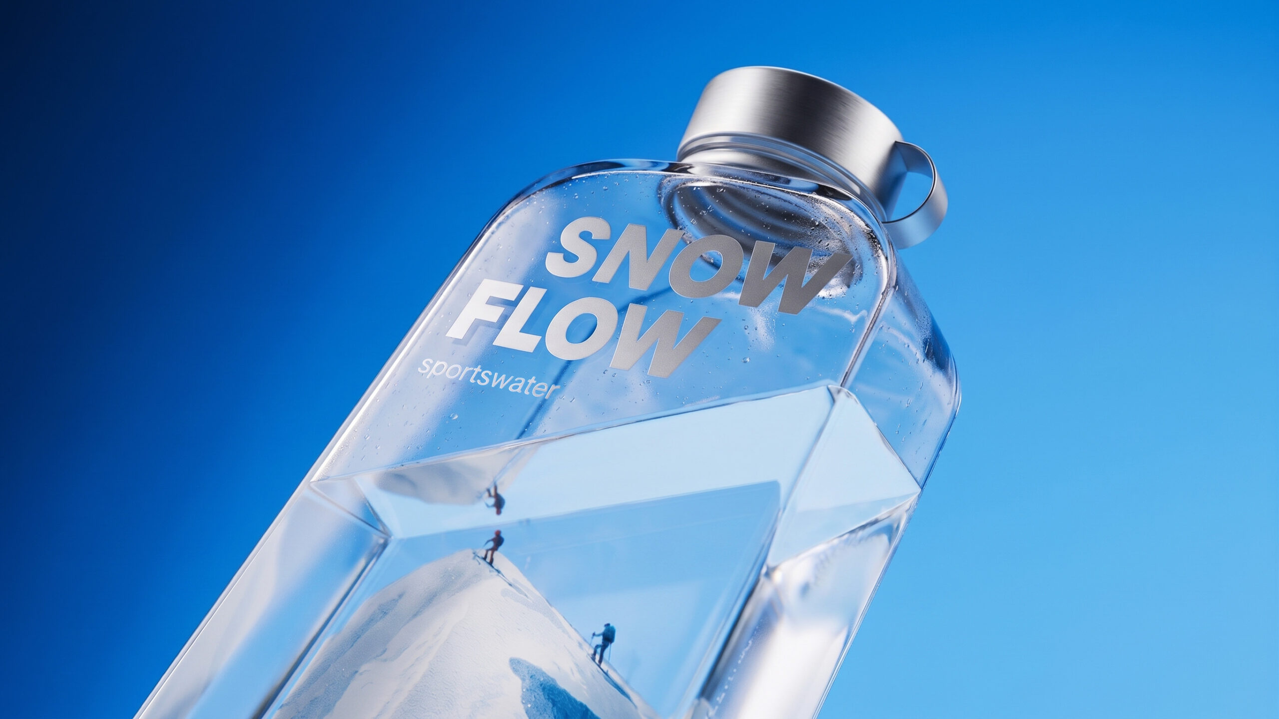
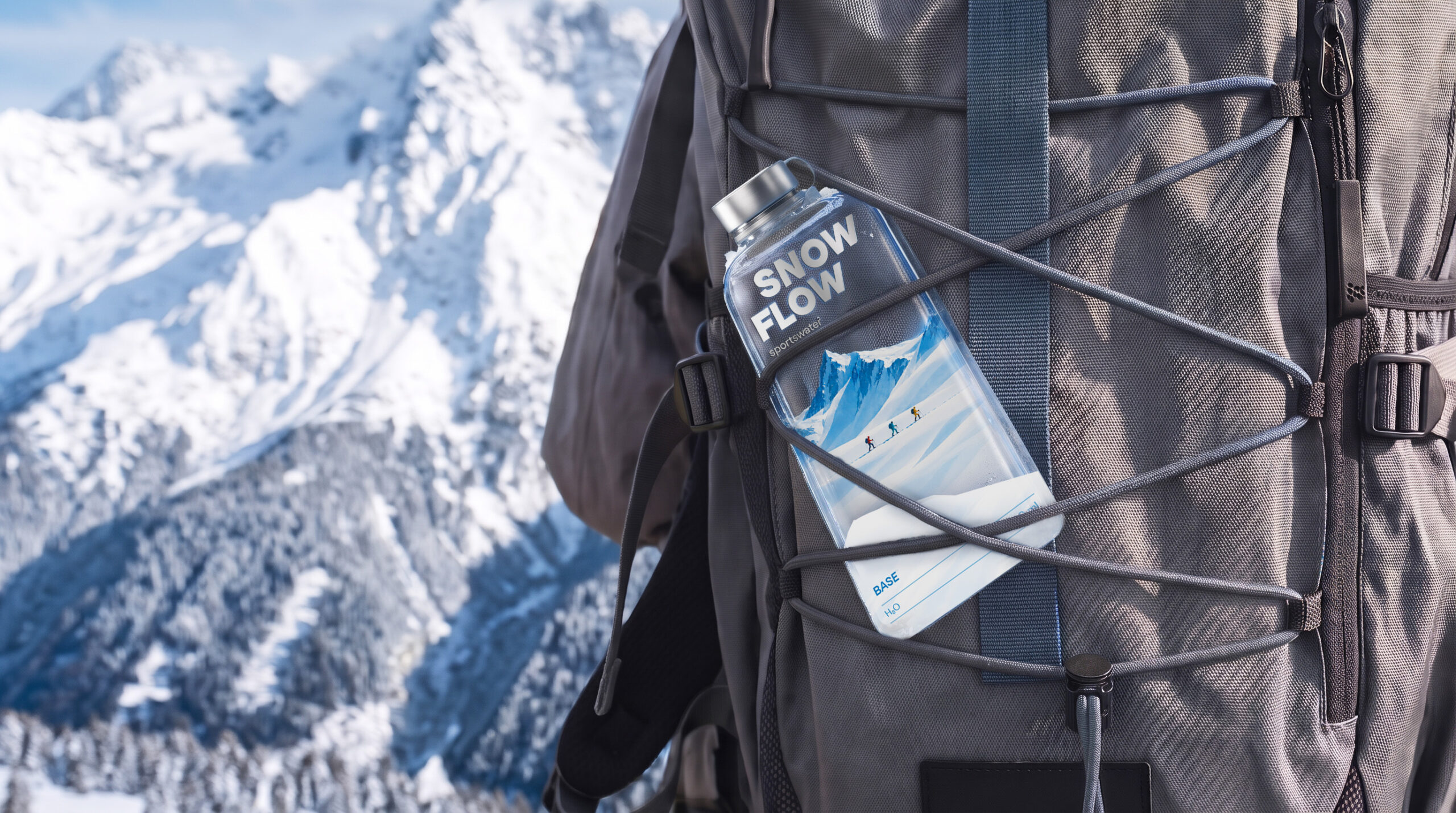
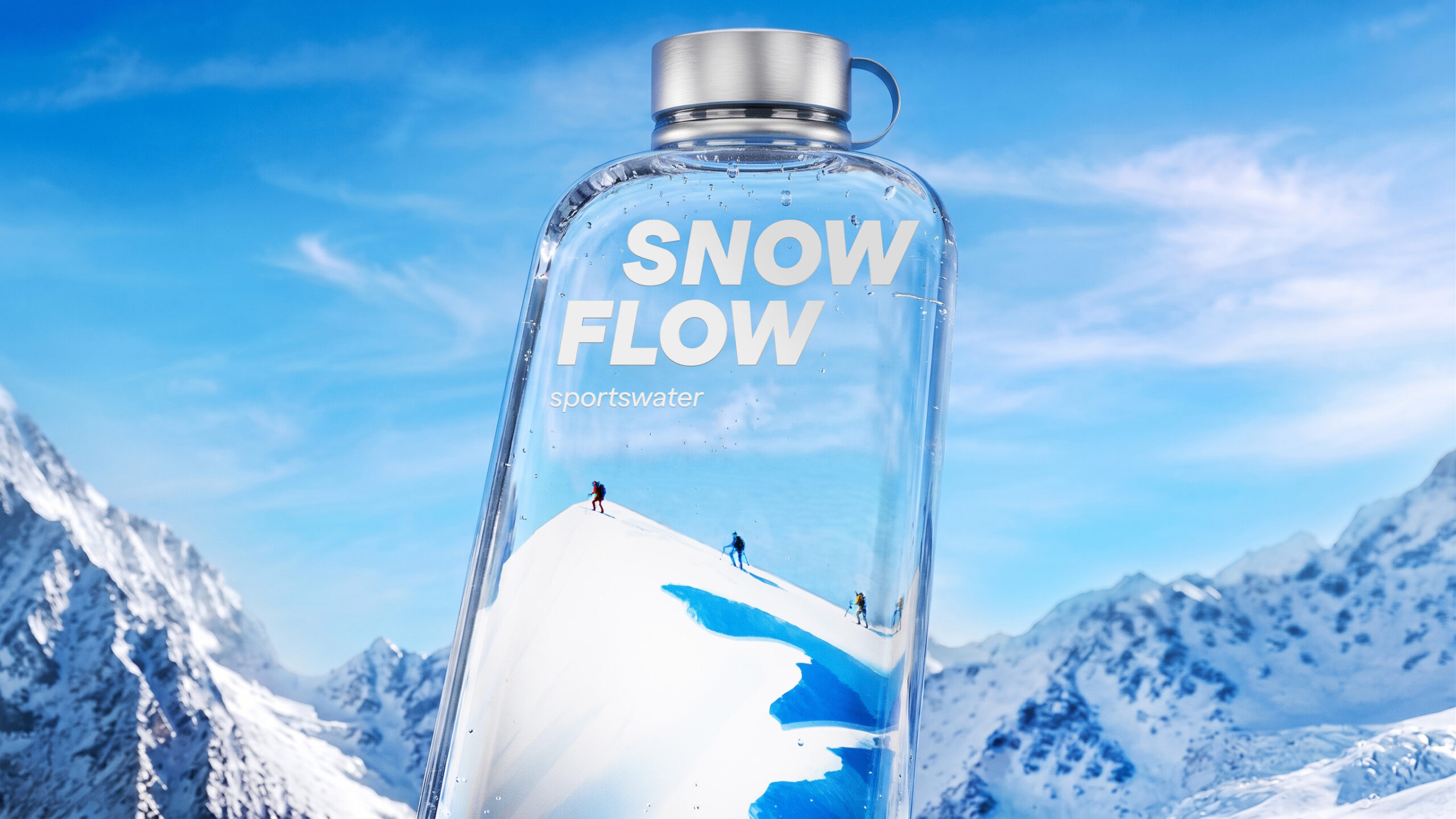
I decided to transform the packaging into a miniature alpine landscape. One of the key design elements is the unconventional slanted silhouette of the bottle, which references the diagonal lines of a ski slope and creates an immediate visual connection with the world of winter sports. The transparent surface becomes a canvas for a snowy mountain environment, allowing the illustrations to interact with the shape of the packaging.
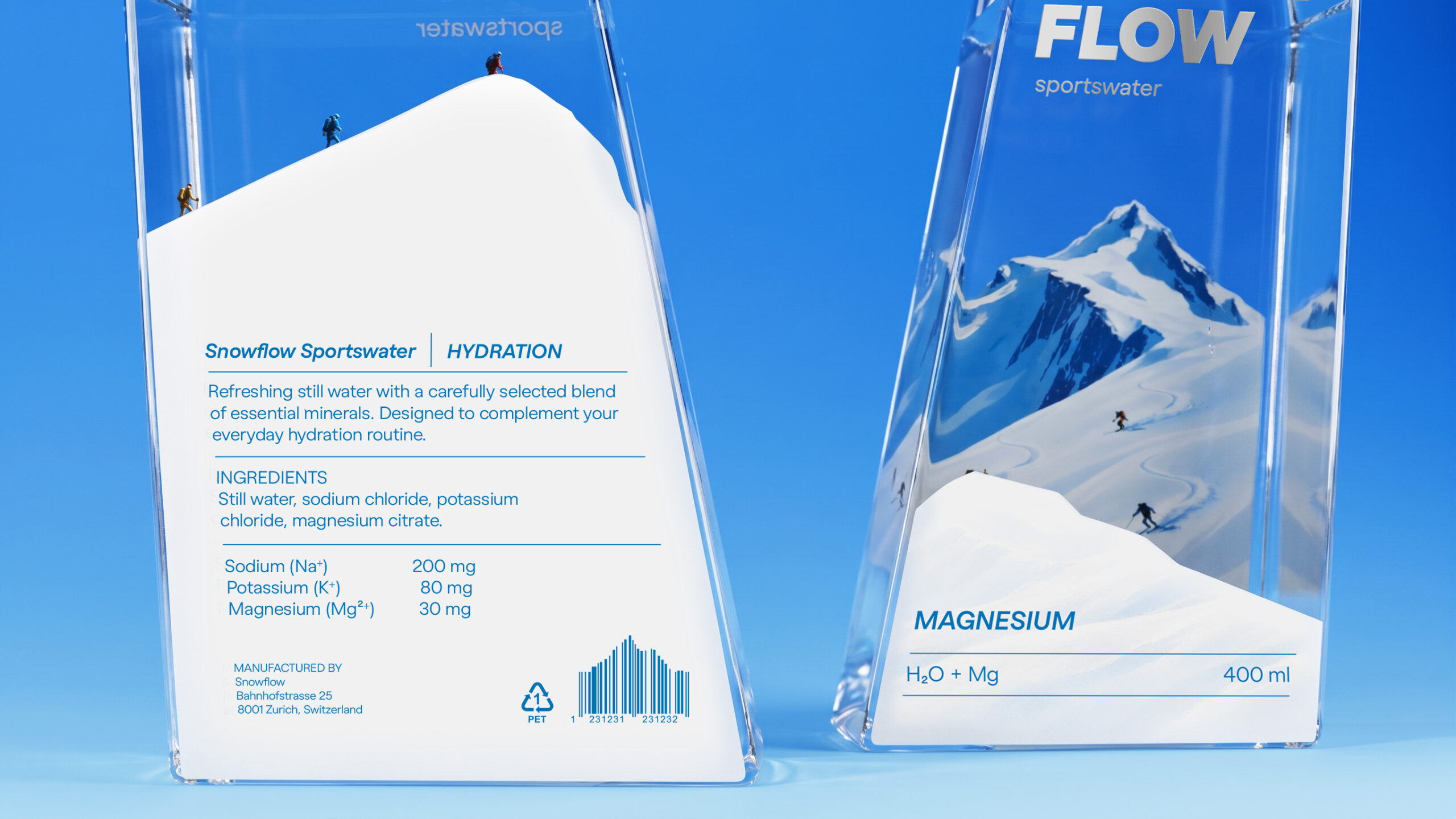
Each bottle represents a different moment of a skier’s journey. Base features a calm mountain setting, symbolizing the beginning of the experience and everyday hydration. Hydration depicts athletes climbing towards the mountain peak, reflecting physical effort and the need to replenish electrolytes. Magnesium captures the dynamic moment of skiing downhill, representing movement and recovery. The mountain illustrations, tiny skiers and cool blue-and-white palette create a consistent visual language, while the individual compositions distinguish each product. Minimal typography and metallic caps complete the clean, modern aesthetic.
RESULT
The result is a distinctive packaging system that combines an unconventional bottle shape with visual storytelling. The slanted silhouette reinforces the connection to skiing, while the illustrations turn each bottle into a small fragment of a mountain landscape. Together, the three designs create a unified collection that follows the skier from the beginning of the journey to the mountain peak and back down the slope. Snowflow becomes more than just a bottle of water — it captures the spirit of mountain sports through both its form and visual identity.
Curator’s Insight
The challenge with a clear bottle is what to do with the empty space, and here the liquid completes the picture. The illustration is anchored low and fades upward into transparency, so the waterline works as a horizon. On the Hydration bottle it cuts across the ridge, so the climbers appear to stand above real water. The white label base doubles as a snowdrift, which keeps the functional text in a calm, high-contrast zone without needing a separate panel. On the reverse, the front wordmark reads mirrored through the glass and becomes part of the scene. The silver print finish on the type also ties neatly to the steel cap. When the substrate is transparent, treat the contents as a design layer rather than something to hide.
 Daria Levina
 CreativeWise
 ANNA ONISHCHENKO
 Denomination
 VANESA GARCÍA ESTUDIO
 Julia Persuk
 Kingdom & Sparrow
 Agustina Bo
 Matcha DNA
 Atelier 9AM
 Jie Yee
 43oz
 monther al omari
 Rajat Chaple
 timaddington
 Brandesign
 Nouna design
 Rabia zouina
 Derrick Lin
 Sophiagdotcom
 Sofia Nikishina