Curator's PicksSubmit a projectShare your work

Explore by Country

AfghanistanAfricaAlbaniaAlgeriaAmerican SamoaAndorraAngolaAnguillaAntarcticaArgentinaArmeniaAsiaAustraliaAustriaAzerbaijanBahamasBahrainBangladeshBarbadosBelarusBelgiumBeninBoliviaBosnia and HerzegovinaBotswanaBrazilBritish Indian Ocean TerritoryBrunei DarussalamBulgariaCambodiaCameroonCanadaChileChinaChristmas IslandColombiaCosta RicaCote D'ivoireCroatiaCubaCyprusCzech RepublicDemocratic People's Republic of KoreaDenmarkDominican RepublicEcuadorEgyptEl SalvadorEstoniaEthiopiaEuropeFijiFinlandFranceFrench GuianaFrench Southern TerritoriesGeorgiaGermanyGhanaGlobalGreeceGuadeloupeGuatemalaGuyanaHaitiHondurasHong KongHungaryIcelandIndiaIndonesiaIranIraqIrelandIsraelItalyJamaicaJapanJordanKazakhstanKenyaKuwaitKyrgyzstanLatviaLebanonLibyaLithuaniaLuxembourgMacedoniaMadagascarMalaysiaMaldivesMaliMaltaMarshall IslandsMauritiusMexicoMoldovaMonacoMongoliaMontenegroMoroccoMyanmarNepalNetherlandsNew CaledoniaNew ZealandNicaraguaNigeriaNorth AmericaNorwayOceaniaOmanPakistanPalestiniaPanamaPapua New GuineaParaguayPeruPhilippinesPolandPortugalPuerto RicoQatarRepublic of KoreaRepublic of KosovoRomaniaRussian FederationSan MarinoSao Tome and PrincipeSaudi ArabiaSenegalSerbiaSeychellesSingaporeSlovakiaSloveniaSomaliaSouth AfricaSouth AmericaSpainSri LankaSudanSwazilandSwedenSwitzerlandSyrian Arab RepublicTaiwanTajikistanThailandTrinidad and TobagoTunisiaTurkeyTurkmenistanUgandaUkraineUnited Arab EmiratesUnited KingdomUnited StatesUnited States Minor Outlying IslandsUruguayUzbekistanVanuatuVenezuelaViet NamVirgin Islands, U.S.YemenZambiaZimbabwe

Materials

Browse all

Amaro Leonardelli

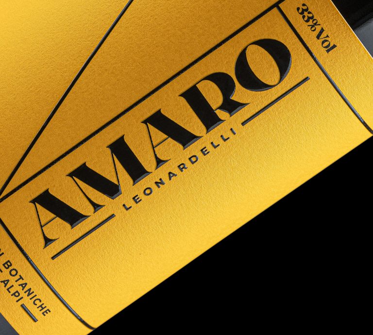
For this project, I adopted an approach consistent with the distinctive style of the distillery’s other products, characterized by the thoughtful use of colors and typography. I aimed for a solution that, while maintaining a modern touch, respects tradition. This is reflected in the choice of a typeface that evokes the elegance of classic fonts from the past, offering a sense of authenticity.

The design is balanced by a warm yellow tone, which mirrors the natural hue of the amaro itself, creating a direct visual connection to the product. The label is printed on 100% cotton paper, chosen to reflect the natural essence of the amaro’s ingredients and emphasize the focus on quality and sustainability.”
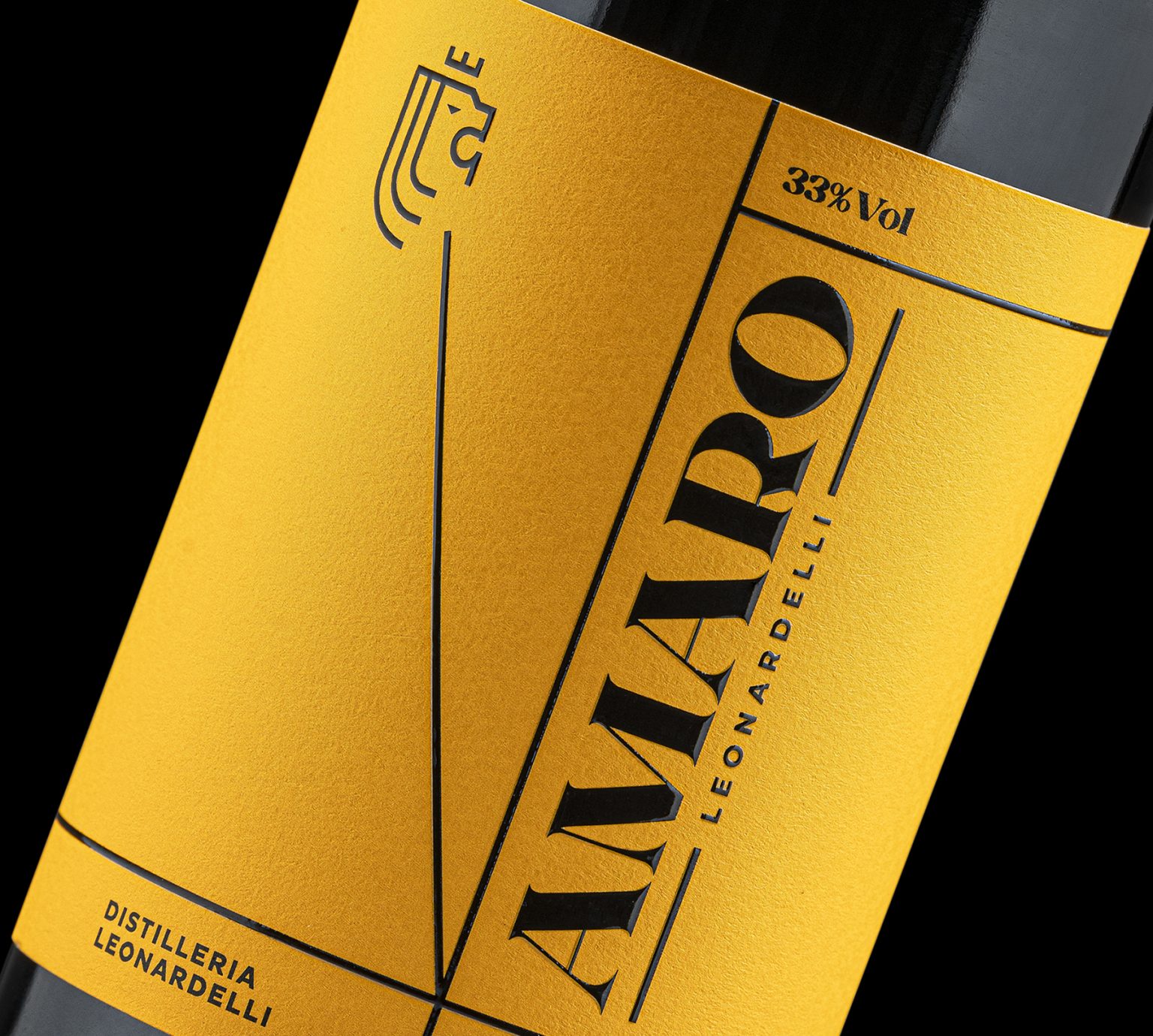
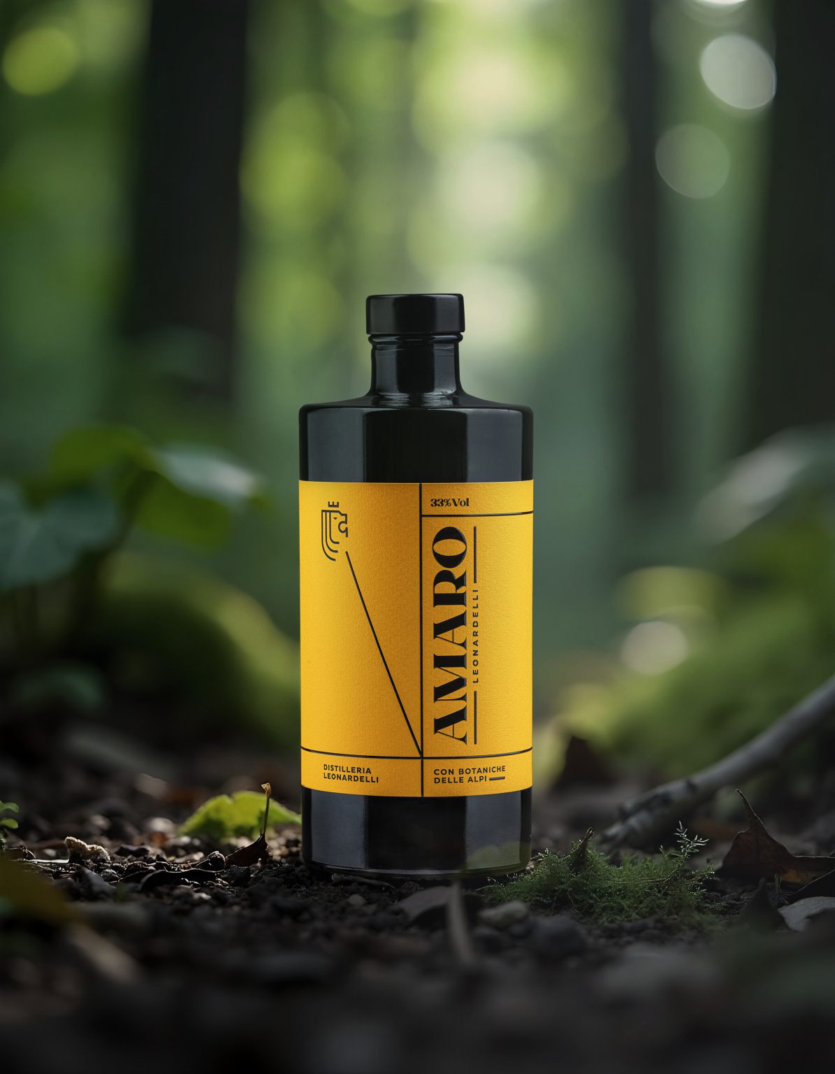
 

Amaro Leonardelli, liqueur packaging design by killeridea, Italy. Image 1 of 3.Amaro Leonardelli, liqueur packaging design by killeridea, Italy. Image 2 of 3.Amaro Leonardelli, liqueur packaging design by killeridea, Italy. Image 3 of 3.