
Our hands are precious and deserve the best. Which is why, when comparing hand care brands, it all comes down to the ingredients that go into the product and then on our skin.
Brand Strategy and Brand Identity
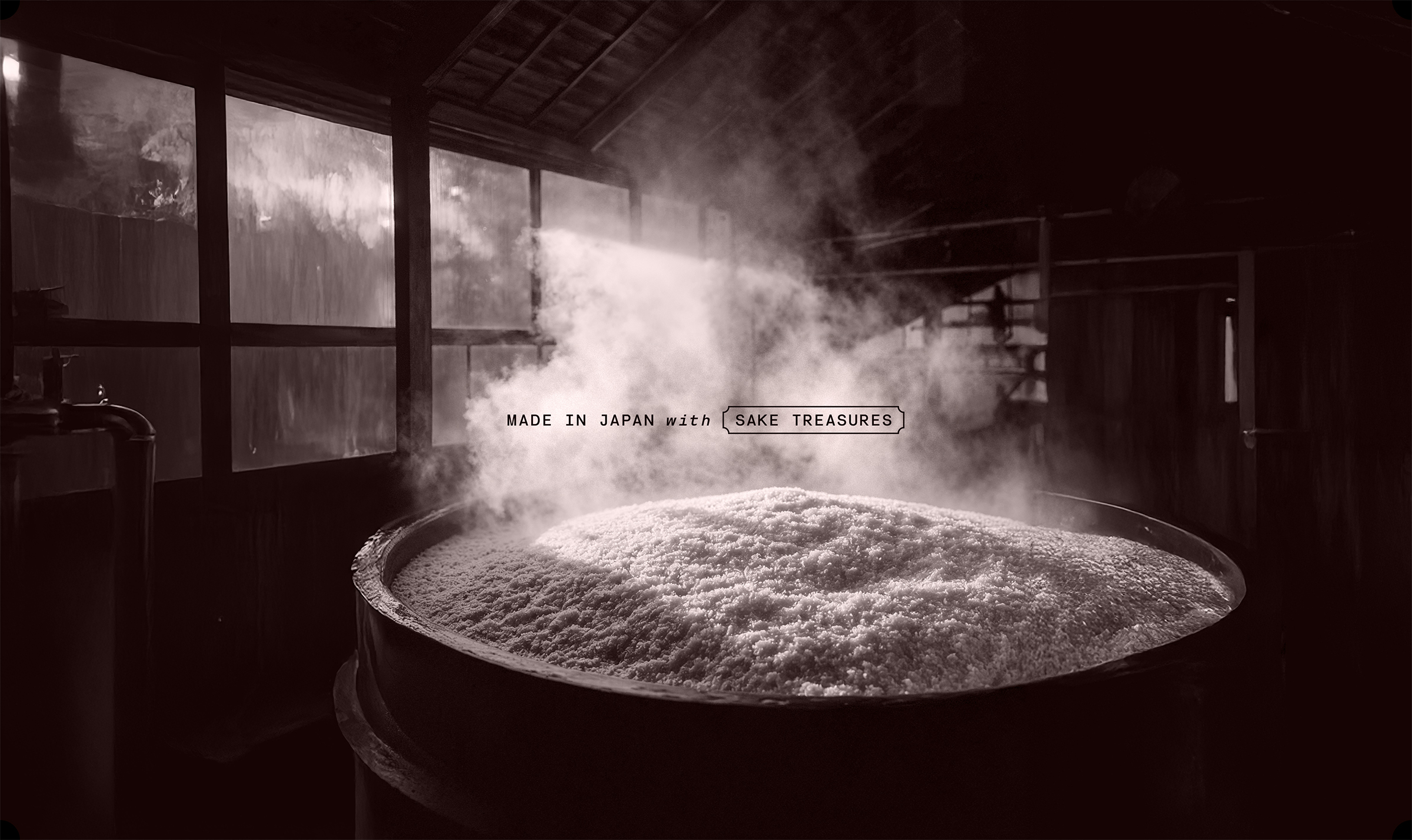
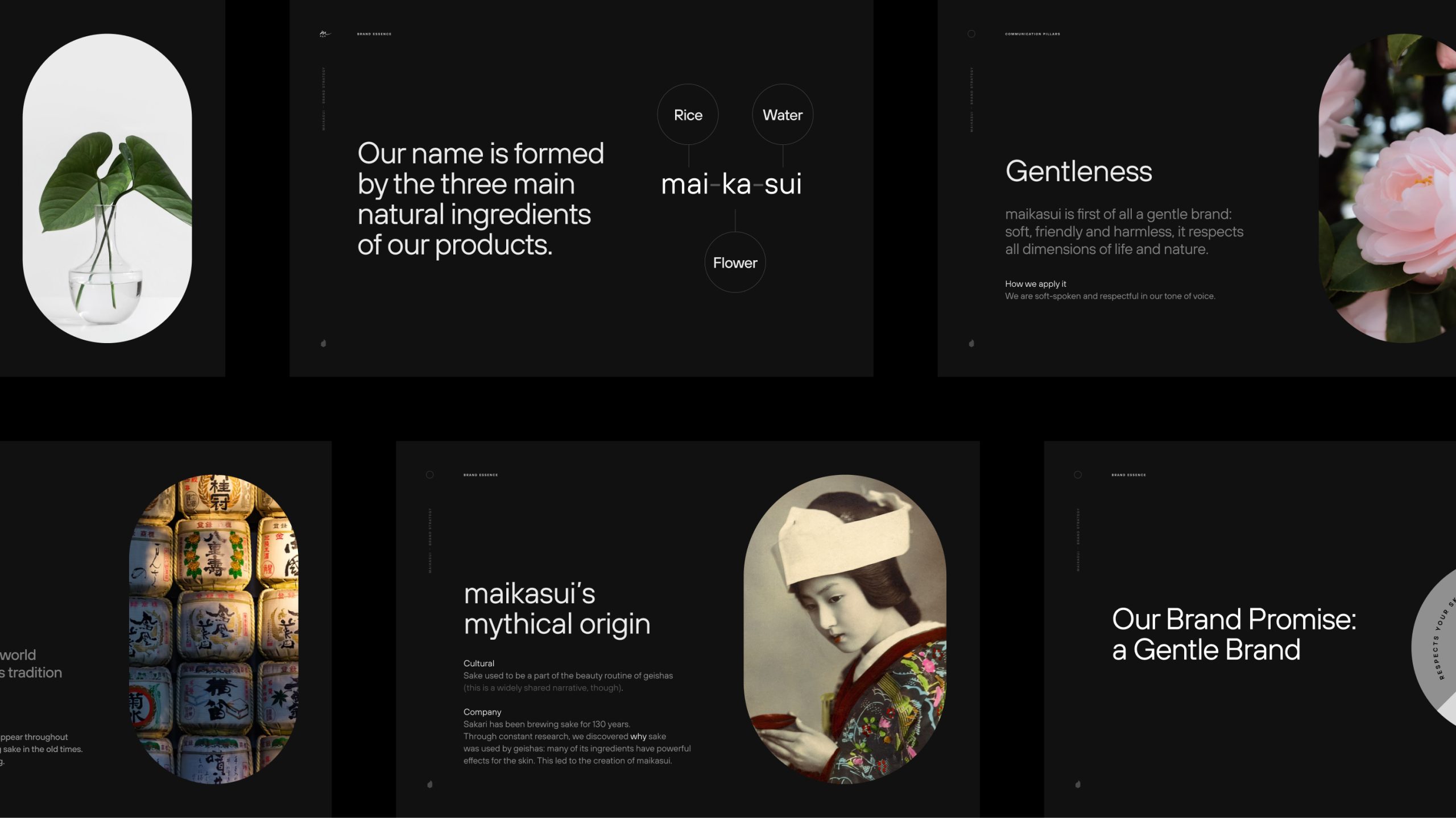
There is one ingredient that is 100% natural and that has been part of the beauty routine of geishas for ages: rice. More precisely, rice that has been used for the production of sake.
This is the soul of maikasui, a Japanese hand care brand that respects the rules and rhythms of nature: not just by using natural ingredients but by taking a sustainable approach and using a 100% vegan formula.
As a boutique branding agency in charge of creating the brand from its strategy, our first job was to give its rice-based ingredients the right framing, as they could have been easily dismissed as “byproducts” while being very precious.
We then created the concept of “sake treasures” that went into the payoff “natural beauty from sake treasures”.
The whole brand was then designed to express this natural gentleness, shaping both its value system, tone of voice, visual world and pack design.
maikasui aims to be a discreet presence and a trusted ally in a woman’s life, but also a way to reconnect with everything nature has to offer. Beyond setting up the maikasui brand, Sublimio has an ongoing collaboration that includes developing its communication and launching new products.
Logo Design
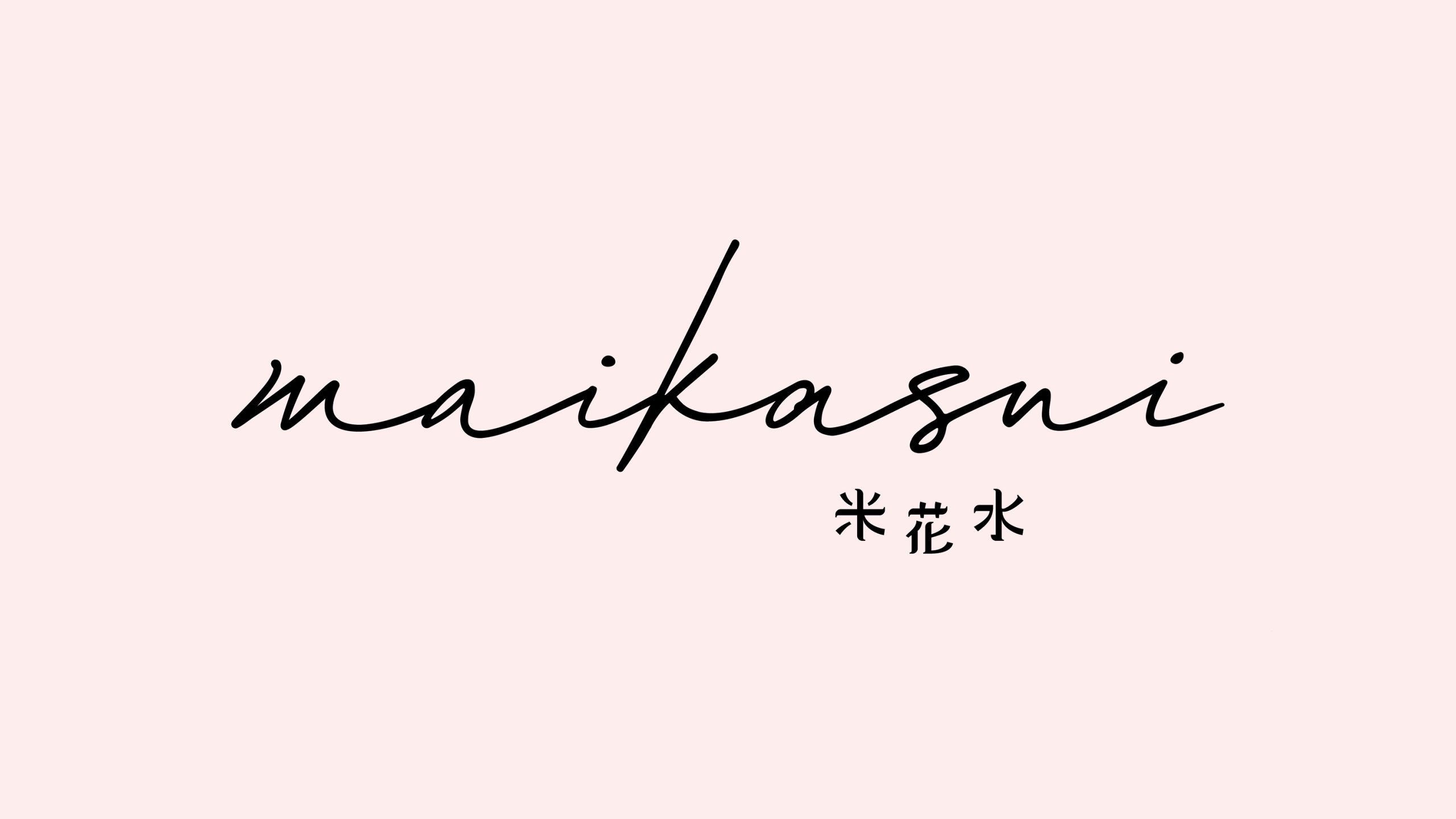
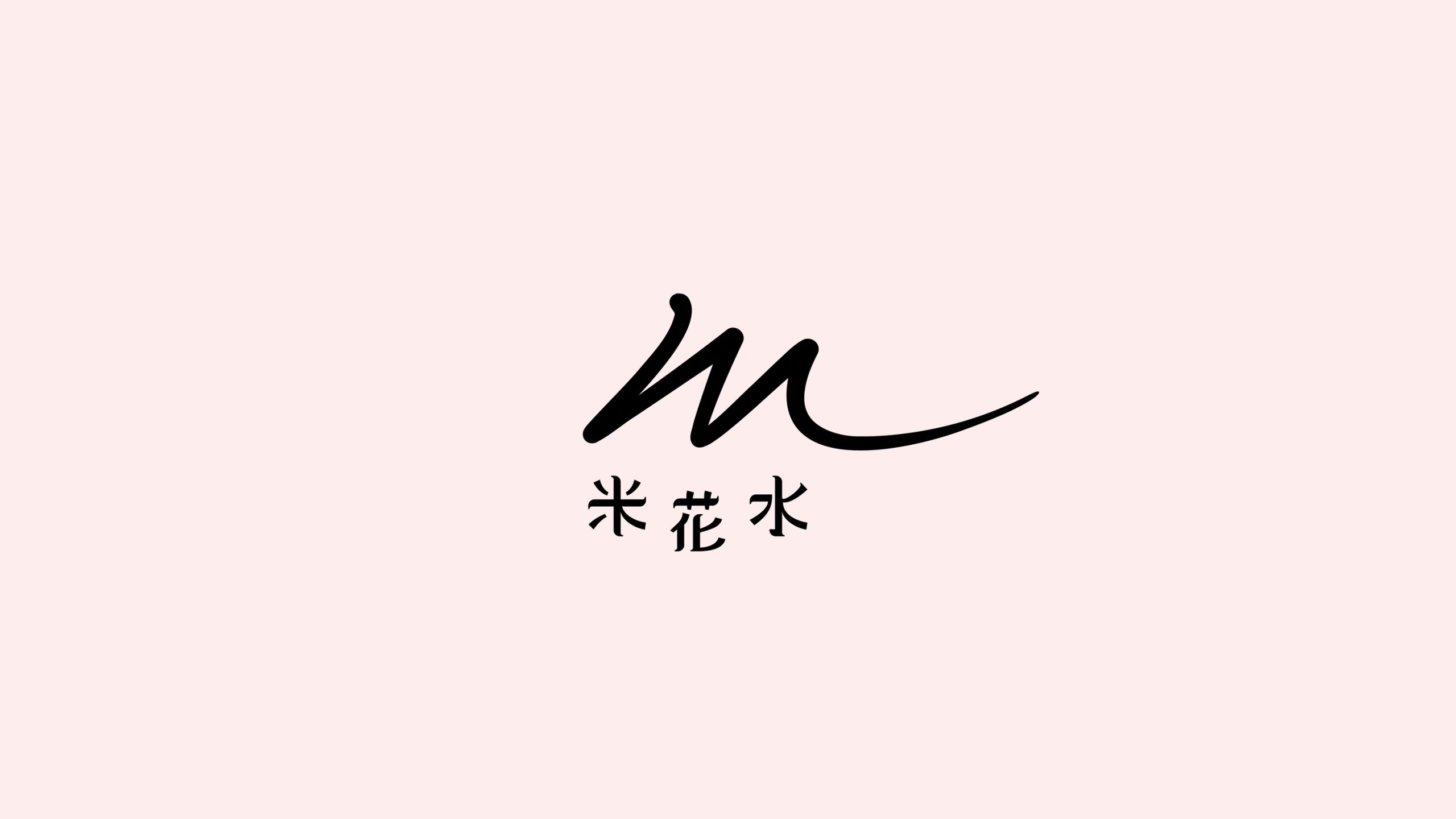
The logo features the ideograms for the words mai ka sui, custom designed and arranged to evoke the shape of a soft smile. A combination of pastel hues, soft forms, handwriting and a general sense of poetry makes the brand as light and respectful as the products it offers.
The logo is designed to express the brand’s authenticity and Japanese roots, while staying delicate and contemporary.
Packaging
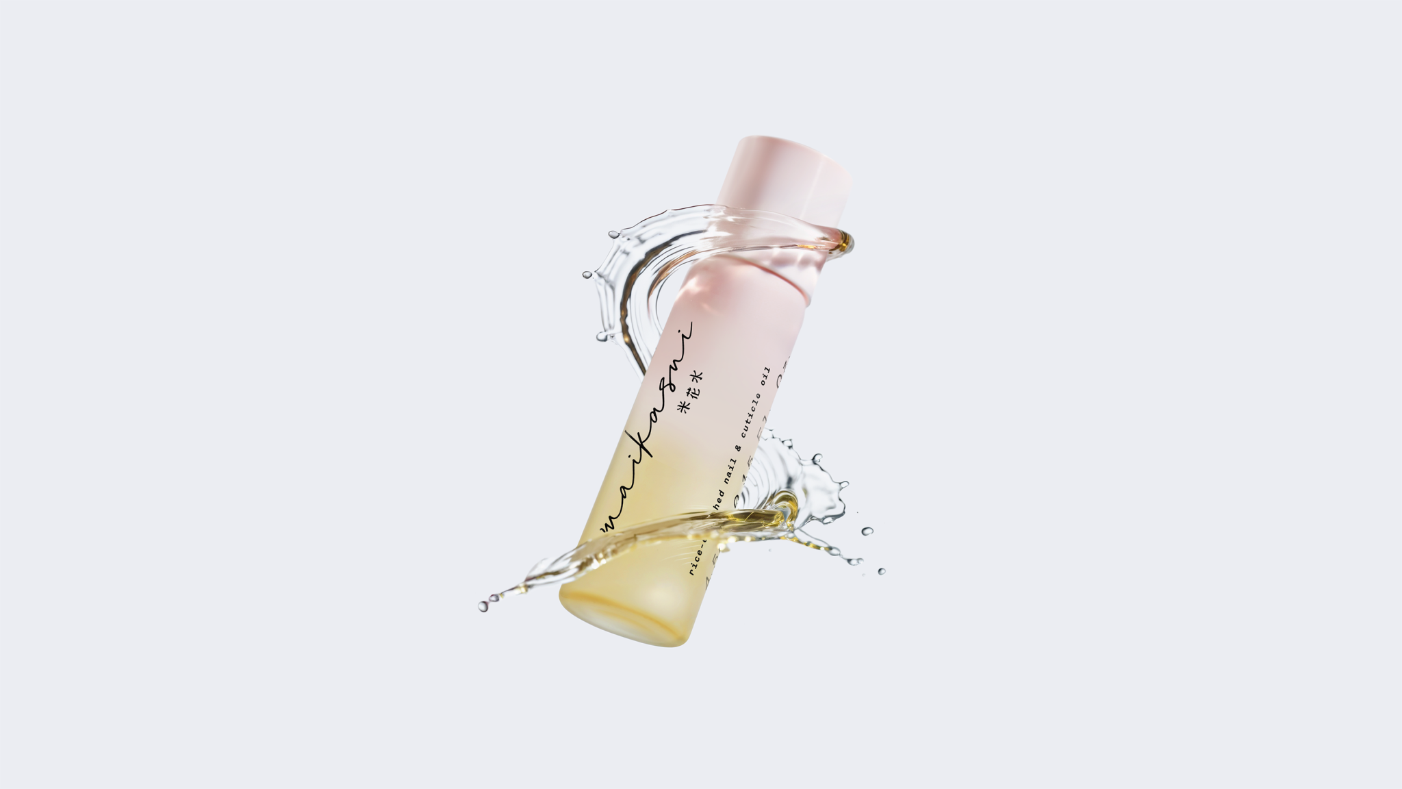
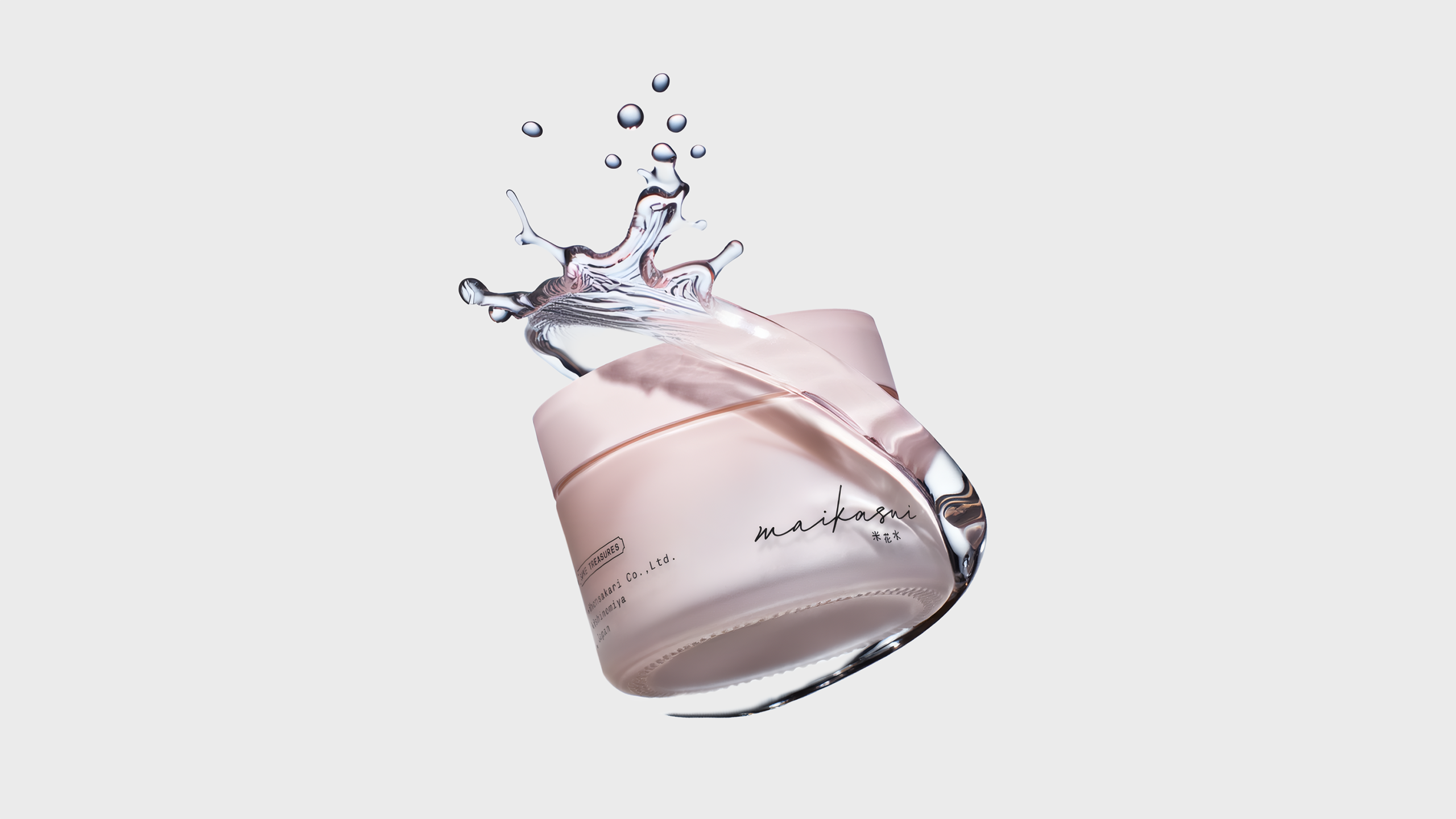
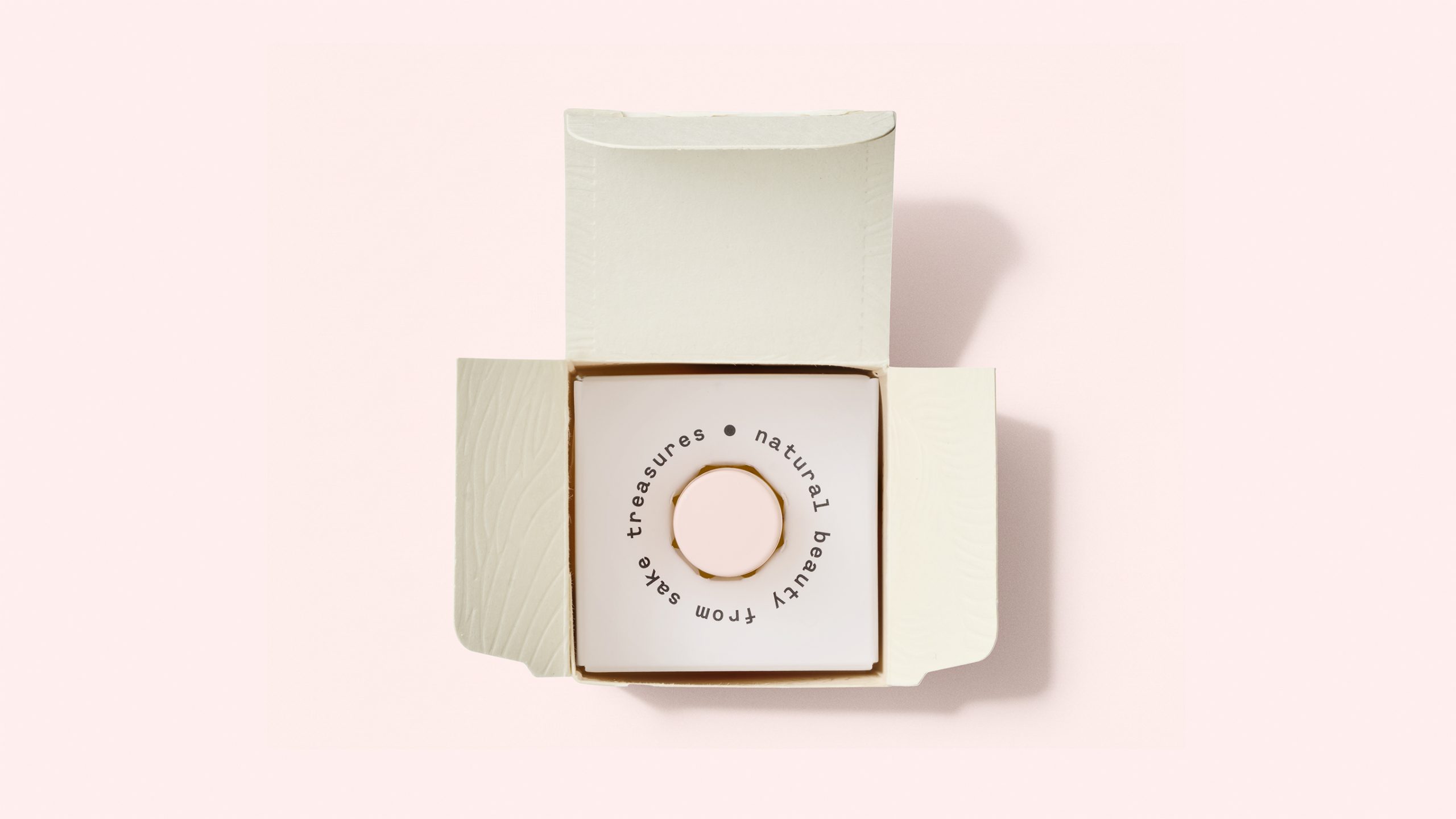
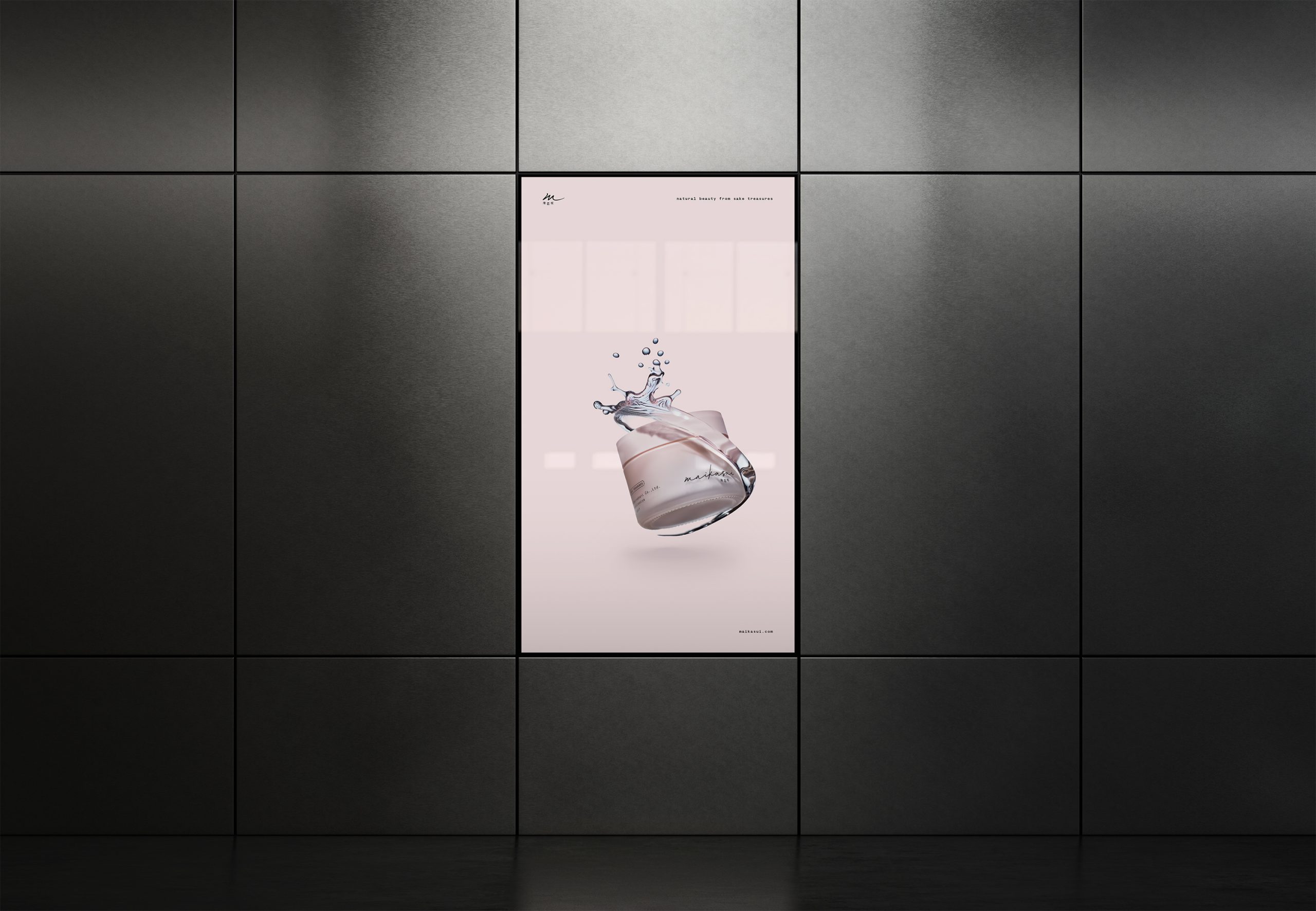
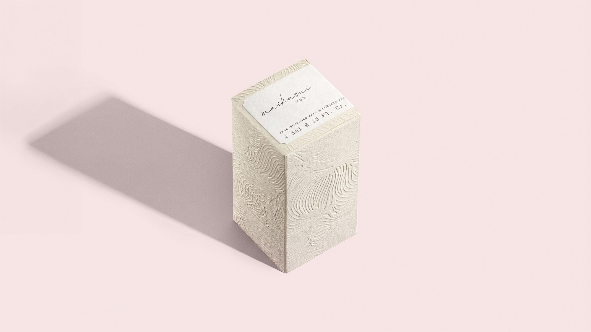
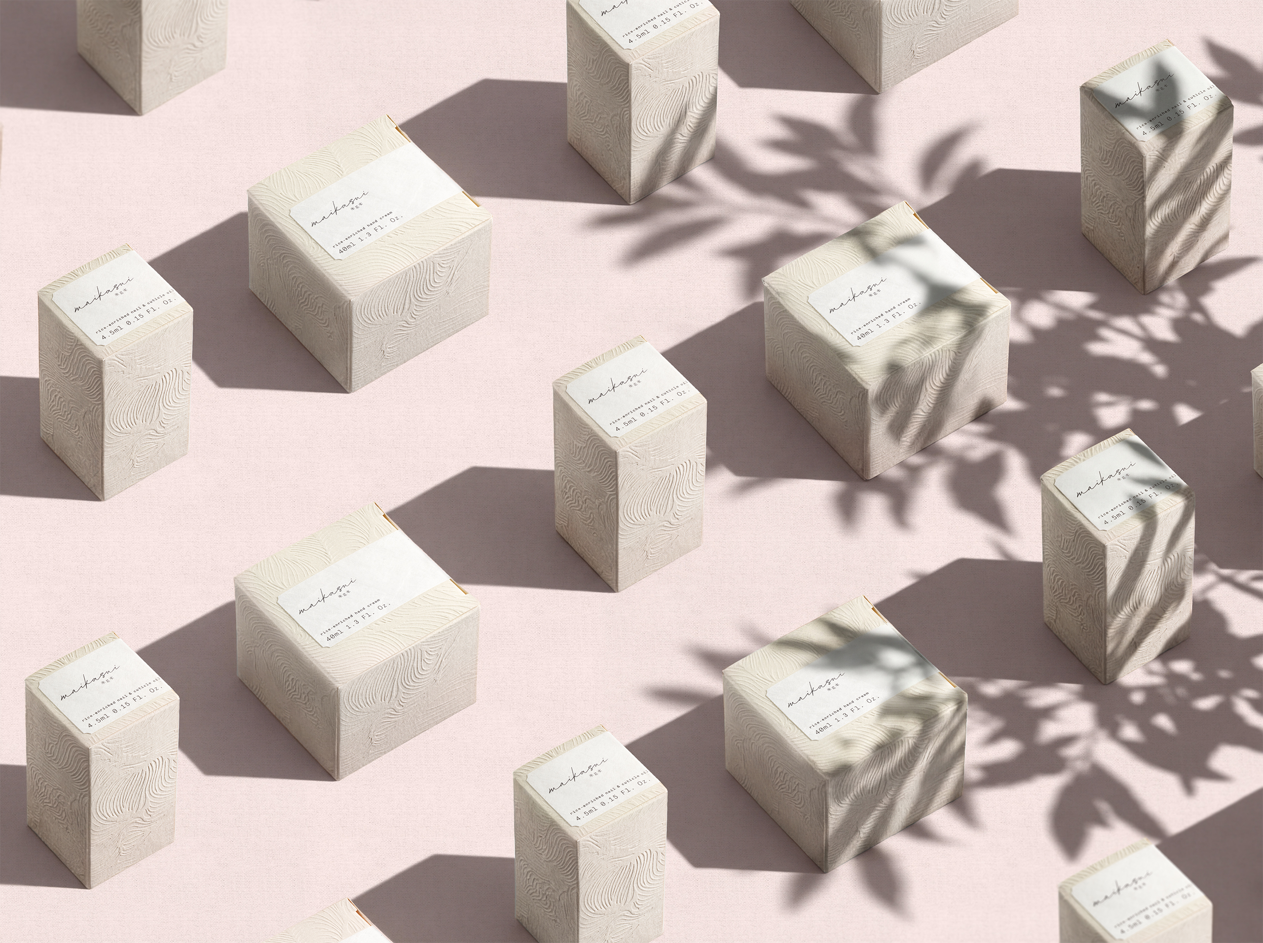
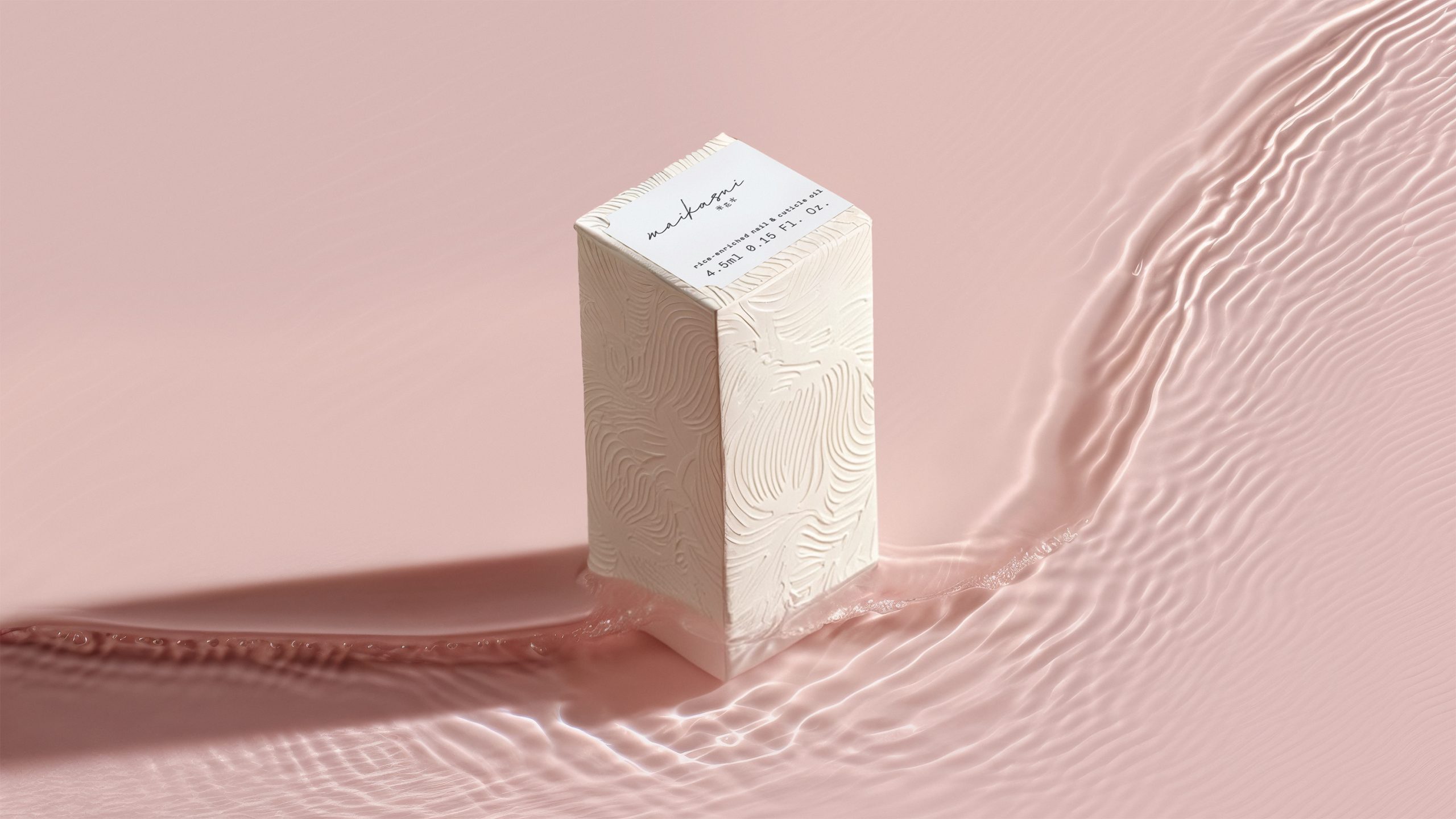
maikasui’s pack design has a soft, almost weightless feel. Pink was selected not only for its traditional Japanese connotations of femininity and gentleness but also because it is the unique color of the distillery’s proprietary yeast.
The overall packaging project follows principles of sustainability, starting from the materials: glass for the containers and paper for the boxes.
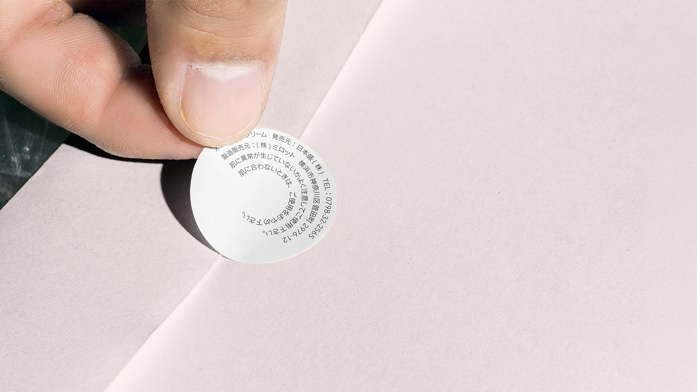
More precisely, the box is made of kome-kami, a special Japanese paper produced from discarded rice, creating a beautiful connection to the product while combating the impact of food waste. The ‘box decor is obtained with the technique of embossing, gentle and tactile, which also allows us to use no ink at all.
Website
For the website, we adopted a unique approach, both from a creative and technological standpoint: since maikasui offers a day-round hand care routine, we developed detailed cinemagraphs showing Japanese women in diverse settings and at various times of the day, always with their maikasui products close at hand.
The scenes are dynamically synced with the current time in Japan’s time zone, while allowing the user to scrub the timeline and see all the different moments of the hand care routine.
Social Media Presence
maikasui’s narrative is all about a woman’s everyday moments. Consistently, the presence on social media takes that very approach: the product’s images are intertwined with snapshots of life, warm and delicate.
—
Agency: Sublimio
Creative Director: Matteo Modica
Strategist / Copywriter: Andrea Ciulu
Developer: Marco Catone



 Li Jie
 Lung-Hao Chiang
 Alessandro Ammaturo
 Antonia Skaraki
 Narrow House Packaging Branding & Design
 teresaredon
 Eva Chistyakova
 Akshay 11
 cheleto
 nadayasser13e
 hello ocean
 Modern Theory
 Alexander Skurihin
 Valérie Colace
 Squad
Squad Studio Zak
 Bhumika Singh
 宏洛图品牌设计HONGLT