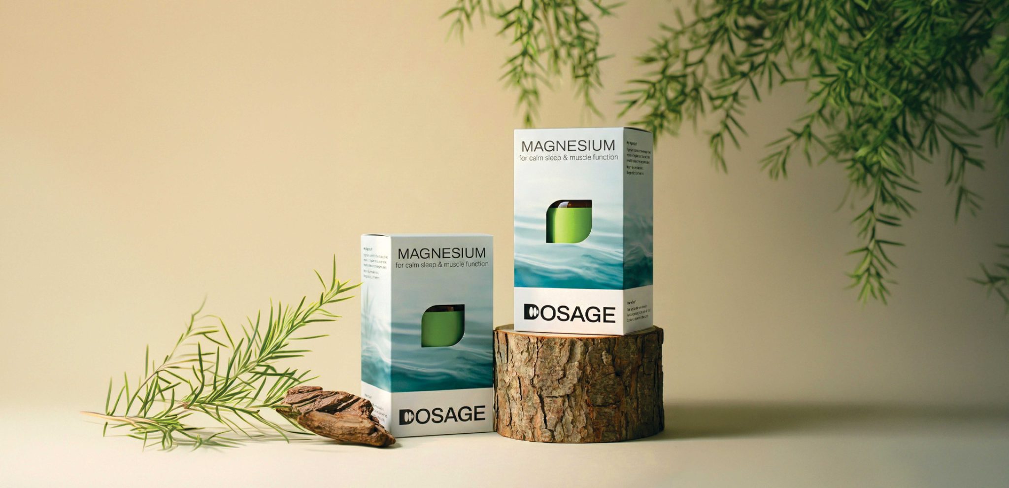

What is the product about?
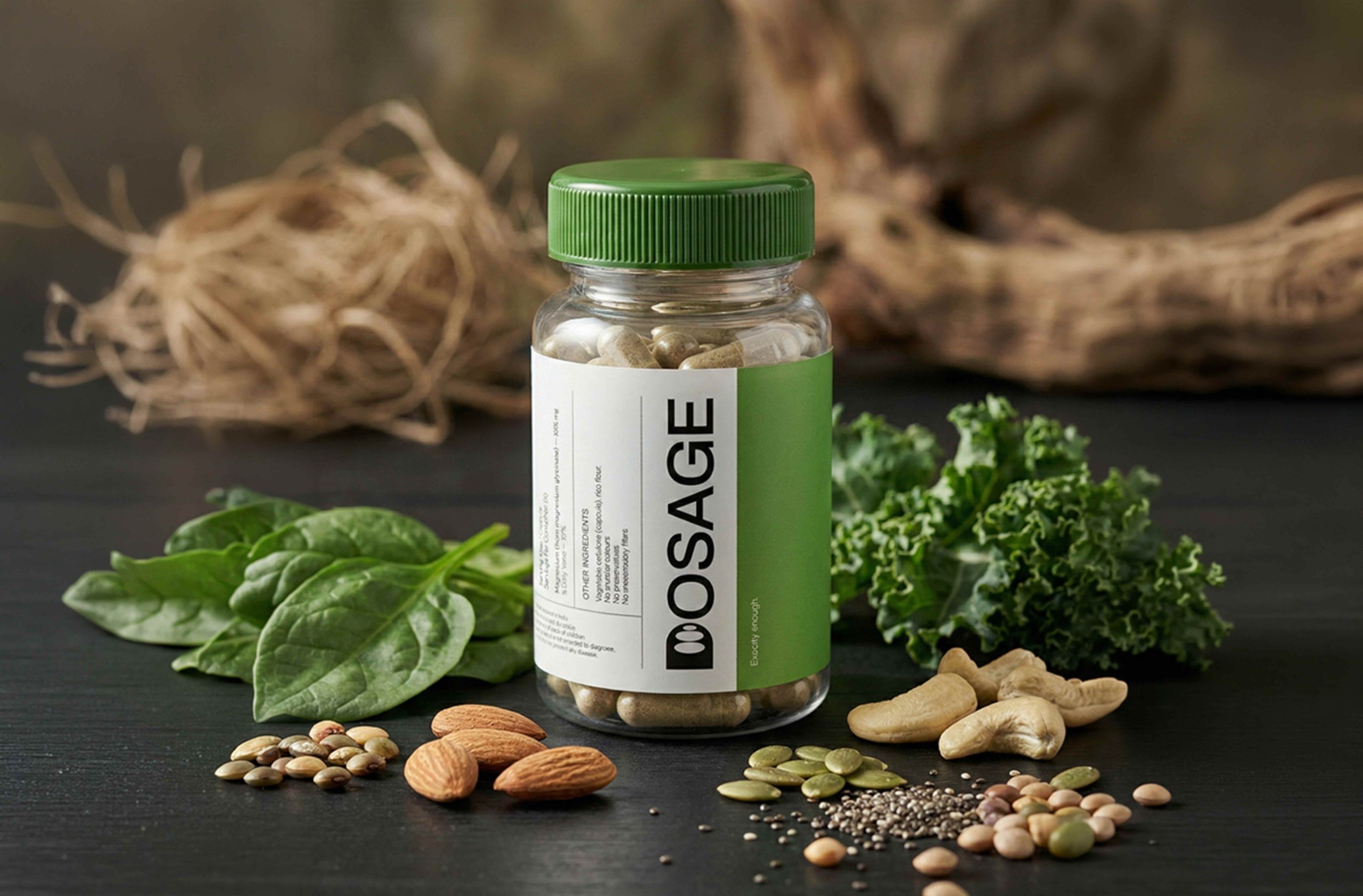
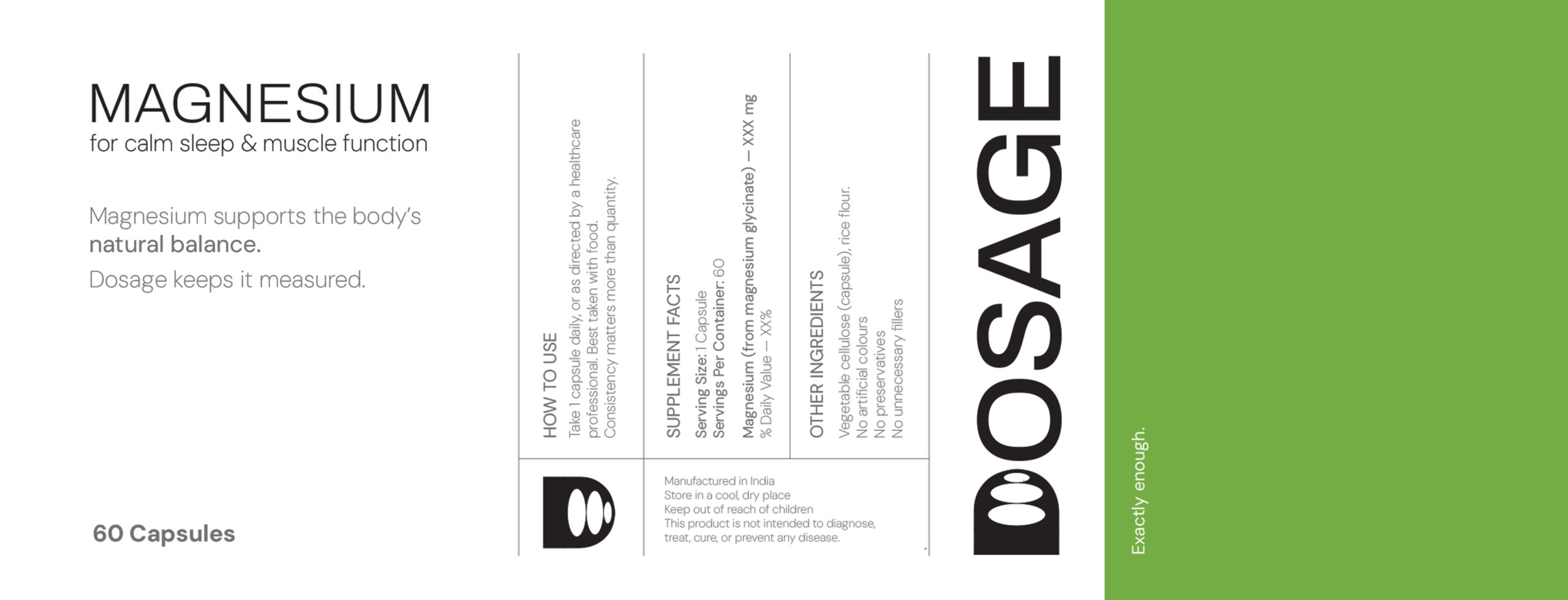
The current supplement market forces consumers into two polarizing extremes: the “Clinical Aisle” (sterile, anxiety-inducing, and pharmaceutical) or the “Performance Aisle” (aggressive, neon, and pressure-driven). Both extremes treat the user as a project to be fixed, often selling dependency rather than health. DOSAGE is a new brand identity designed to occupy the strategic “Goldilocks Zone” between these extremes—balancing the precision of science with the empathy of nature.
The Concept
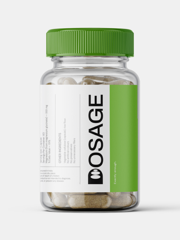
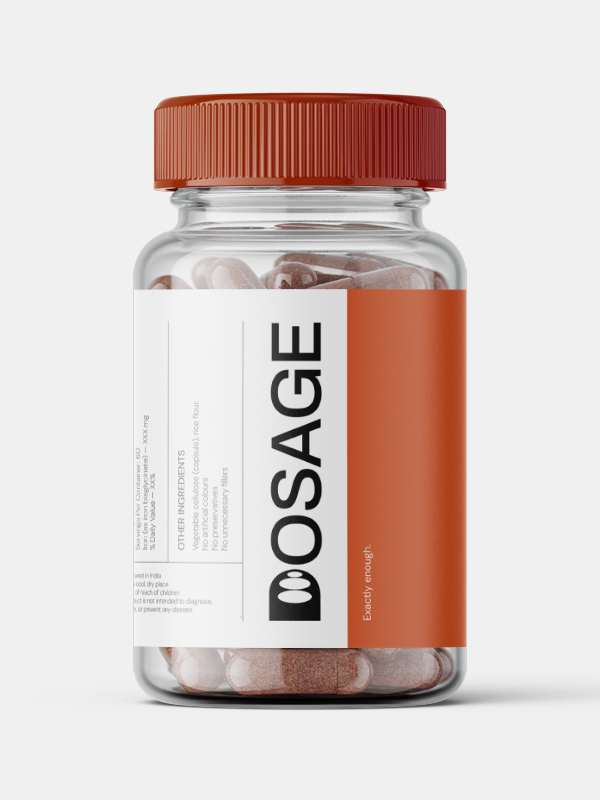
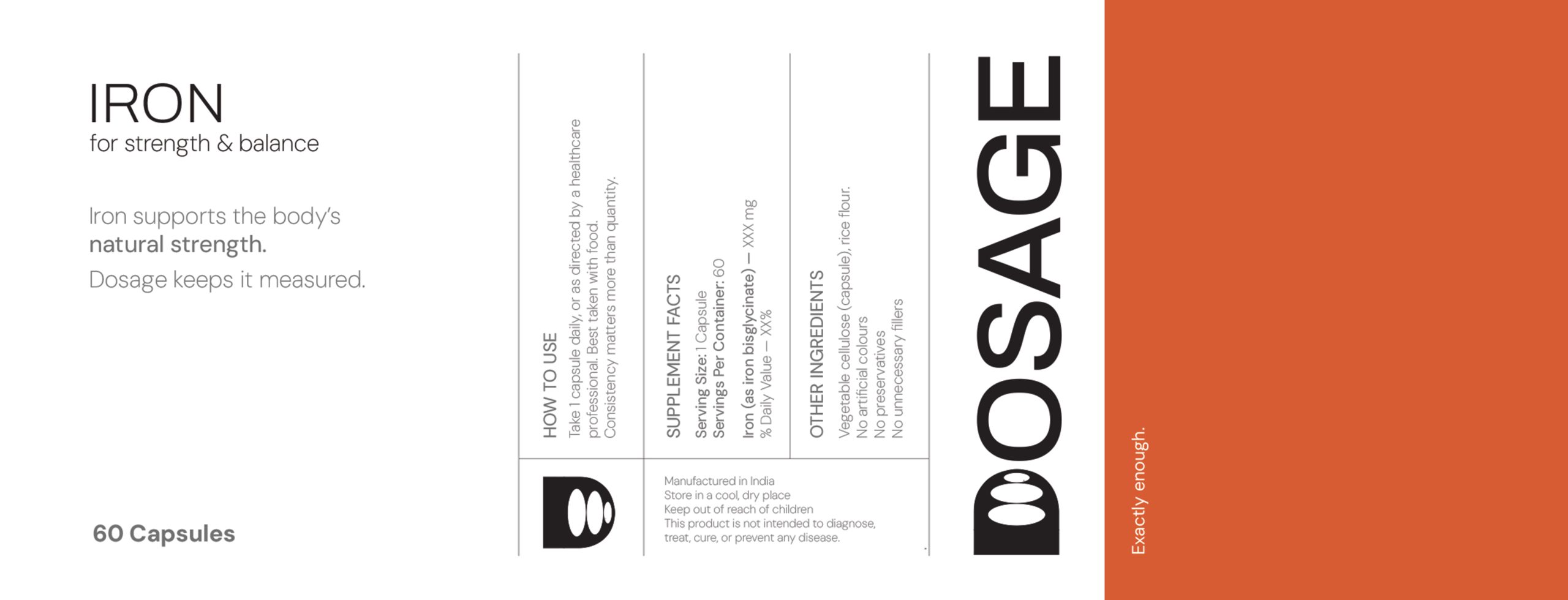
The core philosophy is “Wellness Designed for Independence.” Unlike competitors who aim for lifetime retention, DOSAGE is designed to restore the body’s natural balance until the supplement is no longer needed. This is visualized in the Logo Identity, where the “D” icon features concentric circles that recede in size—a data visualization of the goal to “reduce the dosage” over time.
The Design Solution (Aesthetics & Functionality)
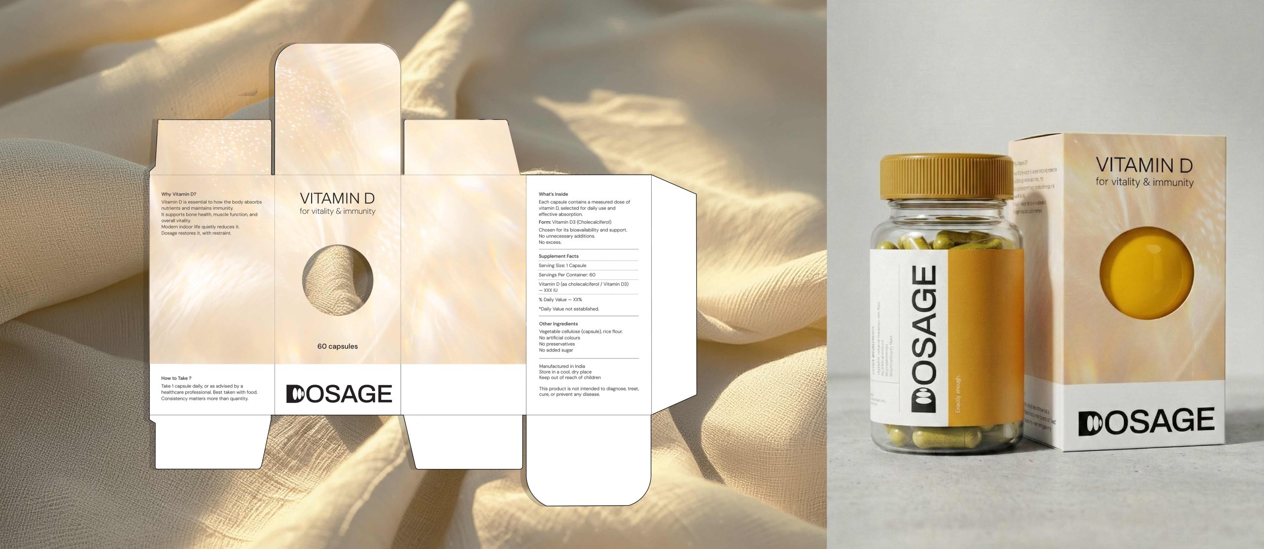
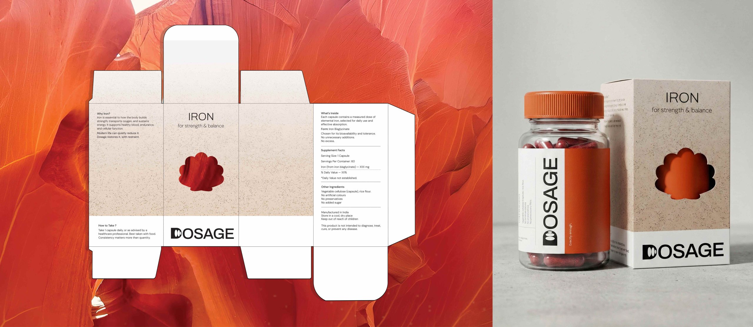
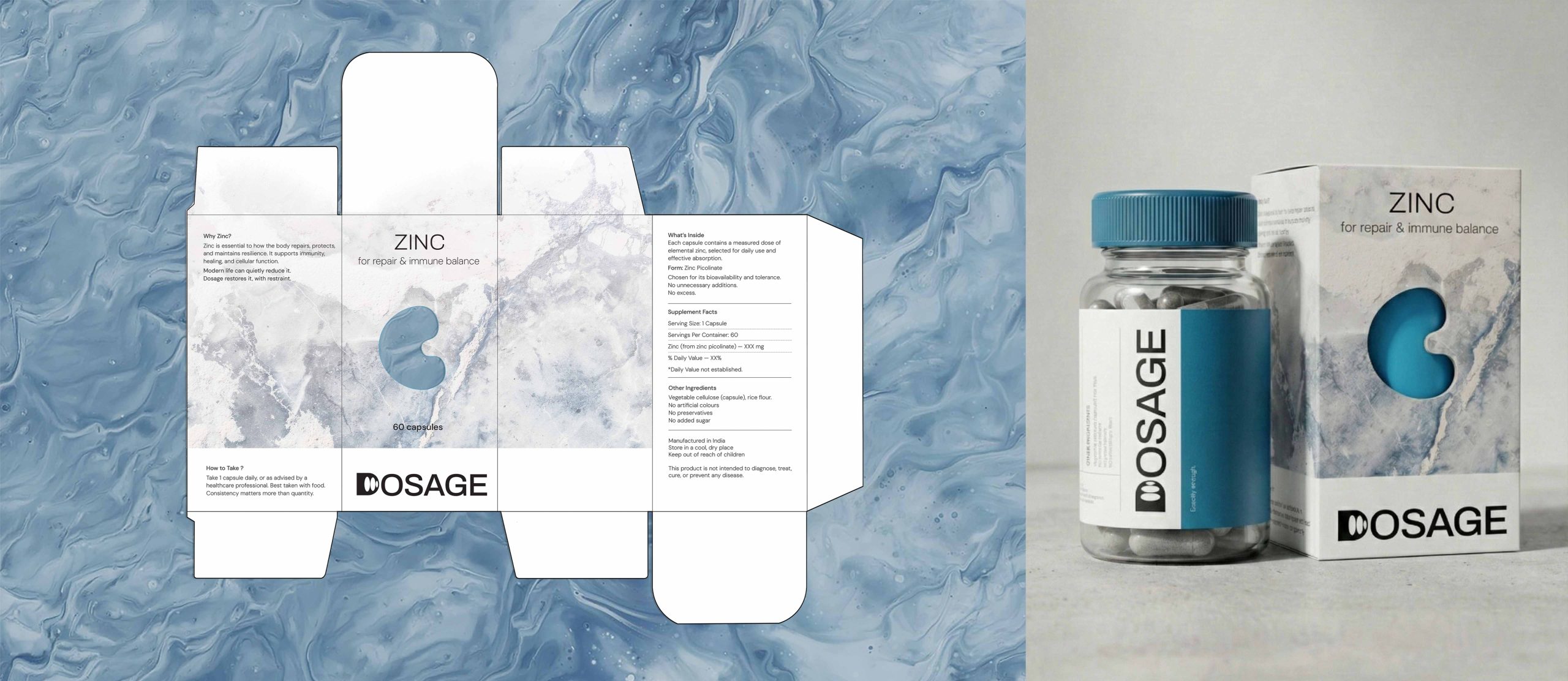
To bridge the gap between “Clinical” and “Natural,” we developed a Dual Narrative Packaging System:
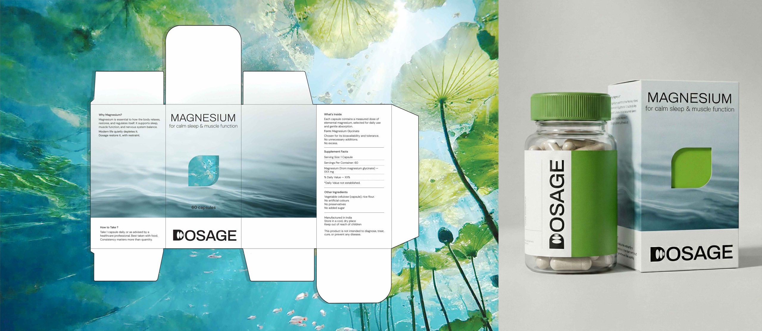
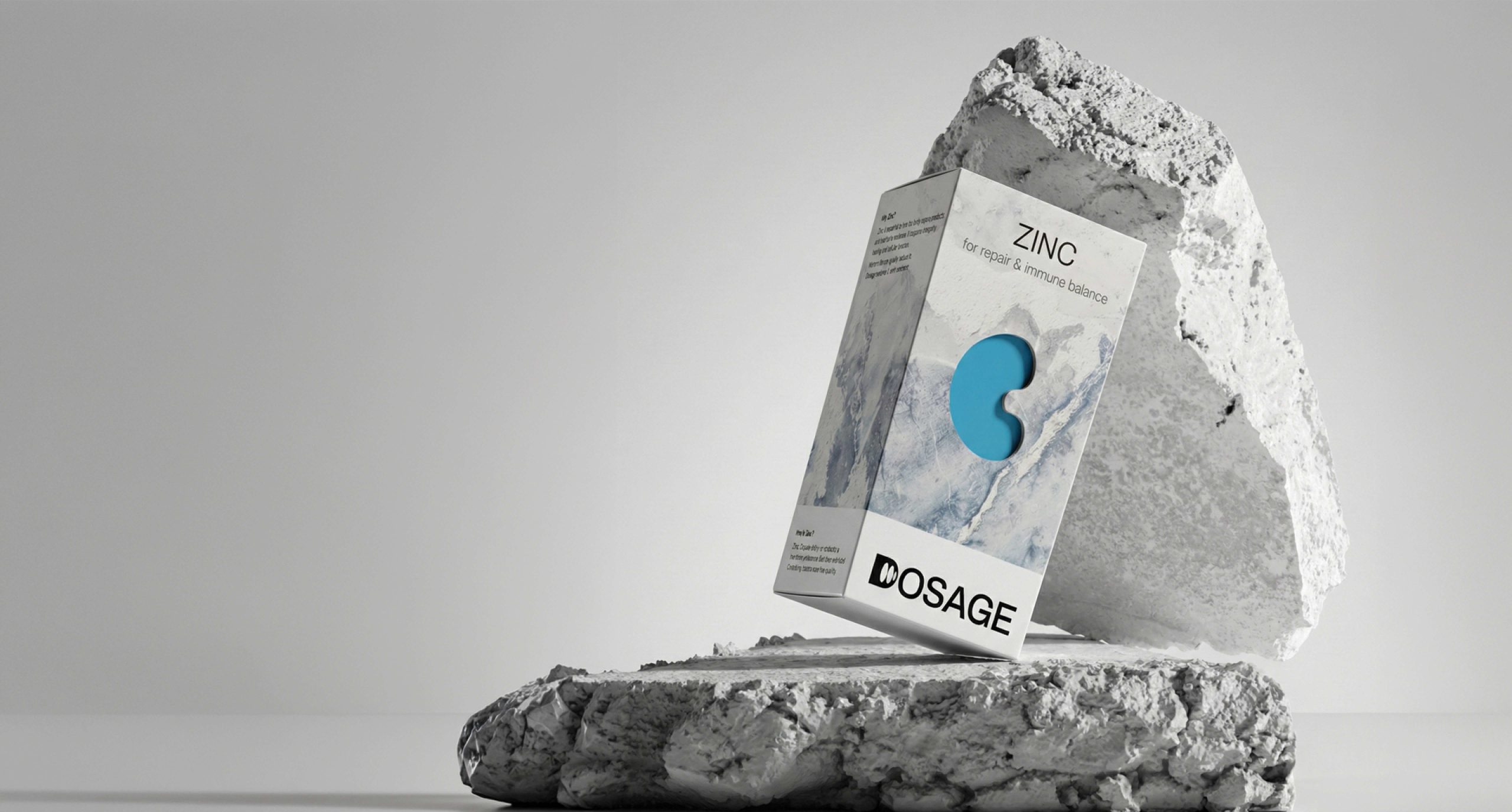
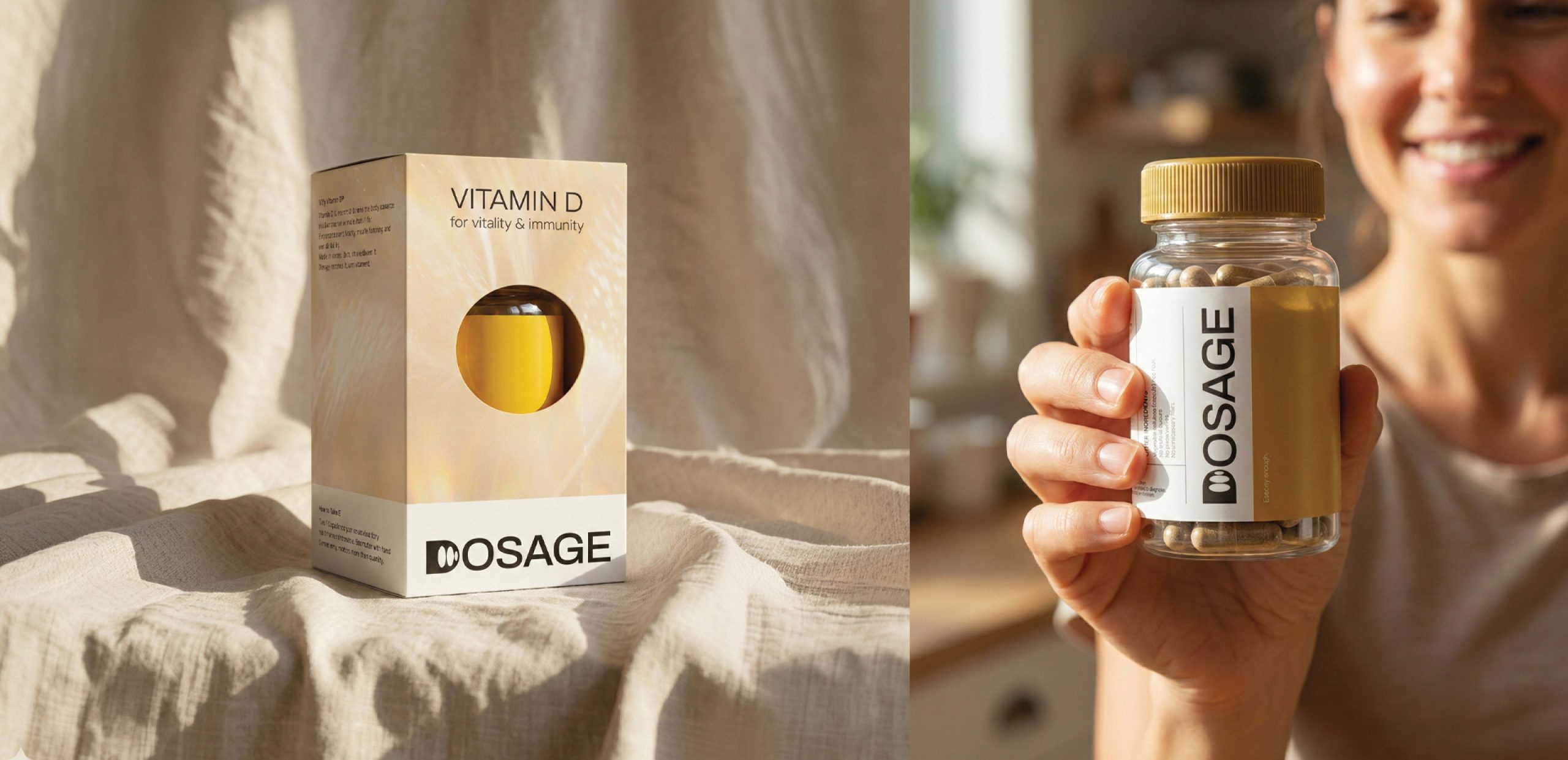
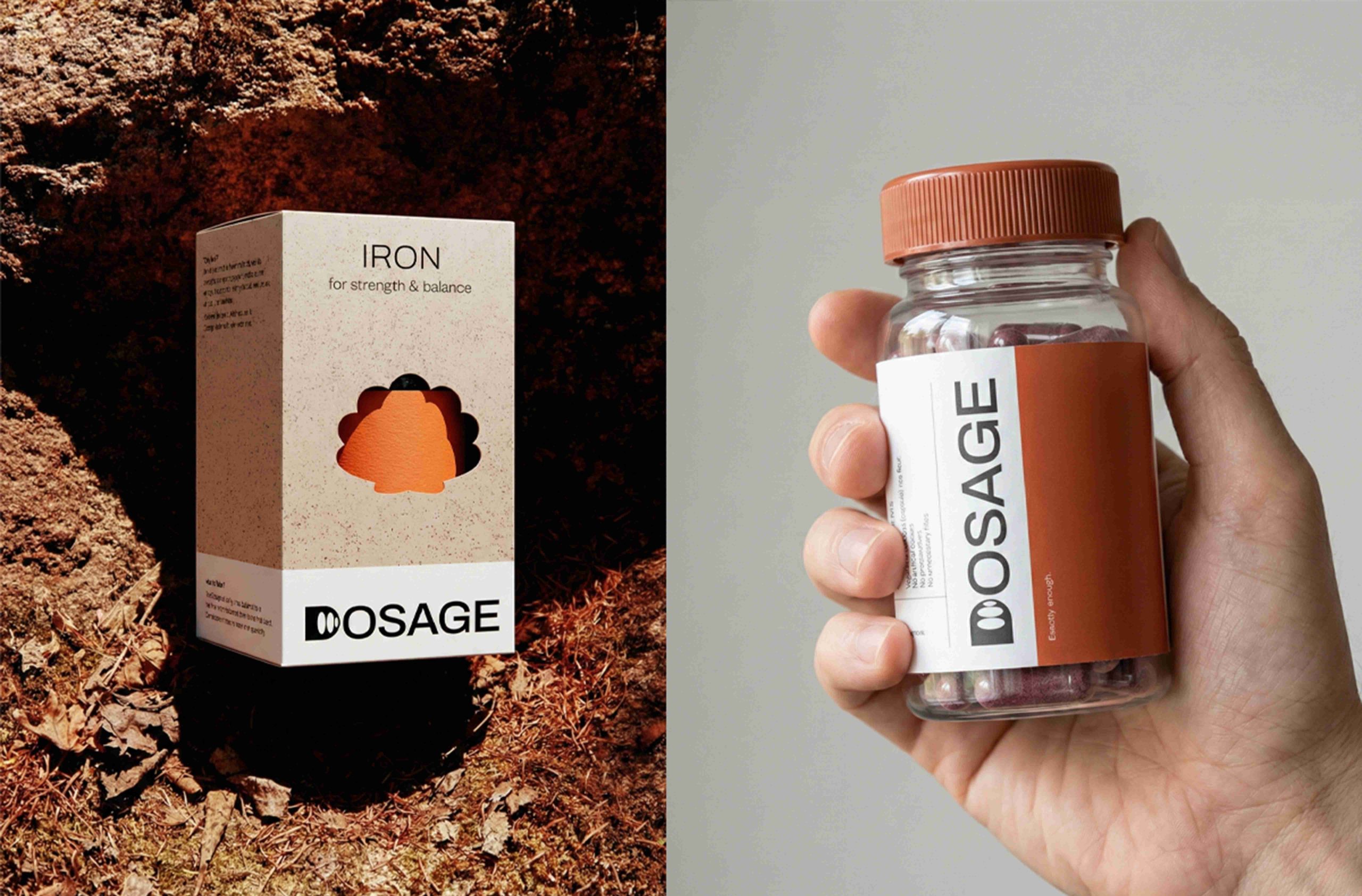
The Exterior (The Somatic Layer): We replaced clinical text with atmospheric textures (Water, Sunlight, Stone, Ice) that evoke the somatic feeling of the benefit—Calm, Vitality, Strength, Resilience.
The Structural Innovation (Usefulness): A central die-cut window connects the abstract texture to the ingredient. The window is shaped like the natural source of the element (Leaf for Magnesium, Sun for Vitamin D, Shell for Iron), allowing the user to instantly recognize the product’s origin without reading fine print.
The Interior (The Clinical Layer): Inside the emotive box sits a stark, minimal white bottle. This validates the brand name “DOSAGE,” ensuring the user feels the safety and precision of the product once unboxed.
What is unique?
Most supplement packaging shouts “Look at me!” with bright colors or “Trust me!” with sterile white space. DOSAGE is unique because it uses texture and silence to stand out. It transforms a medical commodity into a piece of interior decor, respecting the user’s intelligence by offering clarity on the source and comfort in the application.
Technique & Materials :
The exterior packaging utilizes high-quality textured cardboard with precision die-cutting to create the “Source Aperture.” The inner vessel is transparent pharmaceutical-grade glass
 Derrick Lin
 monther al omari
 43oz
43oz lilyz design23
 Modern Theory
 Eighteen Brand Studio
 Bhumika Singh
 MohamedMashaly
 Pixels Studio
 Gulya
Gulya UPRISE
 Lizaveta Kharitonyuk
 Bonsanco Creative Studio
 DesignRepublic
 GIRAFA STUDIO
 PiotrWisniewski
 Sophiagdotcom
 CreativeWise
 SoreThumbStudio®
 Modern World Studio
 Palashcc
 Valérie Colace