Introducing SALTFLK—a Swiss Brand*
A minimal label system built around contrast, clarity, and shelf impact.
Brand Design: AGrafix Design Studio
AGD © 2026
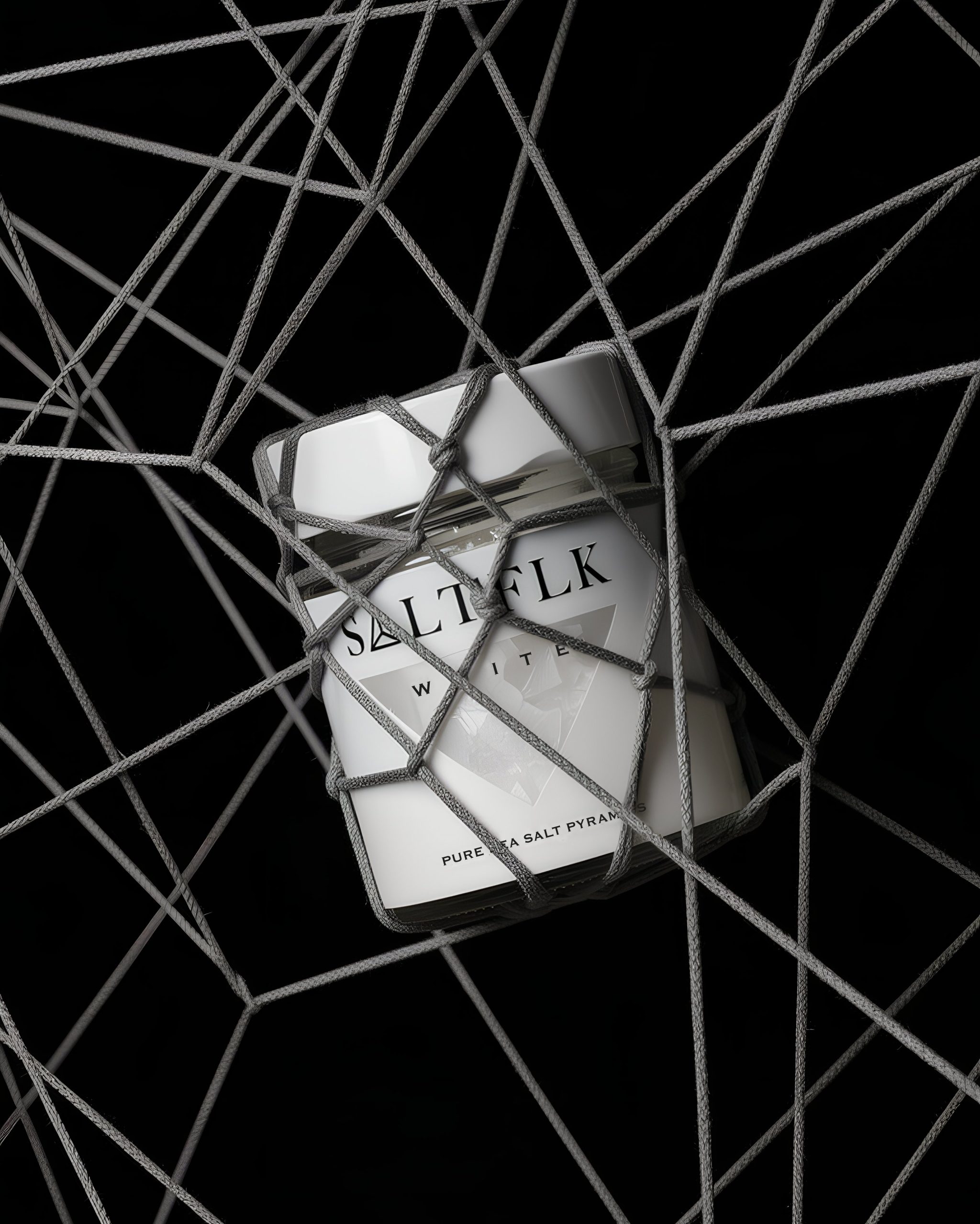
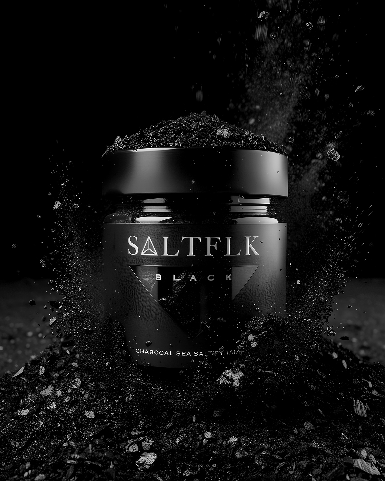
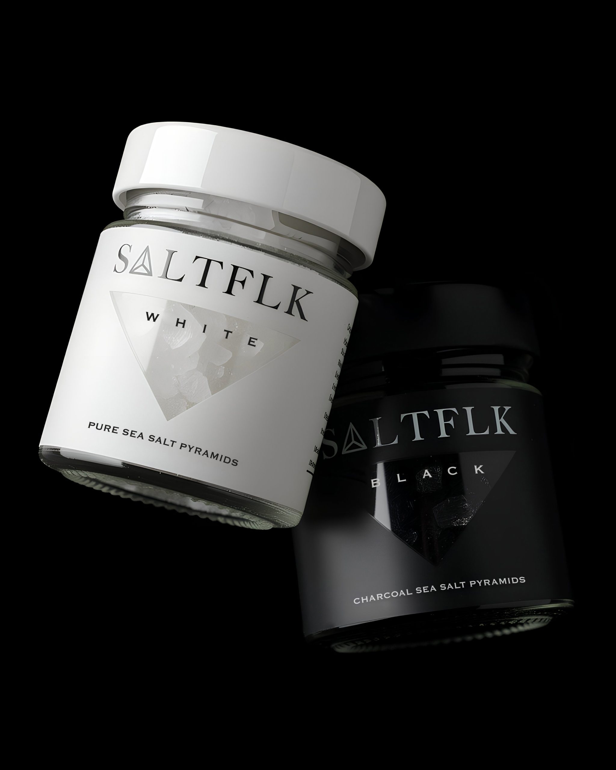
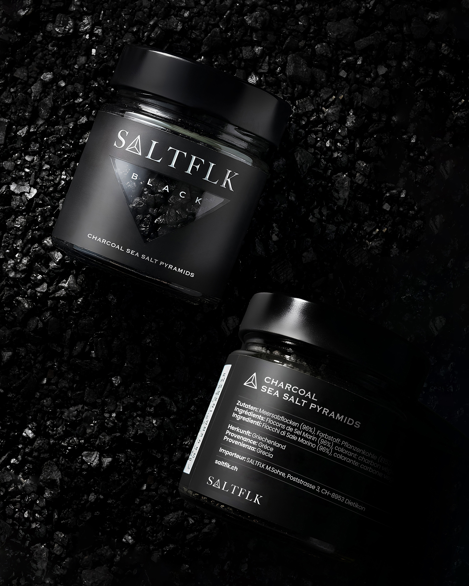
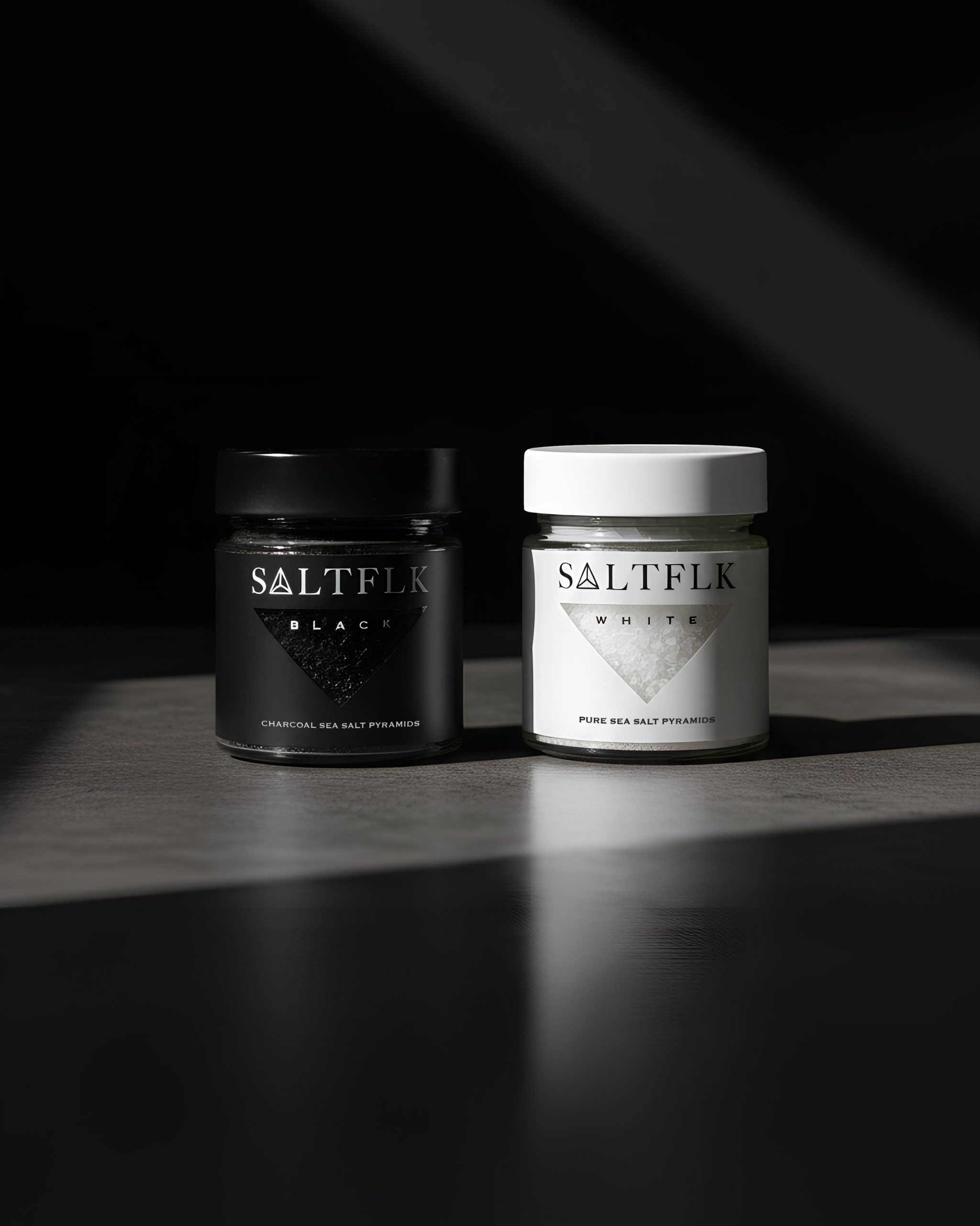
SALTFLK is positioned as a contemporary gourmet salt brand defined by architectural minimalism and sharp visual contrast. The identity centers on a bold triangular window motif, directly referencing the pyramid structure of the salt crystals while creating instant shelf recognition. A restrained black-and-white palette distinguishes variants with clarity and sophistication, supported by refined serif typography and generous negative space. The cylindrical glass jar enhances product visibility, reinforcing purity and texture as key visual assets.
Written by Derrick Lin , POTW curator







Comments
0 commentsLog in to comment or submit projects