Curator's PicksSubmit a projectShare your work

Explore by Country

AfghanistanAfricaAlbaniaAlgeriaAmerican SamoaAndorraAngolaAnguillaAntarcticaArgentinaArmeniaAsiaAustraliaAustriaAzerbaijanBahamasBahrainBangladeshBarbadosBelarusBelgiumBeninBoliviaBosnia and HerzegovinaBotswanaBrazilBritish Indian Ocean TerritoryBrunei DarussalamBulgariaCambodiaCameroonCanadaChileChinaChristmas IslandColombiaCosta RicaCote D'ivoireCroatiaCubaCyprusCzech RepublicDemocratic People's Republic of KoreaDenmarkDominican RepublicEcuadorEgyptEl SalvadorEstoniaEthiopiaEuropeFijiFinlandFranceFrench GuianaFrench Southern TerritoriesGeorgiaGermanyGhanaGlobalGreeceGuadeloupeGuatemalaGuyanaHaitiHondurasHong KongHungaryIcelandIndiaIndonesiaIranIraqIrelandIsraelItalyJamaicaJapanJordanKazakhstanKenyaKuwaitKyrgyzstanLatviaLebanonLibyaLithuaniaLuxembourgMacedoniaMadagascarMalaysiaMaldivesMaliMaltaMarshall IslandsMauritiusMexicoMoldovaMonacoMongoliaMontenegroMoroccoMyanmarNepalNetherlandsNew CaledoniaNew ZealandNicaraguaNigeriaNorth AmericaNorwayOceaniaOmanPakistanPalestiniaPanamaPapua New GuineaParaguayPeruPhilippinesPolandPortugalPuerto RicoQatarRepublic of KoreaRepublic of KosovoRomaniaRussian FederationSan MarinoSao Tome and PrincipeSaudi ArabiaSenegalSerbiaSeychellesSingaporeSlovakiaSloveniaSomaliaSouth AfricaSouth AmericaSpainSri LankaSudanSwazilandSwedenSwitzerlandSyrian Arab RepublicTaiwanTajikistanThailandTrinidad and TobagoTunisiaTurkeyTurkmenistanUgandaUkraineUnited Arab EmiratesUnited KingdomUnited StatesUnited States Minor Outlying IslandsUruguayUzbekistanVanuatuVenezuelaViet NamVirgin Islands, U.S.YemenZambiaZimbabwe

Materials

Browse all

Sihong|Crispy French Fries Series
Project: Sihong / Crispy Fries Series
Service: Packaging Design
Channel: All Channels

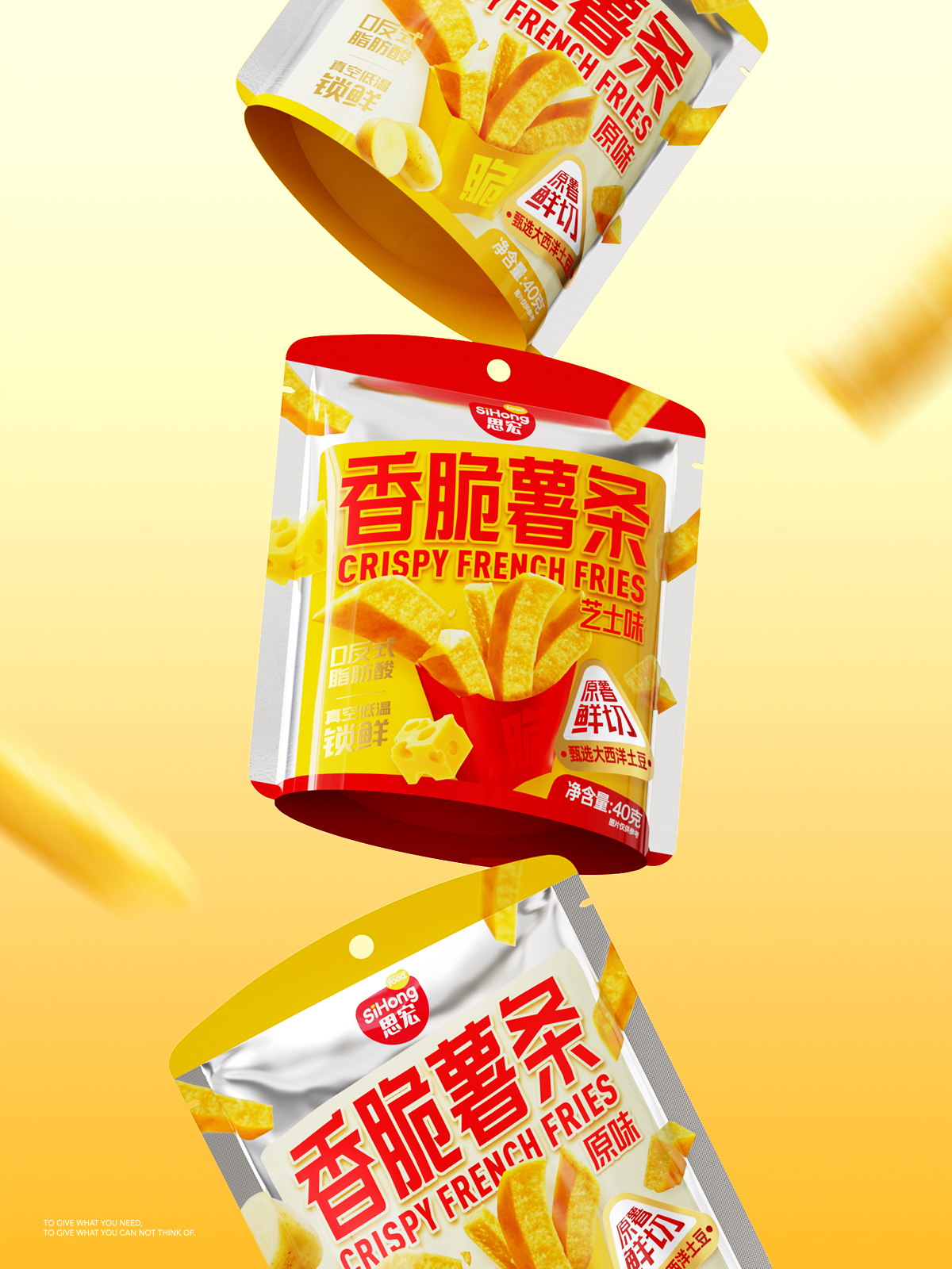
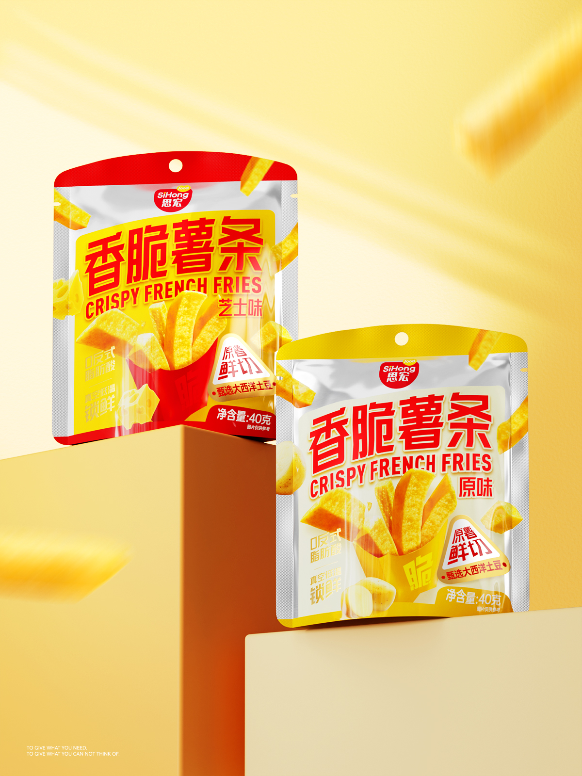
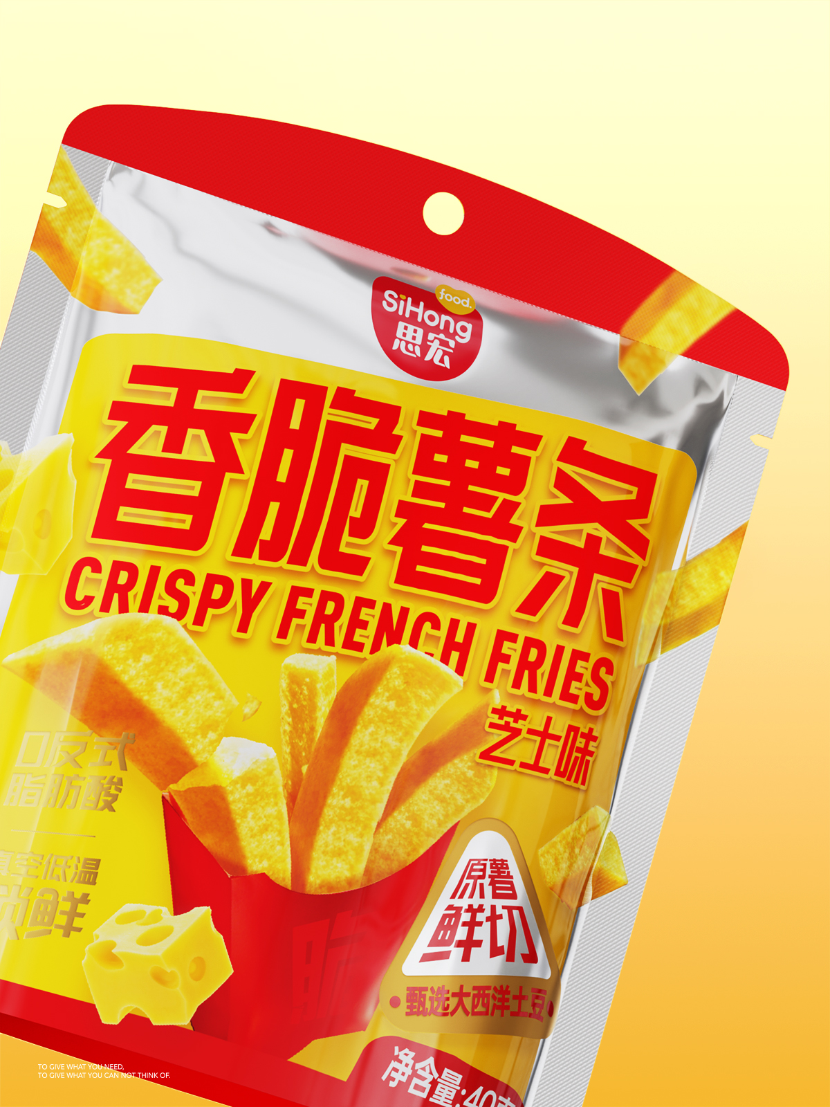
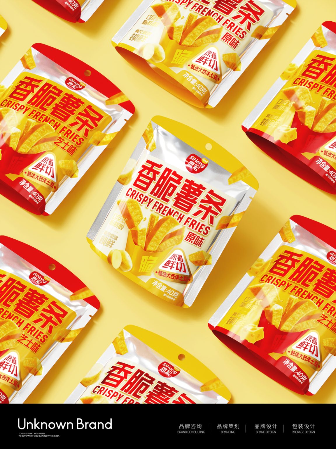
The packaging design for the “Sihong” Crispy Fries series centers on bold visual impact and efficient communication. By aligning with snack consumption scenarios and consumer psychology, the design leverages color, visual symbols, and clear information hierarchy to build strong differentiation in a competitive market.

To enhance shelf presence and unify the product range, red and yellow are used to distinguish flavors, creating a striking color contrast in final displays and improving visibility at retail. An oversized, golden crispy fry takes center stage, instantly highlighting the product’s crunchiness and stimulating purchase desire. Key selling points such as “Zero Trans Fat,” “Vacuum Low-Temperature Freshness,” and “Selected Atlantic Potatoes” are prominently featured to communicate quality and trustworthiness.

The product is packaged in a stand-up pouch with a hanging hole, making it suitable for both supermarket shelves and convenience store peg displays. Overall, the youthful visual language—bright colors paired with clean graphics—positions “Sihong” as a modern, healthier snack option, helping establish a distinctive brand identity and supporting stronger purchase decisions.
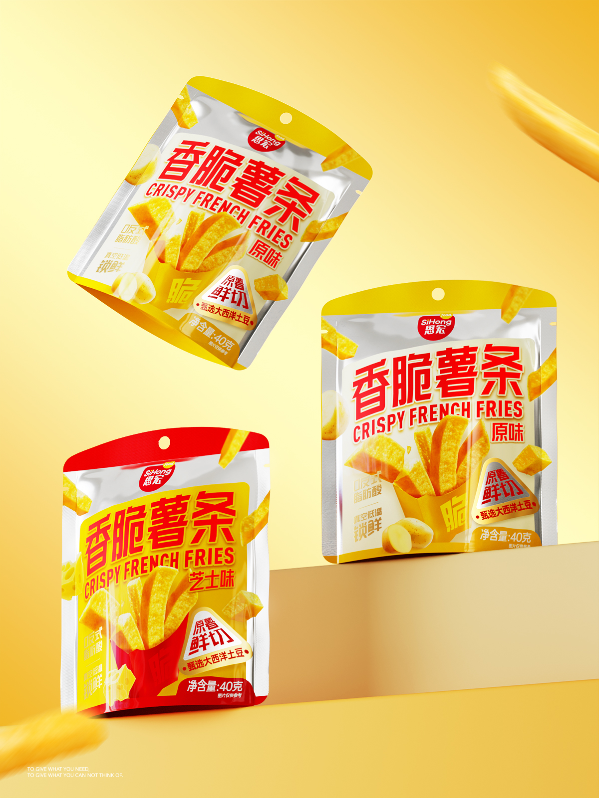
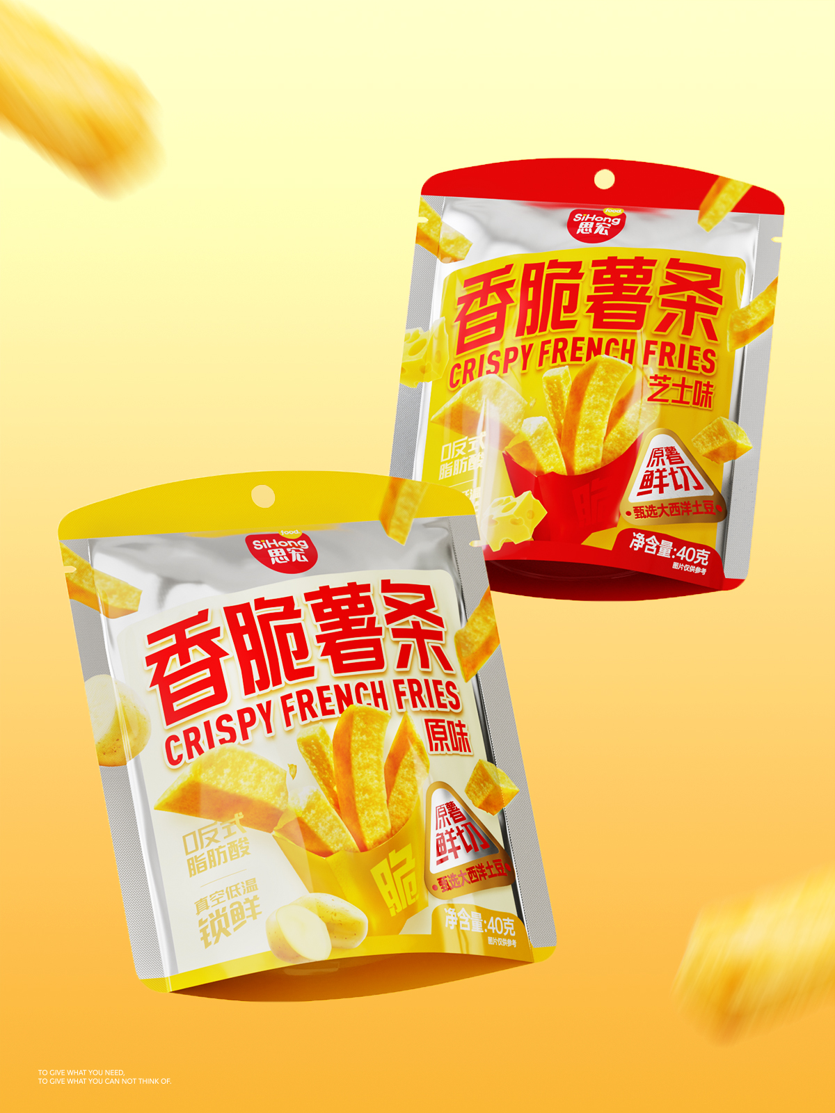
Sihong|Crispy French Fries Series, food packaging design by UNKNOWN.BRAND, China. Image 1 of 5.Sihong|Crispy French Fries Series, food packaging design by UNKNOWN.BRAND, China. Image 2 of 5.Sihong|Crispy French Fries Series, food packaging design by UNKNOWN.BRAND, China. Image 3 of 5.Sihong|Crispy French Fries Series, food packaging design by UNKNOWN.BRAND, China. Image 4 of 5.Sihong|Crispy French Fries Series, food packaging design by UNKNOWN.BRAND, China. Image 5 of 5.

Comments

0 comments