

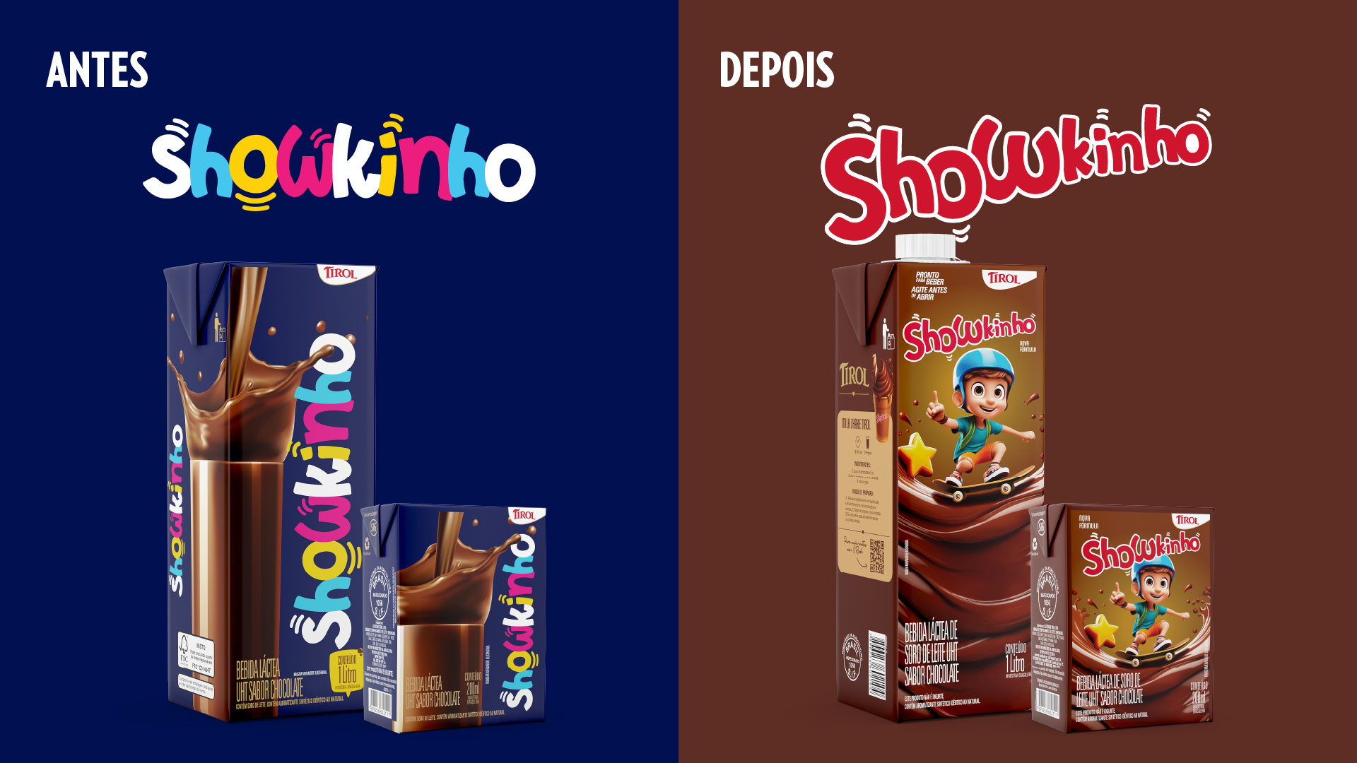
The rebranding project for the Tirol Showkinho line was designed to modernize the brand while reinforcing its relevance and competitiveness within the children’s market. The main challenge was to evolve its visual identity without losing the recognition already built, ensuring continuity while elevating its presence and impact at the point of sale.
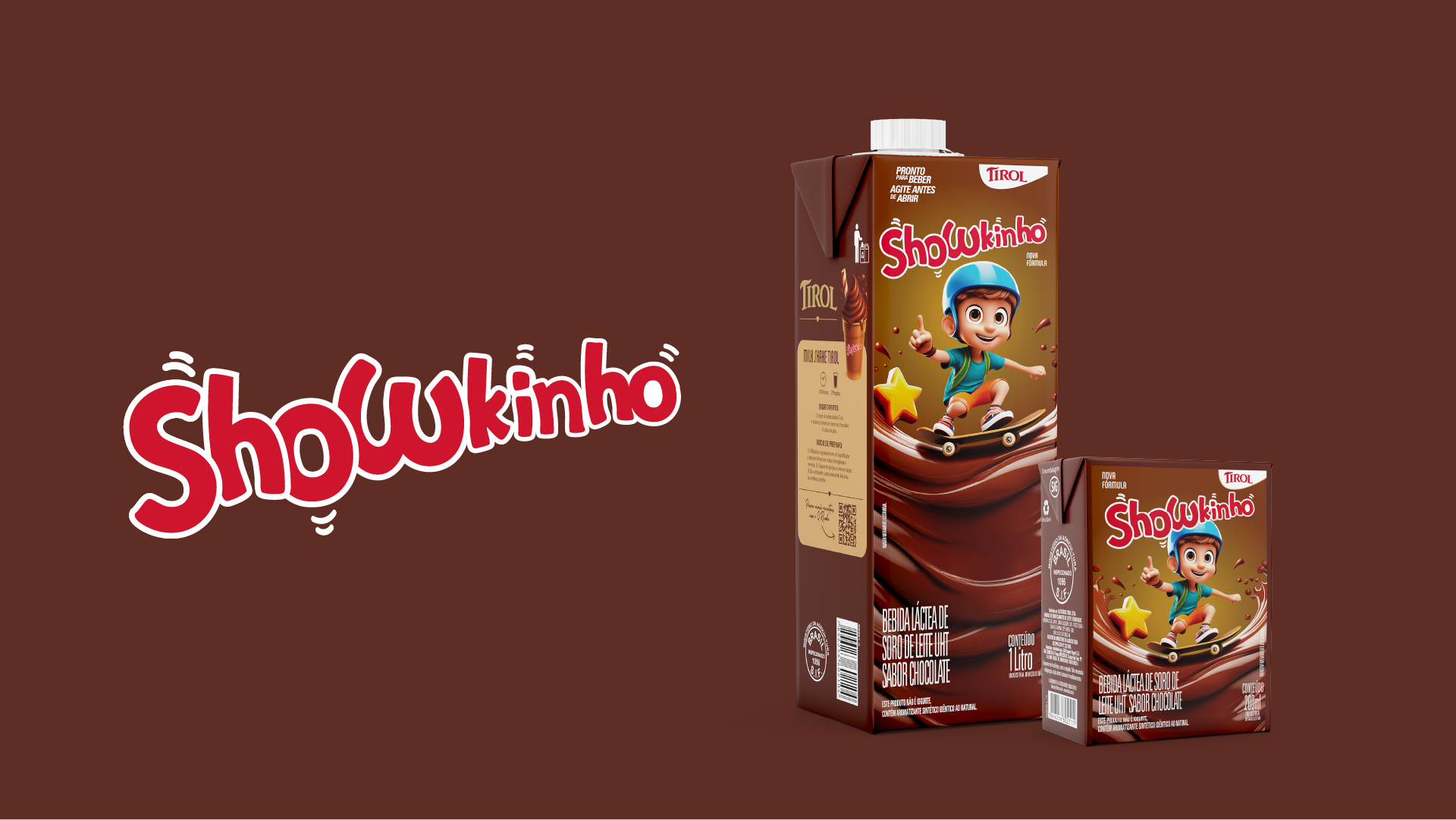
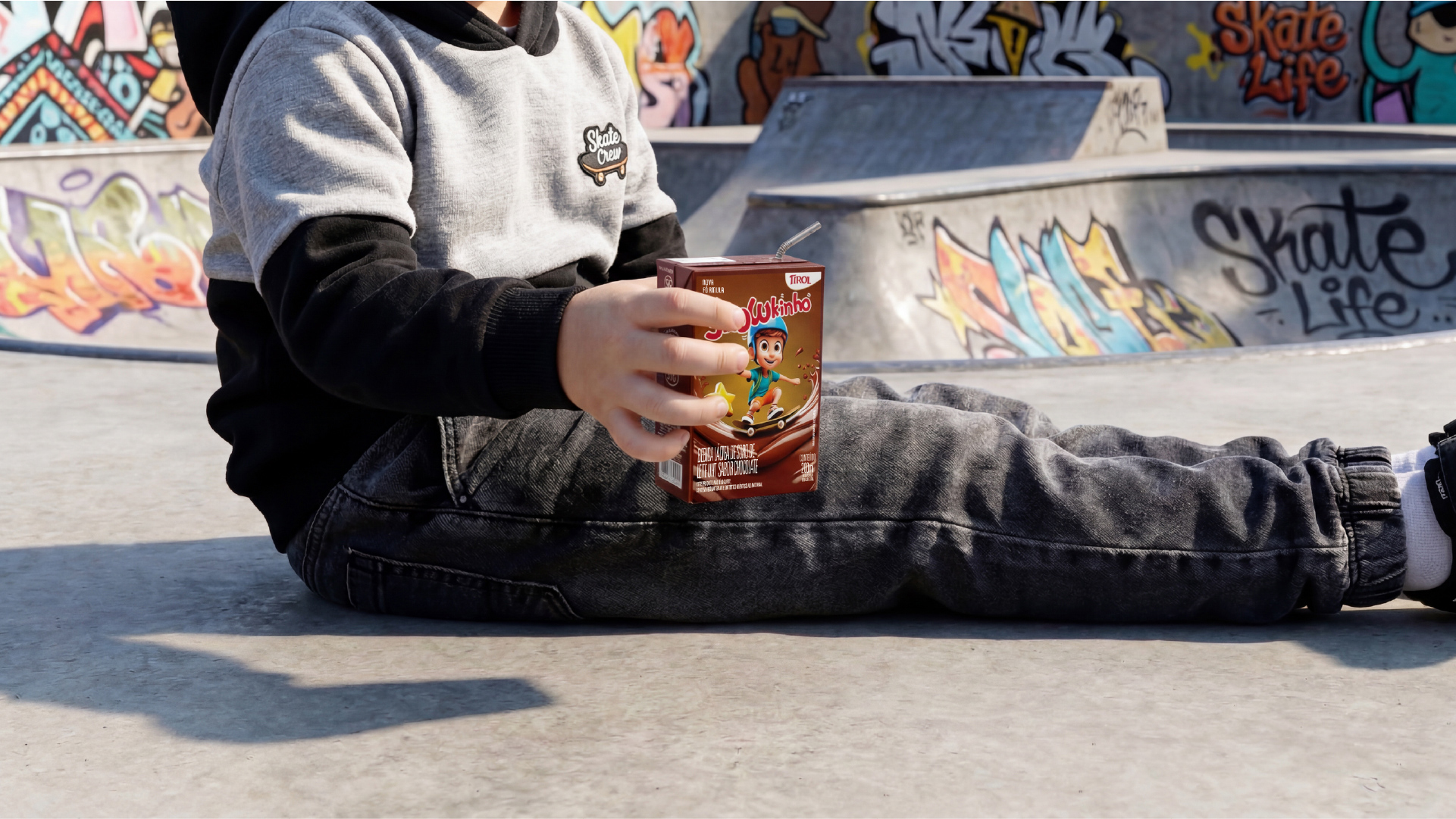
Based on this strategic direction, we developed a new visual language that is more dynamic, vibrant, and engaging, fully aligned with the behavior, universe, and expectations of the kids’ audience. Colors, shapes, and graphic elements were carefully explored to create a more playful and immersive brand experience. As a central pillar of the project, we created a proprietary character, designed to bring personality, emotional connection, and consistency to the brand’s communication across different touchpoints.
In the packaging redesign, special attention was given to the hierarchy of information, ensuring a clear, quick, and intuitive reading flow. Key product attributes were highlighted to support decision-making, while the overall composition was structured to maximize shelf visibility and differentiation. The visual system balances strong child appeal with clarity and organization, connecting attractiveness with trust — an essential factor for parents at the moment of purchase.
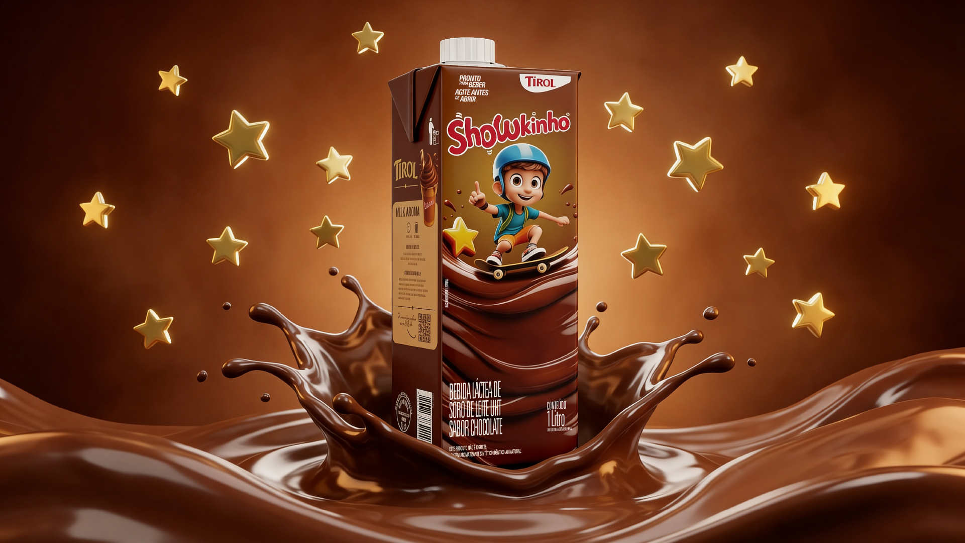
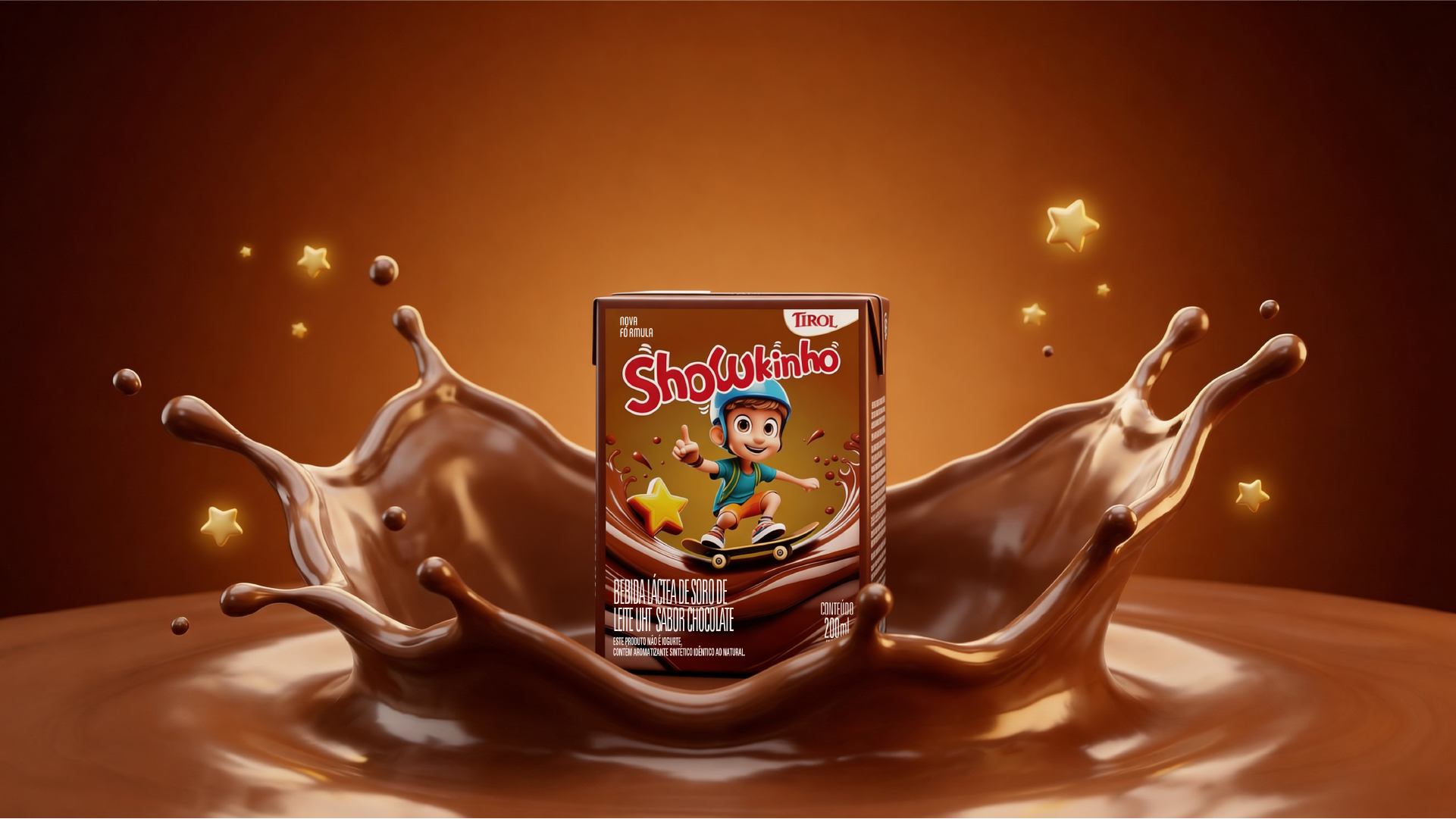
The result is a more contemporary, expressive, and strategically positioned brand, with greater visual impact, stronger shelf presence, and an enhanced ability to connect meaningfully with its audience.


 Studio Zak
 Ander Sanchez
 Atipus
 Widarto Impact
 hovski
 Ohmybrand
 CreativeWise
 Rauf Karaev
 Hooperstudio
 La Nube de Ideas
 Modern Theory
 Akim Melnik Design Studio
 preflightcreative
 Seyf El Haq Menouer
 Badraddine Attik
 Samriddhi Ravi
 Alessandro Ammaturo
 Amblr Studio
 vladlenalevit
 Sis Tsarukyan
 monther al omari
 alchimistestudioParis
 designsbysukaina
 About House of Ta
 Amjad Battal