

Bonaventure Rum was built around a maritime legend brought back to life through design. The brand takes inspiration from the story of The Edward Bonaventure, a ship said to have sailed through the Caribbean carrying a rum so rare and coveted that nature, in an act of jealousy, claimed it as its own.
Rather than treating the story as a literal historical reconstruction, the project approaches it as a visual myth — a world of lost cargo, stormy seas, hidden recipes, old maps, maritime symbols and Caribbean mystery. The goal was to create a rum brand that felt discovered rather than invented.
The identity is rooted in the tension between elegance and danger. On one side, Bonaventure speaks to the refinement of a premium spirit: aged character, depth, craft and heritage. On the other, it carries the drama of the sea: the shipwreck, the storm, the unknown, the idea of a treasure preserved by time. This contrast became the foundation for the brand’s visual language.
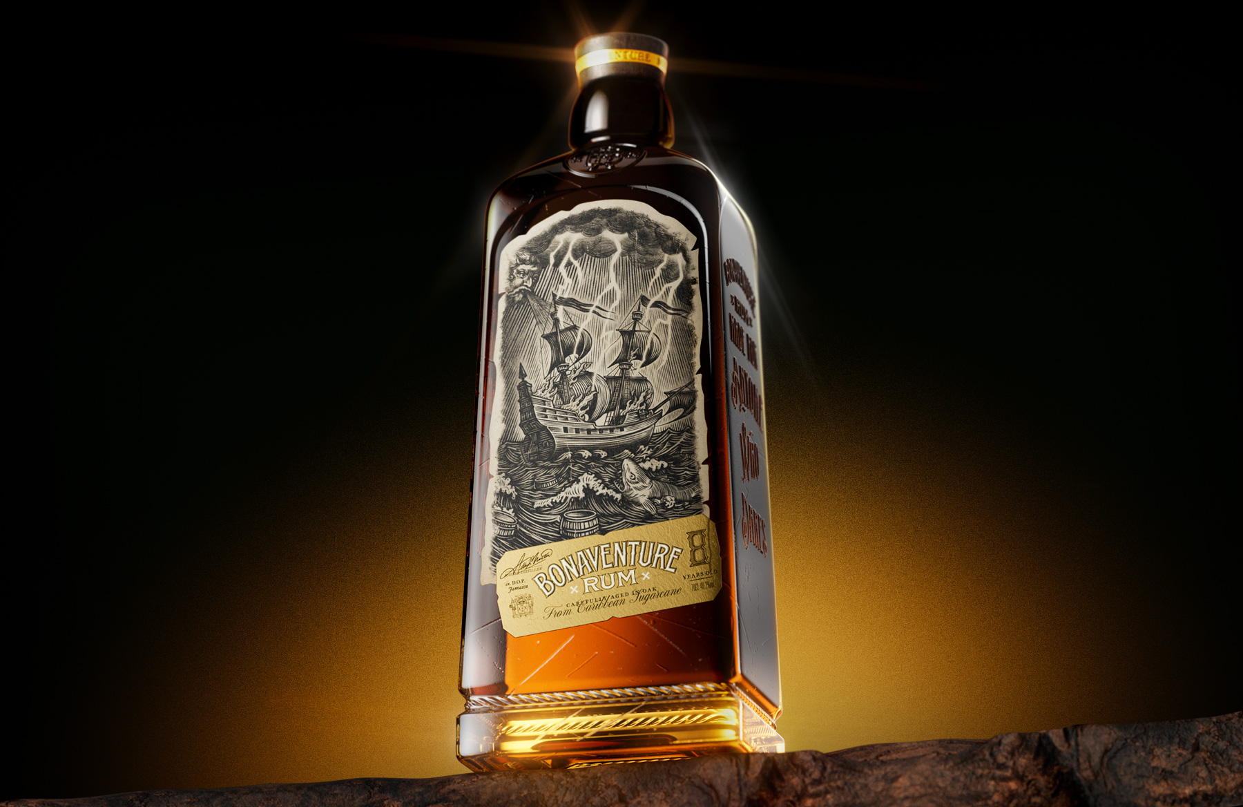
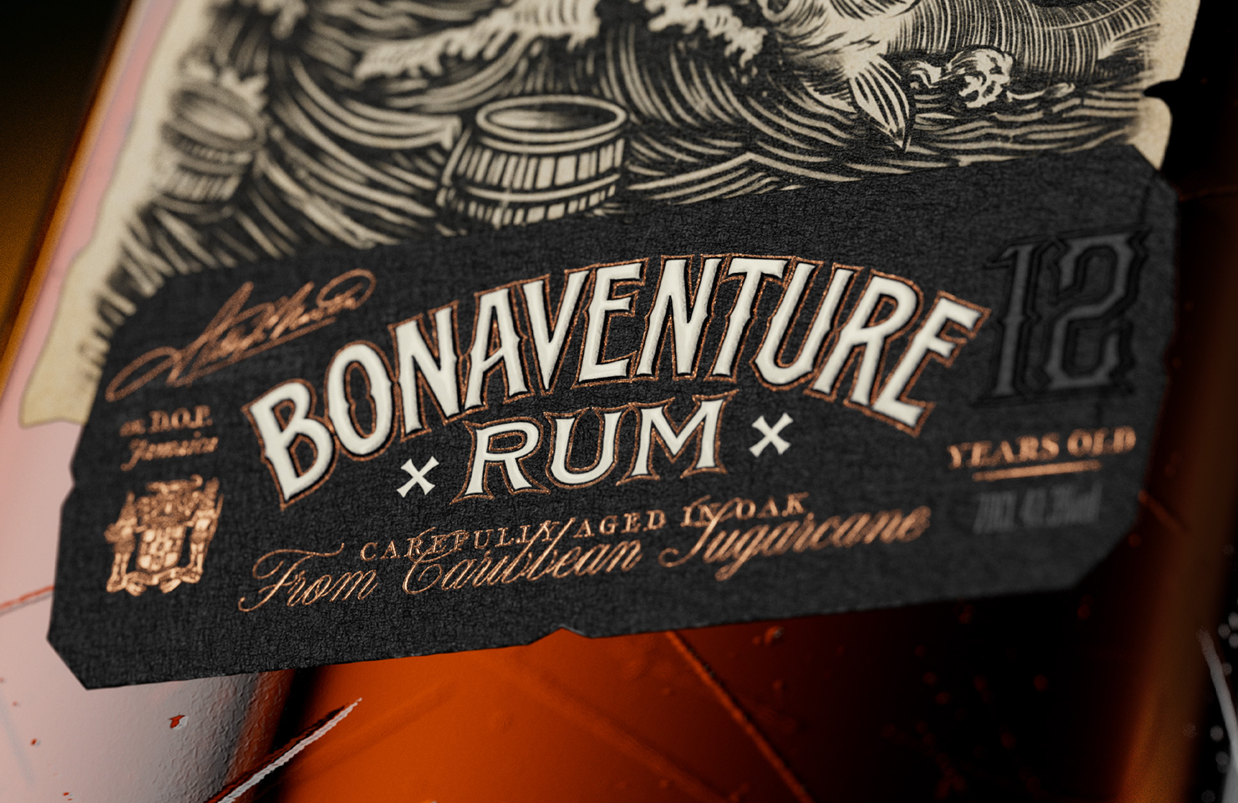
The design translates the legend into a physical artifact. The bottle was conceived with the weight and presence of a recovered object — heavy glass, deep amber tones, engraved storytelling and a label system inspired by old maritime prints. Rather than relying on decorative nostalgia, every detail works to suggest time, travel and survival: scratched glass, embossed typography, aged paper textures, storm-driven illustration and a warm golden palette that evokes both rum and treasure.
The front label carries the visual heart of the myth: The Edward Bonaventure facing the force of the sea, surrounded by waves, barrels, creatures and storm clouds. The side embossing extends the story beyond the label, turning the bottle itself into part of the narrative. This creates a more immersive packaging experience, where the consumer discovers the brand not only by reading it, but by rotating the object, touching it and uncovering its details.
The result is a rum packaging system that feels collectible, cinematic and rooted in craft, a bottle designed to look less like a new product and more like a legend that has finally resurfaced.
A ship once lost.
A recipe preserved.
A treasure claimed by nature.
A resurfaced legend, crafted for the modern shelf.
CURATOR’S INSIGHT
What makes Bonaventure genuinely compelling as a packaging object is not its mythology — it is how deliberately the design resists illustration as decoration. The storm scene on the front label is not ornamental. It functions as a proof-of-concept: a visual argument for why this liquid exists and why it is rare. The narrative logic is embedded in the label construction itself, not appended to it.
The most interesting structural choice here is the decision to push story content onto the embossed sides of the bottle. This is a move that removes the brand from the flat, two-dimensional language that most spirit labels operate in, and forces physical engagement. The consumer has to turn the object. That act of rotation mimics, perhaps subconsciously, the experience of examining something recovered — a coin, an artifact, a sealed document. The bottle becomes an archaeological gesture.



 Derrick Lin
 salutifg
 ADStudio
 WeAreDepot
 Manuvila
 Yellow Umbrella Creative
 Toka
Toka Studio Zak
 Atiq Alam
 monther al omari
 Modern Theory
 Sirka Agency
 DESIGN CONCEPTS
 Eva Chistyakova
 Puigdemont Roca
 marianaaworks
 bloomburo
 andreamarinnn
 Alina
Alina Saadmost
 Bruhken
 Maruf Nishat
 Richest Branding Pvt. Ltd.
 Sophiagdotcom
 saifullahmaslool
 Up-Brands