
Brio – Sparkling Beverage Packaging Concept
Project Description
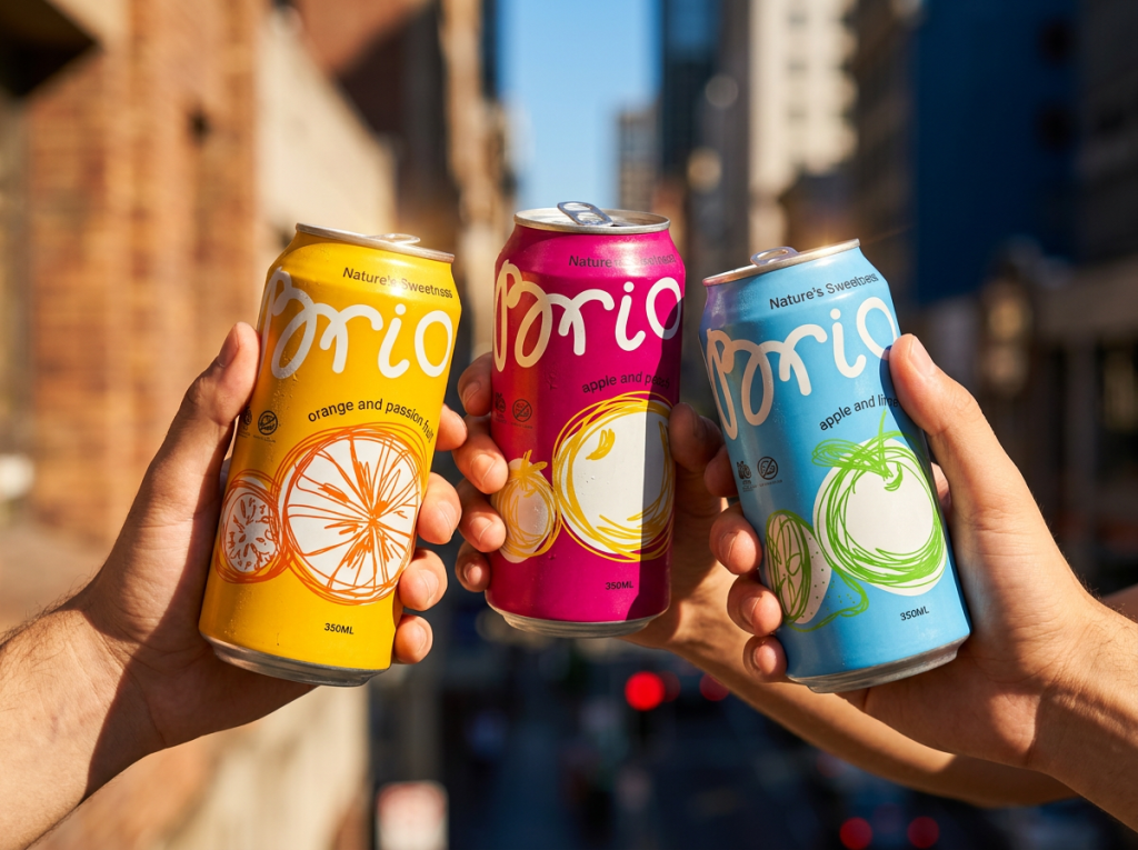
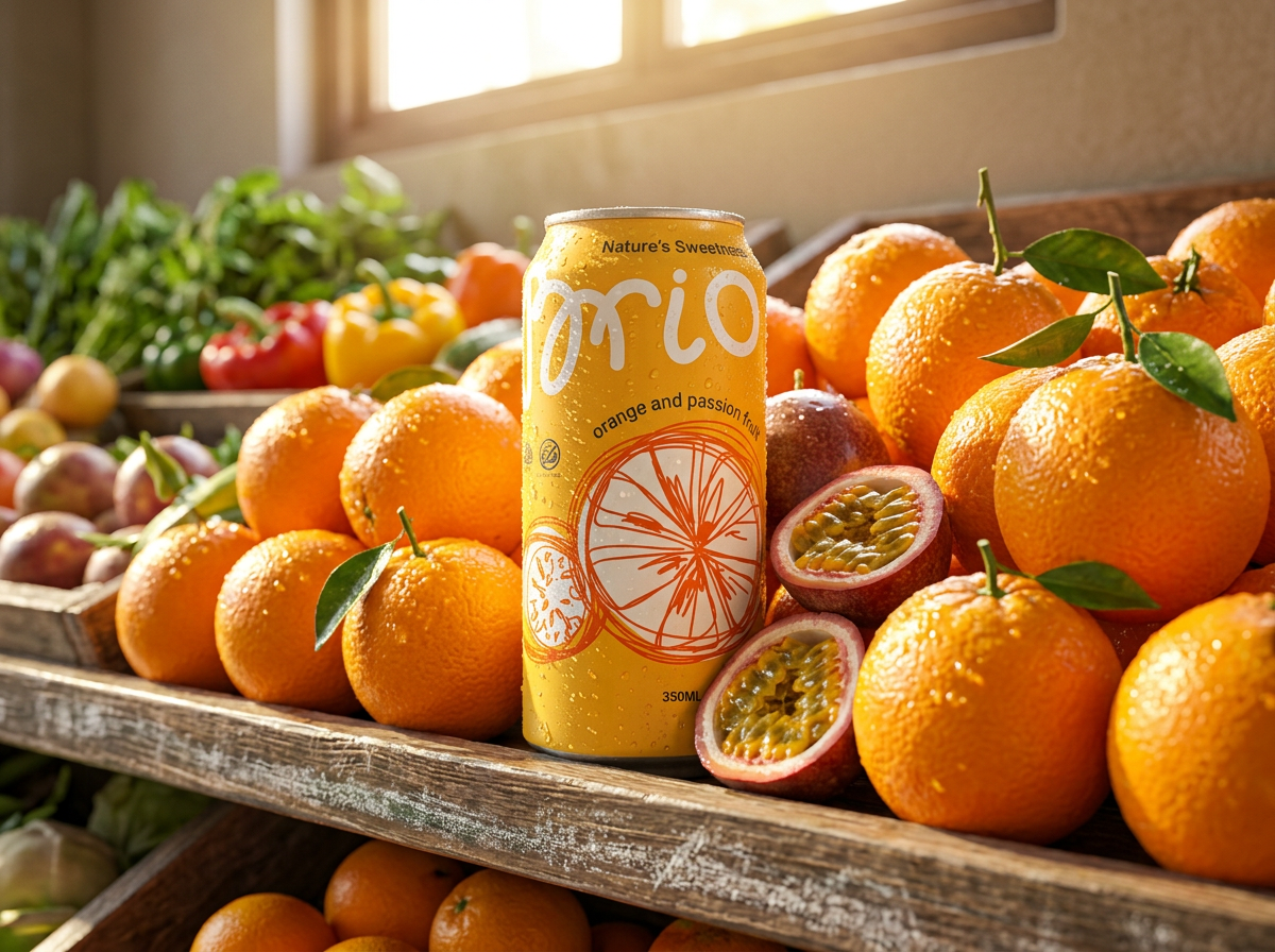
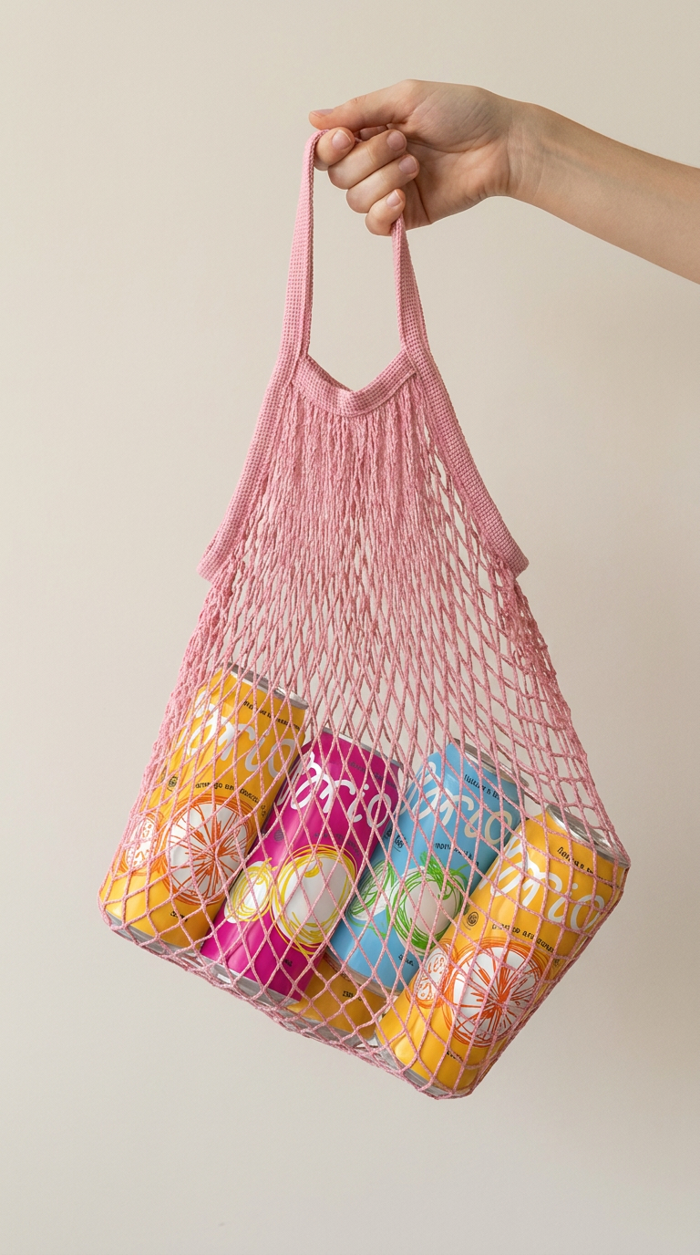
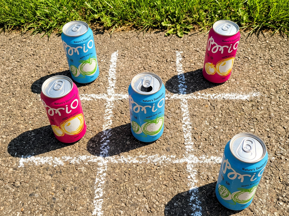
Brio is a conceptual packaging design for a sparkling beverage line based on natural juices. The project explores a contemporary visual language for the soft drink category, moving away from traditional realistic fruit imagery and overloaded compositions.
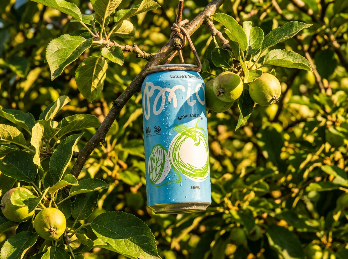
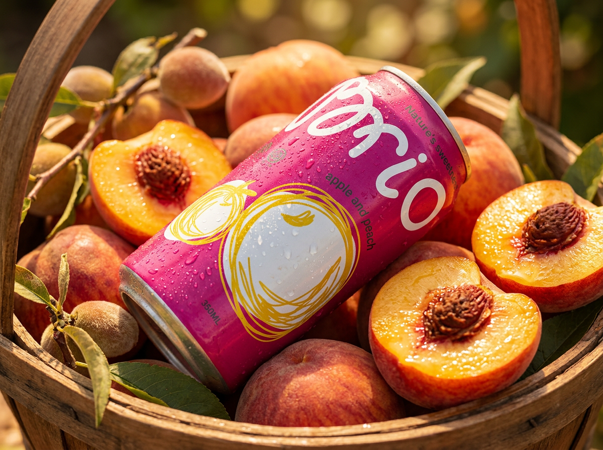
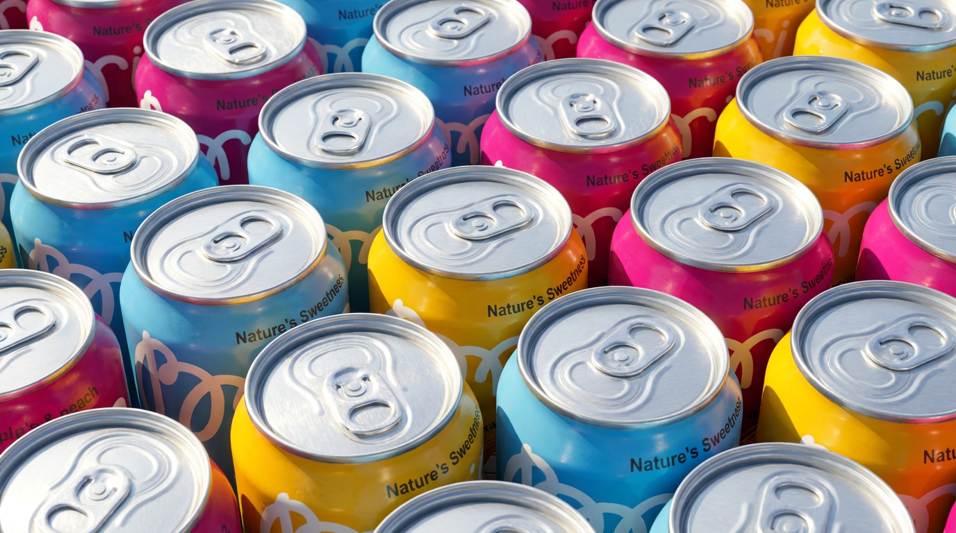
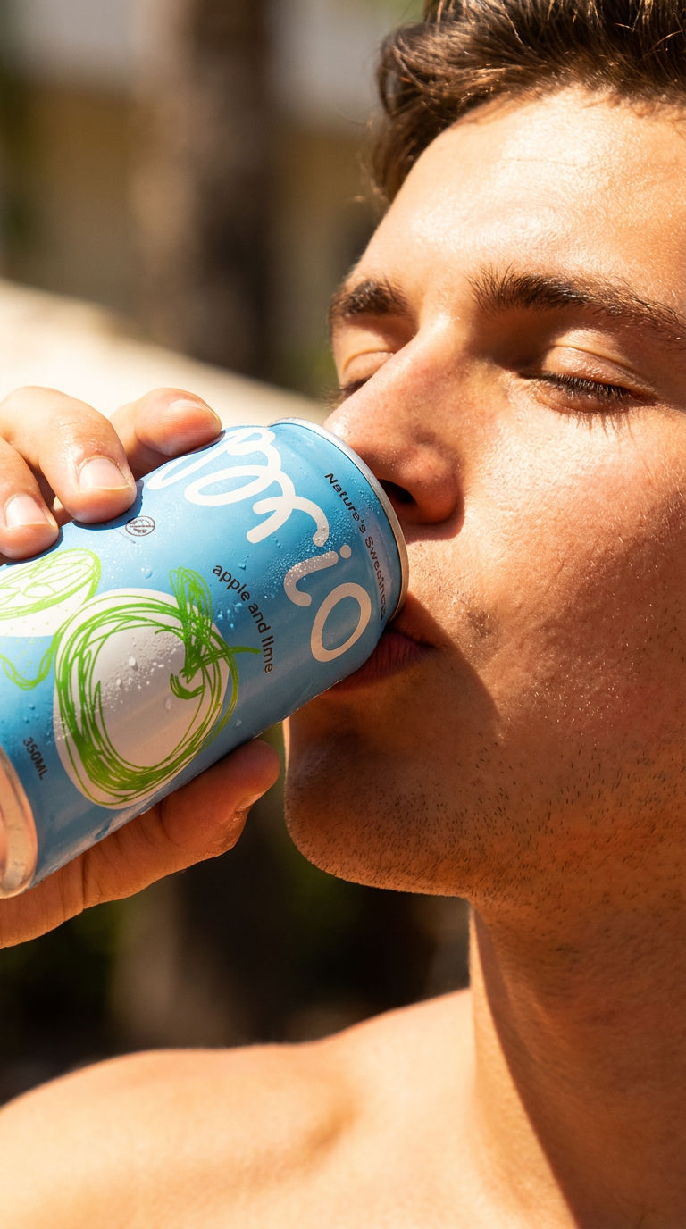
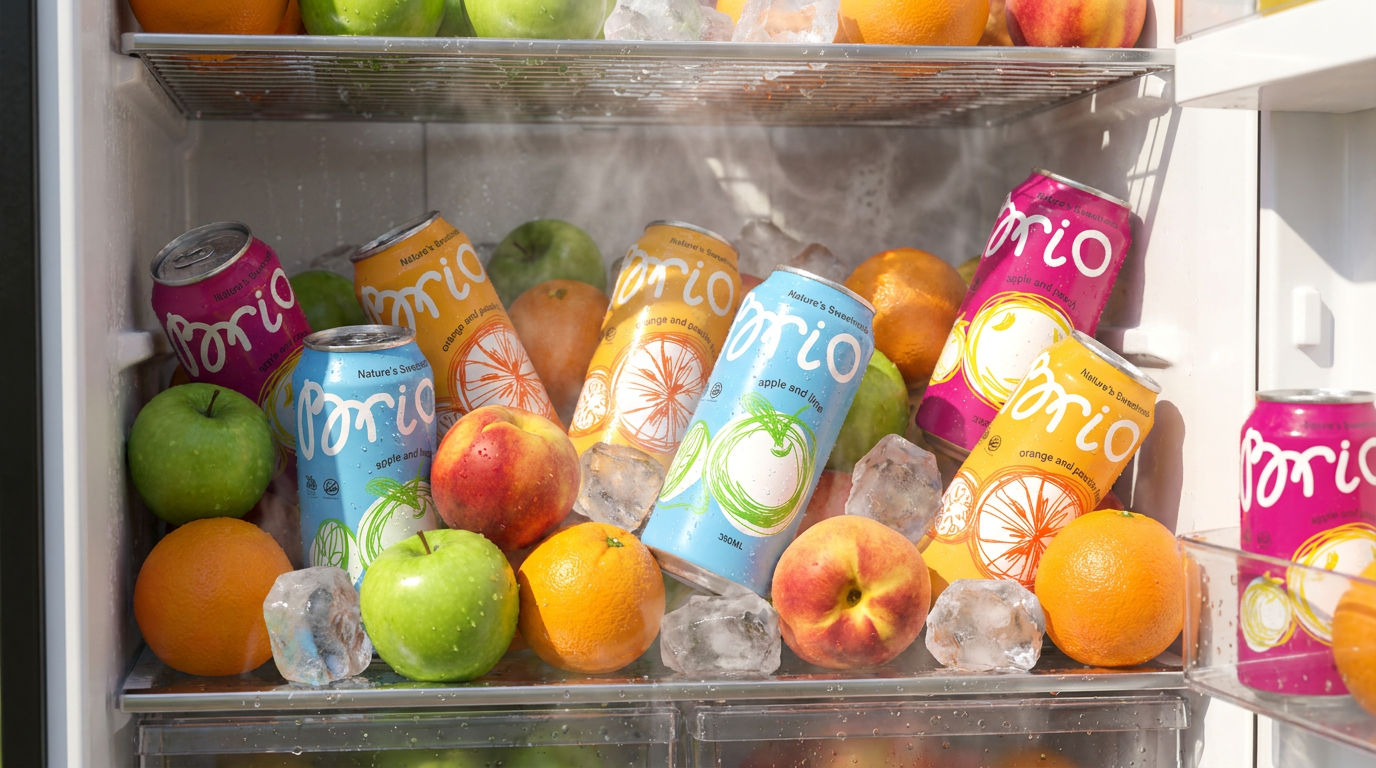
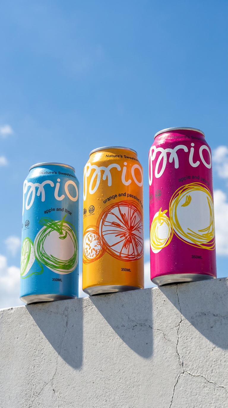
The visual system combines bold color fields, minimalist typography, and expressive sketch-style graphics inspired by spontaneous hand-drawn lines. Each flavor is represented through its own dominant color and dynamic fruit illustration while maintaining consistency across the entire product line.
The packaging was designed to feel energetic, fresh, and visually engaging both on shelf and in digital environments. The result is a scalable identity system that positions the product closer to modern lifestyle brands rather than conventional beverage packaging.
Design Approach
The main challenge was to create a packaging concept that communicates freshness and natural ingredients without relying on common “eco” aesthetics. Instead of realistic fruit photos, the design uses abstract linear graphics to create movement and emotional impact.
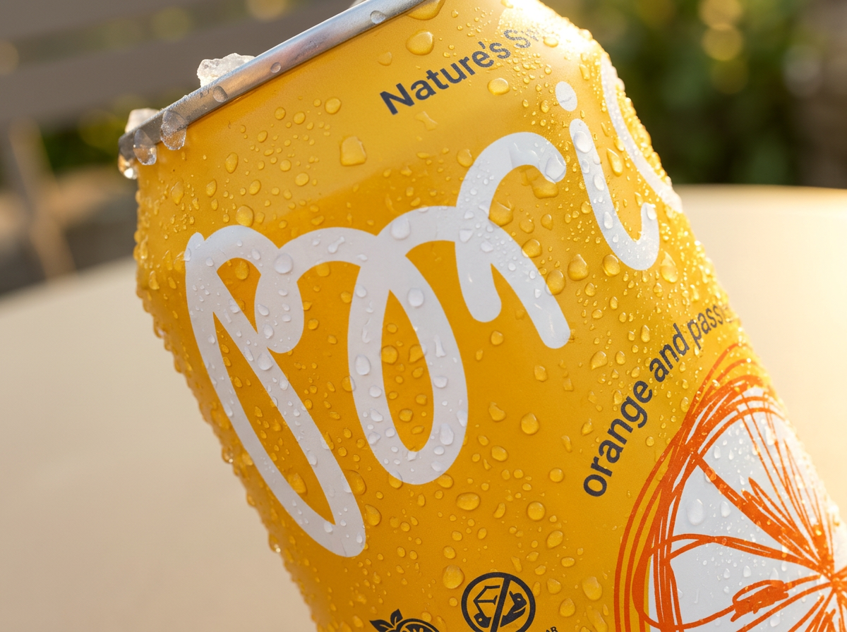
The oversized logo improves shelf visibility, while the clean layout allows the color system and illustrations to become the key visual differentiators between flavors.
Concept, Art Direction & Packaging Design: Svetlana Morozova
 monther al omari
 Ximena Ureta Design Studio.
 vitoramockup
 Up-Brands
 Sophiagdotcom
 Peter said
 ayeidadezigns
 Tancybox
 宏洛图品牌设计HONGLT
 Modern Theory
 Dozen Agency
 Atiq Alam
 Olio Studio
 Ruchi S. Joshi
 mmdesign
 awaiskhadim
 Octasoft
 United Creatives Studio
 Kingdom & Sparrow
 Anastasia Bakhmatskaya
 CreativeWise
 Great and Golden