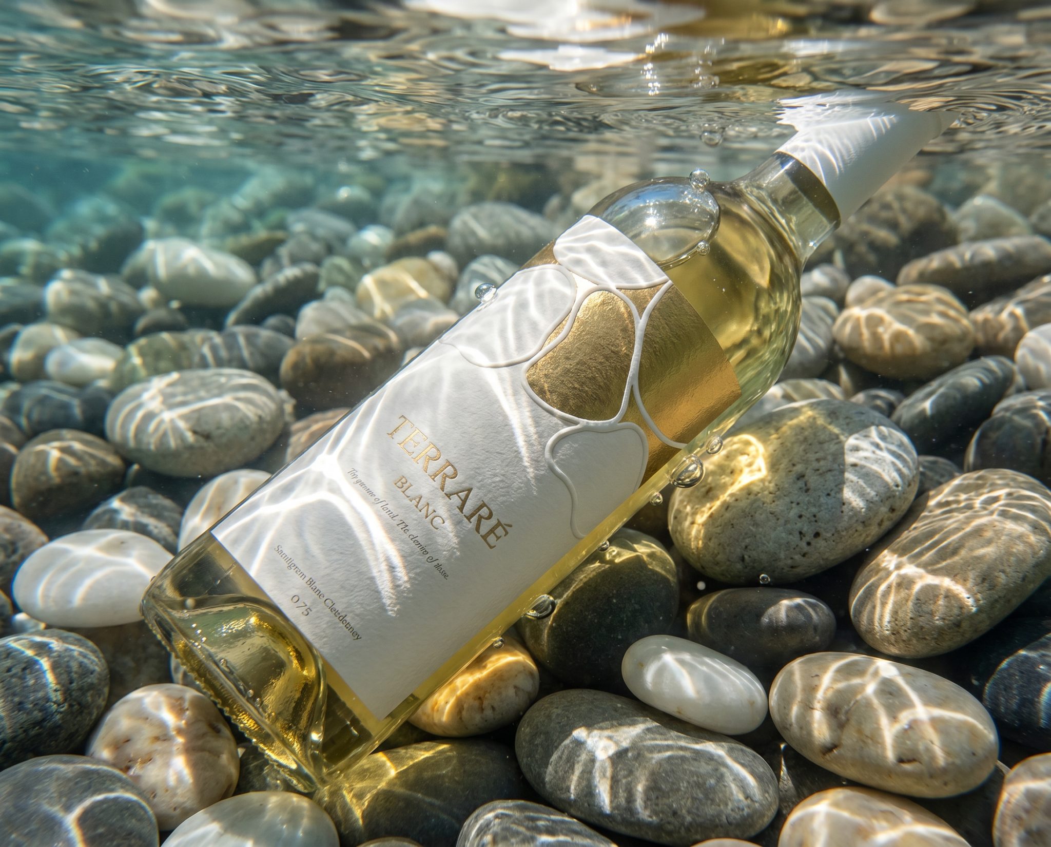

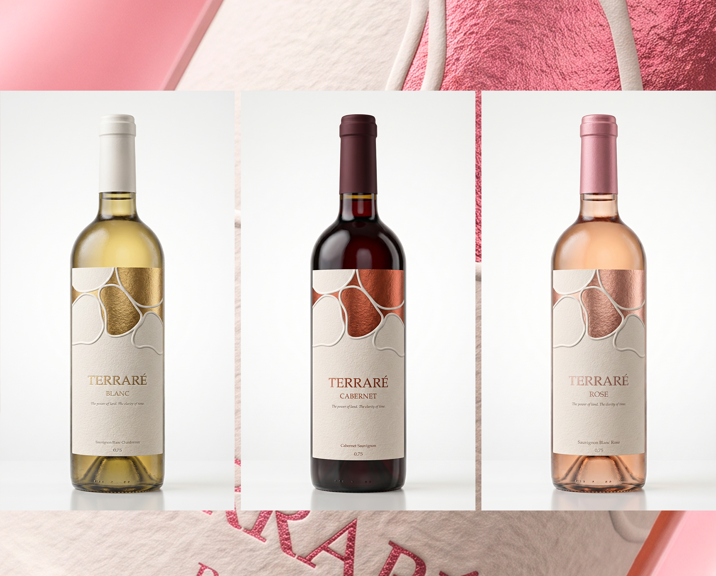
This project explores the visual identity and packaging for a wine collection: Blanc, Rosé, and Noir.
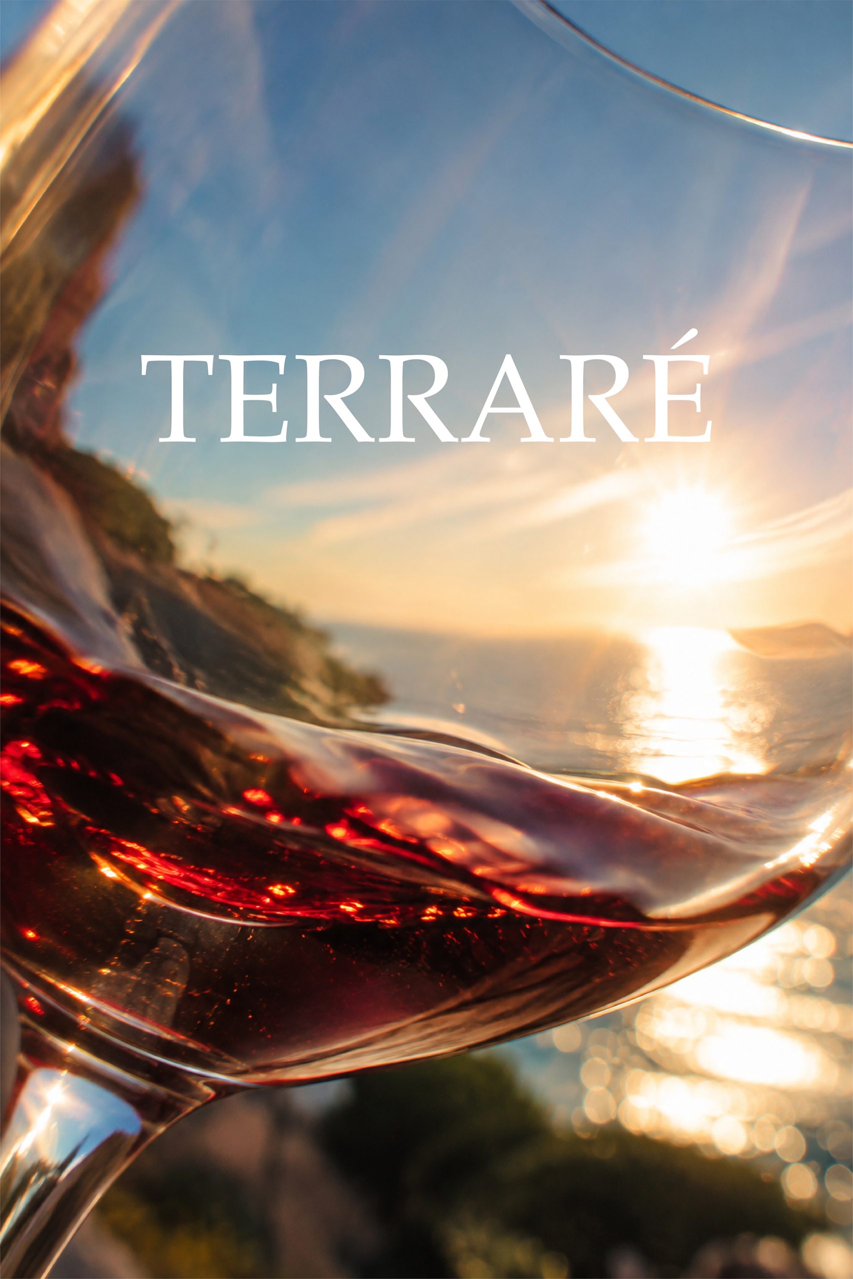
Each variety captures a distinct moment — of light, freshness, or depth.
The goal was to translate that atmosphere through form, color, and typography — avoiding clichés and obvious visual cues.
The project was created for an audience that values origin, terroir, and visual culture.
For those who see packaging not as marketing, but as an extension of the wine’s philosophy.
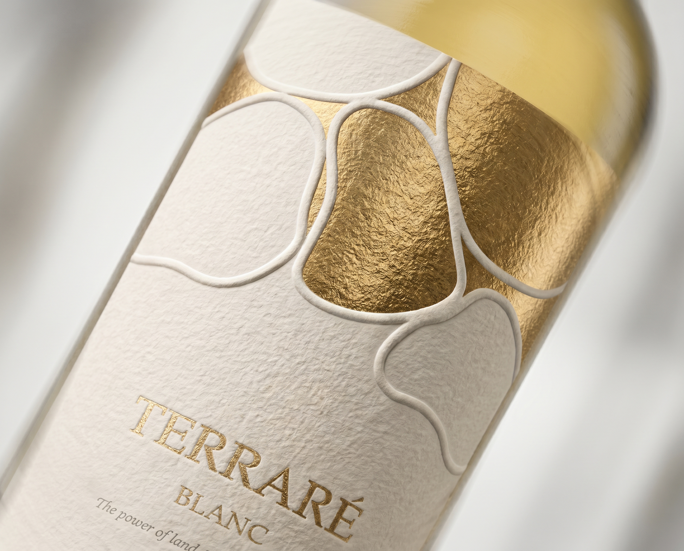
Post-print techniques include embossing and tinted foil — applied only where truly needed.
Curator’s Insight
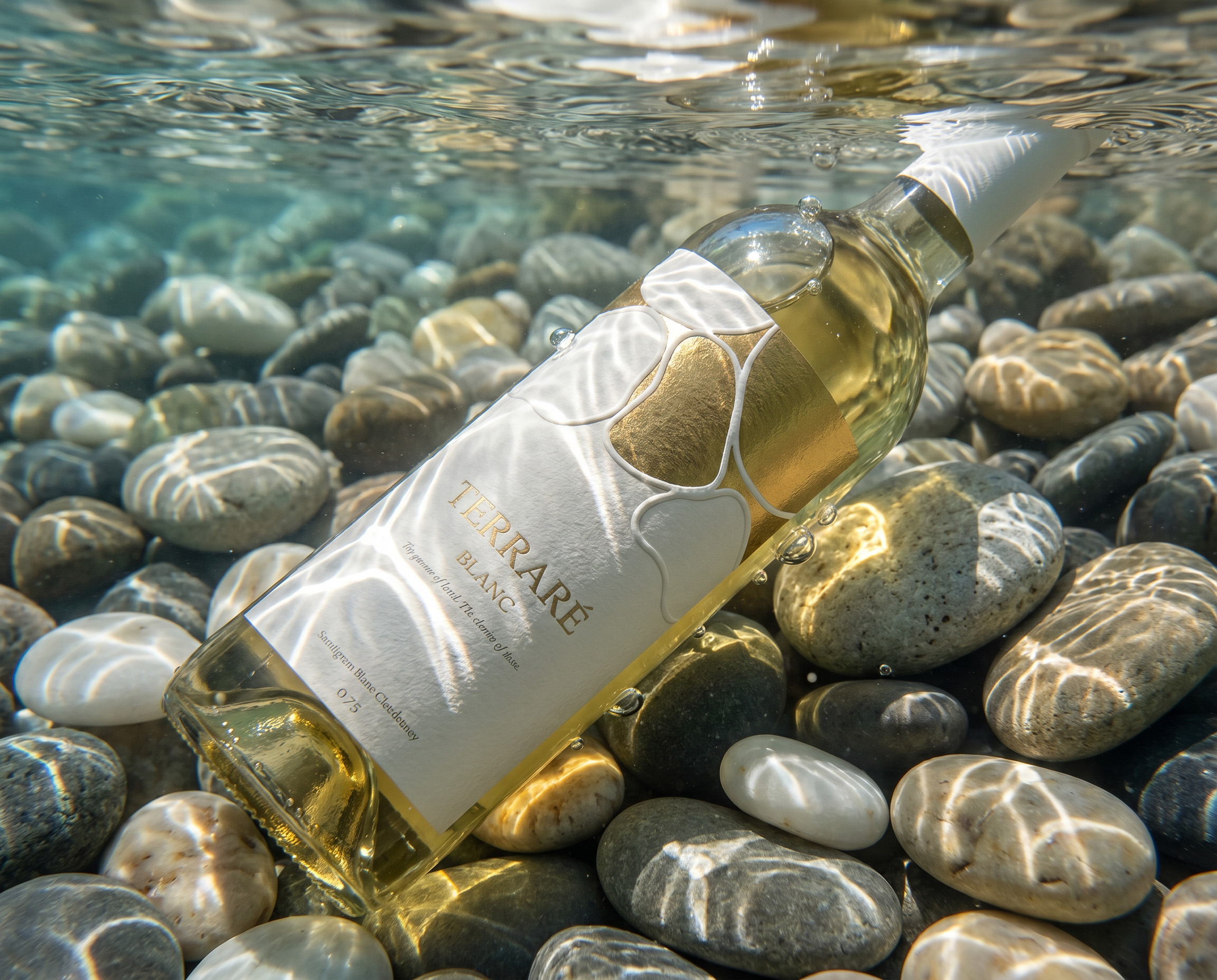
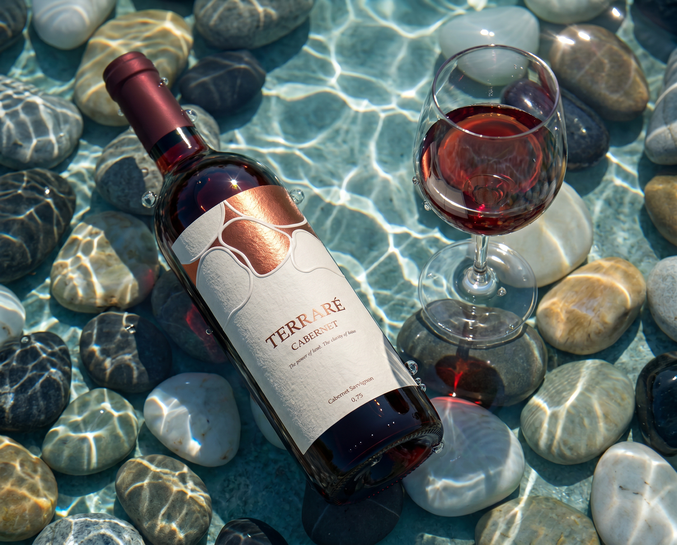
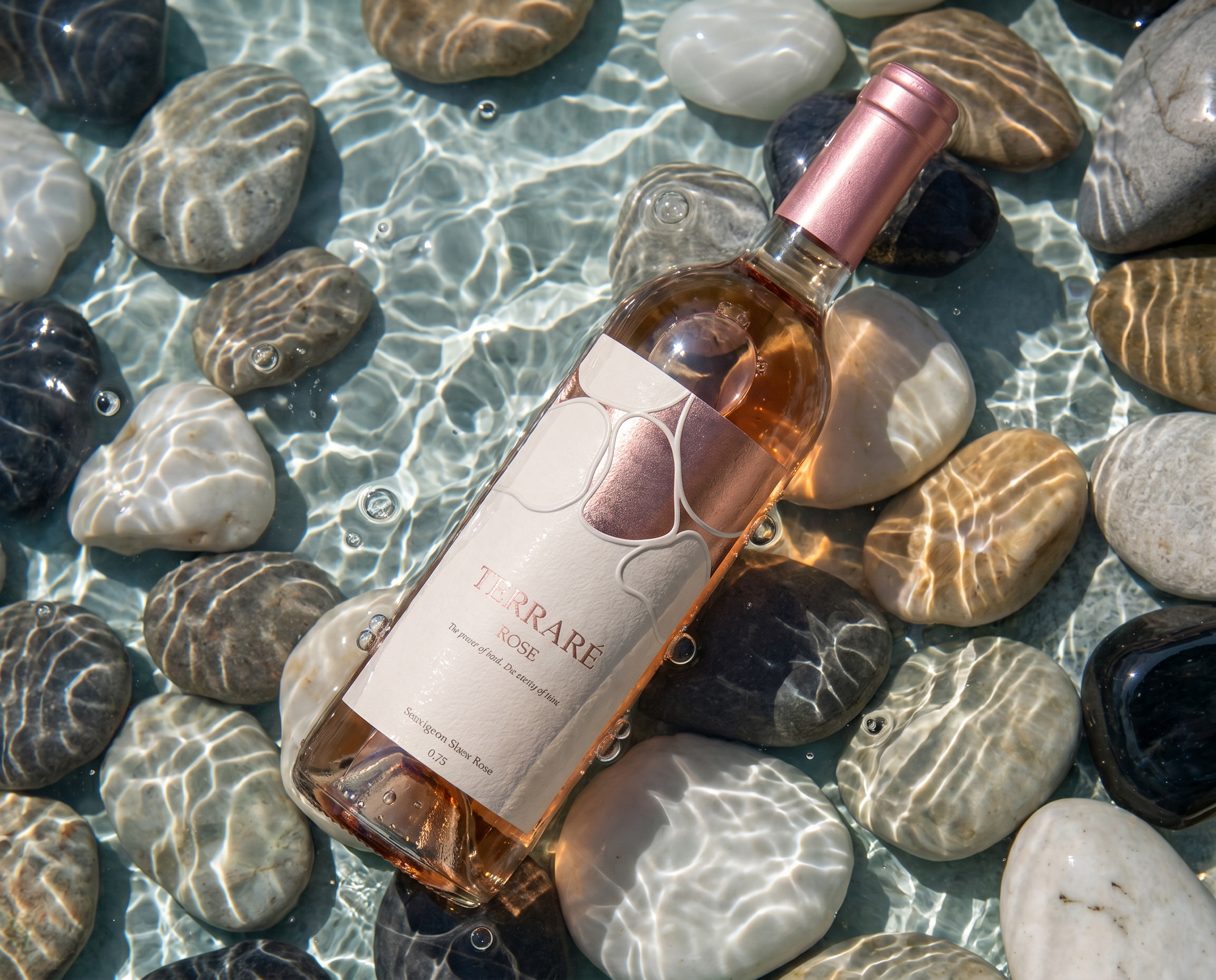
Look closely at the label shape against the riverbed it’s photographed on, and the source of the motif becomes obvious. The cluster of overlapping ovals embossed onto every TERRARÉ bottle is a direct abstraction of the pebbles beneath it, the same rounded, irregular, tessellating forms that river stones make when they settle against each other. This isn’t a generic geometric pattern dressed up with a nice photoshoot. The shape and the setting are the same idea told twice.
That reading changes what the foil is doing. Gold on the Blanc, rose gold on the Rosé, copper on the Cabernet aren’t just SKU differentiators, they’re mineral colorways, the kind of tones water pulls out of stone under different light. The wordmark, layout, and embossing depth stay identical across the range. Only the metal shifts, and because the motif already reads as geological rather than decorative, a colorway change feels like a different mineral vein rather than a marketing variant.
There’s a discipline point worth naming too. Once you see the pebble logic, it would have been easy to overplay it, more literal texture, a stone-toned label stock, obvious water imagery on pack. The design doesn’t do that. It keeps the connection at the level of form only, leaving the photography to carry the rest of the story. The label stays quiet enough to work outside the riverbed context entirely.
 monther al omari
 Ximena Ureta Design Studio.
 vitoramockup
 Up-Brands
 Sophiagdotcom
 Peter said
 ayeidadezigns
 Tancybox
 宏洛图品牌设计HONGLT
 Modern Theory
 Dozen Agency
 Atiq Alam
 Olio Studio
 Ruchi S. Joshi
 mmdesign
 awaiskhadim
 Octasoft
 United Creatives Studio
 Kingdom & Sparrow
 Anastasia Bakhmatskaya
 CreativeWise
 Great and Golden