

Rethinking Makhana through India’s flavorful snacking culture.
Instead of positioning Makhana as just another healthy product, we decided to bridge the gap between India’s rich snacking culture and modern healthy consumption. The strategy focused on transforming the perception of Makhana from a functional ingredient into a flavorful and memorable snacking experience.
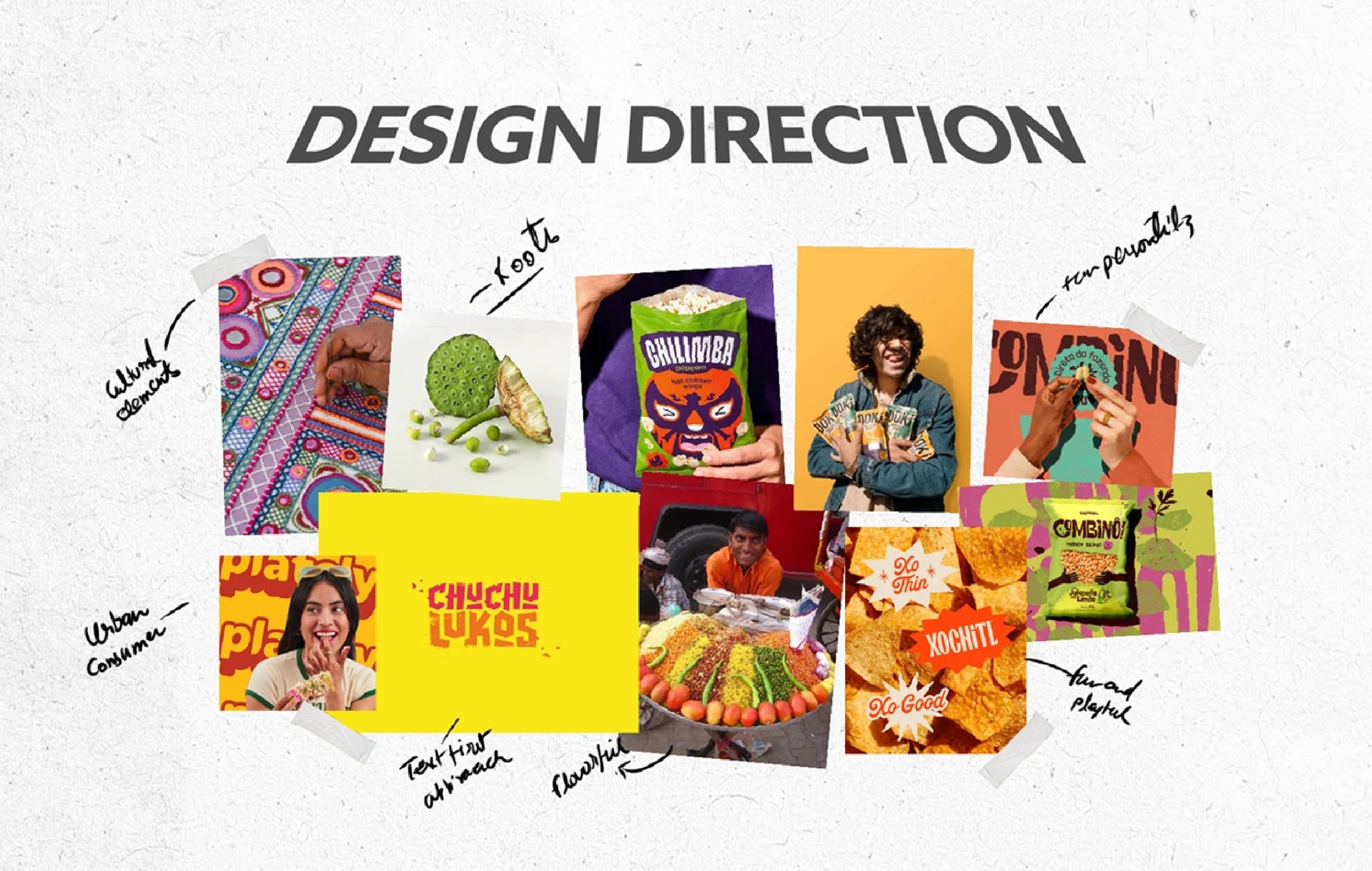
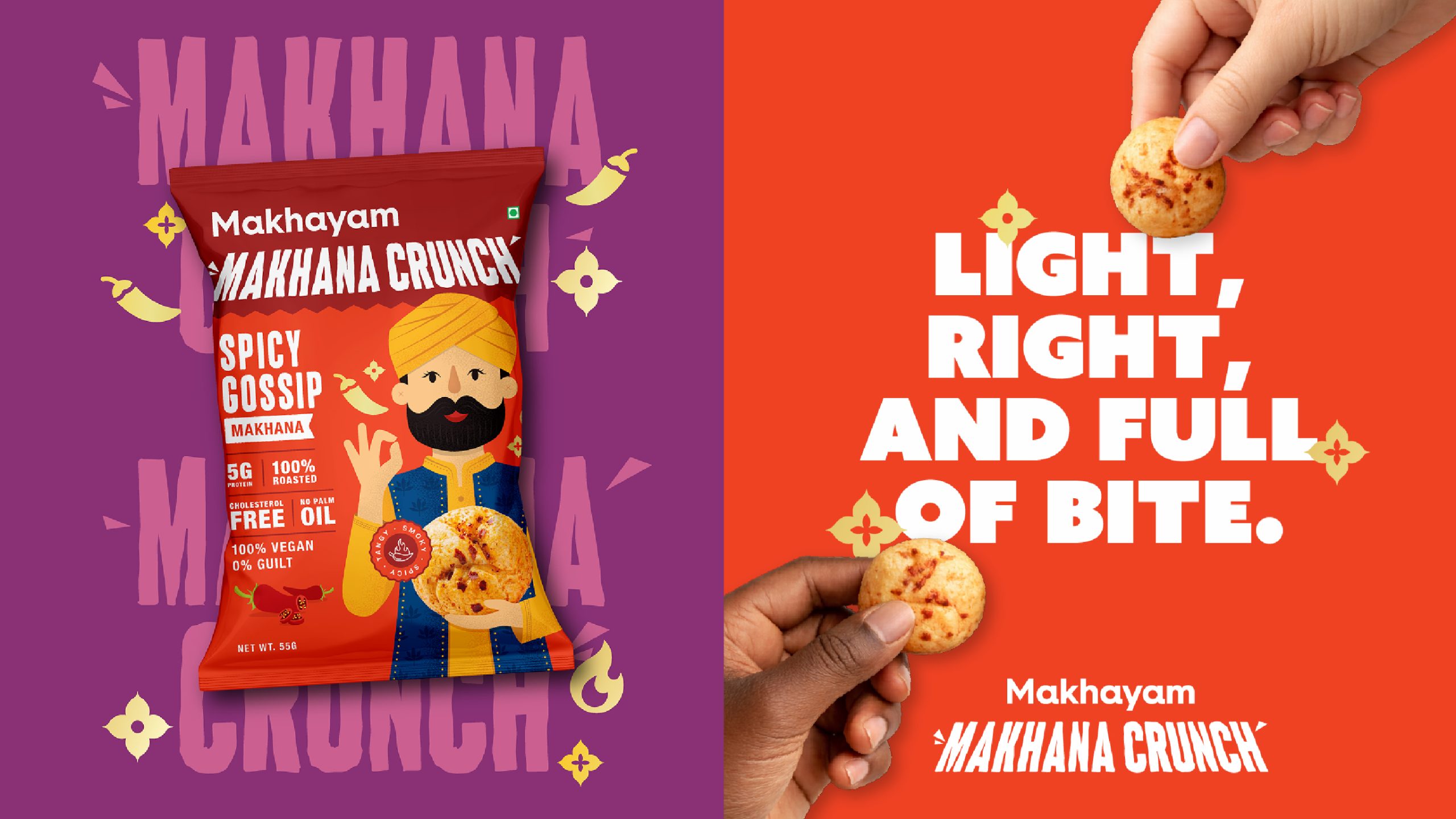
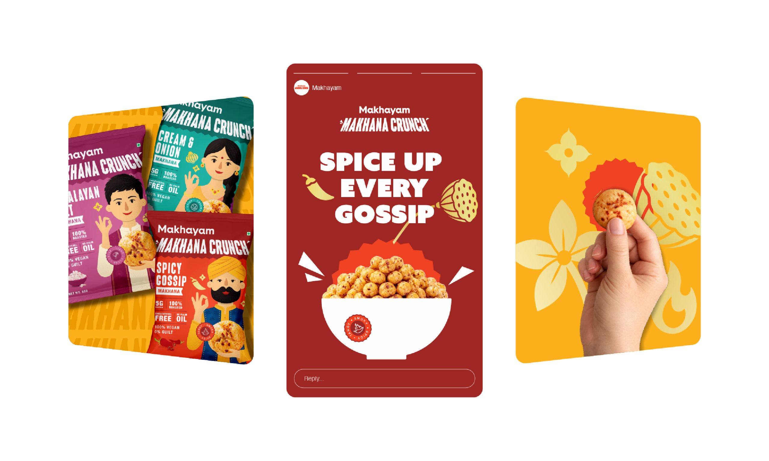
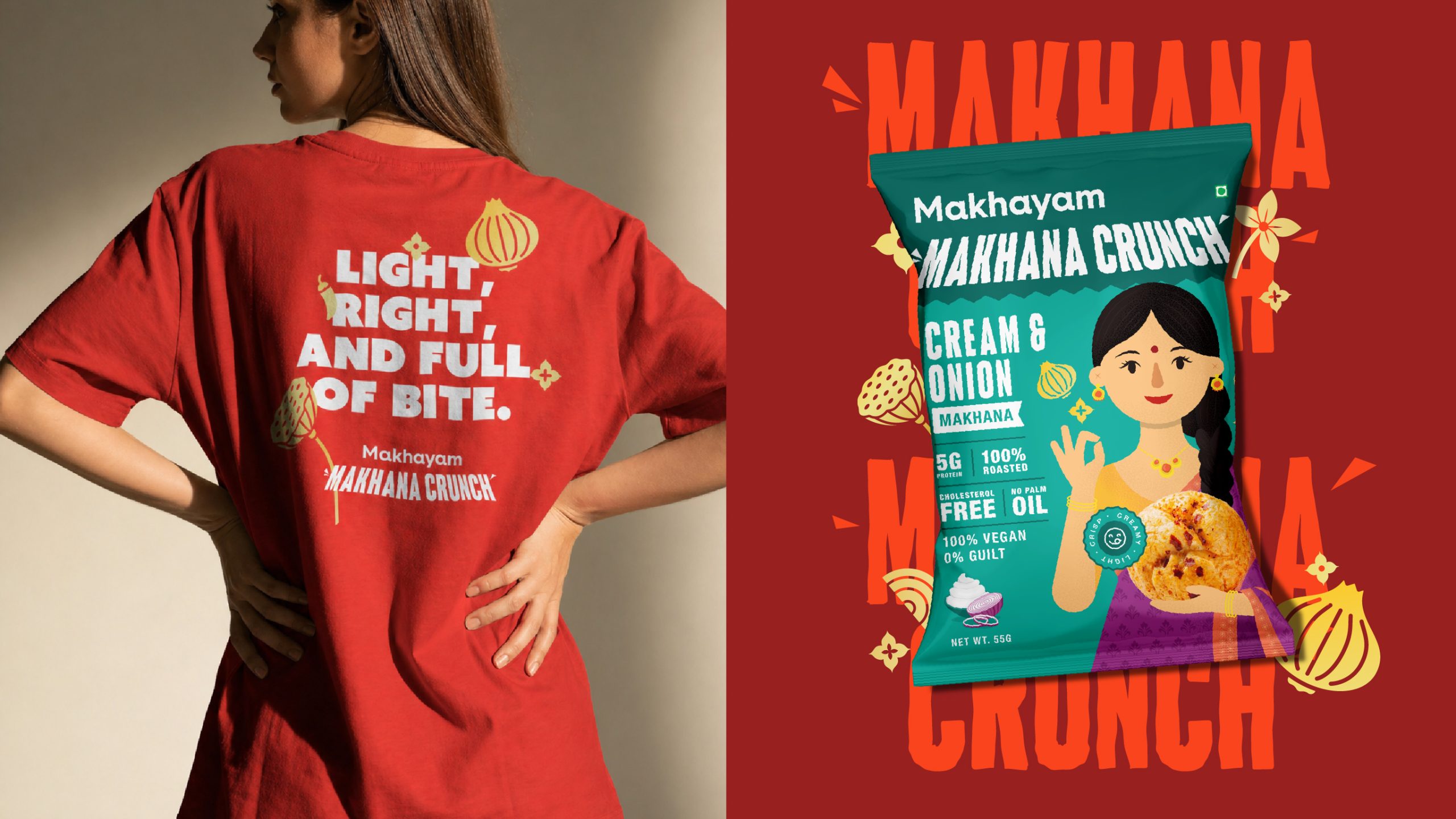
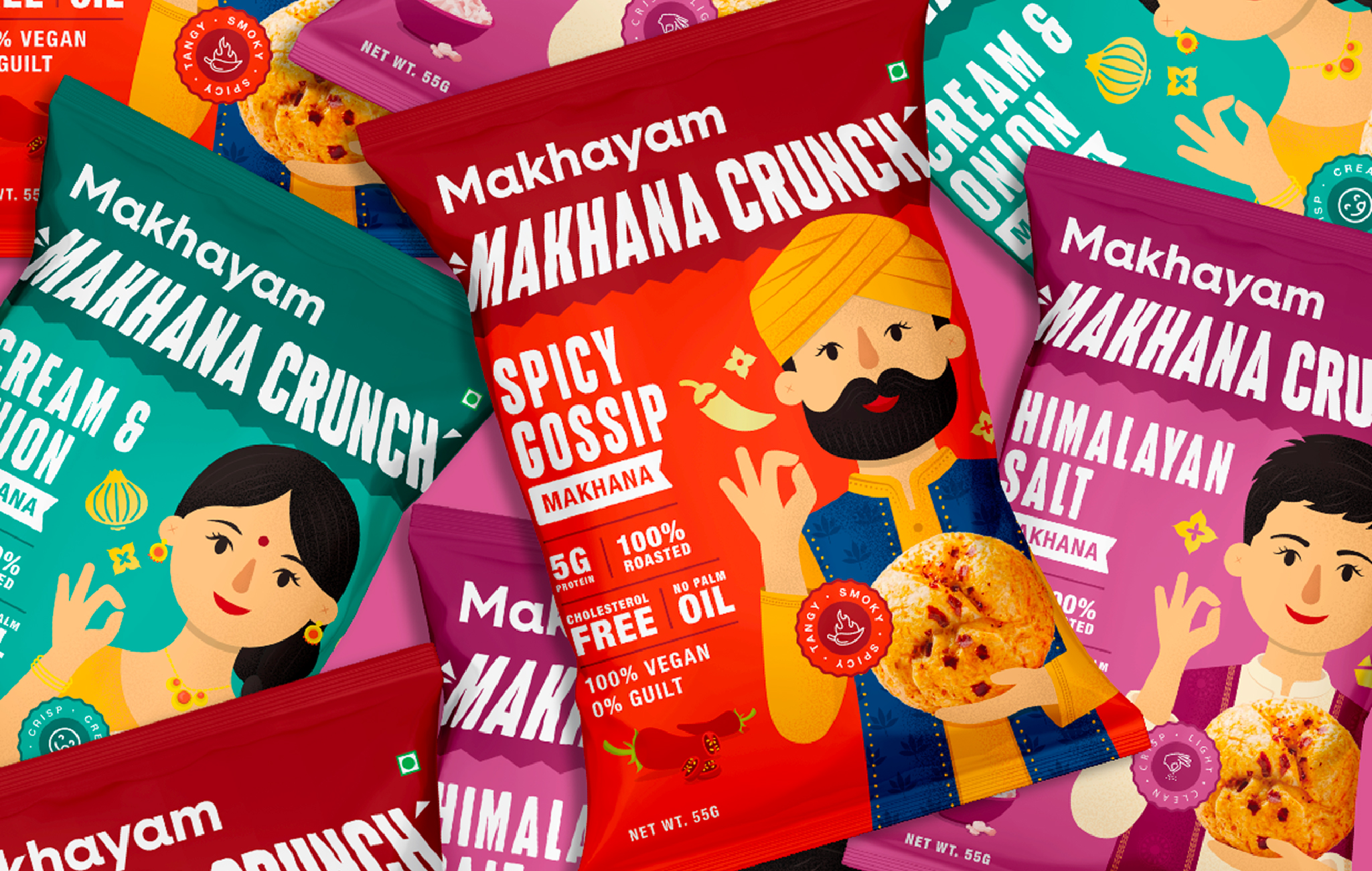
The visual identity moved away from the typical clinical health aesthetic commonly seen in the category. Instead, we introduced a vibrant and playful design system inspired by India’s diverse snacking culture. Bold colours, expressive typography, culturally rooted illustrations, and premium detailing helped the brand feel energetic and modern while still maintaining familiarity and authenticity.
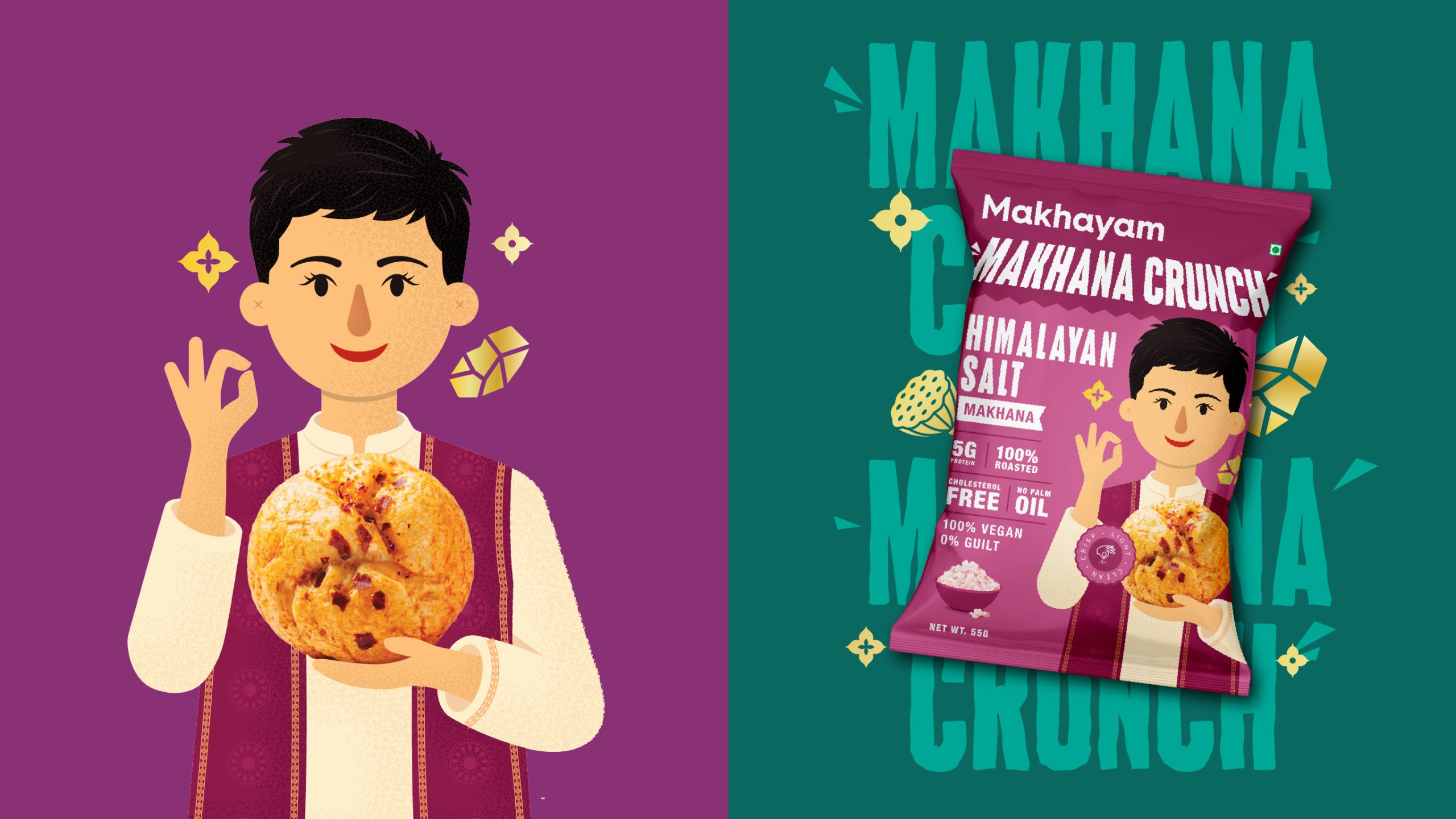
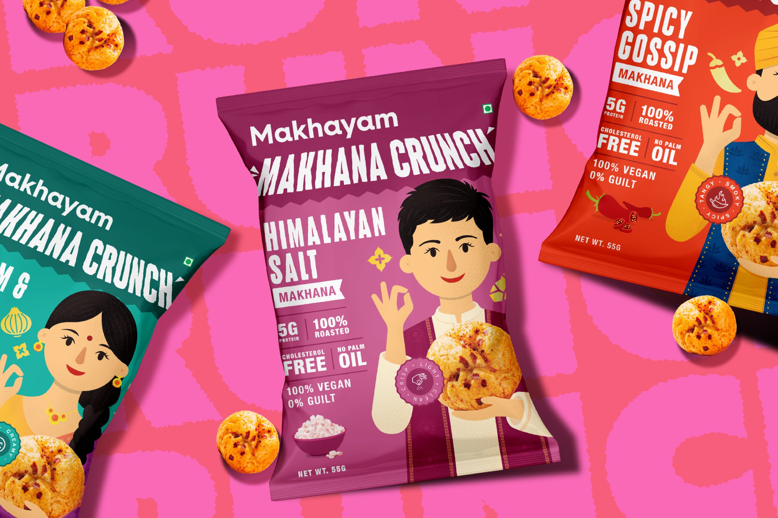
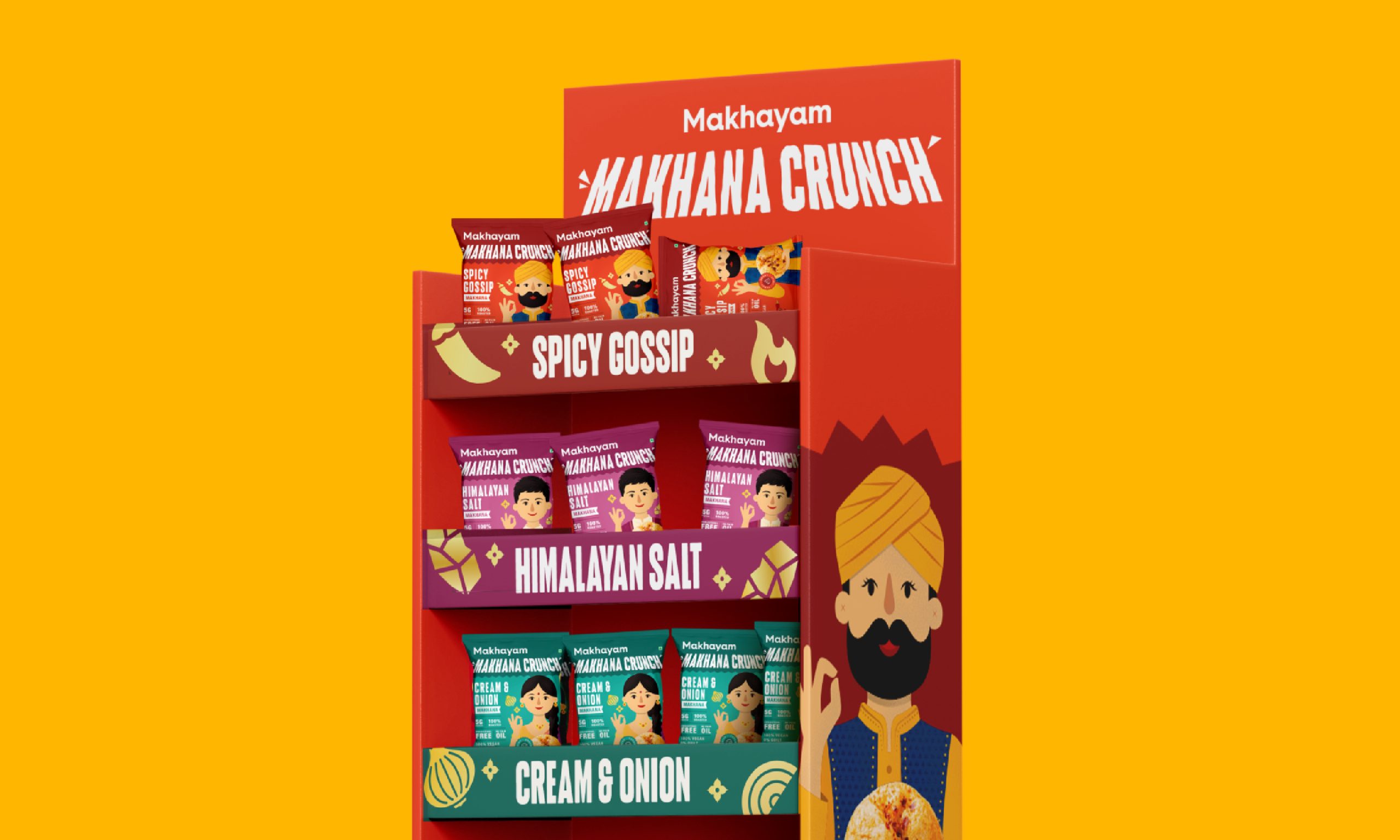
Each flavour was treated as a distinct personality rather than just a variant. To create stronger memorability and emotional connection, we developed custom characters inspired by different Indian identities and cultural references.
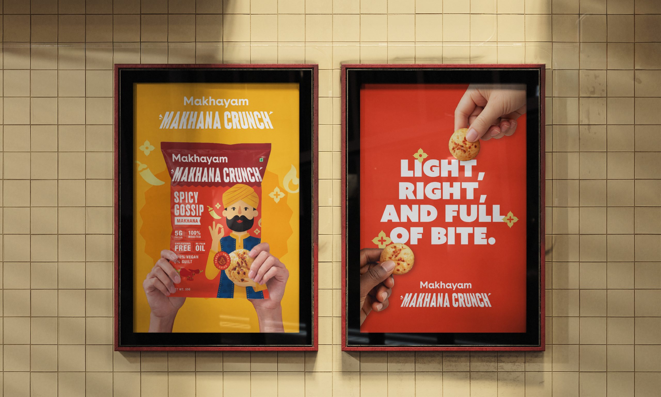
By combining cultural familiarity with playful storytelling and strong shelf presence, the brand creates a clearer reason for consumers to notice, remember, and try the product in an increasingly competitive snacking category.
While flavour became the primary entry point for the brand, health communication was still carefully integrated into the packaging system. Nutritional information and product benefits were balanced with bold illustrations and vibrant storytelling to ensure the packaging remained informative without appearing overly clinical.



 agarcia studio
 Wynand88
 Eva Chistyakova
 Maria Bukhtilova
 estudiomarciano
 monther al omari
 Thirst
 Maruf Nishat
 Gray Matter Studio
 Julia Jay
 Modern Theory
 Furt Goods
 Fluid
Fluid alchimistestudioParis
 Ancora
 Mostafa Abdelmawla
 MewKittyDraw
 Studio Shala
 43oz
43oz Lucid mk2
 Atiq Alam
 IDEOLOGO
 Open Strategy & Design