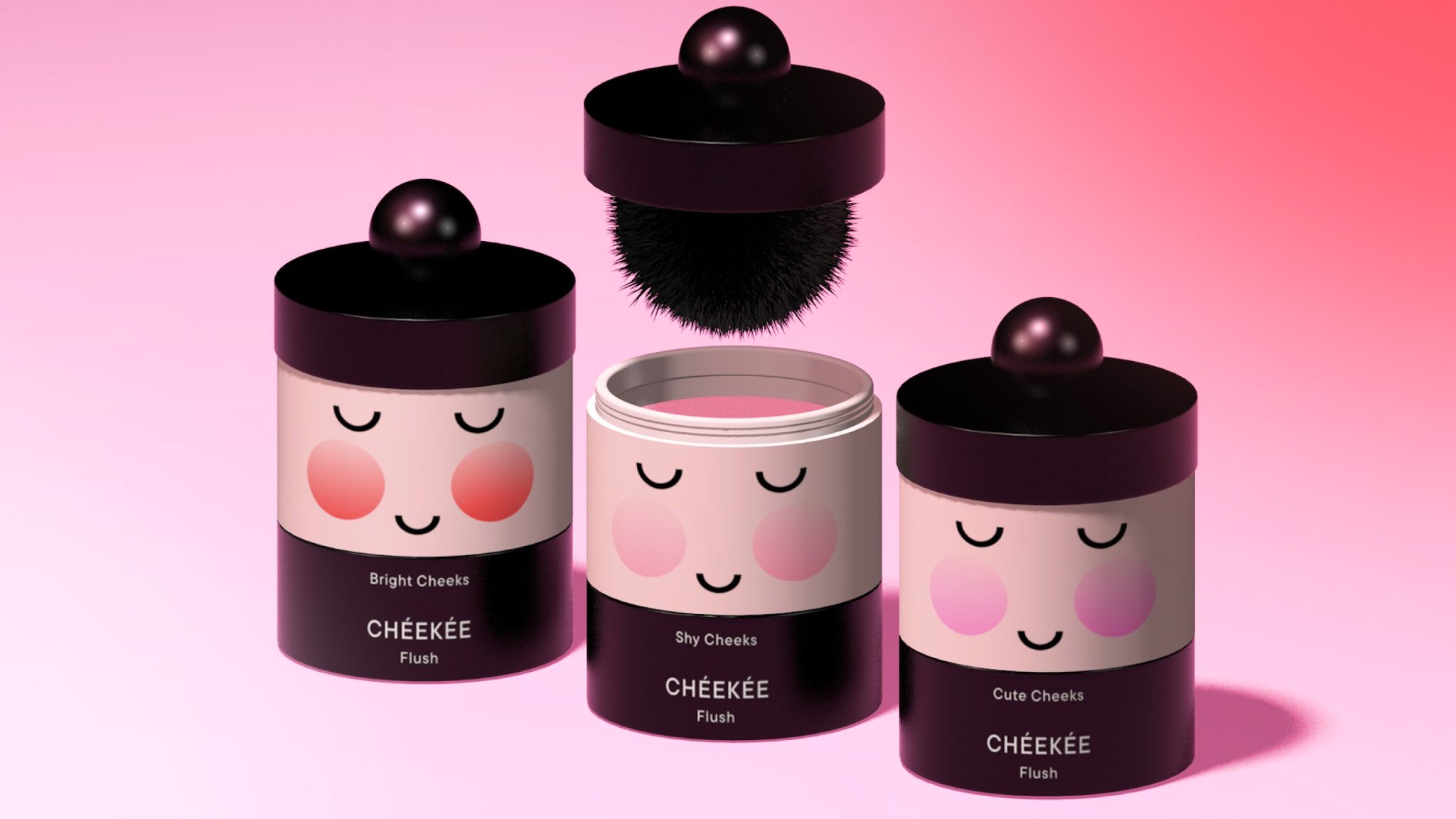

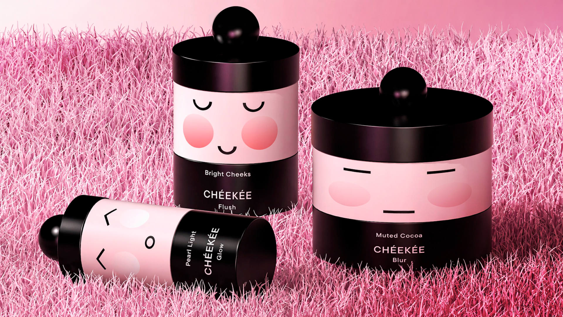
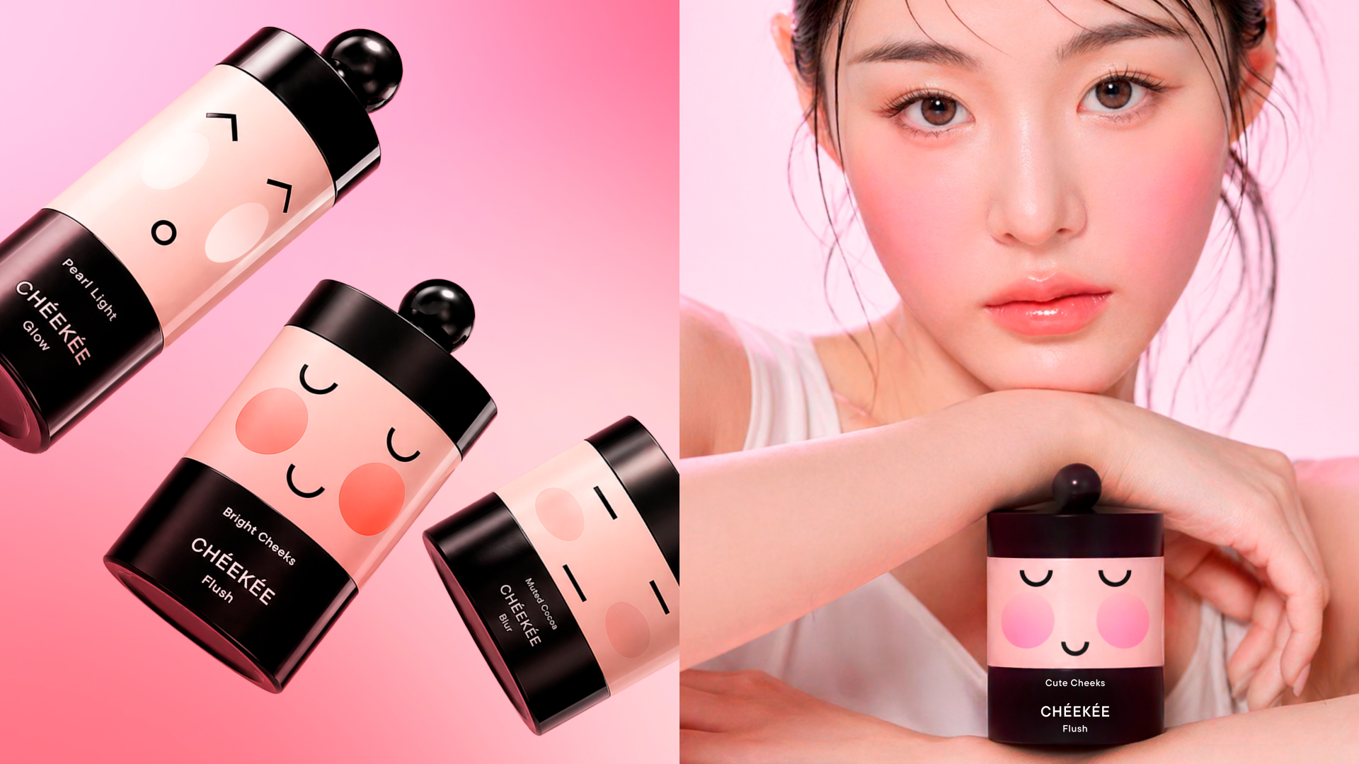
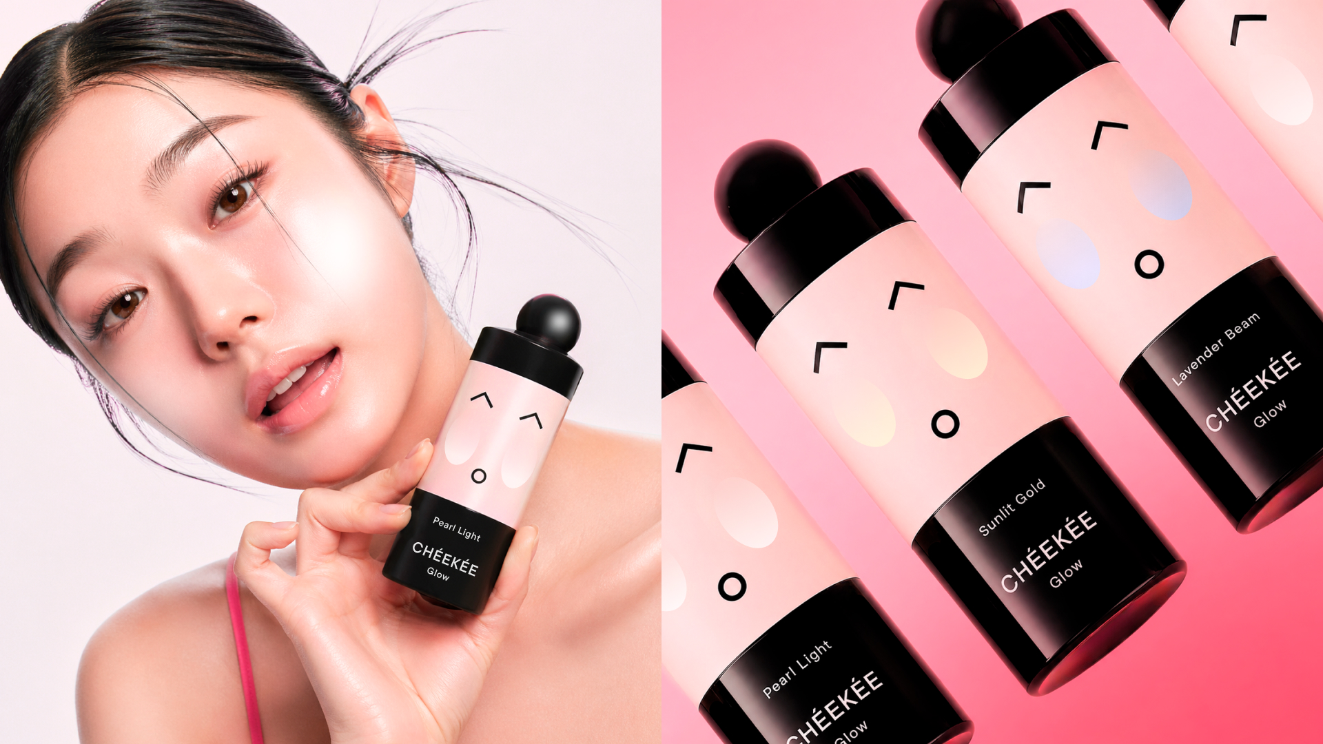
CHEEKÉE is a brand of Korean decorative cosmetics based on a combination of K-beauty aesthetics and principles of Asian minimalism. The visual concept is based around compact packaging with soft, rounded shapes inspired by the characteristic Korean design. The cheeks of the characters on the packaging become the main element of the identity: their color directly reflects the shade of the product inside — blush, powder or highlighter — allowing you to intuitively navigate the line.
The brand pays special attention to user-friendliness. Each product integrates an application tool directly into the package: powder includes a built—in sponge, blush includes a compact brush, and liquid highlighter includes an applicator. This approach makes cosmetics more mobile and self-sufficient, and the packaging itself becomes not only a functional object, but also part of the visual image of the brand.
Curator’s Insight:
What keeps CHÉEKÉE from reading as purely cute is the contrast system holding everything together. The deep plum-black base and glossy sphere lid are genuinely sophisticated, and they give the illustrative face motif something to push against. Without that dark grounding, this could easily drift into children’s product territory. Instead it sits in an interesting tension: playful enough to have personality, restrained enough to sit on a grown-up vanity. The other quietly clever decision is making the cheek circles function as a shade indicator. It removes the need for colour swatches or descriptive copy on the front face, letting the character do the informational work the label would otherwise have to carry. Across Blur, Flush, and Glow, the expressions shift too, so the line reads as a cast of characters rather than a repeated pattern. That gives the collection genuine shelf presence as a set.




 sophioc
 Marta Wasilewska
 House of Thought
 Krithika Chakkaravarthy
 Reema
Reema Oksana
 Palashcc
 KoverCsengeAgnes
 Carreto Concepts Design Studio
 Viktoriia Graber
 Sealburger
 Farah Haddad
 Sami Asaad
 Modern Theory
 PLUSDESIGbd
 Ayanna
 Flow Creative
 jonathanag90
 Creative Platform
 alchimistestudioParis
 Eman AlGhasra
 andreamarinnn