
Title: The clarion call of an inclusive GenZ cosmetics brand: Embrace Every Mood
be!MYN was created for a generation that treats beauty as personal, instinctive and constantly changing — bare and effortless one day, maxxed, glossy, playful or dramatic the next. Not searching for one fixed version of themselves. Comfortable being every version. The brand needed an identity that could hold all of this naturally.
Gen Z grew up rejecting labels. Their beauty brand had to do the same.
The strategic insight was simple and true: Gen Z does not experience beauty in one fixed mood. They move between aesthetics fluidly — no-makeup skin one morning, a full editorial look the same evening. Any brand that tried to pin them to a single identity would lose them before the packaging was opened. The brand philosophy that emerged — Embrace Every Mood — was not a tagline but a structural principle. It shaped everything that followed, from the colour system to the exclamation mark device to the photography direction. The identity had to move as freely as the people it was built for.
We began with pink. But not the predictable beauty-industry pink. This one could feel delicate in one moment and striking in another.
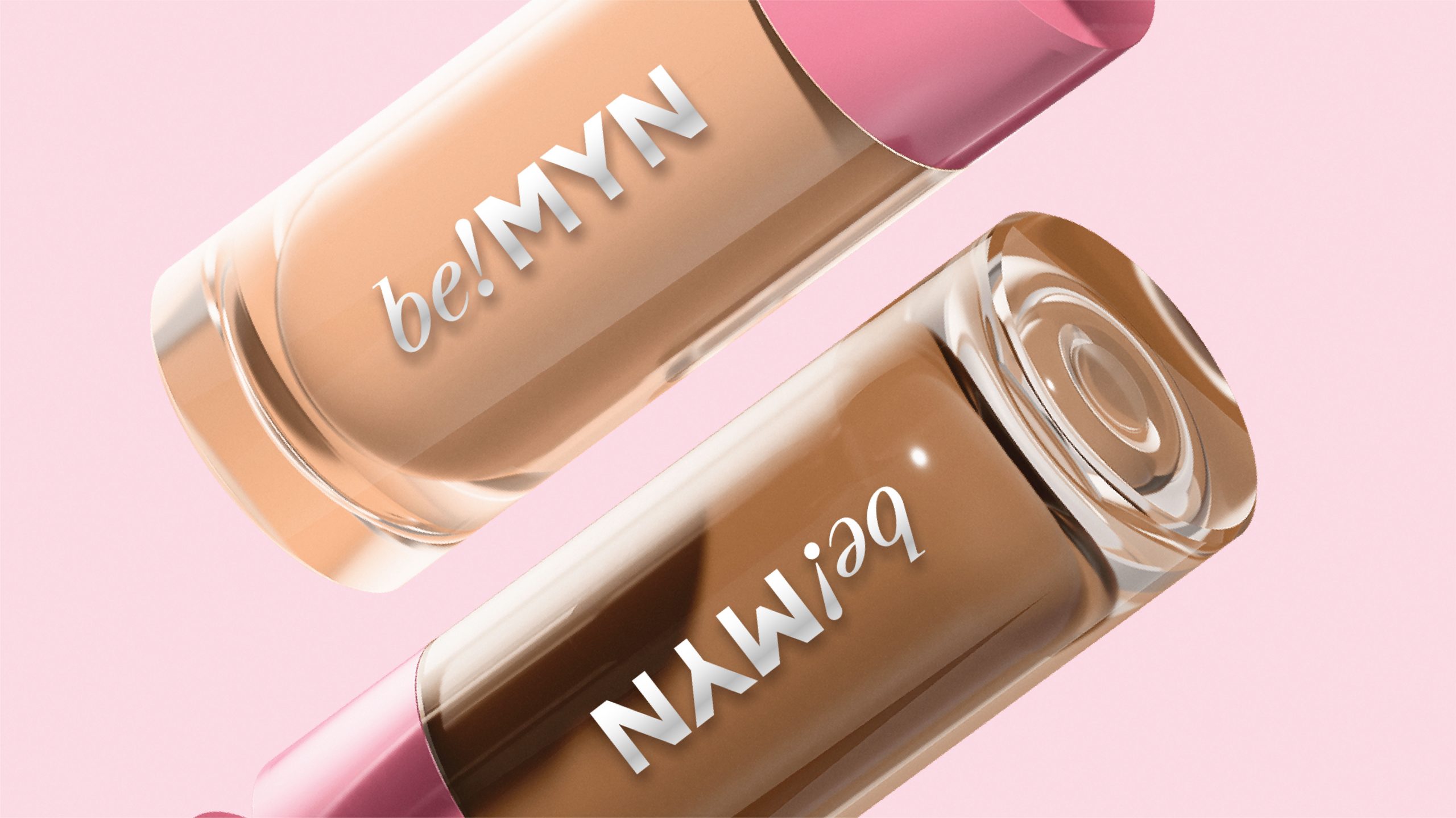
The colour work began with a single decision: pink, but reconsidered. Not the saturated hot pinks of mass beauty retail, nor the blush pastels of luxury skincare. A softer, cooler pink — one with genuine range. It could sit quietly on minimal packaging or hold its own beside silver foiling and bold typography. From that starting point, the palette expanded into different shades of pink across the brand, allowing products and personalities to carry their own character while remaining unmistakably be!MYN. Monochromes and silver accents completed the system, giving the identity a clean, fashion-aware edge that separated it from the beauty category’s visual conventions.
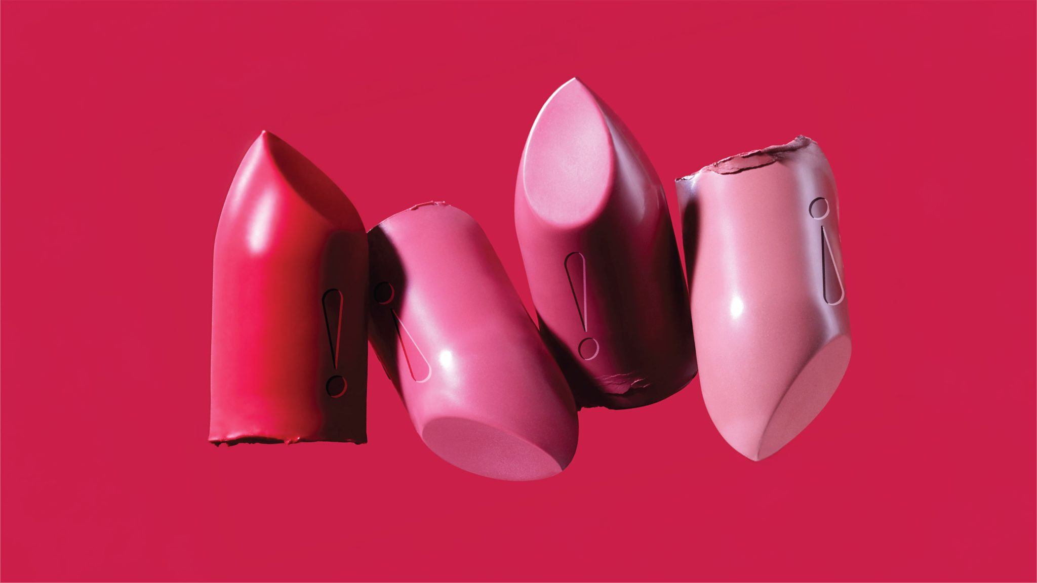
Then came the exclamation mark. We lifted it out of the logo and turned it into a recurring visual device — the brand’s own unmistakable signature.
At the centre of the identity sat the wordmark. The serif “be!” brought expression and individuality — the serif weight giving it warmth and character. The bold “MYN” added structure and sharpness. Together they created a mark that felt stylish, youthful and full of personality. But the real creative move was what happened next: the exclamation mark was extracted from the logo and promoted to a visual device in its own right. Sometimes embossed on packaging. Sometimes cropped into a layout. Sometimes reduced into curves, dots and graphic accents. Typography paired Libre Caslon with Montserrat for contrast between expression and clarity. The layouts borrowed from the exclamation mark and letterforms to create a graphic system that travelled seamlessly across every touchpoint.
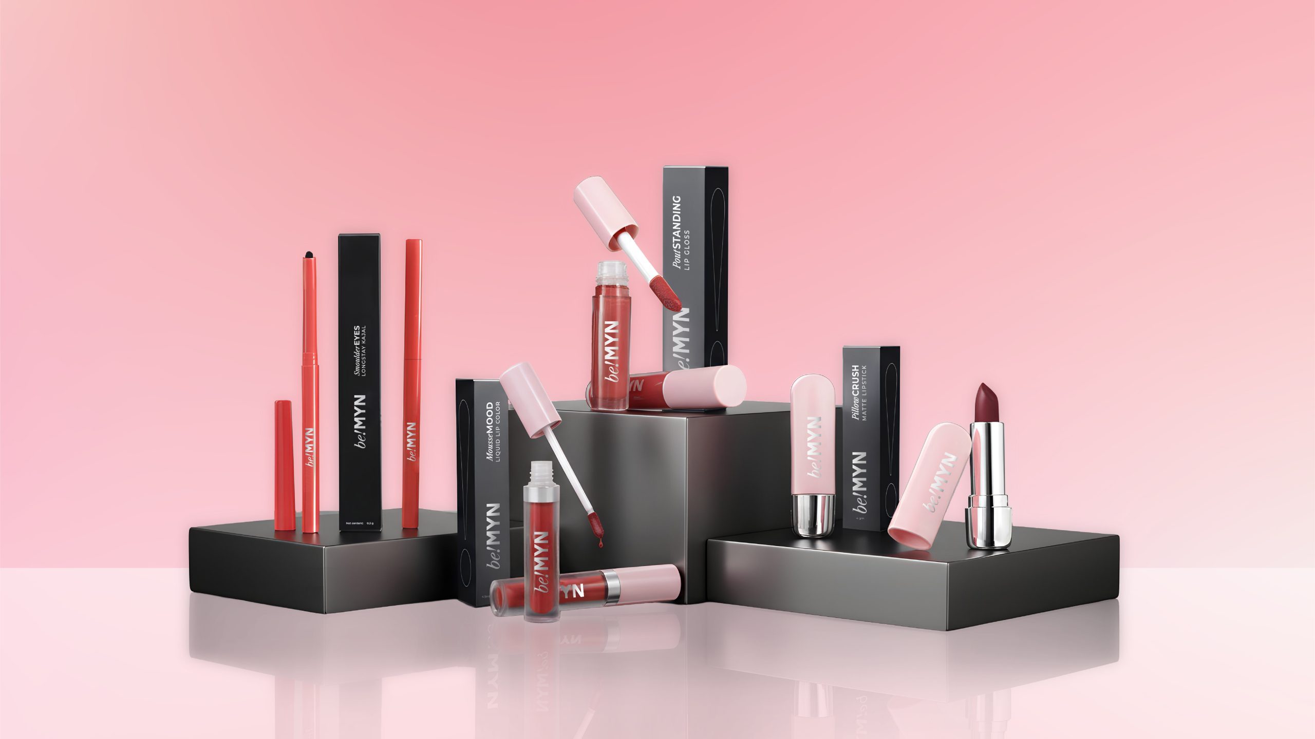
More than a logo, a visual language Gen Z could instantly relate to — across packaging, stickers, accessories, merchandise and digital communication.
The photography direction stayed deliberately away from the overly staged beauty advertising that Gen Z has learned to scroll past. Skin looked real. Expressions felt natural. The imagery carried the individuality and emotional honesty that this generation connects with instinctively — not aspirational distance but felt recognition. The identity was extended across packaging, stickers, accessories, merchandise and digital communication, creating a brand experience that felt cohesive at every level. From packaging to social communication, the identity gave be!MYN a distinctive and instantly recognisable presence — every detail, from the evolving shades of pink to the exclamation mark device, working together to create a beauty brand as expressive and fluid as the people it was made for.
Brand Philosophy
Embrace Every Mood — a brand truth that gave every product, palette and personality a home
Visual Device
The exclamation mark lifted from the logo and turned into the brand’s unmistakable visual signature across every touchpoint
Market Presence
be!MYN entered the category looking like it already belonged there — distinctive, current and instantly recognisable




 Derrick Lin
 salutifg
 ADStudio
 WeAreDepot
 Manuvila
 Yellow Umbrella Creative
 Toka
Toka Studio Zak
 Atiq Alam
 monther al omari
 Modern Theory
 Sirka Agency
 DESIGN CONCEPTS
 Eva Chistyakova
 Puigdemont Roca
 marianaaworks
 bloomburo
 andreamarinnn
 Alina
Alina Saadmost
 Bruhken
 Maruf Nishat
 Richest Branding Pvt. Ltd.
 Sophiagdotcom
 saifullahmaslool
 Up-Brands