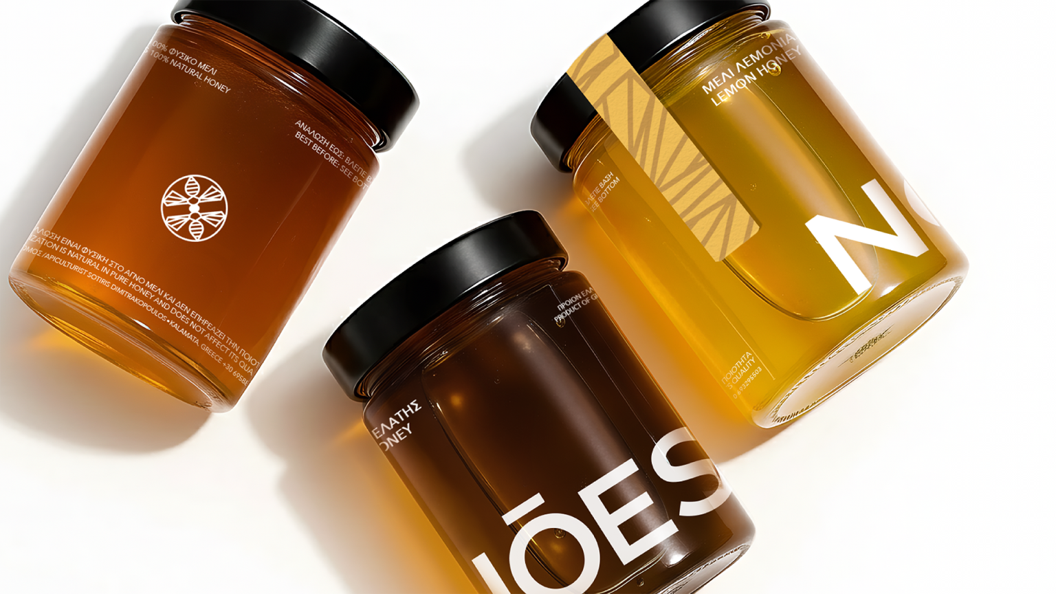

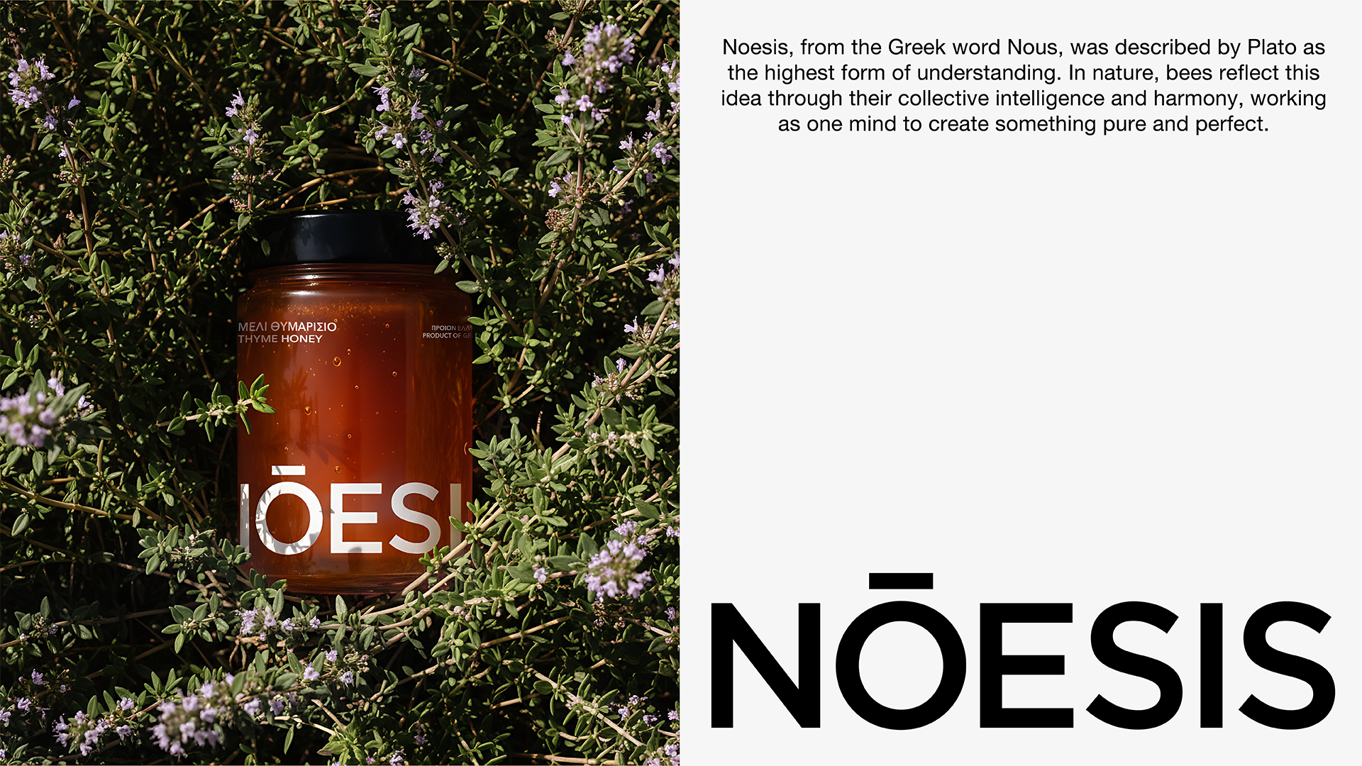
Born from nature and inspired by the intelligence of bees, NOESIS reimagines honey branding through the values of connection, harmony, and collaboration. Rooted in the Greek concept of Nous—the highest form of understanding—the brand offers a fresh and contemporary approach that moves beyond the familiar visual clichés of the honey category.
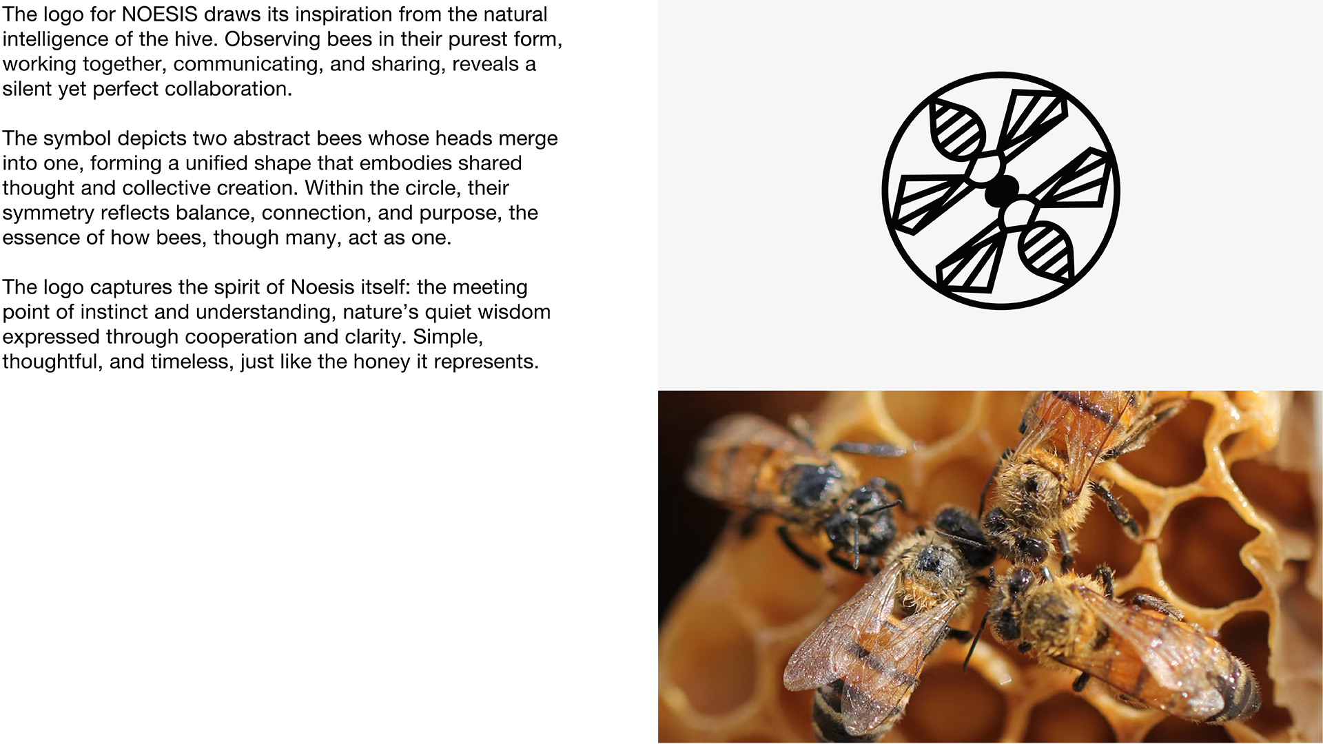
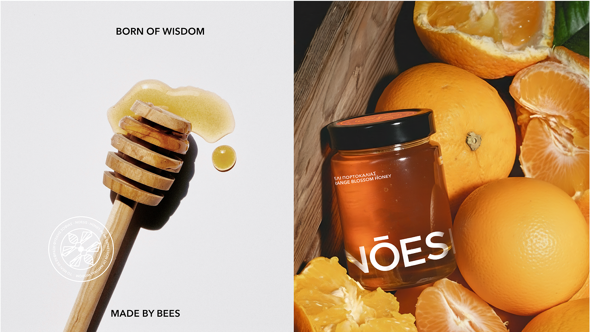
Instead of relying on rustic imagery, decorative honeycomb patterns, and traditional packaging cues, NOESIS takes inspiration from the way bees work together to create something pure and valuable. This idea is expressed through a symbolic mark where two abstract bee forms come together as one, representing unity, balance, and shared purpose.
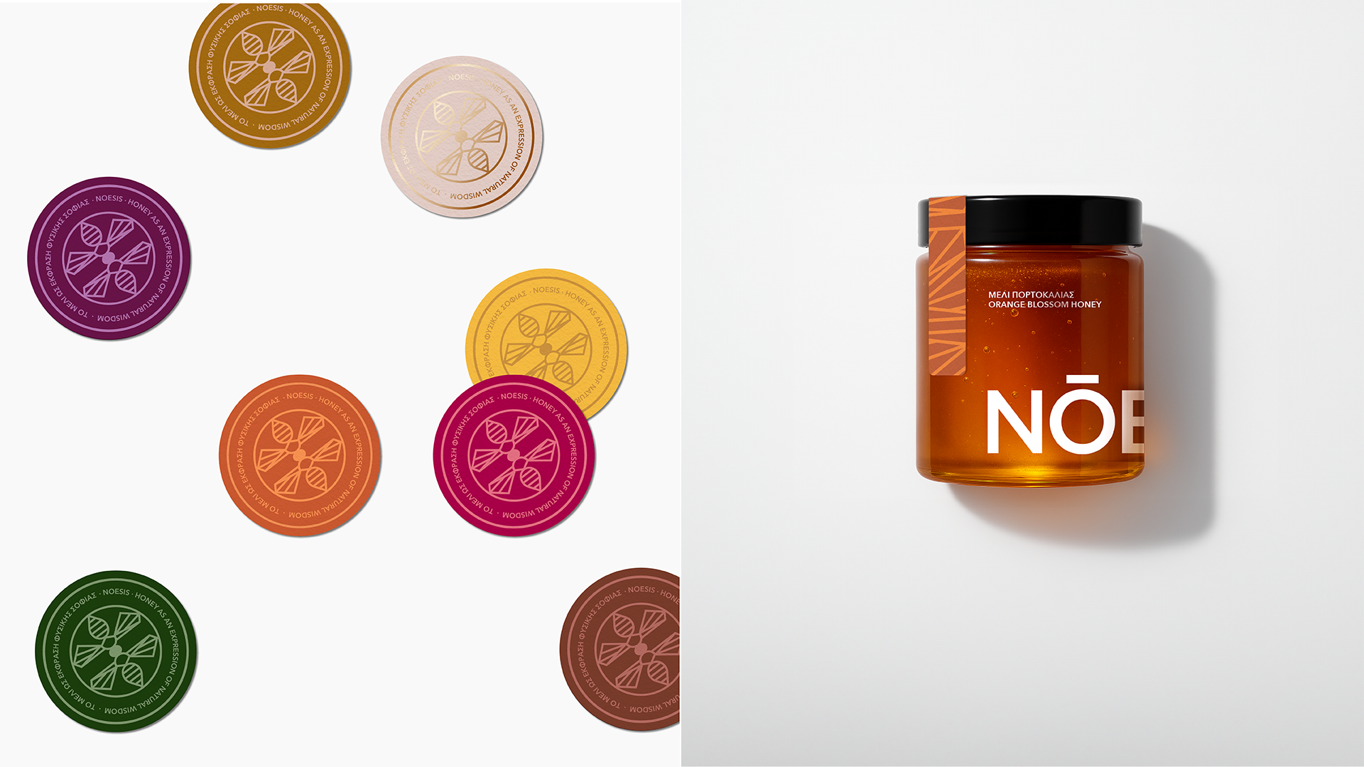
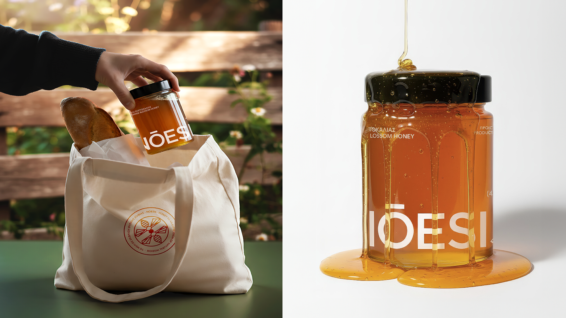
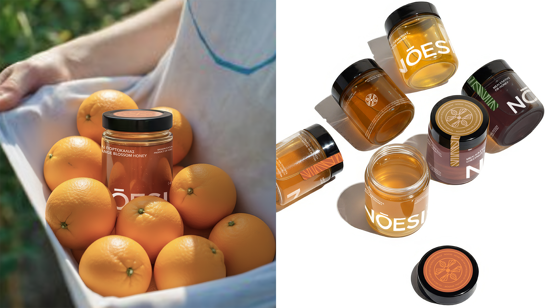
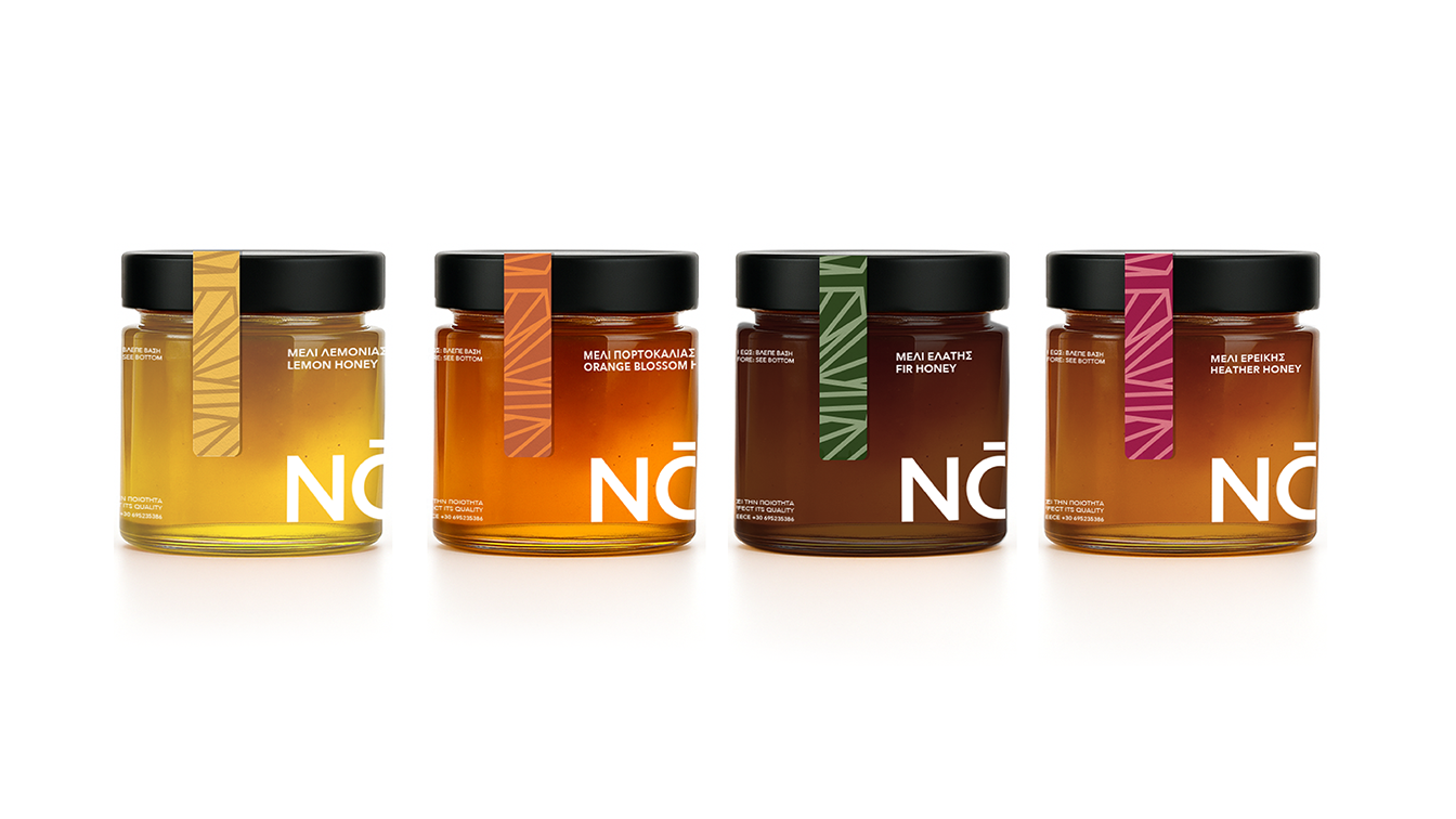
At the heart of the identity is the belief that true quality speaks for itself. The transparent label allows the honey to remain fully visible, making the product the hero of the design. Its natural colour, texture, and purity become part of the visual identity, creating an honest and authentic connection with the consumer. Combined with minimalist typography and a clean visual system, the packaging communicates clarity, simplicity, and authenticity, celebrating both the beauty of the product and the wisdom of nature.
 betterthansunday
 IDEOLOGO
 Eva Chistyakova
 Open Strategy & Design
 cem kutlu
 monther al omari
 Bonsanco Creative Studio
 Confetti Design Studio
 古戈品牌
古戈品牌 Rare Ideas
 Studio Pistache
 Studio Tumpic/Prenc
 Atiq Alam
 bachir bachchar
 Akshita Agarwal
 Carreto Concepts Design Studio
 Hollóka Grafikai Műhely / Graphic Design Studio
 Arsen Avetisyan
 Derrick Lin
 Axiniya Knyazeva
 Hadi Samir
 Furt Goods