Rooto was created to break away from the predictable aesthetics of pet food branding. While most dog food packaging looks conventional, Rooto dares to be different—bold, vibrant, and full of personality.
The design captures the joy, energy, and individuality of dogs without relying on childish or overly playful clichés. The name “Rooto” is inspired by the word “root,” emphasizing the power of vegetables in a dog’s diet. But it also sounds like a pet’s name—friendly, familiar, and full of character.
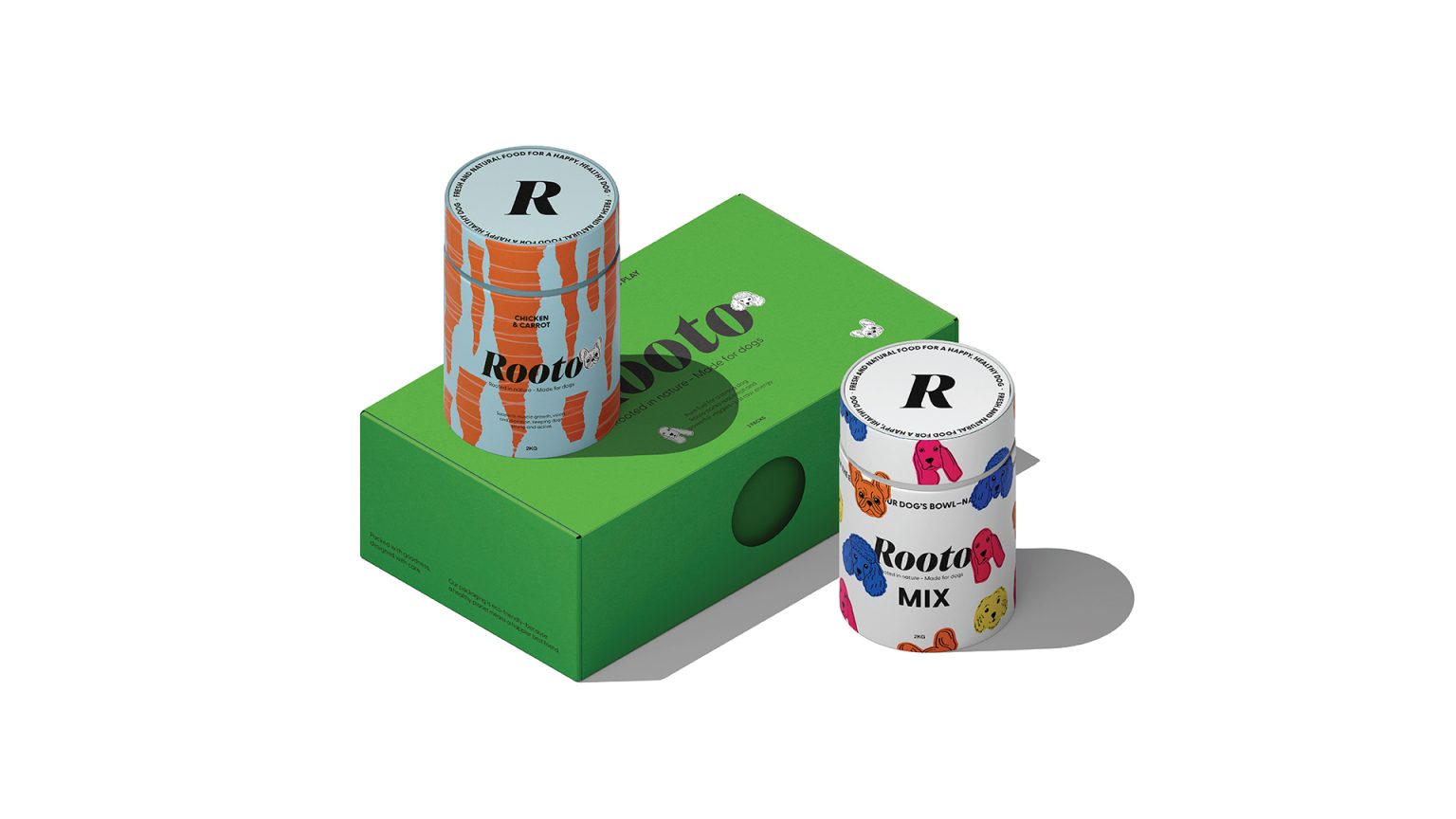
Each product features a hero vegetable, visually represented to reflect its essence—sharp and dynamic for carrots, rich in color and hand-crafted texture for beetroot, solid for pumpkin to emphasize its volume, and outlined for kale to convey its delicate yet bold presence. The lineup consists of four core products, plus a Mix Edition that blends all flavors into one, offering variety and excitement.
To add even more personality, hand-drawn dog face sketches in a sticker-style design subtly link the brand to the dog world. These details inject energy and playfulness while ensuring Rooto remains sophisticated and design-driven.
Beyond aesthetics, Rooto’s packaging is designed to be collectible—something you’d want to keep, display, or repurpose. The bold, italicized logotype reinforces movement and dynamism, mirroring the active, adventurous spirit of dogs and their owners.
Rooto is a brand that is playful, rebellious, and full of personality—created for dogs and owners who embrace fun, adventure, and individuality.


