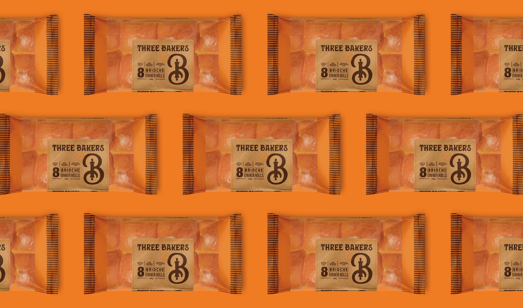

Brioche may be the golden child of the bread aisle, but somewhere along the way, the category settled on a fairly predictable formula.
Traditional typography, heritage storytelling, and European bakery cues had become shorthand for quality. The problem was that everyone was using them.
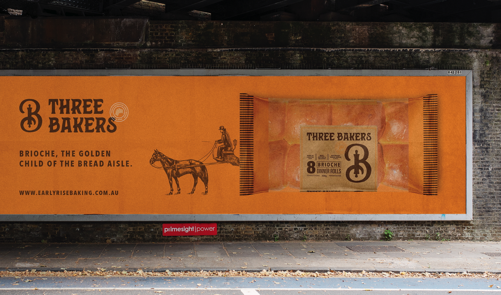
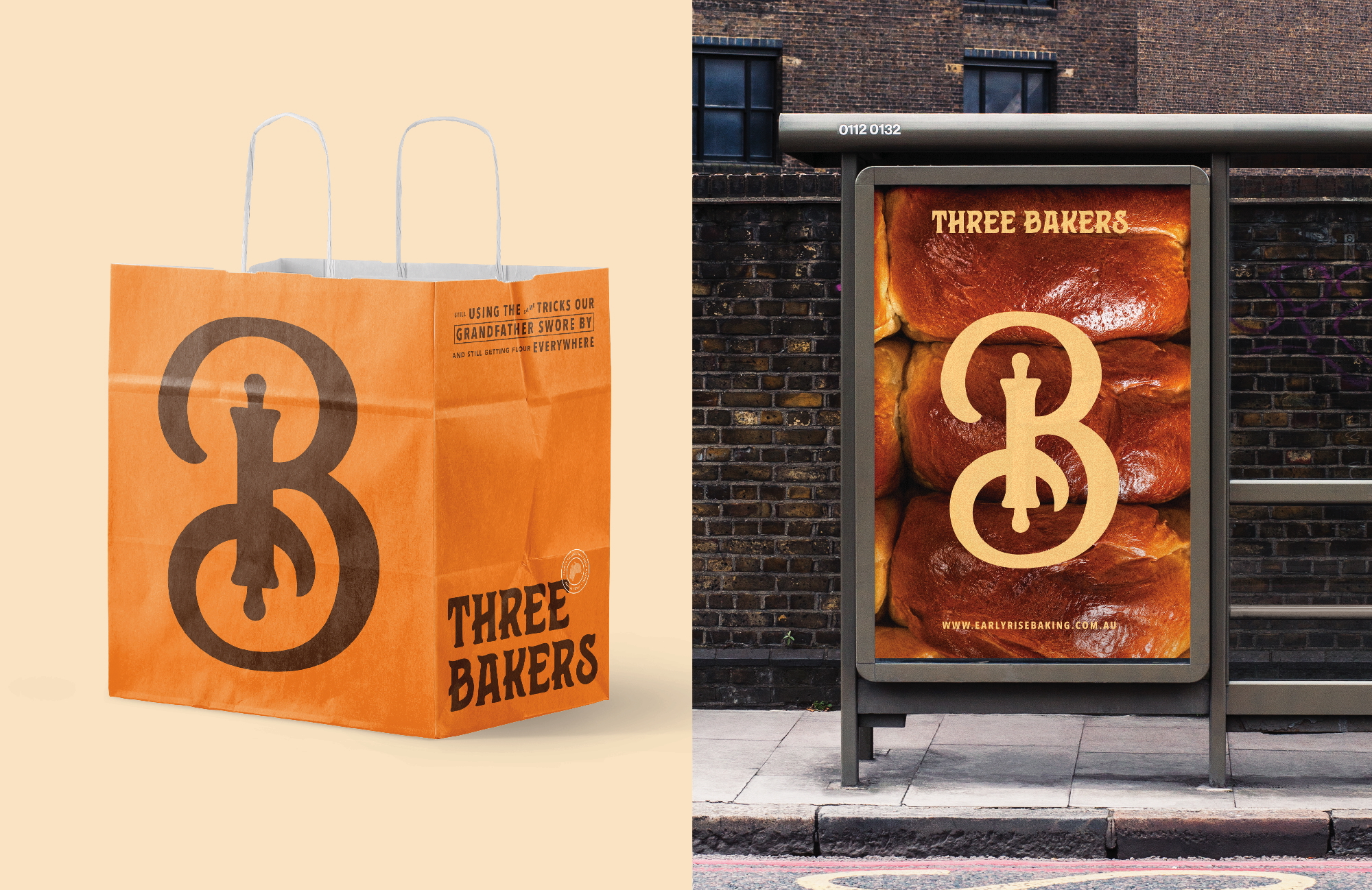
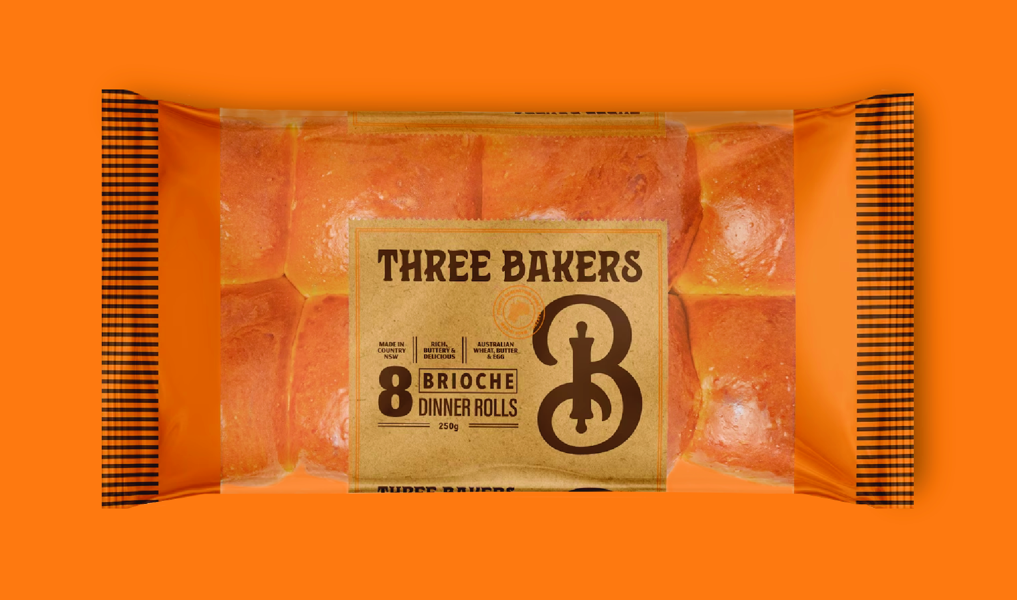
For Three Bakers, we stripped things back. Large transparent windows put the product front and centre, while a distinctive brand mark and bold, approachable design system created a stronger presence on the shelf.
The result is packaging that feels familiar enough to belong in the category, but distinctive enough to be remembered. Since launching, the new packaging has contributed to a 350% increase in year-on-year sales.
 VERONIKA KISELEVA
 al margen
 Jasgul
 Abhijith Madhu
 mariee
 Modern Theory
 Tancybox
 WINK®DESIGN
 impprintz
 Chainhouse
 rufydesign
 White Candy Design
 Just Design
 alchimistestudioParis
 bmd group
 Laurie Offer
 medok4r
 Nouna design
 CreativeWise
 ANNA ONISHCHENKO
 Denomination
 VANESA GARCÍA ESTUDIO
 Julia Persuk