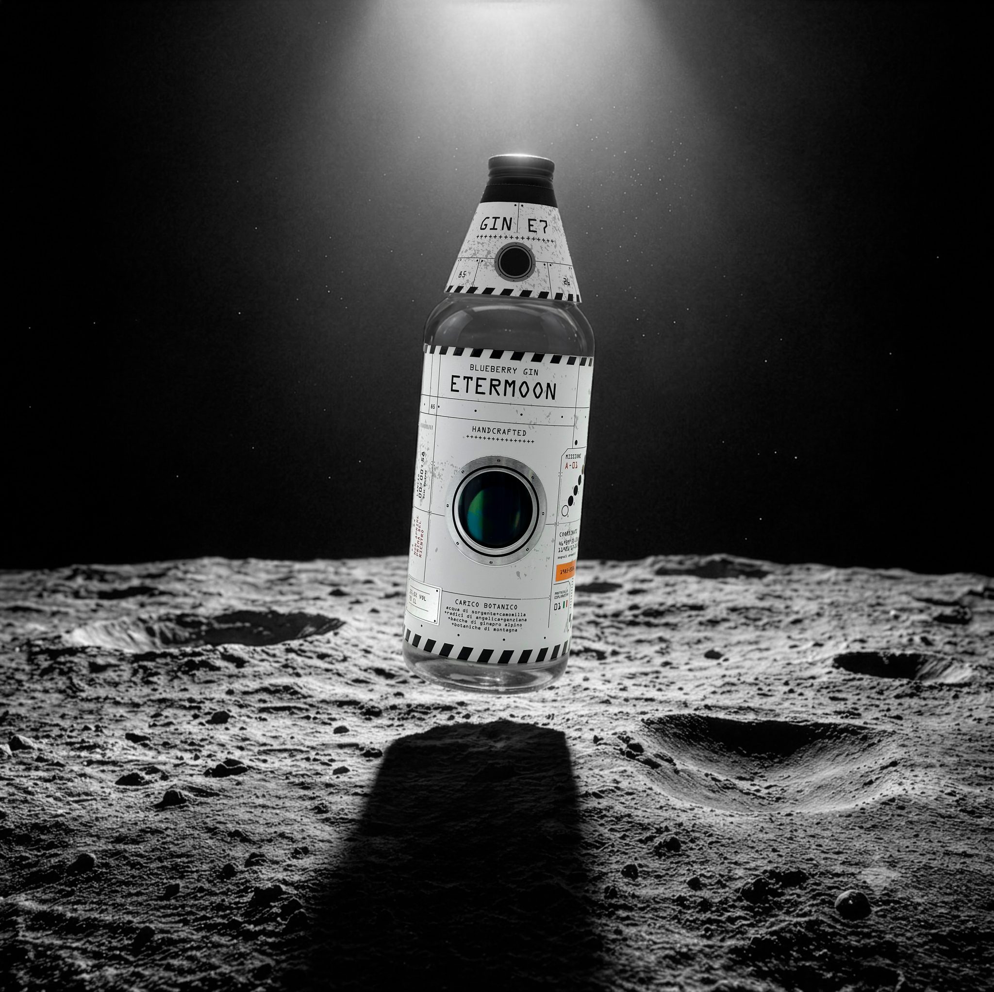

Some projects are born to show what happens when design, print, and technology stop working in sequence and start designing together.
ETERMOON is one of them.
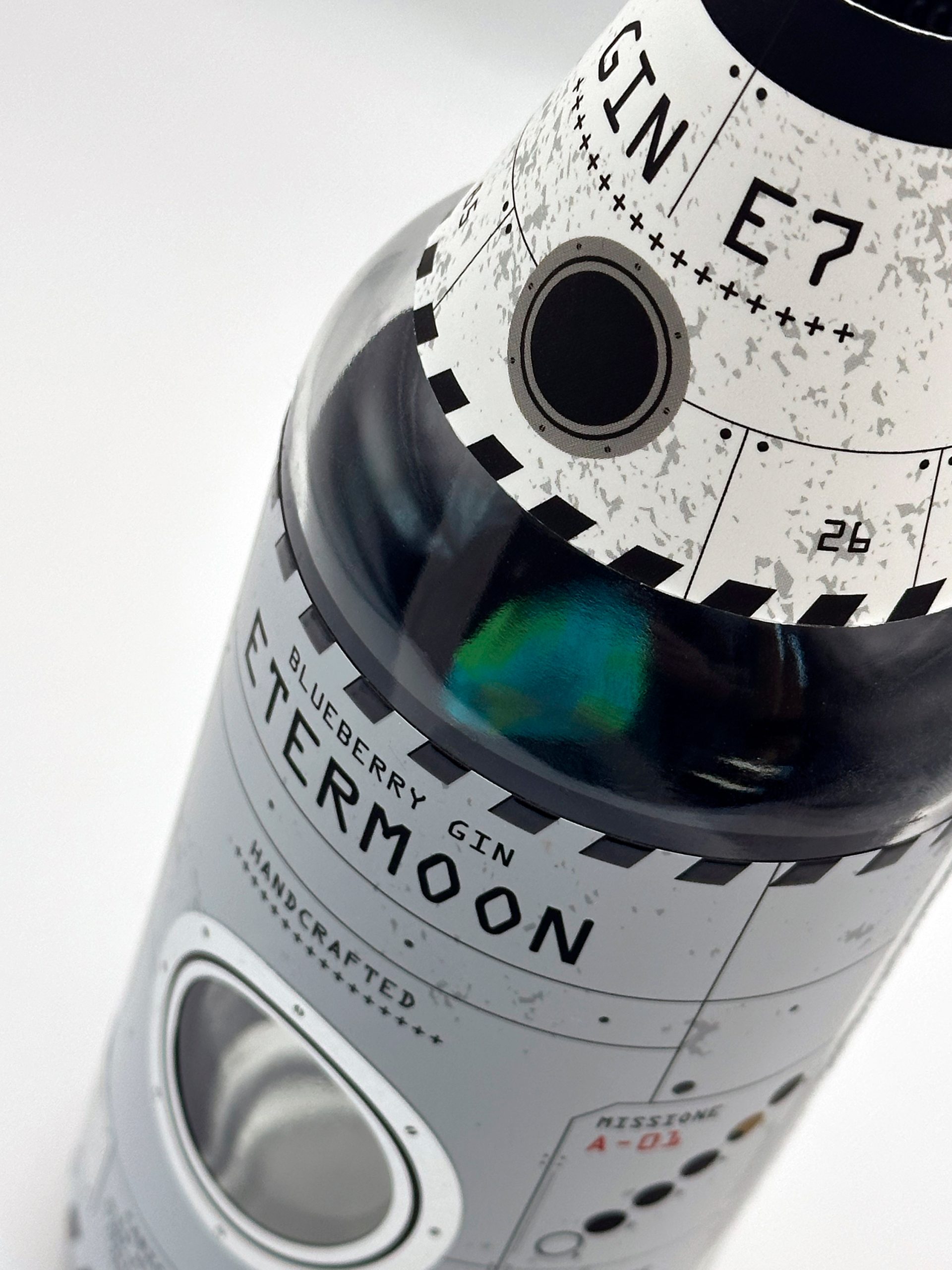
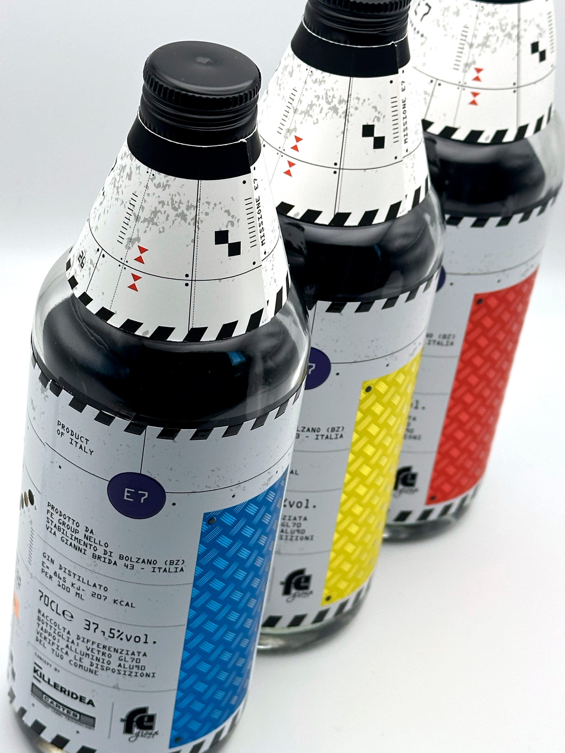
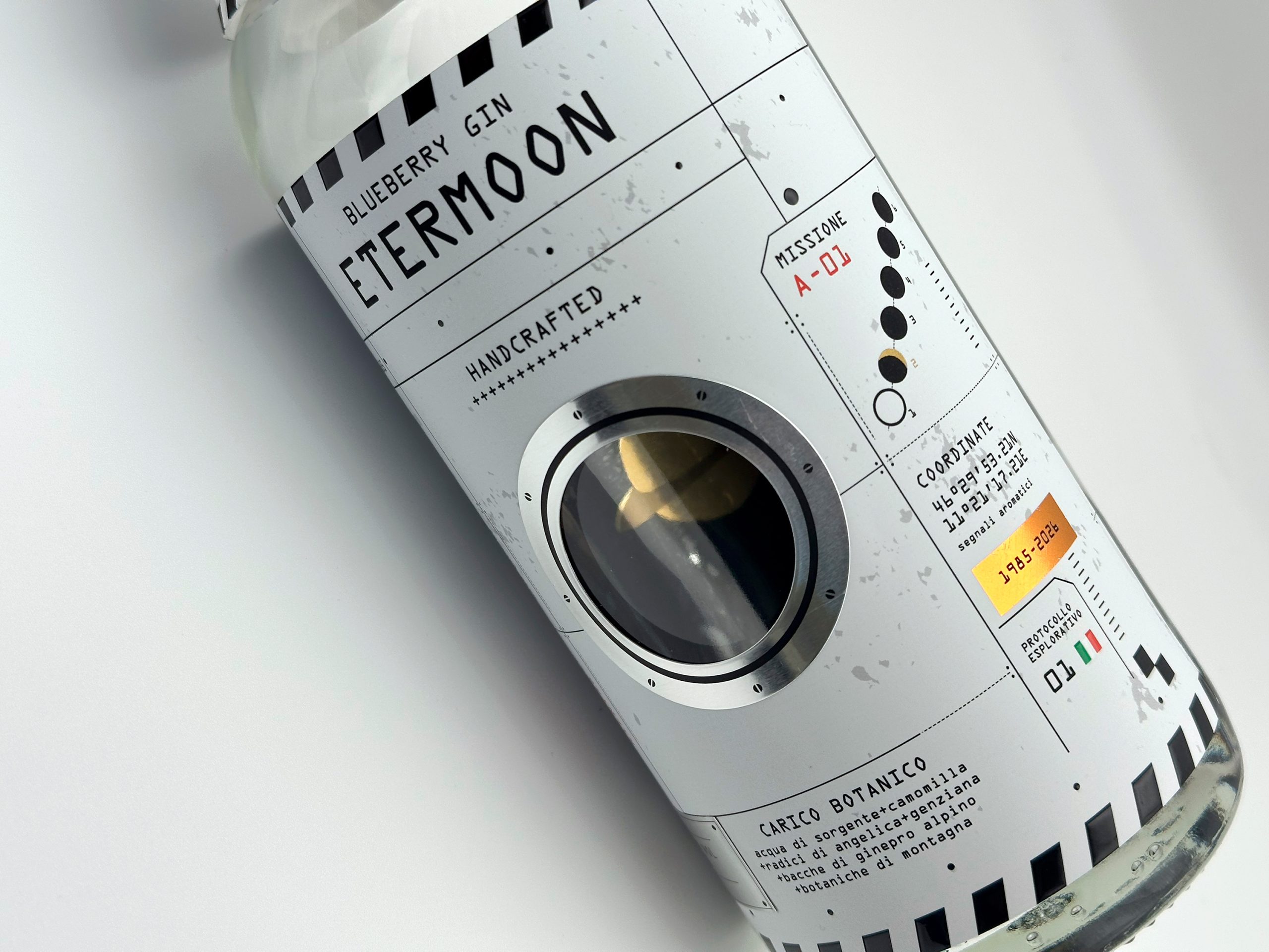
The idea was simple: if a space mission is made up of dozens of steps that must work together flawlessly, why not transform the bottle itself into a spacecraft? That question became the foundation of the entire project. Not only the label, but also the paper structure wrapping the upper part of the bottle was designed to turn the closure into a graphic element, making the cap an integral part of the story.
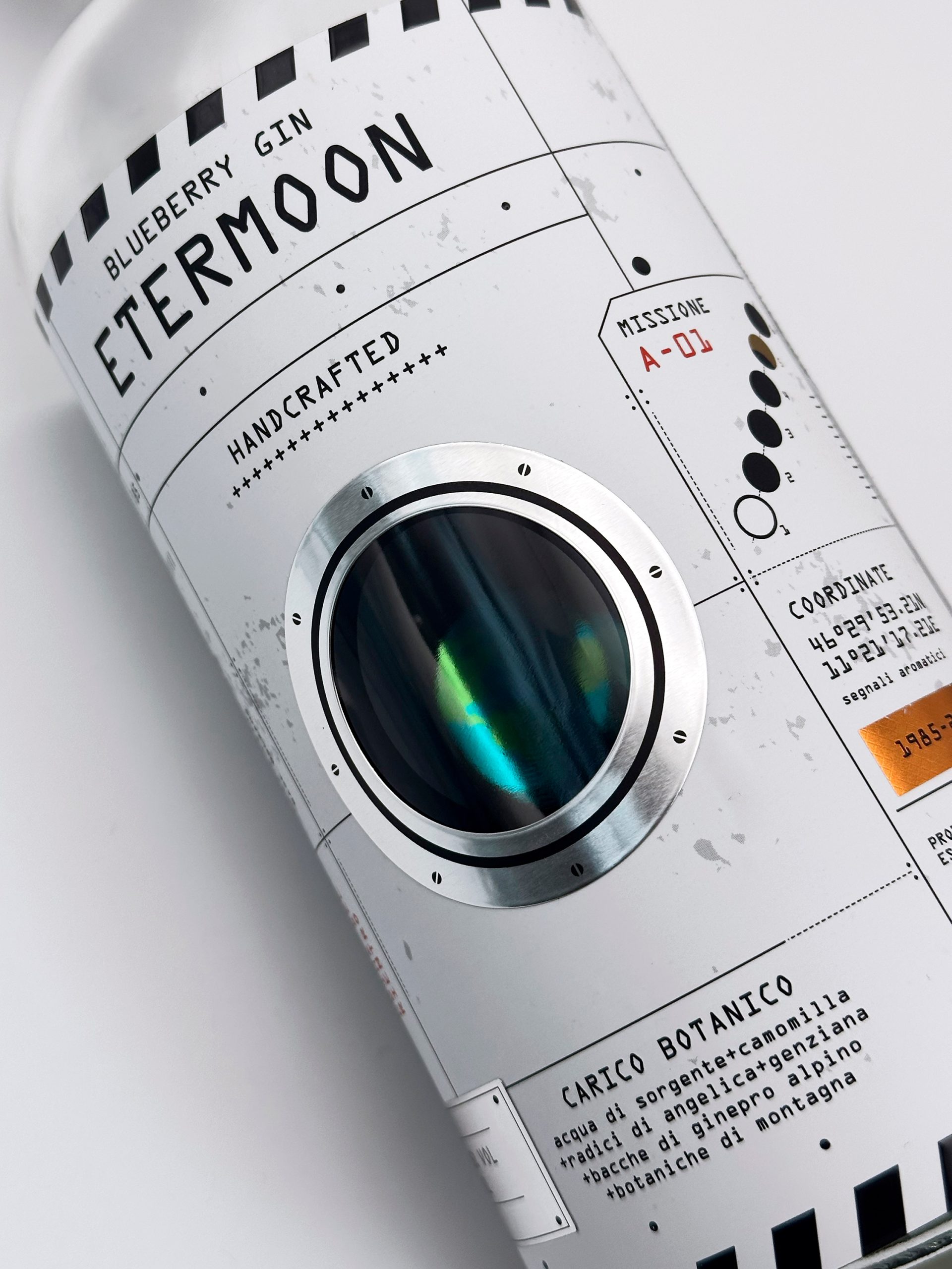
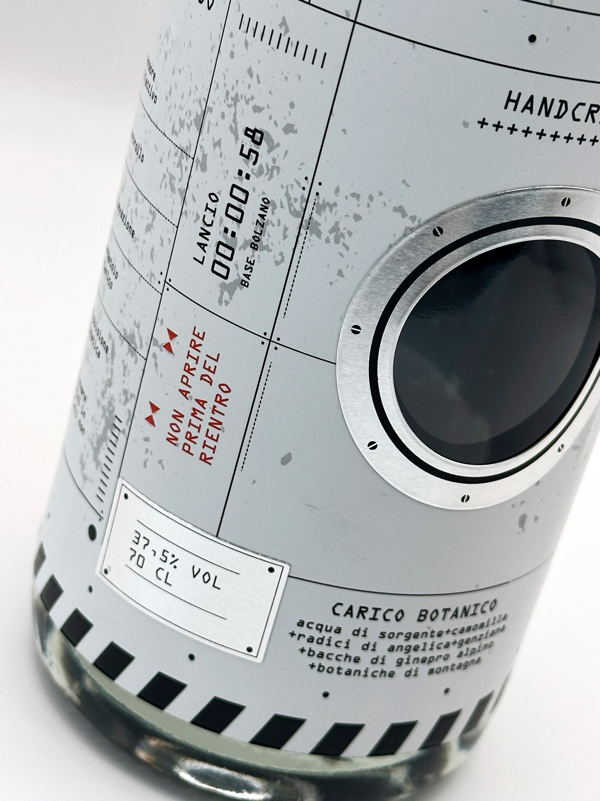
Every finishing technique was selected because it added meaning to the concept:
- Digital reverse printing on clear label
- Digital offset printing
- Die-cutting + black screen printing
- Label-on-Label (PP + Silver + Aluminum)
- Digital embossing
- Foil stamping with micro-engraving
A project born from the collaboration of different areas of expertise, where every technology contributed to building a single idea. Because the true potential of digital printing isn’t about adding more special effects. It’s about giving designers new tools to tell better stories.
Concept & Design: @killeridea + Fegroup
Print: @fegroupsrl
Label Machine: @cartes_label_machines
Curator’s Insight
What makes this project interesting is the sequencing problem it solves. Most multi-technique labels apply finishes as decoration, layered on after the concept is locked. Here the print processes were treated as part of the concept development itself, chosen because each one carried narrative weight rather than visual polish alone.
The neck treatment is the clearest example of this thinking. Turning the closure into a design surface rather than treating it as a separate component is a small structural decision, but it’s the one that makes the bottle read as a single object rather than a label wrapped around a shape. That kind of continuity is hard to fake with graphics alone, it has to be built into how the materials are assembled.
There’s also a case here for print as authorship rather than execution. Involving a label machine specialist as a named collaborator, alongside the concept and print studios, signals that the finishing choices weren’t a production afterthought but part of the creative decision making from the start.

 MID-AIR STUDIO
 Heramb Arora
 monther al omari
 Tríona O'Donoghue • Design
 Cocoon Prague
 alchimistestudioParis
 hugo zapata
 Bonsanco Creative Studio
 parawaradesign
 UPRISE
 Brand Society
 Que Cálido Studio®
 Richest Branding Pvt. Ltd.
 STRATEDGY
 Shapers Studio
 Platon Ivantsov
 WPA Pinfold
 giselepereiradesign
 ShalaSketches
 05Creation
 Voit Studio
 SSTO
SSTO