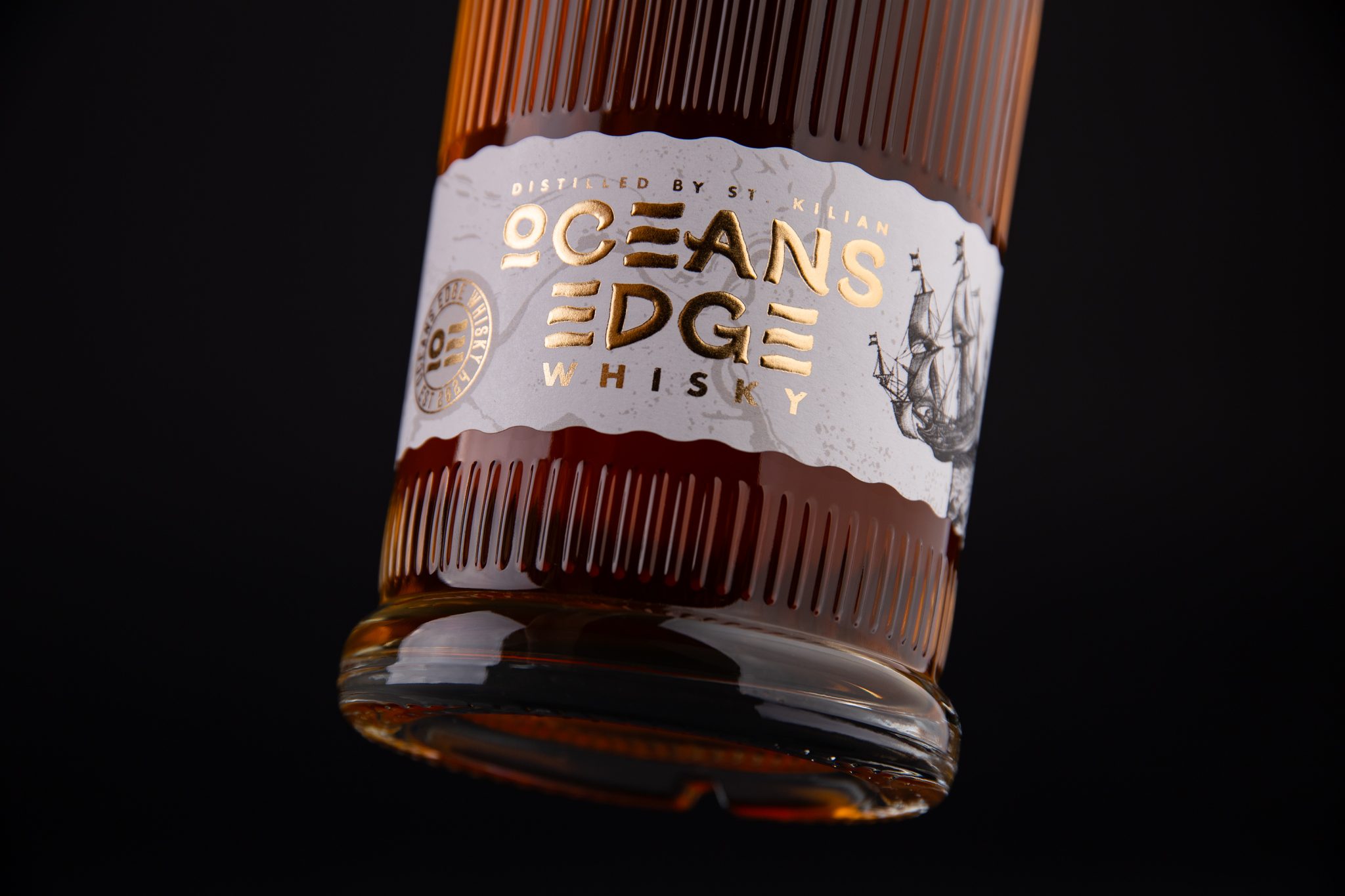

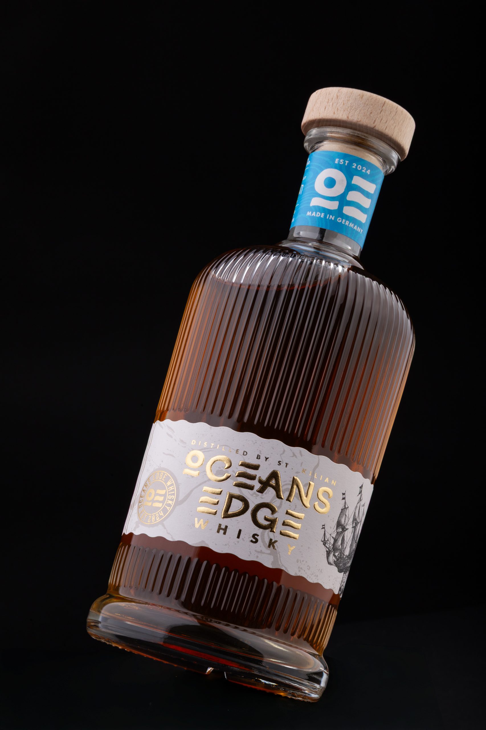
Oceans Edge is a premium whisky brand inspired by the spirit of exploration and the unknown territories once depicted on medieval maps. Located in northern Germany, between the Baltic Sea and the North Sea, the brand takes its name from the place where familiar waters meet the horizon, symbolising the moment when curiosity overcomes certainty.
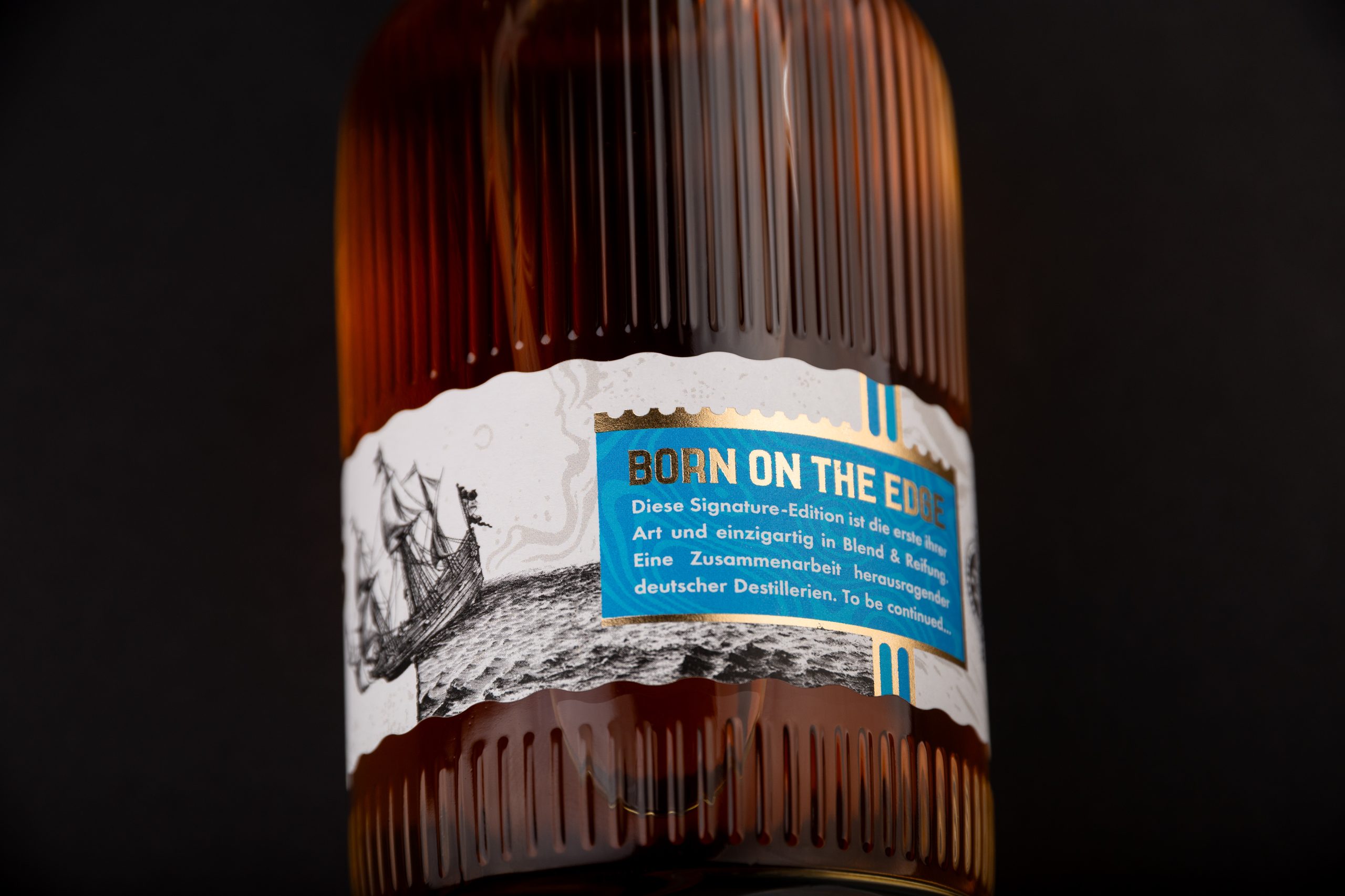
The concept draws from the historic phrase “Here Be Dragons”, not as a reference to mythical creatures, but as a tribute to the explorers who chose to venture beyond the edge of the known world. This narrative became the foundation for the entire visual identity, transforming the idea of exploration into a sophisticated and timeless packaging experience.
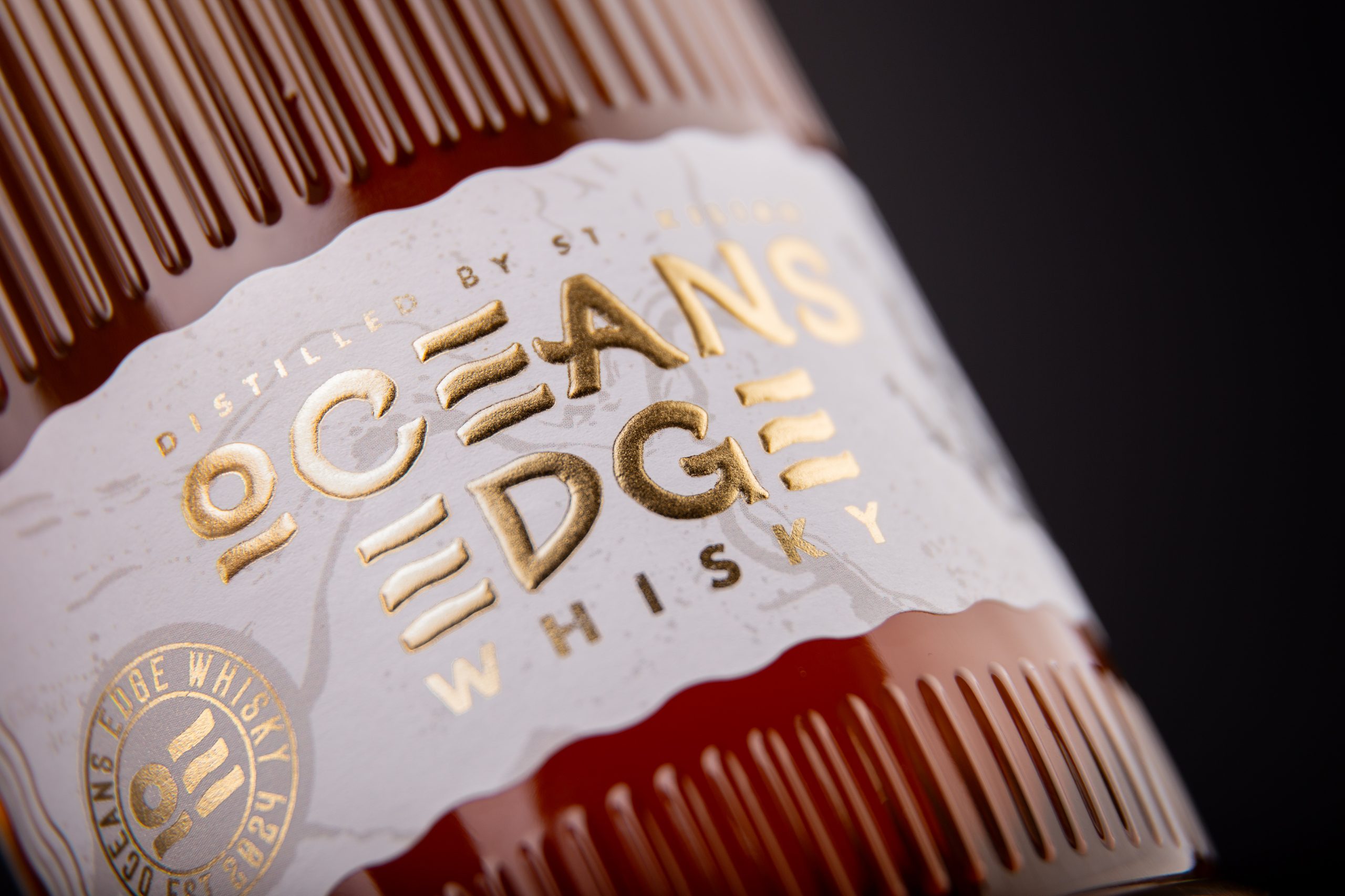
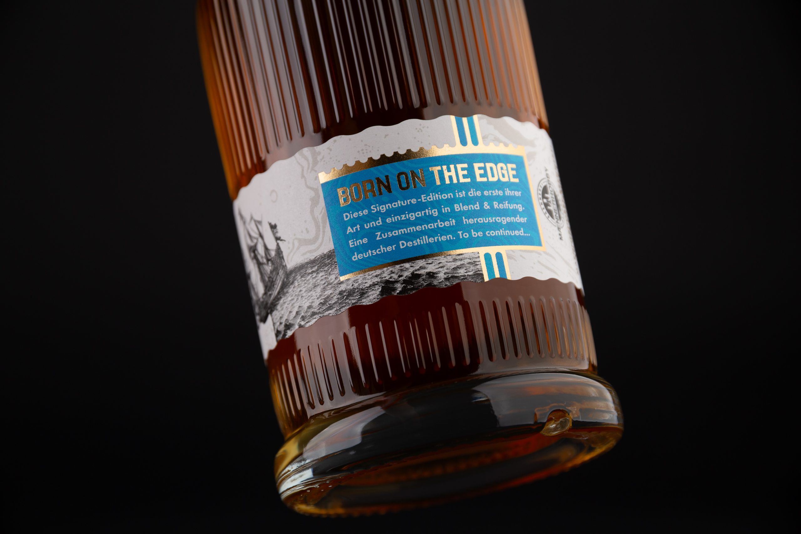
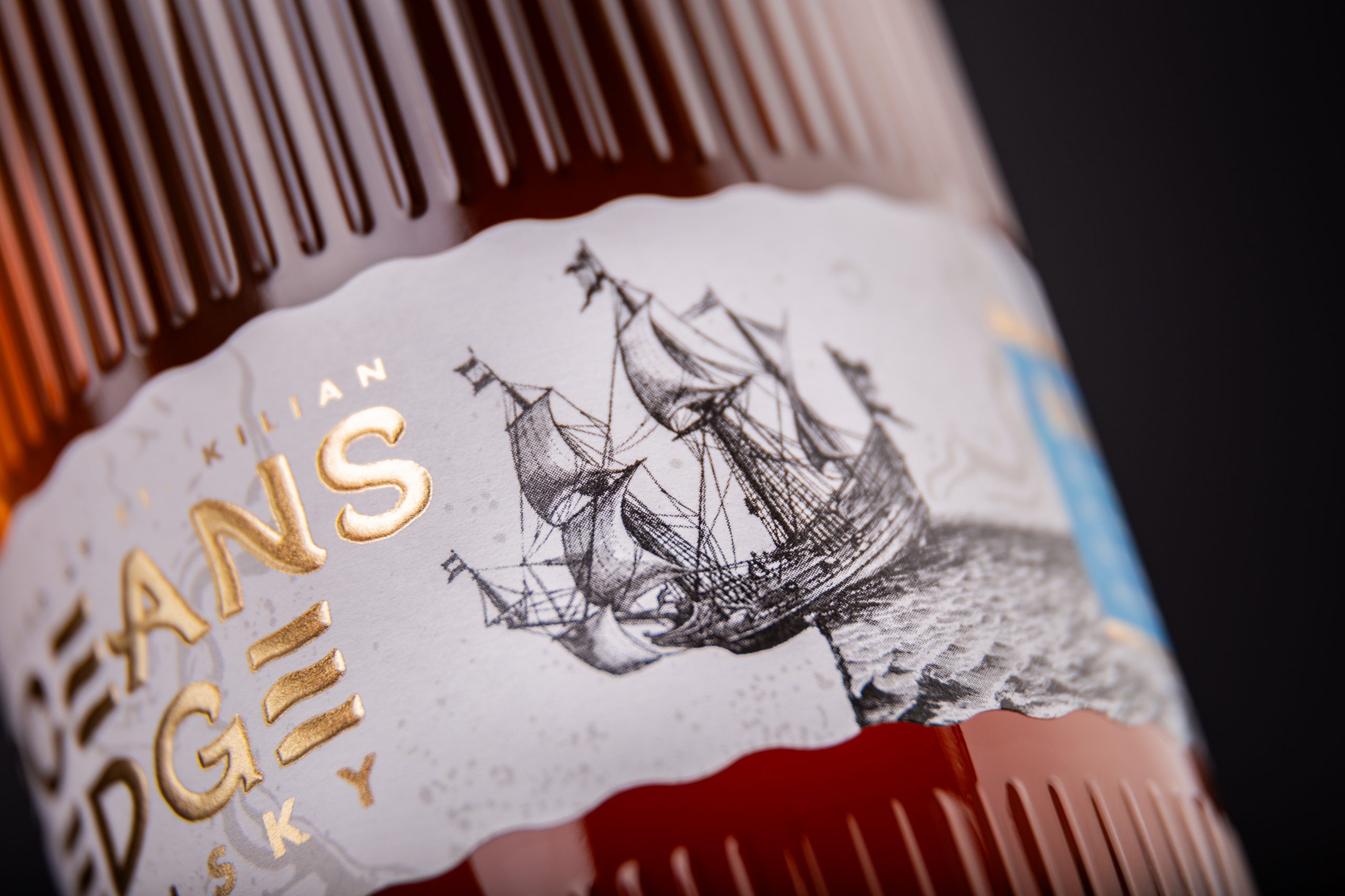
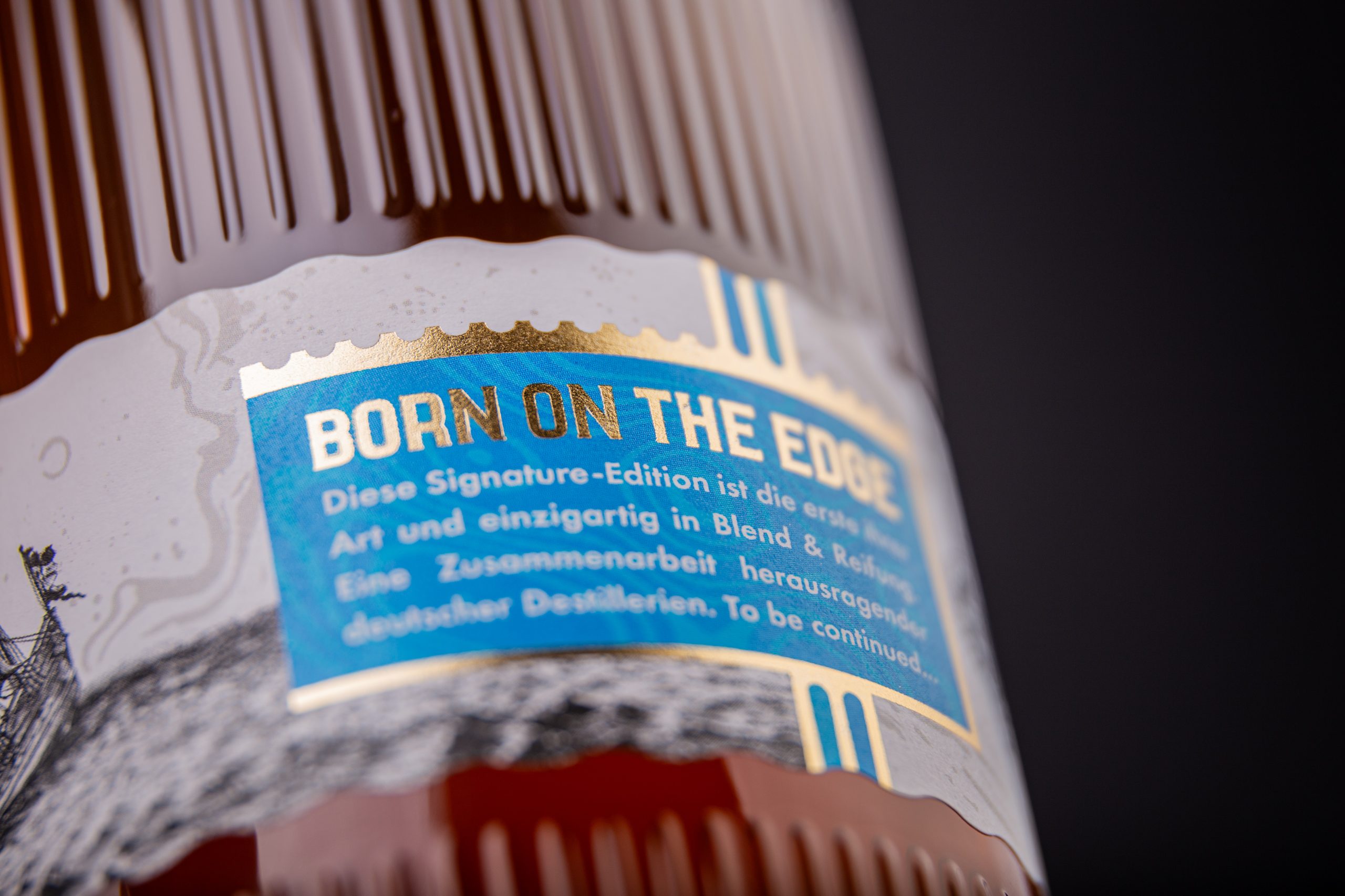
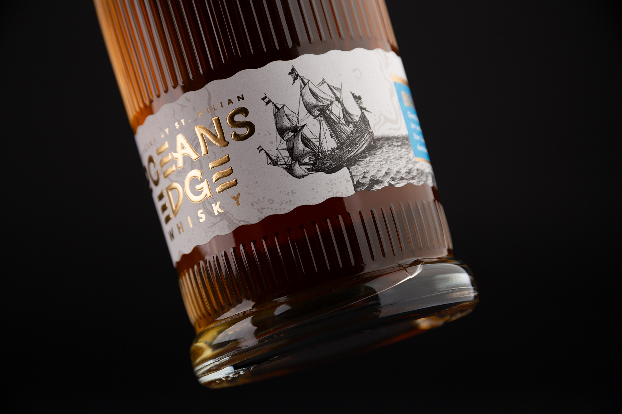
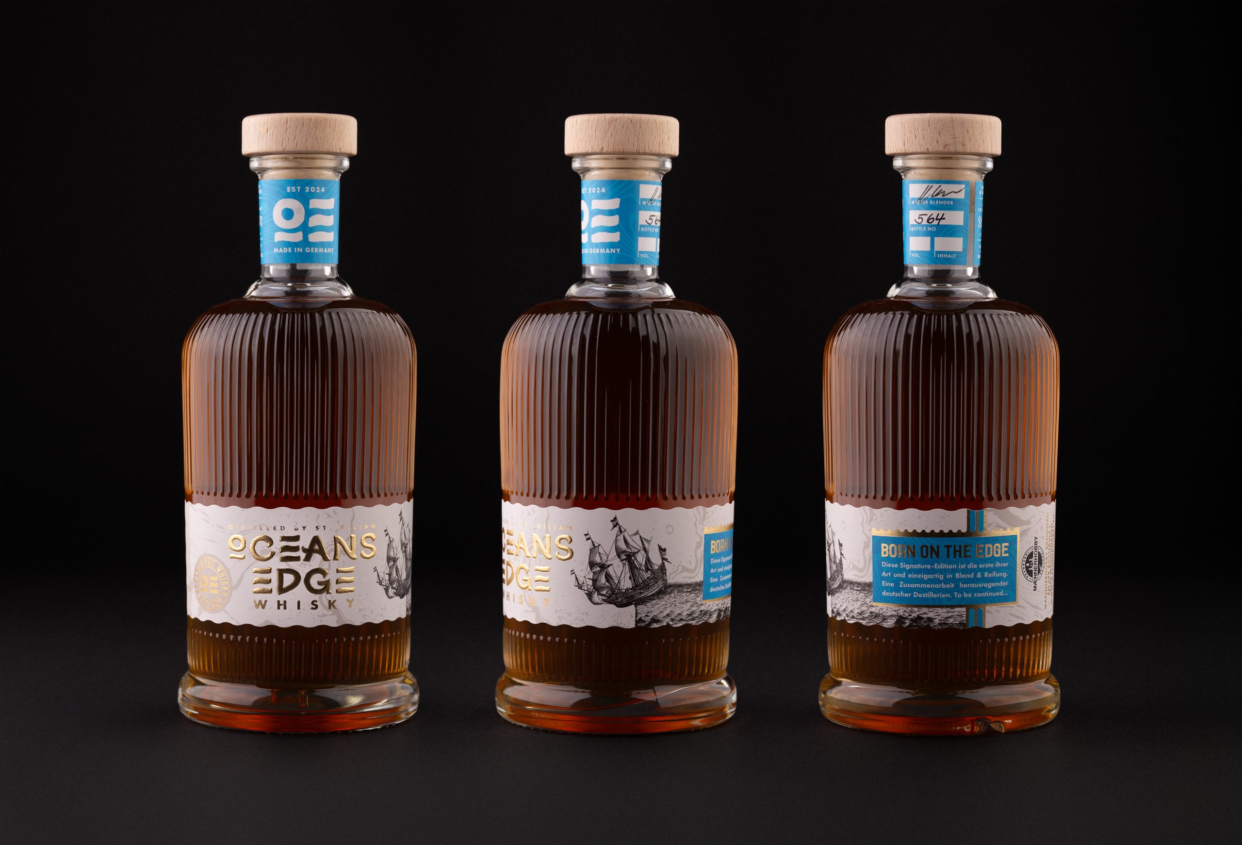
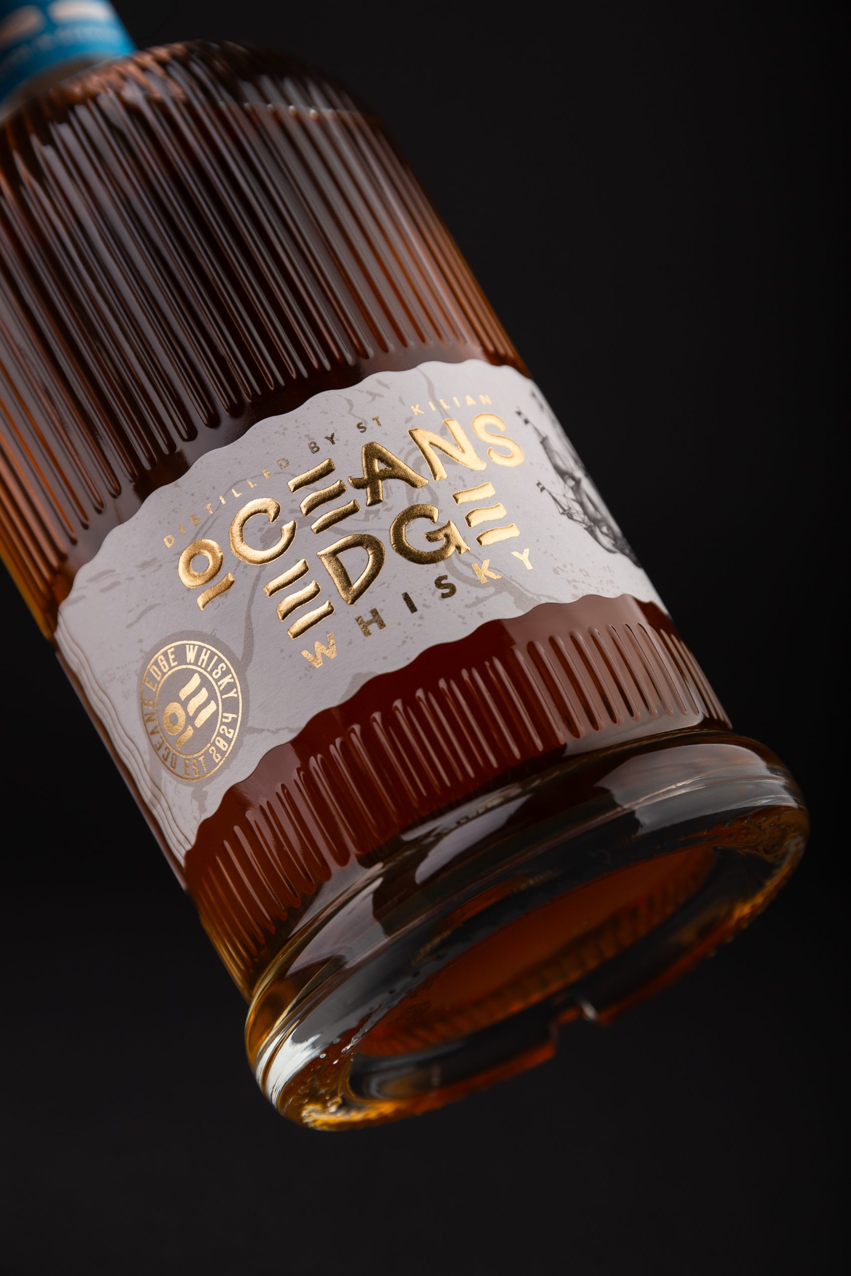
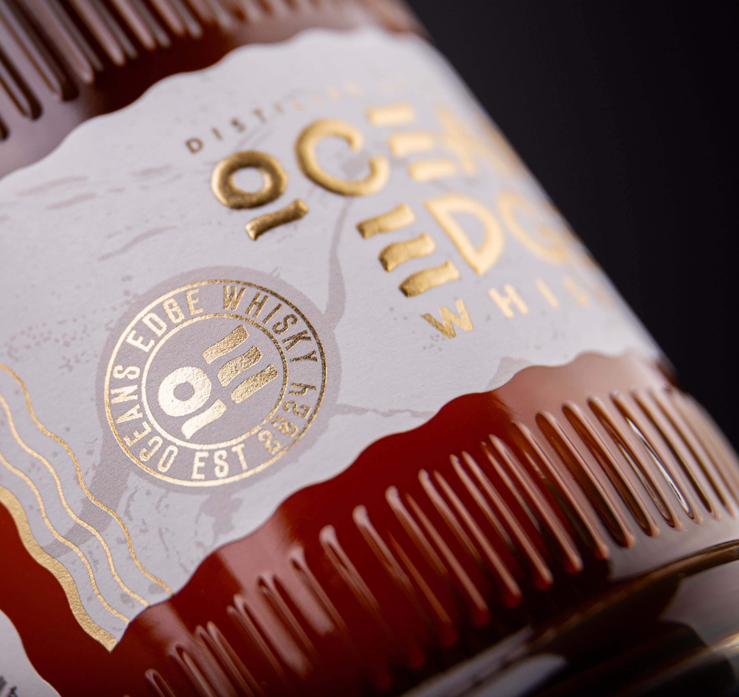
The design combines intricate maritime-inspired illustrations with elegant typography and a restrained colour palette to evoke heritage, authenticity, and craftsmanship. Premium finishing details reinforce the tactile quality of the bottle, creating an object that feels both collectible and enduring. Every element was carefully considered to balance historical references with a contemporary luxury aesthetic.
The debut Signature Edition establishes the visual language for a scalable whisky collection, allowing future expressions to evolve while remaining recognisably part of the Oceans Edge family. Rather than relying on trends, the identity focuses on storytelling, permanence, and refined execution, creating a packaging system that celebrates craftsmanship as much as the whisky itself.

 studiofoxtrot
 Derrick Lin
 monther al omari
 43oz
43oz lilyz design23
 Modern Theory
 Eighteen Brand Studio
 Bhumika Singh
 MohamedMashaly
 Pixels Studio
 Gulya
Gulya UPRISE
 Lizaveta Kharitonyuk
 Bonsanco Creative Studio
 DesignRepublic
 GIRAFA STUDIO
 PiotrWisniewski
 Sophiagdotcom
 CreativeWise
 SoreThumbStudio®
 Modern World Studio
 Palashcc
 Valérie Colace