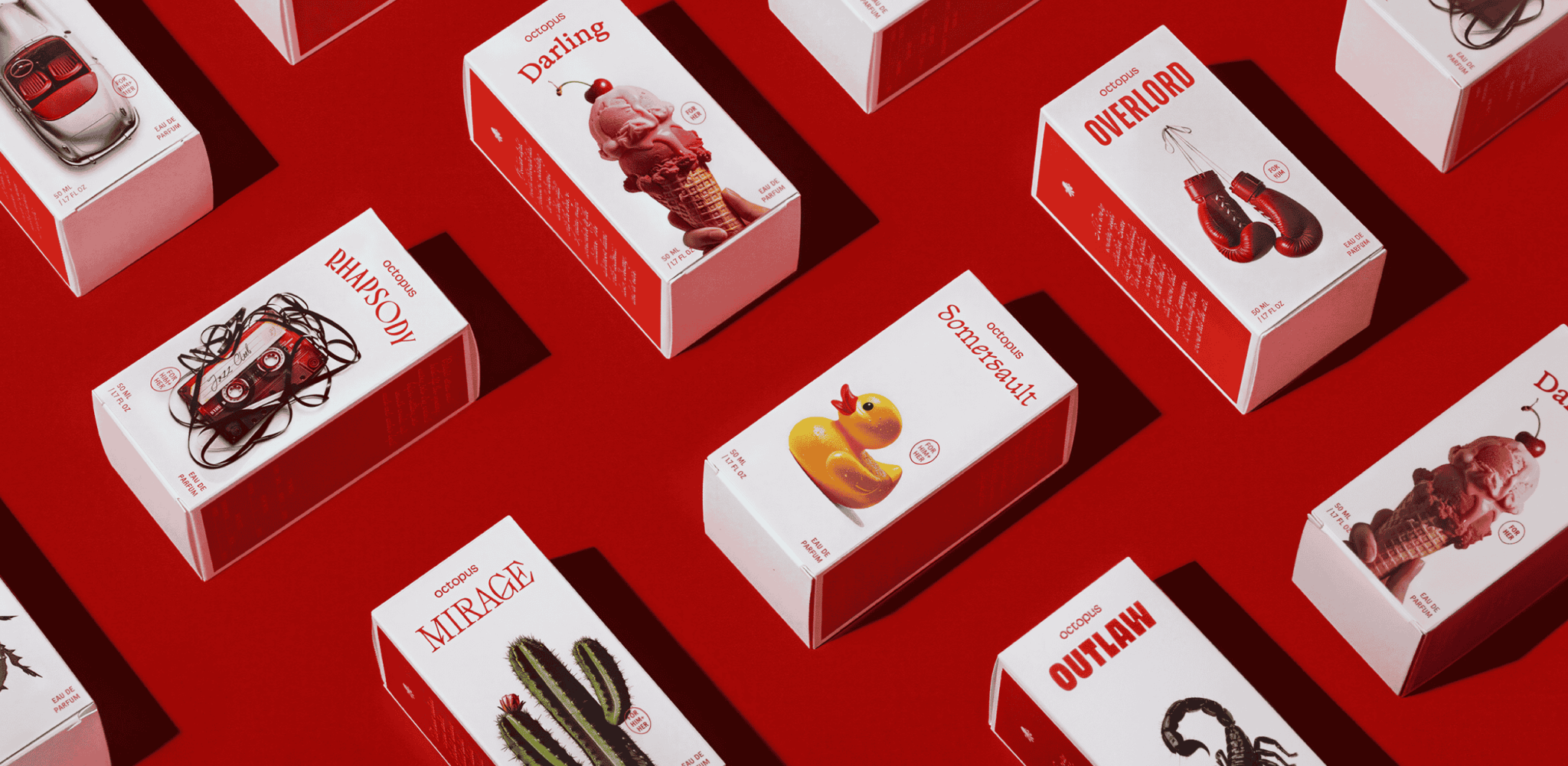

Octopus is a fragrance brand bringing 20 inspired eau de parfums (starting with 9 in the first roll-out) to the Indian market, priced under Rs 3,000. Opposite created Octopus from scratch over eight months. Brand Strategy, Brand Name, Identity, Product Names, Bottle Design and Packaging Design.
For the last decade, the premium personal care space has chased two ideas of aspiration. First, the quiet restraint of European luxury that is minimal, templatized and boring. Second, a manufactured Indian aesthetic presumably rooted in culture, but that usually results in pared-down kitsch. Indian consumers, particularly in discretionary categories, respond to maximalism. Color. Scale. Drama. Contrast. Not restraint. Octopus is our interpretation of this thesis. It embraces flamboyance as the brand’s guiding principle.
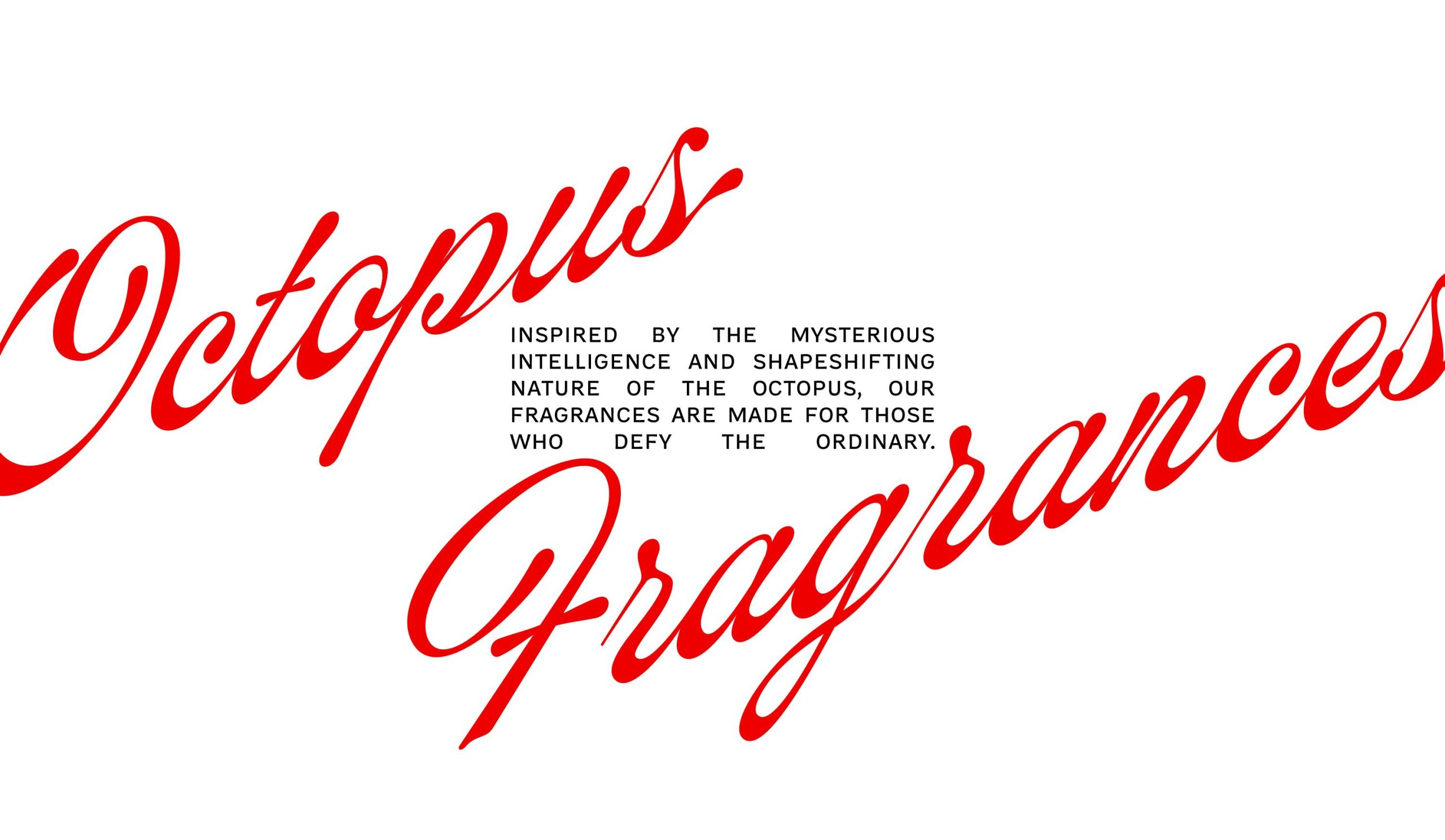
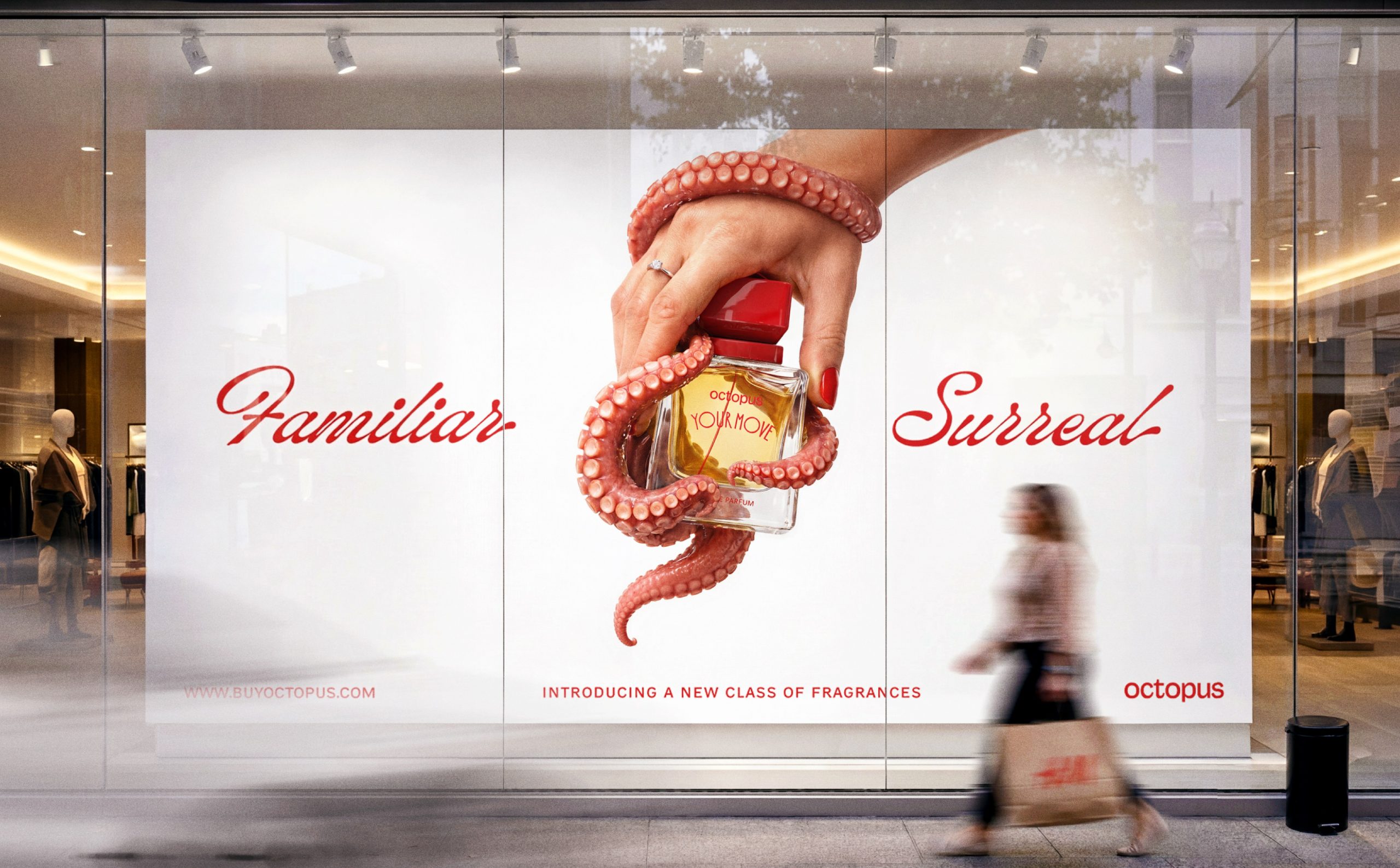
Our naming exercise had one rule. Avoid every cue the category leans on: pretentious luxury signals, spiritual evocations and French/Italian words. “Octopus” is a bold jolt out of the category’s milieu. It works because the creature embodies fluid flamboyance. The visual identity strategically avoids any reference to its marine origins to focus on the word as a verbal asset, turning it into a proper noun, rather than a theme.
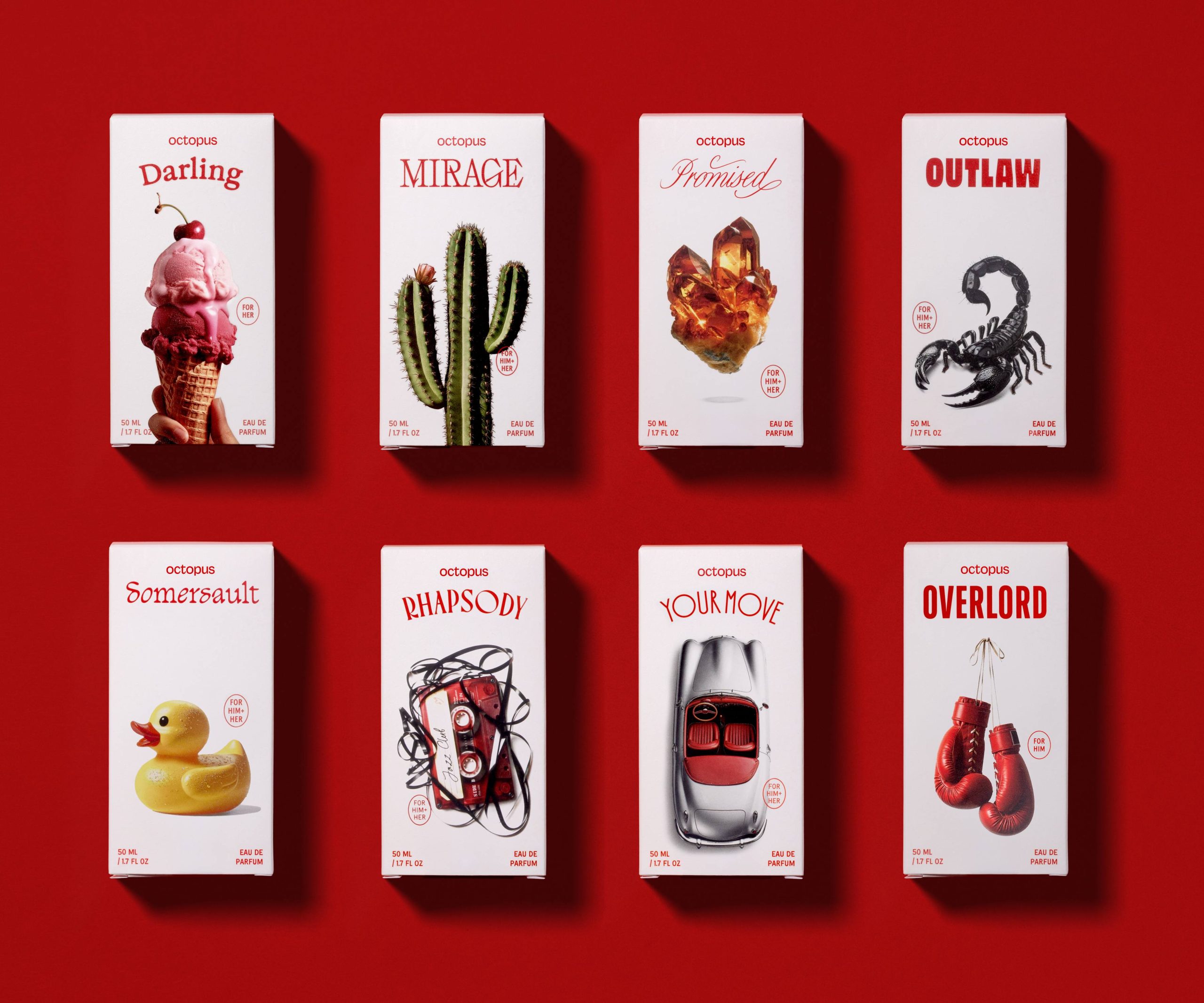
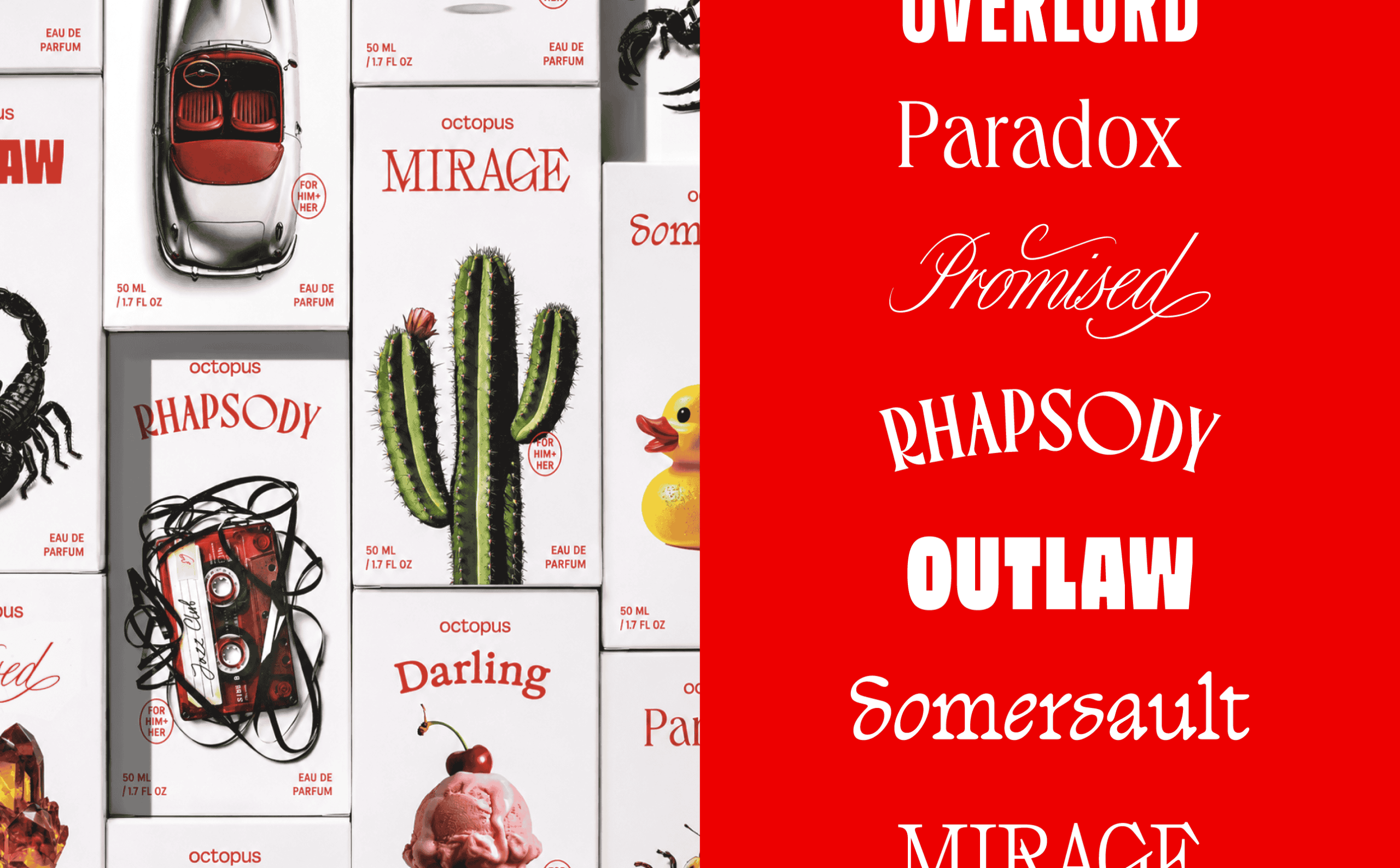
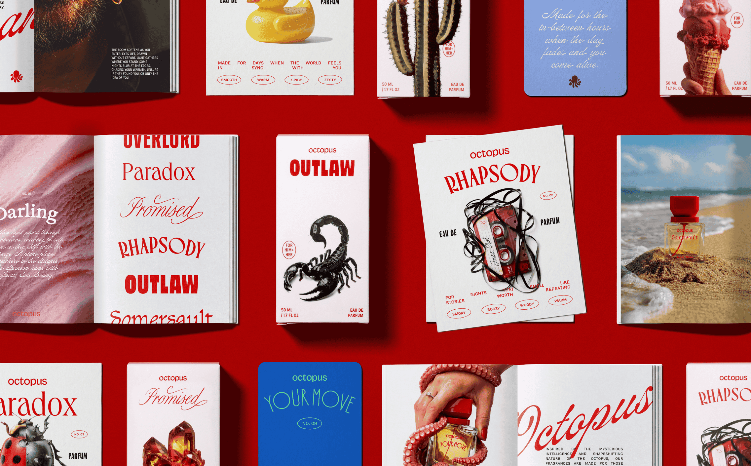
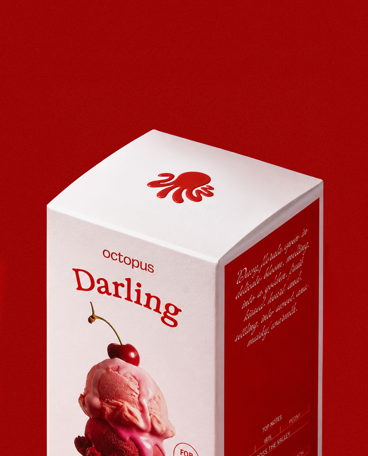
To turn our imagination of a maximalist brand into a cohesive and effective identity, the visual architecture had to do the heavy lifting. Instead of collapsing twenty unique fragrances into a single packaging template, we treat each one as a brand in its own right, with an evocative name, typographic identity and a visual hook. Our version of systematic maximalism, a hyper-expressive system built on a disciplined frame where twenty products can each say something different without breaking the brand voice. Somersault feels energetic and outdoors. Outlaw is dark and masculine. Neither says it out loud. We carry this ‘evocative, not descriptive’ idea to the product visuals, eschewing typical fragrance notes visualisations for imagery that invokes an abstract feeling. A melting ice-cream cone for Darling. A cactus for Mirage. And a tangled cassette tape for Rhapsody. The result is cohesive dissonance. Things that shouldn’t belong together, somehow do.
Two anchors hold this seemingly unwieldy system together. The first, a single color, Flaming Red, used relentlessly across the brand to unite every eclectic element. The second was a complex industrial design challenge. A custom bottle and closure, designed from scratch at Opposite.
The bottle had to embrace the rest of the brand, but also balance its maximalism. Designed from scratch, the cuboid body acts as a clean structural canvas to hold each of the unique fragrance marks, while the deliberately oversized closure in Flaming Red makes the bottle feel substantial in the hand. In a moment of whimsy, the internal dip tube brings the brand’s primary color asset directly into the liquid. Getting the bottle right required an intense, hands-on process that moved from clay models at our studio to 3D-printed prototypes and final glass molding at a factory in China. Each stage informed critical structural refinements, requiring dozens of iterations to perfect the mechanical fit, the lacquer finishes, and the exact color-match across different substrates.
A project like Octopus requires hundreds of big and small decisions, across naming, typography, industrial design, visualization, packaging, materials and finishes. This only works when the brand-owner reposes complete faith in the studio’s judgement. Harsh Beniwal, Sunchith Goel and Rohit Yadav did exactly that.
Curator’s Insight
Fragrance branding usually solves the “line extension” problem by subordinating everything to a template, same bottle, same typography, only the cap color or label hue changes between scents. Octopus takes the opposite bet. Rather than treating twenty fragrances as variations of one brand, it treats them as twenty small brands operating under one flag, each with its own name, its own type treatment, its own image system.
This is a genuinely risky structural choice. Systems built this way tend to fracture, since giving every product room to be different usually means losing the thread that makes them read as one family. The fix here isn’t visual restraint, it’s a single load-bearing constant. One saturated red, applied without exception across type, closures, and packaging, does the unifying work that a shared layout grid would normally do. It means the system can afford wild swings in imagery, a scorpion next to a rubber duck next to a shard of citrine, because the color is doing enough consistency work to hold the dissonance together.
The other quiet discipline is restraint in what the imagery is allowed to say. None of the visual choices describe the scent’s actual notes. They gesture at a mood instead, and let the name and the image argue for a feeling rather than explain an ingredient list. That’s a harder brief to execute than literal notes visualization, but it’s what keeps twenty disparate objects from feeling like twenty disconnected products.







 United Creatives Studio
 Kingdom & Sparrow
 Anastasia Bakhmatskaya
 CreativeWise
 Great and Golden
 Ximena Ureta Design Studio.
 Sorted Branding
 Lisa Sirbaugh Creative
 vitoramockup
 YQIAN
YQIAN Navegante
 Anastasia Cherepanova | xtramez
 Polaris Designs
 pavlyai
 Milena Kocharyan
 monther al omari
 Mohamed sherif midoo
 DESIGN CONCEPTS
 mmdesign
 markcreativestudio
 Rosario Lo Iacono