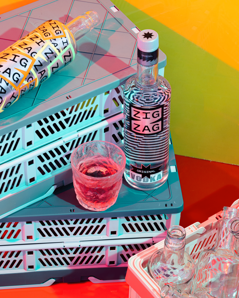
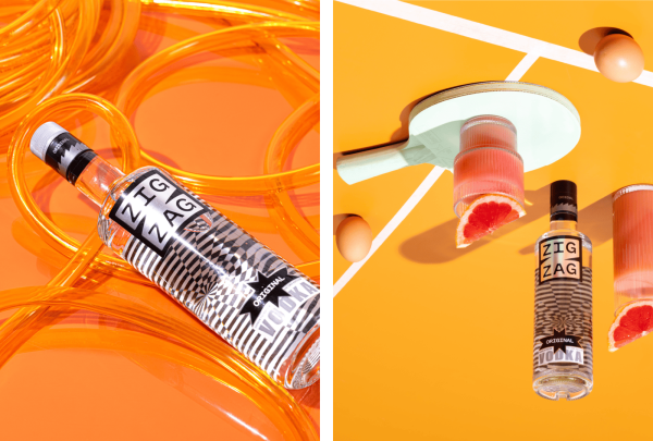
ZIGZAG was conceptualized as an irreverent antithesis to both high-end Vodka brands (Absolut, Grey Goose, Ciroc…) and low-end brands (Magic Moments, White Mischief, Romanov). Sophisticated and design-forward to appeal to a new cohort of drinkers, but without the price and snob-value of imported brands.
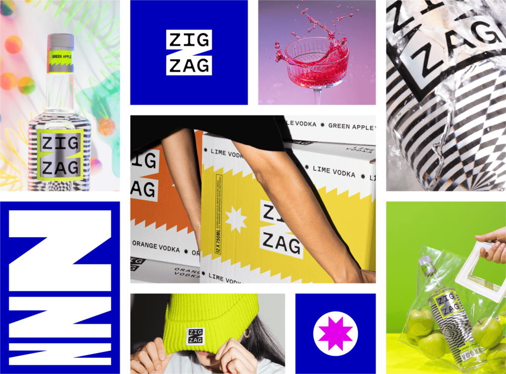
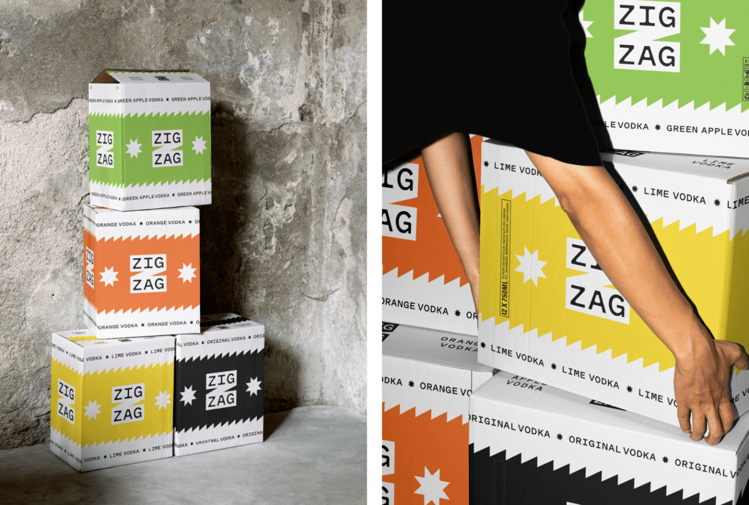
The ZIGZAG logo is designed to be bold, both on the packaging and off it – on coasters, bar signs, merchandise, everywhere. The two symmetrical parts of the name (ZIG / ZAG) fit perfectly within the horizontal strokes of the chunky Z holding shape, making the name stand out. The Z holding shape also stretches beautifully to create dynamic graphics for the visual language.
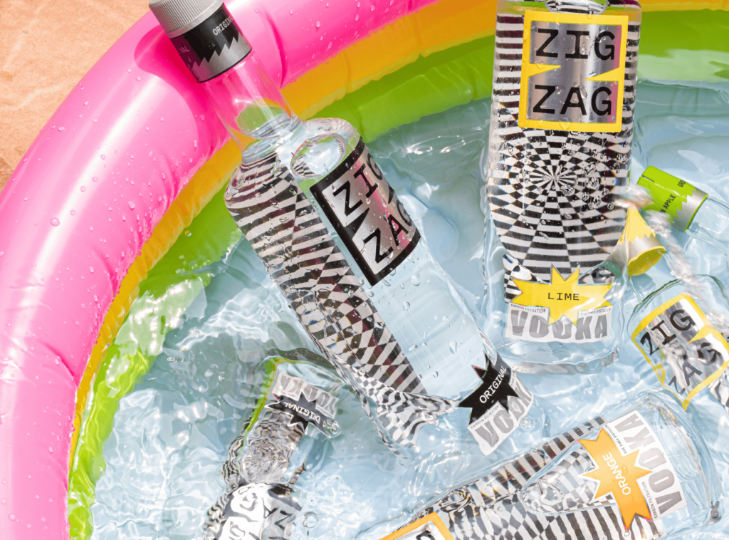
The visual language is all sorts of lively, playful and loud, with an edgy personality that celebrates ‘never walking straight’.
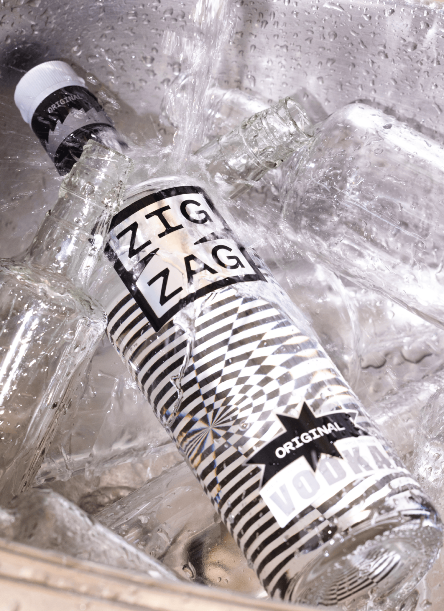
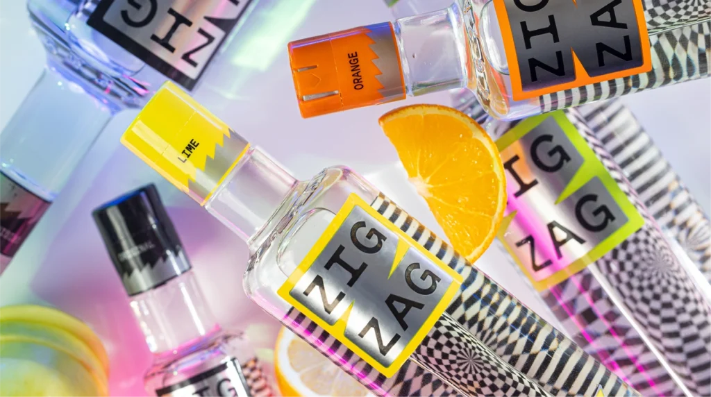
The packaging features a two part front label, leaving a window in between to peek inside the bottle. The inside of the back label features a groovy pattern that distorts in fun and unpredictable ways through the clear liquid, elevating the bottle to a design piece.
Available in Goa, Assam and Delhi starting October 2024. Follow @zigzag.india
Stuio Opposite worked on: Brand Name, Logo Design, Packaging Design, Prototyping and Visual Language.

