ABOUT:
Using a system of logos from our parent brand, we were tasked to create and establish packaging as a cornerstone to the visual identity system.
This project consisted of 2 separate phases:
PHASE 1: Create a Logo system based on either the Seven Deadly Sins or the Six Core Virtues. This part of the project was dedicated to the creation of a parent brand and 4 sub-brands. My chosen product was alcohol, and I developed the story of the sins as represented in Wild West media (think of Clint Eastwood, John Wayne, and wild west movies).
PHASE 2: Using the established parent and sub-brands, create a series of packaging usable by the company to sell their product. This phase is geared towards the translation of our identity system into consumer-facing designs. We were also tasked to follow standard procedures and guidelines for our product. In my case, this involved Ingredients, alcohol regulations content, and specific information about the brewer and alcohol content.
SOLUTION:
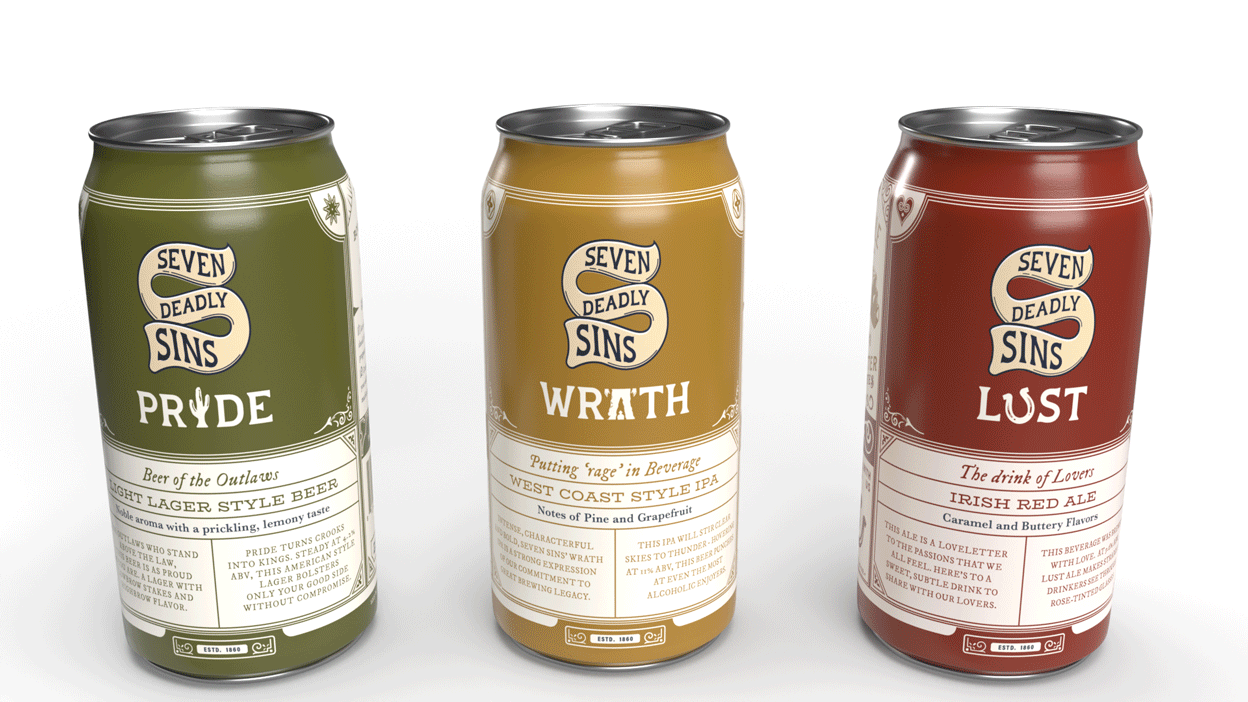
Using a series of typographic moments displayed on the packaging, I created a visually striking system that accurately represents my brand’s message and values. The Seven Deadly Sins Brewery is meant to engage viewers through this packaging, letting consumers find something new each time they look. Every inch of packaging has had care taken into the branding and visual appeal so as to signal a proud, albiet fun, brand of alcohol.
CONCEPT:
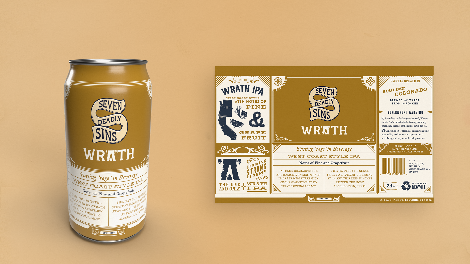
WRATH IPA: The Wrath IPA was created with taste in mind. IPA’s are very strong, sometimes sour, beers. This IPA is a playful pun on the yellow-bellied coward. Within the sub-brand for Wrath, the letter ‘A ‘has graphically been changed to depict the moment at high-noon right before showdown. A figure/ground relationship is used to better represent the letterform.
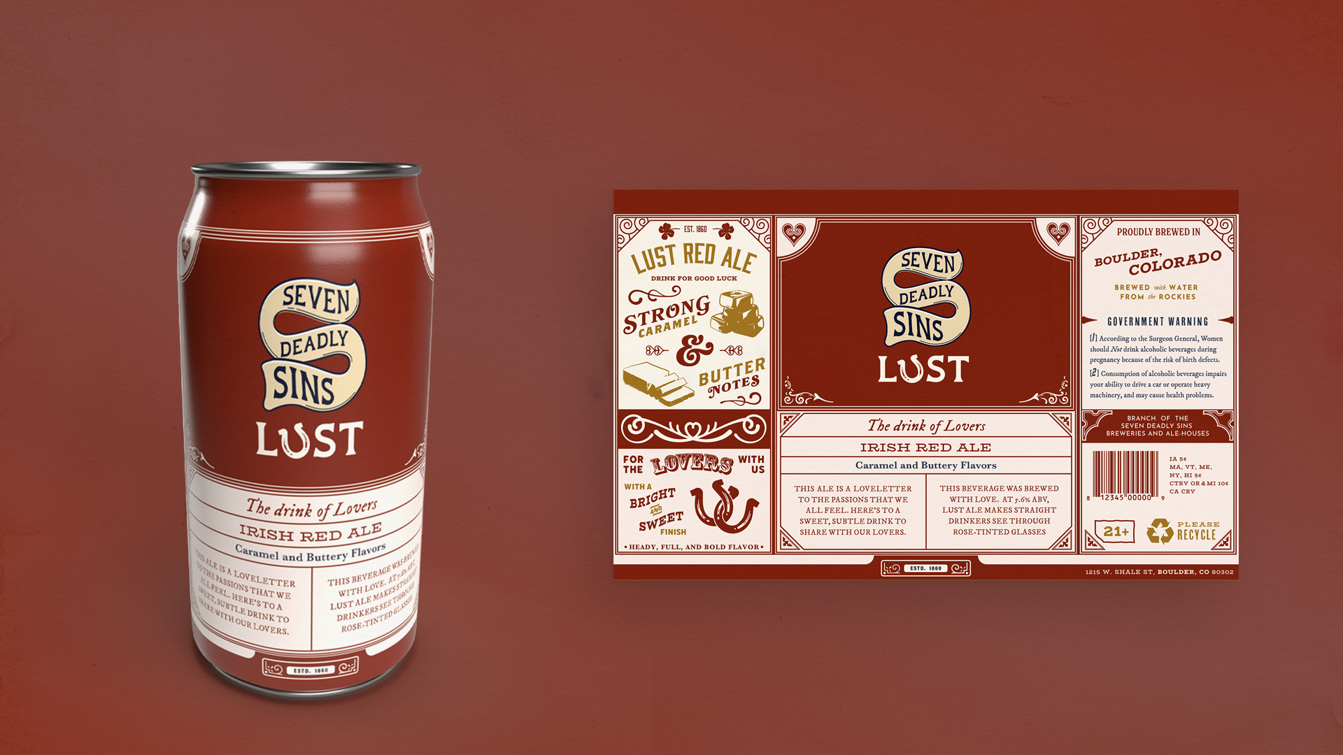
LUST RED ALE: Lust Red Ale was made for the lovers. Because red ales are traditionally on the sweeter side, I established tone through a pleasant color scheme and flowing typography. The sub-brand makes use of a horseshoe to replace the leter ‘U’, used as a joke about horeshoes being for good luck. Typography is flowy, and certain decorative elements make use of spirals and loops to best evidence this as a sweet beer with a smooth finish.
PRIDE LAGER: Just like beer, it’s easy to overindulge in pride. Pride lager was created from the idea that too much of a good thing can push people away. Cacti keep people at a distance by their spikes, yet, they are one of the tallest growing plants in the desert. Pride lager does the same through its low ABV, sweet and citrusy taste, and its image as a drink for the vigilante in us all.
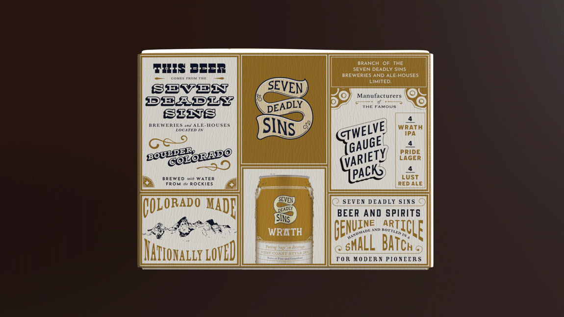
TWELVE GAUGE VARIETY PACK: This party pack is an obvious pun on the variety of firearm often used or seen as props in wild west films. The pack contains 4 of each beer in total, and is adorned with typographic moments around the whole surface of the box. The reasoning behind this massive billboard typography is simple: Wood type was cheap and easy to transport to the frontier, and many printers would boast 12 display types on one poster. I used this type crime to my advantage to create a stunning, blaring package which precisely places my product in context. Besides being graphically absurd, this variety pack breaks the mold on what alcohol packaging could look like, using a similar column system as seen on the labels to better connect with my target audience.
RESULT:
The culmination of this project is a packaging system that pioneers the trails less traveled. In an age of succint and developed systems, a booming visual identity is the perfect disruption to auction itself to the masses. I developed this system to better express the wonderful ways in which type tells us stories beyond the words, and how we might forge forward at a time when many of us are so uncertain of the future.
DESIGNER: stan
CLIENT: ball state university/ Shantanu Suman