

PHEASANT & VINE (GRPheasant & Vine — Grand Reserve
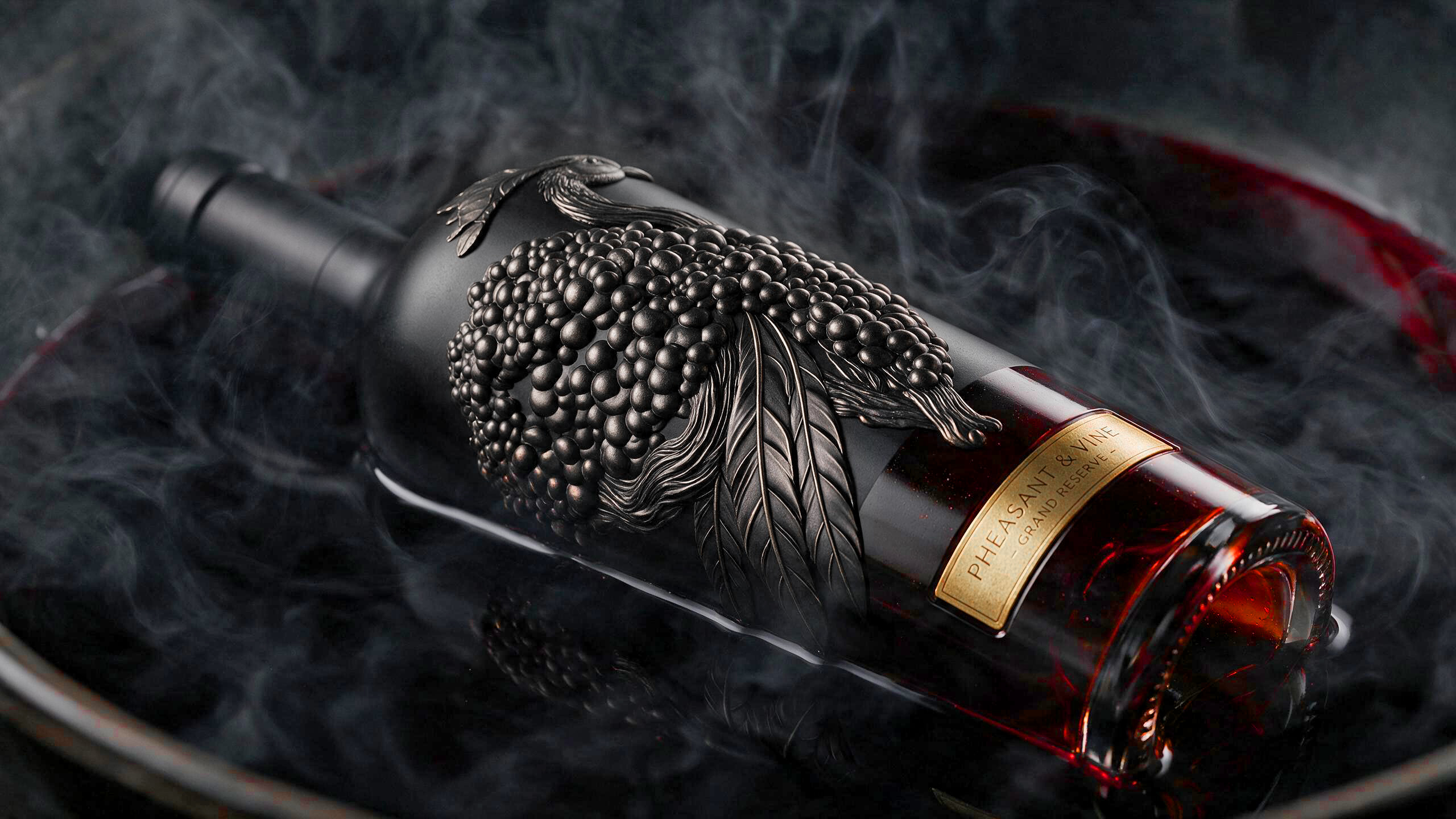
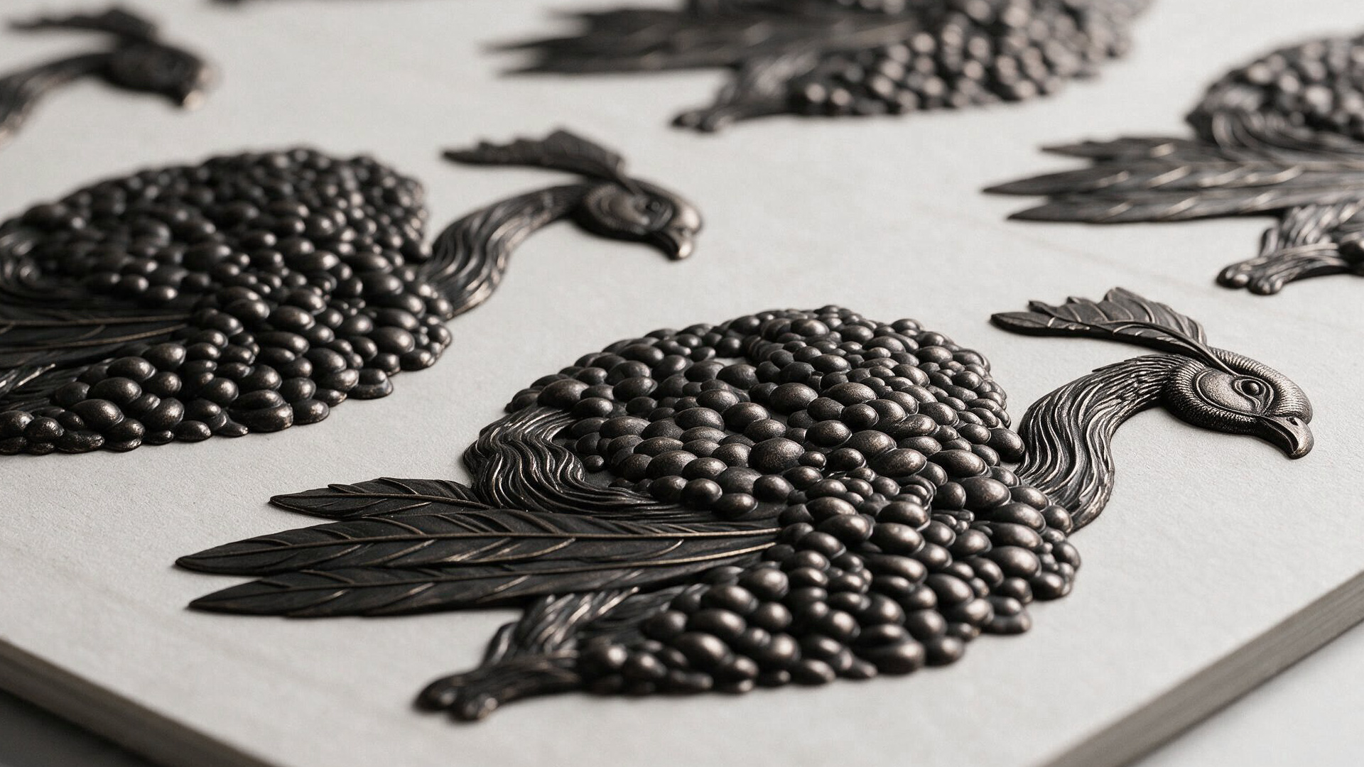
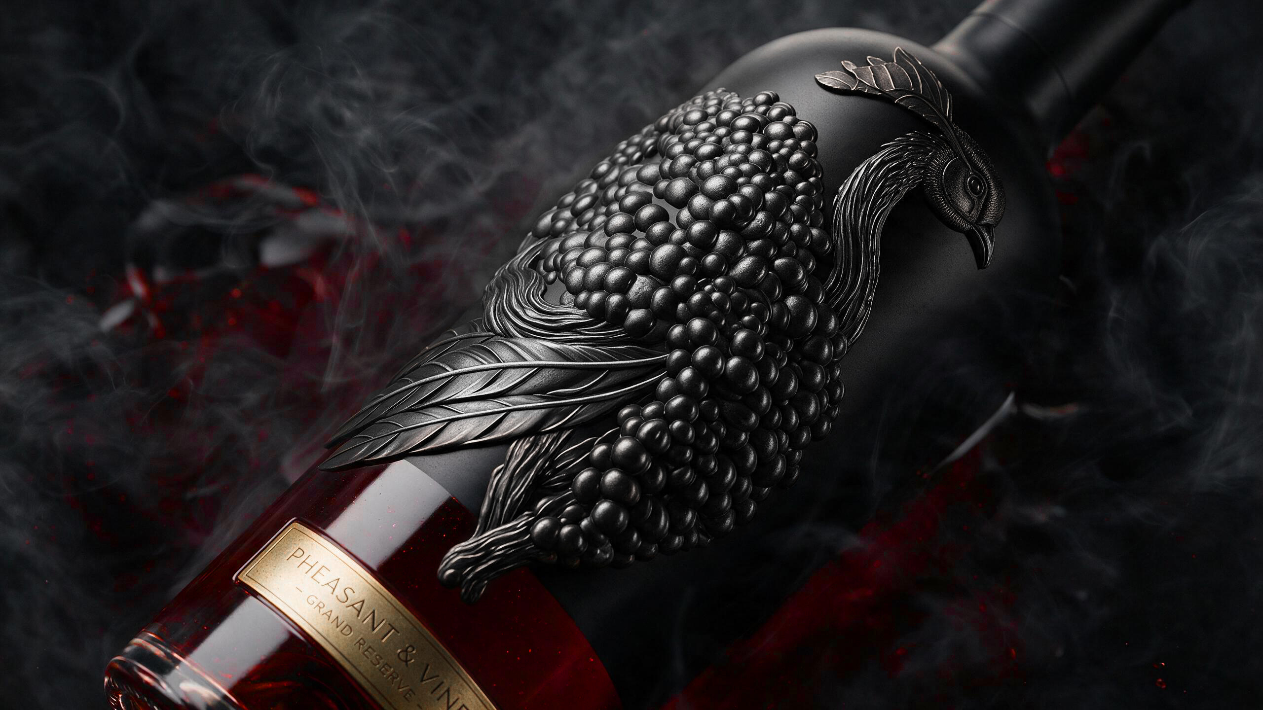
The Pheasant & Vine wine brand concept combines natural elegance, aged character and premium aesthetics. The central visual element is a pheasant whose silhouette is formed from a cluster of ripe dark grapes from a mythical garden of paradise. This visual metaphor brings together the nobility of the bird, the richness of the harvest and the deep character of aged wine.
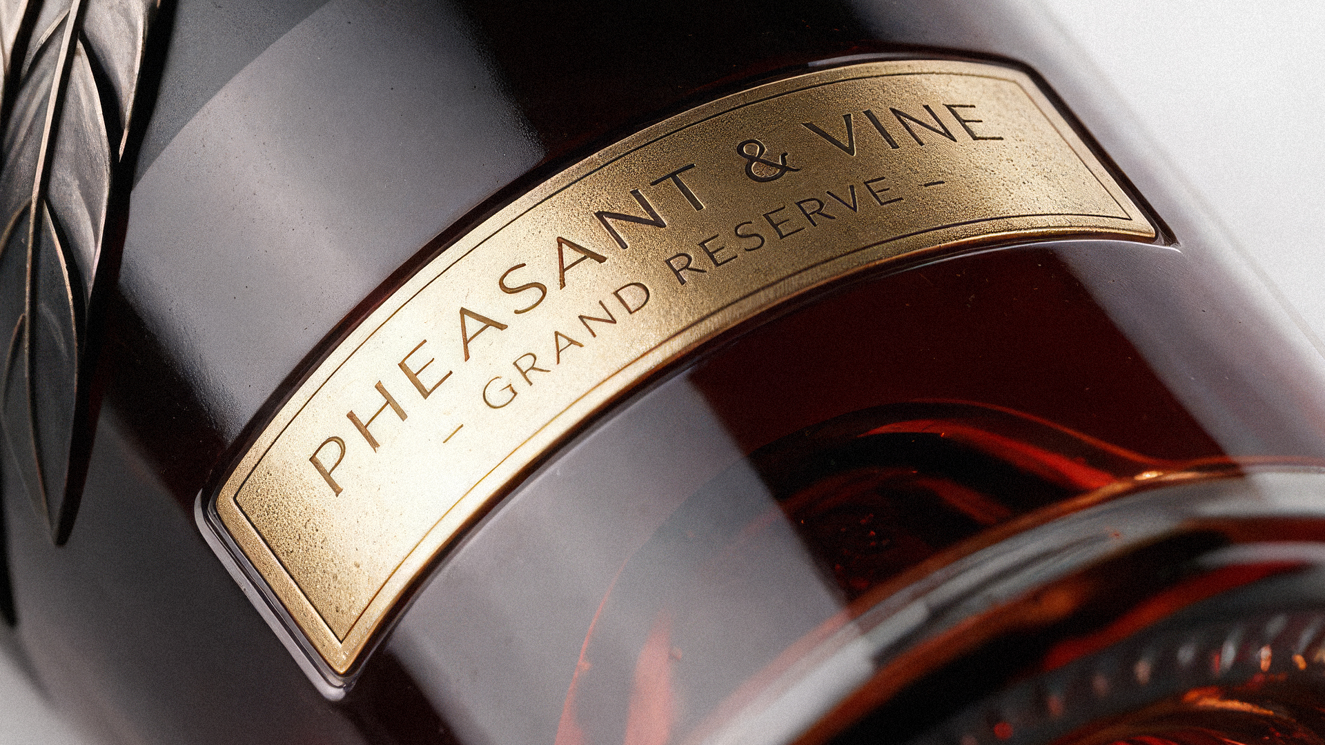
The pheasant is presented as a three-dimensional embossed element directly on the surface of the bottle, creating a distinctive tactile effect and emphasizing the exclusivity of the product. A gold label featuring the Grand Reserve inscription completes the composition, highlighting the wine’s extended ageing, high quality and premium positioning. The combination of dark glass, deep grape tones, sculptural detailing and gold accents creates a refined and recognizable
Curator’s Insight
There’s a specific trap in luxury wine packaging: reach for grapes as a motif and the result usually reads as a vineyard postcard, pleasant but forgettable. This concept sidesteps that entirely by refusing to treat the grape cluster as ornament. It becomes the bird’s body.
The transformation only works because of where the designer chose to stop. The tail feathers stay leaf-shaped, the head stays unmistakably avian, but the torso dissolves into a mass of individually modeled berries. That’s the tension holding the whole piece together: too literal a bird and the metaphor collapses into a novelty label, too abstract a grape cluster and the pheasant reads as noise. The pencil studies confirm how deliberately that balance was worked out by hand before it ever became a 3D relief.
Material choice does the rest of the heavy lifting. Matte black glass absorbs light rather than reflecting it, so the embossed metalwork has to generate its own shadow and highlight to be legible, which is exactly what gives the piece its sculptural weight in the campaign photography. The gold label is kept small and low on the bottle, functioning as punctuation rather than the focal point, a rare instance of restraint in a category that often over-relies on gold foil to signal premium.
Worth noting this is a concept study rather than a commercial release, and that context matters. Unconstrained by production cost or shelf regulations, it operates more like a design provocation than a market-ready SKU.




 Sophiagdotcom
 Sofia Nikishina
 studionerius
 monther al omari
 Monroe
 KateChachava
 Snob Duck
 宏洛图品牌设计HONGLT
 Studio Six F
 Just Design
 New Century Design
 VIEWPOINT
 Abbydraw Designs Unique Conceptual Branding & Packaging Designing Ideas
 BexNelson
 Vladimir Shmoylov
 Kris
 Agence des Coteaux
 Julia M.
 Rabia zouina
 www.branding.uz
 Diego Alves do Amaral
 studioaslihan
 Minim Brand Design
 DesignPro