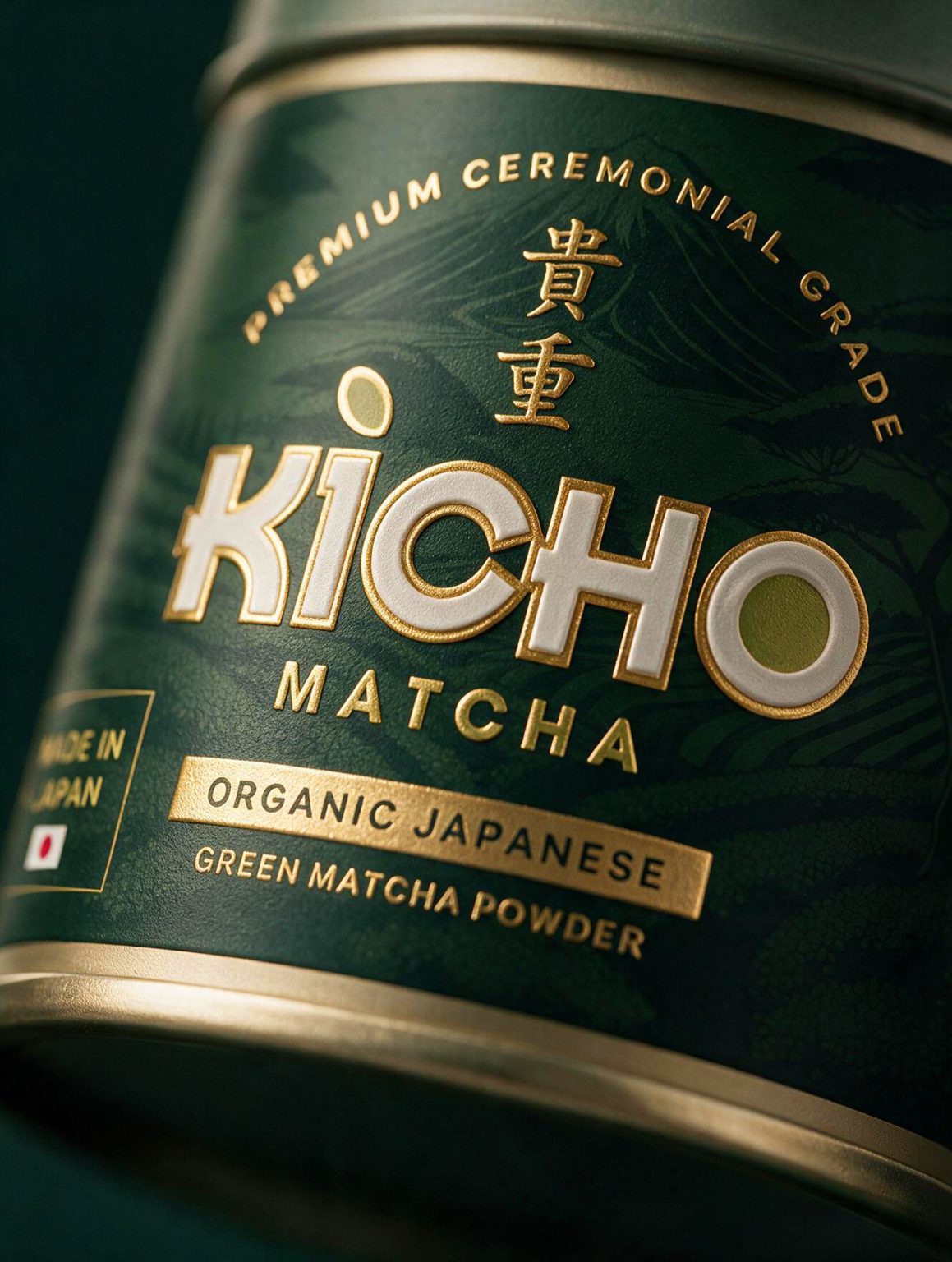

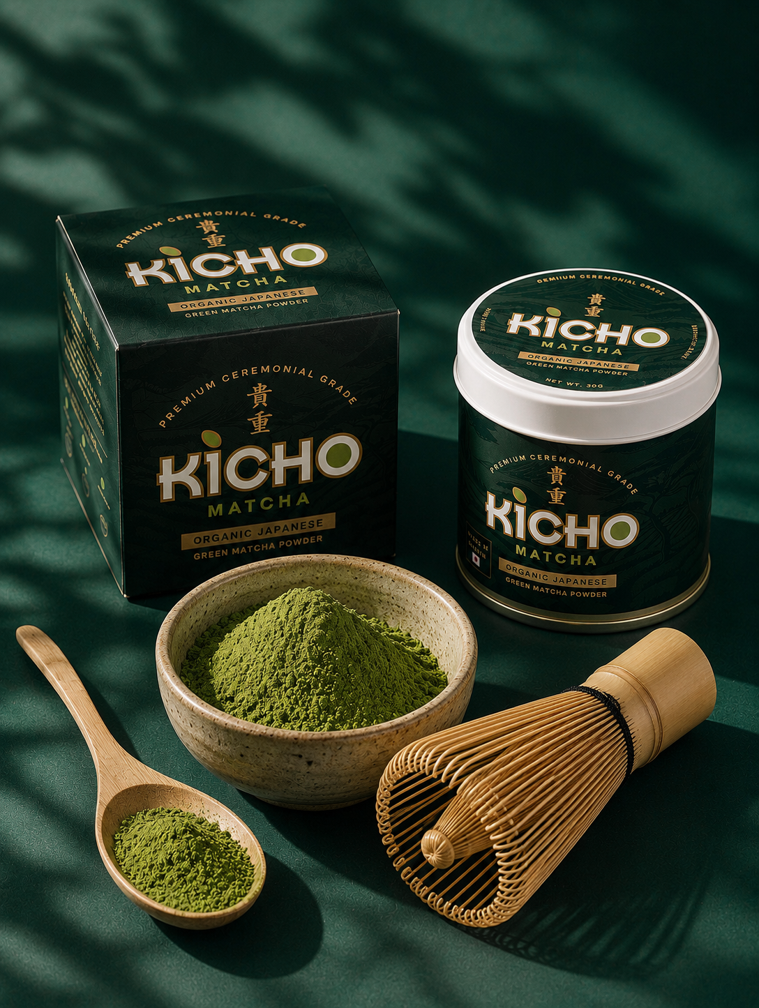
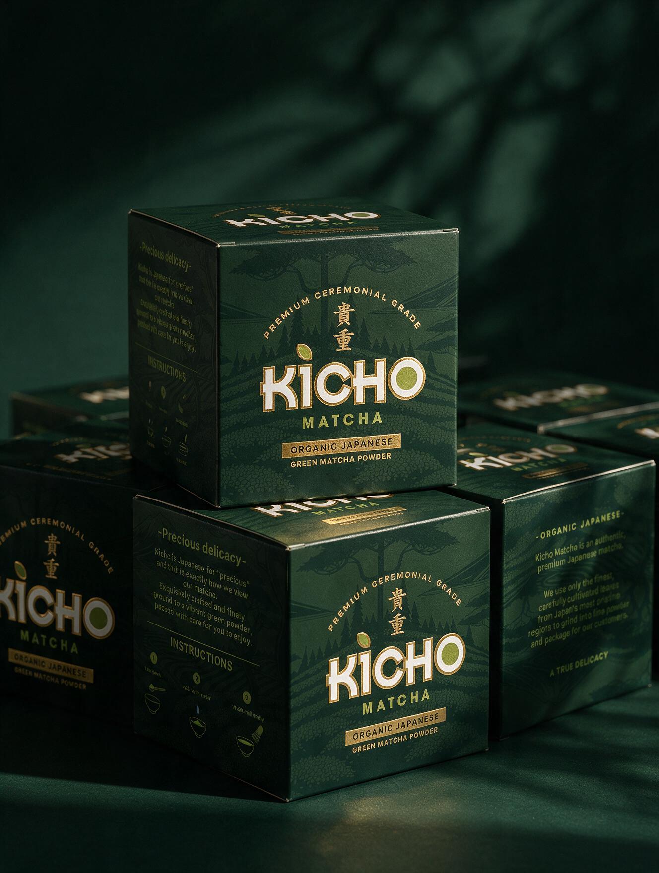
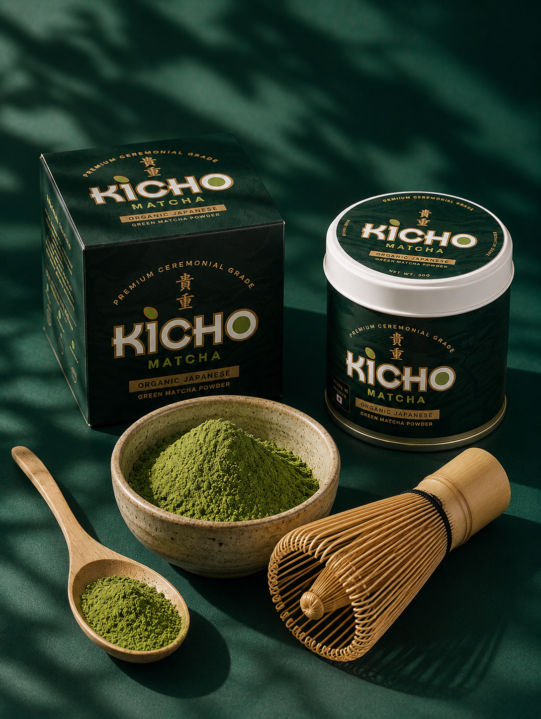
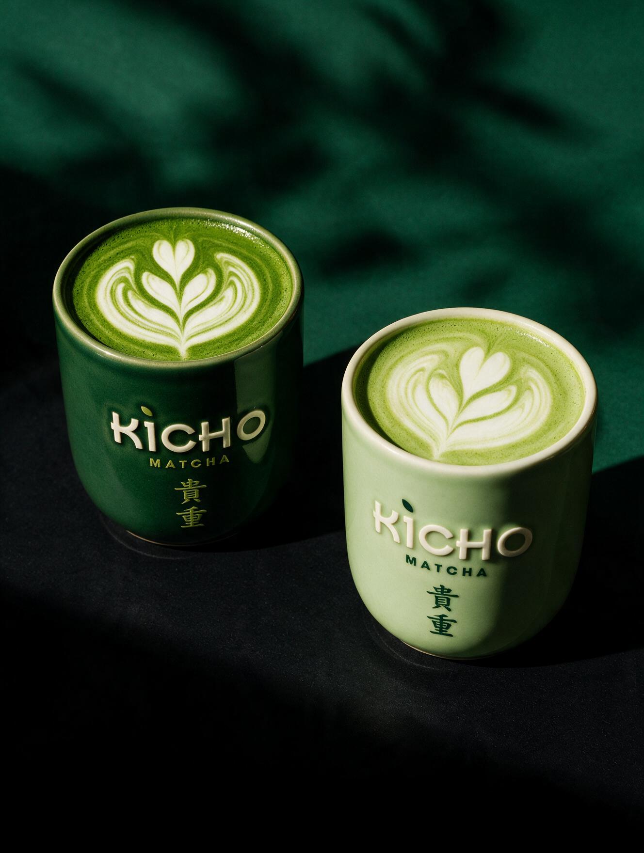
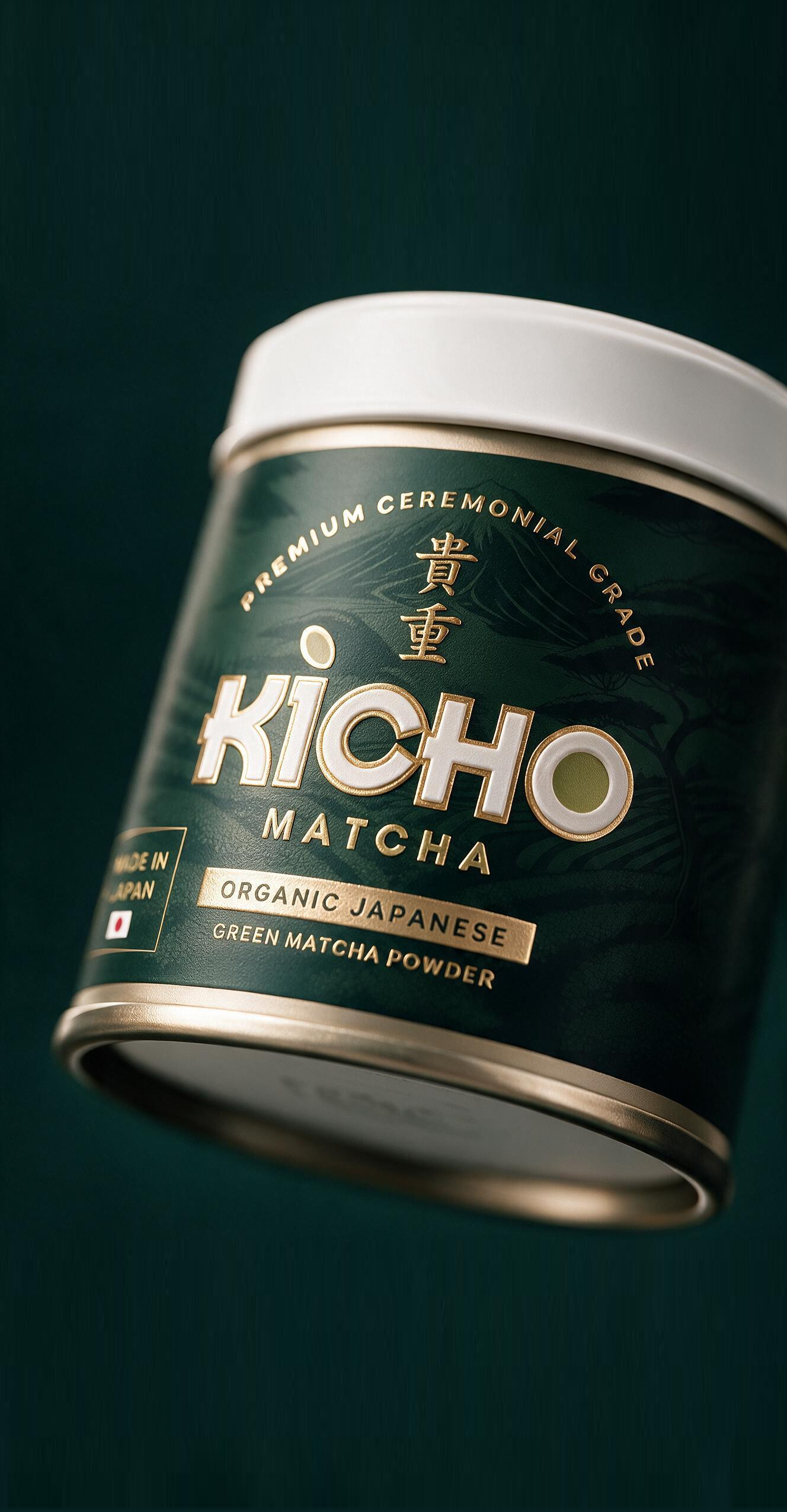
KICHO Matcha is a premium packaging identity inspired by the quiet elegance and craftsmanship of Japanese tea culture. The design combines refined typography, a restrained color palette, and subtle illustrative textures to communicate authenticity, ceremonial quality, and a contemporary premium positioning. Every detail from the material finishes to the visual hierarchy was carefully considered to create a packaging system that balances tradition with modern minimalism, delivering a memorable shelf presence while reinforcing the brand’s commitment to quality.
Curator’s Insight
The hardest part of a matcha launch isn’t convincing anyone the product is good. It’s convincing them it’s worth the price jump from the supermarket tin. KICHO solves this almost entirely through restraint, which is the harder route and the one most packaging systems avoid.
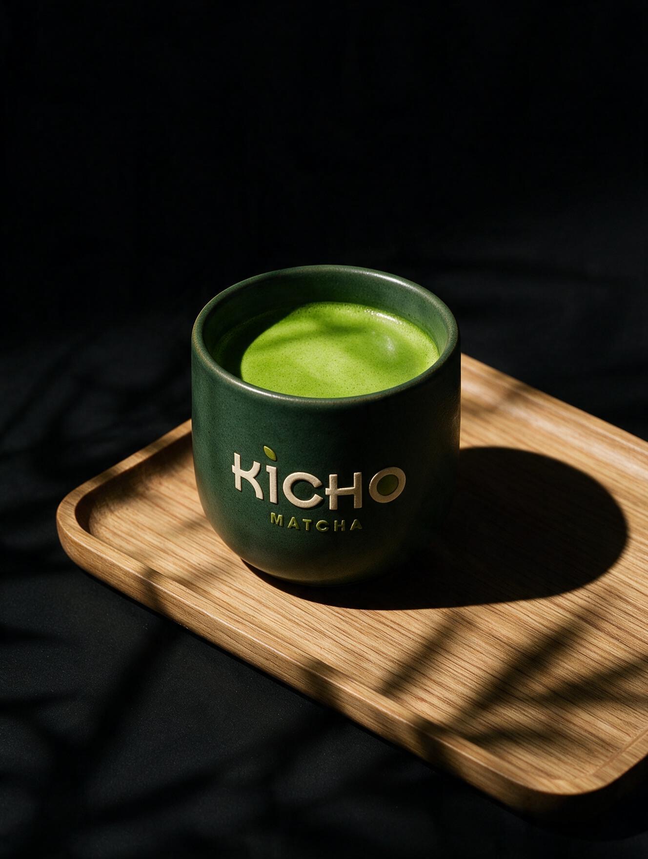
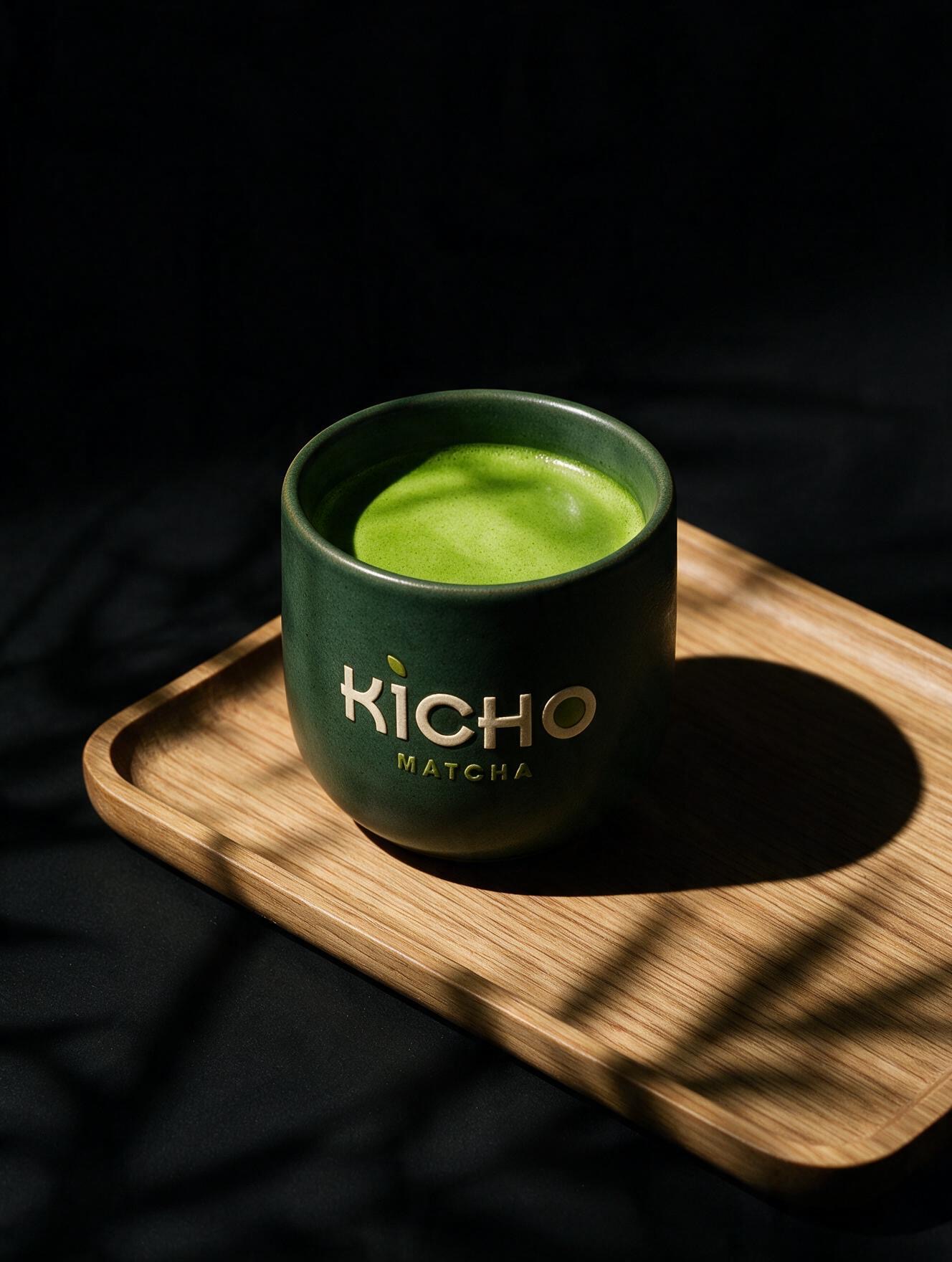
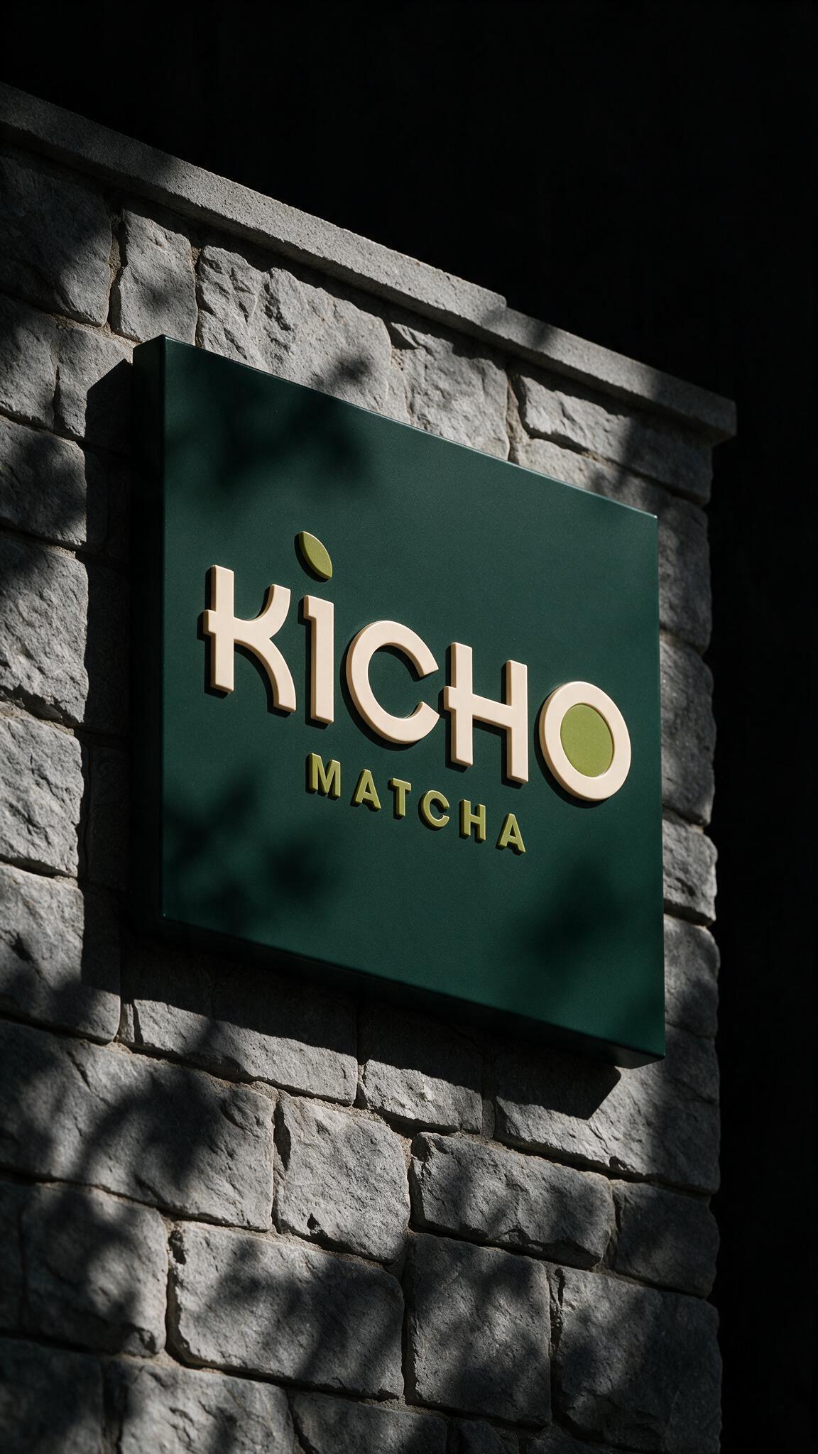
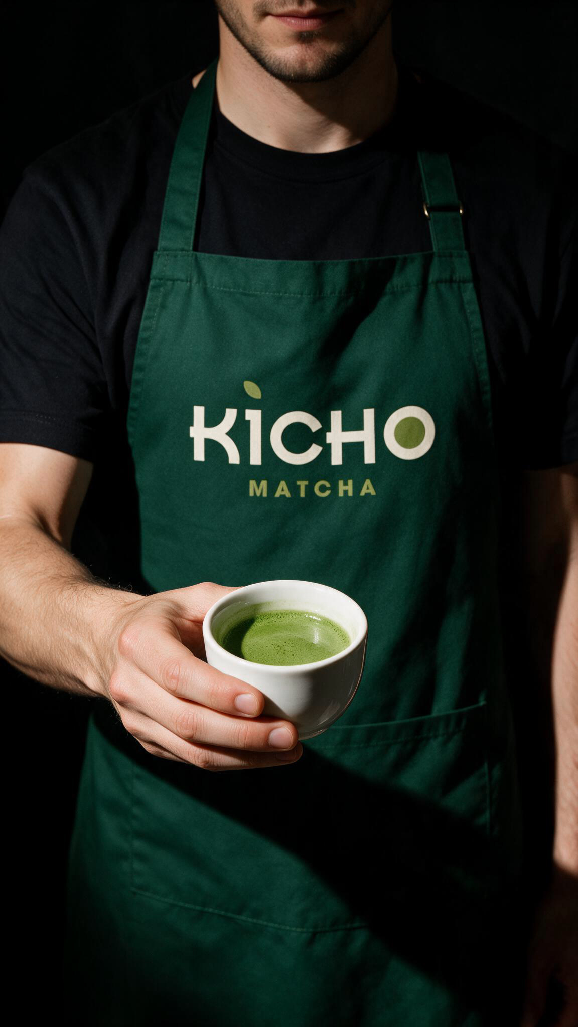
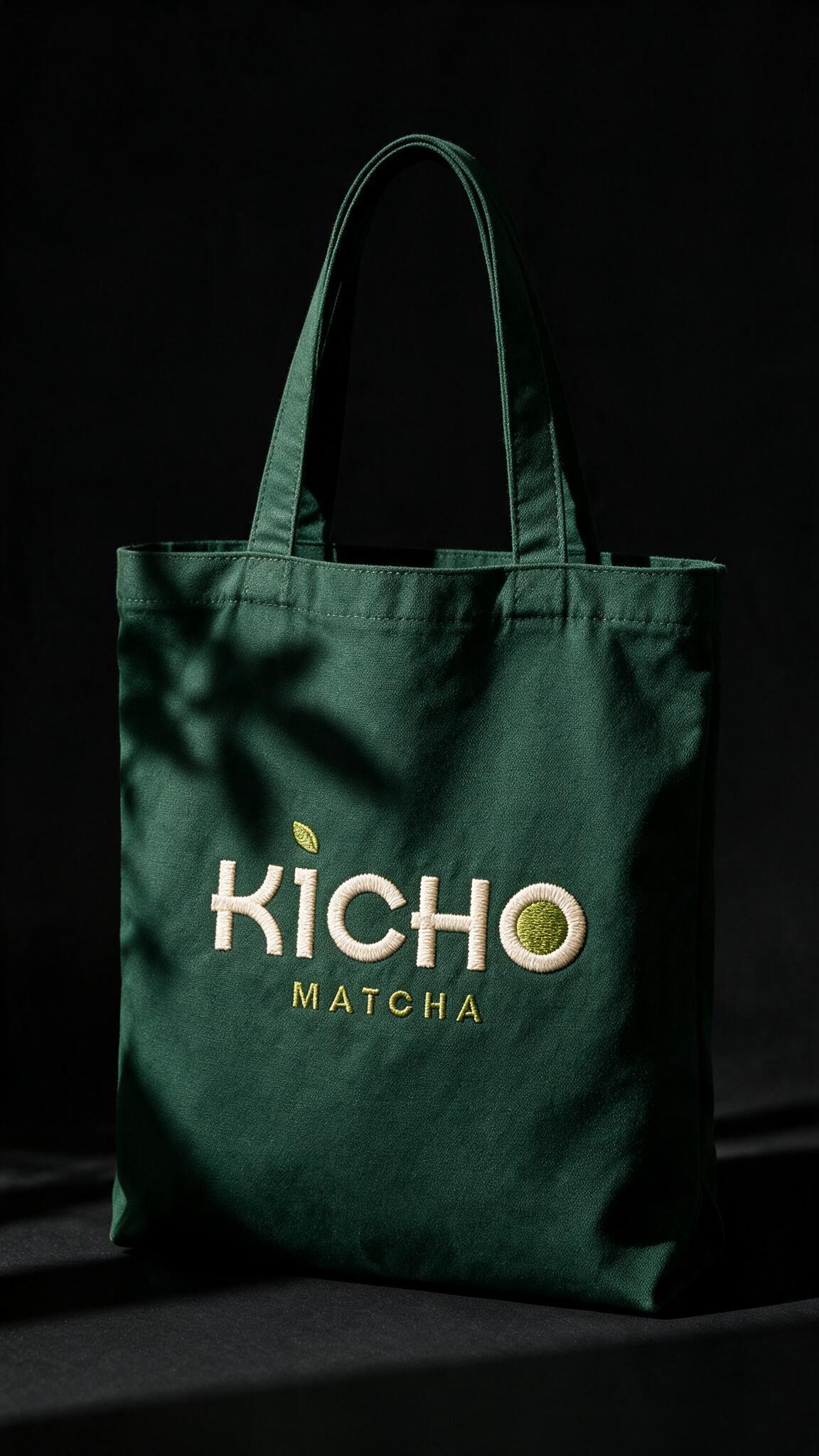
Look at the wordmark closely and two decisions stand out. The dot above the “i” isn’t a dot at all, it’s a leaf. The “O” isn’t hollow, it’s filled with a small disc of matcha green. Neither is a loud gesture. Both are the kind of detail a shopper registers subconsciously before they consciously notice it, which is exactly how a logotype should carry brand meaning: quietly, and only once.
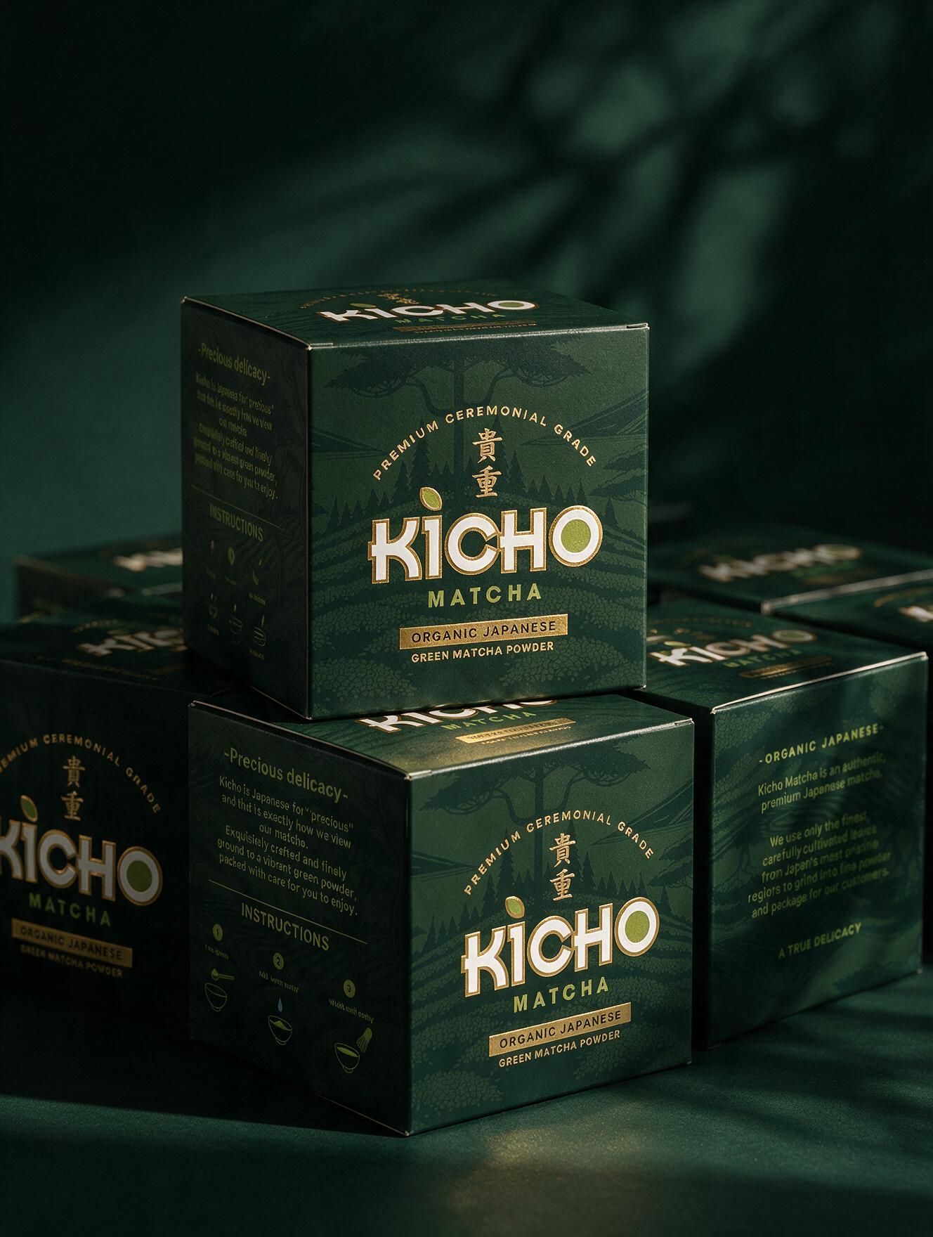
The color strategy does similar work. A near-black forest green reads as expensive in a category dominated by bright, appetite-driven greens, and it lets the gold foil do all the signaling. Foil on dark stock has a specific advantage at shelf: it doesn’t compete for attention in daylight the way it would on a pale label, it waits for the light to hit it, then announces itself. That’s a deliberate bet on restraint over immediacy, and it only works because the rest of the system is disciplined enough not to undercut it with clutter.
The tone-on-tone illustrated landscape running behind the type is doing the most understated job in the whole system. It’s nearly invisible at a glance and only resolves under closer inspection or raking light, which rewards the customer who picks the tin up rather than the one scanning past it. That’s a packaging decision built for the buyer already inclined to linger, not the one still deciding whether to.
 Lizaveta Kharitonyuk
 Bonsanco Creative Studio
 DesignRepublic
 GIRAFA STUDIO
 PiotrWisniewski
 Sophiagdotcom
 monther al omari
 CreativeWise
 Modern Theory
 SoreThumbStudio®
 Modern World Studio
 Palashcc
 Valérie Colace
 andreamarinnn
 Chochoi Creative
 Hi estudio
 bachir bachchar
 Aferdini
 AUN BRANDS
 vitoramockup
 InterWish
 ash123456
 Studiotaketwo