

PUSHHH — Your scent. Your mood. Your message.
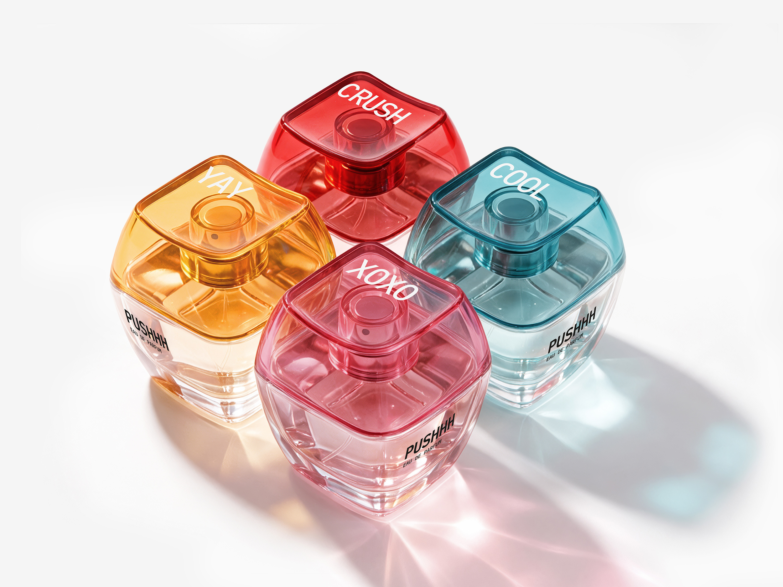
PUSHHH is a perfume concept inspired by the way we communicate today. Short messages, reactions and emotions are often sent with a single tap, and the project translates this familiar digital gesture into the physical world of fragrance. The bottle cap takes its shape from a keyboard key, turning the act of spraying perfume into a simple symbolic action: press the key, release the scent, send a message.
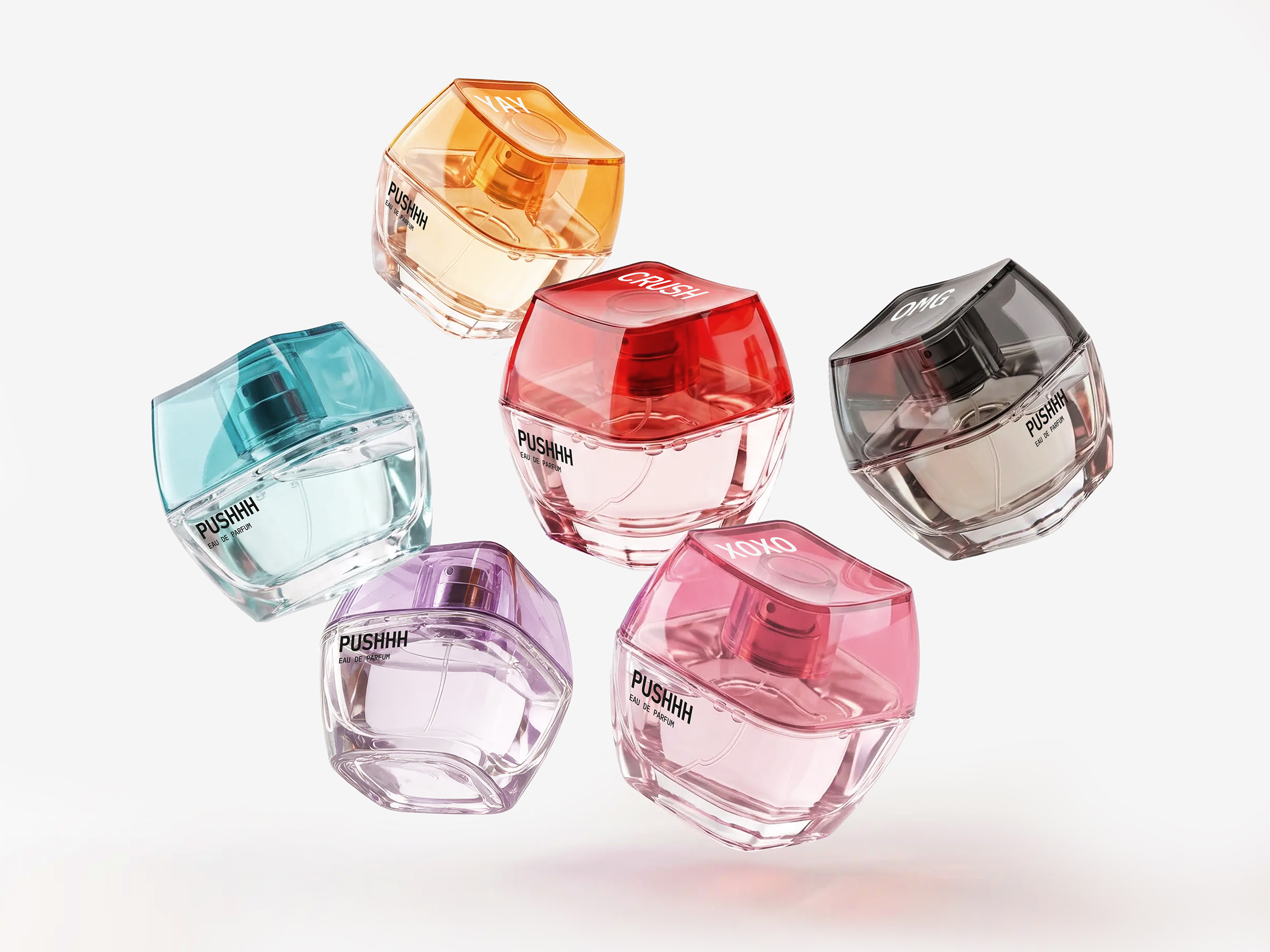
Each fragrance represents a different mood or emotional signal, expressed through short names such as CRUSH, XOXO, COOL, YAY and OMG. Transparent coloured caps create a playful collectible system while giving every scent its own personality. Designed primarily for a younger audience, the bottle is intended to feel as much like a personal accessory as a traditional perfume object, something that can naturally exist alongside a phone, headphones, charms and other everyday objects.
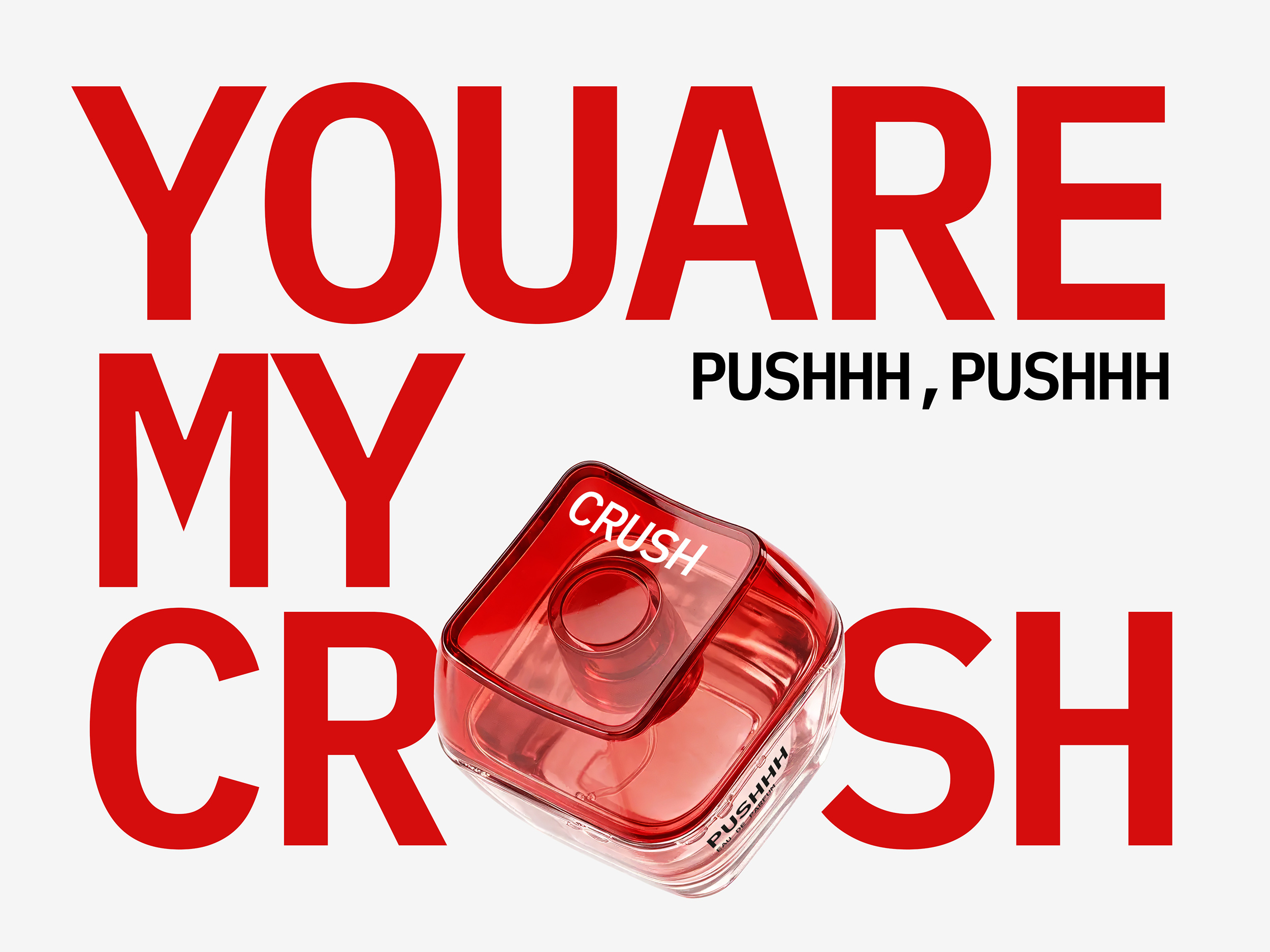
The concept was developed beyond the bottle into a complete visual and communication system, including product design, visual identity, campaign art direction, collectible colourways, keychain accessories, personalised editions and gifting ideas. Campaign language such as “YOUR SCENT. YOUR MOOD. YOUR MESSAGE.” extends the central idea across social media, e-commerce and retail. PUSHHH explores how perfume packaging can become a form of communication itself, connecting scent, object, emotion and contemporary digital culture through one simple gesture: a push.
Design by Igor Mitin
Curator’s Insight
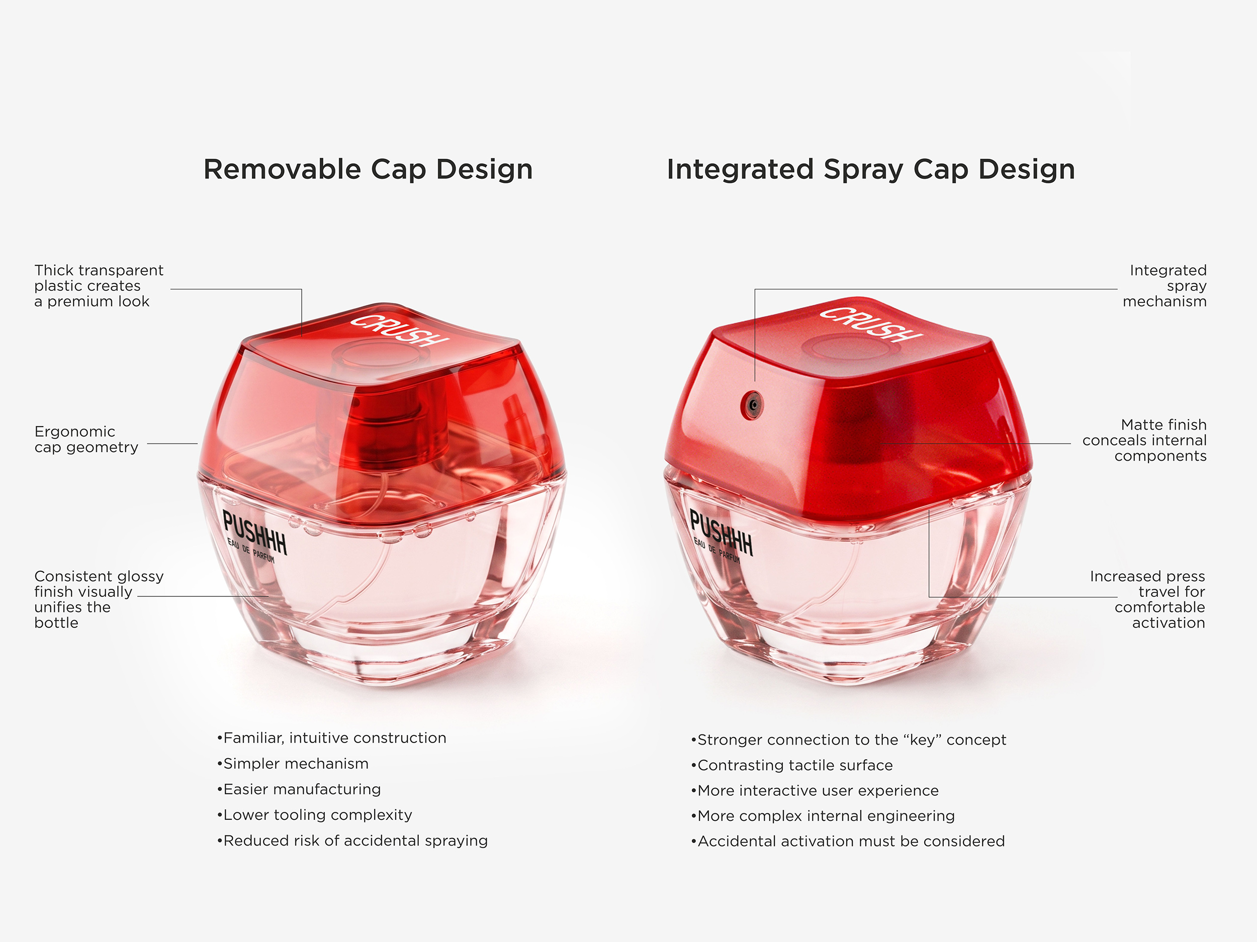
The clever move here isn’t the colour system, it’s the cap geometry. By squaring off the cap and recessing the actuator into a shallow well, the design borrows the exact visual grammar of a mechanical keyboard key rather than a conventional atomizer. That’s a deliberate substitution of reference points: instead of pulling from perfumery’s own vocabulary of domes, facets and jewel-like stoppers, it pulls from an entirely unrelated object category that the target user already touches dozens of times a day.
That substitution does real work. It shortens the distance between seeing the bottle and understanding what to do with it, since the gesture of pressing a key is already automatic for anyone raised on phones and laptops. The fragrance names reinforce this rather than sitting decoratively on top of it. Short, reactive, text-speak terms function the way a notification or a sticker would, so the whole object starts to behave like an interface rather than a bottle.
The principle worth carrying into other categories is this: when a product needs instant fluency with a younger or digitally native user, look for gestural cues borrowed from unrelated everyday objects rather than refining the conventions of your own category. Familiarity travels faster than elegance.





 Studio Zak
 Ander Sanchez
 Atipus
 Widarto Impact
 hovski
 Ohmybrand
 CreativeWise
 Rauf Karaev
 Hooperstudio
 La Nube de Ideas
 Modern Theory
 Akim Melnik Design Studio
 preflightcreative
 Seyf El Haq Menouer
 Badraddine Attik
 Samriddhi Ravi
 Alessandro Ammaturo
 Amblr Studio
 vladlenalevit
 Sis Tsarukyan
 monther al omari
 alchimistestudioParis
 designsbysukaina
 About House of Ta
 Amjad Battal