

GAMBIT XXO is a premium spirits packaging concept built around the world of chess, a game of intelligence, patience, precision and calculated decisions.
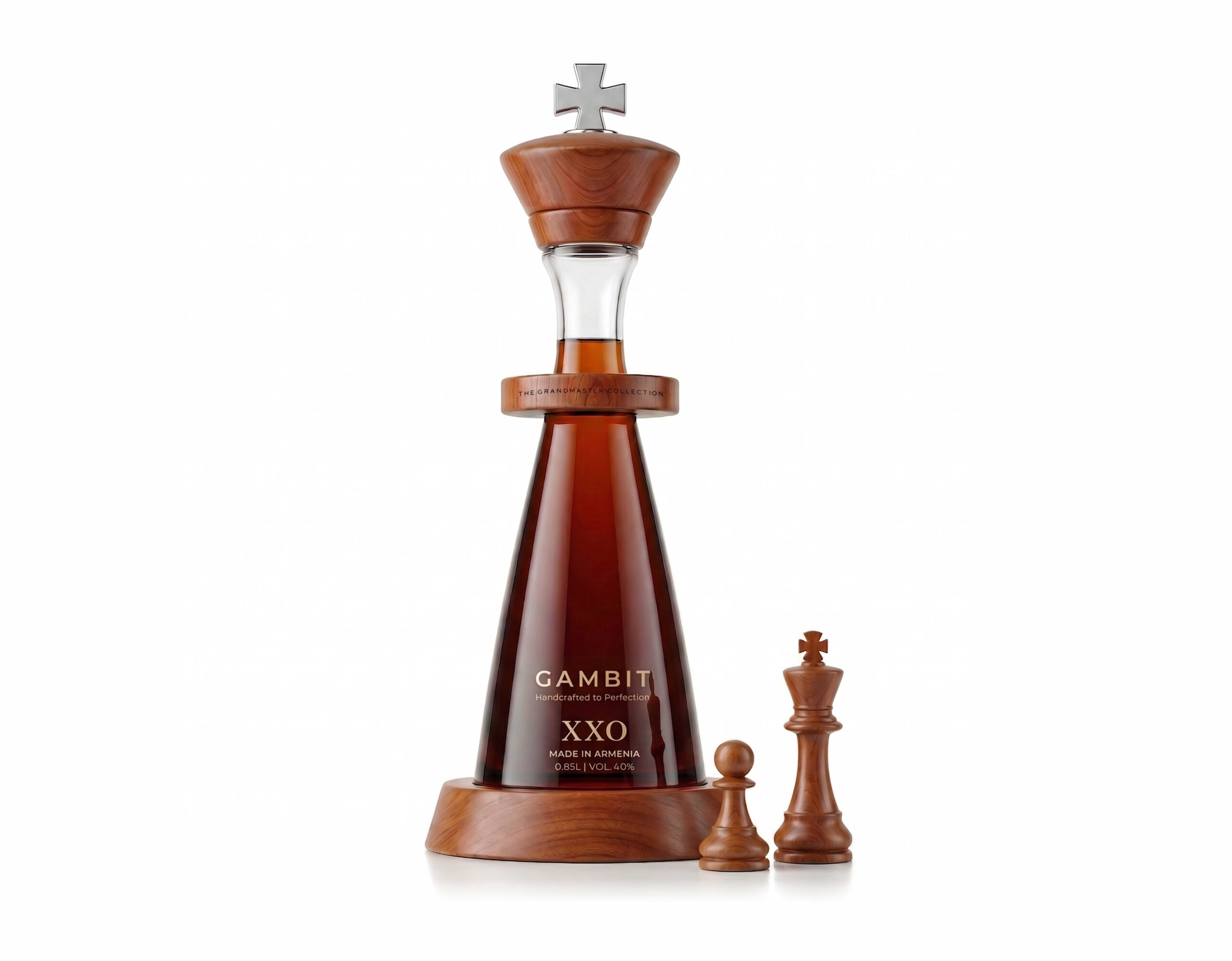
The bottle is conceived as more than a container. Its entire silhouette transforms the product into a monumental chess king. A strong tapered body, sculptural wooden elements, a raised collar and a distinctive cross-shaped crown create an unmistakable visual connection to the most important piece on the board.
The name GAMBIT reinforces the concept. In chess, a gambit is a deliberate move, a calculated sacrifice made to gain a stronger strategic position. Here, that idea becomes a metaphor for ambition, confidence and mastery.
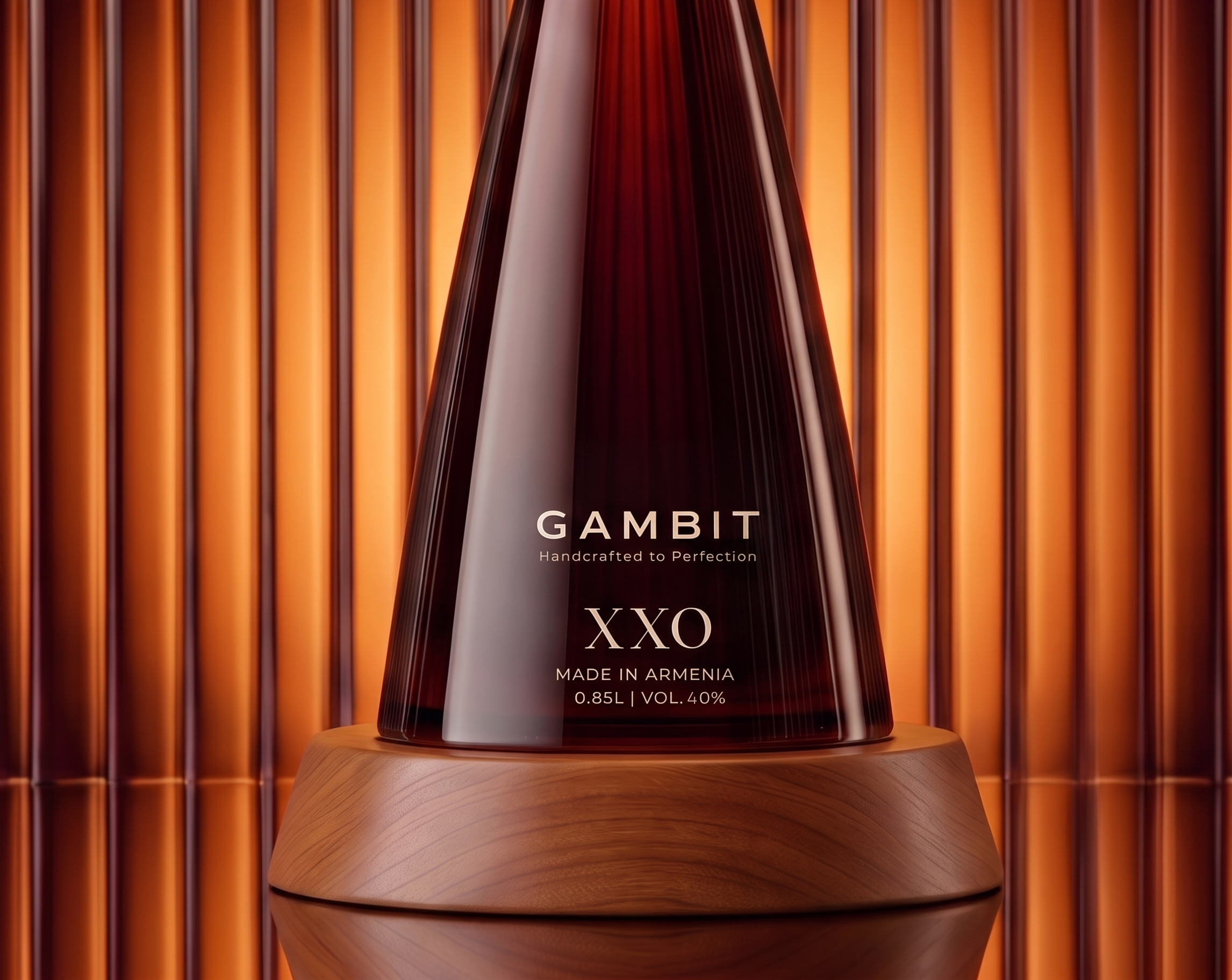
Natural wood brings warmth, tactility and craftsmanship to the design, creating a sophisticated contrast with the clarity of the glass and the deep amber tone of the spirit. Refined metallic details add another layer of precision and exclusivity, while the restrained typography keeps the overall composition elegant and contemporary.
Every element is designed to communicate value through proportion, material and detail rather than decoration. From the chess-inspired architecture of the bottle to the subtle “The Grandmaster Collection” inscription, the identity is built around one central idea: mastery is achieved through patience, strategy and perfection.
GAMBIT XXO is where product design, storytelling and symbolism meet, transforming a premium spirit into a collectible object.
Curator’s Insight
The strongest move here is a restraint most premium spirits packaging skips: the chess reference isn’t printed on, it’s built into the tooling. The wood cap isn’t a decorative topper sitting on a generic stopper, it’s shaped and turned to function as the king piece’s crown, cross finial included, and it has to physically seal the bottle. That’s a much harder brief than “make it look like a chess piece.” Form and mechanism had to solve the same problem at once.
Worth noting too how the design handles scale. Chess pieces are small, tactile objects meant to sit in the palm. Blowing that silhouette up to bottle height risks losing the thing that makes a king piece recognizable, its proportions. The tapered base widening into a narrow neck keeps that ratio intact even at ten times the size, which is why it still reads instantly as “king” and not just “cone with a lid.”




 Studio Zak
 Ander Sanchez
 Atipus
 Widarto Impact
 hovski
 Ohmybrand
 CreativeWise
 Rauf Karaev
 Hooperstudio
 La Nube de Ideas
 Modern Theory
 Akim Melnik Design Studio
 preflightcreative
 Seyf El Haq Menouer
 Badraddine Attik
 Samriddhi Ravi
 Alessandro Ammaturo
 Amblr Studio
 vladlenalevit
 monther al omari
 alchimistestudioParis
 designsbysukaina
 About House of Ta
 Amjad Battal