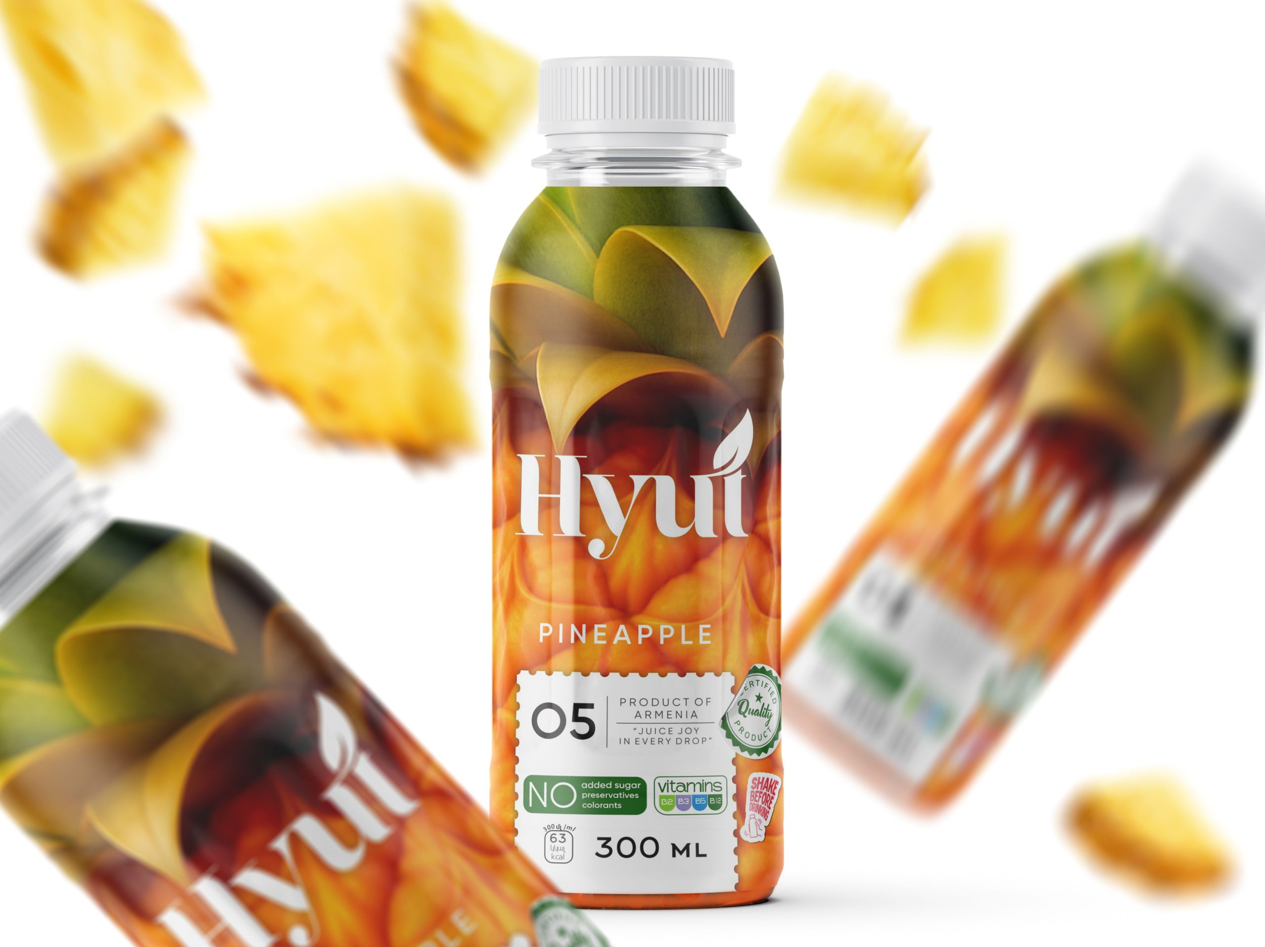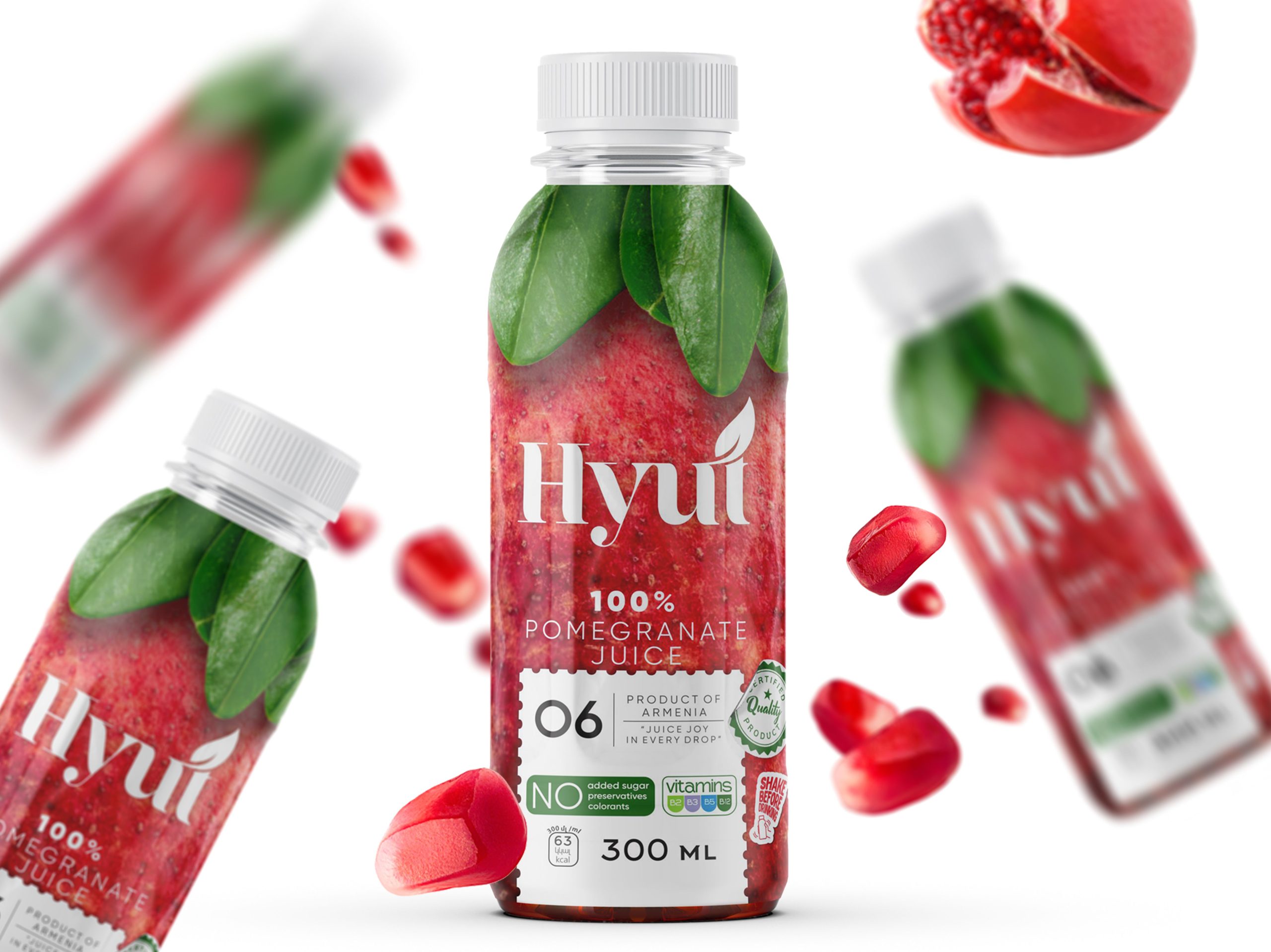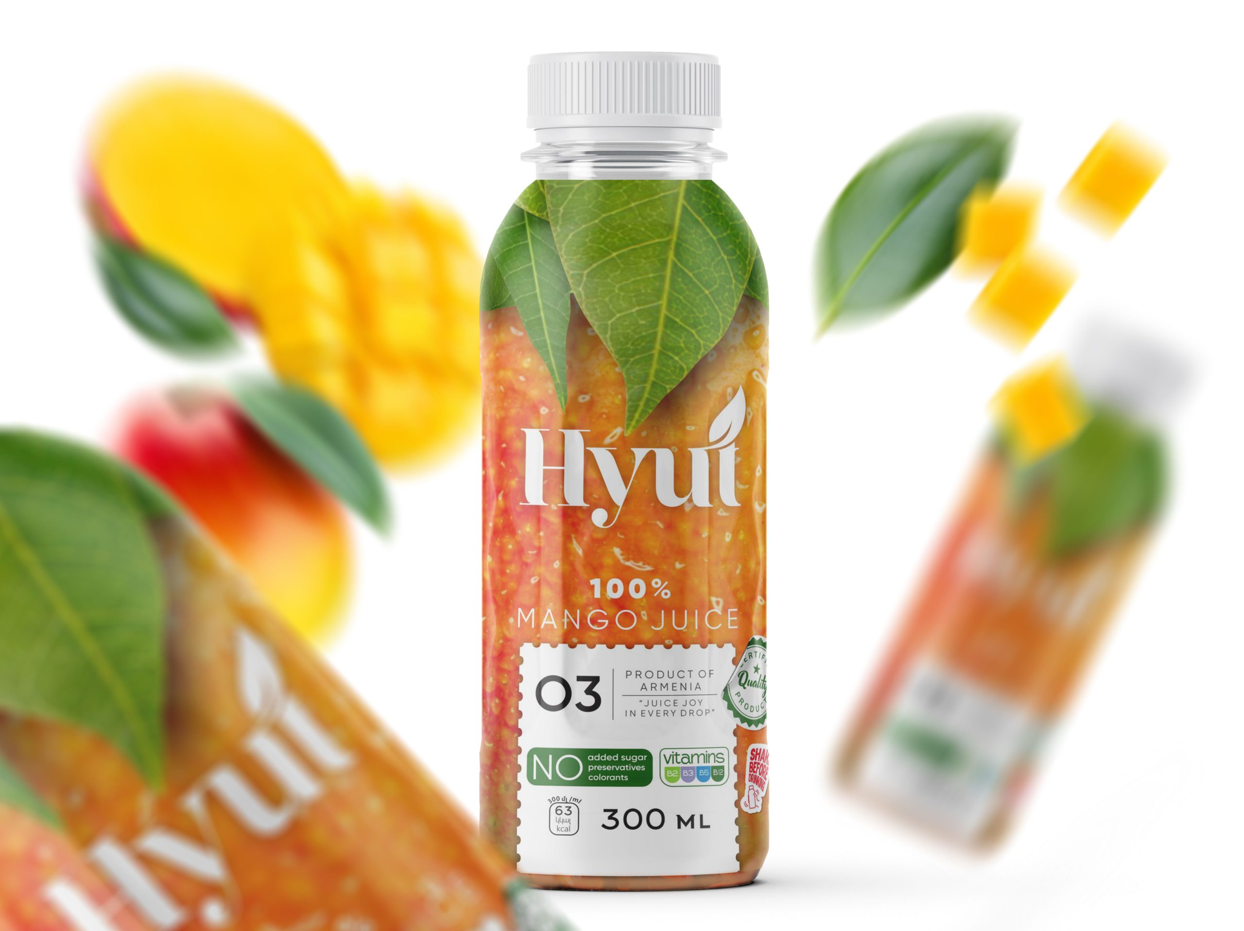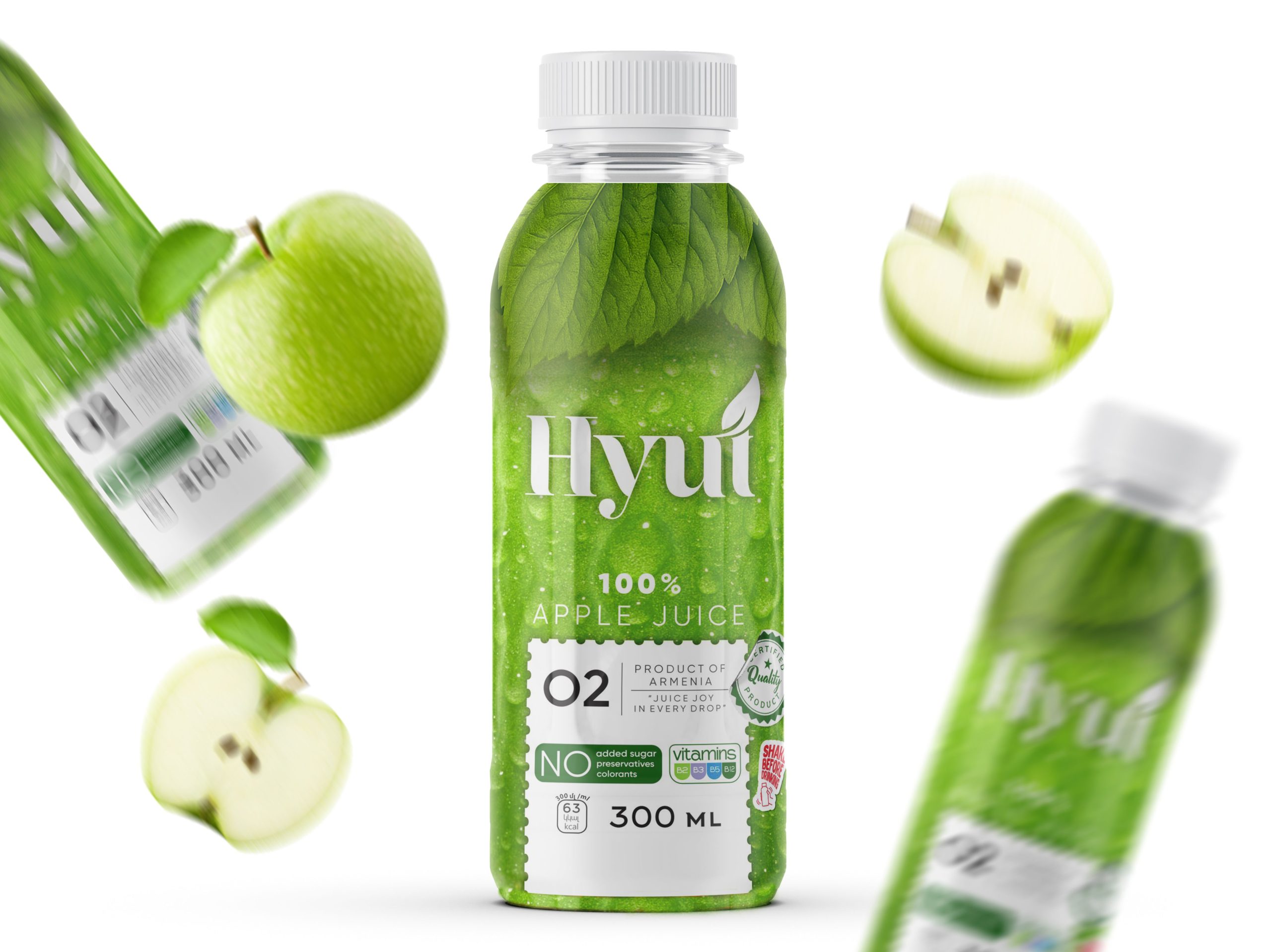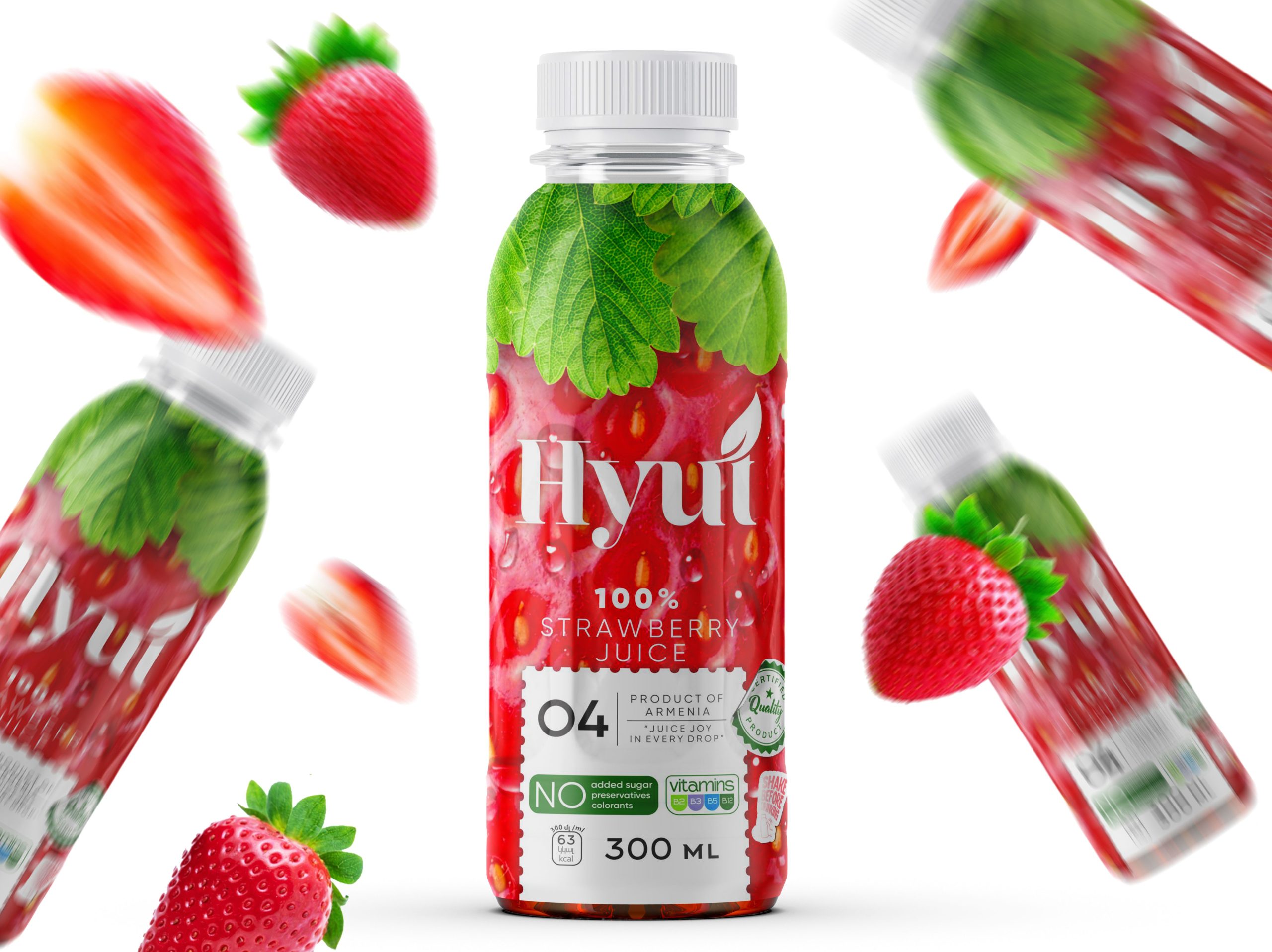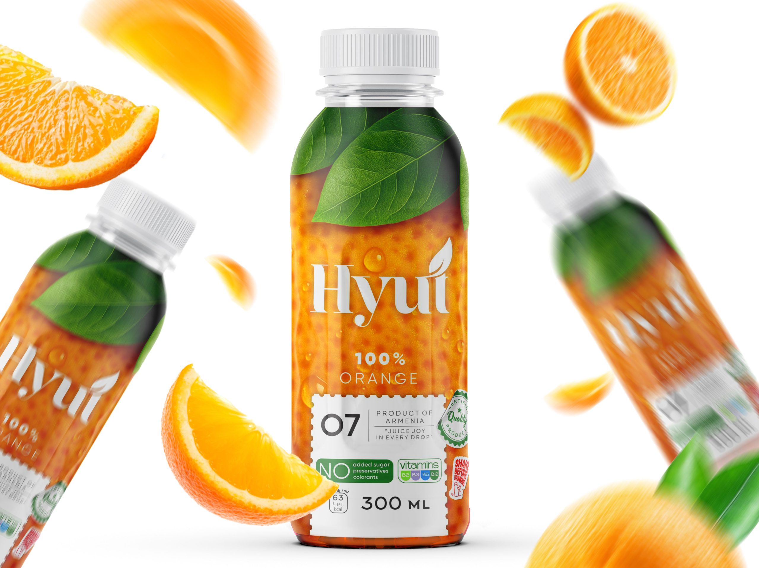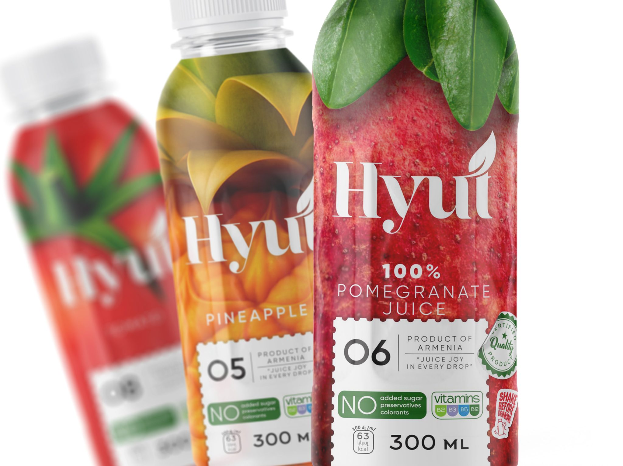
HYÚT, which means “juice” in Armenian, was born from a desire to present juice as a pure, genuine product. The design combines photorealistic fruit imagery, soft leaf accents, and a modern, airy composition, allowing the packaging to speak for itself. The white emblem and clean visual markers make the identity recognizable and honest: no added sugar, no unnecessary advertising, just real, beneficial taste. The packaging reflects the brand’s core values: simplicity, quality, and naturalness.