
Toxic Tulip: a rebellious flower shop with its own line of bloody products
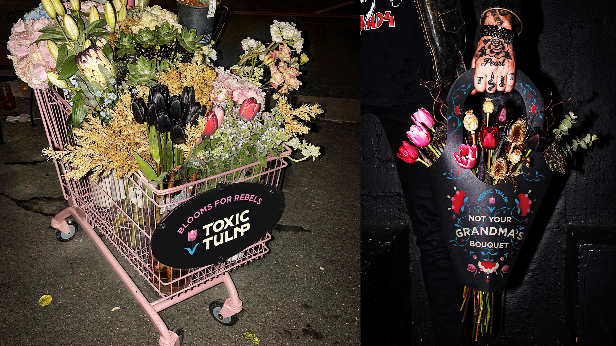
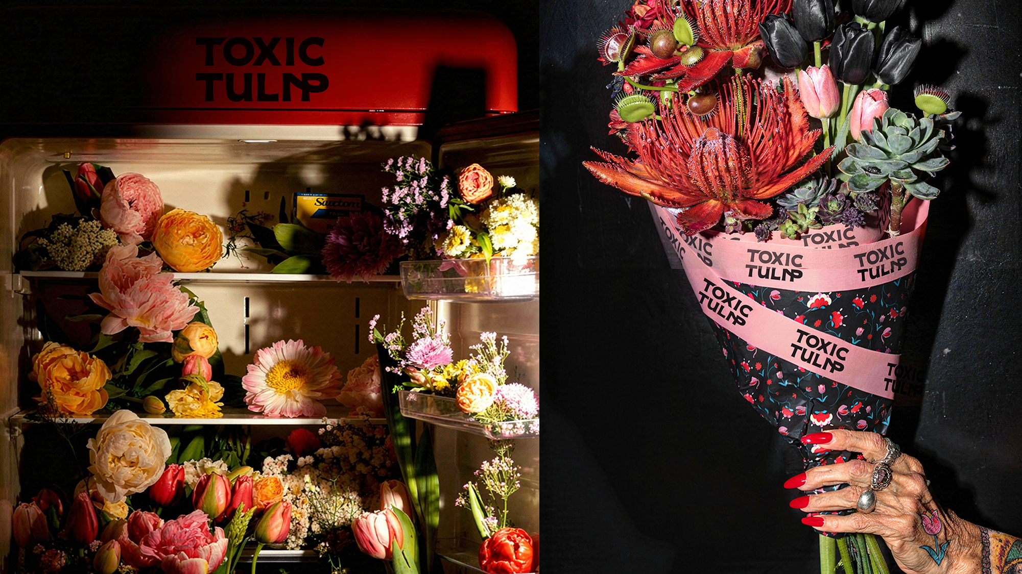
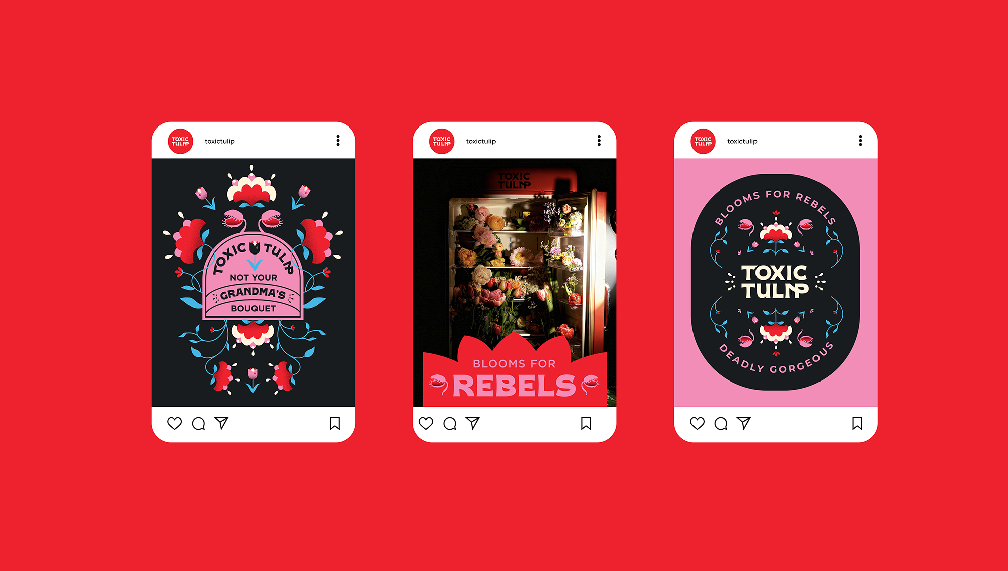
Toxic Tulip is a flower shop like no other. No romantic florals or soft pastels. This is rebellious, it is toxic, it’s not your grandma’s bouquet.
In every category, we see products and brands that disrupt the market, go against the current, and set the tone. Toxic Tulip did just that in the flower shop market, turning something traditionally delicate into something strange and bold.
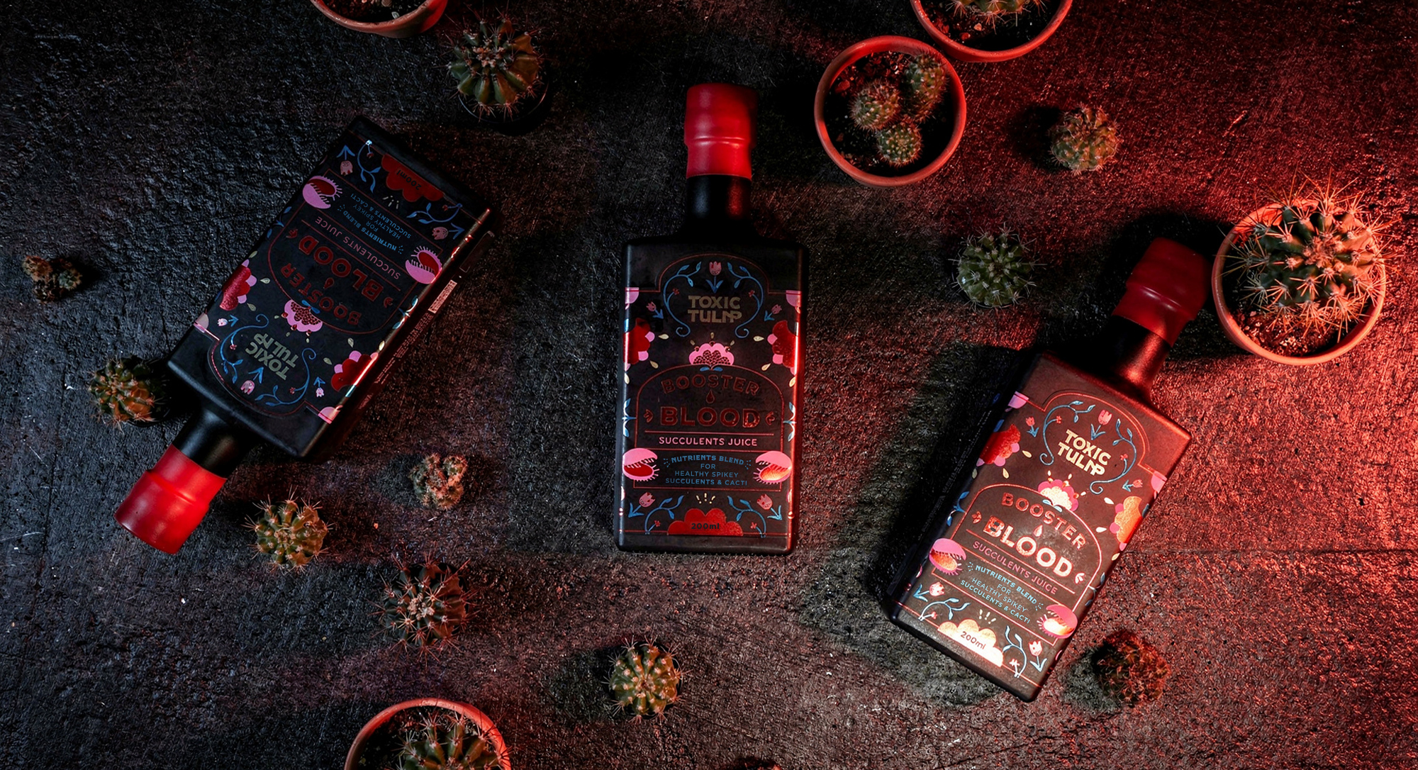
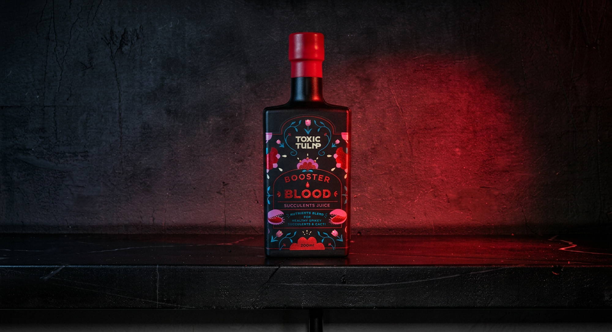
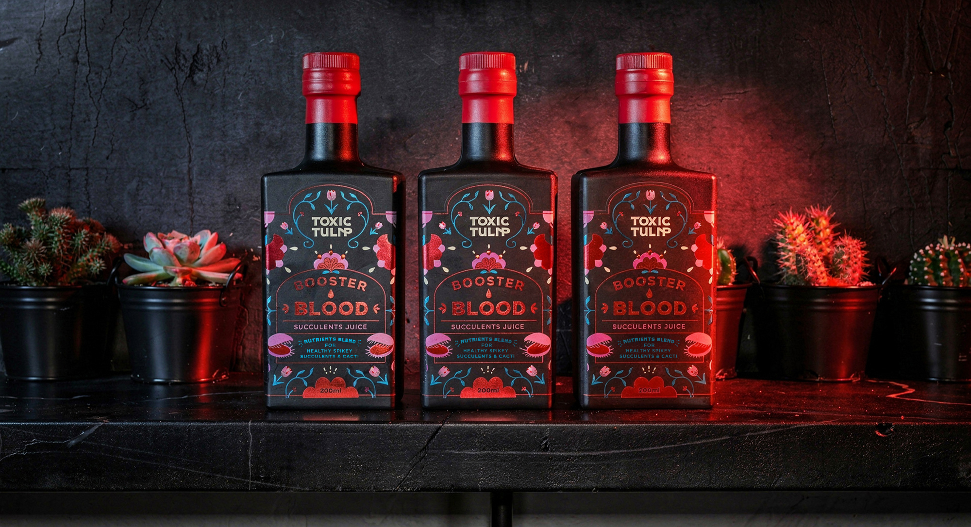
With its own line of products, Boaster Blood is the hero product. The storytelling is clearly shown in every choice: from the product names and tagline to the imagery, packaging, and selection of flowers; carnivorous whenever possible.
There are still delicate flowers in the branding, along with pinks and blues. But that’s where the sweetness stops. This contrast between cuteness and rebellion is what makes the brand completely different. It feels playful and dangerous at the same time.
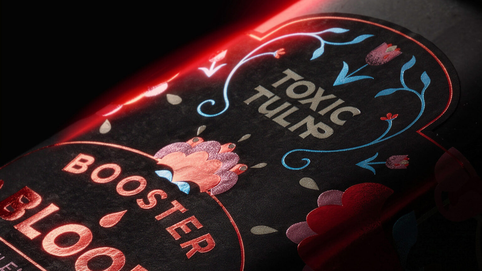
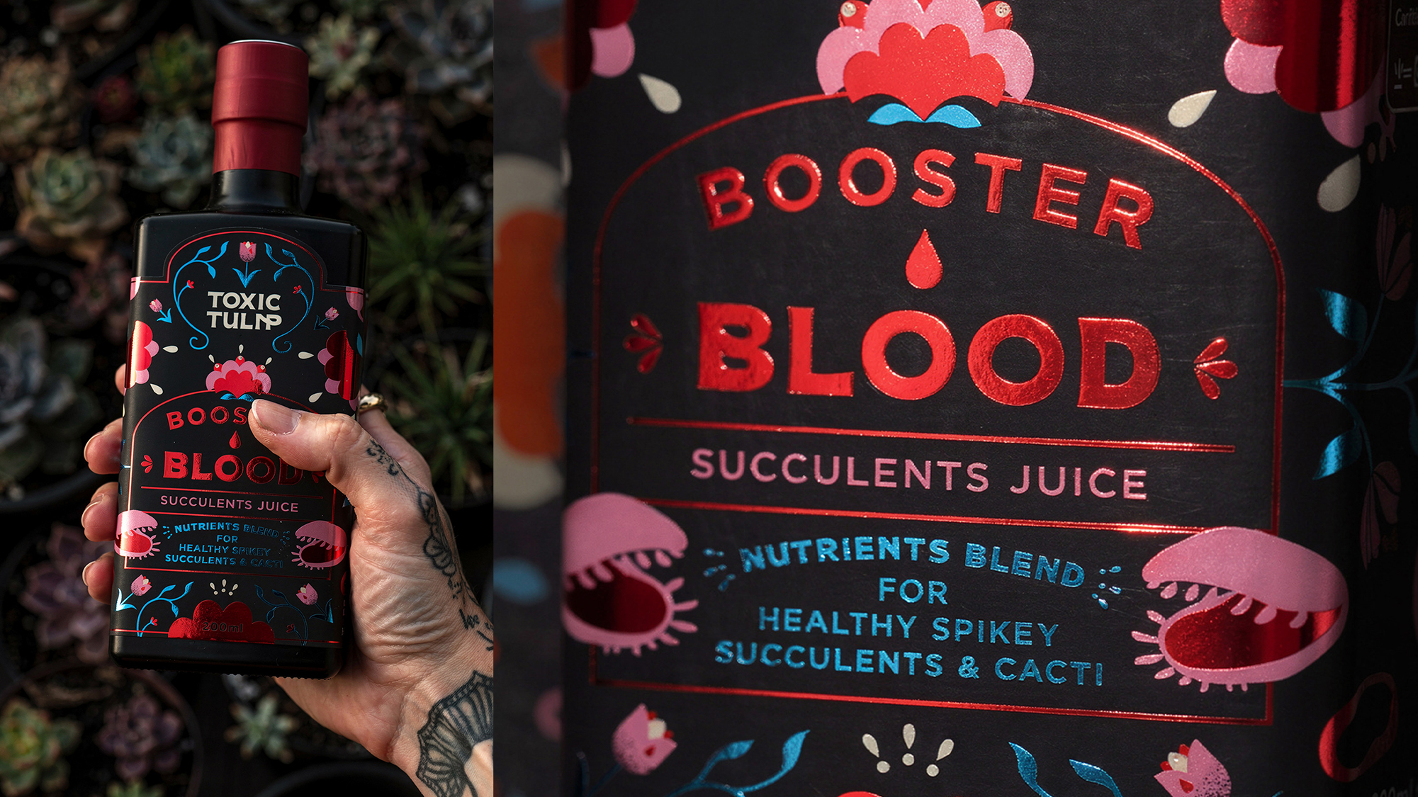
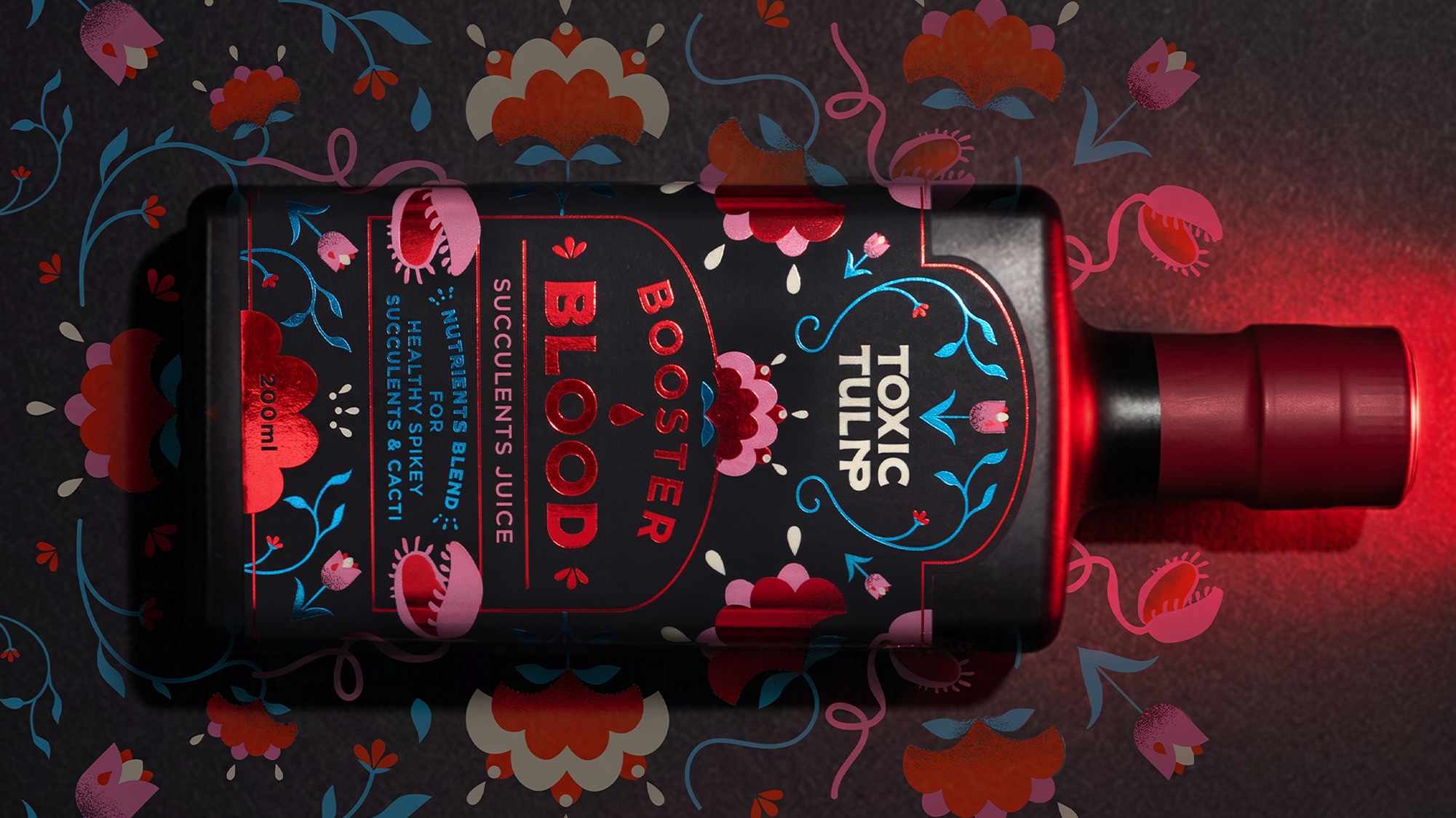
The hero product features a tactile label finished with red and blue foil, making it as irresistible to touch as it is to look at. It’s truly drop-dead gorgeous. Created for a young generation of proud homebodies and self-proclaimed flower parents, Toxic Tulip is here to make flowers and gardening cool again.
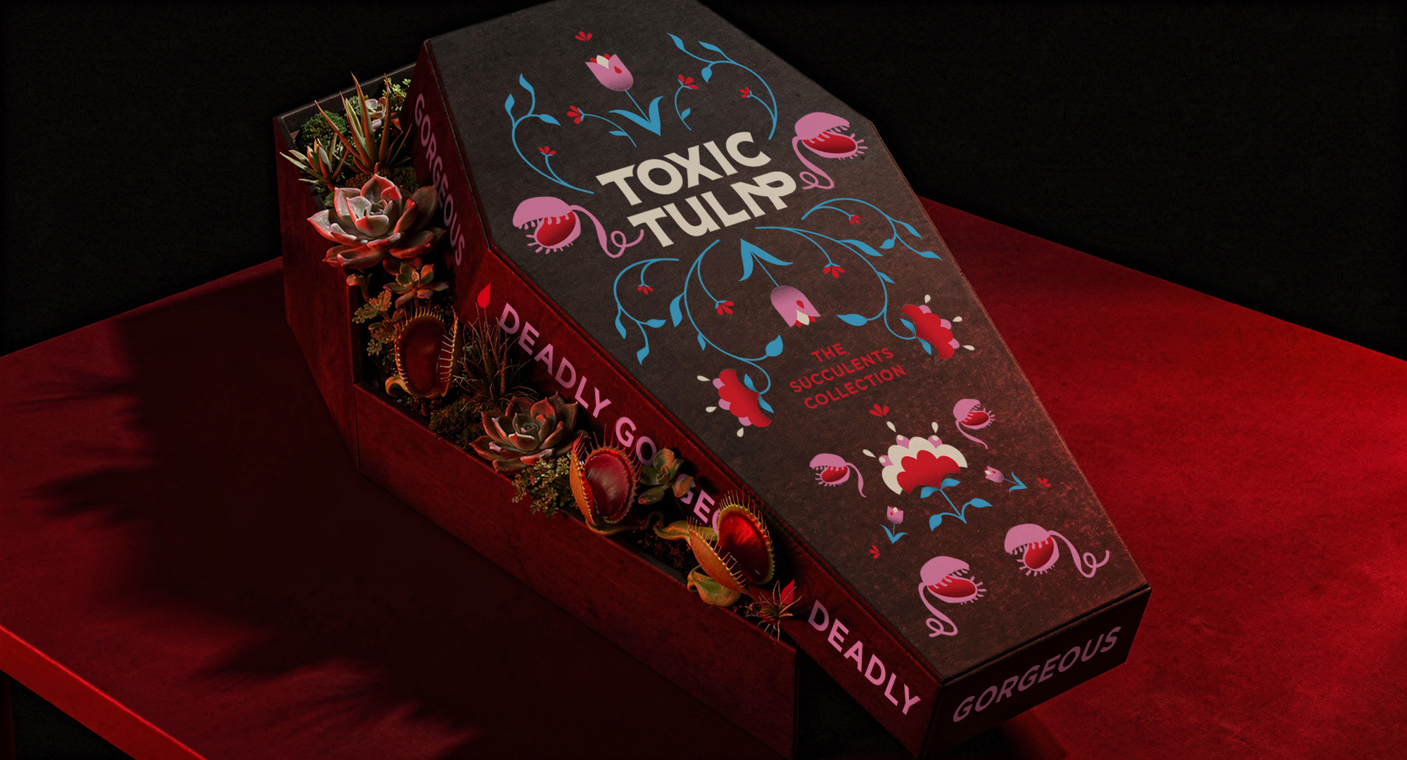
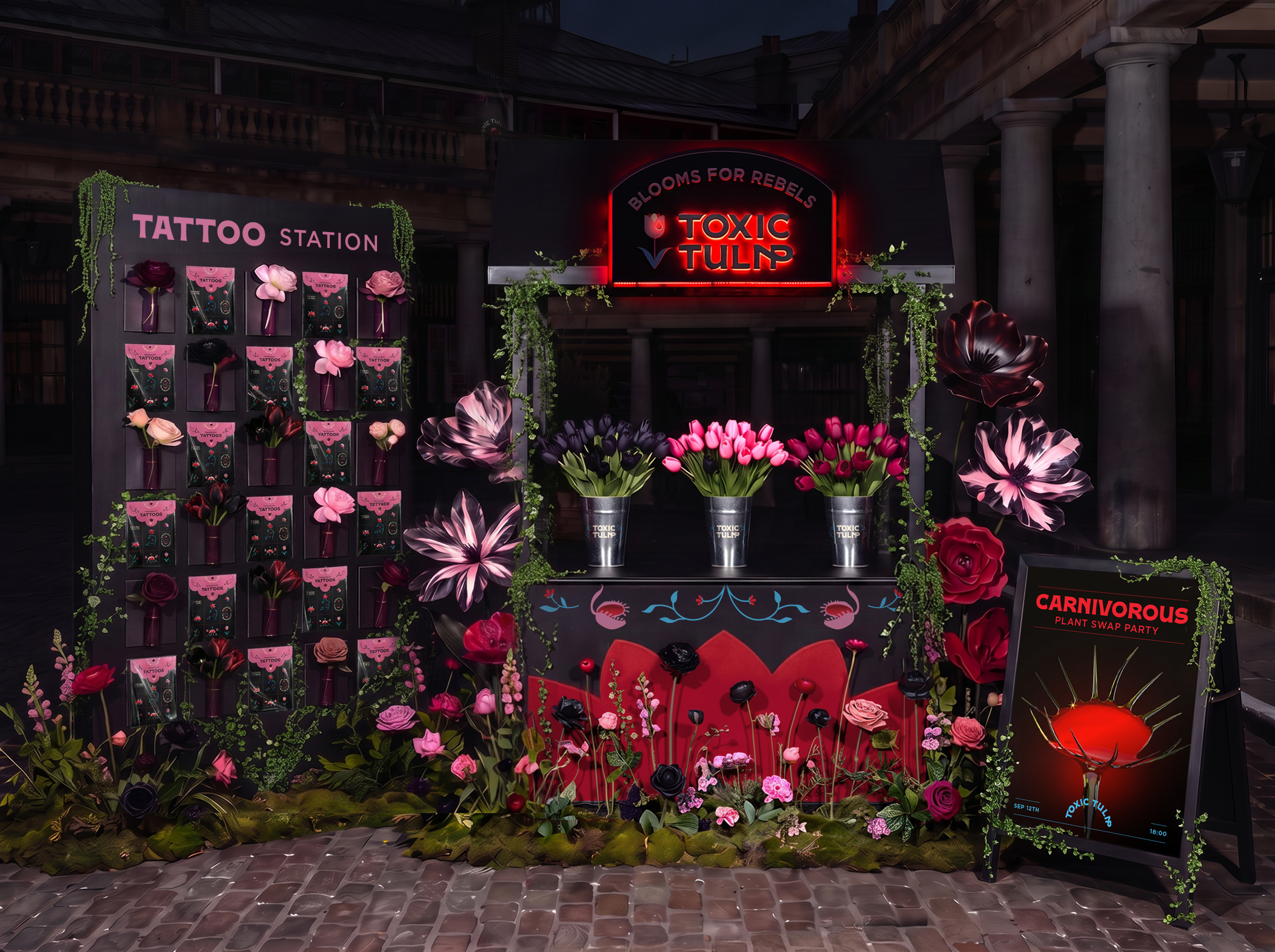
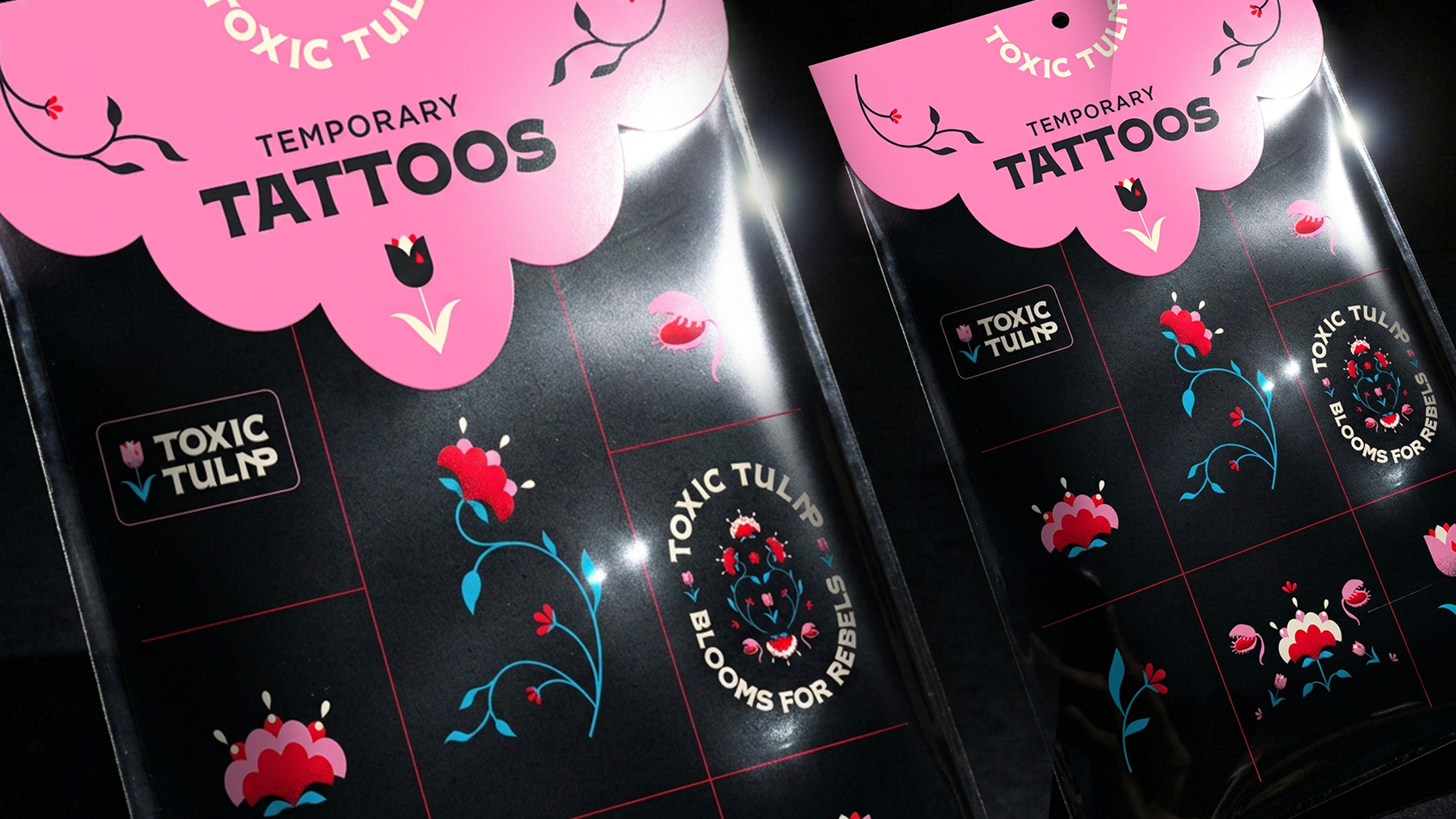
With brand activations involving temporary tattoos, a goth pop-up store, and special coffin-shaped flower boxes, the storytelling is carried across each touchpoint. Everything about Toxic Tulip screams toxicity, in a playful way.
Toxic Tulip is blooms for rebels.
Curator’s Insight
The clever move here is structural, not decorative. The coffin silhouette isn’t just a novelty box shape, it’s a single geometric motif carried across two completely different packaging formats: a rigid gift box for the bottled product line, and a flexible paper sleeve for fresh-cut bouquets. Most brands would treat “bottle packaging” and “flower wrap” as separate design problems with separate rules. Here they share one shape language, which is what makes the system read as a cohesive brand rather than a themed product drop.
The sleeve is worth a second look too. The cutout at the top isn’t purely ornamental, it doubles as a carry handle, meaning the tombstone-arch shape had to solve a functional hand-hold problem while still reading as iconography. That’s a harder brief than it looks: most novelty die-cuts sacrifice usability for shape. This one doesn’t.
Foil placement is also doing quieter work. Restricting the red and blue foil to the linework rather than the type keeps the wordmark legible at a glance while still giving the packaging that tactile, light-catching quality on shelf. It’s a reminder that foil doesn’t need to cover a design to earn its cost, targeted application often reads as more premium than full coverage.
 andreamarinnn
 Chochoi Creative
 Hi estudio
 bachir bachchar
 Aferdini
 AUN BRANDS
 vitoramockup
 InterWish
 ash123456
 Studiotaketwo
 monther al omari
 Maruf Nishat
 secondpound
 Sun Jia Yang
 宏洛图品牌设计HONGLT
 Palashcc
 Clever Branding
 ARTKA
ARTKA Boordon
 SANTIAGO
 Studio Husk
 Studio Tumpic/Prenc
 Abbas Sayyed
 Antonia Skaraki
 Luminous Design
 eldiyar