
ABOUT
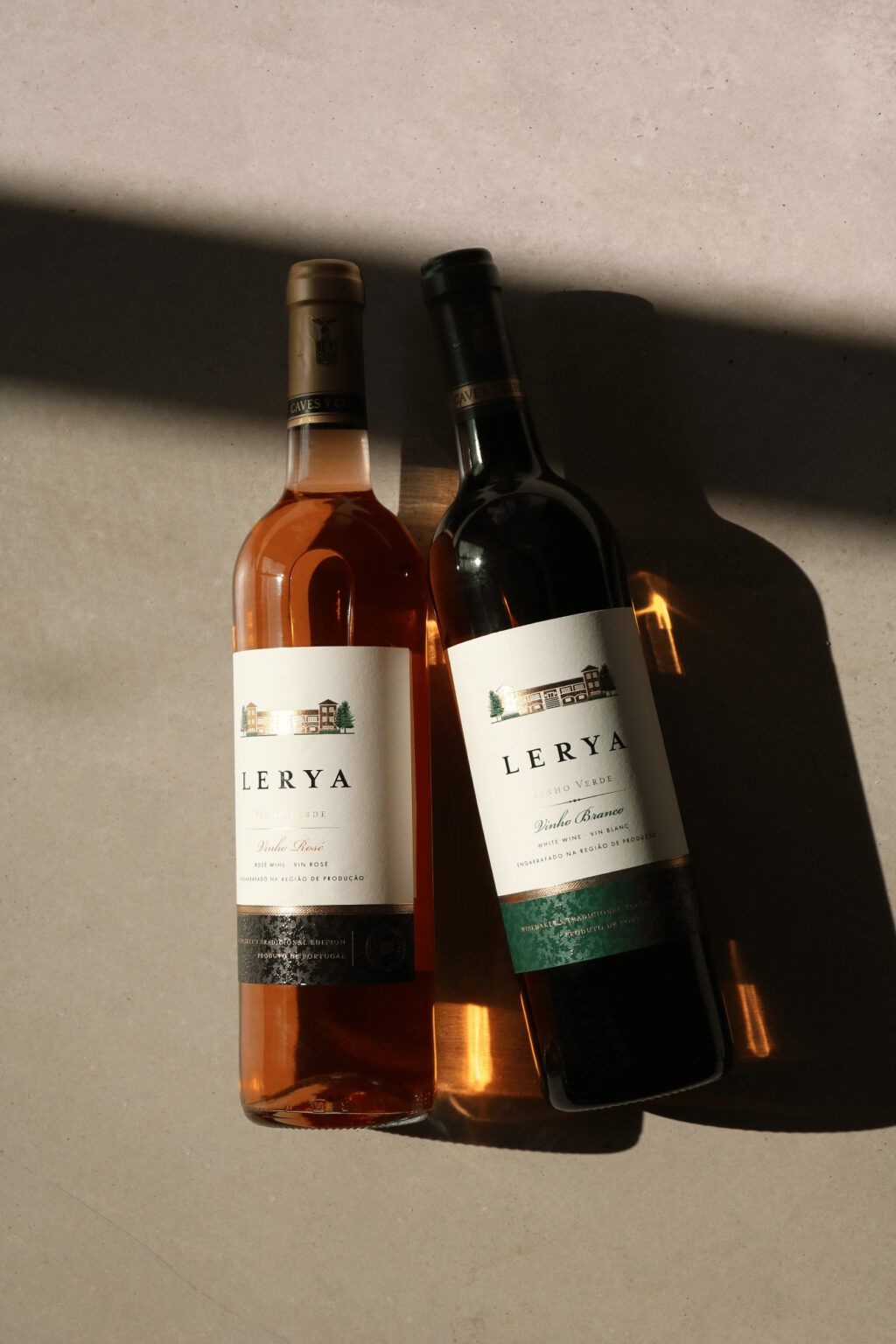
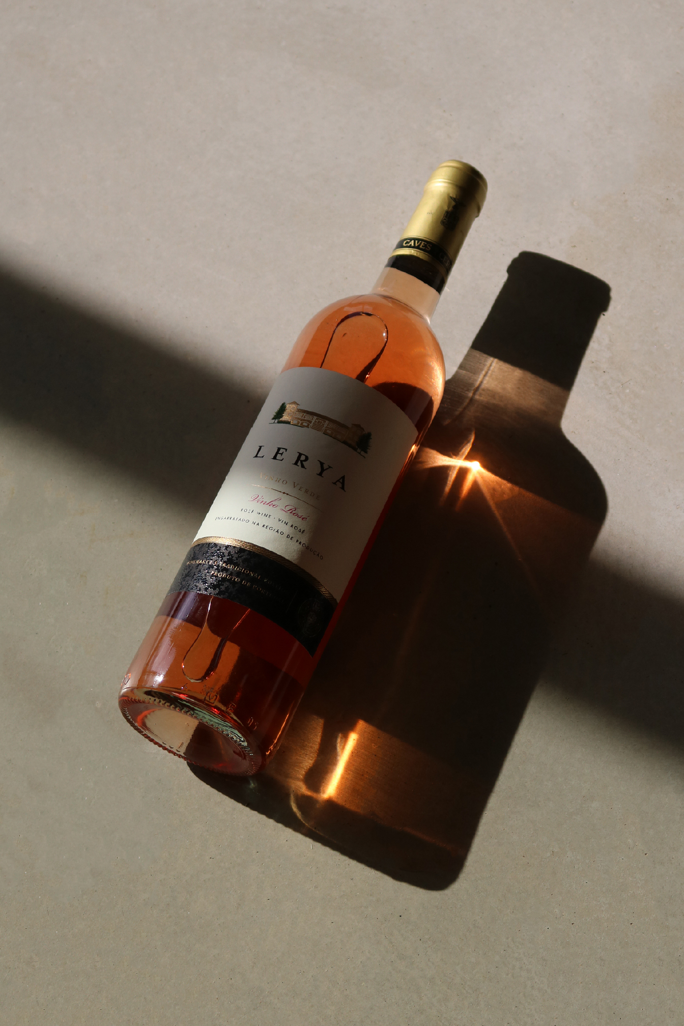
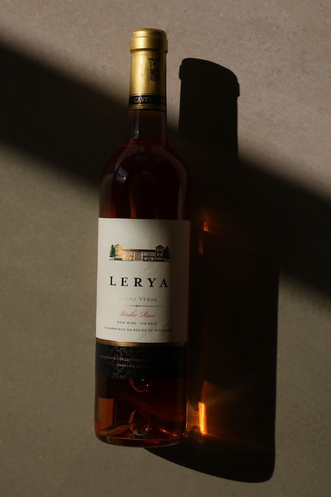
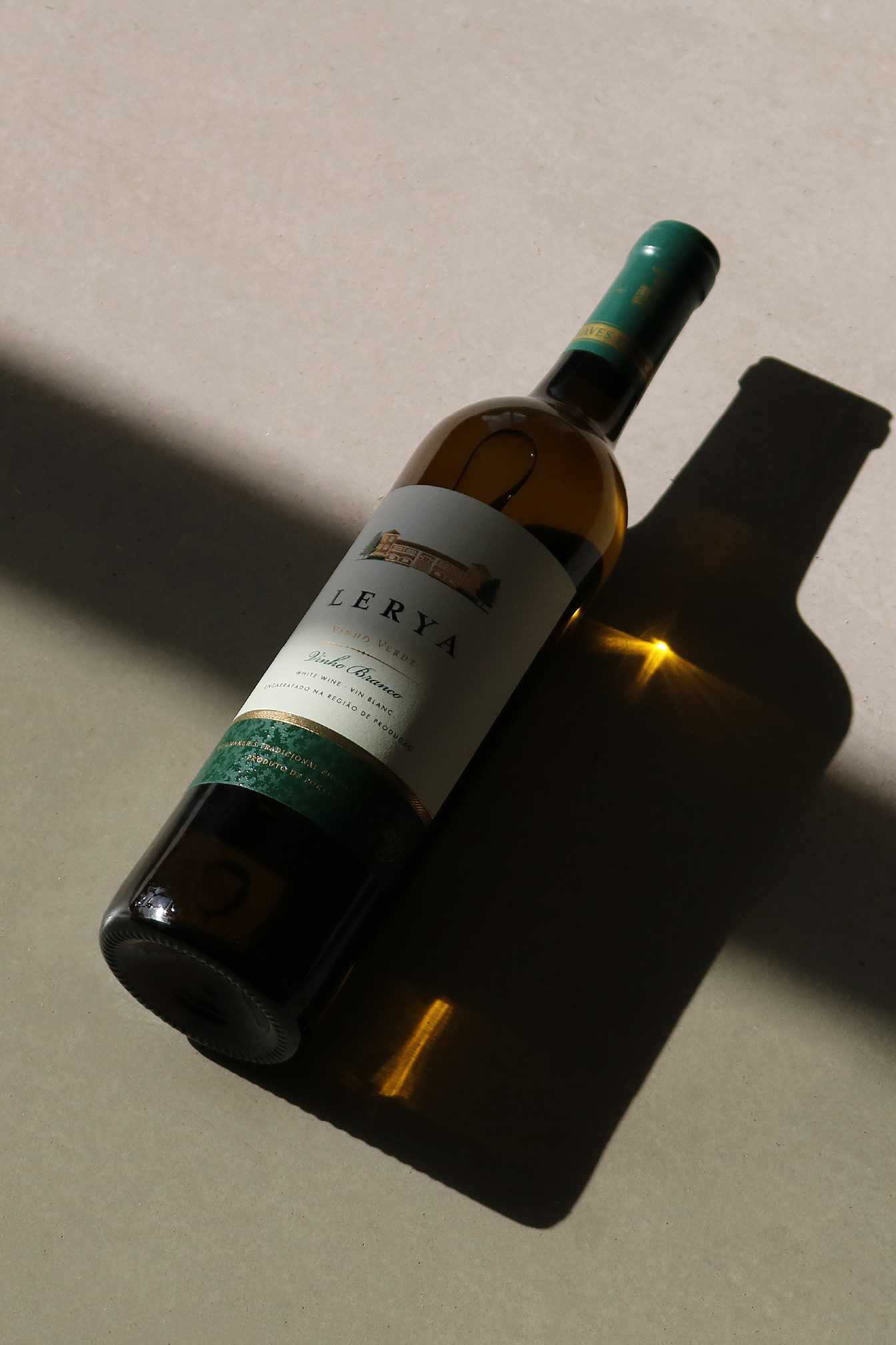
LERYA is a collection of Vinho Verde wines from Portugal, presented in white and rosé varieties. The project focused on creating a new visual identity and packaging system that would express the character and origin of the wine through a contemporary and refined language.
CONCEPT
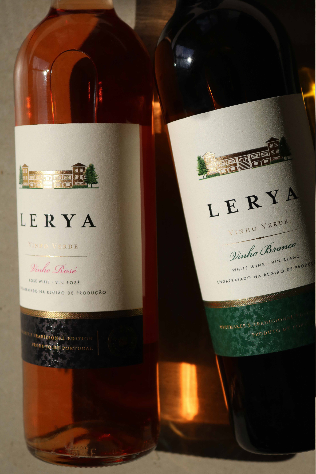
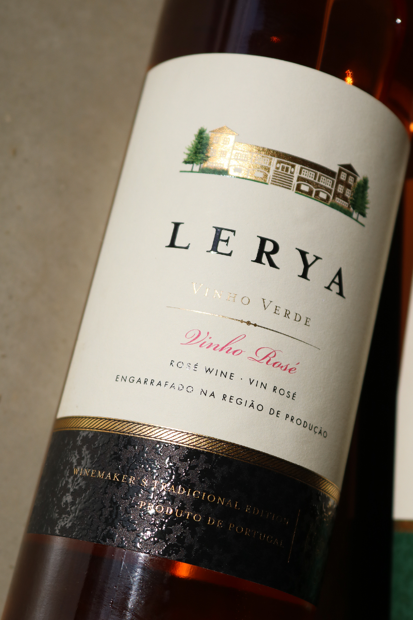
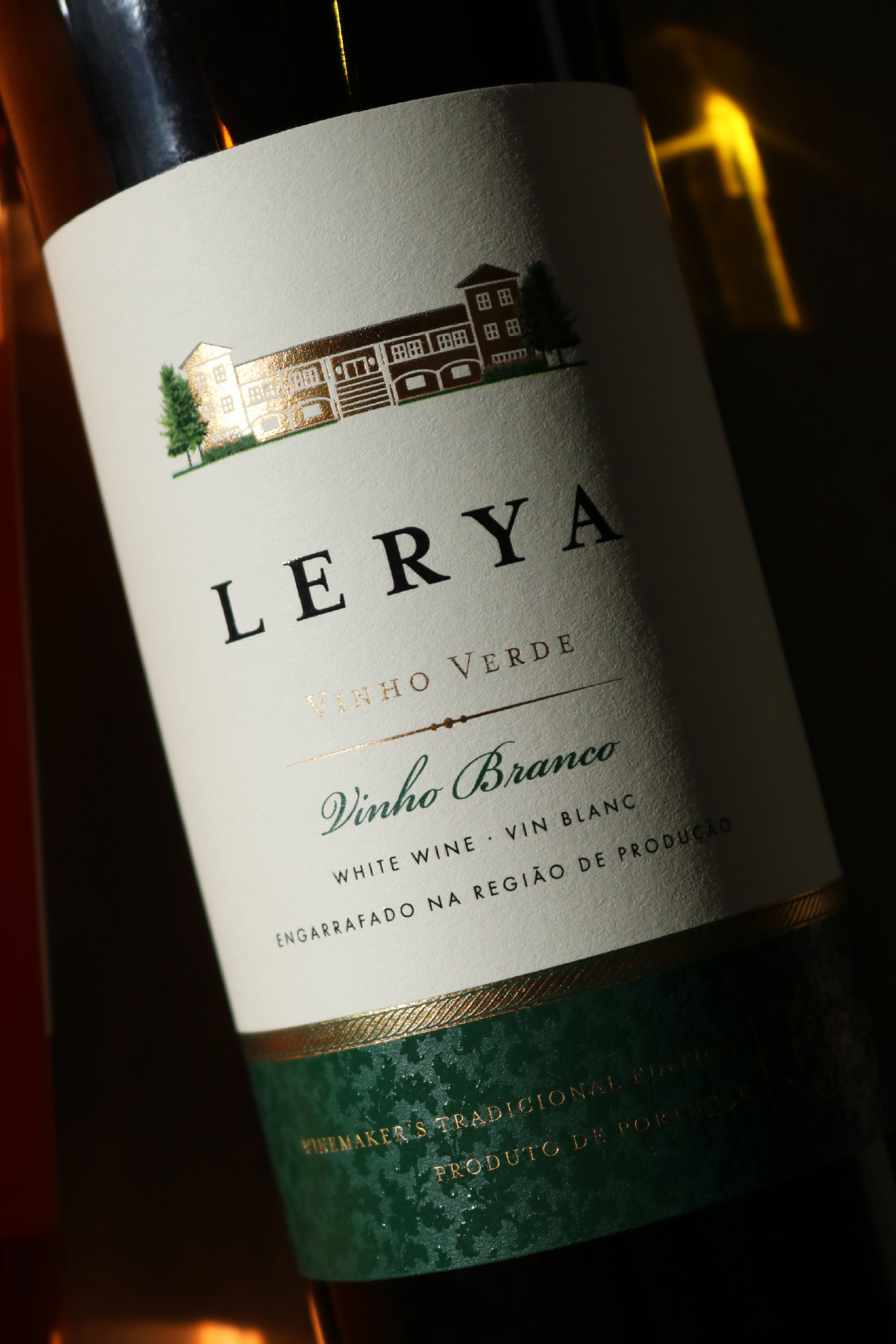
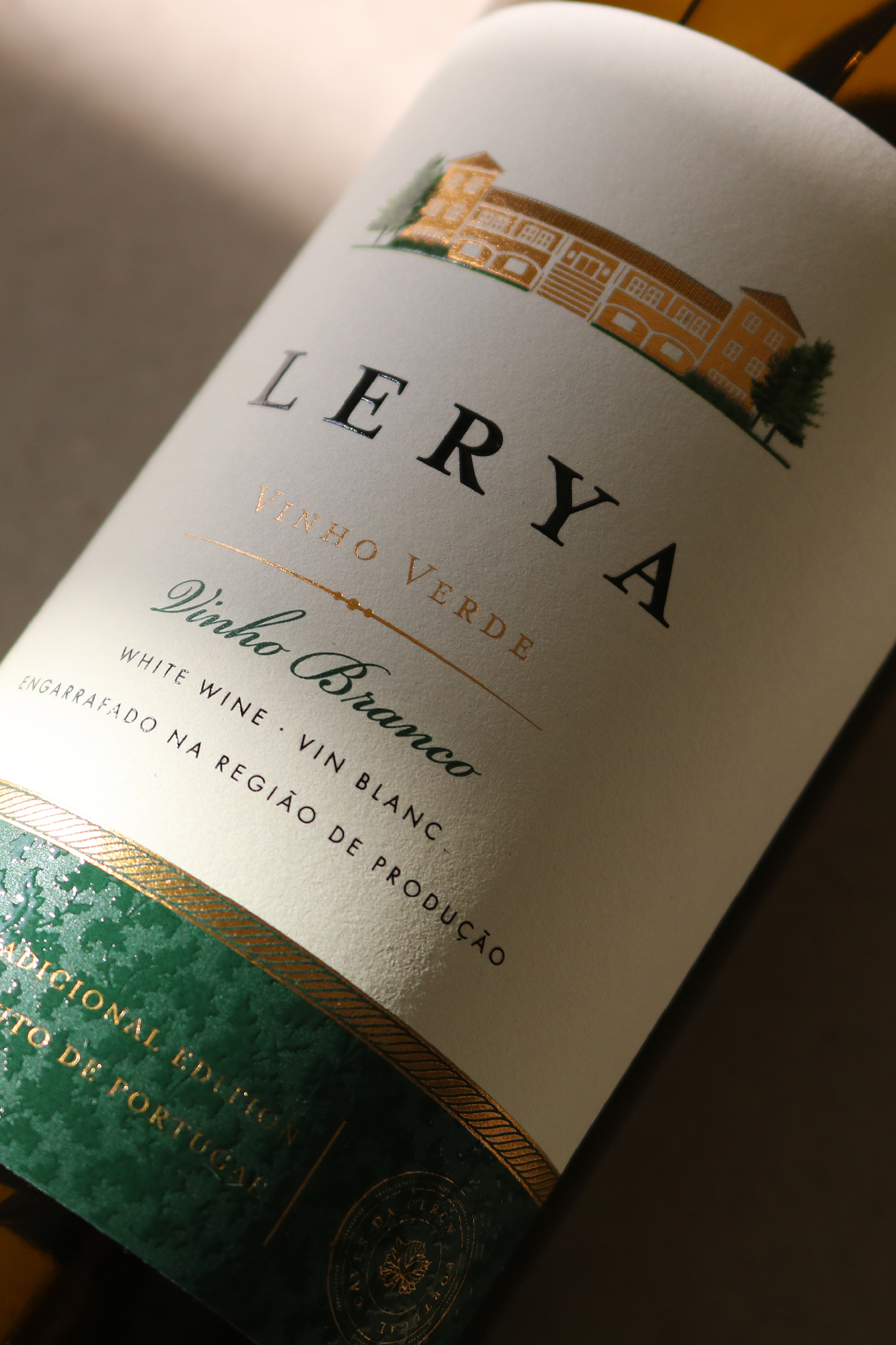
The concept is rooted in the idea of origin and belonging. At the center of the label is an illustration of the property, transforming the place where the wine comes from into a distinctive visual signature for the brand.
Instead of relying on traditional wine label codes, the design interprets Portuguese heritage through a more restrained and contemporary aesthetic. The house becomes a symbol of the place, connecting the product to its territory and giving the brand a memorable and recognizable element.
SOLUTION
The visual identity was built around a clear and consistent hierarchy, with LERYA as the central element of the brand and the property illustration acting as the main narrative resource.
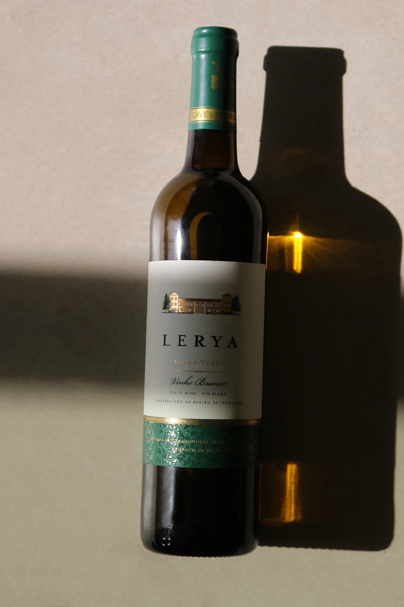
A warm ivory background is combined with deep green and subtle gold details, creating a sophisticated expression that maintains a strong connection to the landscape and cultural identity of the Vinho Verde region.
The white and rosé wines share the same visual architecture, creating a cohesive family while allowing each wine to retain its own character.
TECHNIQUE
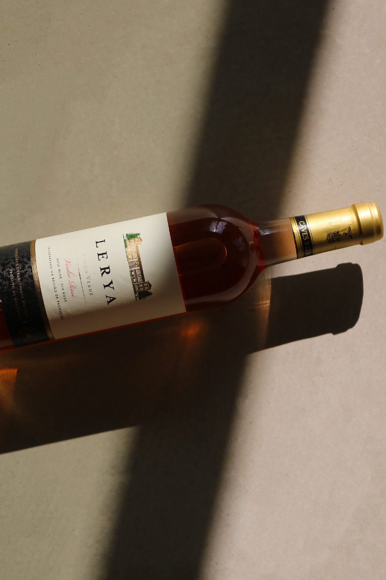
The packaging combines carefully structured typography, a custom illustrated element, and a sober color palette to create a balanced composition. The label was designed to function both as an individual bottle and as part of a wider product family.
WHAT MAKES IT UNIQUE
The distinctive element of the packaging lies in how the property itself becomes part of the brand identity. Instead of treating the origin simply as information on the label, the architecture of the location is elevated to a visual signature.
This creates a direct relationship between the wine, its territory, and the brand identity, avoiding overly conventional visual references commonly associated with Portuguese wine packaging.
RESULT
The result is a contemporary packaging system that brings together Portuguese heritage, a sense of place, and a refined visual language.
LERYA aims to communicate the authenticity of its origin, presenting Vinho Verde through a fresh, elegant, and easily recognizable identity.
 Lizaveta Kharitonyuk
 Bonsanco Creative Studio
 DesignRepublic
 GIRAFA STUDIO
 PiotrWisniewski
 Sophiagdotcom
 monther al omari
 CreativeWise
 Modern Theory
 SoreThumbStudio®
 Modern World Studio
 Palashcc
 Valérie Colace
 andreamarinnn
 Chochoi Creative
 Hi estudio
 bachir bachchar
 Aferdini
 AUN BRANDS
 vitoramockup
 ash123456
 Studiotaketwo