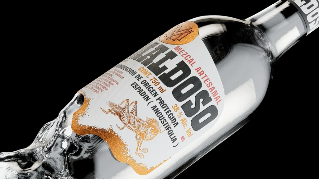

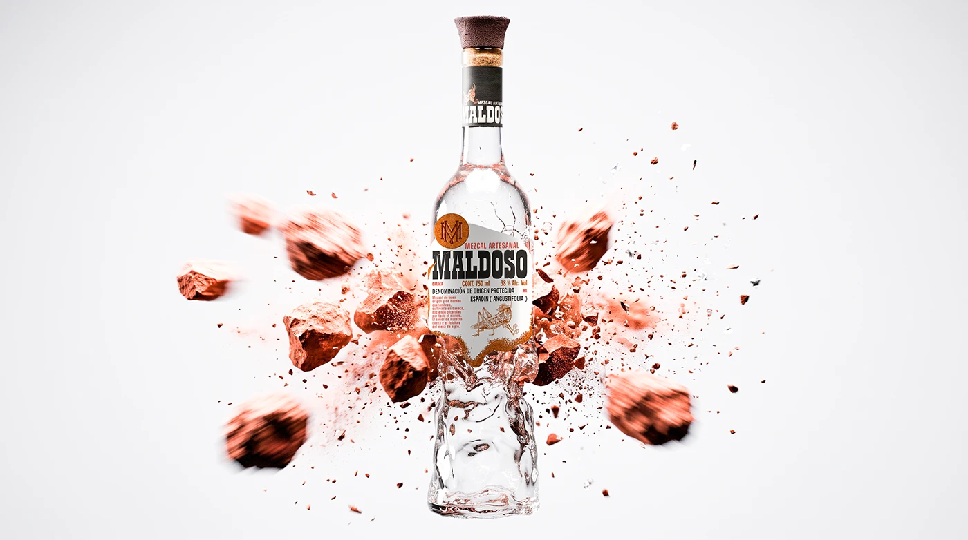
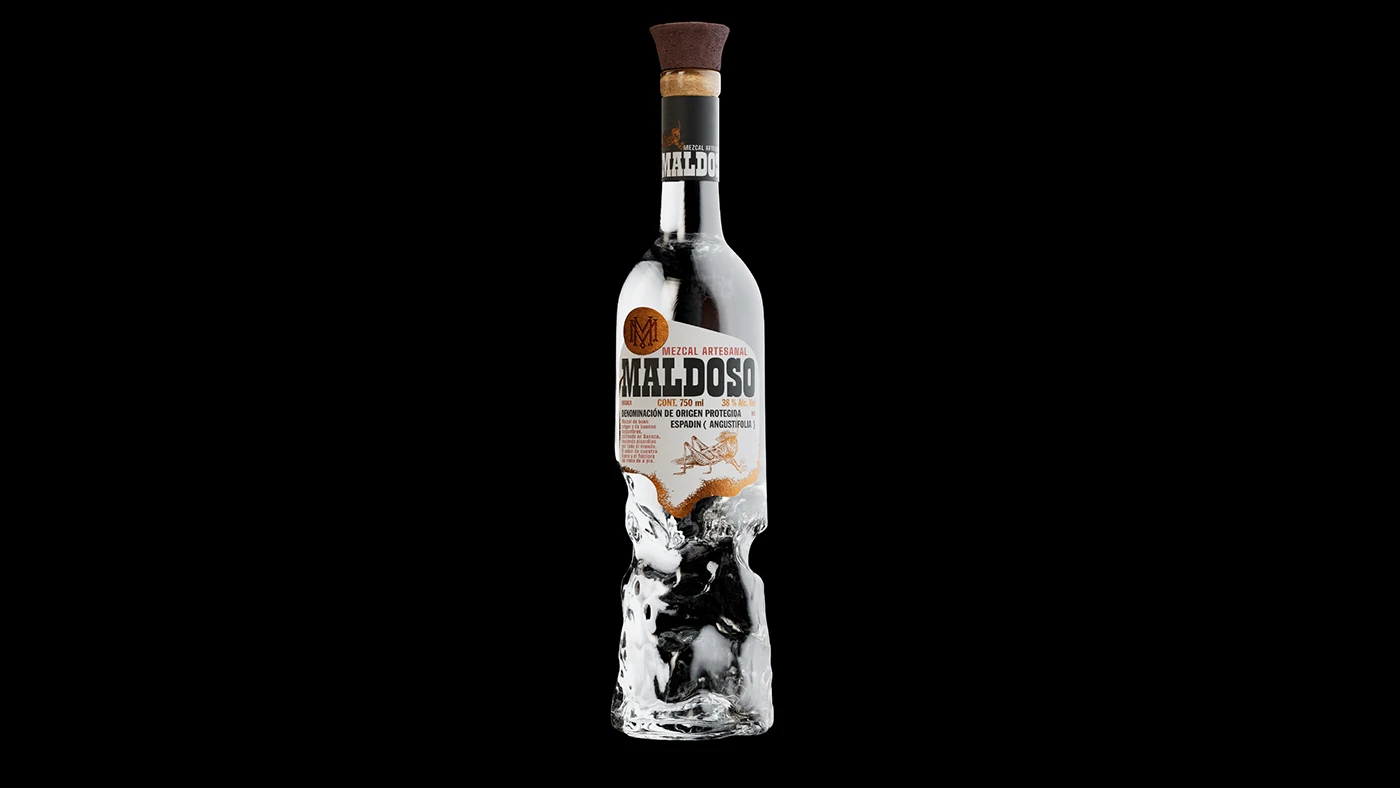
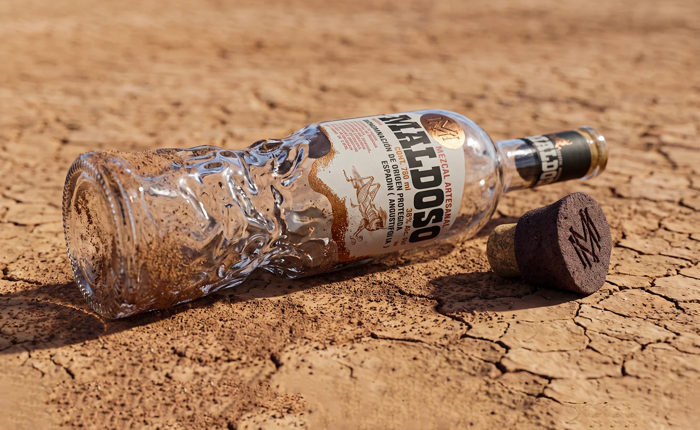
A bottle that didn’t make it out intact. It came out Maldoso.
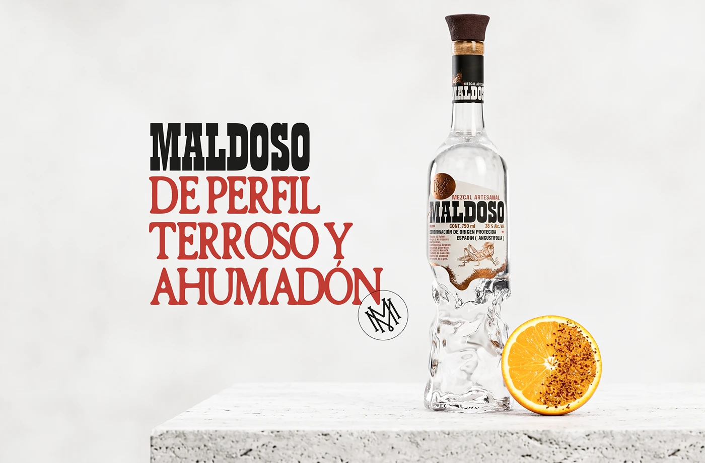
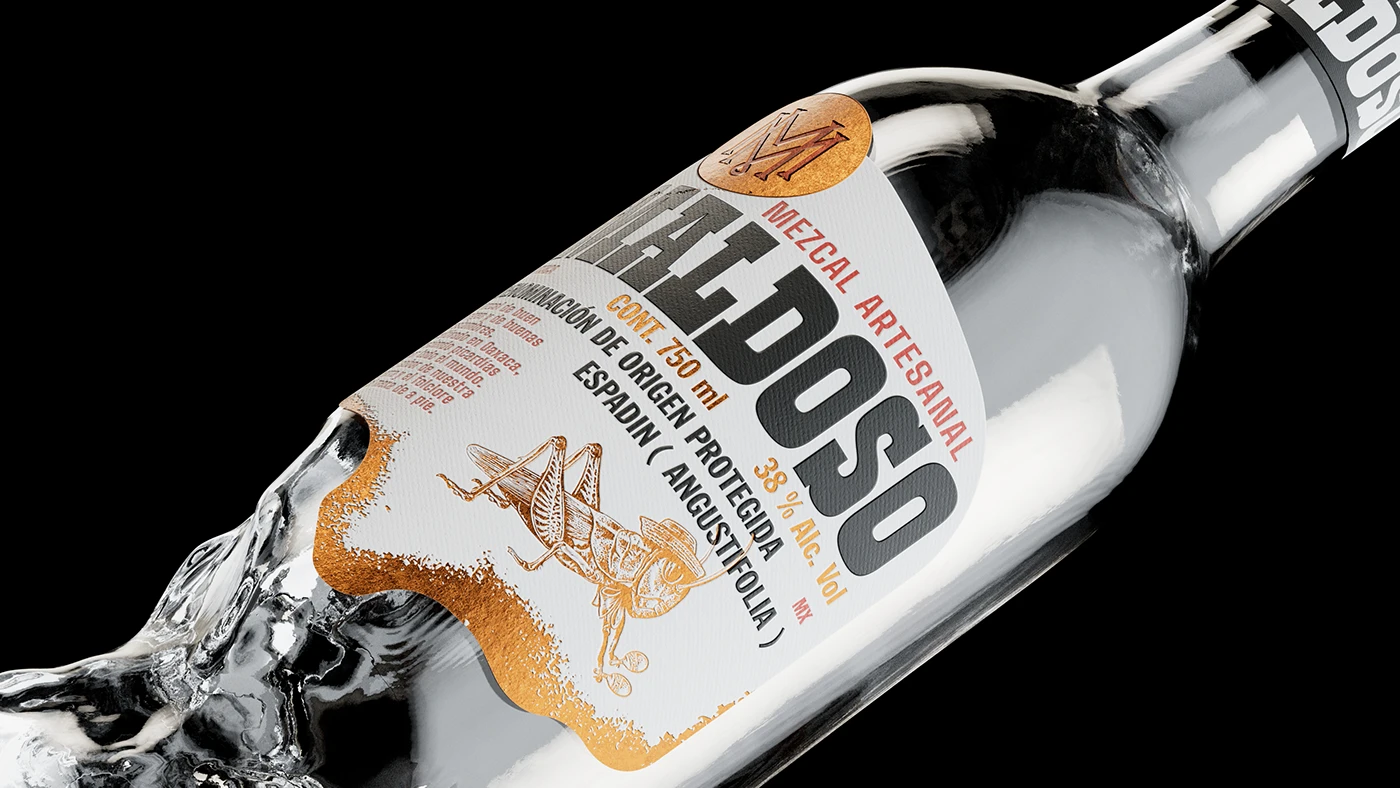
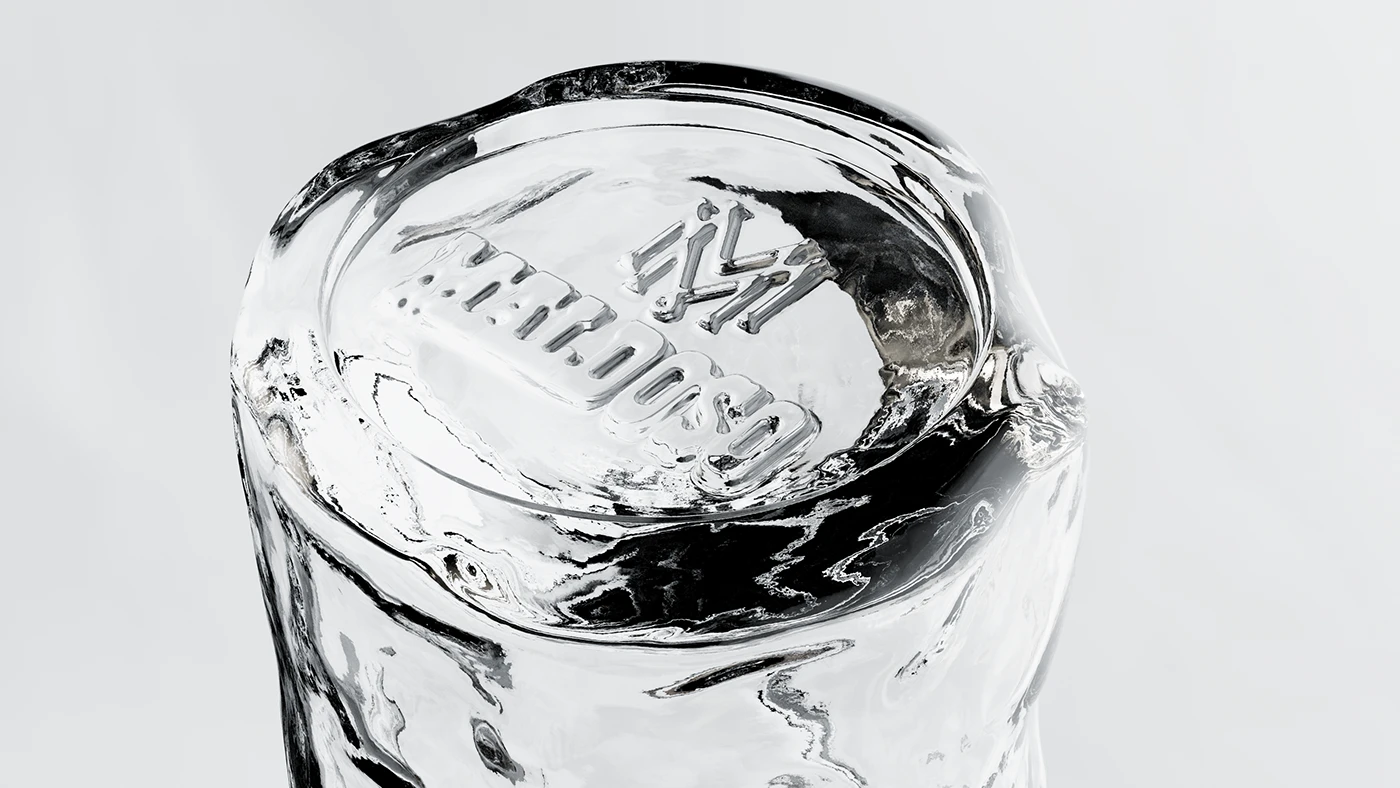
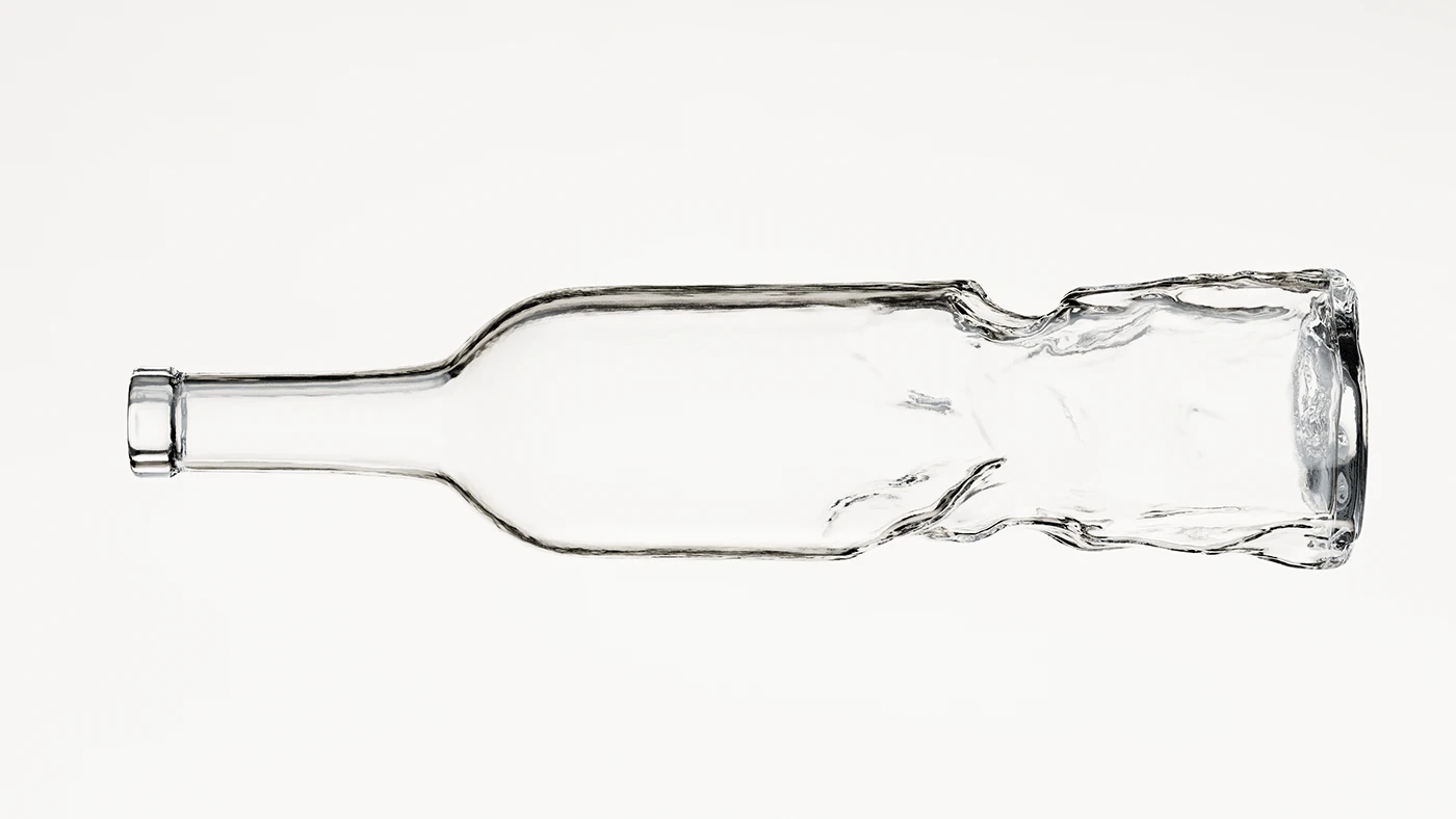
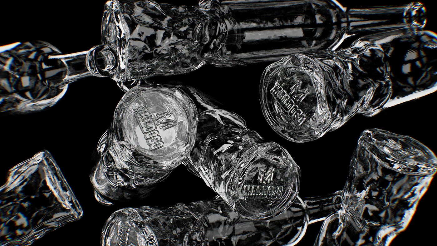
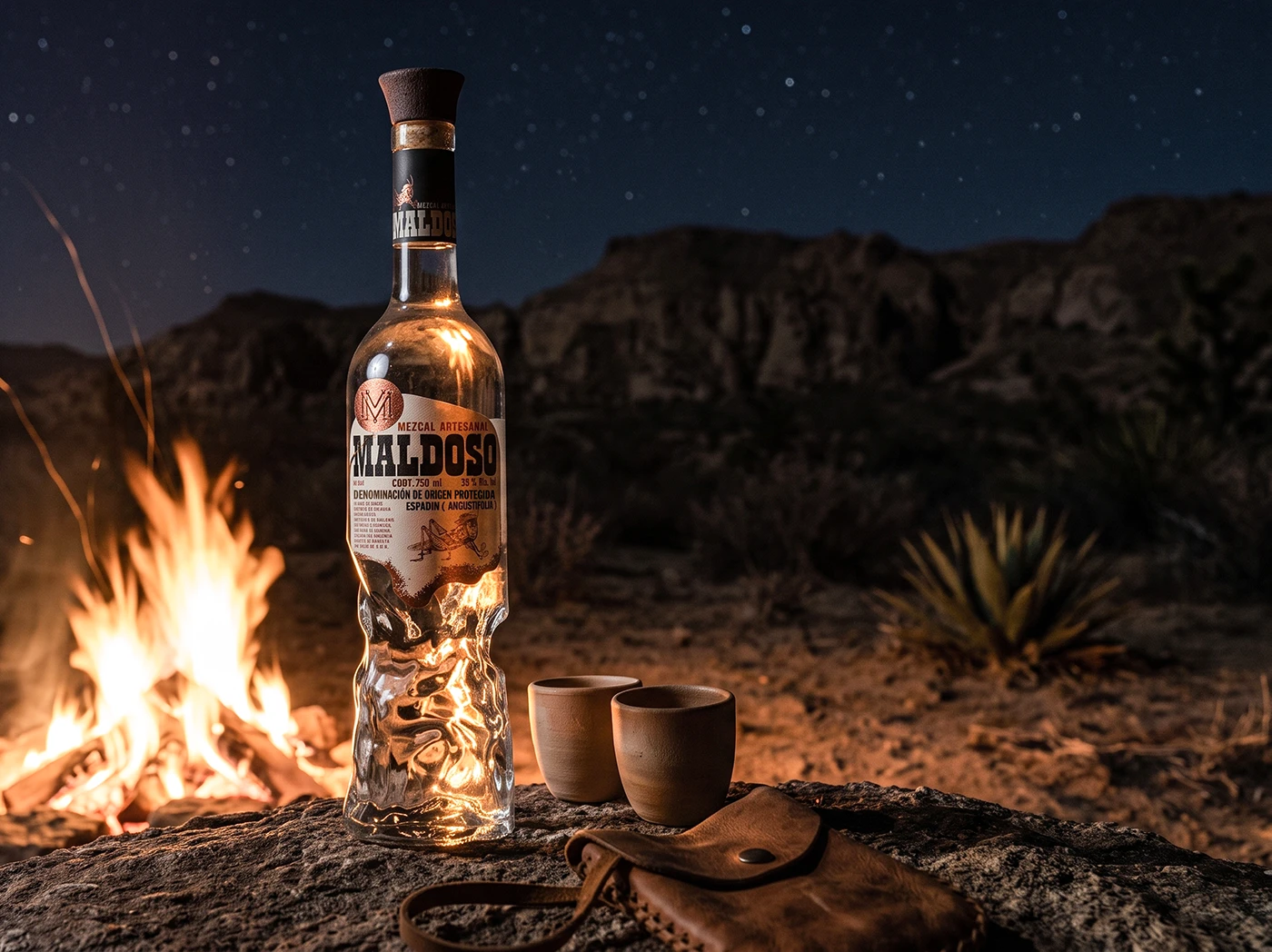
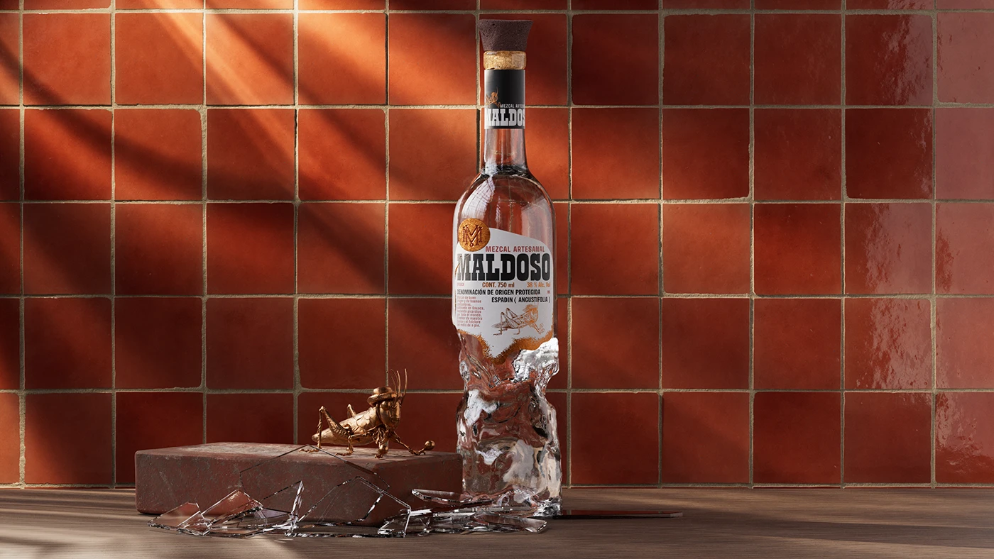
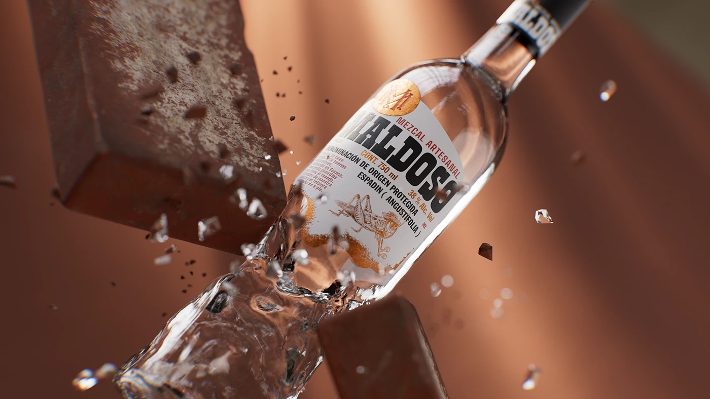
We started with a standard bottle and brought it into the world of the brand: we hit it, distorted it, and turned it into a battered, imperfect, instantly recognizable object.
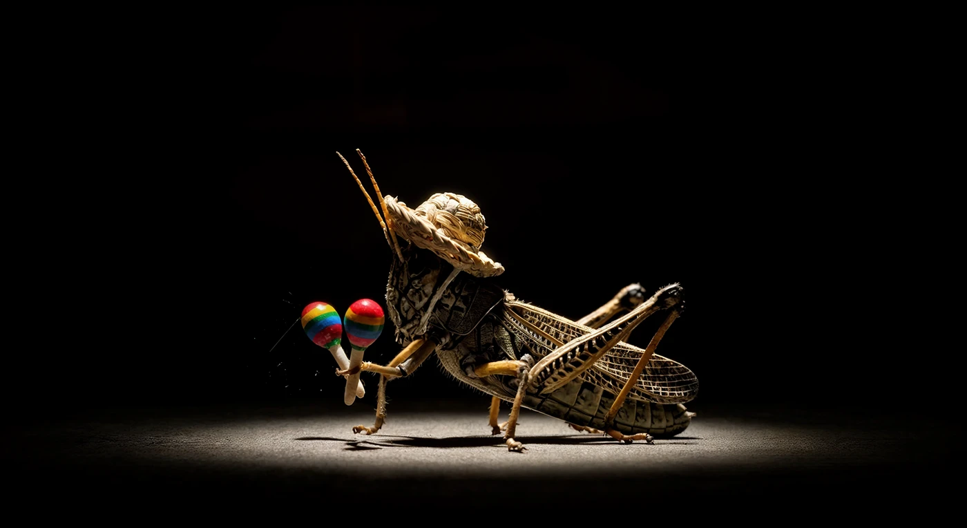
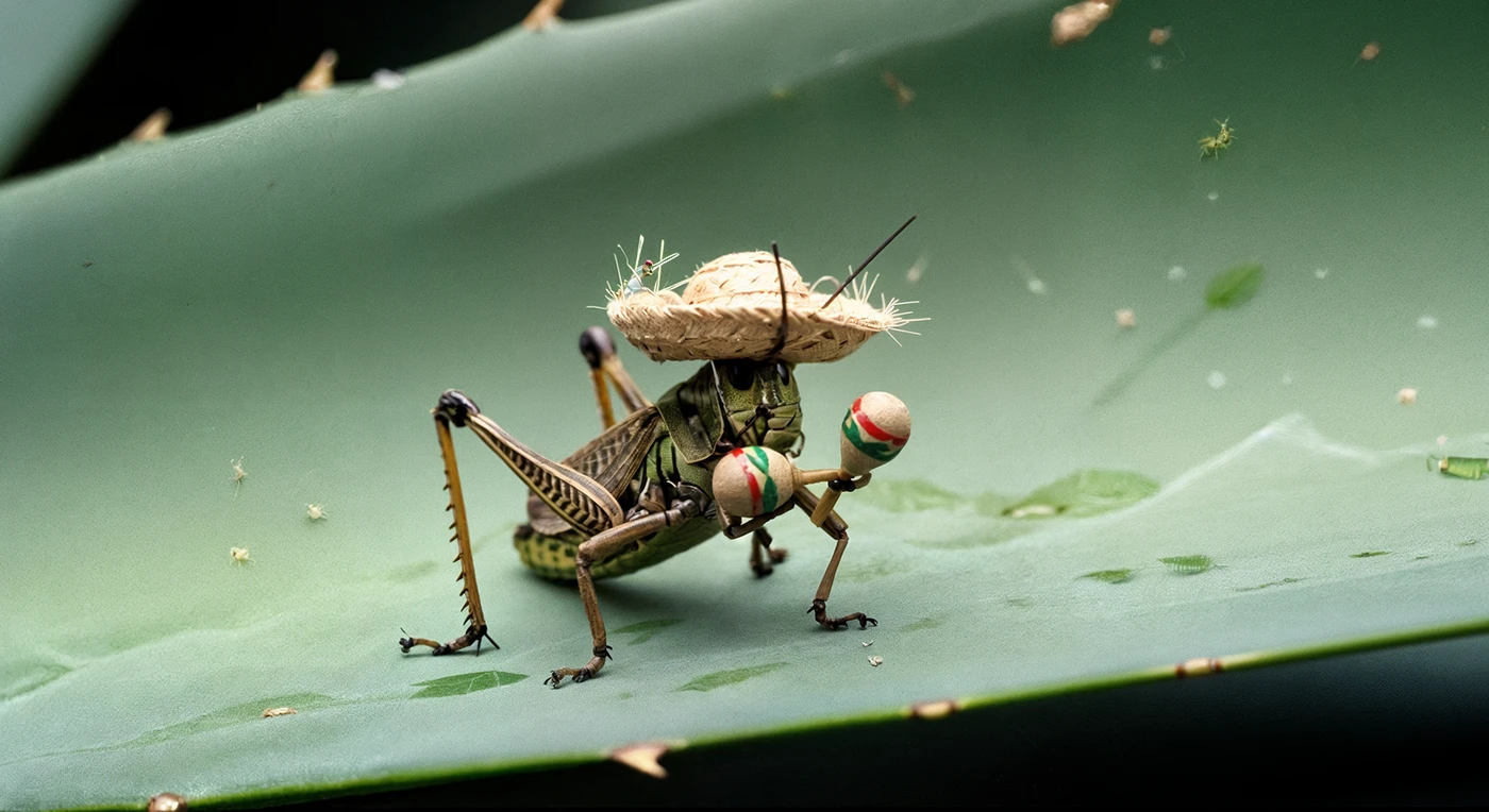
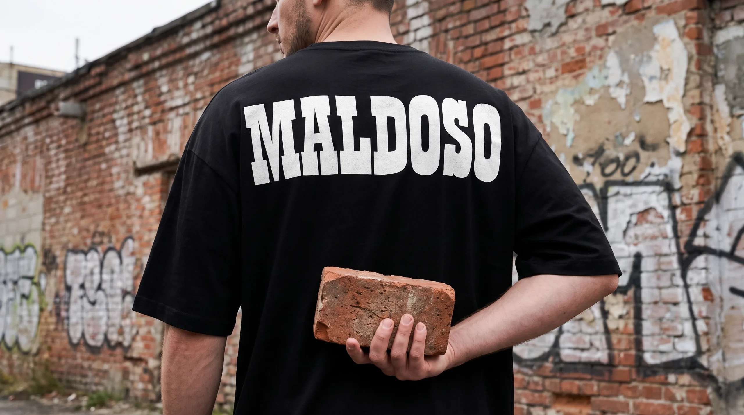
Because Maldoso is born from the attitude of someone who creates disorder, breaks the rules, and finds pleasure in doing things differently. That same attitude had to live in the bottle.
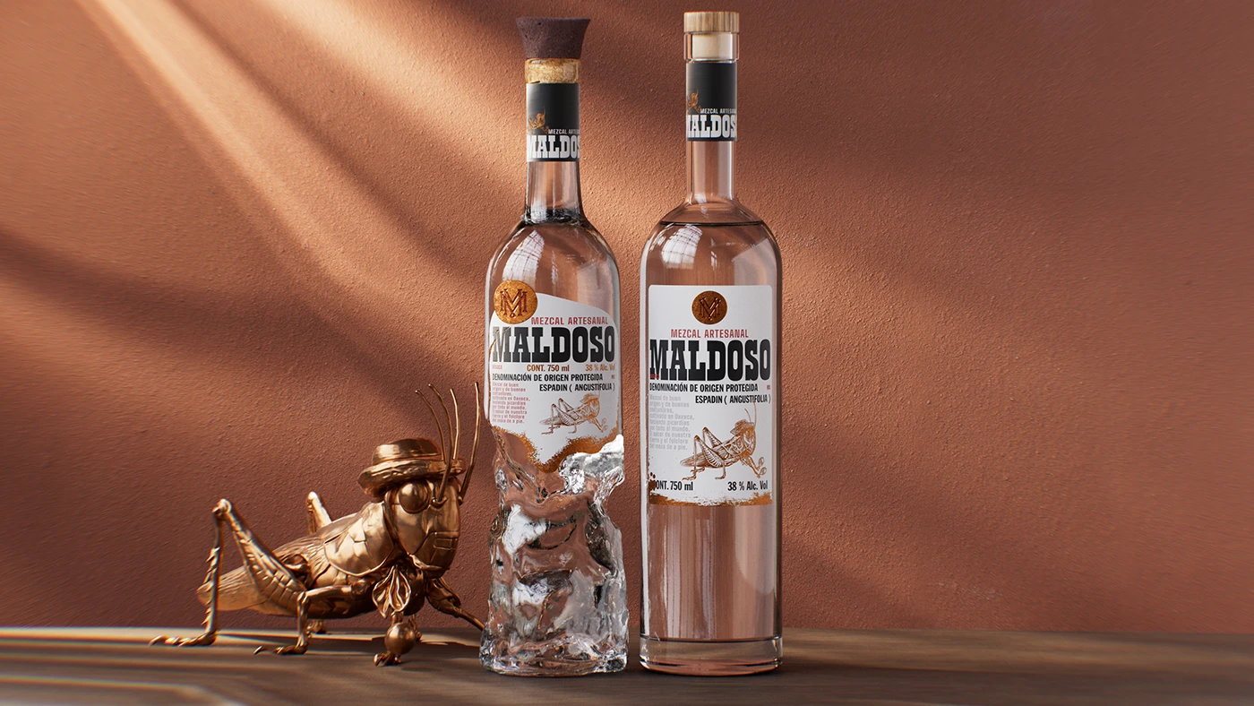
The result is an artisanal mezcal that respects its origins, but not established conventions. A bottle marked by scars, dents, and distortions. A bottle that misbehaved.
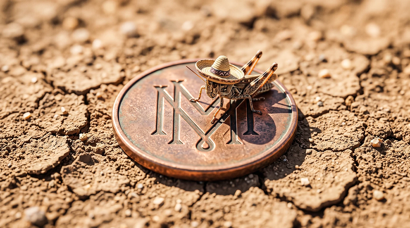
ILLUSTRATIONS & LOGO CONCEPT : MONOTYPO ESTUDIO
Curator’s Insight
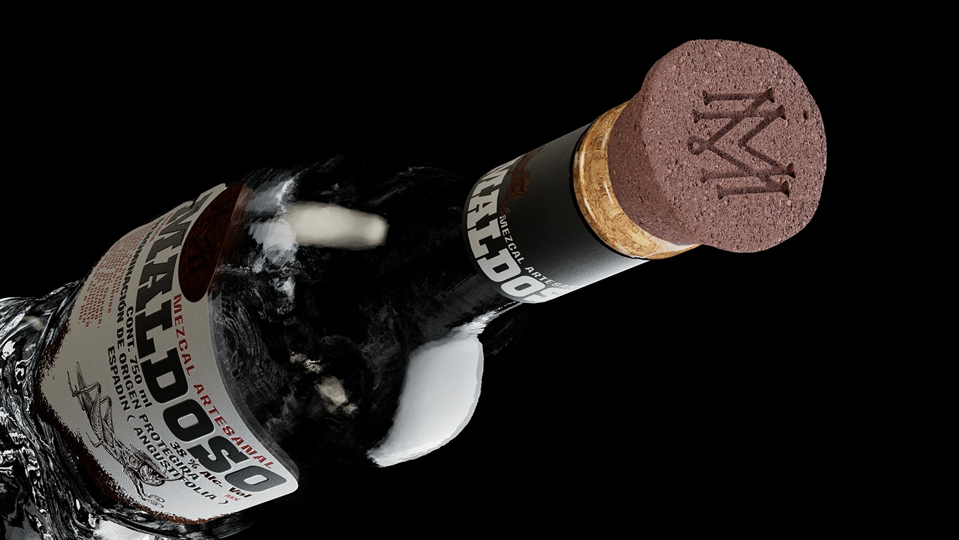
Most bottle “distortion” effects in spirits packaging are surface tricks, a printed illusion of texture applied to an otherwise standard mold. What’s happening here is structural instead. The glass itself appears to have been modeled with dents and irregular warping built into the form, so the damage reads as something the object actually endured rather than something printed onto it.
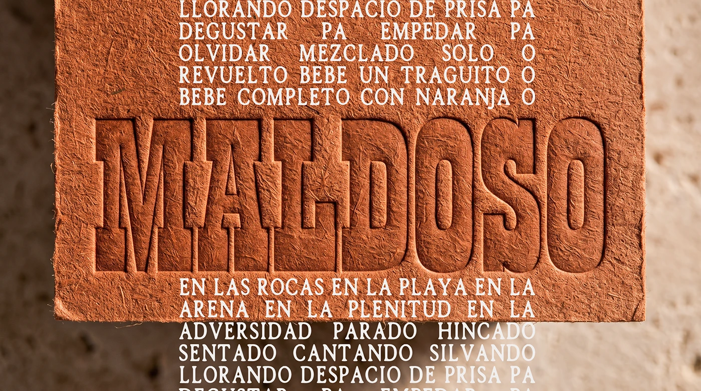
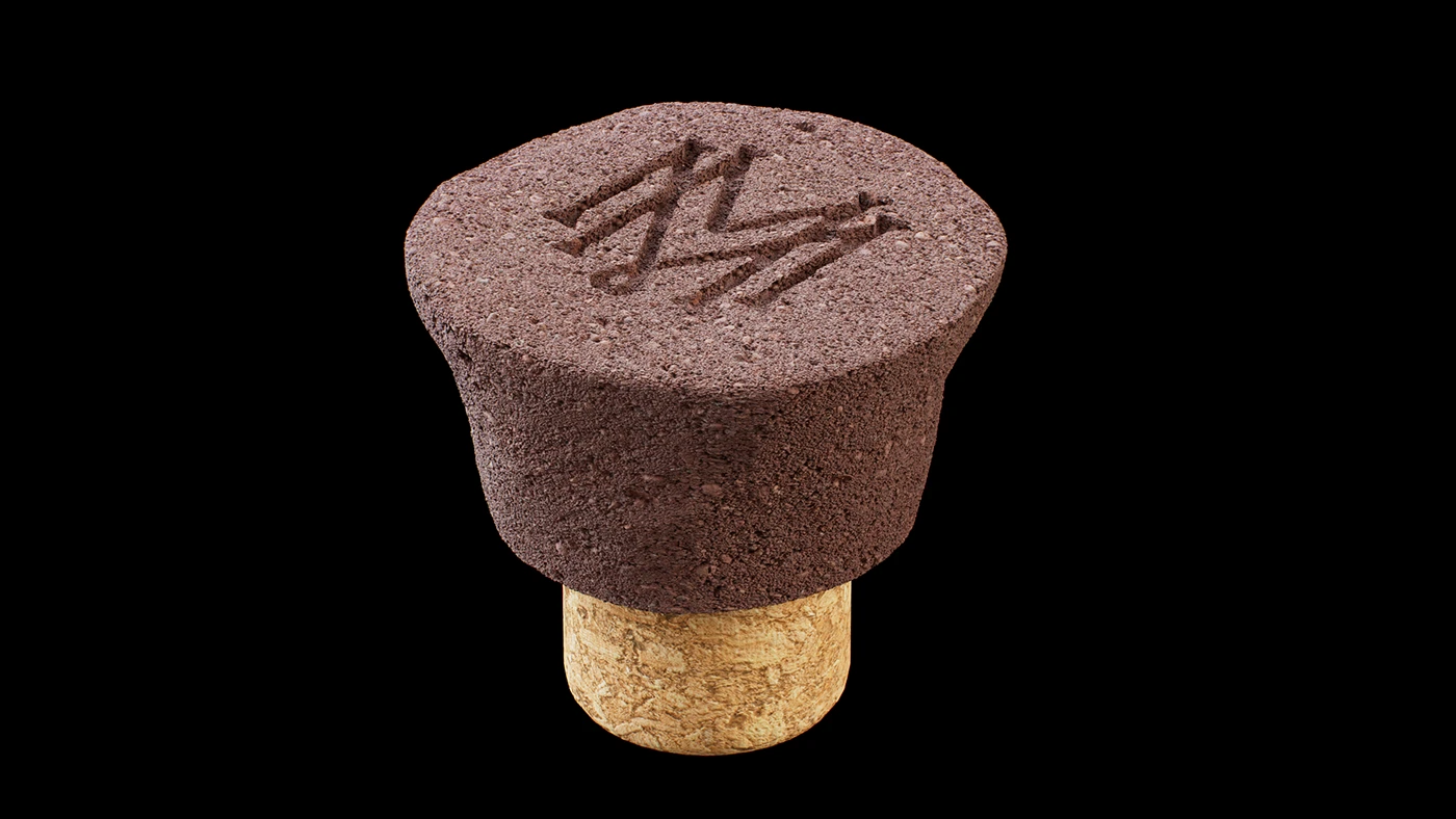
That distinction matters for how the hand experiences the bottle before the eyes ever get involved. A distorted mold changes grip, weight distribution, and how light catches the surface at different angles, none of which a flat texture on smooth glass can replicate. The embossed maker’s mark on the volcanic-textured cap reinforces this logic. It is a detail almost nobody will notice on shelf, but one that rewards the person who already picked the bottle up.
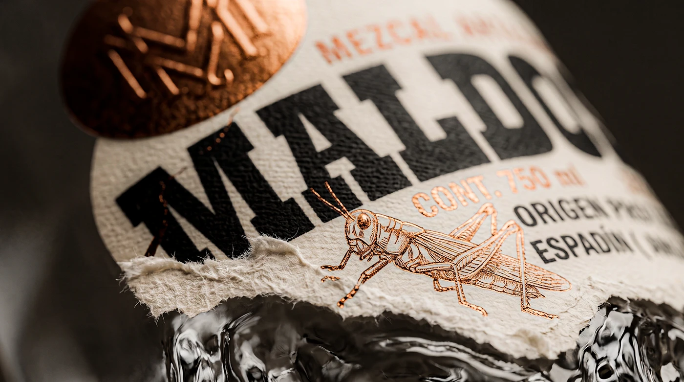
The deckled label edge does similar work in a different register. Handmade paper’s irregular border only reads as intentional, not accidental, when it is paired with disciplined typography and precise foil placement around it. Roughness signals authenticity only when it sits next to something clearly considered. Left ungoverned, the same rough edge just looks unfinished.
 Derrick Lin
 monther al omari
 43oz
43oz lilyz design23
 Modern Theory
 Eighteen Brand Studio
 Bhumika Singh
 MohamedMashaly
 Pixels Studio
 Gulya
Gulya UPRISE
 Lizaveta Kharitonyuk
 Bonsanco Creative Studio
 DesignRepublic
 GIRAFA STUDIO
 PiotrWisniewski
 Sophiagdotcom
 CreativeWise
 SoreThumbStudio®
 Modern World Studio
 Palashcc
 Valérie Colace