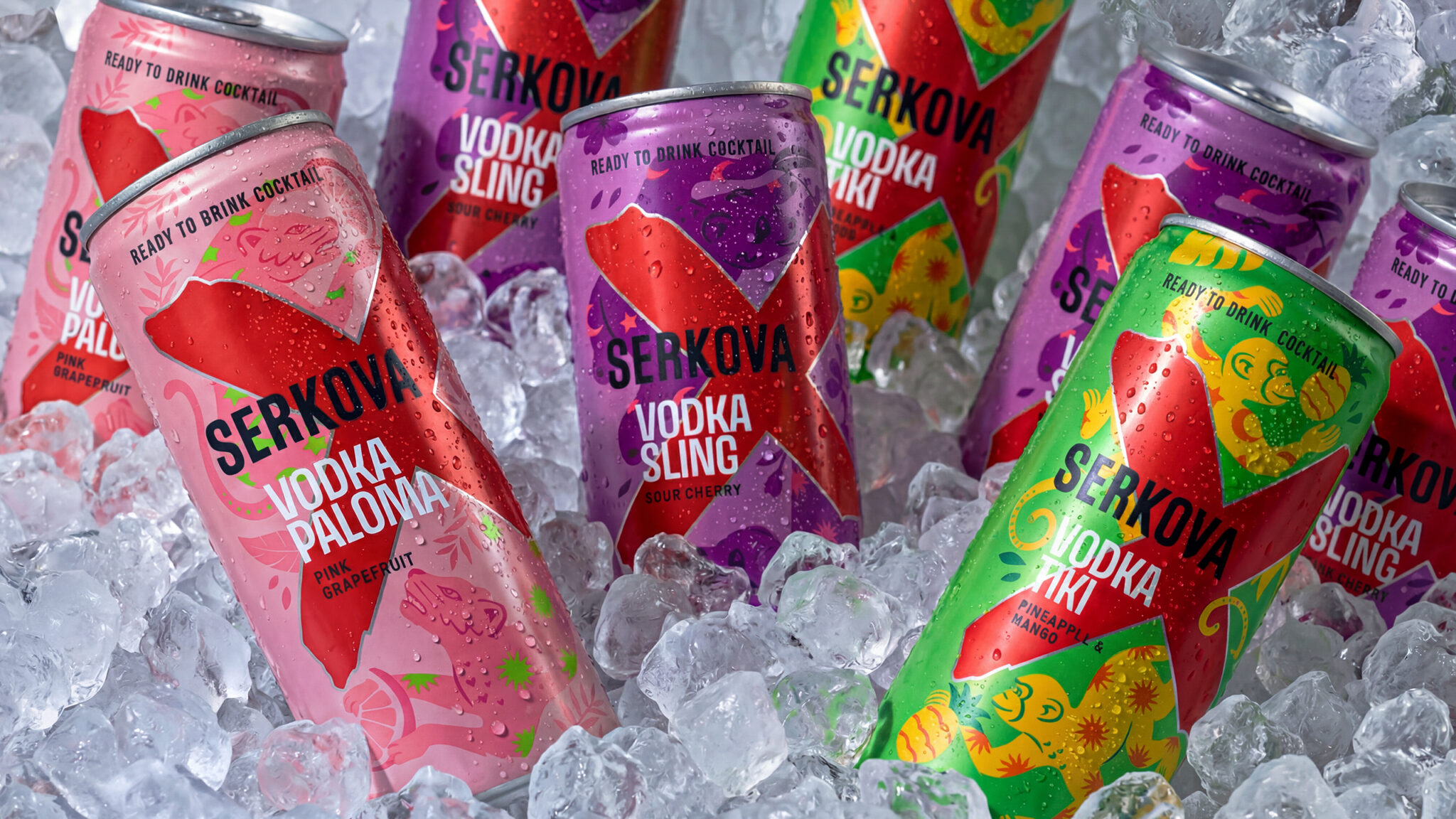

Serkova has never been interested in behaving like a conventional vodka brand. Loud, energetic and slightly rebellious, it has always belonged to the night. With its new Ready to Drink range, that attitude moves into a different territory: three cocktails, three flavours and three illustrated worlds designed to turn a can into a small piece of visual storytelling.
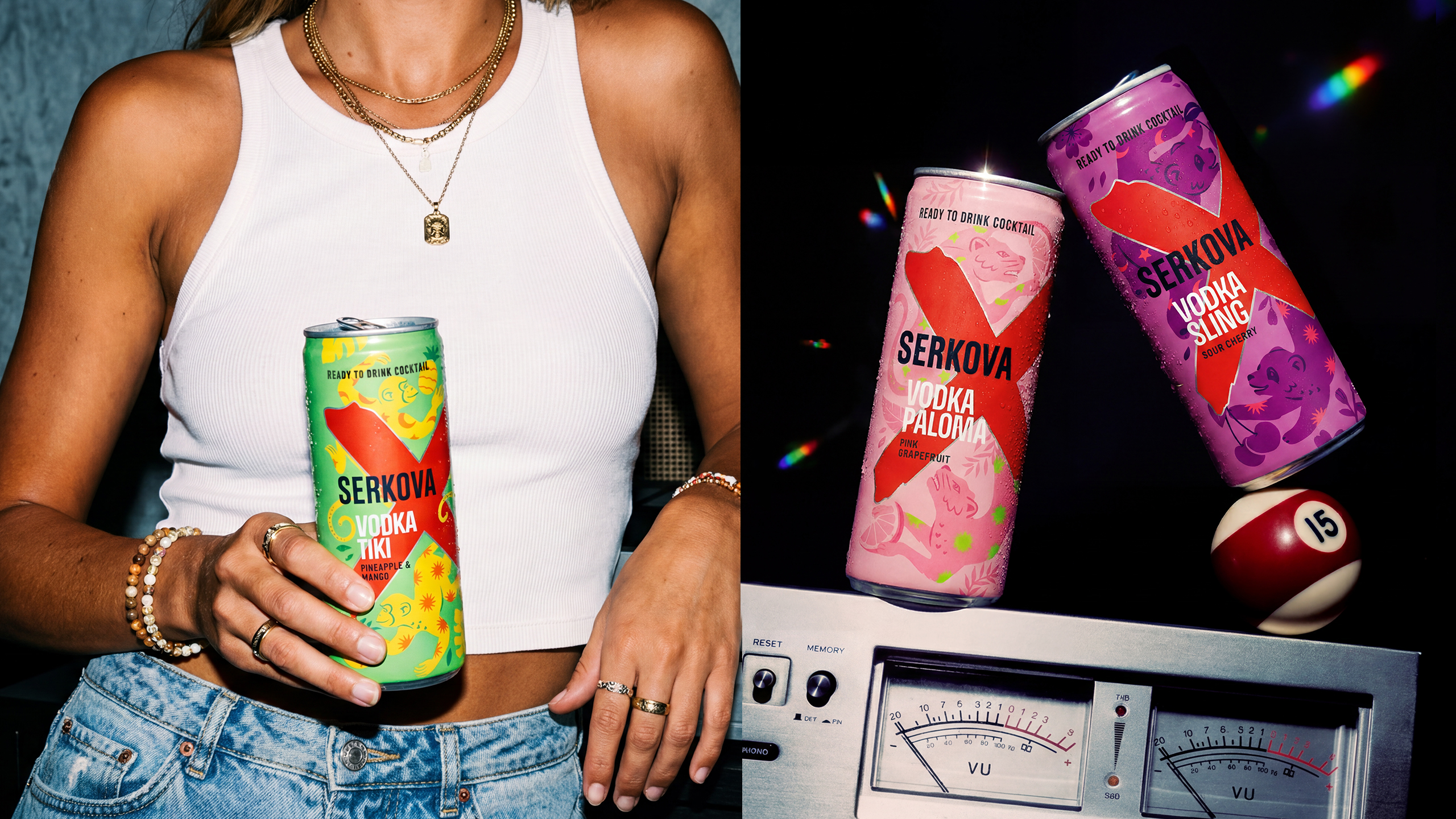
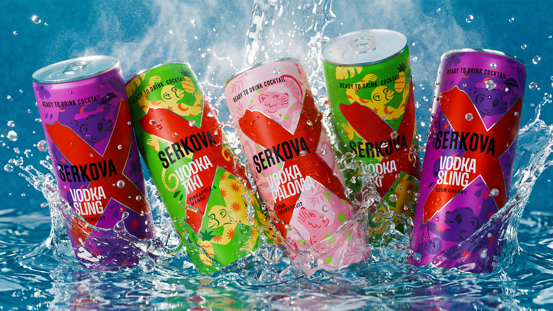
The range includes Vodka Paloma with pink grapefruit, Vodka Sling with sour cherry and Vodka Tiki with pineapple and mango. Rather than creating one visual system and simply changing colours from flavour to flavour, each cocktail was given its own character, mood and story.
The starting point is Serkova’s iconic red X. Across all three cans, it remains the unmistakable brand signature, cutting through the composition and holding the range together. Around it, however, the world changes completely.
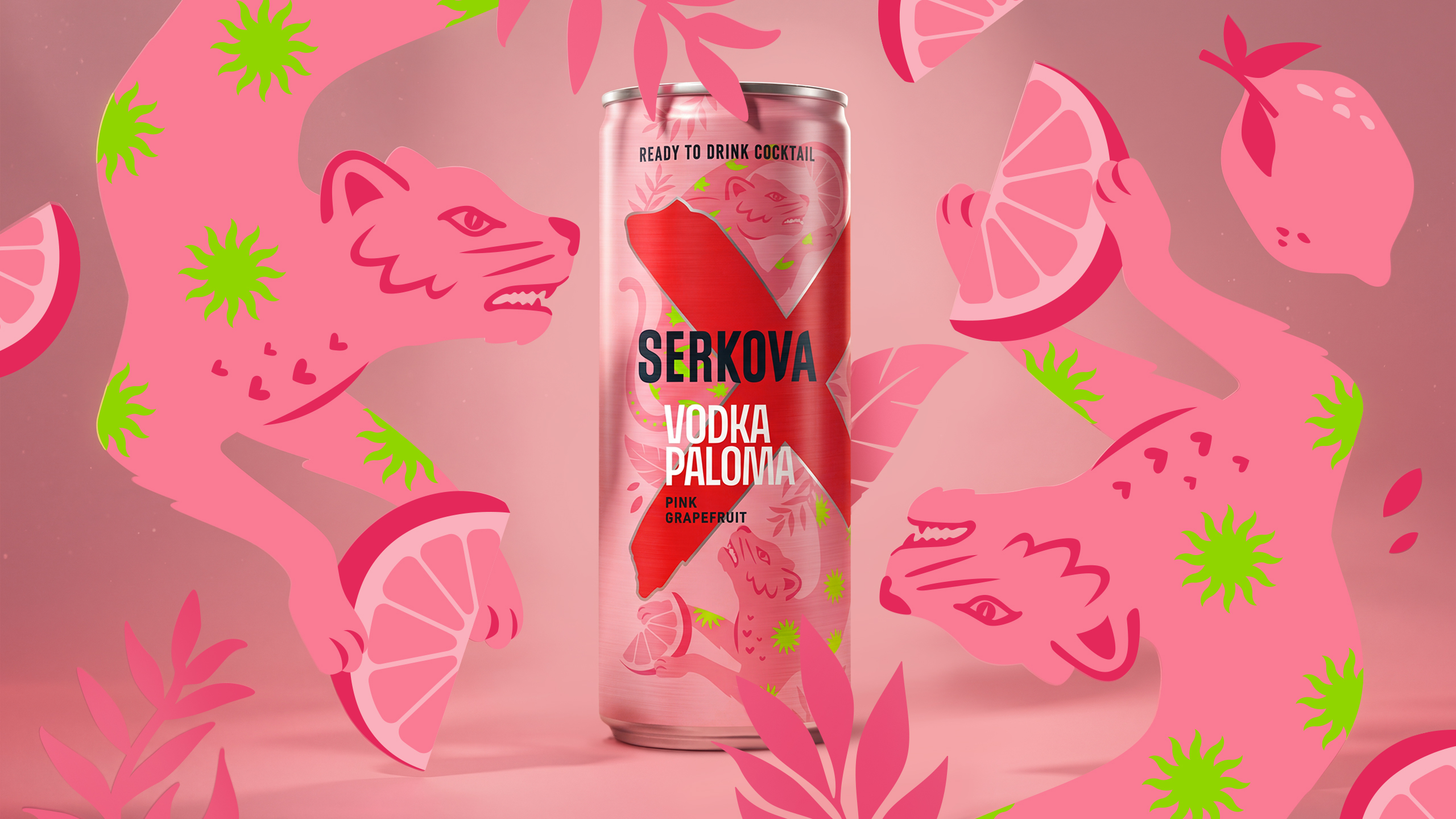
Vodka Paloma enters a pink, sharp-edged Mexican-inspired universe, inhabited by an ocelot: beautiful, independent and impossible to tame. Grapefruit, leaves and flashes of acid green create a sweet-and-sour visual tension that mirrors the drink itself.
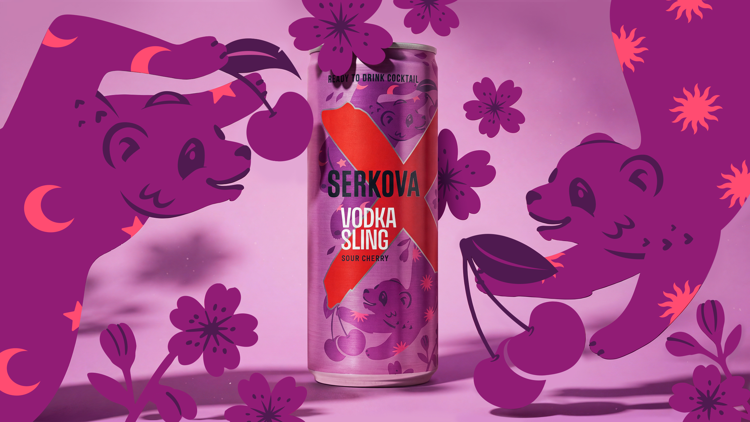
Vodka Sling moves into deep cherry, purple and magenta. Here, a laid-back panda plays among cherries, flowers, moons and stars, bringing a playful, almost dreamlike character to Serkova’s take on the classic Sling. The mood is easy, relaxed and slightly surreal.
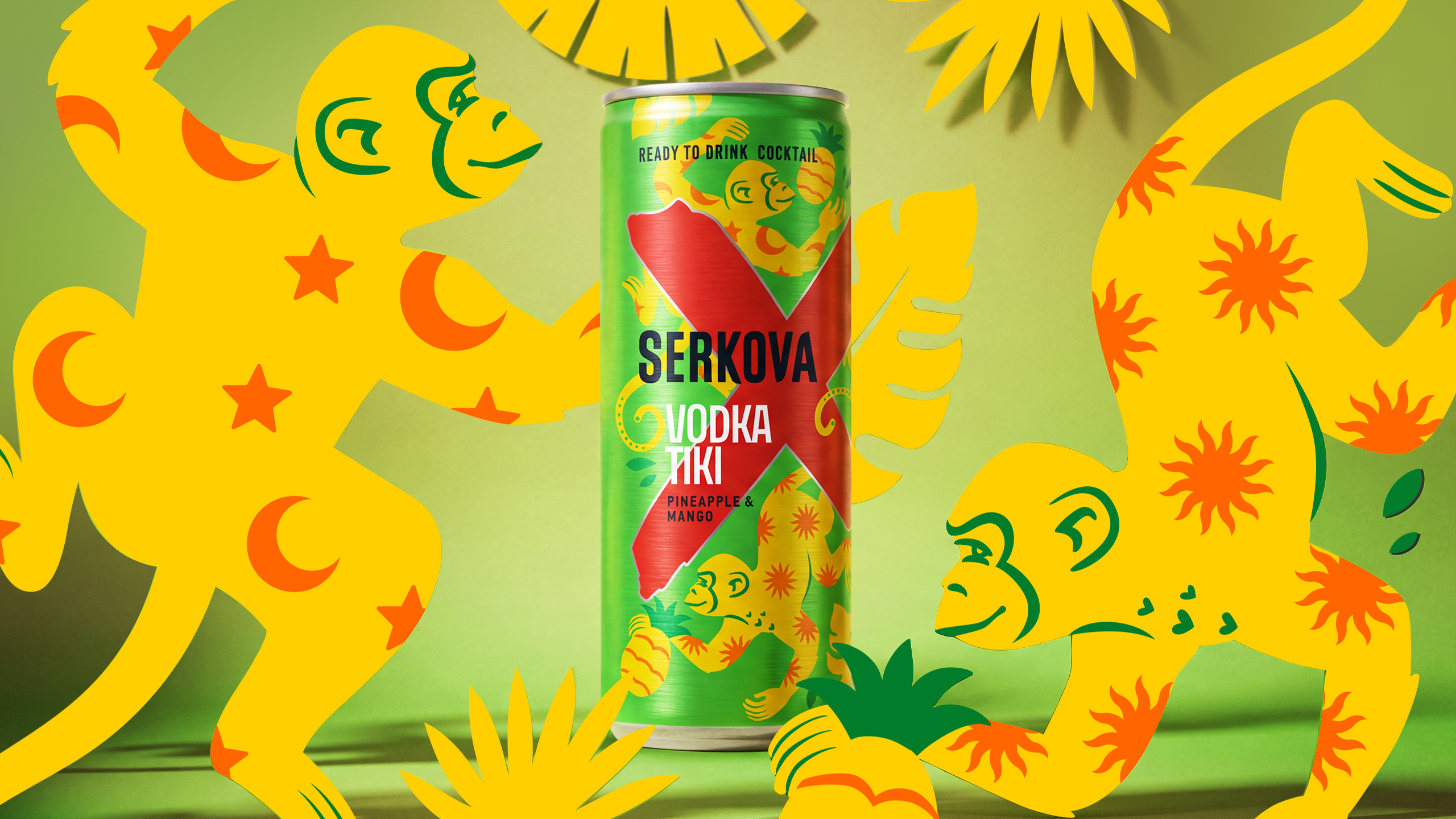
Vodka Tiki goes full tropical. A bright green can is taken over by yellow monkeys, pineapples, palms, suns and jungle energy. It imagines a tropical world that exists nowhere on the map: a place where monkeys offer you a drink and rules are optional.
Illustration gives each flavour its own personality, while bold colour blocking makes the range instantly recognisable both individually and as a family. The animal characters act as shortcuts into the emotional world of each cocktail.
The RTD range is unmistakably Serkova, but with a freer, brighter and more playful mood. Three different stories designed for a generation that expects packaging to do more than identify a flavour. A generation that has turned the “little treat” into a culture of its own, and is always looking for the next one.
Curator’s Insight
The challenge with any RTD flavor range is holding a brand together while three products pull in three directions. Serkova solves it by fixing one element and setting everything else loose. The red X stays locked in scale, angle and position across all three cans, doing the job a logo usually does: it’s the thing your eye finds first, regardless of which can you’re holding. Everything else, palette, texture, creature, is free to diverge completely.
That divergence is doing more work than decoration. Assigning each flavor its own animal, rather than a shared mascot recolored three ways, gives the range emotional range: an ocelot reads sharp and solitary, a panda reads loose and dreamy, monkeys read chaotic and social. The flavor note becomes a personality before it becomes a taste.
 Li Jie
 Lung-Hao Chiang
 Alessandro Ammaturo
 Narrow House Packaging Branding & Design
 teresaredon
 Eva Chistyakova
 Akshay 11
 cheleto
 nadayasser13e
 hello ocean
 Modern Theory
 Alexander Skurihin
 Valérie Colace
 Squad
Squad Studio Zak
 Bhumika Singh
 宏洛图品牌设计HONGLT