
Por las Nubes. Openly expensive.
We always see the bottle, the label and the price.
But not the plot, the age of the vines, the pruning, the harvest, the decisions, the losses, the barrels, the analyses, the tastings, the time, or the accumulated experience it takes for this bottle to be exactly what it should be.
We say we want craft wine, small productions, work in the field, local and carefully made products. Until all of that comes with a price, and then we call it expensive.
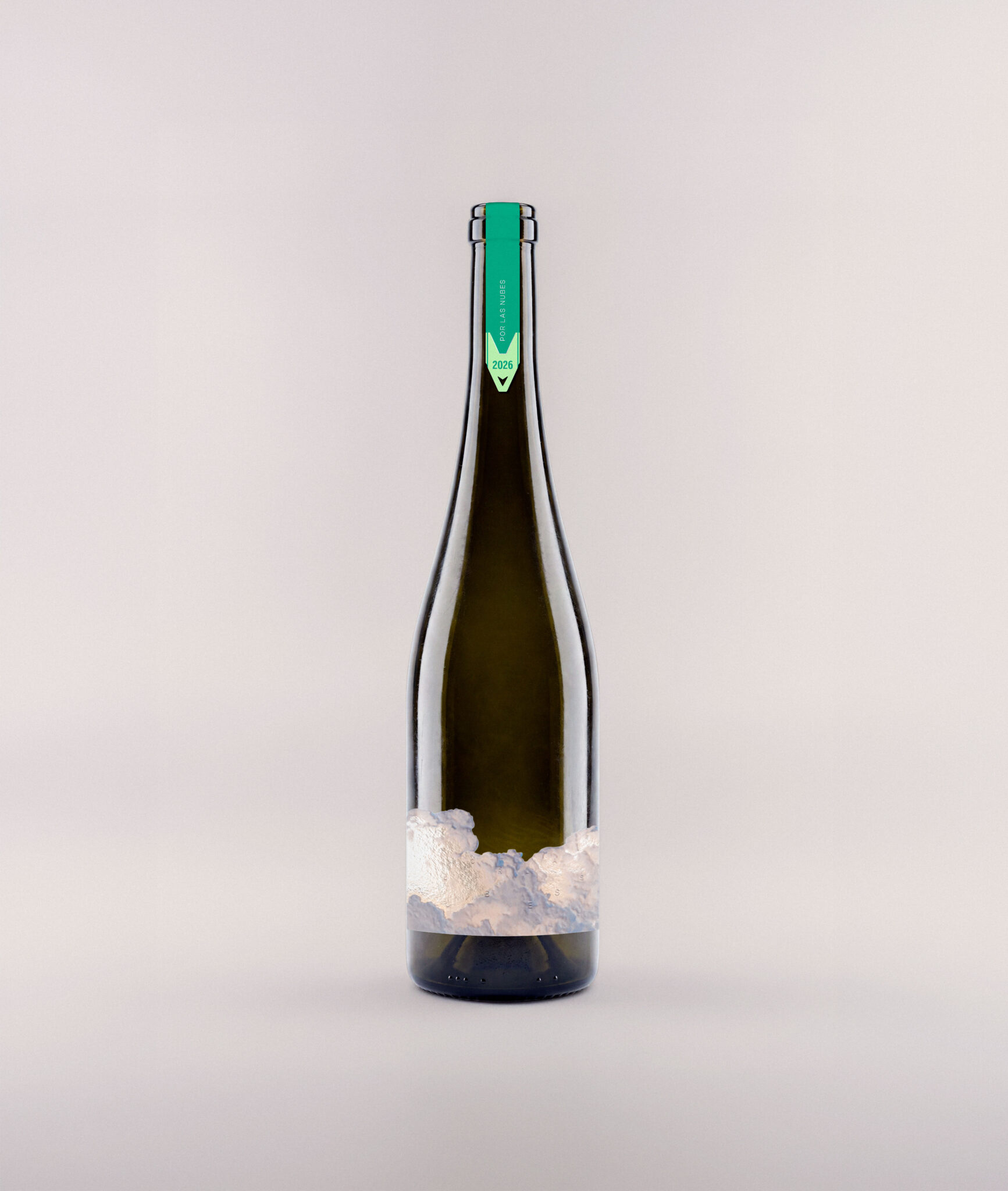
Por las Nubes doesn’t hide its price behind words like “premium” or “exclusive.” It is openly expensive, for anyone who has never seen a vineyard in February. Its price is simply the one that does justice to the work behind it. It’s not that the wine costs a lot: it’s that we have learned to consider cheap all the work we don’t see.
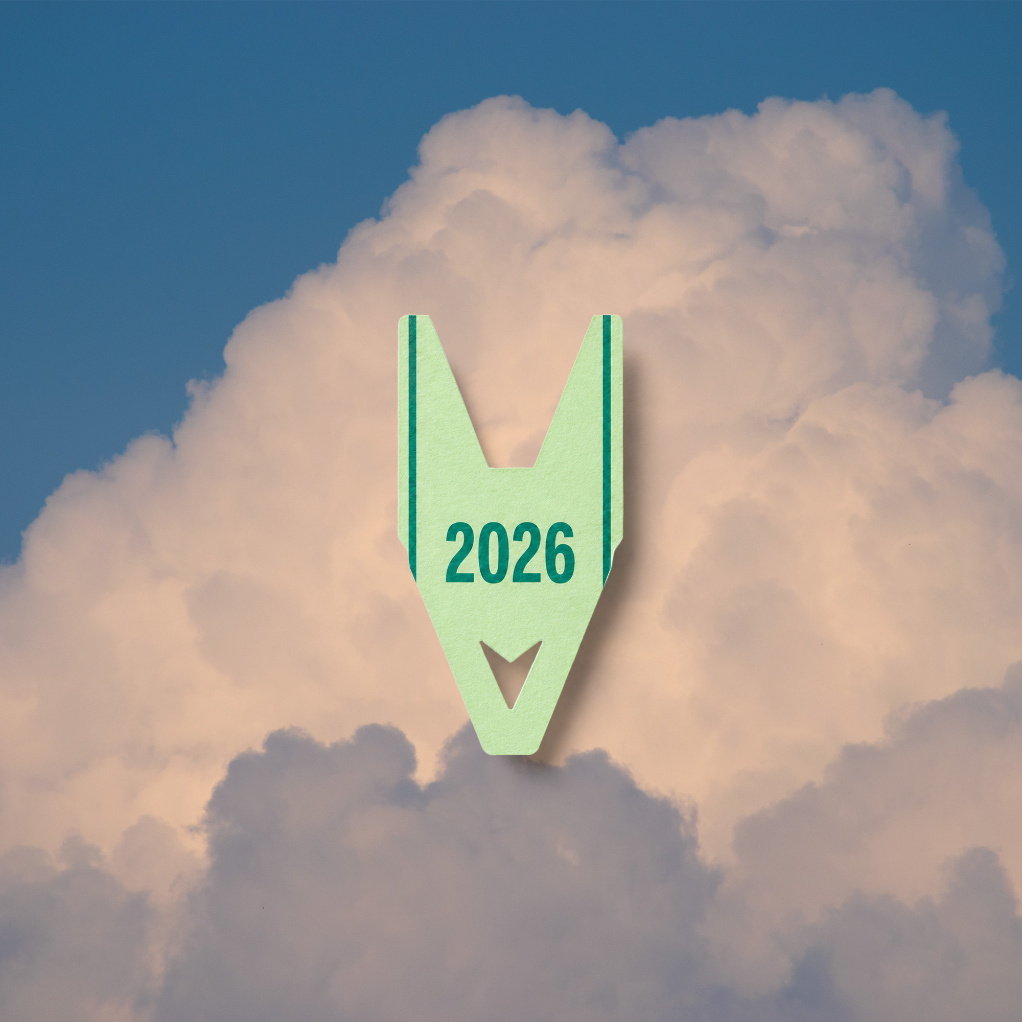
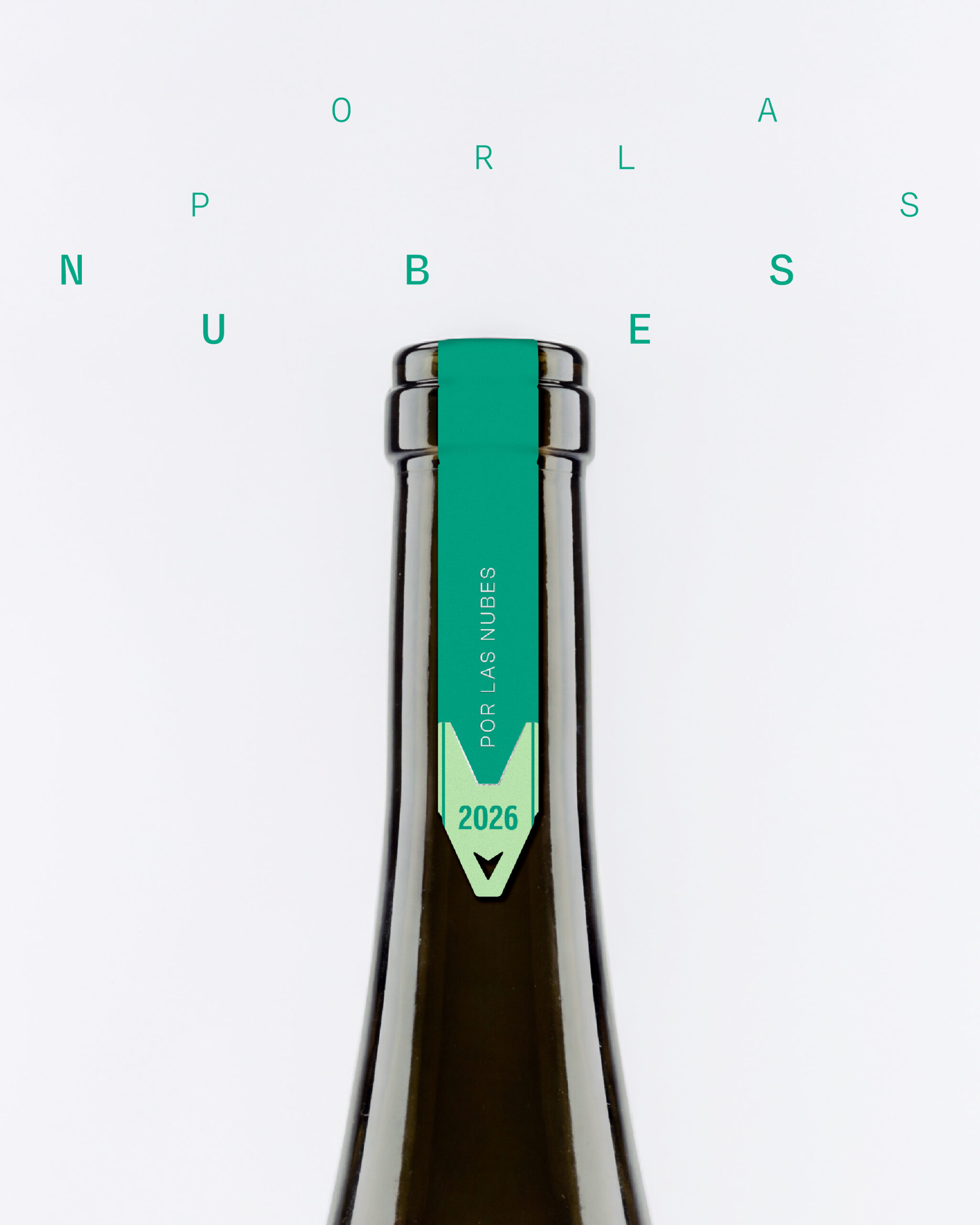
The label is built on a real photograph of a cloud over a vineyard in Ribera del Duero. The capsule borrows the iconography of a market stall, the place where the Spanish expression “estos precios están por las nubes” (“these prices are sky-high,” literally “in the clouds”) is part of everyday speech. It’s a direct wink at the concept.
Por las Nubes is a conceptual project and a small gesture of support for the work in the vineyard all year round, and especially during harvest.
 Derrick Lin
 Biaa
Biaa Petitmoulin Studio
 White Bear Studio
 Eva Chistyakova
 monther al omari
 Atipus
 alchimistestudioParis
 oneandother
 bloomburo
 helocrene
 Shapers Studio
 Denver Design
 Aidearte
 andrew.huerta
 softmachine
 airobtq
 Buzz & Co.
 Ruby
Ruby themythographer
 IDNB Inc.
 viktorflr
 Zenpack