
Saltletts – A Snack Icon Reimagined
MILK. Gives Saltletts a Fresh, Modern Look with Maximum Shelf Impact
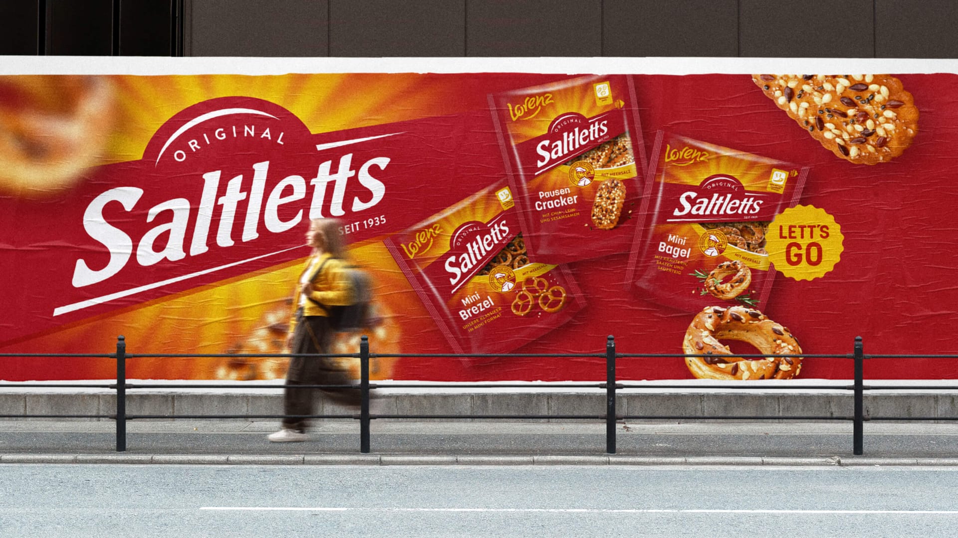
Together with Lorenz, MILK. has redesigned Saltletts, one of Germany’s most iconic snack brands. The new packaging modernizes the brand while building on the distinctive visual assets and product qualities that have defined Saltletts since 1935.
The central challenge was to create a stronger and more consistent umbrella brand across a diverse portfolio of classic pretzel products, innovative snack concepts, and ranges aimed at younger consumers. At the same time, every product needed to remain easy to recognize and navigate in the highly competitive snack aisle.
MILK. completely reworked the packaging hierarchy to bring greater focus to the brand, product name, and variety. New typefaces, optimized proportions, more precise positioning, and a unified color system improve readability and make it easier for shoppers to identify products both from a distance and when comparing them directly on the shelf.
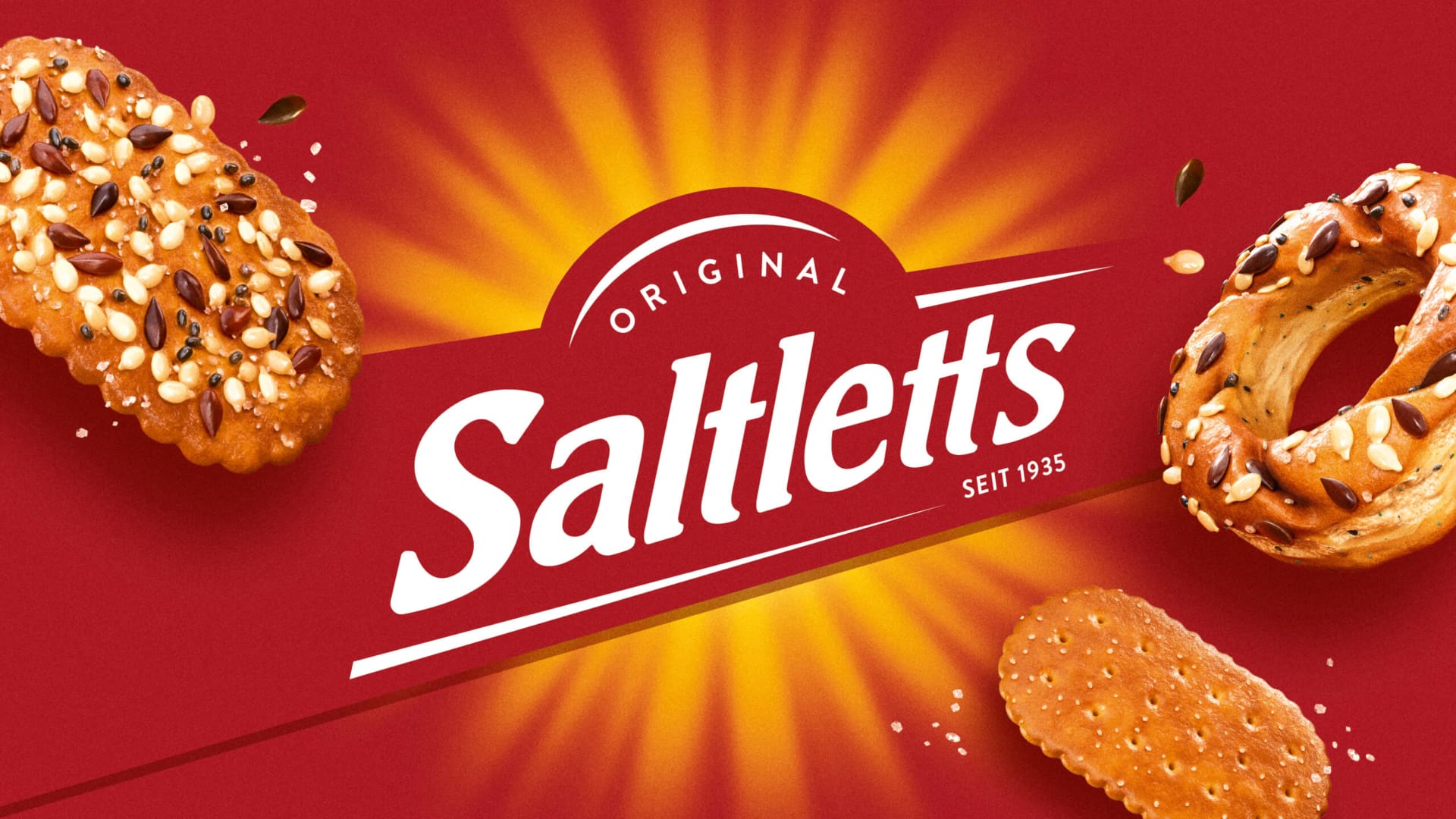
At the heart of the redesign is the iconic red-and-white Saltletts logo with its distinctive oven shape. Enlarged and extended beyond the edges of the pack, it creates a bold visual signature and strengthens the entire portfolio. A refined sunbeam motif adds warmth and freshness, reinforcing the idea of pretzel snacks baked golden brown and enjoyed as if fresh from the oven.
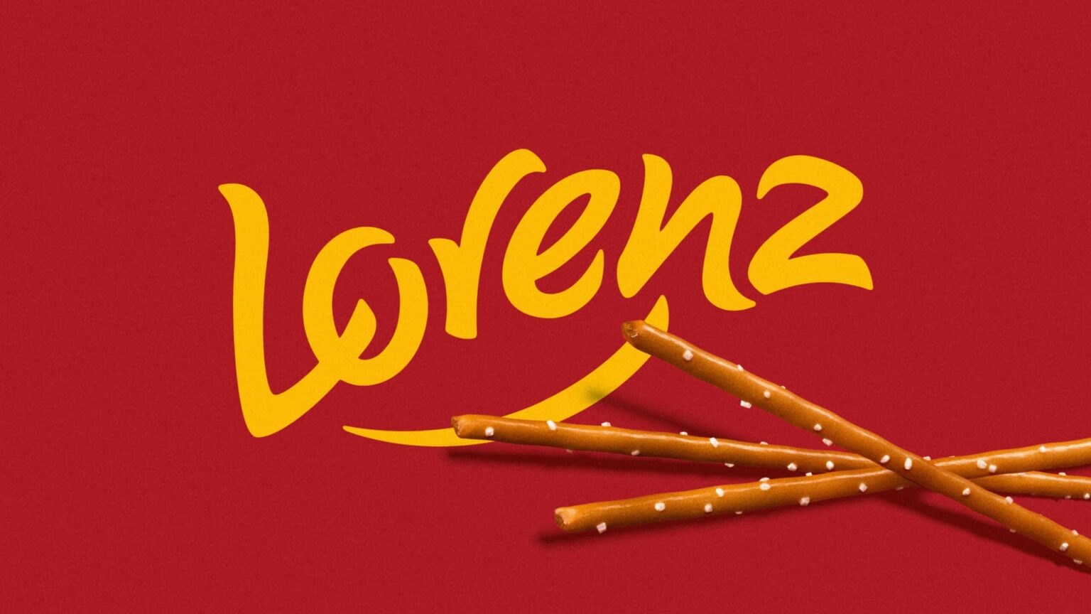
Familiar brand elements were also carefully evolved. The smile beneath the Lorenz logo inspired the new curved display windows, adding movement, energy, and a friendlier character to the packaging. All product images were recreated as high-quality 3D renderings, delivering greater taste appeal while providing a flexible visual system for packaging, point-of-sale materials, campaigns, and digital communication.
New products such as Crunchy Bites and Tasty Rolls were given a more expressive design language within the wider Saltletts brand world. Bold flavor cues and dynamic compositions increase appetite appeal while maintaining a clear connection to the umbrella brand. The Junior Farm range was also refreshed with new hand-drawn and vectorized animal illustrations that add warmth, authenticity, and personality.
The result is a cohesive and scalable packaging architecture that combines heritage with contemporary shelf presence. Saltletts now appears clearer, more distinctive, and more impactful—ready for the shelf, future innovations, and the next generation of snack lovers.

 hello ocean
 monther al omari
 the Labelmaker
 alamgirbrands
 kat bres
 Vantablack Studio
 GruppoSaida
 studiorevv
 grafisercreative
 Kate Reichel
 UPRISE
 Modern Theory
 By siddika
 MAISON D'IDÉE Prague
 Kinshuk Bainss
 Palashcc
 www.branding.uz
 Hutton Creative
 DESIGN CONCEPTS
 Tancybox
 habiba hatem
 Up-Brands
 sayadworks
 Kingdom & Sparrow
 furtgoods
 Si me preguntas