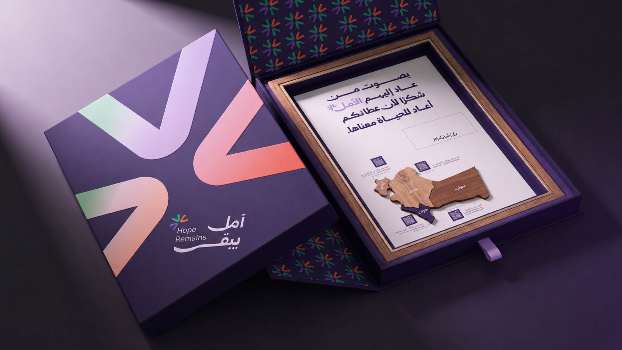

Juniper of AsirTransforming a Regional Material into a Complete Commemorative Gifting System
The project began with a material directly connected to the natural landscape of the Asir region: juniper wood.
Instead of selecting a luxurious material with no relationship to its geographical context, reclaimed juniper wood sourced from Asir was used as the primary material for the frame and commemorative object.
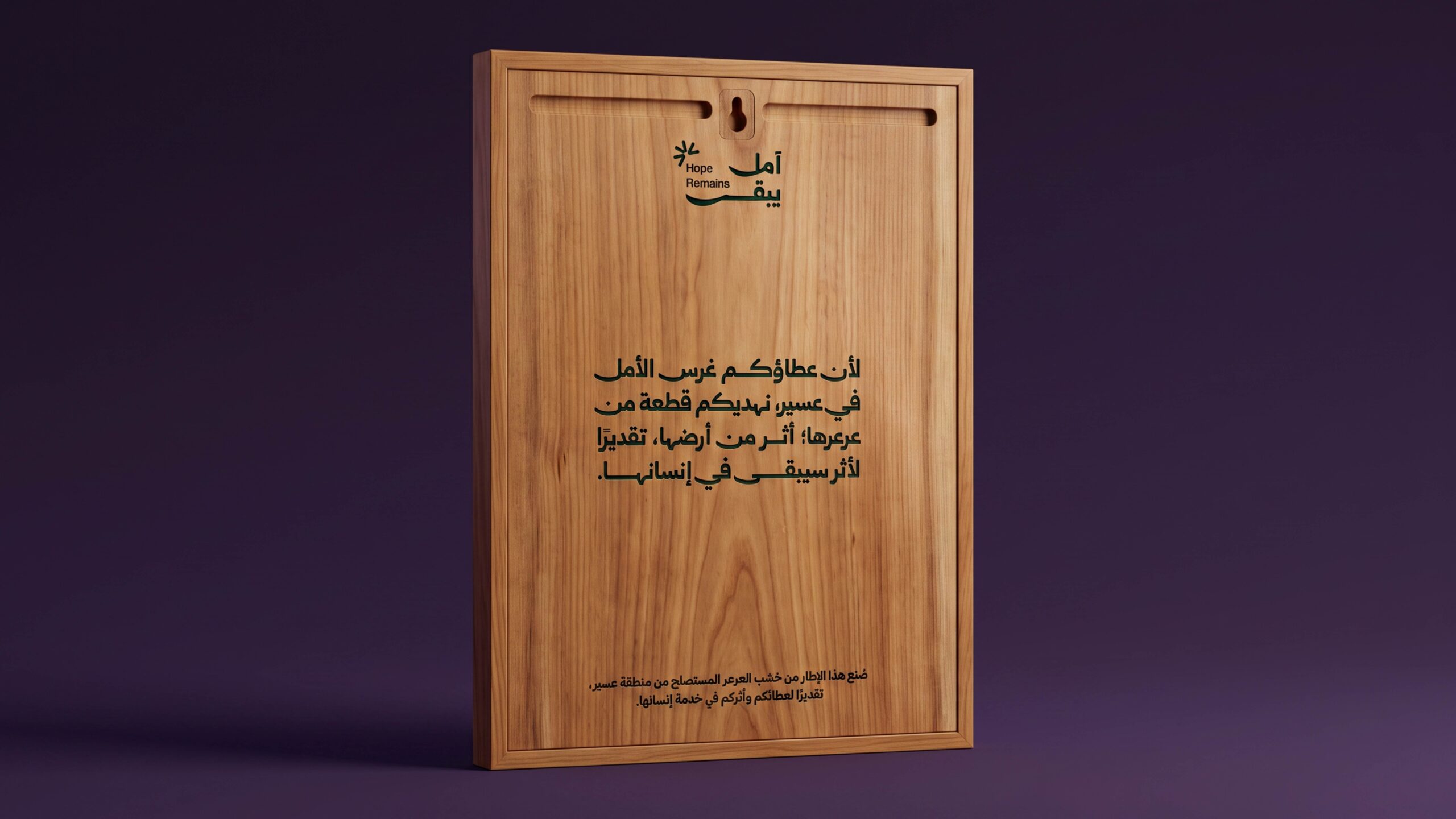
The intention was to make the material itself part of the identity system. Its natural grain, texture and tonal variation were intentionally retained, allowing the physical object to communicate its origin without relying solely on graphics or decorative references.
The frame was developed at approximately A3 scale, with minimal surface treatment to preserve the visual characteristics of the wood.
Rather than creating a flat printed composition, the design uses multiple physical levels and raised elements to introduce depth and hierarchy.
Visual System
The original identity was based on three interconnected geometric units, each representing one of the three medical centers.
Each center was assigned a distinct color:
Oncology Center — Recovery Purple
#9B7BEA
Dialysis Center — Renewal Green
#37A77C
Medical Rehabilitation & Prosthetics Center — Movement Orange
#F0643B
The three colors are unified by the primary identity color:
Deep Purple — #2B2457
The color system was developed as a functional coding structure rather than as decoration.
Each color identifies a specific center and allows its related information and touchpoints to be visually distinguished throughout the project.
This coding system was then transferred from the visual identity into the commemorative object and its packaging.
Wood Treatment
Color was applied in a way that allowed the natural juniper grain to remain visible.
Instead of applying opaque surface colors, the treatment was designed to preserve the material character of the wood while adding a controlled visual reference to each medical center.
Raised wooden elements of approximately 3–4 mm were also introduced to create physical separation between information layers.
This allows light, shadow and material depth to support the visual hierarchy instead of relying entirely on printed graphics.
Map as Information Design
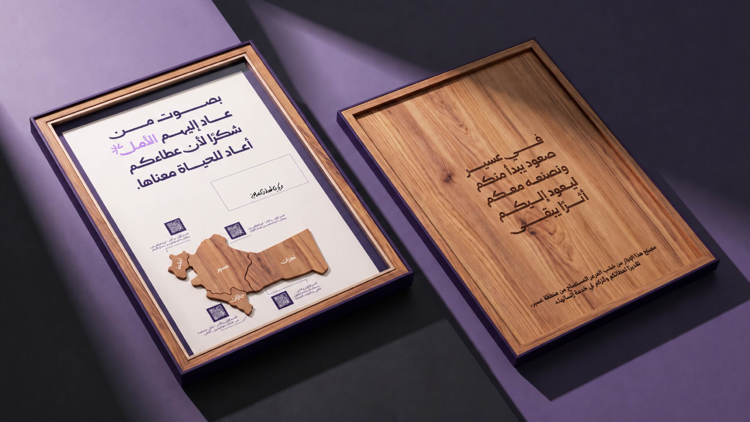
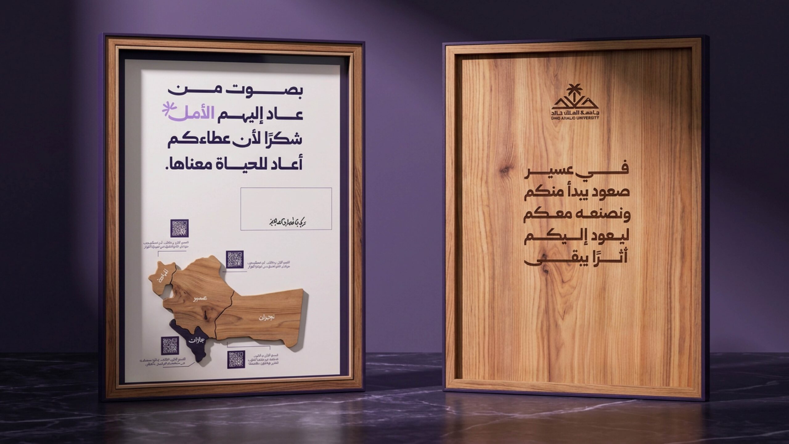
A raised geographical map of the beneficiary areas forms the central element of the composition.
The map was not introduced as a decorative motif. It functions as an information layer showing the geographical reach of the project.
It was produced as a dimensional wooden element using the same material language as the rest of the object, ensuring that geography becomes part of the physical structure of the gift rather than a separate printed graphic.
Digital Integration
The object incorporates four QR touchpoints connected to authentic audio messages from beneficiaries.
This creates two parallel layers of interaction:
Physical layer:
wood, color, engraving, map and dimensional structure.
Digital layer:
real beneficiary voices and personal stories accessed directly from the object.
The QR system was therefore not treated as a technological add-on. It was used as an information layer that extends the storytelling capacity of the physical object.
Engraving and Production
Additional components were intentionally minimized.
Key text and supporting information were engraved directly into the wood, avoiding the use of a separate metal plaque or unrelated secondary material.
This decision maintained material consistency throughout the object.
A dedicated area was also created for a handwritten signature, introducing a unique physical intervention into each final piece and making every edition slightly different.
Packaging Structure
The packaging was designed as a direct extension of the object rather than as a separate transportation box.
The unboxing sequence was developed around controlled reveal, allowing the commemorative piece to be presented gradually while also protecting the raised wooden elements.
The relationship between:
packaging dimensions, frame dimensions, wood thickness, dimensional elements and opening direction
was considered as one structural system.
This ensured that the external packaging and the internal object were experienced as a single design rather than two independent components.
Design Concept
The core idea of the project was not to decorate a conventional gift with regional symbols.
Instead, the project transformed a material native to the region into the primary carrier of identity, information and narrative.
Juniper wood communicates geographical origin.
Color identifies the three medical centers.
The map communicates the geographical reach.
QR interactions introduce beneficiary voices.
Engraving and handwritten elements create physical permanence and uniqueness.
The final piece therefore operates simultaneously as Material Design, Visual Identity, Information Design, Digital Interaction and Packaging Design within one integrated system.
 habiba hatem
 Up-Brands
 sayadworks
 Kingdom & Sparrow
 furtgoods
 Si me preguntas
 Narrow House Packaging Branding & Design
 Clever Branding
 About House of Ta
 Hossam khalifa
 Valentyna Hradova
 Backbar Studios
 Holy Studio
 Prime
Prime Naeema Raashid
 Buddy Creative
 ezgidesignstudio
 Minim Brand Design
 Nenad Došen Studio
 Atyan
Atyan Massimo Lo Cascio
 Carreto Concepts Design Studio
 Charles Mason
 Pinot Agency