

ABOUT
OWL SYSTEMS — Protection Logo
The Protection Logo was designed as a visual identity for OWL SYSTEMS, with a focus on observation, analysis, and protection.
The symbol is built around a distinctive owl-like structure, expressing the idea of an entity that observes and analyzes its surroundings while maintaining a protective role.
SOLUTION
The mark uses a simple two-element structure to create a recognizable and directional visual system. The contrasting forms establish a sense of observation, protection, and controlled movement while keeping the symbol visually concise.
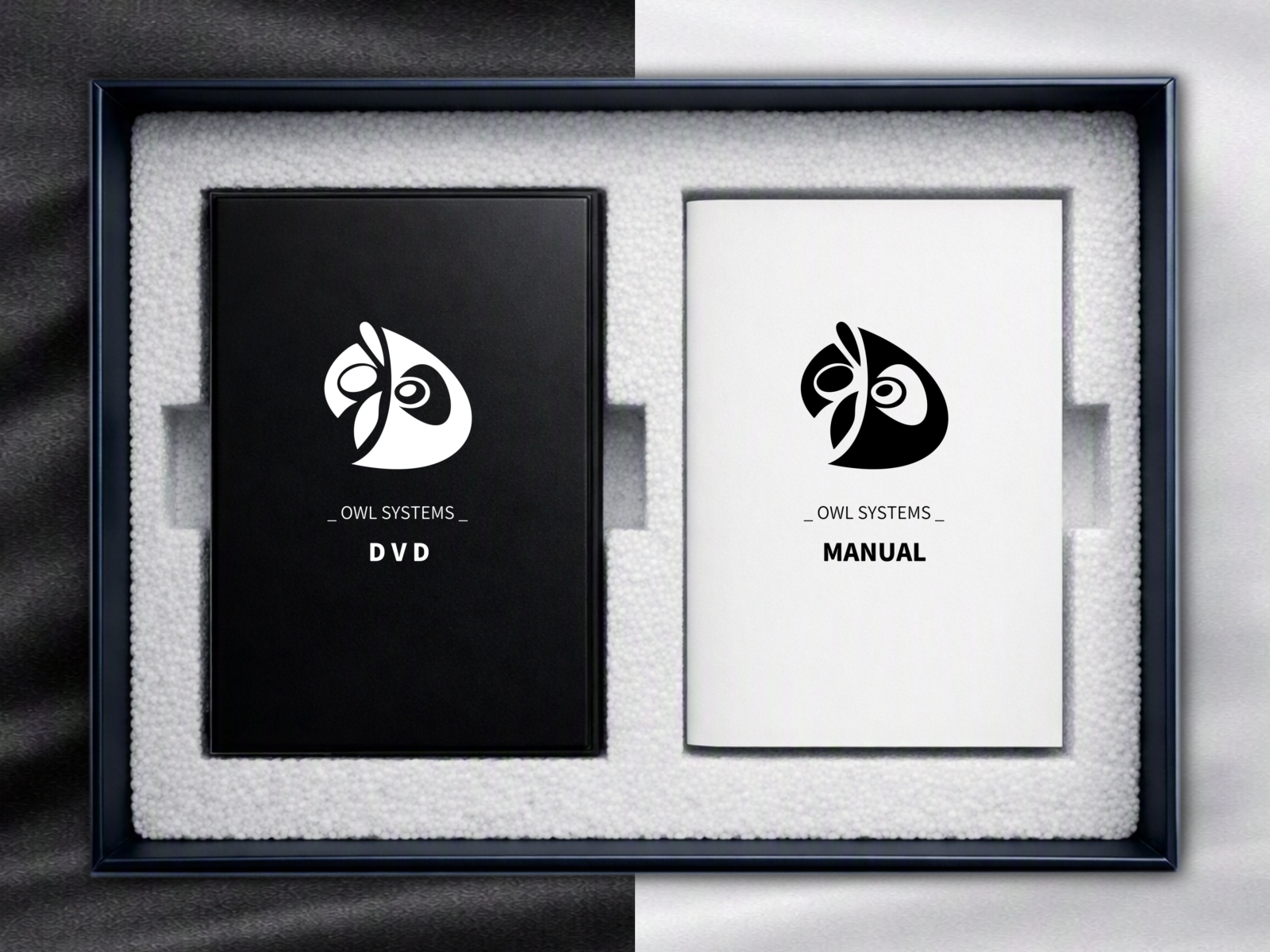
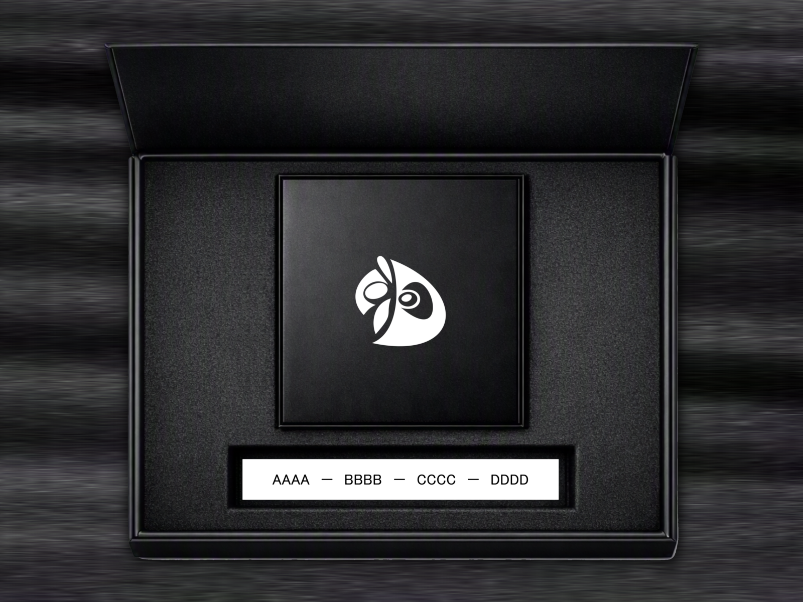
Rather than treating the logo as an isolated graphic, its structural logic was designed with future applications in mind. The same principles can be extended across branding, products, interfaces, and packaging.
RESULT
The result is a compact protection-oriented symbol that can function independently while providing a structural foundation for a broader visual identity system.
The logo is designed to remain recognizable across different applications, allowing its visual logic to carry consistently from the identity itself into products, interfaces, and packaging.


 Derrick Lin
 Biaa
Biaa Petitmoulin Studio
 White Bear Studio
 Eva Chistyakova
 monther al omari
 Atipus
 alchimistestudioParis
 oneandother
 bloomburo
 helocrene
 Shapers Studio
 Denver Design
 Aidearte
 andrew.huerta
 softmachine
 airobtq
 Buzz & Co.
 Ruby
Ruby themythographer
 IDNB Inc.
 viktorflr
 Zenpack