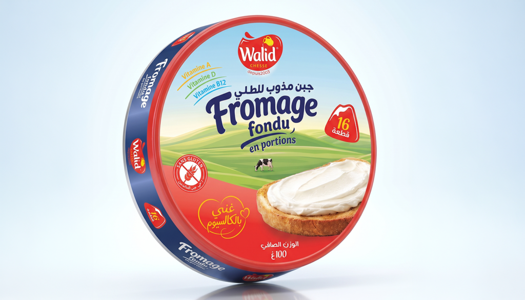

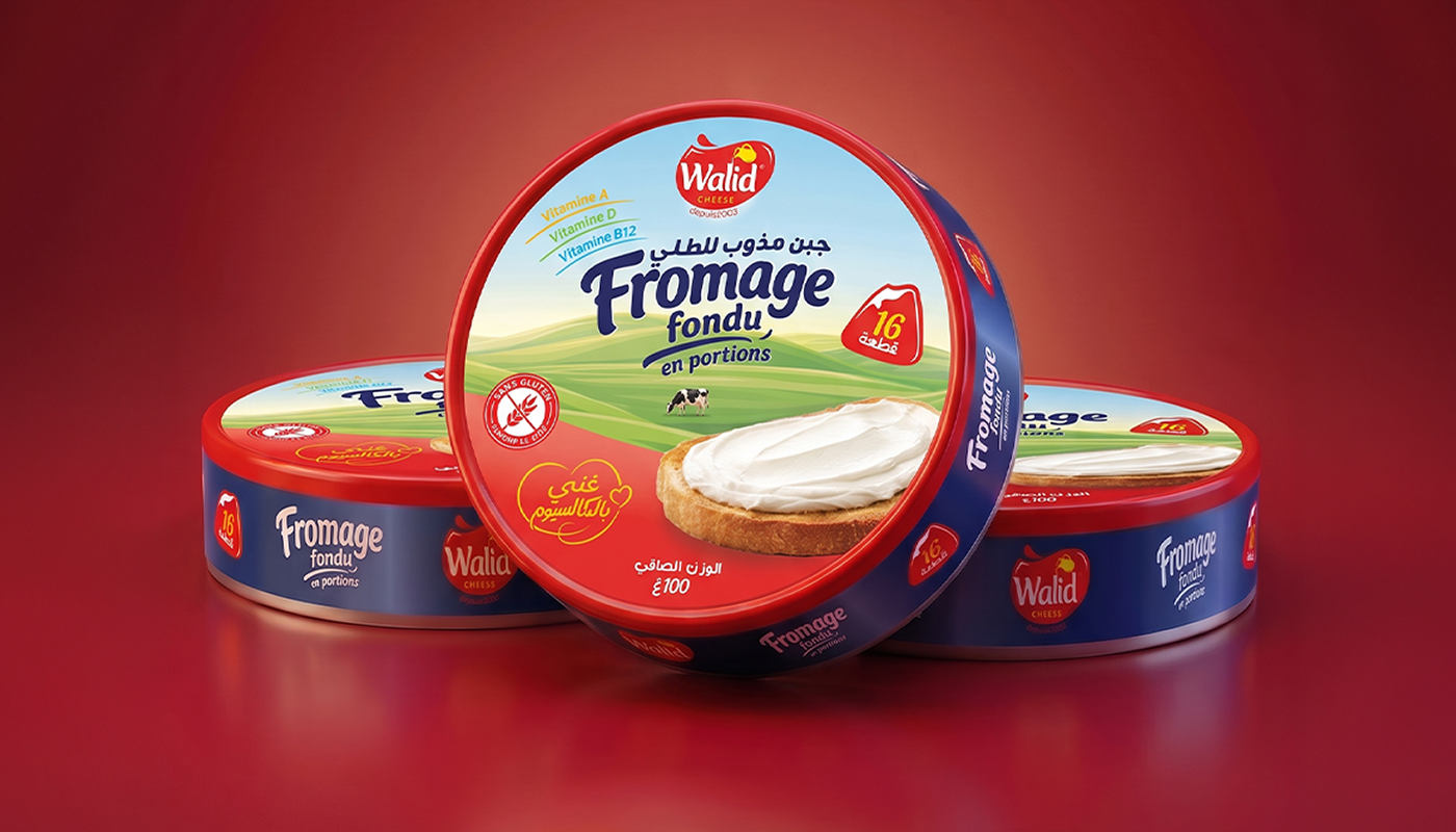
The packaging was designed as a natural, energetic and highly recognizable extension of the Walid Cheese identity, while creating a stronger visual presence on the shelf.
The design builds on the brand’s core blue and red color palette, reinterpreting both colors in a more dynamic and cohesive way to ensure consistency with the company’s natural cheese product range while giving this specific product its own distinctive visual character.
Natural Storytelling
A soft pastoral landscape was introduced as the main visual environment, immediately communicating the idea of nature, freshness and authentic dairy production.
At the center of the composition, a cow is deliberately positioned beneath the main typography, creating a direct visual connection between the product name and its natural origin.
Rather than using a conventional flat color block, the lower red area gradually shifts from lighter coral tones into deeper red, allowing the red identity to interact naturally with the landscape. The lighter tones visually capture the feeling of the surrounding light, creating a smoother transition between the natural scene and the brand’s energetic red.
The Product as a Hero Element
The toasted bread covered with creamy cheese was treated as a physical hero element, extending beyond the packaging artwork.
Instead of simply placing a food photograph inside the layout, the cheese toast was integrated into the composition as though it were emerging from the package.
This creates a stronger sense of depth and realism, while giving the front panel an unexpected visual break that naturally attracts attention.
The result is a packaging composition designed to feel more dimensional, appetizing and distinctive among competing products.
Typography & Visual Hierarchy
A dedicated Arabic and Latin typographic treatment was developed to create a recognizable visual personality for the product.
The typography was carefully balanced with the landscape and surrounding elements, using contrast in scale, weight and color to maintain immediate readability while preserving the visual harmony of the composition.
The main product name becomes the central communication point, while the supporting information is organized around it without competing for attention.
Packaging Band
The surrounding packaging band continues the brand language through a deep blue base, creating a strong visual frame around the circular front panel.
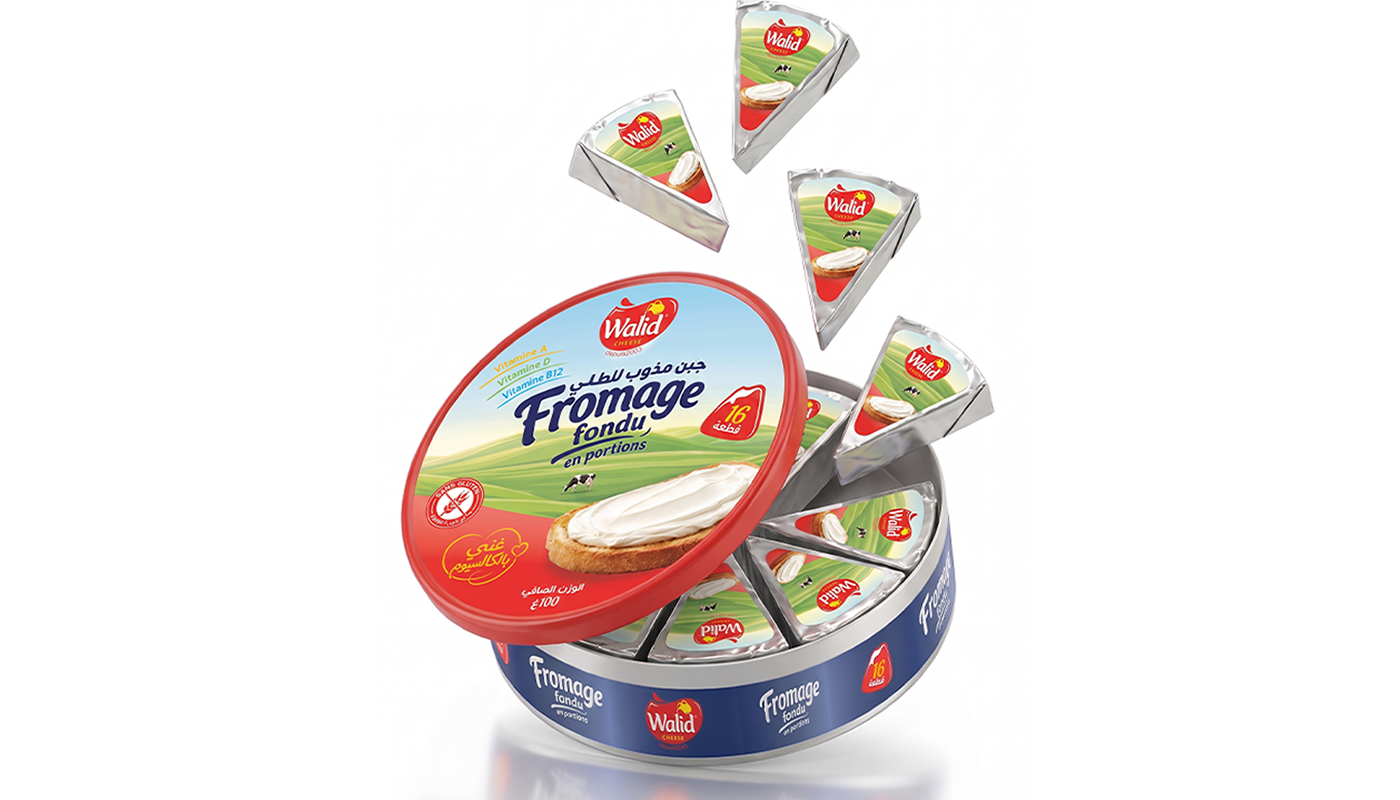
Repeated brand and product elements are distributed across the band, creating a recognizable rhythm designed to remain visually effective when the package is displayed on shelves.
Subtle light-reflective accents were introduced across the blue surface to simulate the way packaging catches and reflects store lighting, adding visual movement and helping the product stand out within a retail environment.
Product Information
Essential nutritional and product information was integrated directly into the visual system, including:
Vitamin A — Vitamin D — Vitamin B12
Gluten Free
16 Portions
Net Weight: 100 g
These elements are positioned as clear secondary communication points, maintaining accessibility without disrupting the main visual composition.
Final Design Philosophy
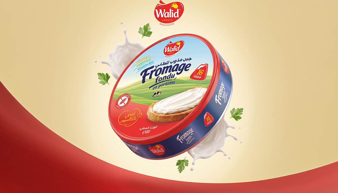
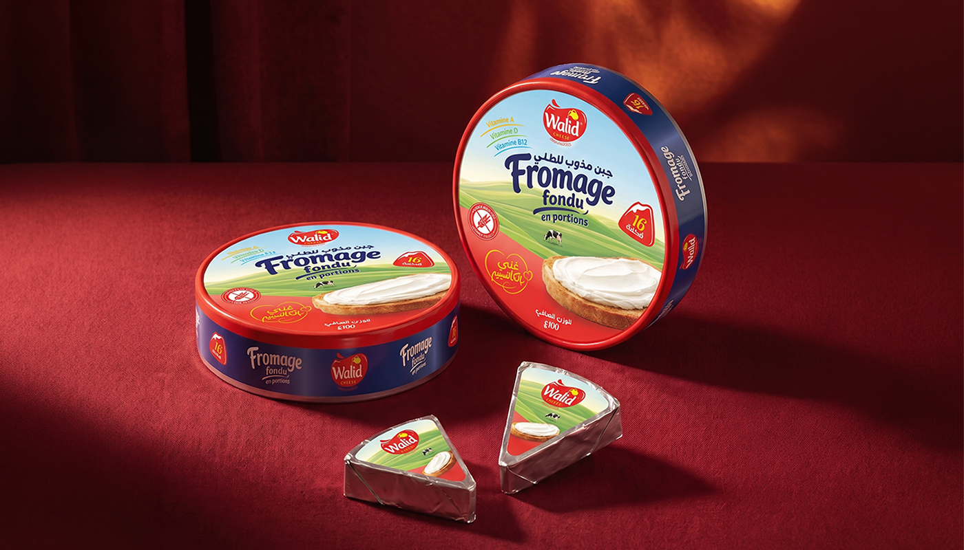
The result combines brand recognition, natural storytelling, appetite appeal and shelf visibility into one coherent packaging system.
 Otherness
 Alena Chemodurova
 Estudio Argo
 Pomodoro Design Office
 amandacoppeti
 Rabia zouina
 VANESA GARCÍA ESTUDIO
 anima
 Radar Agency
 Aadarsh Jain
 M&A CREATIVE AGENCY
 Valérie Colace
 Antonia Skaraki
 Aurora Baréalisse
 Artrime Graphic Design
 Just Design
 ANONIMA/
 Armoder Arte y Diseño
 eimanbeh
 Biaa
 Hartson Creative
 Karen Danielyan
 AUN BRANDS
 Studio Zak
 Hey Joe Studio