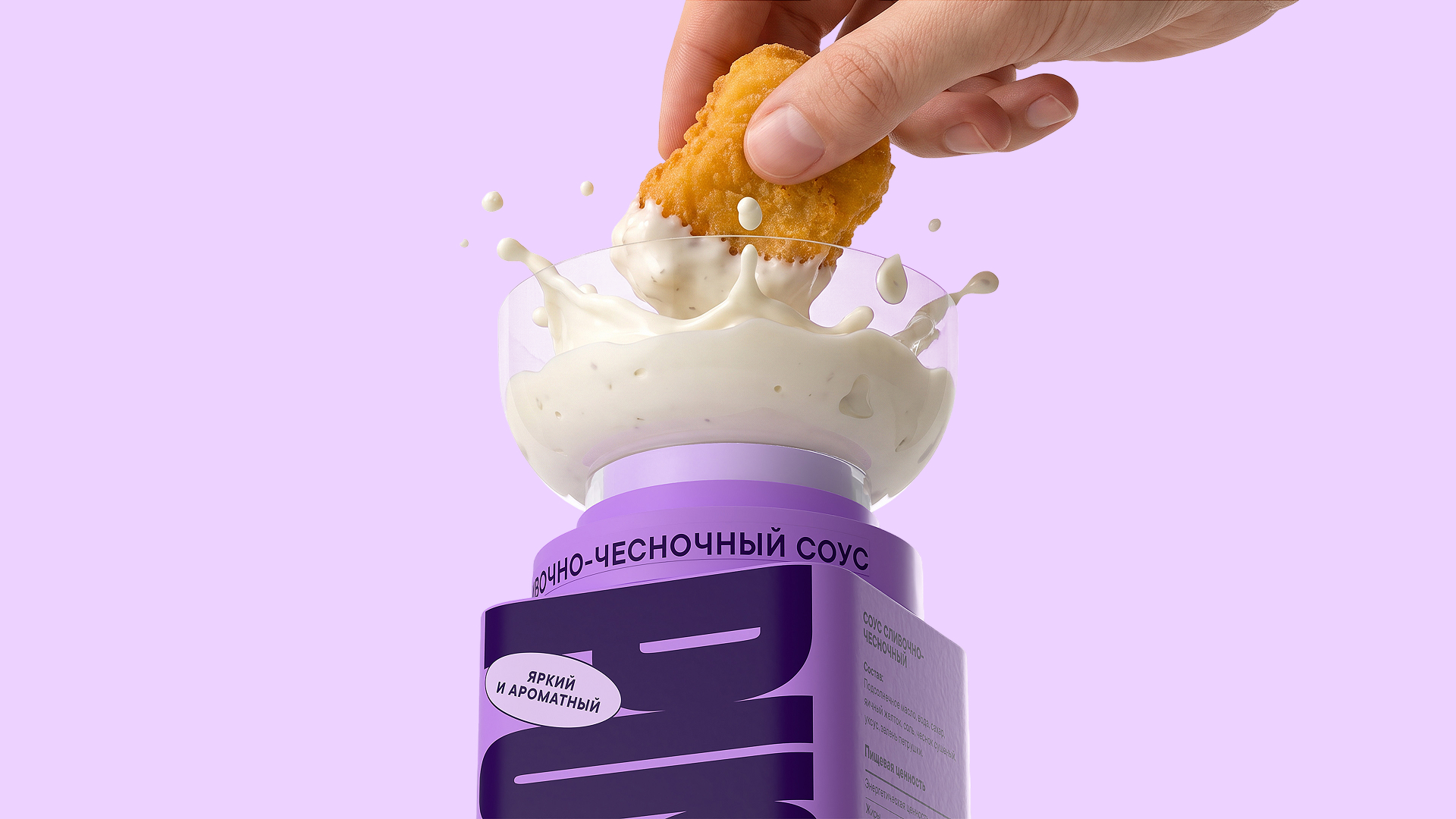

Pushe is a sauce packaging project designed for fast-food enthusiasts and anyone who values the ability to enjoy a tasty, quick, and hassle-free meal—anywhere.
The concept emerged from observing how people typically consume sauces: whether it’s fries, nuggets, chicken wings, chips, or veggie sticks, we almost always want a sauce to go with them, yet the sauce itself is often the most inconvenient part of the experience. Small cups tip over easily, sachets tear in the wrong places, and transferring sauce into another container requires a spoon, a plate, or at the very least, a flat surface. PUSHE eliminates these compromises, transforming sauce into a self-contained, convenient, and portable product that’s always ready to use—at home, in the office, on the go, while out for a walk, at school, or during travel.
The name Pushe is short, energetic, and modern. It alludes to the action of “pushing”, pressing or activating which directly relates to the packaging’s mechanics. To access the sauce, there’s no need to open multiple lids, hunt for cutlery, or flip a container over; a single, intuitive motion is all it takes. The brand targets a young, active audience people who often eat on the move: between classes or meetings, while working, on public transport, out for a stroll, at a festival, or late at night at home.
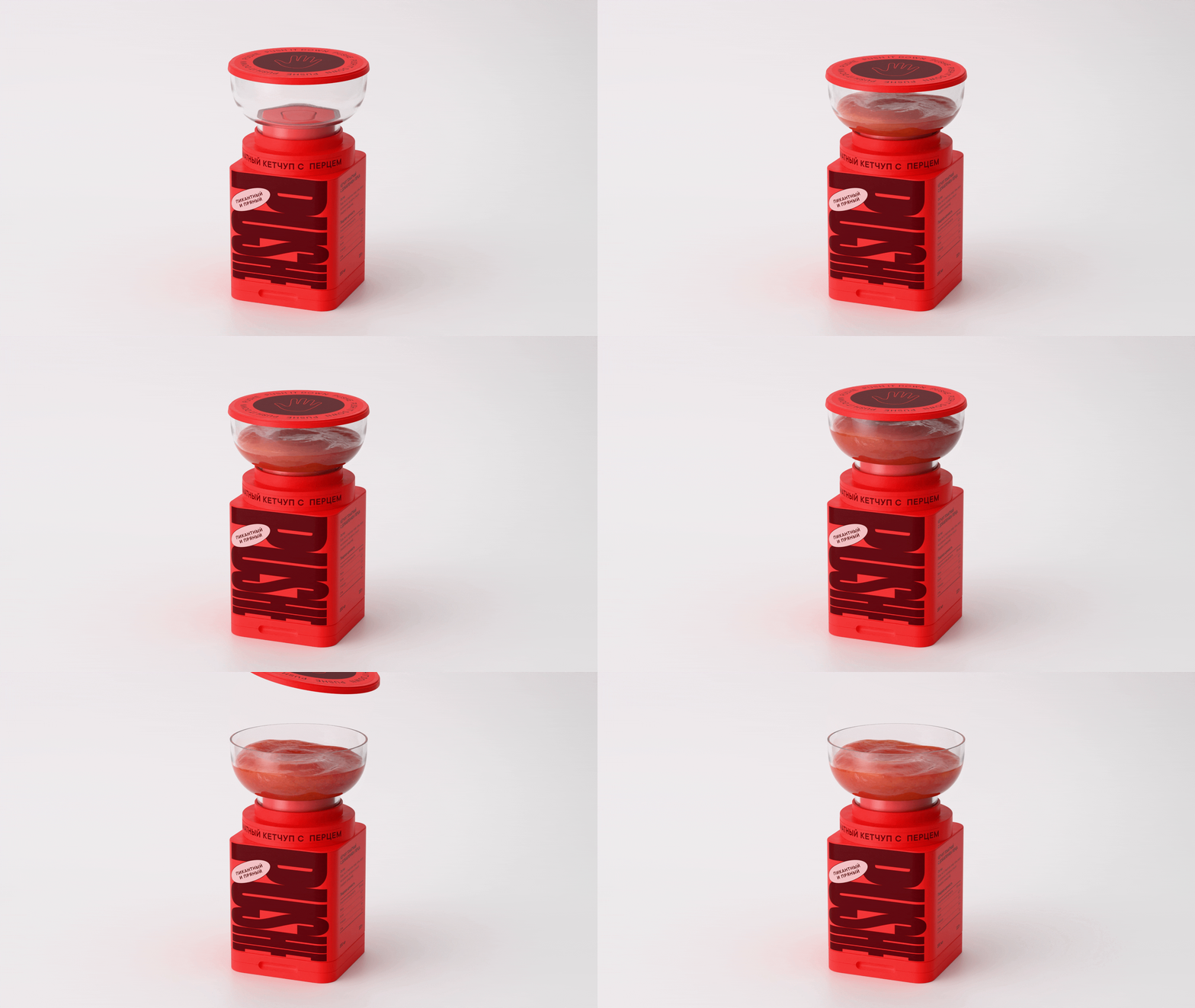
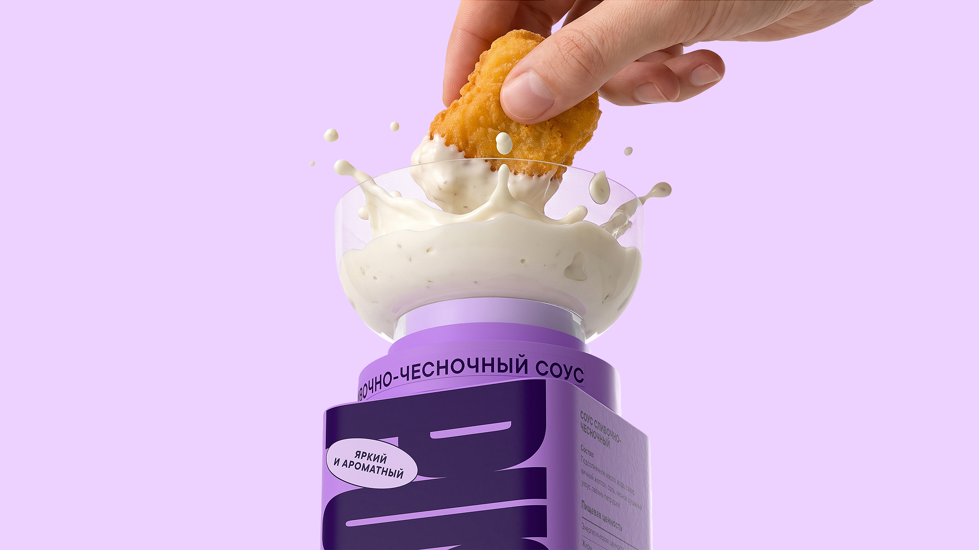
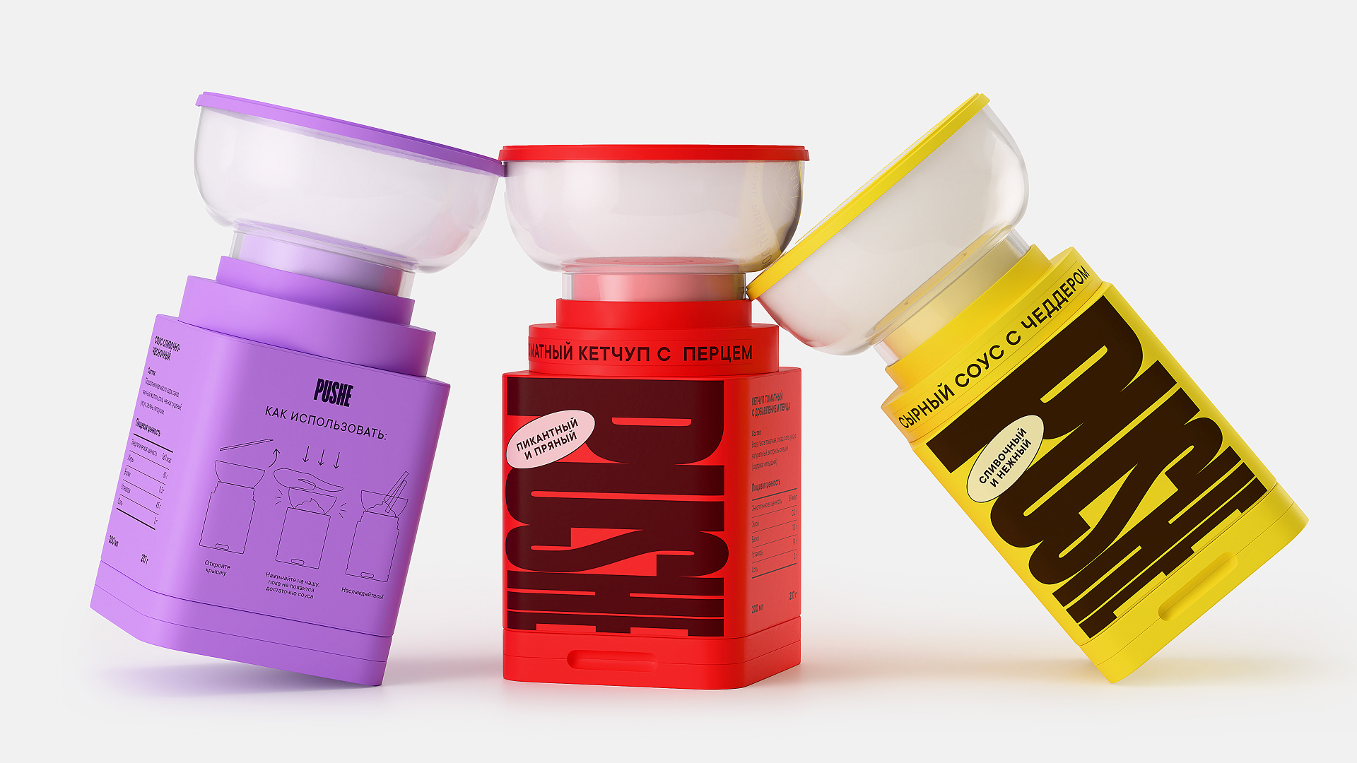
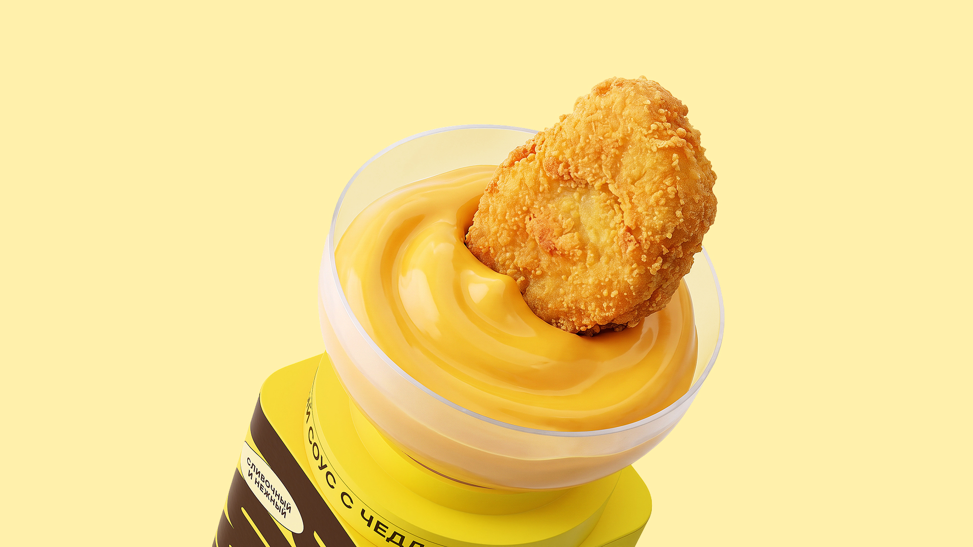
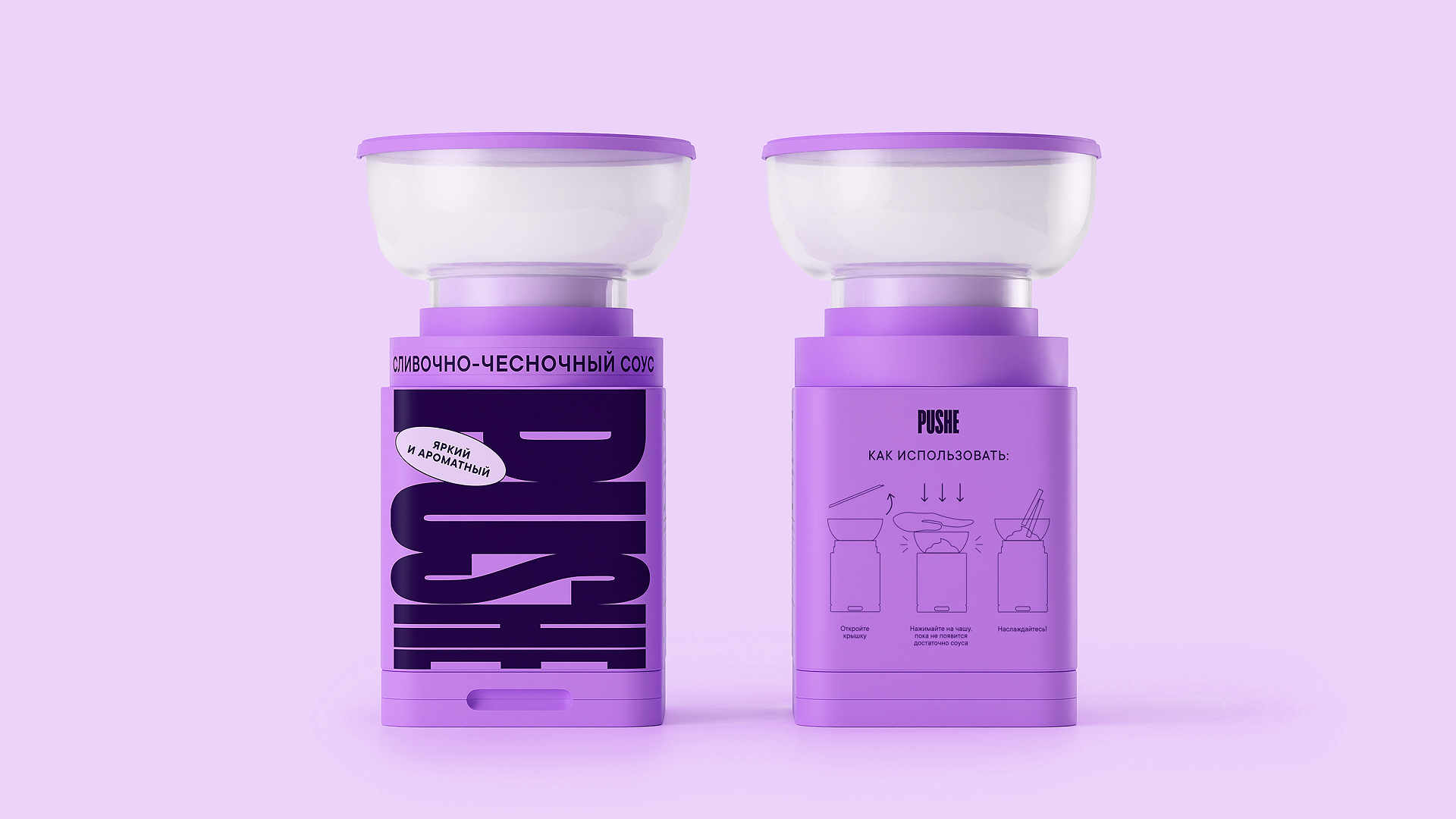
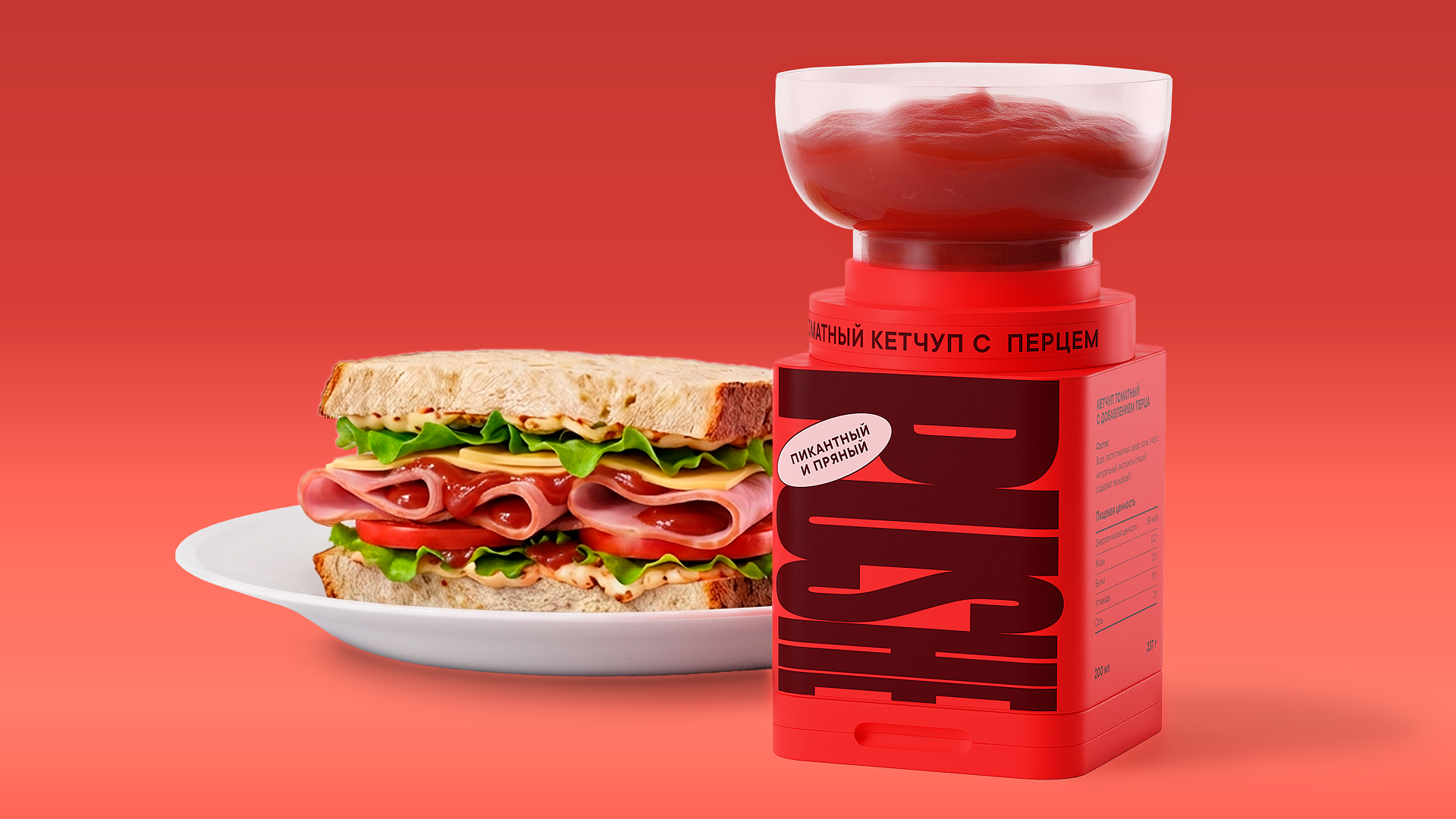
The defining feature of Pushe is its unique pump-cup design. The top of the packaging functions as a small bowl, allowing the user to dip their snacks directly into it. Unlike a standard sauce container, Pushe requires no transferring of the sauce, nor does it assume that the user is sitting at a table. The packaging itself functions as a mini sauce station compact, stable, enclosed, and always close at hand. The user removes the top lid and activates a pump mechanism, which brings the sauce up into a top basin. From there, items like French fries, nuggets, chips, chicken pieces, or vegetable sticks can be dipped directly into the packaging. This format is especially well-suited for sauces with thick or medium-thick consistencies, such as cheese, garlic, barbecue, ketchup, mustard, mayonnaise, or ranch. Pump mechanisms are valued for their hygiene, precise portion control, and the reduction of unnecessary contact with the product, making them an excellent choice for sauces, dressings, and dips.
Curator’s Insight
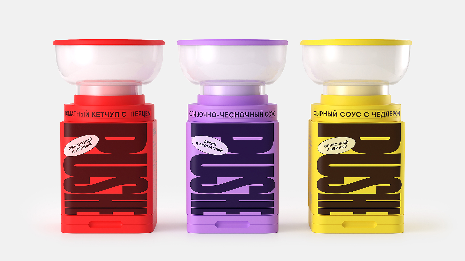
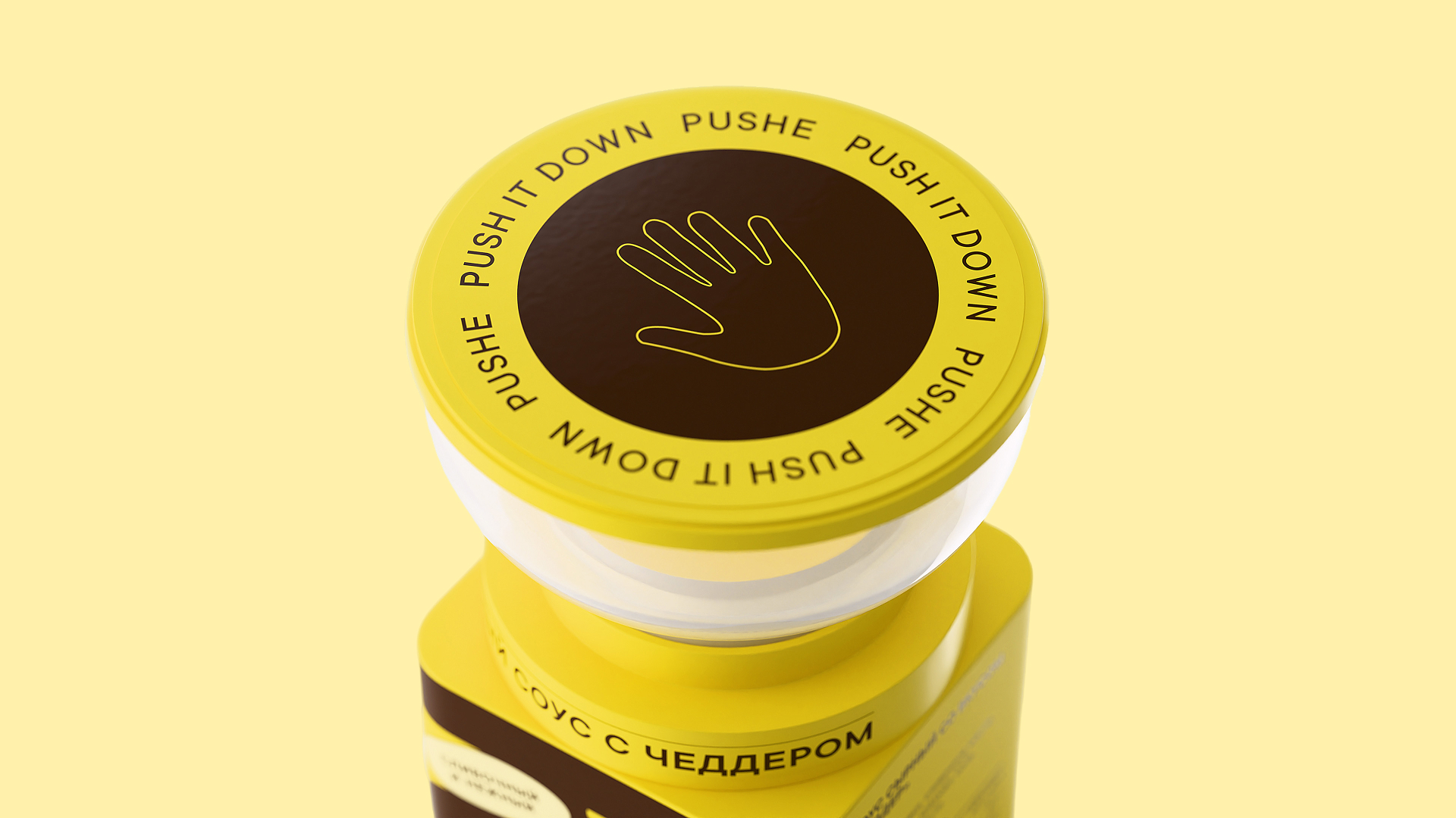
What stands out is how little the graphics have to explain. The lid carries a hand outline on a dark disc, ringed by repeating text, so it reads as a button before it reads as a lid. The oversized wordmark is rotated, cropped and printed tone on tone in a deeper shade of each flavour’s colour. It works as a texture as much as a name, so the colour carries the identification and the Cyrillic copy can stay small and quiet. Pill-shaped descriptors add taste cues without breaking the block. The clear bowl lets the sauce itself become the final colour accent. When a pack asks for a new behaviour, the strongest move is to put the instruction where the hand lands and let the brand colour do the rest.
 Derrick Lin
 Sophiagdotcom
 Sofia Nikishina
 studionerius
 monther al omari
 Monroe
 KateChachava
 Snob Duck
 宏洛图品牌设计HONGLT
 Studio Six F
 Just Design
 New Century Design
 VIEWPOINT
 Abbydraw Designs Unique Conceptual Branding & Packaging Designing Ideas
 BexNelson
 Vladimir Shmoylov
 Kris
 Agence des Coteaux
 Julia M.
 Rabia zouina
 www.branding.uz
 Diego Alves do Amaral
 studioaslihan
 Minim Brand Design