Greta Oto — Pét-Nat Wine Packaging
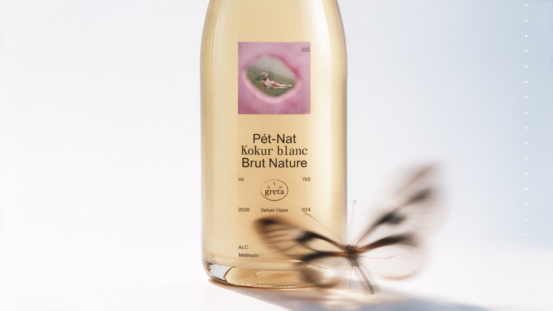
Concept project. The brand and its story are fictional; the packaging has not been produced.
The Story
Maria and Alexandra inherited old vineyards in the Balaklava Valley and started a small farm making natural pét-nats in tiny batches — for themselves, their friends and anyone who loves the southern way of life.
The Audience
Urban 25–35-year-olds who choose wine by character, not status. Tired of wine snobbery, but still looking for discovery.
The Challenge
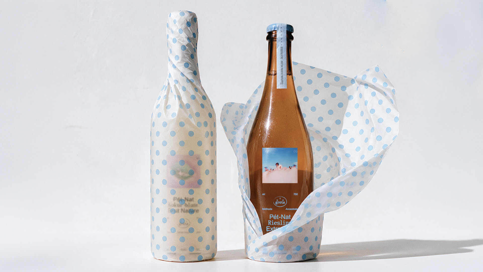
Sediment, a crown cap and wild aromas read as mistakes. A premium label would hide this; a playful one would make it look accidental.
The Task
Turn the flaws into character: make Greta Oto feel like a rare find — uneven, alive and real because of it.
The Idea
Pét-nat exists in culture as a lowbrow genre: a wine without pedigree, cloudy and fizzy, belonging to the beach and the street rather than the cellar. Its unfinished nature (fermentation that continues behind the glass, sediment left at the bottom) is usually read as a lack of form. The Greta Oto project proposes to read it as form. Pét-nat resists reproduction in the sense Walter Benjamin wrote about: every batch is singular, bound to a particular year, weather and slope, and so it keeps what Benjamin called the aura: its presence in the here and now.
The Name
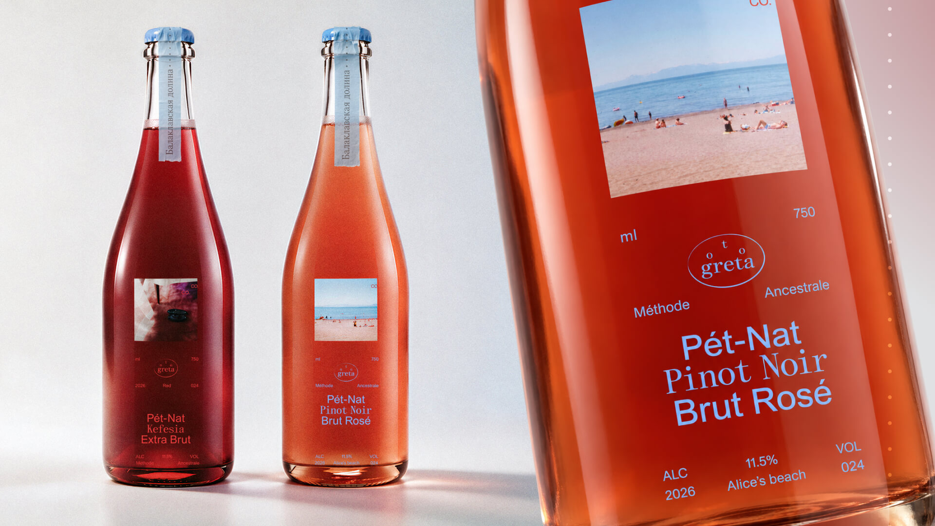
The wine comes from the Balaklava Valley, from limestone terraces where the stone stores the heat of the day and, by evening, the sea merges with the sky in color. The name is borrowed from the butterfly Greta oto, whose wings are almost free of pigment. The Latin name changes the tone of the conversation about a “simple” wine: people begin to look at it with the attention they give to something fragile and small. This shift is the aim of the project: to move pét-nat from the category of the accidental into the category of the subtle.
The Solution
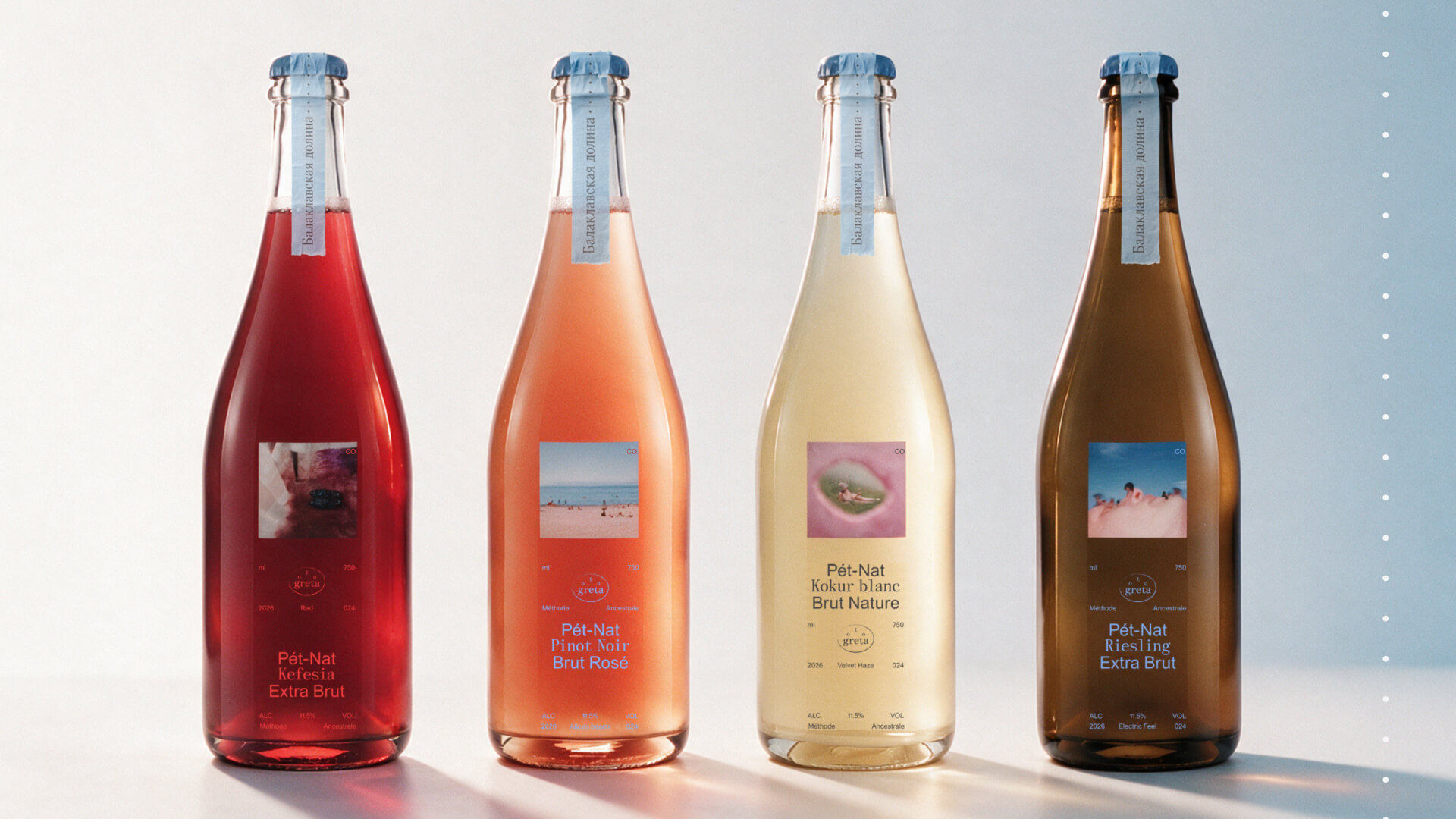
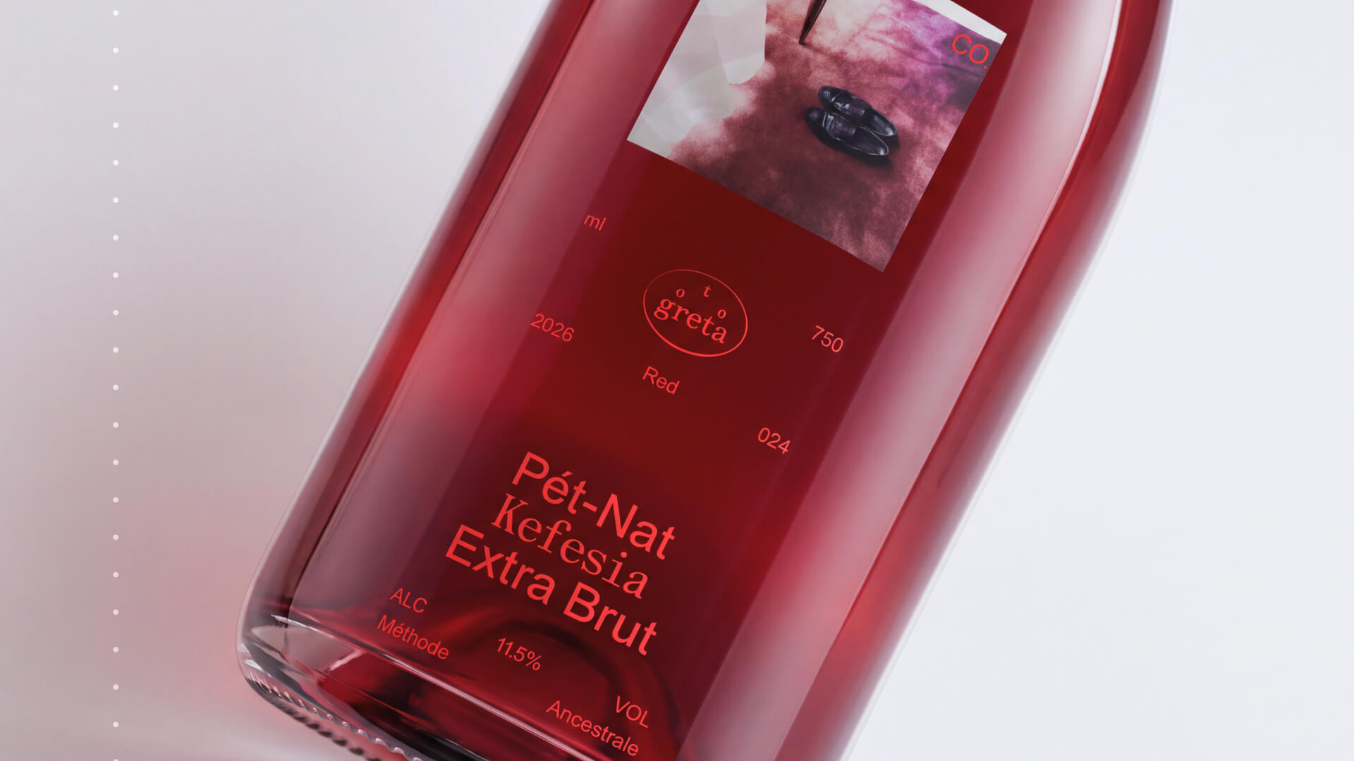
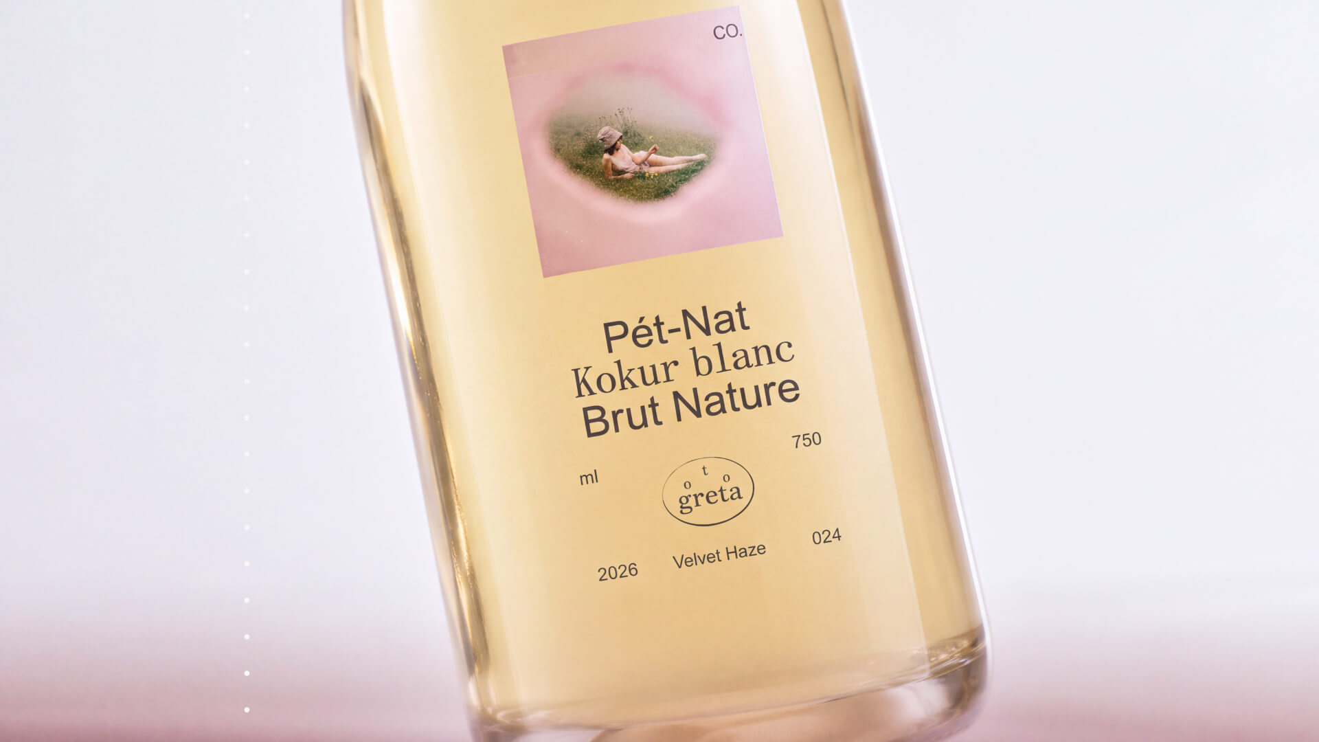
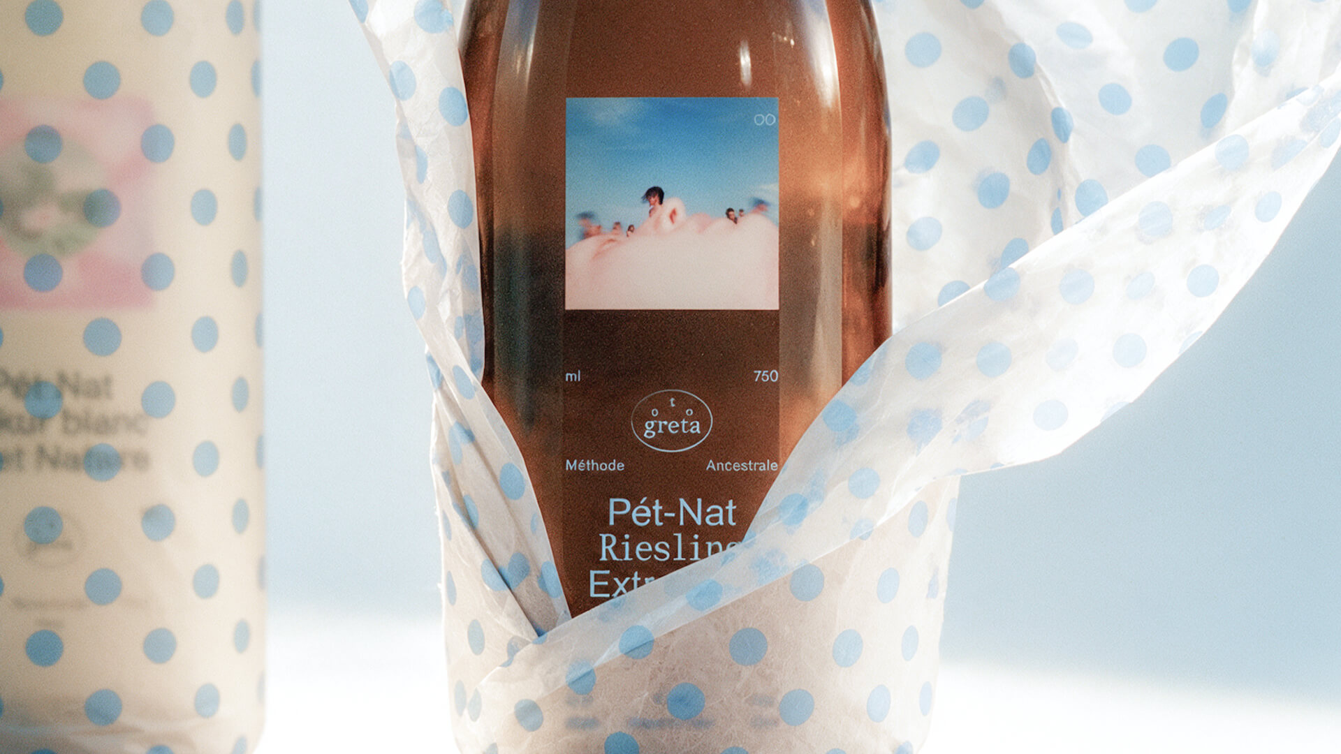
The butterfly itself is absent from the visual language. Its presence is carried by two principles: transparency and bilateral symmetry. Printing on glass rejects the label as an opaque surface, so the text exists over the wine rather than in place of it. The typography is mirrored along an axis, like a pair of wings, and gravitates toward the base of the bottle. It follows the movement of the sediment slowly settling to the bottom, so the text becomes one more layer of the same process.
Credits
Design & Art Direction: Daria Kolesnikova
Concept, naming, brand identity, packaging, typography, photography direction and editing
Some imagery was AI-generated and edited by hand; the packaging design is original.
Video


Comments
0 commentsLog in to comment or submit projects