Beej Origin: Reimagining the Visual Language of Edible Oil
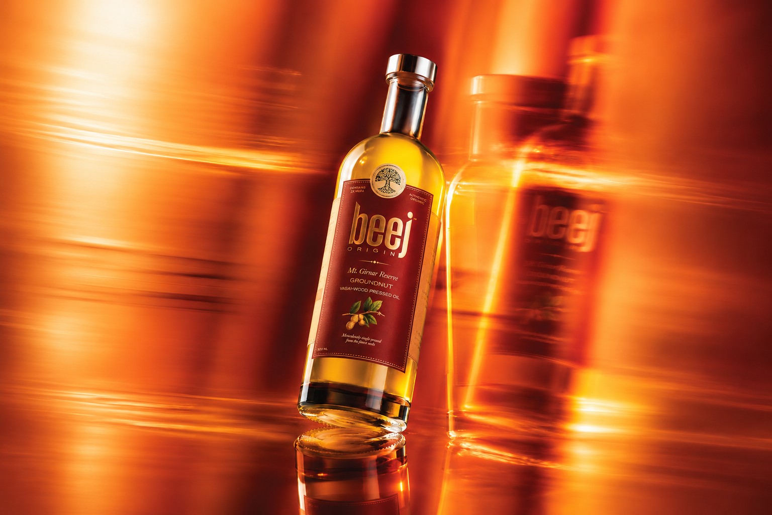
Beej Origin: Branding & Packaging
Beej Origin is an Indian edible oil brand built around the idea that good oil begins with knowing where it comes from.
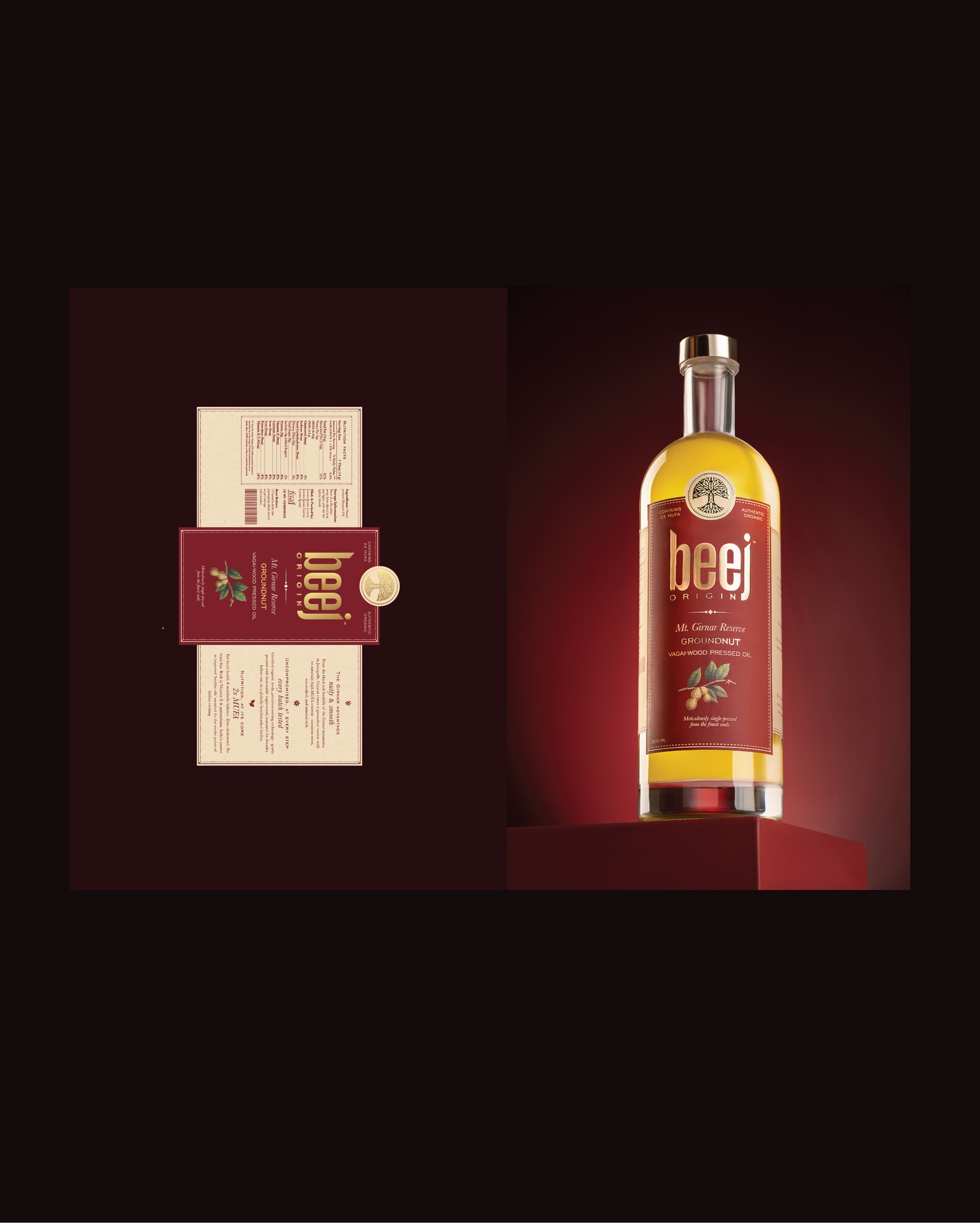
The challenge was to bring a new visual style to an otherwise conventional category, creating packaging that felt premium and contemporary while communicating the integrity of the product.
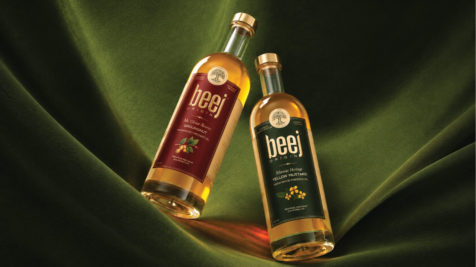
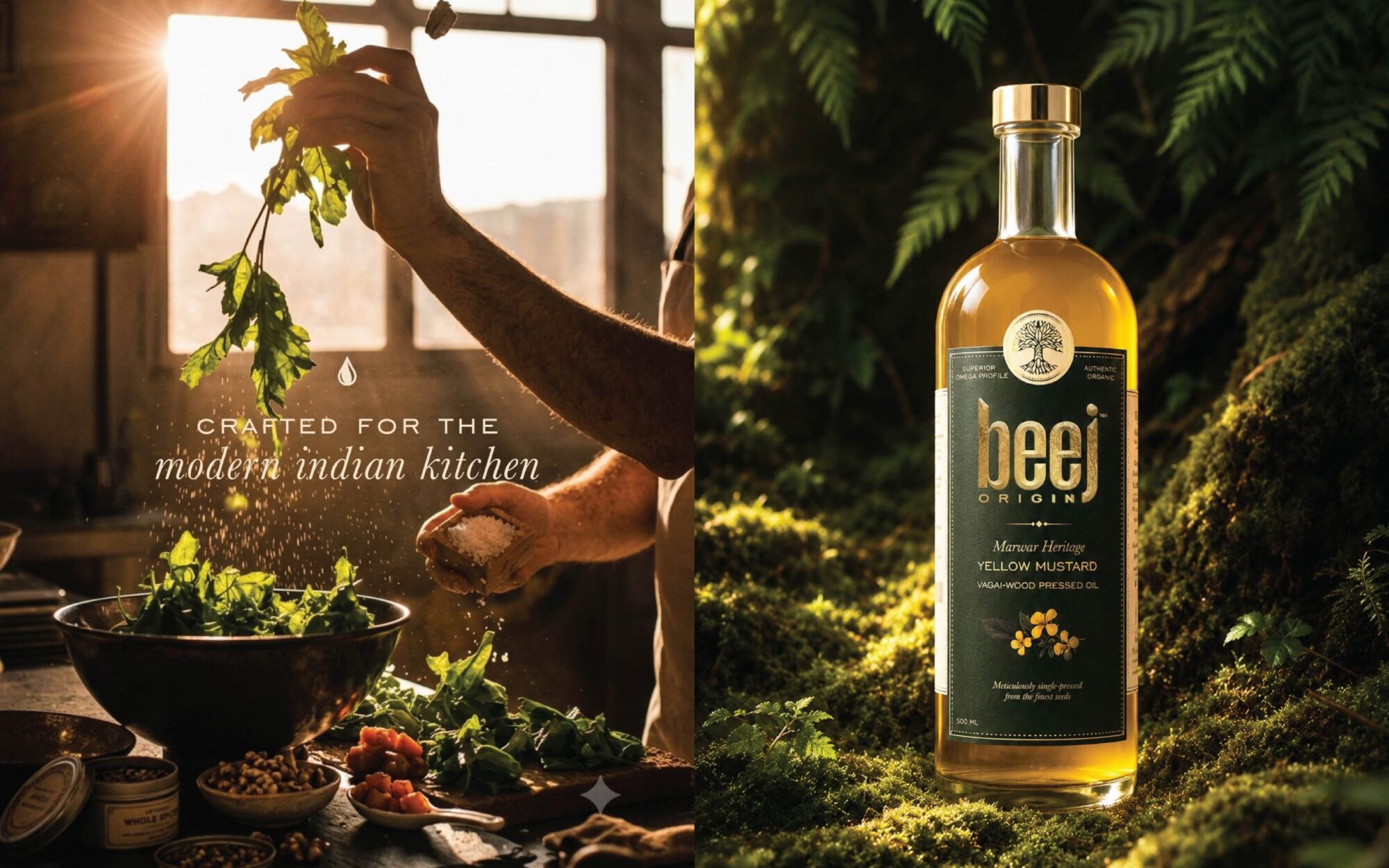
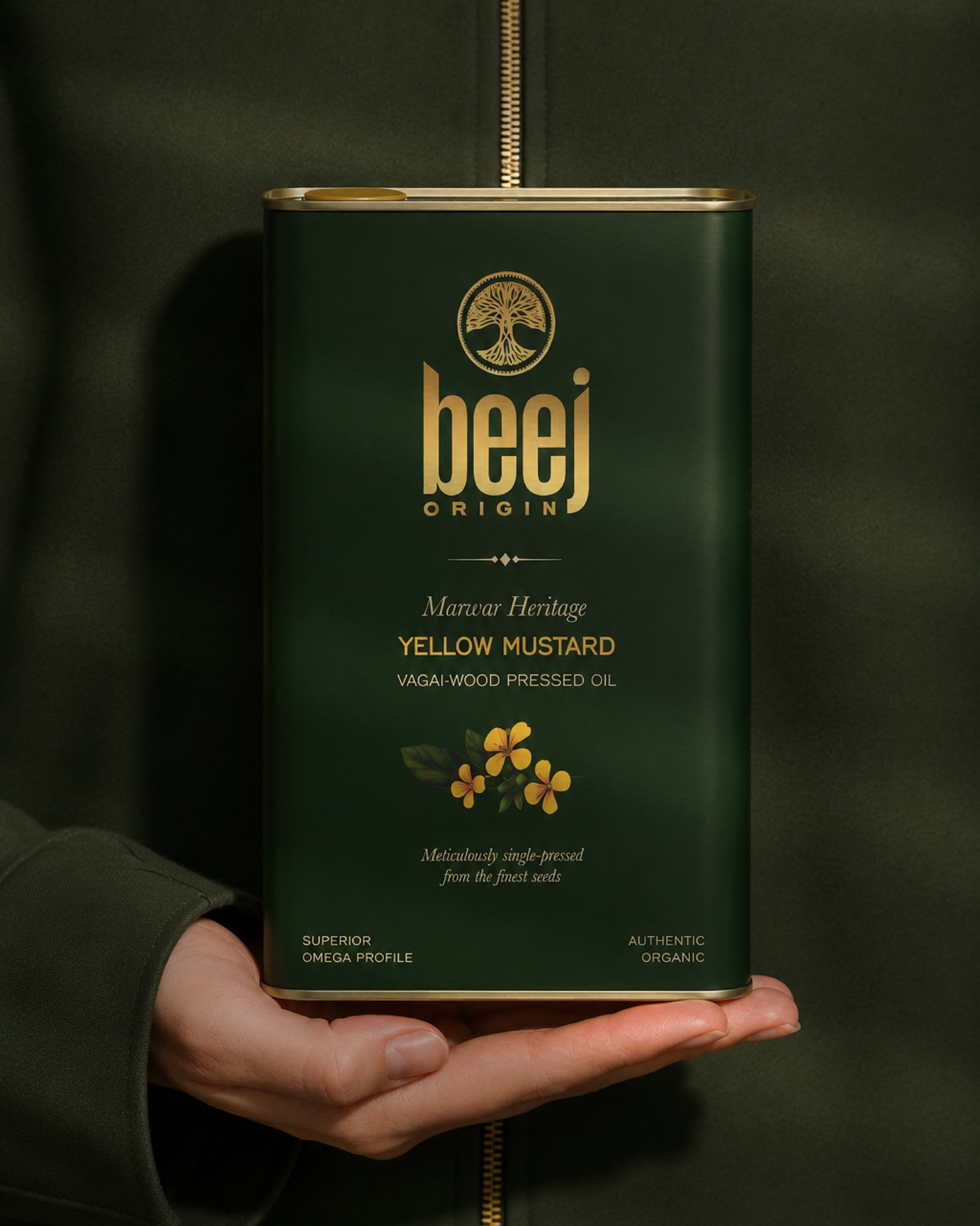
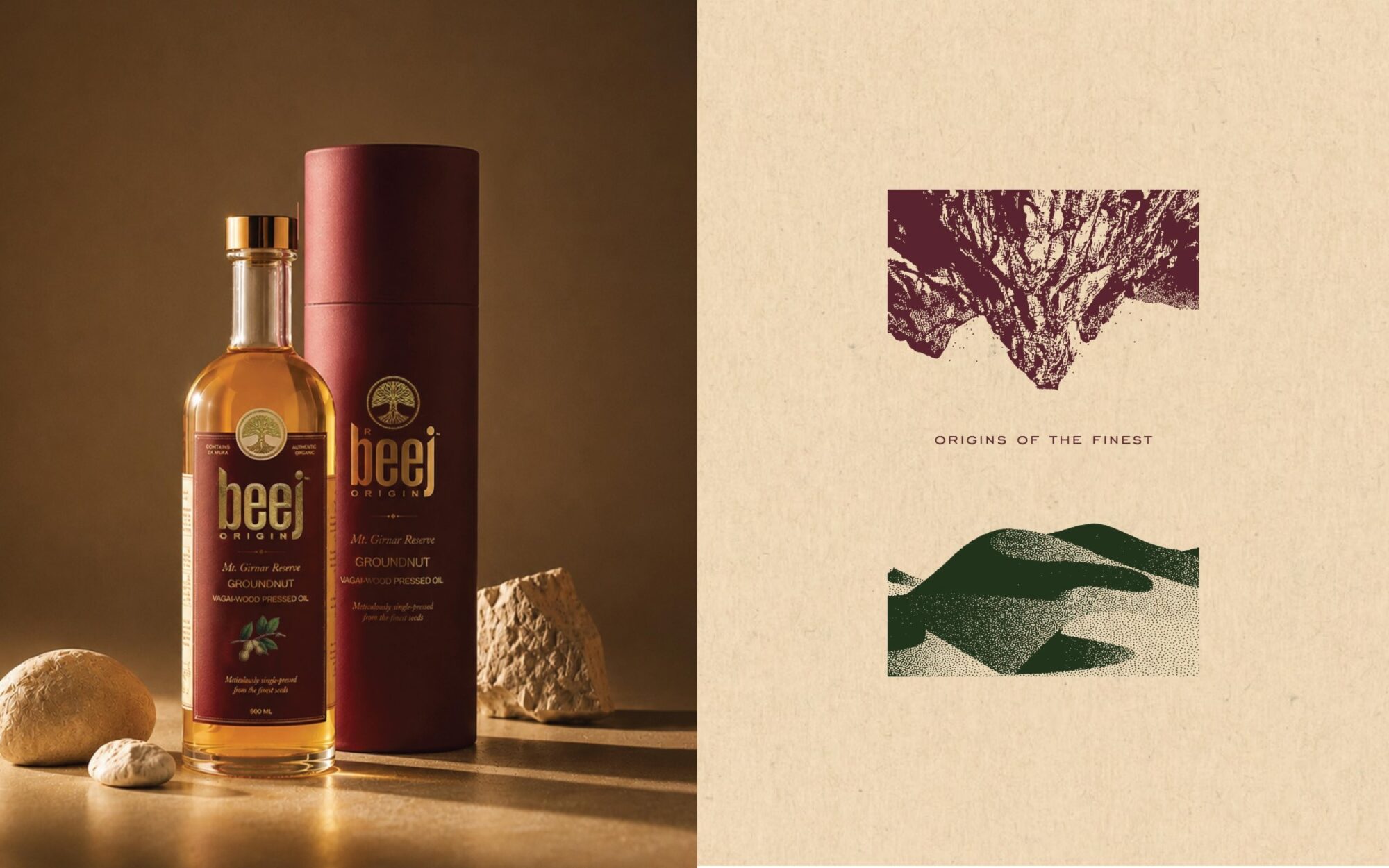
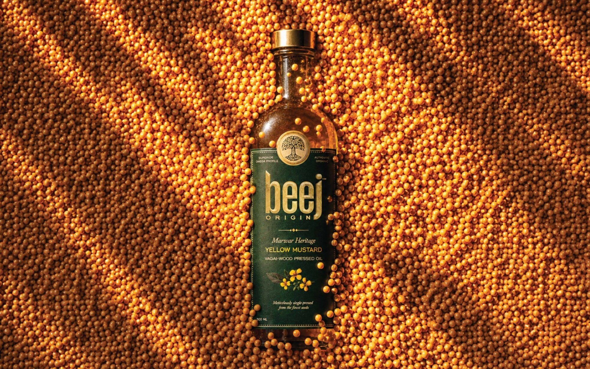
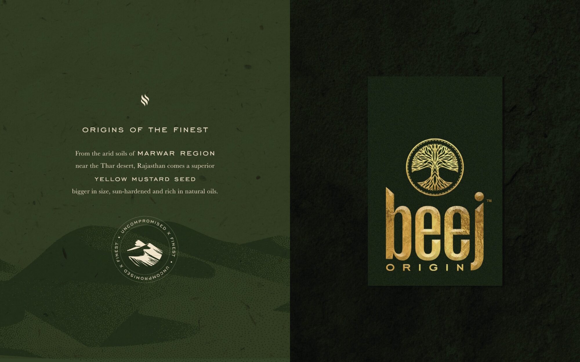
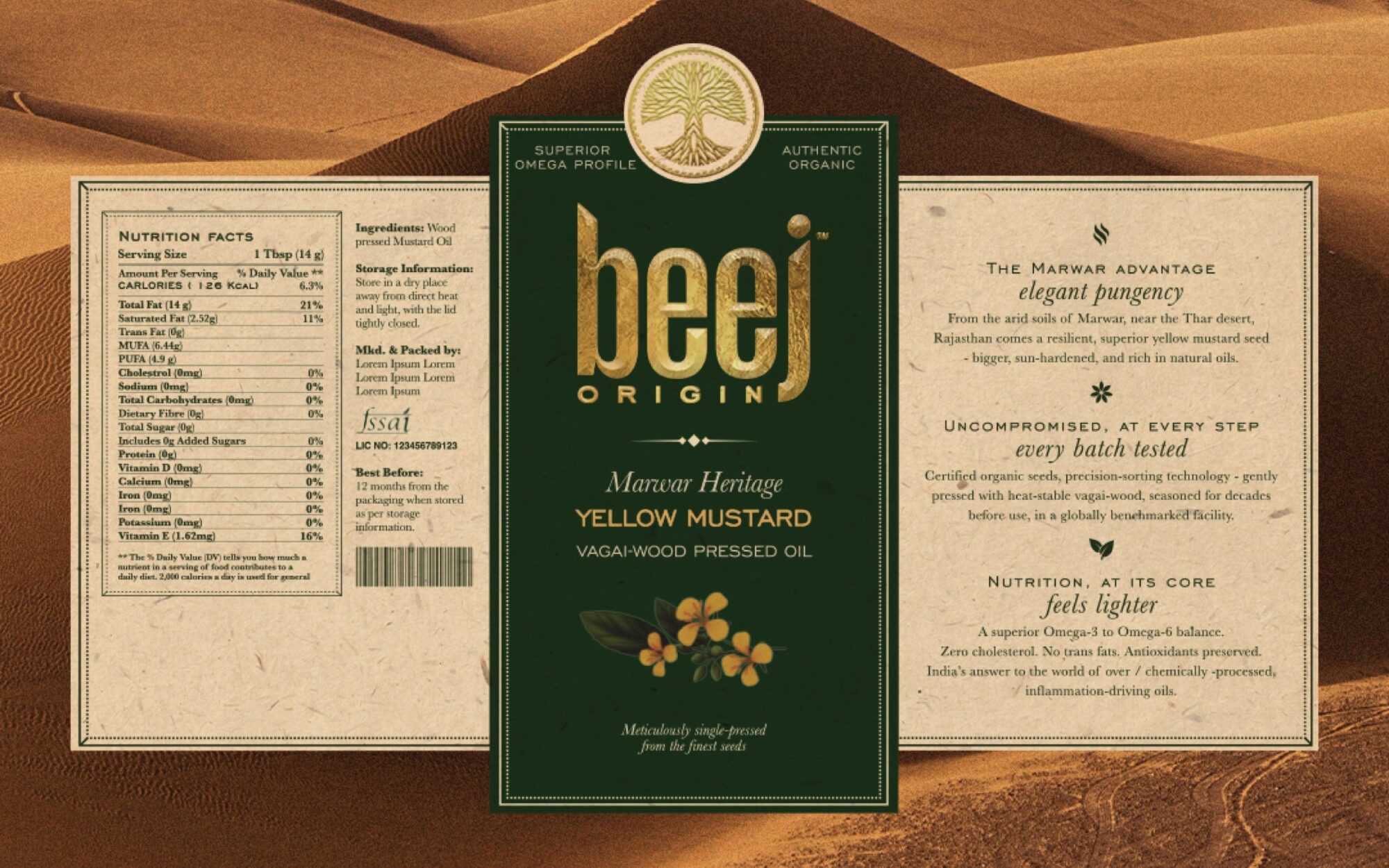
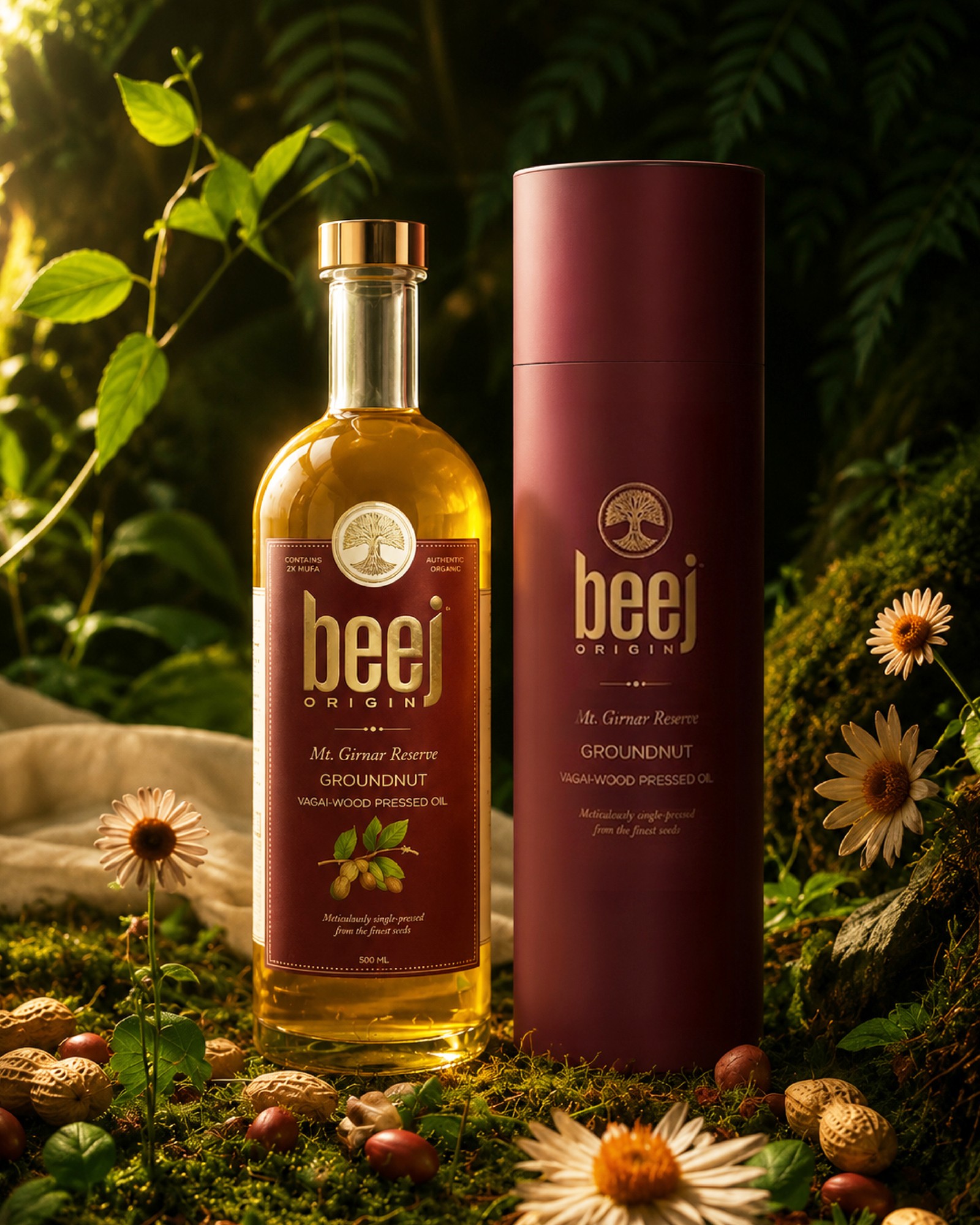
Provenance became the central idea behind the identity. Each oil is sourced from a region best suited to growing its ingredient, yellow mustard from Marwar and groundnuts from the foothills of the Girnar range. We translated these origins into a visual system that brings together ingredient-led illustrations, considered typography and a distinctive graphic language.
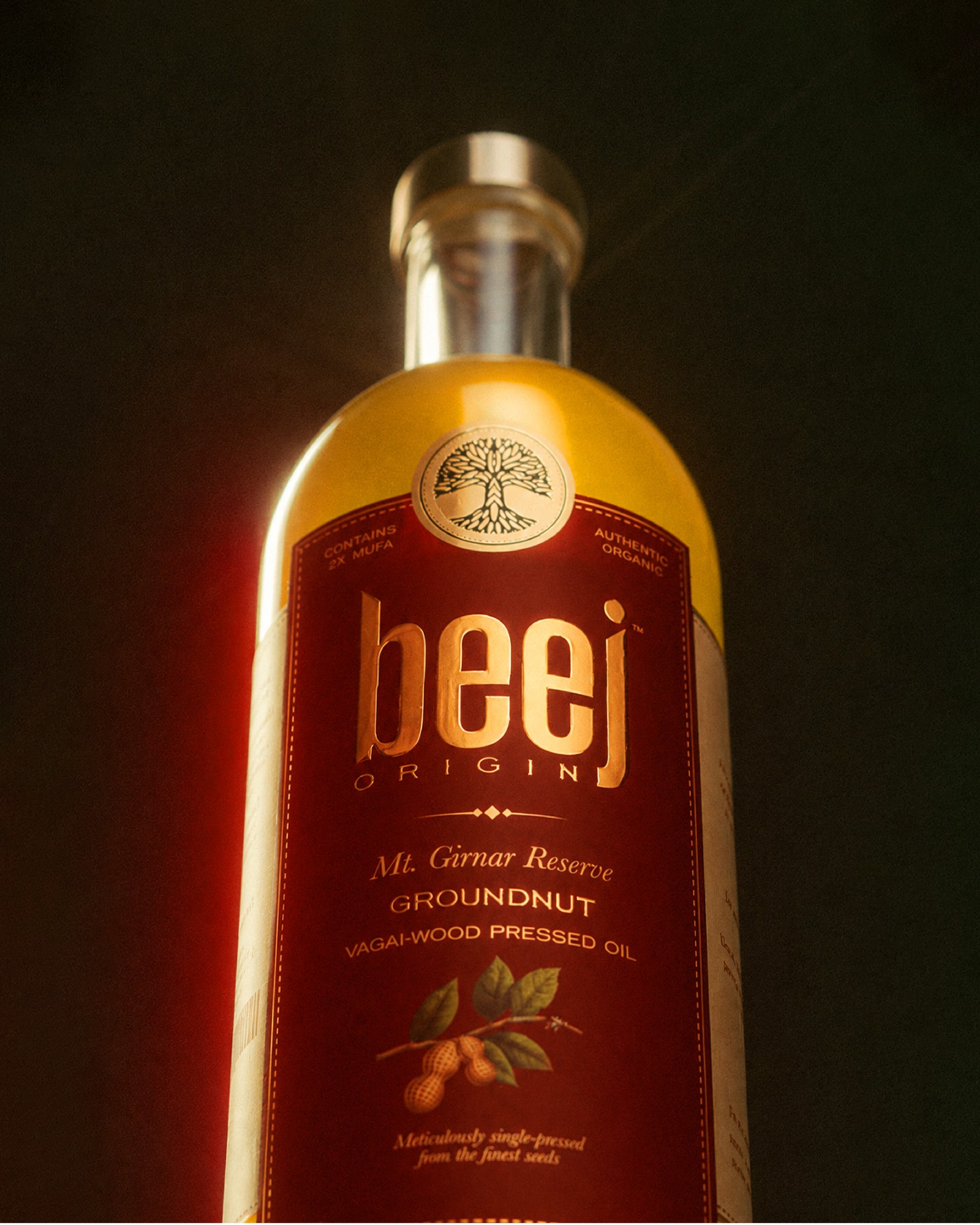
The packaging was developed with equal attention to its physical expression. From cold-foil detailing and print finishes to colour reproduction and production trials, every element was considered to create a tactile, elevated experience that reflected the quality within.
The result is an identity that brings together the origins of the ingredients, the integrity of the process and a more considered approach to everyday cooking essentials.


Comments
0 commentsLog in to comment or submit projects