Calm after the storm
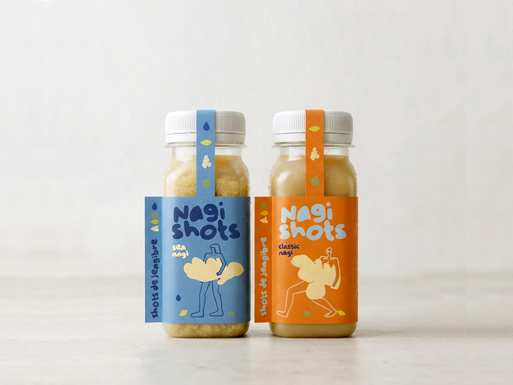
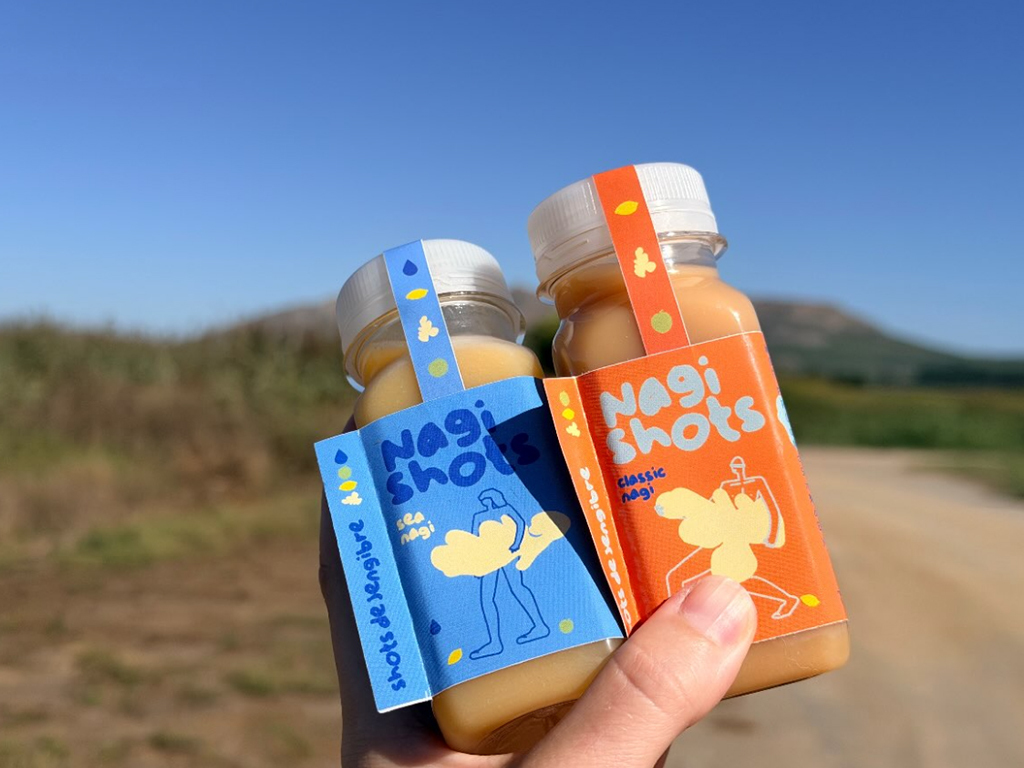
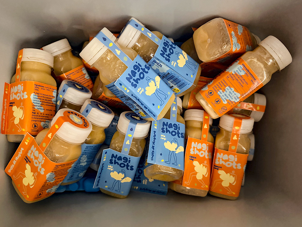
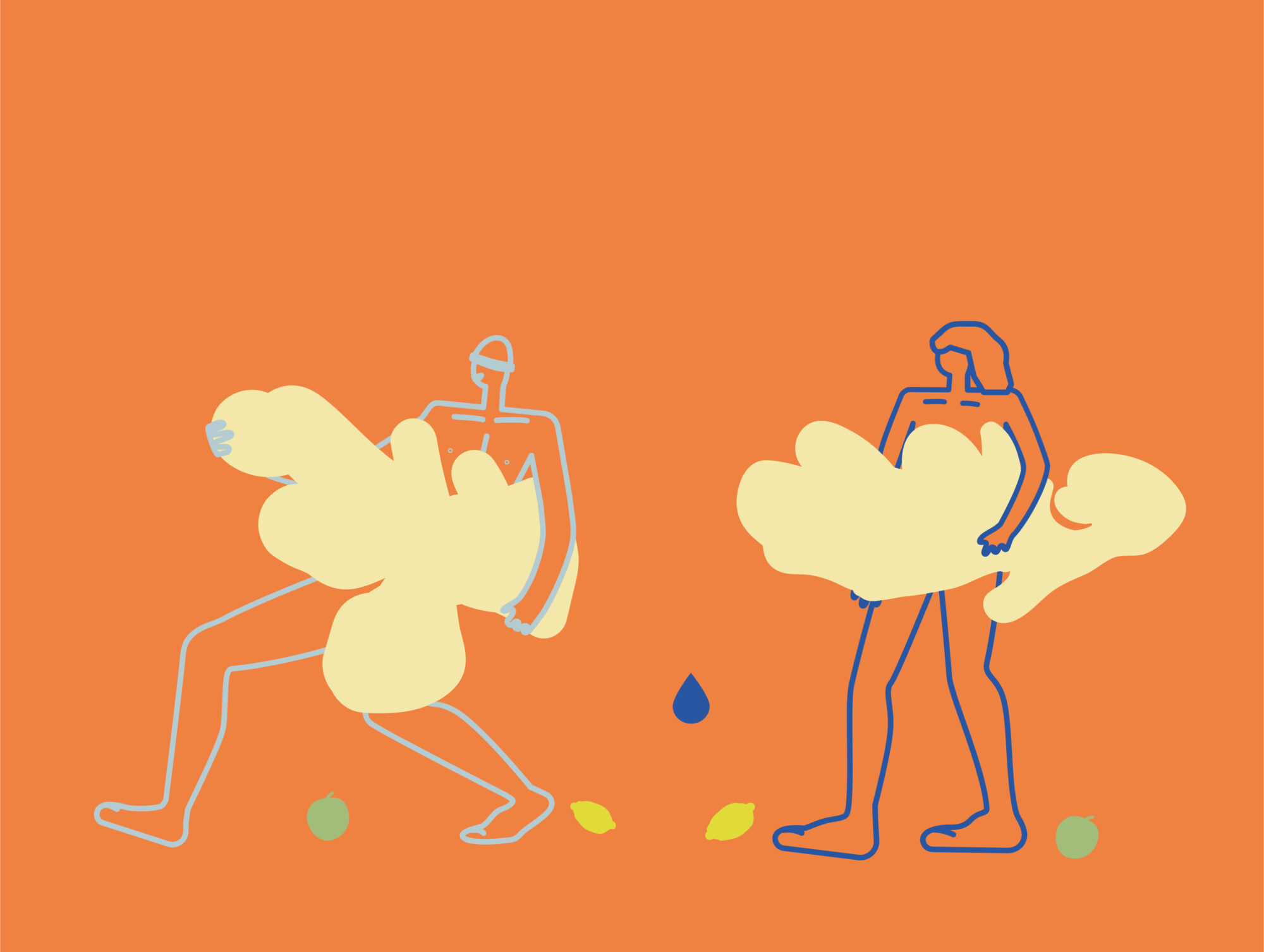
Branding and packaging for the new brand of ginger shots Nagi shots. The name NAGI connects with three concepts: in Polish, “naked”; in English, naked; and in Japanese, the calm after the storm. This idea becomes the conceptual axis of identity. An identity full of color, illustrated characters that transmit movement and a free and expressive graphic that reflects a positive energy, far from medicinal aesthetics. The design uses color, naked illustration and an identity full of character to communicate energy, optimism and naturalness, turning each bottle into a recognizable, attractive and memorable object. The result is a lively, optimistic and recognizable packaging that turns each bottle into a small shot of energy with its own personality.


Comments
0 commentsLog in to comment or submit projects