Poem Chocolat
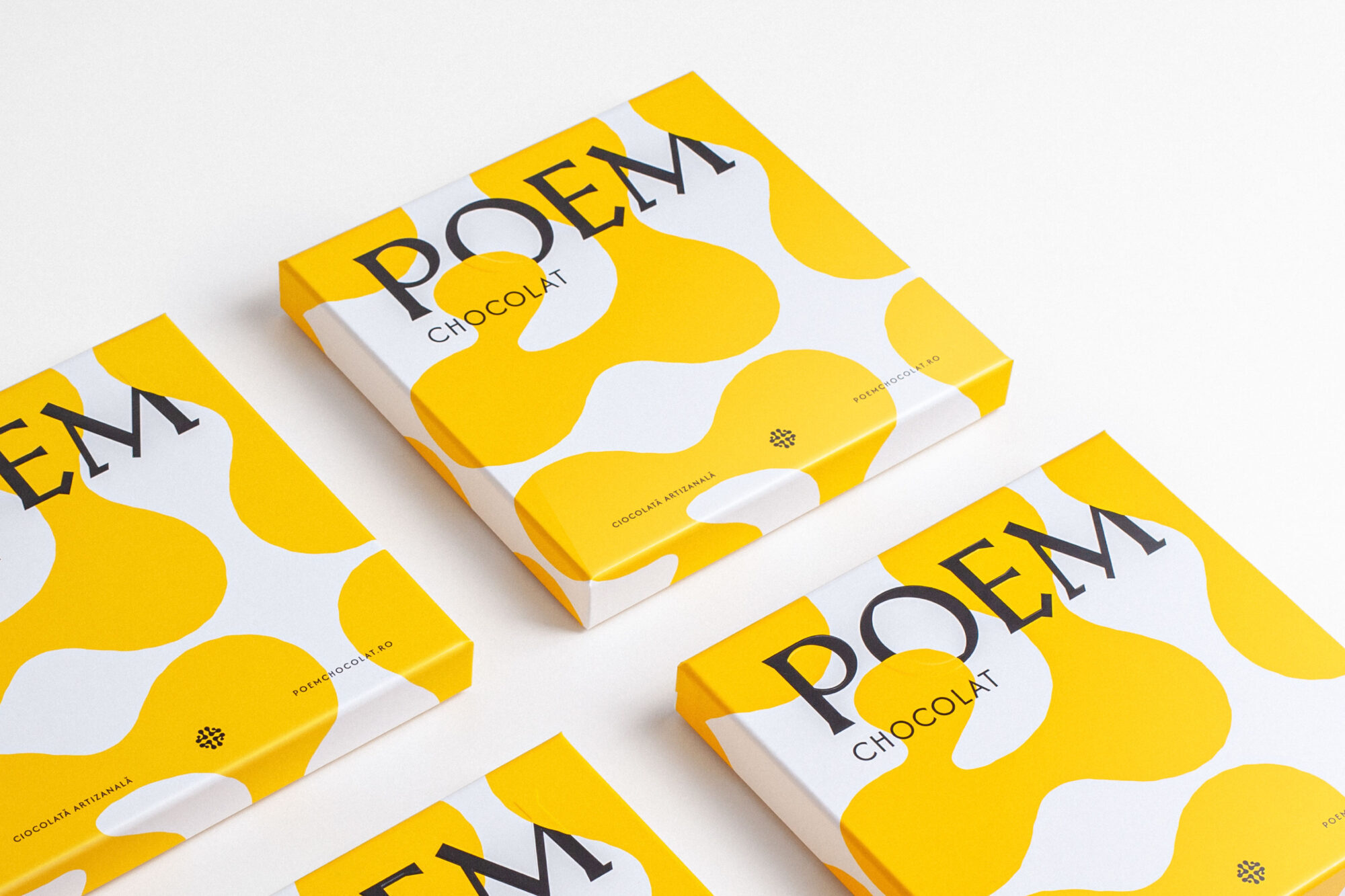
Poem Chocolat:
A bright new chapter
The context
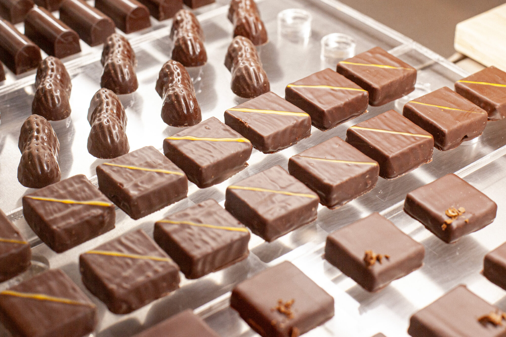
Poem Chocolat is an artisanal chocolate brand from Romania, led by award-winning pastry chef and chocolatier Vera Maxim. In 2025, the brand opened a flagship store in Bucharest. Its old identity, heavy with chocolate-world visual clichés, no longer reflected the new space or the craftsmanship behind the product, so the owner decided it was time for a change.
The solution
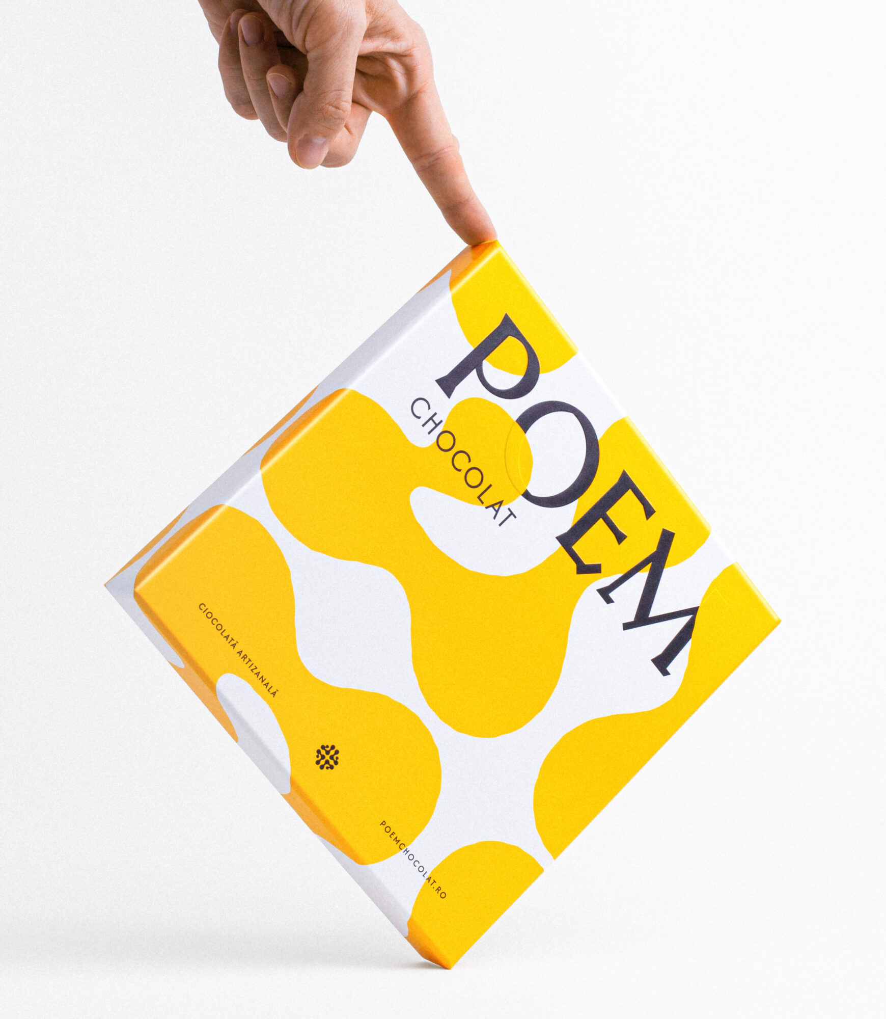
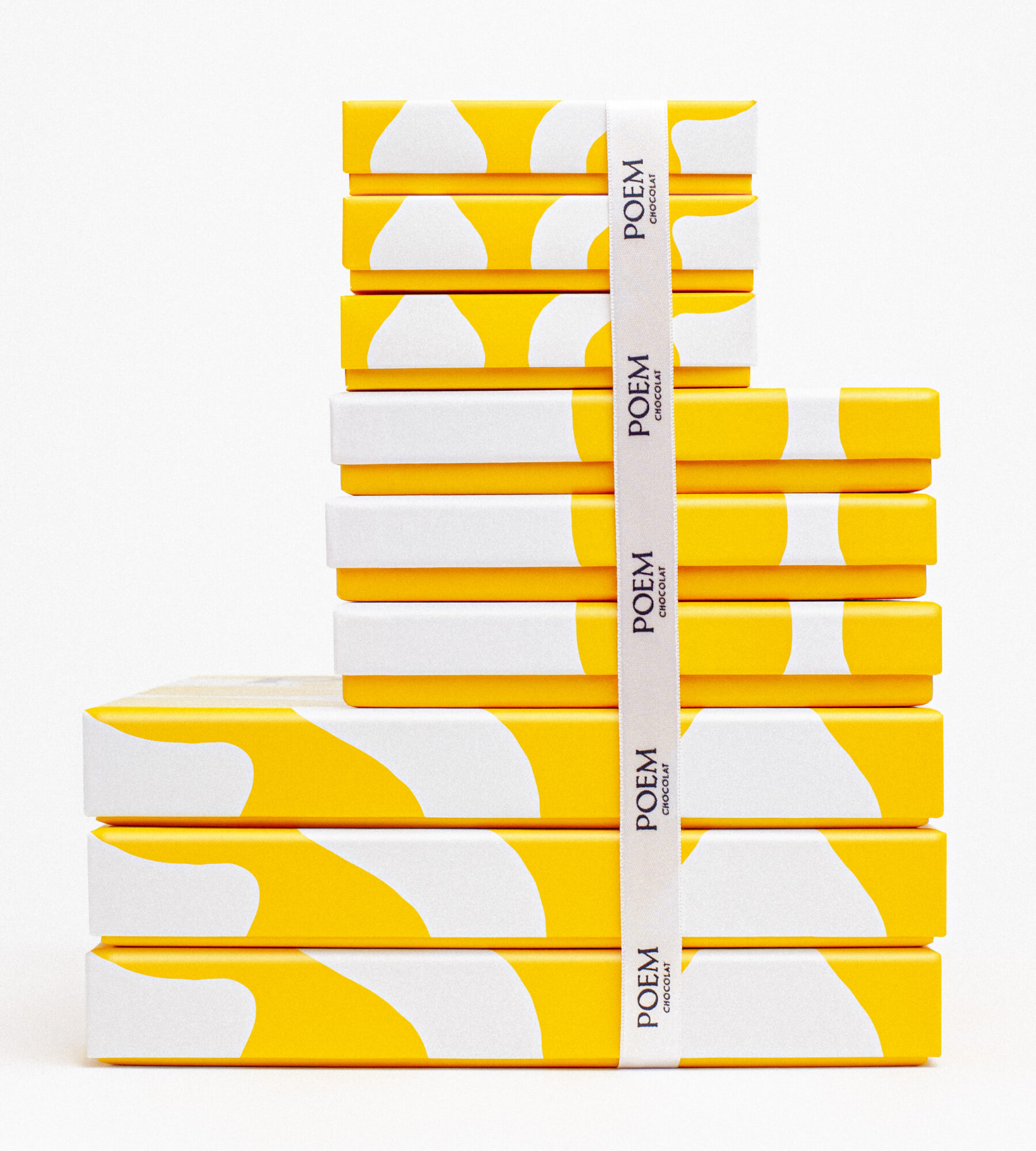
Inspired by the Arts and Crafts movement, the new wordmark is sculptural, angular, and precisely crafted. It sits high on the packaging – like the title of a new chapter – creating a strong visual hierarchy. The contrast between the commanding logotype and the whisper-level typography brings rhythm and quiet drama to every box and label. Soft, fluid, and intentionally imperfect, the new brand pattern adds warmth and tactility, balancing the strict geometry of the type system. It feels hand-touched without being rustic, evoking the artisanal process behind each product. The color palette centers around solar yellow and pure white, with space for seasonal shifts on special occasions, from wintery blues to romantic pinks. Elegant, luminous, and quietly luxurious, the new identity places Poem Chocolat confidently in a premium space, while remaining approachable and full of joy. Just like the chocolates themselves.

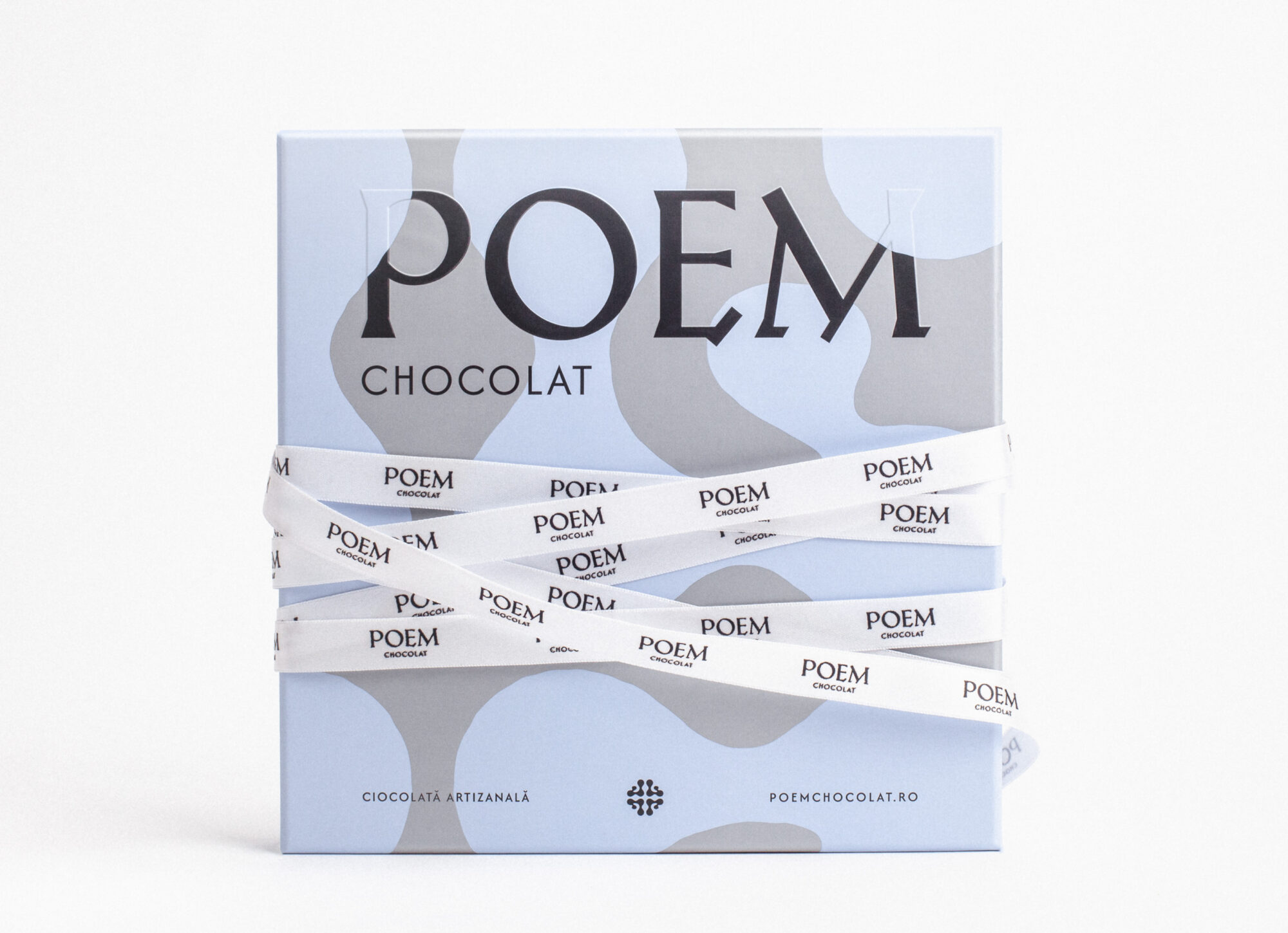
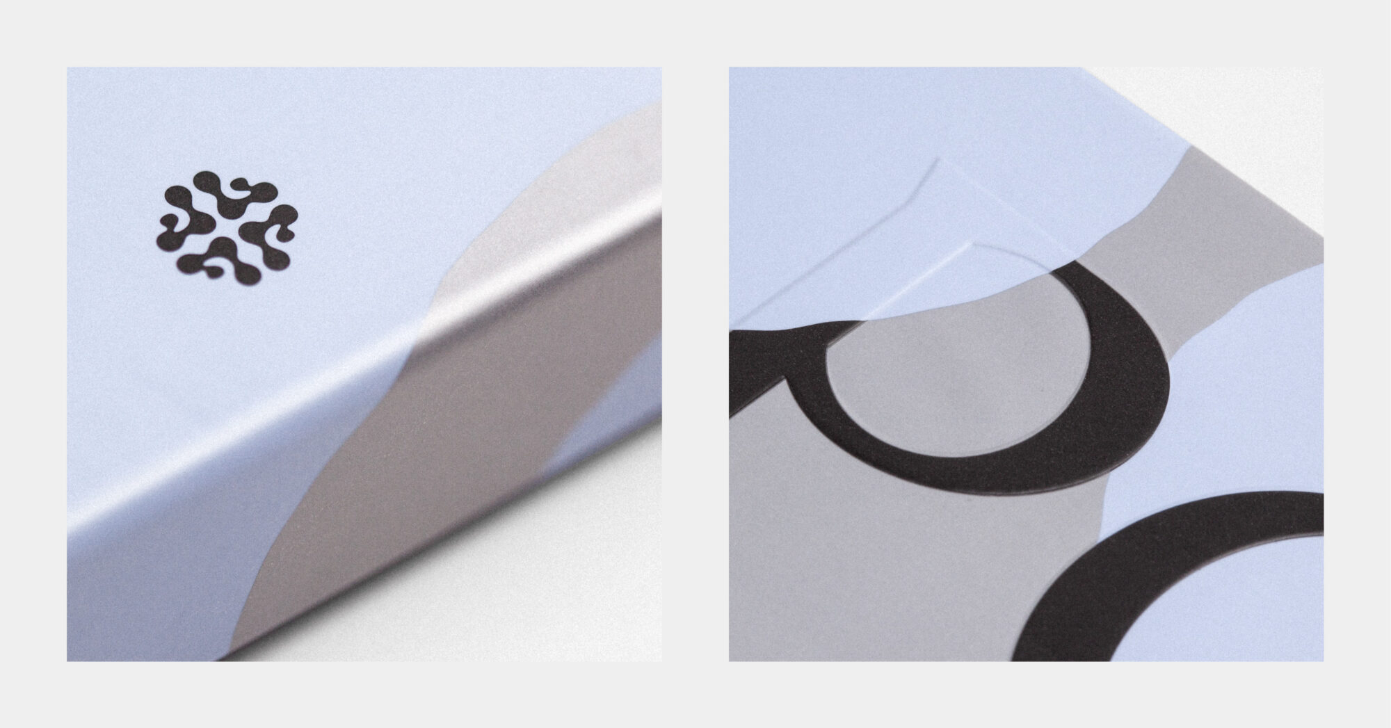
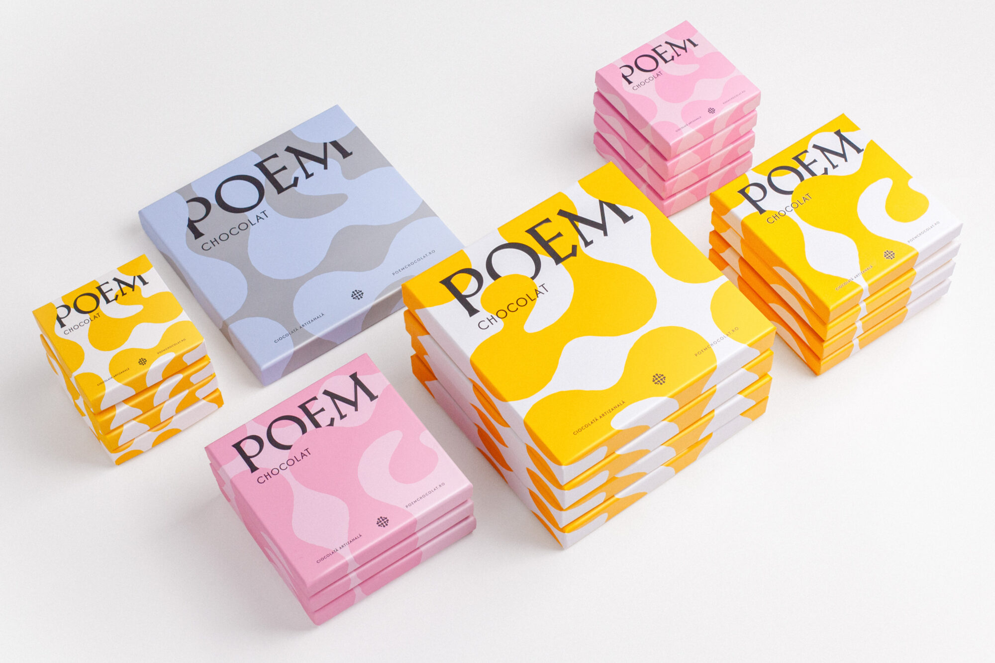


The yellow-and-white range and the tonal seasonal versions seem to pose quite different print checks. Did you approve the blue and pink combinations on the actual packaging stock before applying them to the boxes? I’d be interested in how you kept the quieter pattern visible without losing the small supporting text.
Hello Baron,
We carefully specified and locked in the exact PMS color combinations beforehand, but unfortunately we didn’t have the opportunity to run a physical press proof on the actual packaging stock, due to business constraints and the store opening timeline, so the client needed to push straight to production. To make sure the quieter pattern remained visible without sacrificing the legibility of the small supporting text, we balanced contrast precisely during the prepress stage so the background texture would sit back cleanly even without a physical prototype test.