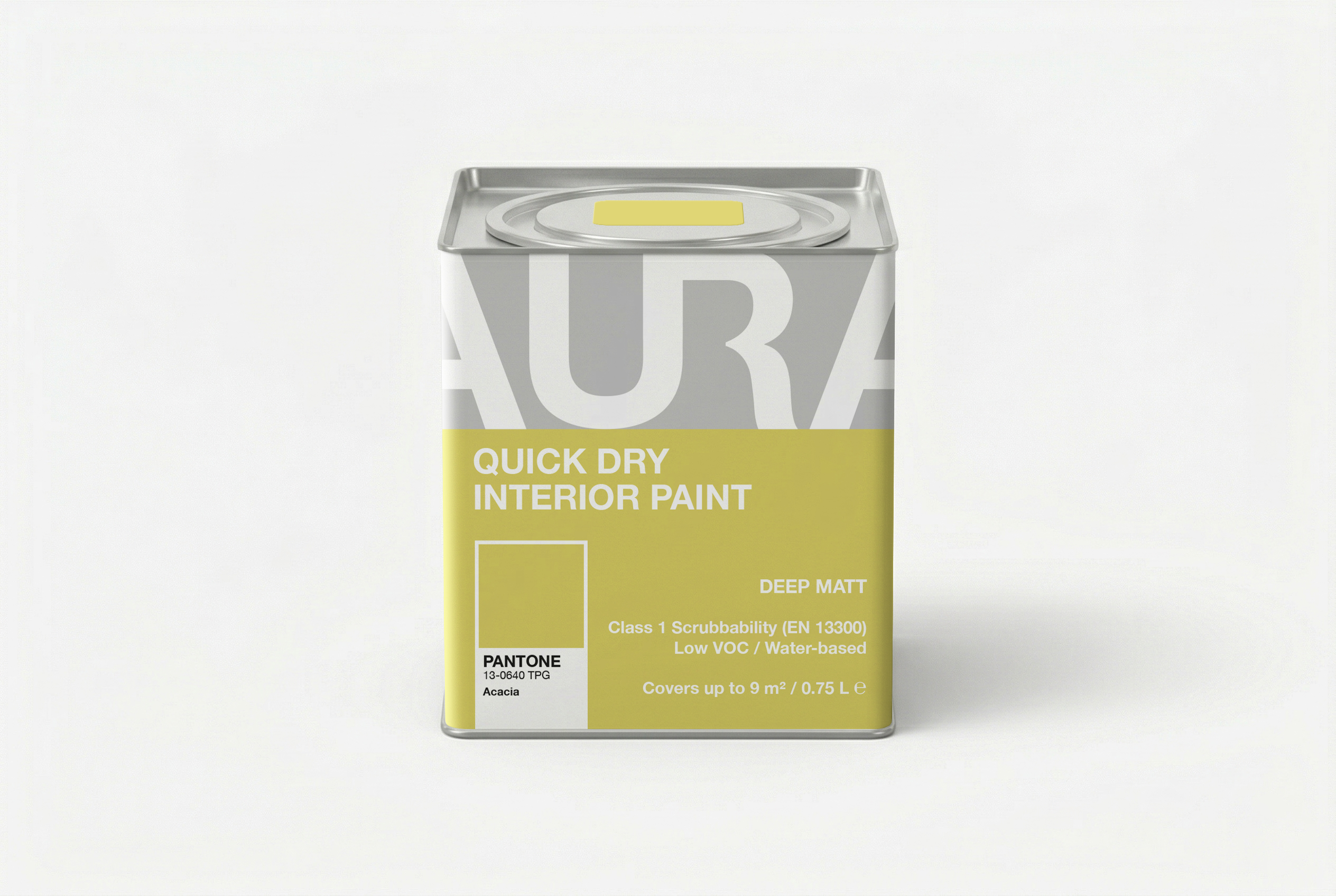

The packaging concept for this interior paint is designed as a collaboration between AURA and Pantone. The visual solution centres on large-scale display typography and modular layout patterns. By relying entirely on the type itself to drive the message, the design eliminates the need for any traditional illustrative clutter.
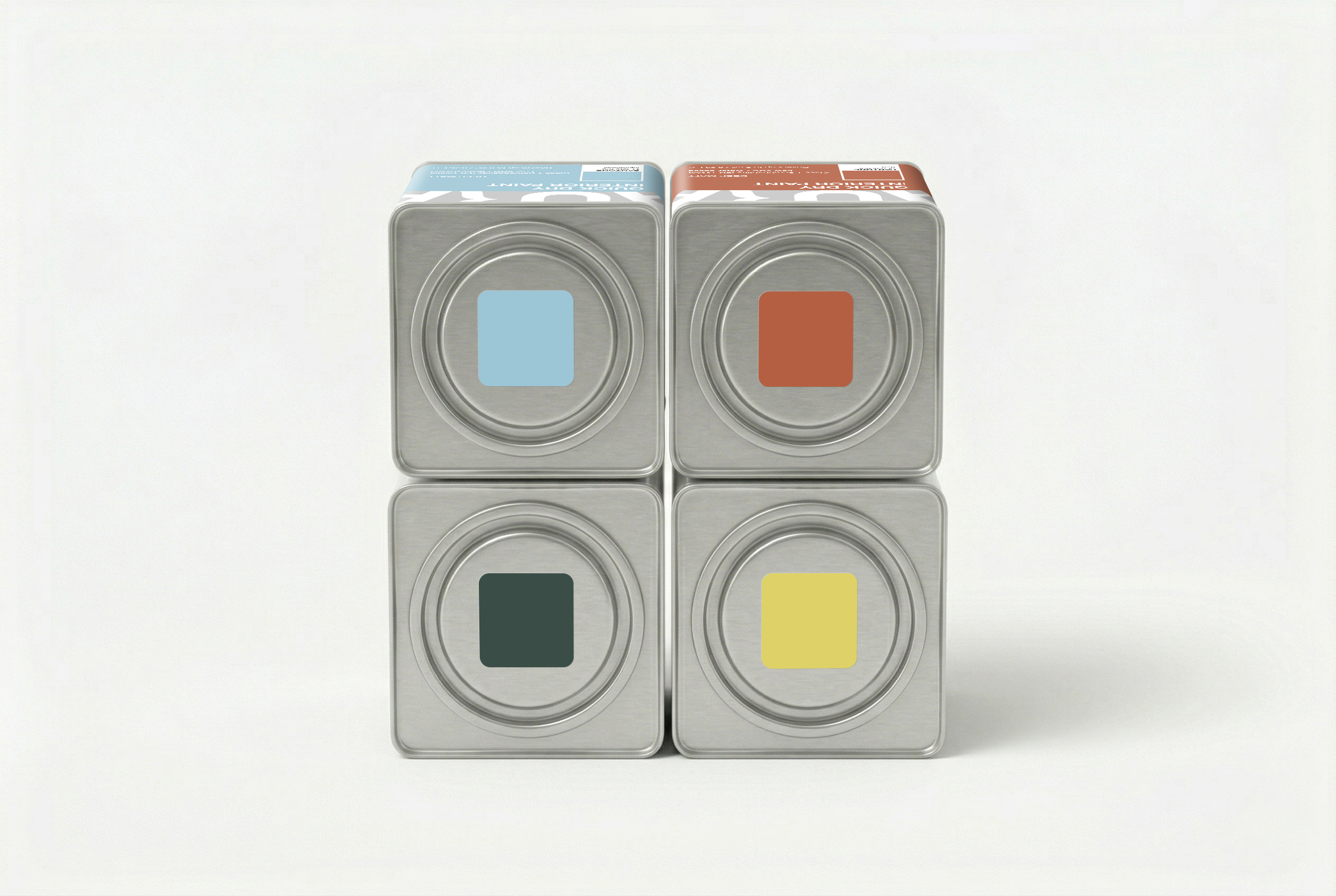
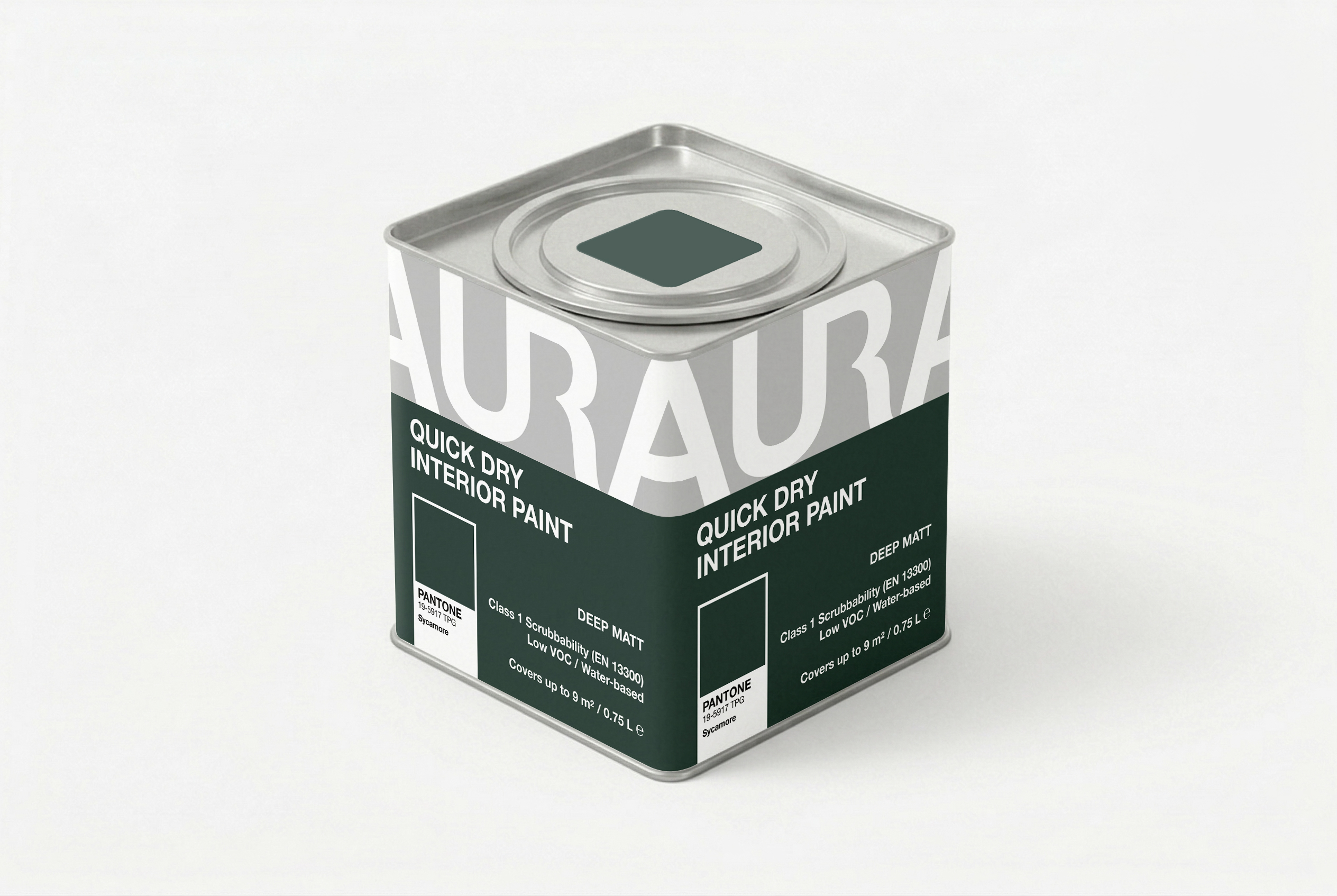
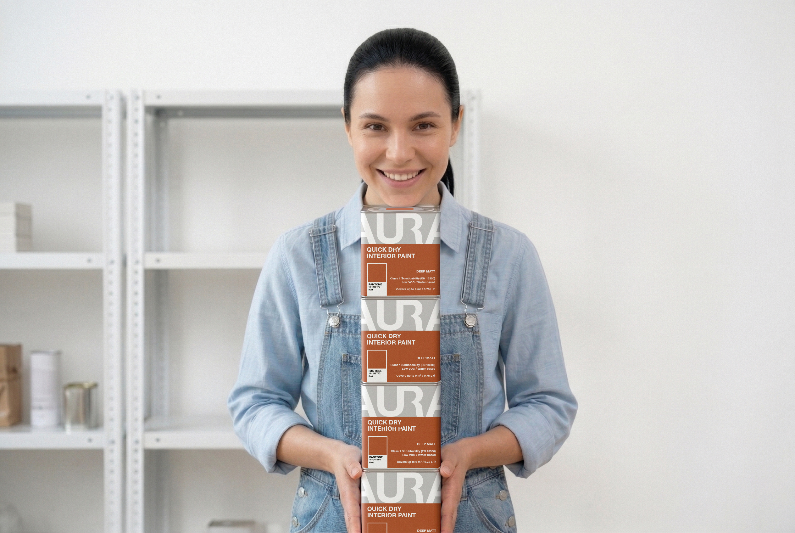
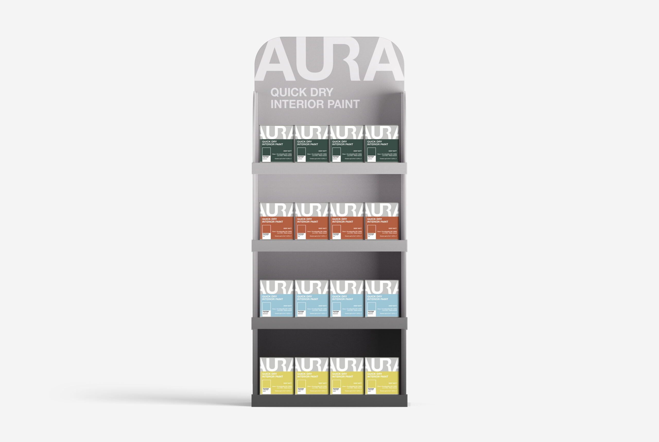
The oversized brand name intentionally bleeds off the physical edges of the can, creating a dynamic, monumental feel. Because the letters are cropped precisely at the edges, the individual cans lock together to form a continuous graphic pattern when stacked. This turns a standard retail shelf or display stand into a cohesive structural installation, significantly boosting the product’s presence in store environments.
The layout follows a strict, functional grid. The top portion of the can is dedicated to the brand name, while the bottom section focuses entirely on colour identification. Integrating the iconic Pantone chip directly onto the front panel—paired with a matching colour swatch on the lid—ensures instant palette navigation from any angle. This approach elevates everyday packaging into a clean, high-impact design object.
 VERONIKA KISELEVA
 al margen
 Jasgul
 Abhijith Madhu
 mariee
 Modern Theory
 Tancybox
 WINK®DESIGN
 impprintz
 Chainhouse
 rufydesign
 White Candy Design
 Just Design
 alchimistestudioParis
 bmd group
 Laurie Offer
 medok4r
 Nouna design
 CreativeWise
 ANNA ONISHCHENKO
 Denomination
 VANESA GARCÍA ESTUDIO
 Julia Persuk